New Entry Light Fixture, Flooring Option, and Half Bathroom Wall Inspiration
Progress on the studio was slow but steady over the weekend. After much frustration, I finally got the walls painted. At least, I think they’re finished. Once the new light actually has power and the entryway has light, I might discover yet more areas that need touchup. But for now, I’m calling it done.
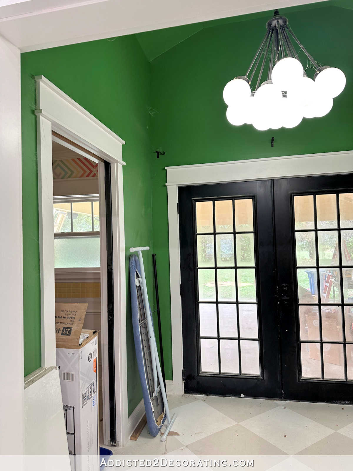
But speaking of light fixtures, I made my decision on the light for the back entry. I went with immediate gratification and bought this light fixture from Lowe’s. And oh my gosh, I’m so glad I did, because it’s PERFECT!
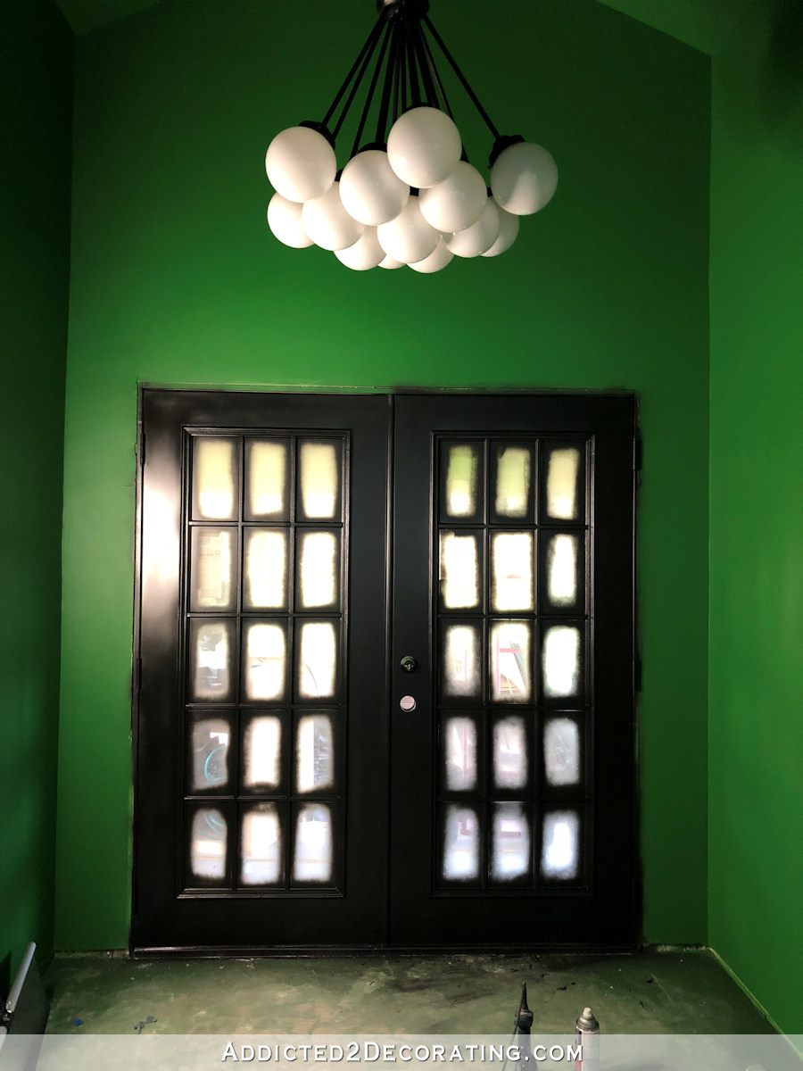
I didn’t think I would like the black metal on it, but I actually do. And make no mistake. Even though the product description calls it bronze, that thing is black. Solid black. And it’s perfect.
Y’all, this fixture was a bear to put together and install. I’ve never in my life bought a light fixture that required so much assembly. It’s a 13-light fixture, and all but about four of those arms had to be screwed into the base. Then my brother had to come help me install it because it’s too heavy and way too bulky for one person to hold and install while standing on a 10-foot ladder. Then once that was done, it took forever to screw in all of those 13 light bulbs and get all 13 of the globes installed. I was so paranoid that I was going to drop one of those globes on my way up the ladder! But I made it through all 13 without incident.
And I’m so glad, because I absolutely love it!
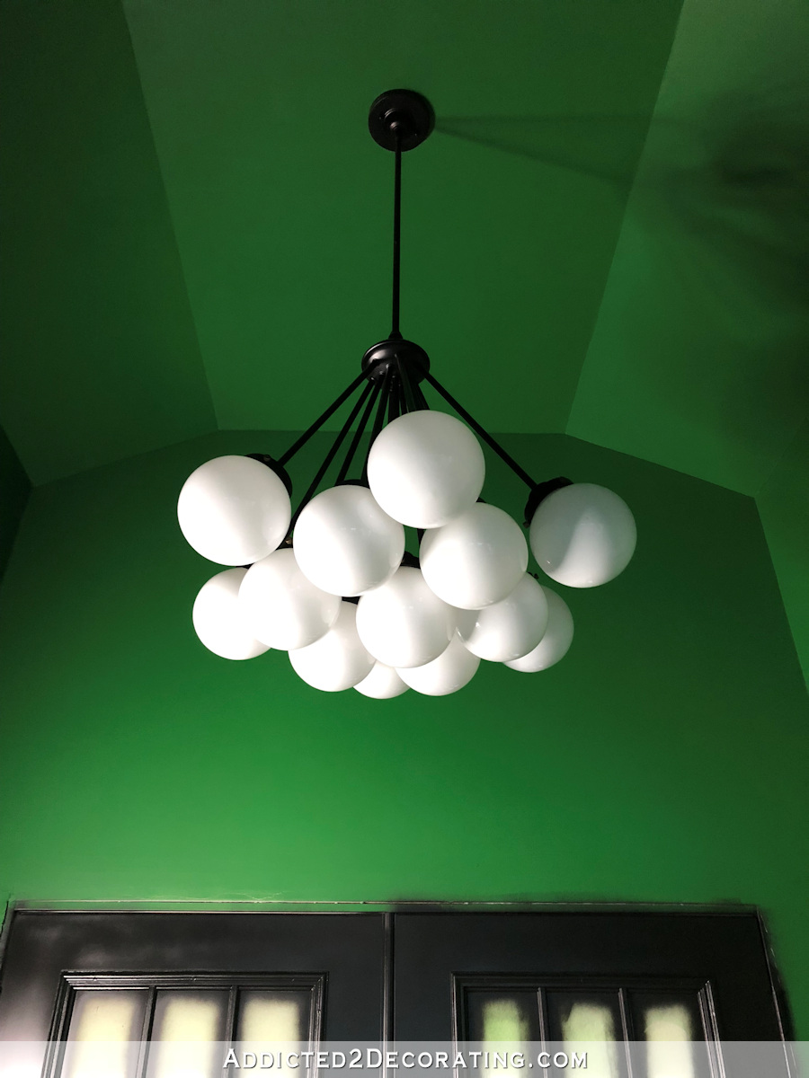
Actually, immediate gratification wasn’t even the main reason I went with this one. The deciding factor for me was actually that this fixture has glass globes that will more evenly disperse light into the now-dark entryway. The other light that I thought was my favorite had a metal drum shade, which obviously wouldn’t have let light through the sides.
So the immediate gratification and the saving of $140 were just added bonuses. 🙂
And I love how it shows from the studio…

So in addition to finishing the walls, painting the doors (I still need to scrape the overspray off of glass, obviously), and assembling and installing the light fixture, I also spent about an hour or two looking at countless images of black and white floors to see if I could find any inspiration at all for the entryway floor. I wanted something beyond a black and white checkerboard design.
I found several complicated designs that were pretty amazing, but if you’ll remember, I’ll be using groutable peel-and-stick vinyl tile (LVT, or luxury vinyl tile) for the entire studio area. So unless I could find someone to laser cut all of my tiles (which would be amazing, but expensive, I’m sure), then I needed a simple design.
Of the simple designs I liked, I think this one is my favorite…
I always love a herringbone pattern, but using two different widths of tile — a wider white tile and a narrower black or charcoal tile — just seems to take it up a notch. So as of right now, this is the direction I plan to head for the flooring in the back entryway.
And finally, I also got inspiration for the bathroom walls, and I wasn’t even looking for it. I knew that I wanted something colorful and geometric or linear, but I didn’t know exactly what that would be. Then as I was clicking around on Instagram and looking at the “suggested” accounts that Instagram thought I might be interested in, I came across this image.
The design on that tin stopped me in my tracks. Y’all, inspiration can come from anywhere! And as soon as I saw that, I thought, “That’s what I want my bathroom walls to look like!”
It’s colorful, which I obviously love. It’s geometric, which I think would be a good counterbalance to the big floral wall in the studio.
But I have no idea if I could actually pull that off. That would be so much taping, unless I just freehand it and go for a more relaxed, less perfect outcome.
I tried to find wallpapers that looked like that, and while I did find a few that came close, none of them were as pretty to me as the design on that tin.
So I’m still giving it some thought. We’ll see if I actually have it in me to tackle such a design. But now that I’ve found something that I absolutely love, it’ll be hard to settle for something else. But as I learned with my light fixture, sometimes the second best option turns out to be the best!



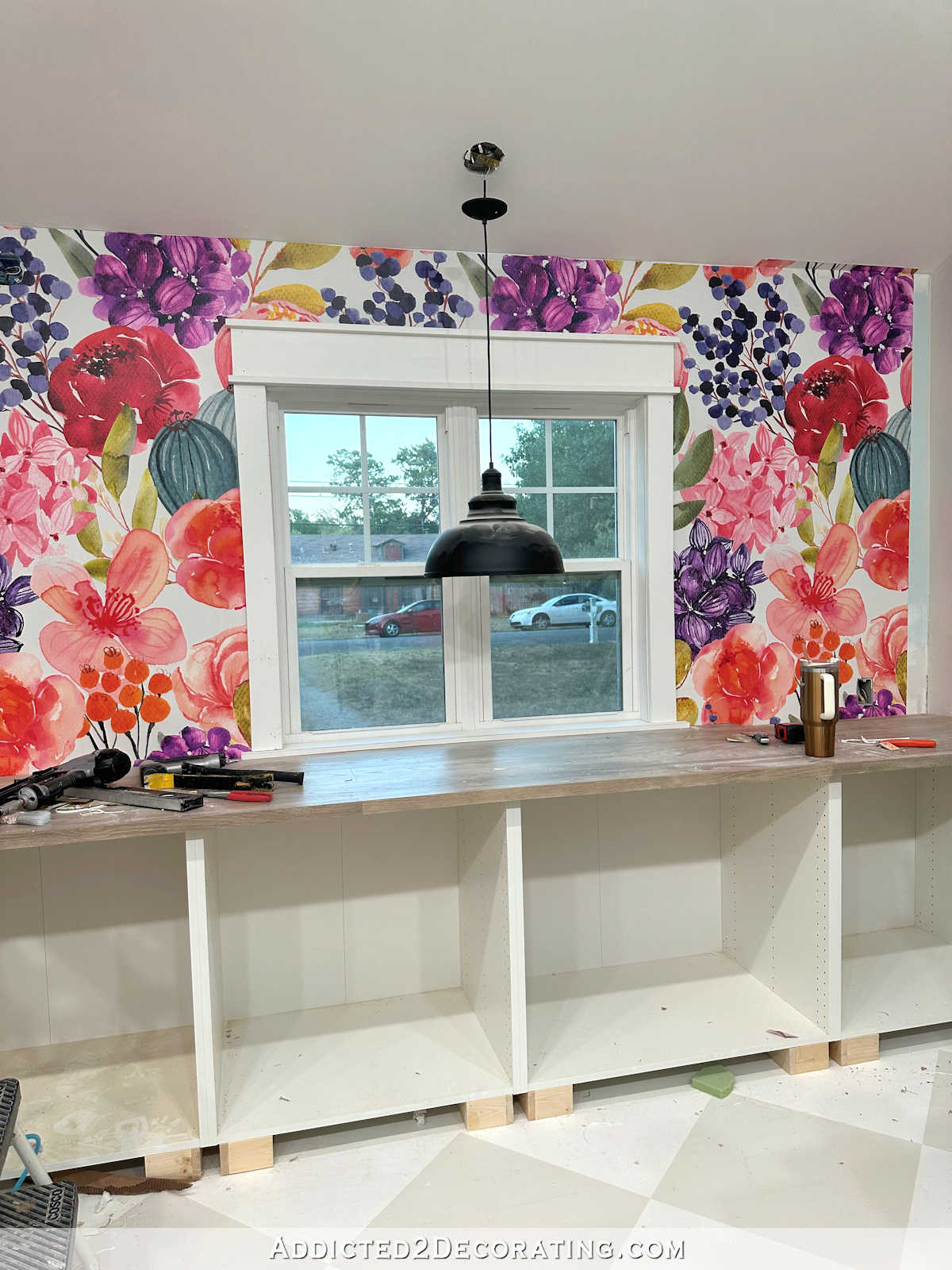

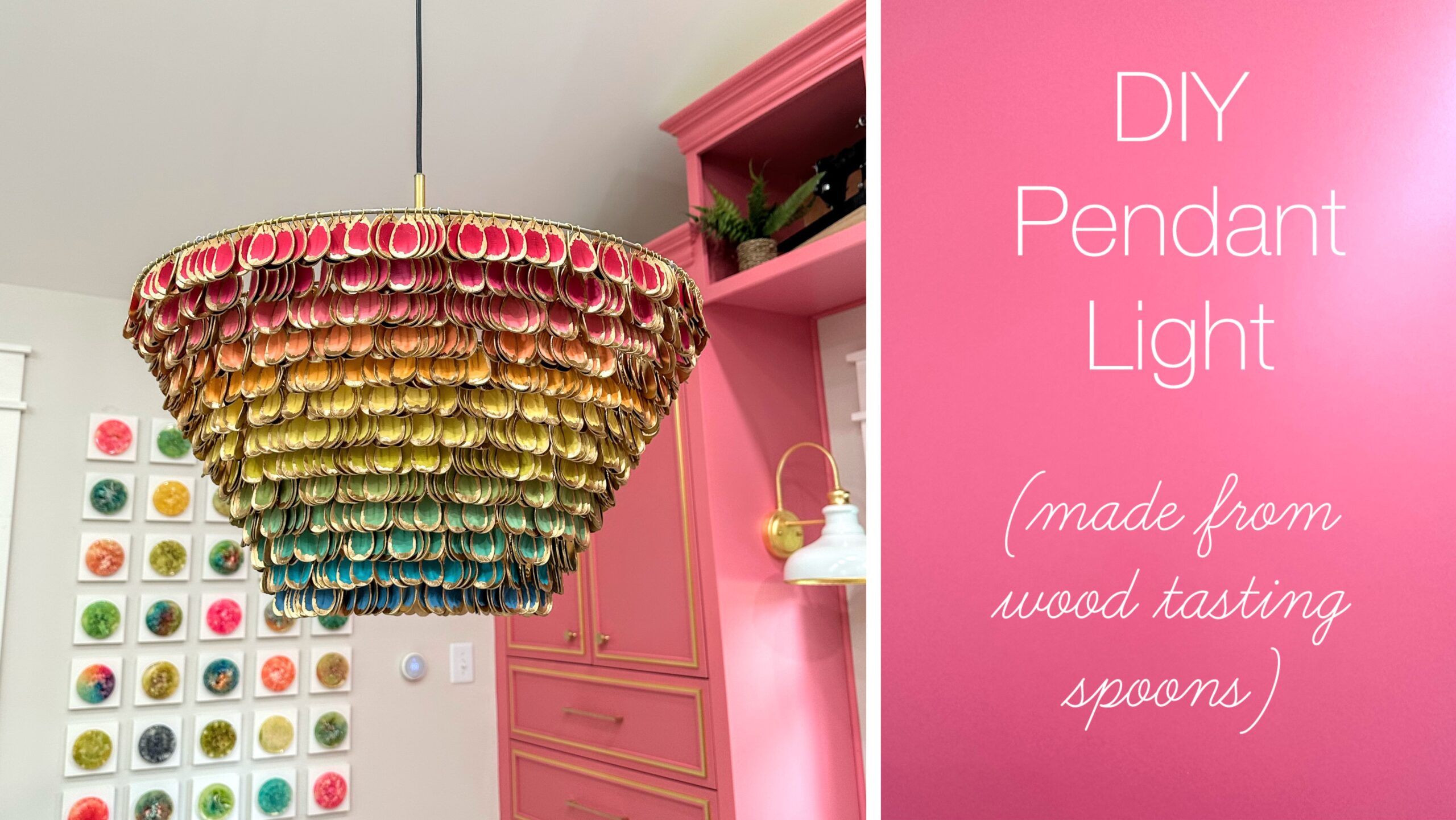
I love it all! That light was my favorite, but it looks even better than I imagined!
As to the bathroom walls, I think that design would be so much fun! I know you’re already doing your own floral wallpaper, and you don’t always like to redo the same thing, but maybe you could create your own artwork version of that design on the tin and make your own wallpaper from it? You could even choose the colors to be the same as you are using in the floral. I just think it is so cool, and would love to see it done!
I think you could create a design like that and have it printed as wallpaper – I think that would be considerably easier than trying to map it out and paint it and you could get some transparency and texture into the colour blocks like on the tin.
If you over-lapped colour tissue paper cut to shapes you like you could achieve the different saturation levels in that tin design. Maybe you could “decoupage” walls with a white base coat and then seal the paper some way?
LOVE.IT!! SO happy you picked that light and it looks AMAZING!!! (Makes me miss mine!)😊 Well done, as always! I can hardly wait to see what you do next and the “prism”/geometric concept!
For being a “slow” weekend in the studio, you were quite busy! Love the lights! They are so fun and make the perfect statement. In fact, if you can do your bathroom in the funky design they will be the perfect complement for each other. What are your chances of being able to design your own wallpaper like that? Yes, it’s going to be a fun ride watching the studio come together. Fasten your seatbelts!
The studio is going to be stunning. Love what you have done so far.
Seeing that plate instantly reminded me of a wallpaper I pinned years ago: https://www.pinterest.com/pin/771804454868565589/
Yes! I have that same one pinned or saved somewhere as well. I’ve looked at it so many times and wondered if I could ever replicate such a design.
I think you’ve put the cat amongst the pigeons lol.
Was just coming on to say that reminds me of this https://www.designerwallpapers.co.uk/cole-and-son/geometric-ii/circus.html#multi-colour-wallpaper-tint-7
That light is a party in and of itself! Love the green walls! Of course, no surprise that you picked one heck of a design for the bathroom walls, but I have no doubt you will figure out how to pull it off…my head went to using colored tissue paper to make the shapes and doing a decoupage, but then when I asked myself how the heck that would work, I said “forget it, she’ll figure it out!” LOL
I thought immediately of tissue paper too! Or gift wrap, if she could find the colors. Just use wallpaper paste. Back in the ’90’s, there was a trend of using thin paper bags, tearing them in random shapes and applying them to the wall (or floor!) then top coat with more paste. When dry, it looked like leather. The overlapped edges appeared like “seams” where the leather would be stitched.
Ha, that’s so funny, I did that on a wall in our dining room in Florida years ago…always said it was the Ralph Lauren wall! I also used animal print tissue paper on a wall once, overlapping the same as the paper bags! Oh lord, I cannot imagine thinking that looked good…LOL! I feel sure if it can be done, Kristi can accomplish it with perfection!
The color scheme you’ve got going is lovely, and your ‘tinspiration’ reminds me of a paper that I think might be Kelly Wearstler? I love it so much, I’ve had this less expensive/brighter version in my cart for a while! https://www.decoratorsbest.com/p-cole-son-prism-multi-coloured-wallpaper-295420.aspx?gclid=Cj0KCQjwg73kBRDVARIsAF-kEH8-tcAXBgJ1yteBdOtlMpd4UdUDUhz7bgABJgs7Or_oasd9C5p5EEIaAk_gEALw_wcB
I liked that paper until I looked for pictures of it on a wall. It looks blurry and hurts my eyes.
“Tinspiration.” You win the internet today, Rachel!
😉 thank you!
I found the Cole and Sons wallpaper pretty quickly.
Here’s another similar one on Etsy:
https://www.etsy.com/ca/listing/506911835/kaleidoscope-removable-peel-n-stick?ref=related-1
I love the new light and that you finally get to pursue your green dream of having it somewhere in your house. When I saw the tin of your idea for the bathroom it reminds me of a quilter that I follow. His name is David Armour and he makes geometric designed quilts. I think he is an engineer Here is one that I really love and it looks like your tin . https://www.facebook.com/photo.php?fbid=2554734044667835&set=pcb.2554734098001163&type=3&theater
I love that design on the tin. I imagine you could get the sheer overlay look with an air brush or your paint spayer. It would take a lot of tapering but you have done more than that before. Go for it!!
The light looks GREAT and I love that you painted the whole ceiling green as well.
Love the light. I would think of a party every time I looked at it! In the bathroom, what about color-saturated walls and a very large panel with your geometric idea?
Does the long hang of this fixture help balance out the fall of the ceiling fan? Maybe you don’t have to change the length?
Did you ever see Vintage Revivals octagon wall? Hers was relatively simple and beautiful, but with your sense of color and style, you could do something along the same lines just take it up a notch – more you.
I am now OBSESSED with the Cole and Sons Prism wallpaper! And I generally HATE wallpaper. I can’t imagine my husband being okay with $135/roll but stranger things have happened.
Taping? Psssssshhhh. Girl, you took a Sharpie to hundreds of edges on a stenciled design. You got this.
How about this Cole & Sons Prism wallpaper? https://pin.it/4yatnkofwx2462
https://www.designsponge.com/wp-content/uploads/2017/01/PinkHouse13.jpg
https://www.wayfair.com/Brewster-Home-Fashions–Geometrix-Wall-Mural-WALS0001-L6161-K~BZH8423.html?refid=GX238996466360-BZH8423&device=m&ptid=18283950120&network=g&targetid=pla-18283950120&channel=GooglePLA&ireid=35158052&gclid=EAIaIQobChMItr_DzY6M4QIVzFqGCh3lcAEwEAQYAiABEgL4xfD_BwE
Dawn Caskie that’s a great one, and more reasonable in price!
Absolutely love the light!! It’s light happy balloons or bubbles. So fun for a fun inspiring space!! Love all the updates!!
Kristi, could you use resin with geometric shaped tiles to get a result like that? Rather than using multiple colors on a single tile, use 1 color per tile (or a couple shades of the same color) and then use lots of different colors on different tiles. It’s really cool though and I’m sure you’ll make it look amazing however you implement it. 🙂
Check Society 6 for their wall murals. They have some designs that are very close to what you are looking for.
I love the light fixture; it’s so much fun! Your choice for the bathroom walls is rather tricky. I think Dawn’s suggestion from Wayfair is close but to get the look you might just have to hire a grafitti artist to get the of fade and blend with all the colors.
Do you have photoshop? I once made a “cityscape” just by drawing rectangles and squares, in different colors, overlapping them and playing with the opacity to give it a layered effect. I think you could easily make a wallpaper design on your own that looks like that tin. That would be way easier than trying to paint all those little shapes!
The light isn’t my style at all, but oh my goodness, I LOVE it! It looks kinda like a flower.
I can’t imagine how you’d even begin to paint that tin design, but it’s great! I think the wallpaper idea might be easier. You’ll figure it out!
Could you design another Spoonflower wallpaper?
I still love the green (you probably were feeling St. Paddy day, yesterday). The light fixture you choose looks great in entry way as you have that big space to fill.
I only hope you put LED light bulbs in that fixture. I have a 5-bulb light fixture and before I brought those LED bulbs, I was changing at least one bulb a month and I didn’t have to climb on a 10-foot ladder. I haven’t changed a bulb in at least 2 years in that fixture.
P.S. Does your brother have your talents? He can hire himself out. 😊
I’m in love with that light. It is stunning with the green walls. You have me trying to figure out a way to raise my ceilings. I can’t wait to see what you do in the bathroom.
Glad you are in love with that light! It’s really cool, but no way would I deal with changing light bulbs in it. Hope you got LED’s so you won’t have to for a while! Despite MY misgivings, it does look awesome for the space! As for the bathroom idea, I love that! Hope you can figure it out, but I know you will if you want it bad enough! And I love the doors, although it isn’t my thing. We had almost black trim and woodwork in our first house (back in the ’70’s) and it made me crazy for ten years. We finally just replaced all of it after first trying to paint it white. After bumping it with the vacuum, it got chippy and the black stuck out like a sore thumb. I swore NEVER AGAIN, and now the trend is back. Not for me!
She’s going to put white trim around the doors, like in her hall closet. That’s what she posted the other day anyway
https://i.pinimg.com/originals/a1/ab/20/a1ab2053ee6483456aa63e9a00a879bb.jpg
Buffalo check??
I must have missed the post where you decided on all your flooring for the studio. Can someone tell me which post that might have been in? Didn’t realize the decision for the LVT and also tile for the back entry. Thanks!
It’s right here: https://www.addicted2decorating.com/ive-made-a-studio-flooring-decision-and-purchase.html
Beyond words. I love the way it is coming together.
The design on that tin wouldn’t be too hard to replicate in a Photoshop-like tool and have printed at Spoonflower. Wonder if maybe your Mom could use her Mad Photoshop Skillz to help you out.
OK, now you have me looking for a better quality photo of that tin to see if it could be ripped-off and manipulated. 🙂 If done just right, you could even probably preserve the metallic look.
https://www.thesun.co.uk/wp-content/uploads/2018/09/NINTCHDBPICT000435204443.jpg
https://www.google.com/search?safe=off&tbm=isch&q=nestle+quality+street+tin&chips=q:nestle+quality+street+tin,g_1:logo,online_chips:john+lewis&usg=AI4_-kRLpUV_zJCnGMqWMrjfIz78LHlCeQ&sa=X&ved=0ahUKEwjjq4WwrYzhAhUOJt8KHU41BA8Q4lYILCgC&biw=1300&bih=738&dpr=2#imgrc=_
That 2nd link makes me happy 🙂
You got me searching, too. Look at this adorable little bathroom!
https://vintageindustrialstyle.com/vintage-bathroom-decor-bold-colors-geometric-shapes/
Not gonna lie…I actually spent 10 minutes in Photoshop with that tin trying to clean it up. 🙂
While I think I can do it, I doubt it’d look nice printed. Plus, I’d have to figure out how to make it a repeating pattern, which isn’t easy with a random geometric pattern like that.
That was my problem as well—making it into a repeating pattern that flowed naturally together. It’s difficult with a design like that.
Your house is so fun!!!
Beautiful!!! Love the fixture, love the black, love love love the green. Amazing!!
Adorable light!
LOVE THAT GREEN!!!!!
One thought would be to make a stencil of the geometric shape or shapes that you want. Also I love the light fixture.
Loving the new light fixture. It’s such a statement piece and it looks so good with the green and black.
I love the light fixture! The more expensive one looked like something you would find at Ikea for 1/4 of the price. I love the design for the bathroom. It would look so good to pull the colors from the wallpaper into the geometric design in the bathroom. Can’t wait to see the final result! You’ve been busy!
Oooh, that green with the lamp is just absolutely gorgeous! That was my favorite of all and it works perfectly! So glad you had help. I can only imagine the hassle of putting it up. Now I will wait patiently to see how you integrate all those delightful colors in your bathroom. 🙂
Your vision and skills are amazing! So glad I found your site. Your designs are eye candy.
That light fixture is perfect in your entryway. The black goes great and with that many globes, you should get good light there.
As for the tin tiles in the bathroom, I really like those. If anyone can pull it off, it would be you.
I do like the herringbone pattern for the floor.
Hi Kristi,
Fell in love with that light fixture and purchased it yesterday. Now I’m thinking it might be too tall for my foyer. I have 10’ ceilings and I read that yours are 12’. What’s your advice?