Painted Floor Cloth:: Two Three Of Many Design Options
One project I’m going to embark on in the next few days is making a painted floor cloth for my kitchen. I’ve wanted to do this for many years now, and since my kitchen floor needs some color, and I don’t really want an actual rug, this is a great opportunity to make a floor cloth.
After looking at different canvas options online, and then poking around at Home Depot this weekend to see what I could find, I actually decided to use a remnant piece of vinyl flooring for my “floor cloth”. I think it’ll be more durable, and won’t be prone to wrinkles and waves like canvas can be.
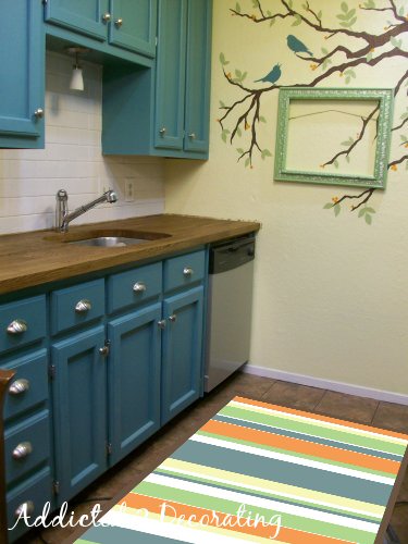
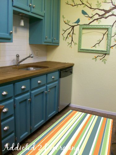
So with my vinyl, paint and primer “at the ready”, I now just need to decide on a design. Stripes seems like the easiest and most obvious choice, so if I go with that, which way should the stripes go?
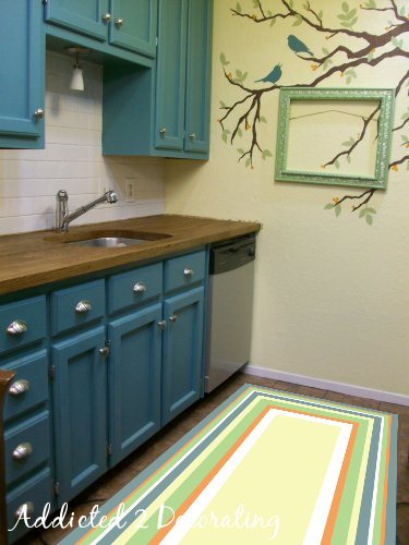
And then I’ve considered a chevron pattern, and possibly a concentric rectangle pattern.
Any input? Tell me your thoughts!!
Edit: I wanted to see for myself what a concentric rectangle pattern would look like, so I whipped up this quick little pic. I made it too big, but at least it gives the idea.
Hmmm…what say you?

Addicted 2 Decorating is where I share my DIY and decorating journey as I remodel and decorate the 1948 fixer upper that my husband, Matt, and I bought in 2013. Matt has M.S. and is unable to do physical work, so I do the majority of the work on the house by myself. You can learn more about me here.
I like the first picture. Love the colors !!
I like the first also. I think the 3rd may show too much dirt with the wide beige rectangle
I like the first one the best also-and totally agree with Aprile (at least that's what would happen in MY house!
Stacy
I like the first as well. I really like the third, though. Maybe a different color in the center rectangle so the dirt doesn't show…??? I can't wait to see this tutorial though! You will do a tutorial, right?? Pretty please??? I found some left over vinyl in my attic a couple weeks ago and thought about using spray adhesive and a drop cloth and then poly-ing the whole thing after I paint it.
Apparently I'm alone in this, but I really like the second picture. I think it makes the kitchen look bigger by drawing the eye back to the end of the kitchen.
All look great though! I'm excited to hear about how this works out for you!
I like the second as well – it does seem to make the kitchen look longer and draws your eye up the wall to your tree! I am sure whatever option you choose will be great!
i feel safe with the first option, adventurous with the third. shouldn't design be adventurous?
I like the third. It's has the long lines that draw the eye but mixes it up a little with the rectangle.
Really like the 2nd or 3rd! Can't wait to see it!
Number two seems to make the space seem longer. It's also a little unexpected, which I always support
How many rugs are out there with stripes like number one? The answer is A LOT.
I can't wait to see what you decide. They'll all look great!
I vote for number one because a galley kitchen such as you have can always use something to "widen" the space. Number two does just the opposite – makes it seem even narrower.
Just had to add: Your first and second designs show you really are succeeding in breaking out of the "everything must be symetrical!" box. I love the way you mixed up the colors and stripe widths.
I like the first one best. Since your kitchen is kind of narrow I think the stripes running the same direction as your ceiling tricks the eye into thinking the room is wider.
LLinKS
I like the first one – the short stripes add a nice burst of color and make the space appear a bit wider. Love the way you did the pictures!
I like the first one the most, the second one makes it seem so…long. and the third one hurts my eyes, and makes me think of my grandma.
My first choice is the second one, second choice is the third one and third choice is the first one. Wow. That can get a bit confusing!
I like the stripes- I think either way would be nice. I love the idea-
I'd go with the second one with the horizontal stripes. Why? because it leads the eye to look at the wall peice–which by the way is very nice, i like the frame and how the tree branch design goes right through it.
I like the second picture with the horizontal stripes. It just looks better and makes the space look longer (it's the second picture)!
If you go stripes I think they need to go horizontally instead of lengthwise to give the illusion of more width. I like the stripes but a chevron may be kinda cool.
I like the first one best because it gives the illusion of making the kitchen look wider. I think the long stripes make the kitchen look more narrow. Love the colors.
Use the rectangle one, take some photos of your wall birds and put them on the floorcloth too. I used the method from "Floorquilts!: Fabric Decoupaged Floorcloths–No-Sew Fun" from Amazon. Its a downloadable ebook.
The first one, with the horizontal stripes gets my vote. I love how you "photoshop" you ideas on a photograph before committing to them, such a time saver. I took the same approach recently for a wall montage I painted in my basement, I now have a "penthouse" down there.
http://www.indigoimage.com/wpblog/2011/02/a-teenage-chicago-penthouse-in-my-basement
I like the first one the best. Maybe because each color gets more space that way. I might like the second one better if the stripes were wider!
Love the colors you've chosen!
Oh I like the second, totally makes the kitchen look longer, but you didn't show us the chevron rug,,,, lol. Totally can't wait to see your tutorial on how you did this girl, I really need some fun vinyl rugs in my kitchen too.
Hugs,
Bella 🙂
I like the stripes running lengthwise… makes the room look longer/bigger, in my opinion. I really like that you've varied the widths of the stripes, too. Great way to tie in all the colors.
Looking forward to seeing the finished product. I've thought about doing something like that too. I use cotton rugs now, but they have to be washed every other day (I turn them over so get two days out of one rug). So once you've done it, I might be brave enough to tackle it 🙂
I like the first the best.
I would go for the 3rd option. I wouldn't worry too much about it showing dirt because it is vinyl, you can wipe it off. Really you are going to be cleaning it no matter what stripes are on it! It also isn't so busy that it competes with the awesome feature wall!
hmmm, hard to choose. I think #1 is too plain, I like #2. Probably #3 is my favorite!
I'd vote for #2 – I definitely think it makes the kitchen look longer / bigger.
I dig the third one the most. 🙂 Just keepin' it real.
The 2nd one. Absolutely the way to go. I like #1 too, but I'm really digging the way it lengthens the room.
I love them all, but I think the concentric rectangle makes a bigger statement.
The first one! I think it makes your kitchen look more open.
#3 followed closely by #1. LOVE your color combo!
Erin
I like the first pic w/ the stripes perpendicular to the cupboards. Regarding toning down the colors – you could use an dark stain to give it a distressed look – you mention a whitewash – I thought of the dark stain because when I scrapbook I use distress ink to tone down color… just a thought.
I'm a fan of number 2 , love the length it gives to the room. I don't think your going to get a unanimous vote on this one! I think whatever you do will look great! Paint isn't forever!
Use the rectangle one, take some photos of your wall birds and put them on the floorcloth too. I used the method from "Floorquilts!: Fabric Decoupaged Floorcloths–No-Sew Fun" from Amazon. Its a downloadable ebook.
I like the third. It's has the long lines that draw the eye but mixes it up a little with the rectangle.
I like the stripes- I think either way would be nice. I love the idea-
You are awesome!!!! Love everything you have done!!!! The first original rug is my favorite, but love all of them. Your wall branch and bird artwork is perfect adds so much! Fun!!!