Painted Studio Floor In Progress! (Plus, Three Options For My Checked Floor)
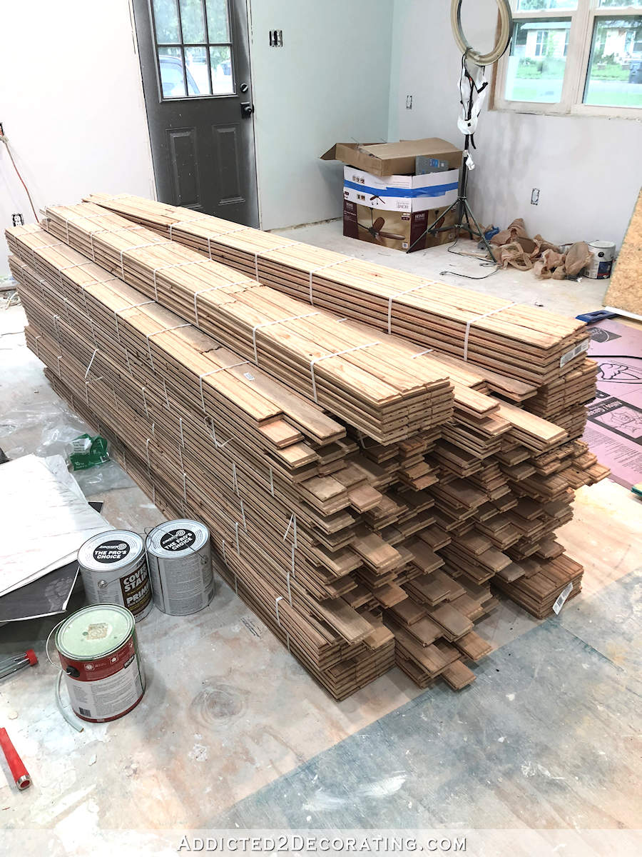
I’m finally to the point in my painted studio floor project where I feel like I’m making good progress. I’m having to work in sections, and the section I’m working on right now is about 19.5 feet by 14 feet. So once this area is painted, and I give it about 24 hours to dry, I’ll cover it, move everything to this side of the room, and then work on the back section of this room, which is 19.5 feet by 7.5 feet, plus the back entry, half bathroom, and storage room.
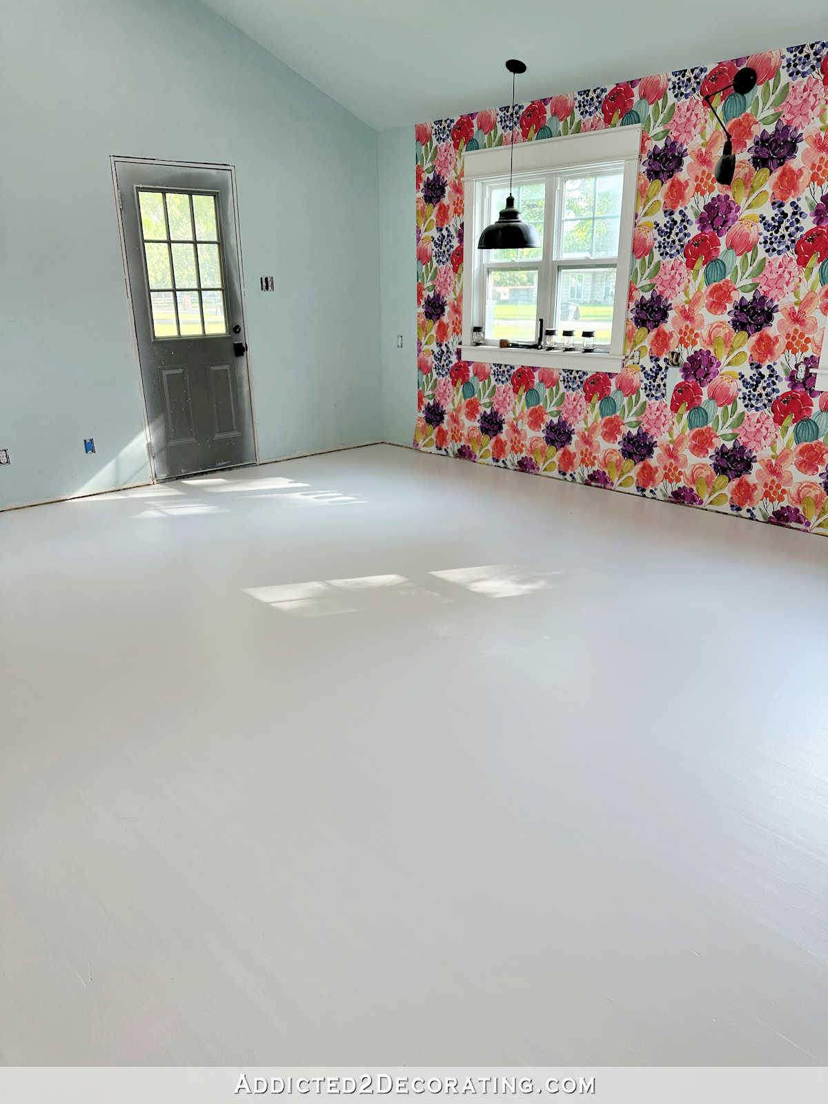
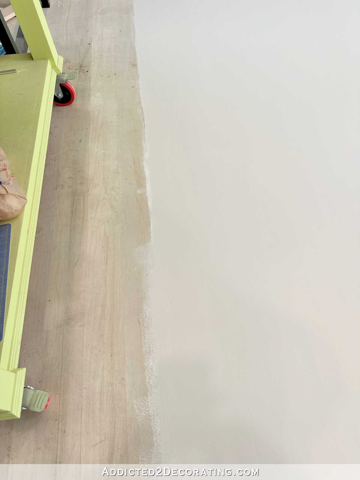
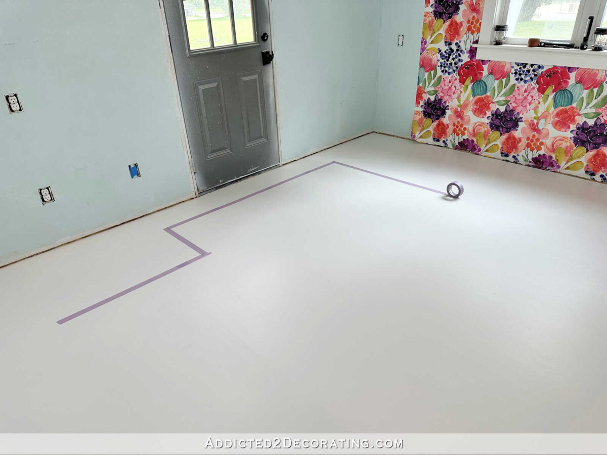
This weekend, I finally got to the painting. After all of the prep work (sanding, sanding, and more sanding, plus wood filling, sanding again, priming, and more sanding), I was ready to get to the fun part. The painting! I did one coat of primer, and two coats of porch and floor paint. I decided to do the gray color as the base color, and then I’ll go back and do the white checkerboard design over the gray.
So this is the darker color of the two. This is as dark as the floor will get. And I was amazed at how clean and bright this light gray even looked against the original floor. I knew the white would look really clean and bright against it, but I wasn’t expecting the light gray to be such a contrast.
Today, I’ll be ready to start taping off the design and painting the white checkerboard pattern on the floor. This will be the fun part seeing the floor go from a plain solid color to a fun design.
But there’s a small problem. I’ll be ready to start taping and painting this afternoon, and yet, I still haven’t quite decided exactly how I want to do the floor. I know I want a checkerboard floor. That part of the plan is solidified in my mind, and I won’t be doubting it or changing my mind. But what I’m still not set on is whether or not I want a border around the wall (I really think I do), and if I do a border, does the border just follow the wall? Or does the border follow the wall and the cabinets?
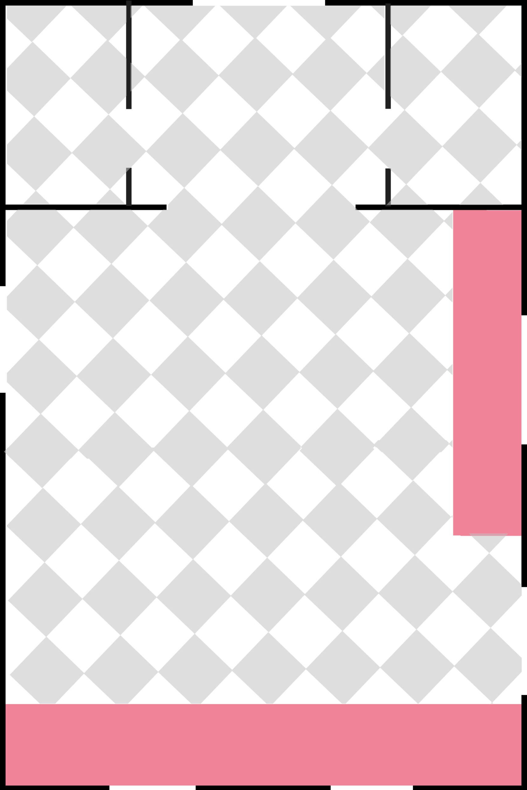
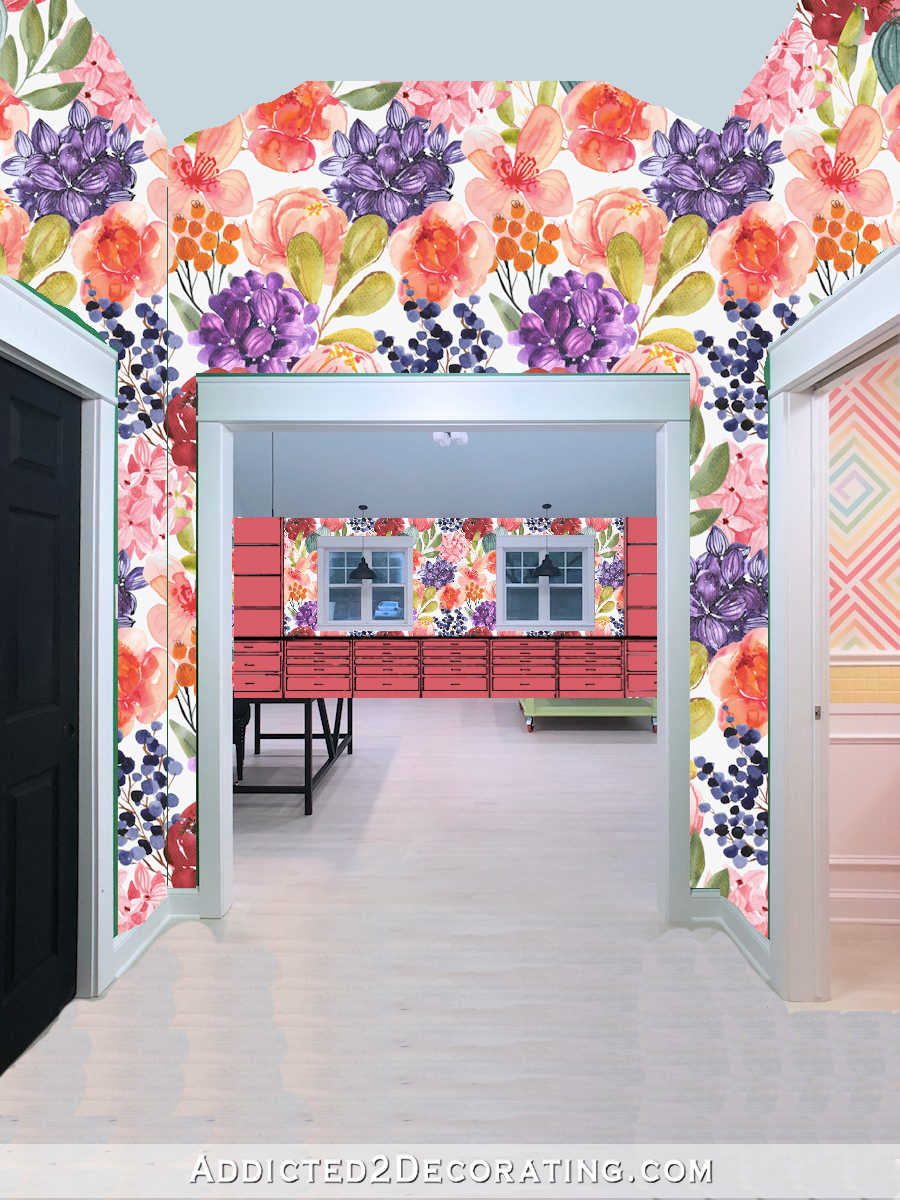
Here’s what the floor would look like if I just do a simple checkerboard design in the entire area. It seems a little busy to me, although in reality, it probably wouldn’t be since the actual white and gray that I’m using are much more subtle than the colors I used on this picture. And obviously, the pink areas are where my cabinets will go. This probably isn’t exactly to scale.
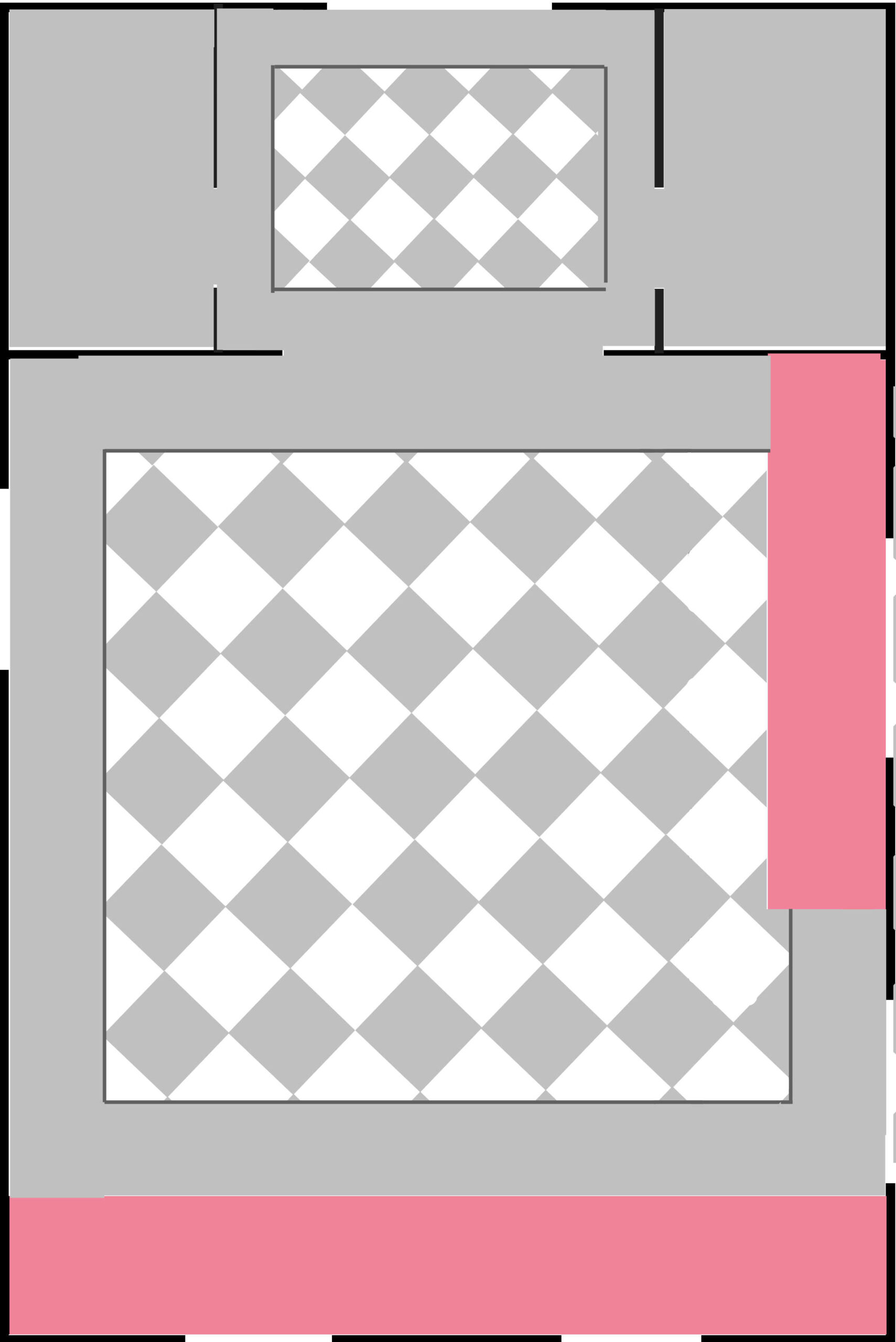
I really like the idea of a border, though. And I like the idea of using the two colors to make the different areas distinct. And ever since deciding on a checkerboard floor, I’ve had it in my mind that a border would follow the walls and the cabinets, like this…

But now I’m second-guessing. Perhaps the border shouldn’t follow the cabinets, but should only follow the wall. The problem with that is that on the entire front wall of the room (the wall with the two windows and the wallpaper), the border would be lost completely if the border follows the wall.
So I could make the border follow the cabinets on that wall, since the cabinets will be wall-to-wall with no spaces, and then in the rest of the room, the border would follow the wall. That means I would lose some of the border under the cabinets on the side wall, but it would make the whole floor design feel more symmetrical.
*Sigh* I just don’t know. The good thing is that I can go ahead and start on the checkerboard design, since I’ll be starting in the center of the room, and then see if I get clarity as I progress. But feel free to let me know your opinion on these floor design option.
EDIT:
On the picture showing the border following the walls and the cabinets, the area around the side door on the right looked very small and squished. So I went into the studio, measured, and taped off what that area would actually look like with a border following the front cabinets, the wall around the door, and the side cabinets. In the actual room, there’s far more space in that area for the design to “breathe”.

Addicted 2 Decorating is where I share my DIY and decorating journey as I remodel and decorate the 1948 fixer upper that my husband, Matt, and I bought in 2013. Matt has M.S. and is unable to do physical work, so I do the majority of the work on the house by myself. You can learn more about me here.

I like a border but I wondered if you have considered a narrower border? It appears on the picture that you have shared that it is really wide and it over powers the check. Just my thoughts. It is going to be amazing what ever you do.
The last example is most attractive.
Yes, agree with this thought. Actually caused me to prefer the no-border option.
I like the border idea to be in front of the cabinets as it will give them a really custom built in look. However, I don’t know why but I think the border should be half the current thickness and also white. That’s what I see when I close my eyes. I’m sure whatever you do, will be awesome!
suggestion: have the border in front of both sets of cabinets so it would look like a rug, as in the way it is in the foyer.
Could you just do the checkerboard like a giant rug? Then you could do a wide border and if you change your layout soon or even down the road the border would still work.
I agree with Tonya.
I love the middle option but without the jut out by the door. It makes it look like an area rug and very intentional. I imagine the space by the door will get the most wear and tear and dirt. probably easy to repaint a solid then a design
I was thinking this same thing as well. Or maybe paint something in front of that door to look more like an entry way. That little jut out seems out of place? It probably won’t be in person.
Agreed. I’d do the border following the cabinets and just come straight down without the jut near the door. Place a rug in front of the door to trap some dirt as you come in that way.
I agree with eliminating the portion that juts out to the side door.
Agree
Ditto.
I love the checkerboard floor pattern but not the border. I think it takes away from the floor and it is just more work. If you decide to do the border, follow the cabinets and the wall on those walls without cabinets.
Personally, I like your first example with the border. But, it seems that if you are starting your checkerboard lined up with the center point of the room, and have the border follow the walls, instead of cabinets, then decide that you don’t like that, you could always change the location of the border. Right? Or if you did go with following the cabinets, I think I would just leave off the small area, near the cabinets. My thinking with that is, if you had rugs, it wouldn’t have that little area.
I prefer the all over diamond design. I think the borders make it look too busy.
Same! when there’s a border in tile or painted floor, it always strikes me as an attempt at a faux rug in a odd way. I much prefer it just land into the wall.
I am team No Border all the way. Once you add the border everything looks squished and I suspect the border will make future arrangements difficult.
Me …three
Totally agree. No border.
I like the no border look best also.
Me, too
I agree.
Me too
Yes, I agree for these reasons; also there will be tables, etc in the room….the border would either get lost or make it look too busy.
The border strikes me as convoluted and unnecessary. It adds an additional design element where none is needed.
Agreed.
Based on your mock-ups, I think using the checked are like an area rug , centered between the cabinets and walls, would be a perfect solution. You would get the best of both worlds!
This!
I agree.
I agree!
Agreed! This! It will be beautiful whatever you decide!
Also, whatever other furniture and equipment you end up putting in the room, the centered floor pattern will remain unaffected.
Agree!
In my old kitchen I followed the cabinets and door. It just made sense to my mind and I loved it. I confess I didn’t think about it to much once I decided I wanted a border. It’ll be lovely regardless.
I think the border could follow the cabinets. Imo it like uneven otherwise.
Your thought processes are fascinating! I would never have come up with option 2 with the weird L shape in the pattern, even though I understand how you got there. How about sticking with no 3 but designing the border in such a way that you can still see some of it in front of the cabinets which will be next to the door? That means a wider border, but it would deal with the problem without complicating the pattern. I’m pretty sure you come up with the perfect solution – and it will be something entirely different. As I’m saying, it is fascinating to watch your mind working and comparing it to how mine navigates problems when I’m sewing 🙂
#3, please!
Without seeing the floor design with the wallpaper, I’m guessing #1 might be too busy.
#3 looks more like a natural flow, but taking the floor design up closer to that back wall of cabinets would make it seem even more natural, giving it a more centered rug look.
I think the floor would be lovely without the border.
What if you did a mock up with furniture placement? Then you’d see the floor as you will usually see it.
I like second option with border OR 1st option without border.
Wow, I am stumped and can’t form an opinion at all. 😂 All I can say, is one looks like a beautiful floor, and then whatever is in the room covers whatever part of it. The other makes me think of area rugs. I don’t know if I like that jut out by the door. But, I would prefer the border in front of the cabinets. Is there still cabinets on the other side where you come into the room, and behind the desk? How will that look- changing the border again, or just covering part? I would make the beautiful floor and put whatever, wherever, and it will look normal to me. 😉 But I’m old…what do I know!
Will you have an entry rug by the doorway? I think I’d do the first design but leave off the leg that goes to the doorway. That way it will look like a rug centered in your room.
Sorry, I meant 2nd design.
If that seems “off” to you because of the entry, you could always do the entire entry as in design #1.
I vote pic 3!
I’m on the “rug” bandwagon. Don’t try to take the pattern in front of the side door. Since Matt won’t be using that door you can put down a little rug there. I’d float the design in the middle of each area without it going under cabinets at all.
I think when it follows the wall only, the cabinets look like a later addition and not part of the plan..
No border, you have a lot going on with wallpaper, the colorful beautiful cabinets and artwork…the floors will be beautiful on its own and will compliment all else in the room.
I agree with Francine. No border. I like the checkerboard but that wallpaper is busy enough on its own & a border would just cause more confusion, IMHO.
I like the rug look suggestion with a wider border and no jog for the door.
I’m another vote for #3, rug look, no border. But whatever you do will be lovely.
#2 with no jog for the door.
I vote for option #1 — follow the walls and the cabinets.
update: I changed my mind and am now in the “no border” camp. 🙂
If you must have a border I would go for one that is much narrower and follows the walls and cabinets – maybe 8-10 inches wide. I don’t think it necessary to divide the pattern between the main room and entry way.
I actually prefer the no border look myself.
Nope, nope, nope! Leave the design symmetrical without that piece at the door. I’m a Libra and that is jarring to me. I suspect it will be to you after you actually get it done. Doesn’t matter that some of the design is under the cabinets. The brain accepts that because it is “furniture” and not odd looking to have a “rug” under furniture. Or make the border wider so that the “rug” is floating in the middle of the floor. Or paint the entire floor.
Hey Kristi, I’m loveing your floor idea. The part by the door bothers my OCD. But that’s looking down at it not from in the room. I did my studio floor the same but no border. But, i had a small studio and the border made it look smaller plus i had different size furniture along the walls. I know you will decide whats best for your comfort. I’m so glad to see you working in there. I downsized my house so no studio yet. One bedroom for sewing and one for art and crafts. I’m alone so it’s working great. Can’t wait to see it finished.
I like a narrower boarder and no jut out at the door. You would probably end up putting a mat at the door anyway
How about checkerboard over the entire floor and then a narrow solid dark border following the cabinet outline over top of the checkerboard design?
I love the border. And if your cabinets won’t be moving around and are “built in,” the border should definitely follow the cabinets! As soon as I saw the border I loved the idea of it! I think it is the little detail like this that really finish a space and make it go from nice to wow!
#3 but make it smaller so it doesn’t go under the edge of the cabinets
I would treat it the same as you would an area rug, like you did in the entryway
I’m in the no border camp. Maybe you should complete the floor with no border and live with it a while? You might find that the expansive look without a border is what the room needs when everything else is finished. A border can always be added later -much easier than covering a border with the checkerboard pattern- if you find you can’t live without it after the room is finally arranged.