Q & A–What Foyer Paint Color Will Coordinate With This Living Room?
Victoria is having trouble choosing a paint color for her foyer in her new home and is hoping that we can help her out!
Here’s what she says:
Normally I don’t have much problem landing on that ONE color I want to use in a room – and I’m not afraid of color – but I’m drawing a complete blank on this one.
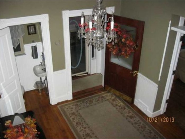
We’re buying a 1898 Victorian home and I love the house, love the colors in most of the house – but hate, HATE the foyer color.
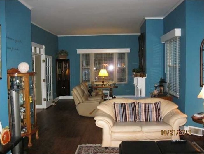
The adjoining room is close to a Behr Paint “Deep Blue Sea” (which I love and plan to keep)…. but the foyer is an olive drab, think Army Olive Brown (and did I mention that I hate it). Anyway, I’m having the hardest time finding a color for the foyer.
It’s a large area (15×15) and while I’ve had some suggestions from family (such as “Paint it salmon”) I’m just not that into “Flesh tones” on the walls. (Peach, Salmon, Rose, etc)
I want the foyer to be light and inviting while remaining warm and comforting. But I also want it to be a peek-a-loo partner to the rest of the downstairs (Sea Blue, Dapper Tan, Black and Crisp White). I’m looking for that fab color that will make you go “ahhhh, I love this room” and compliment the adjoining living areas at the same time.
The foyer is much darker in person than it appears in the photos — OH and the color will also have to extend into the powder room located off the foyer (which is actually rather small).
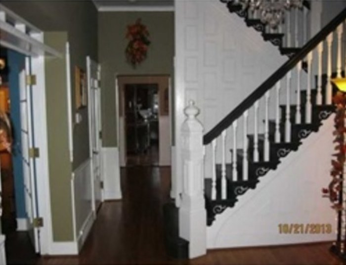
I’ve included photos of the foyer (in both directions) and the living room.
Do you have any suggestions? Ideas? Thoughts? Inspiration?
Kristi’s Suggestion:
Since you mentioned that you’re not afraid of color, and that you want the entryway to be warm and bright, and that it needs to blend with the living room wall color, I personally would suggest yellow.
Yellows can be tricky, though. Choose one that’s a bit too saturated, or too bright, and your room will look like it’s glowing. Or it could look like a child’s room, which is probably not the impression you want to make in your entryway.
So I would recommend finding one that’s more of a buttercream color — very light and muted. It’ll still give you the brightness and the warmth without being an in-your-face yellow.
My favorite light buttercream yellow that I’ve used is called Rich Cream from Behr. It’s the color that I used on the walls in the kitchen, breakfast room, and living room of our condo.
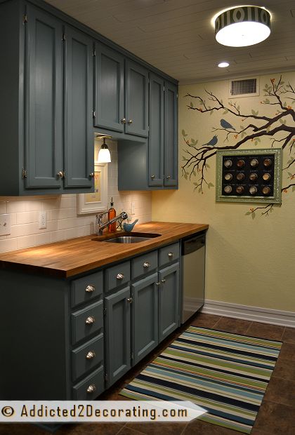
It’s light enough that it almost reads as a neutral, but still yellow enough that it actually looks yellow. And obviously, I think it coordinates beautifully with various shades of blues and teals.
That’s my suggestion! Do any of you have a suggestion for Victoria? What color(s) do you think would coordinate well with her Deep Blue Sea living room walls, and the rest of the colors she mentioned?
Psstt…Have a decorating dilemma in your own home? Submit your question and photos here!
Two questions will be selected and answered every weekend.

Addicted 2 Decorating is where I share my DIY and decorating journey as I remodel and decorate the 1948 fixer upper that my husband, Matt, and I bought in 2013. Matt has M.S. and is unable to do physical work, so I do the majority of the work on the house by myself. You can learn more about me here.


I was thinking yellow with the other colors she mentioned too, but a light soft yellow not a sun bright one. I hope that makes sense.
i agree. My home is decorated french country with lots of blue and yellow, some green and red too. I wanted to warm up the downstairs and had always loved the yellow walls seen in many tv shows and movies. My painter suggested “Flax Seed” by Dunn Edwards. I love it. It’s warm without looking icky. That’s the only way I can say it. Both windows in the room are very large with a vaulted ceiling and one faces east while the other faces west. Lots and lots of light. It still looks invitingly cool in summer and warm in winter. Since spring and Fall only last about a week here in the Mojave Desert of California, it look lovely then too.
I just couldn’t believe it when I read that Kristi suggested yellow, because that is exactly the color I had in mind when reading the post. Although I might go just slightly more yellow than the cream, since the foyer is dark the cream might not show up as yellow. I’ve heard of a color called double cream, but I can’t remember the brand. Not only will yellow brighten up the foyer and powder room, it will also make the blue pop. I painted my dad’s kitchen a pale yellow and accented with cobalt vintage pharmacy bottles in a wall cabinet and blue transferware dishes on display above the cabinets. My daughter loved it so much it was what she chose for her living room.
I would use rich cream 340A-2 by Behr or one that is near it. i hope you show us what you do.
You said you liked color. Paint it terra cotta. Not a salmon but a color like a flowerpot
I love the terra cotta idea. It would be so warm and welcoming!
I agree with Kristi. A light butter cream would be really nice. I would then use some butter cream accents in the living room. Not sure how that would look though with the color of the sofa.
Victoria, you home is beautiful!!! You are blessed.
I thought yellow as well!
Here’s another vote for yellow 🙂 Since yellow is my favorite color, I might be a bit biased though! Pittsburg Paints’ 2014 color of the year, “Turning Oakleaf”, is an option. According to the company, this sunny hue is “like a buttercream; [it] has a fullness to it, while remaining light enough to act as a neutral. It’s mellow and stable, providing the calm we all seek before embarking on new journeys.” Here’s a link to see what it looks like: http://www.houzz.com/ideabooks/21992831. It reminded me a lot of a Benjamin Moore paint I used throughout the main living areas of our last home in the states; it really does read as neutral and looks fabulous with crisp white trim. It would enhance rather than detract from the lovely colors in the other rooms.
I think Shallow Sea 520-D4 would be a great option if you wanted something that would be in the same tone, but a brighter, lighter version.
Ever considered staying neautral and paining the ceiling a bold green? My style is a little wacky so just a thought.
Neautral on the walls bold paint on the ceiling I mean.
Revere Pewter. BM- Historical Color 172- it is gorgeous. So elegant- but if you look at chip you will swear its boring. – IT’S NOT! Gorgeous with white molding!i have pics if you want to see it. Or just google that color and images will give you an idea. Good luck.
I have revere pewter on all my walls, except for my sons room, (I am boring that way) and I love it. It looks like the most boring of the boring-est horrible ever on the chip. On the wall it just transforms into a lovely soft grey. Sooo beautiful.
It is a green grey though, so definitely paint a good sized sample on the wall before proceeding, a grey with an undertone similar to your blue might be more harmonious, or, RP it might be a perfect contrast. It definitely looks wonderful with white and black.
I have to veto yellow, because, well, I personally do not like yellow, LOL. Really, if I went to someone else’s home and they had yellow, I’d probably think it was gorgeous, I just can’t imagine being surrounded by it in my own home.
Revere Pewter is what I have on my walls, with bright white wainscoting. LOVE THIS COLOR
We painted most of my in-laws house that color, it’s beautiful and they have a lot of blues in their furnishings.
Why not just go a couple of shades lighter on the same color card as the paint in the LR?
My all time favorite neutral foyer color is Manchester Tan by Benjamin Moore. It looks great with just about anything!!
Also, just puttin’ this out there…if you want to go bold in the foyer but still keep it classy, how about a red. It looks great with white wainscoting. Do an image search of red foyers before you call me crazy, they look fabulous! 🙂
I hope you will show us an “after” photo.
I adore Behr’s Claire de Lune. A perfect warm neutral.
Or, a spring green. It would set the tone (and not be too dark) for the rich happy color in the living room.
My first thought was pink. Which is weird, because I’ve never painted a room pink in my life. But if you were wanting to go with a bold accent color instead of something that would create competition, I think it would look awesome with the blue in your living room.
I agree with a light buttercream yellow. That was my first thought, as well.
I started looking at the comments and the pic of the room that was on face book, b/4 I actually clicked on the blog site.
When I got a look at the foyer (without seeing the living room next to it) I thought the color was stunning. I agree though that next to the living room, it is not compatible.
If you like the color of the living room, and absolutely hate the color of the foyer, I agree with Kristi that a light shade of yellow would be a good compliment to the bold blue in the living room.
Kristi’s pics of her blue cabinets against her pale yellow walls are a good example of how it might look taking into account that the blues are not exactly the same.
I would keep in mind the colors that Kristi recently used in her living room as accents to her beautiful blue that she put on her walls.
Have you considered painting the bottom of the walls a stark white or waynes coating them? It may take the shock of the blue away a bit, and help in deciding the color of the lobby/foyer?
Kristi used shades of green in her choices, maybe you could go the same direction.
I have to say I LOVE the floors, and the set up that I can see of this home, it’s beautiful! Enjoy making it your own style!
I agree with Kristi, the Rich Cream from Behr . I also really like the Manchester Tan by Benjamin Moore, it’s a light color, but with your wooden floors, it would warm the color up some.
I have no exact color recommendation, however I would go light. It’s a large space, you want it to look clean and inviting. I also like another posters comment to paint the ceiling an accent color…I would still not go bold on the ceiling, however it looks like it’s a 2-story entrance….go with soft, subtle cloud blue just to give it a little offset. Good luck and please show us what your final choice looks like after completion.
I think a gray color would be wonderful! I just painted my bedroom gray and your living room color is my accent color as well as black and white and silver. It looks amazing. Good luck!
What if you use that same blue and add another color with it. Maybe different shade of blue. I guess if u added cream to it, it might look brown. Hum! Don’t know!
My first thought was a lighter blue/aqua, to tie into the main room but not be the exact same color. But I like your yellow idea, too!
I, too, agree with Kristi. Buttercream is a great color to replace the top color and leave the bottom white. Painting the upper wall in the bathroom a blue-gray tinted would add some pop as you go by.
I think yellow too and I hope we get to see the after picture of whatever she chooses.
I think you should try purple colour for foyer .it will look awesome with white borders.on the ceiling ,doors and windows.
The color you have on the living room walls are the same color I have just painted my closet door in my master bedroom (which is an old barn door style that slides like a real barn door). I painted my walls in the bedroom a tan that is the lightest tan before you go to Grey and it looks great together. I have stark white trim which helps the pop. I use all Sherwin Williams paints. If you would like some pics let me know. Good luck choosing!!!
I would do either of the following. Cut the blue color in half or even a bit lighter and paint the live color and the ceiling and the powder room and ceiling in the same color. Or do a faux painting using this littler blue and the color in the adjoining room.
I agree with Kristi 100%
I was about to make a suggestion similar to Debi’s — color-match the blue from the living room, and use it at about 1/4 strength (1 part blue to 3 parts white) in the foyer. It’ll be like a prelude.
Sounds good.
Christy, before I even looked at your response, I thought very soft butter yellow. I love yellow but you’re right, you have to be very careful selecting. I would definitely go lighter than darker and if need be a bit darker, they could do that for you. Yellow looks beautiful with blue and just about any other color. I have used those together and was very pleased.
I think red, grey or yellow would look good!
Here is my suggestion. Use the pillows on the sofa to connect everything. Choose a light, neutral color from the stripes in the pillows for your foyer. BHG has a couple of color schemes that you might like to look at here: http://www.bhg.com/decorating/color/schemes/interior-color-schemes/?socsrc=bhgfb0208141
exactly what i said! thanks for the confirmation!
Great minds think alike! My very first thought was buttery yellow. It would soften all the corners and provide a good backdrop for colorful accent pieces. What’s more inviting than a pretty yellow room? !
P.S. Gorgeous house!
After seeing her room the striped pillow caught my eye. If it were my house, with a small foyer and hall bath, I’d choose a color like the beige like color on her pillow. It would allow you to flow into other rooms of the house with different colors without feeling like you lived on a checkerboard. Use accent furnishings in the foyer that pick up the color in the adjoining rooms, ie: vases in blue, etc.
Get a chip of Sherwin-Williams 6185 Escape Gray. Here are some pictures of it http://www.houzz.com/escape-gray It has a gold undertone but does not look yellow and poopy like your green. It looks good next to S-W Golden Gate in my home. My only concern is that it’s warmth may fight the coolness of your blue. I tend to either go all warm, if there is a way to mix warm walls with cool walls I do not have that skill. We love S-W Escape Gray. When my husband saw it he liked it so much he painted his office at work Escape Gray. Funny thing is that I hid the name from him because I knew the word “gray” would influence him negatively. When he later noticed the name he said “What?!”
Take a look at SW’s Beeswax which is a rich yellow but more on the muted edge than bold. It’s a great neutral, but not boring. Is a fabulous background that enhances the blues and reds of my home. It also seems to showcase most any color of art. Good luck with your choice!
Your blue is beautiful and is toned down by your darker flooring. The foyer has excellent and appealing contrast. A warm neutral with your white painted wood might be a good choice to let your blue room be the focal point. if that sounds too boring perhaps a rich, true red might appeal to you. i would stay away from yellow.
I was thinking yellow too. If you put some yellow accents in the other rooms and maybe pull those other colors (blue) in that entryway, it will all relate. The house is beautiful.
What do you think of the green in the first two photos of this link?
http://www.whoislauralee.blogspot.com/2014/02/artner-playtime-part-1-glitter.html
Consider painting walls and ceiling the same color, or lighten the ceiling up just a hair, even if you choose yellow. I would prefer a neutral with a lighter blue ceiling in the same tone as the other room. That would tie it together, but then I don’t like yellow.
While I was reading your description and looking at the photos, I thought of yellow. When I read what Kristi suggested I smiled because we were thinking along the same color lines! LOL I think a lighter shade of yellow would brighten up that foyer and tiny bathroom and make a nice ‘lead-in’ to the other colorful rooms in your home. Good luck with your choice and remember, you can always paint over it if you don’t like it!
I’m on the yellow page too, but I was leaning more toward a darker yellow with some red. Like sunflower by Sherwin-Williams.
I was also on the Behr Site today as I just bought millennium Silver and Whisper White for my bathroom. I would choose White Oak. I know that sounds like a white color; but it’s really a light to mid-toned yellow color that would seem to transition into the saturated deep blue nicely. Good luck! Can’t wait to see what you finally choose; yes, the olive is really not very inviting…
First of all, let me say that the foyer, and especially the stairwell are stunning. Do you desire a “Zen feel” which would lead you to chromatics, i.e. lighter shades of the same blue as in the den/living room or adjacent coordinating colors on the color wheel; or do you feel like mixing it up with a bold statement? The prevailing opinion seems to go with yellow, which I like as well, but I would go bolder than the butter cream, just not cartoonish. I think that the buttercream would look washed out in contrast with the gloss of the white wainscoting on the stairs and the glossy black paint on the stairs. Mustard yellow is a traditional golden yellow of the Victorian Era. I think a golden ochre yellow tone would be lovely as well as historically accurate.
liking the yellow thoughts and suggestions! I also heartily agree that you should continue the half white wainscoting theme. I however would do the living room as well. To sort of bring it all together,,,
But that is just me – I like the color of the blue — just be careful with the color depth of the yellow or any color as it may pull too much color out of the blue, leaving it wishy washy – if that makes sense,,,,
Goos luck!!!
I think yellow is an awesome idea. My favorite yellow is one of valspar’s national trust for historic preservation colors-Homestead resort tea room cream. I used it in my kitchen and it is perfect both in direct sunlight and poorly evenings.
If you are going to keep that black and white on the stairs, I’m just not seeing any muted yellow or any yellow. I think the blue of the living room would would be great or a lighter version of it. Since you said you love it and it is a big space, I think it would look good. Another option that would be true to the period of the house would be a nice wallpaper, maybe something graphic if you are not loving the Victorian vibe. It looks like a wonderful house, I’m so happy to see people save great old houses. We restored a Victorian and I loved every minute of it.
Benjamin Moore – Shaker Beige
I’m going to give a revised recommendation of purple. I suggested mid-tone warm yellow earlier, but realized after looking at the photo’s and reading the other recommendations that the stairs had black treads and so the yellow may not give a good vibe..
So, after re-reviewing the living room photo’s, I noticed the wood tones are a warm oak, the pillows have a purple strip, and the carpet has a rose blush of color. It’s a Victorian house and purple can be both royal and give a new vibe. I also think purple would highlight the black/white staircase. blackberry wine in sherman Williams or purple blanket in behr would be my new recommendation. A rich purple that would transition into the deep sea blue.
Hmm Does she want to stay true to the Victorian theme for the foyer? I have seen a lot of Victorian foyers that were, gulp, burgundy….I can imagine it done with a modern version of an old Victorian wallpaper. Otherwise I think yellow would be the color to choose.
I was thinking of a very light brown or yellowy beige?
My suggestion would be to buy several different trial jars of the paint colors you are considering and paint a different 12″ section at each entry way that leads into each room off the foyer and live with the different colors for a week. That way you can see how the colors look in different lighting and get a feel for how the colors make you feel. You will also get to see how each new color transitions into the other rooms colors.
My first thought was yellow. But I see your striped pillows & it looks like there is a lavender stripe in them & it occurs to me that a light lavender on the pinkish side might be nice. I agree most with the suggestion that you get sample paint and tack up a fairly large pieces of paper on the wall with paints from the colors you think you may like and see which one actually pleases you the most once it is up there in the lighting you have there.
I would advise a color that contrasts the blue in the living room. The buttercream idea is good, also a not too dark rust (Behr glazed ginger PPU3-13,) a not too deep reddish taupy tan (Behr coconut shell PPU5-5,). a putty gray like Valspar Waverly Deep Mink is also nice.
I would advise using more accent pieces, in addition to your pillows, to tie everything together. Pull the areas together with artwork, drapery, more pillows, a throw over the loveseat, decorative accessories-vases, metalwork,word pieces to tie everything together.
Rather than painting an entire room a color you love, consider an accent wall in that color and a more neutral, but not boring color like Valspar Lamb’s Ear (CI 145) on other walls or faux painting that favorite color with an adjoining color, or neutral to gradually transition the color story through your home. The HGTV color selections at Sherwin Williams help you choose colors that will flow beautifully through your home. Check David Bromstad’s suggestions regarding flow.
I have a living room with 5 different colors on the walls! However, it has a healthy dose of white with vaulted white ceilings and a large wall in a creamy white. I used accents of color on partial walls and color blocking. My foyer is mostly the creamy color, but has color blocking used as the prelude to the living area.
I would do a taupe, similar to the stripe in the sofa cushions
Yellow or even a light warm gray
I love pale yellow or pale green to compliment the deep blue. I use those colors in my home, and I love living with them. So cheery!
Not sure about your decorating style (I’m guessing the furniture may be the previous owners) but have you thought about a white or a sandy color that is very light?
I have noticed a lot of houses going with white and it seems stark but if done in the right finish can look amazing. With you describing the room as dark and the small bathroom, it could work. it is a great backdrop for amazing art as well! And with your bold living room choice it would work and tie all rooms together. You could also add color by painting the inside of your front door. Trim is usually painted glossier than the paint itself, so you could go with a matte finish or eggshell (not flat – it is awful).
I just can’t wait to see after pictures, so please send them to Kristi to share!!!
Orange! I think it would be quite contrasting to the blue! http://www.house-painting-info.com/image-files/wood-refinishing-stained-wood-in-foyer.jpg
I would lean more to a soft, creamy white or a much lighter version of the blue to keep it bright, airy and inviting to keep a nice flow to your other rooms. I know gray tones are popular right now, but they all seem a little drab to me. Everyone has their own tastes, though. I would go with what you think will make you feel the happiest. Good luck.
I love the terra cotta idea. Believe it or not in our family room we have a graish teal on our walls, terra cotta sofa and black and white roman shades. Sounds like a lot and i is but it works. it is amazingli warm and i always get complements
I think a grey like Sherwin Williams Mindful Grey would be perfect with the white woodwork, dark stairs & adjoining rooms!
I am late to the party and wonder what was actually done. Were it me I would go with a modern wall paper in beige, blue, cream etc. This is a nice pattern and colors would be great! A very wow effect.
http://www.houzz.com/photos/30043809/Candice-Olson-Inspired-Elements-Modern-Petals-Wallpaper-modern-wallpaper