Searching For A Fabulous Floral Fabric
I’ve decided that for my living room, I need to start with a floral fabric, and then decorate from there. It’s what I did last time, but unfortunately I chose the wrong floral fabric for my taste. I’ve decided what I need is a floral that packs a colorful punch, has a large scale pattern, and most importantly, is on a very light (preferably white) background. I also want it to have both blues and greens, as well as some warm colors, preferably a good mix of reds, yellows, and oranges.
And this time, I won’t be using it on window treatments. I’ve decided that I like my florals better used in ways that you can actually see the flowers in all their glory. When they’re made into draperies, you really lose the beauty of the pattern.
I’m embarrassed to tell you how many hours I’ve been searching. I’m pretty sure I’ve seen every single floral fabric available online. I started this search at the beginning of my blogging break at the end of last year, and I spent at least an hour each night searching, and searching, and searching. At one time, I probably had over 100 fabrics saved in my “maybe” file, but I’ve narrowed those options down to just the few below. But now it seems like an impossible task choosing just one.
Option #1 is Schumacher’s Hothouse Flowers in Spark. Unfortunately, even through my trade account, this fabric is still $102/yard. That number is hard for me to swallow, but after thinking about it for a couple of weeks, I’ve decided that the floral fabric I choose might just be important enough for me to make it one of my splurges. And if I just make pillows, I wouldn’t need much.
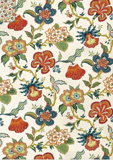
But if I decide to reupholster a chair or something, then it’s out. I won’t spend that much on fabric.
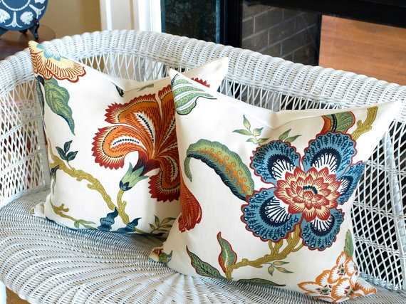
Here’s that fabric used on pillows. Look at those big, gorgeous, colorful flowers!!!
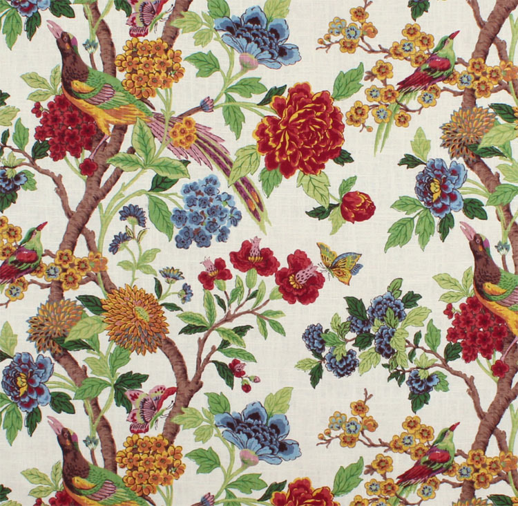
Option #2 is Richloom’s Whipporwill Summer fabric. It has a ton of color, and obviously it has one more thing that I absolutely love. Birds! Y’all know how I have a love for anything with birds on it.
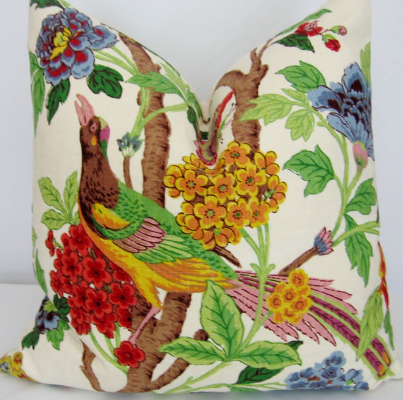
Here’s that fabric made into a pillow.
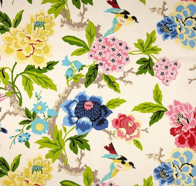
Option #3 is Waverly Candid Moment Gardenia. When I saw this fabric swatch below, I wasn’t very impressed. But I’ve learned that instead of just looking at the fabric swatch, it’s important to actually find a picture of the fabric made into something like a pillow or curtains.
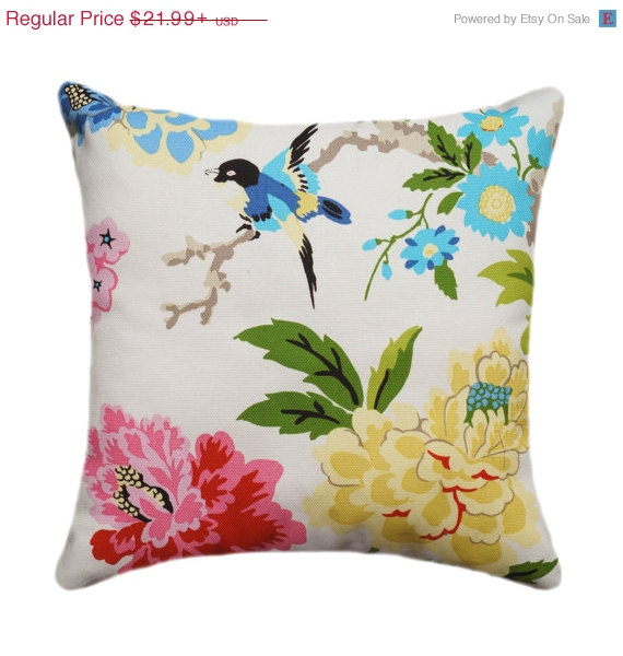
It definitely looks better as a pillow. And again…birds!
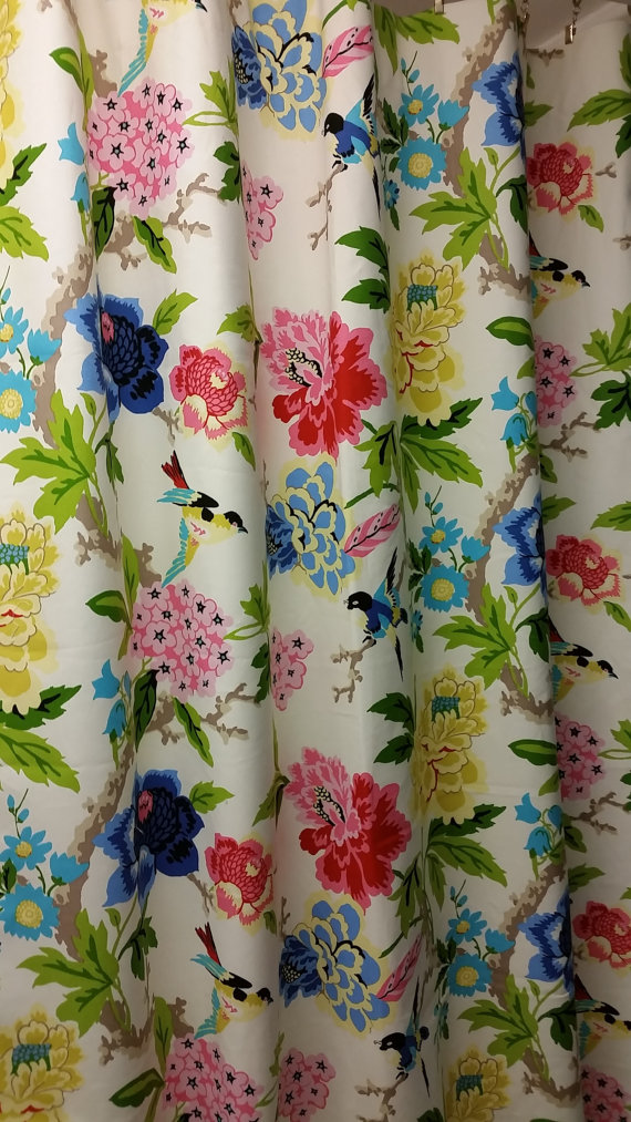
And then I also found a picture of it as curtains. Too bad I couldn’t find a full-length picture, but at least this shows more of the fabric.
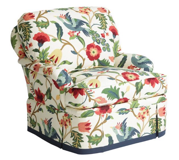
Option #4 is Richloom’s Lucy Eden fabric. Another one with birds, and funny whimsical birds at that!

This is another fabric that didn’t really impress me as a fabric swatch, but seeing it used on a large item really changed my opinion of it.
And then here’s a pillow made with the fabric, centered on the bird.

Option #5 is P. Kaufmann’s Paint Palette Punch fabric. I really do like this fabric. I absolutely love the colors, but this is more of a painterly pattern, and I think I’m more drawn to the Jacobean prints. But the colors of this fabric have kept it the running.
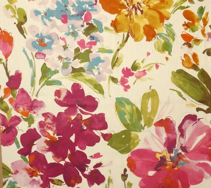
You can see more of the pattern on these curtains.

And here it is made into a pillow.
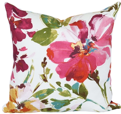
Option #6 is Zephirine Fabric’s Orangerie. This is a perfect example of the need to find the fabric actually made into something rather than just looking at the swatch, because quite honestly, I thought this swatch was downright ugly.

But look at it on this headboard! I love it! I think it might be a bit too busy for the look I’m going for. And I really do prefer the Jacobean prints over the more realistic florals like this. But again with this fabric, the colors have kept it in the running.

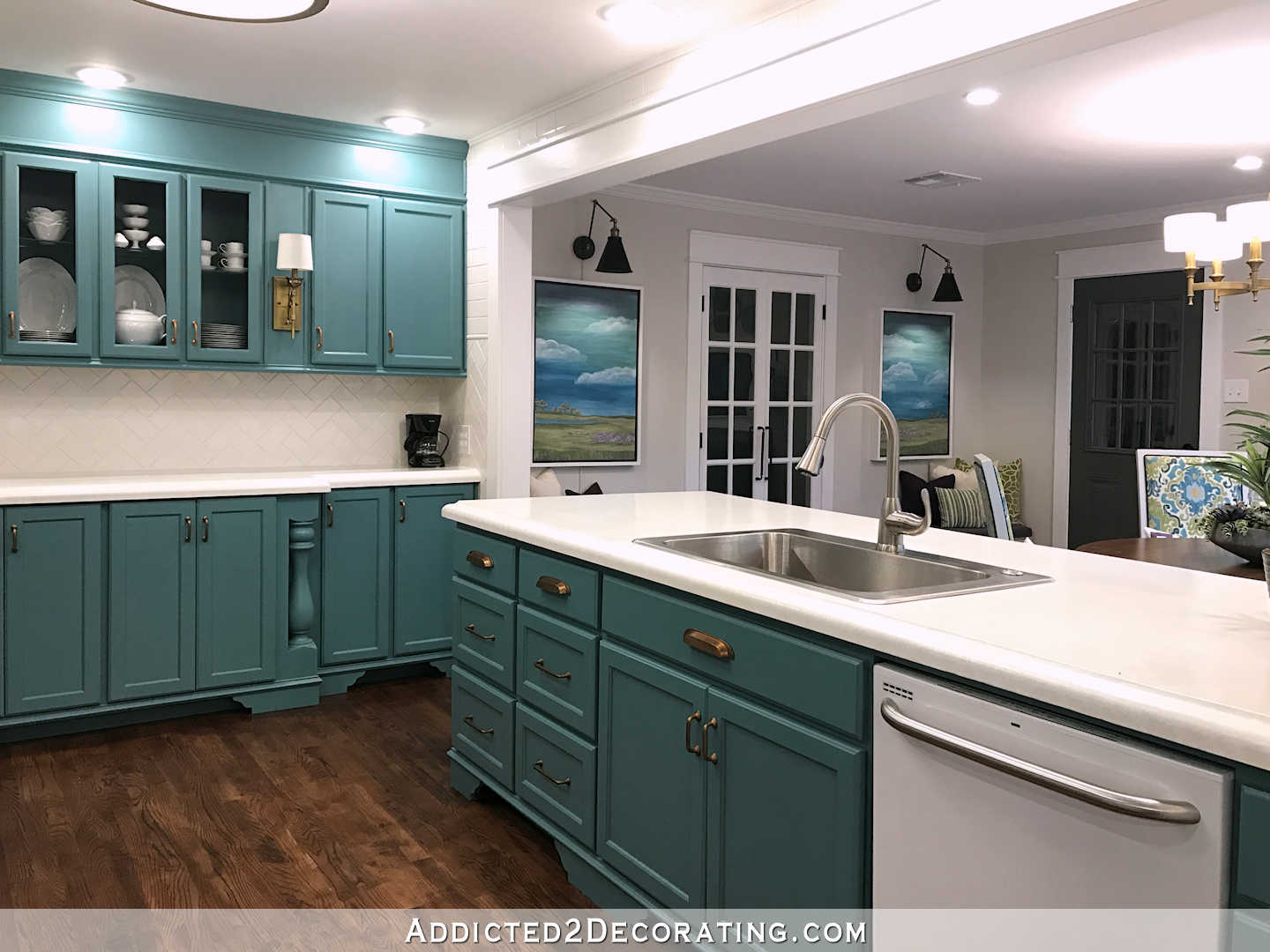
Option #7 is Richloom’s Gloria Jubilee. This fabric is just about perfect. It’s more Jacobean in style. It has just about ever color I could want. The greens look like they would blend beautifully with the color I used on my kitchen cabinets.

The only thing that has kept me from buying this one is the background. It looks like it’s more of a cream color than white. If it was white, I think my decision would have already been made.
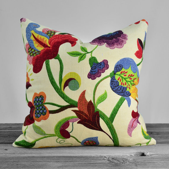
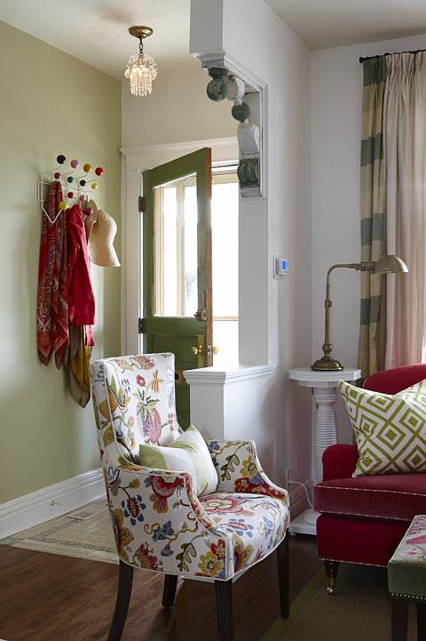
Option #8 is Braemore’s Wonderland Pearl fabric. The colors are great, and I love that it’s more Jacobean in style. And even though the background isn’t white, the fabric does have white in the pattern. My only wish is that it had less pink and more red, but I could probably live with that. And Matt said that a bit of pink on fabric won’t bother him. He just doesn’t want me painting walls with pink. 🙂
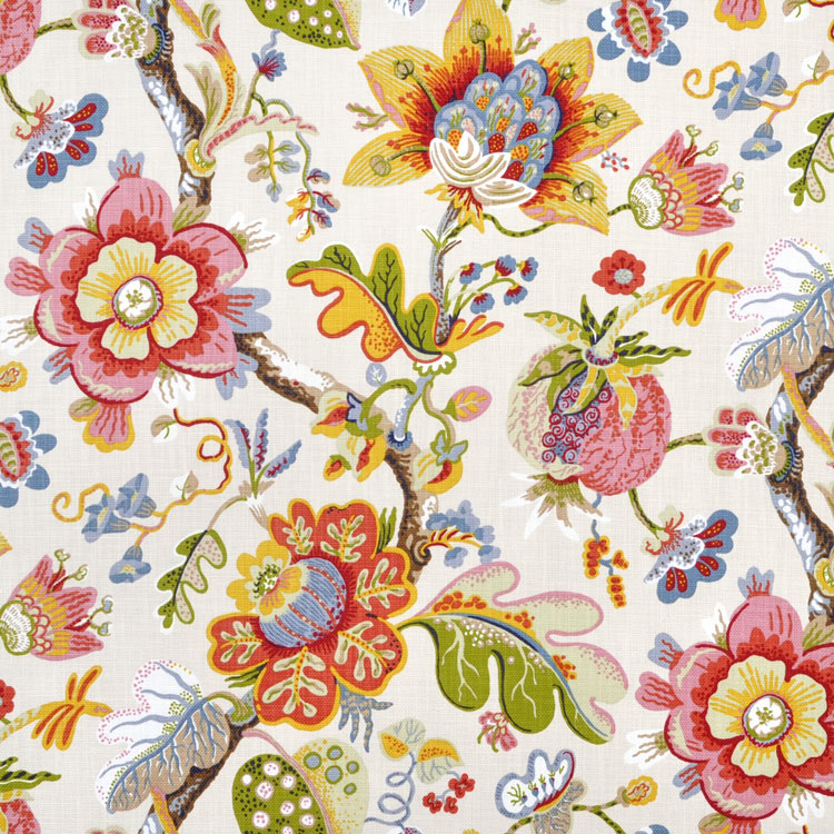
I love this fabric used on the chair in this living room by Sarah Richardson. I pretty much love everything about this room.
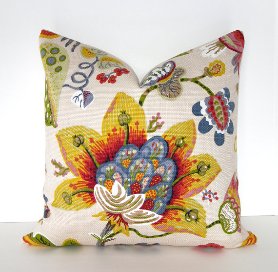
And it’s definitely colorful! Here’s a pillow centered on an orange/yellow flower.
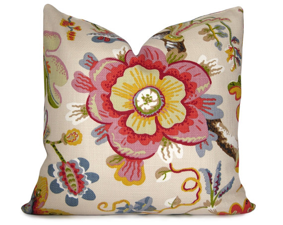
And then here’s another pillow centered on a pink/purple flower.
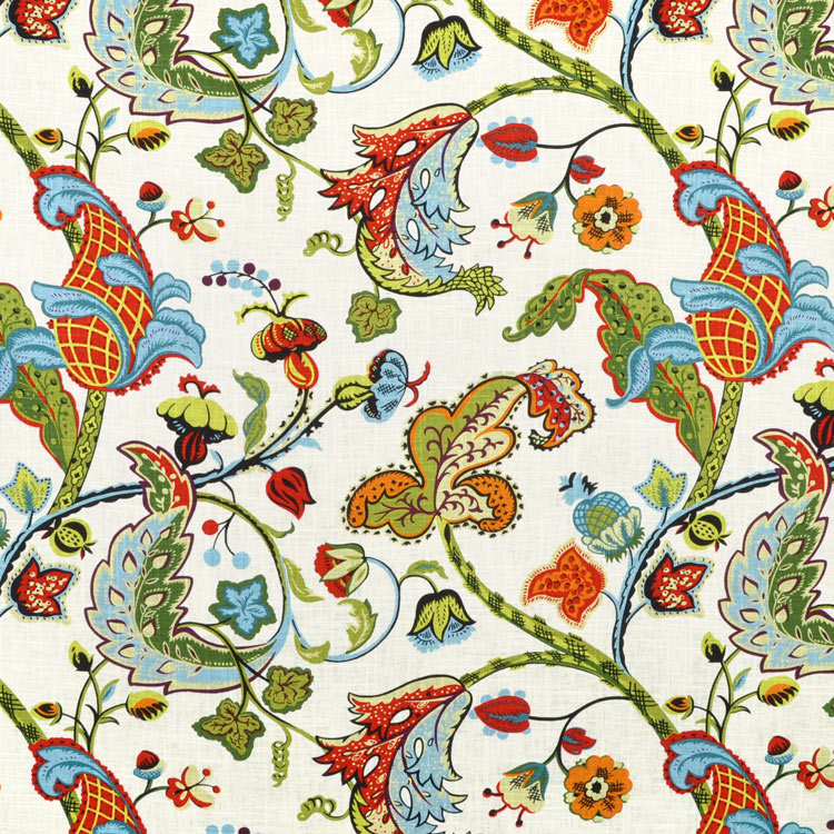
Option #9 is Covington Wilmington Multi fabric. Again, I love the Jacobean pattern, and the colors are great. I do love orange, and it has plenty of that, but there’s also some red and yellow in the mix.
Here’s a picture of it made into a pillow.
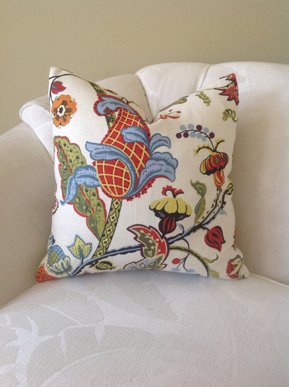
So I’ve whittled my choices down to those nine…from over a hundred. I don’t know how I’ll settle on just one, but I do feel like just the exercise of writing this post helped me narrow down even further. The ones that are really standing out to me are #1 (Schumacher Hothouse Flowers Spark), #2 (Richloom Whipporwill Summer), #7 (Richloom Gloria Jubilee),#8 (Braemore Wonderland Pearl), and #9 (Covington Wilmington Multi). So it’ll probably be down to those five. Once I figure this out, I know that everything else will fall into place for my living room.
Addicted 2 Decorating is where I share my DIY and decorating journey as I remodel and decorate the 1948 fixer upper that my husband, Matt, and I bought in 2013. Matt has M.S. and is unable to do physical work, so I do the majority of the work on the house by myself. You can learn more about me here.


#4!!!!!
Yes to 4. The others look too serious.
I love #9. There is a lot more red there than the pink because there is red in the pink and in the yellow flowers too and other areas in the print. The sofa in the room picture is red and paired with that fabric on the chair. You said you love everything about the room so go with #9 if you want and don’t worry about the pink. I have a room with a red sofa and I have some pink hydrangeas I use in a blue striped crock. They look gorgeous and pick up on the small amount of pink in the area rug we have. By the way, I continue to be amazed by your work. LOVE your pony walls.
I agree…I love #9!
You are so smart to look for an item using that fabric!! That is my favorite hint EVER…Thank you!!!!!!
Blessings,
J
My favorites are the Richloom Gloria Jubilee and Covington Wilmington multi fabrics. It would be wonderful if you could find somewhere with swatches. Good luck choosing! 🙂
Those are the ones I picked as well, the colors are great! I went crazy bold with the color of my drapes in my dining room and I am so glad I did. I know this won’t be used for drapes, but they would be gorgeous too!
I would try to find 1 and 7 and look in person. If 7’s background is white it is perfect!
I love the more darker colored patterns like 1, 2, and 7. They all look similar in colors and depth. 8 & 9 to me look more muted or softer even though the colors are brighter. I would say want ever you choose will look beautiful with the kitchen and the music room colors.
#4 then #7
I love #4 and #7
Out of the 5 that you’ve listed as your favorites of the bunch, I vote for either #2 or #7 because their greens are closer to your kitchen cab color than the others and would tie into that room nicely.
I used a very similar fabric as the jumping off point in my family room and also carried into the dining room. Unfortunately, I don’t know what it’s called because I found 5 huge drapery panels of it at the thrift store for $15 and snatched those puppies up! I’ve used the fabric for lots of little projects: throw pillows, “upholstering” the sides of the entertainment center, recovering the dining room chair seats, etc.
http://lh3.ggpht.com/-zDwzbO910-U/UeRPK-Er3NI/AAAAAAAADRQ/cDvfEE6uBmk/living%252520room%252520palette_thumb%25255B1%25255D.jpg?imgmax=800
Awww. Look what greeted me on my local craigslist this morning! I’ve spied that fabric before. 😉 http://prescott.craigslist.org/fuo/4849373951.html
Unbelievable! If that were in my area, I’d snatch it up in heartbeat and make it work! 🙂 I NEVER find good stuff like that on our Craigslist. Ours is filled with junk.
Yeah, WE never have anything like that on OUR CL either! And I live approximately 100 miles FROM there. Mostly junk around here too, or if it IS something nice, it’s WAY overpriced! But to be honest, I’ll check for awhile, and then lose interest when I can’t find anything, so I don’t check it consistently.
Yeah, I’d be all over that loveseat! In my area we don’t get anything that great on Craigslist.
Wow! That’s a lot of choices still. I like 8 & 9 best. The first 1 is pretty, but so expensive AND it reminds me so much of the wallpaper and drapes that were in the house we bought in 1982.
It didn’t post the rest of my comment…I grew weary of all that pattern. They are all beautiful and I know you will make the right choice for you and Matt. I LOVE your pony walls.
2 and 9 are my favorites and were even before I read your 4 favorites.
These were my favorites as well! I like the bold, dramatic design of each. I also think they have more of the jewel tones (ie drama) that you are looking for. #2 looks like it would work the best with your ottoman. I also like how it repeats the green from your kitchen so there is a continuity of design. My absolute favorite fabric choice you have made, you have not used yet, the P Kaufmann BRISSAC JEWEL. I have been drooling over that fabric for about a year now. I would like to use it in our living room. I have a painting that matches it perfectly. Problem is, I am waiting for the puppy to become a dog and the toddler to get potty trained before starting on the living room. I don’t want all my work to be ruined by “accidents.” LOL! Good luck Kristie! I am sure that whatever fabric you choose, it will be beautiful!
7! 7! 7! 7! 7!
Do you have to use just one? With similar color pallets for pillows I would think you could do some mixing.
I love #1, and have actually done my kitchen/family room centered around two pillows make from a really expensive fabric like that. I guess the key is whether you will be satisfied with just a touch of that fabric.
I also really like #8. I wouldn’t worry about the pink, as there is plenty of red in there too. I also like that it ties to your kitchen so perfectly.
But whatever you choose is going to be beautiful, and you’ll need to see your choice “in person” as sometimes the feel of the fabric is quite different “in person” that what you imagined in the picture!
i also love 4 it’s whimsical and bright Love the colors in 9 and 8 too.
Paint palette punch!
That is the one I’d choose for my house but I can’t see it in her house.
I think I’m in the minority as I like #4 the best, but #7 is a close second. But either way – the direction is great! A few pillows, a maybe a hint somewhere else, will look awesome!
4 and 7 are my favorites, too! I didn’t like 4 on the swatch, but it’s darling on the pillow.
My favorites are- in this order, 7, 2, 4 though 7 and 2 are VERY close because of the birds!
Ok, Not that you asked but I am going to put in my two cents also 🙂
I think the winner is Number 8, it really doesn’t scream pink and it reads as sophisticated and still playful- which is the direction your home seems to be going!
I’m putting in 2 cents as well. They are all lovely, but I’m voting for #8. You know my nickname is Pinky, so the bit of pink is great but not too much, and I simply love Braemore fabric. I’m planning on using their Garden Toile in Rose for my bedroom. Their fabric quality is excellent.
BUY THE SWATCHES!! It’s really worth it.
#7, #8, #9! if it were me I would choose #8! Love Sarah’s rooms too!
I love big florals! All those are pretty to me. Just wondering if they are going to fight with the music room wall, which is pretty neutral and you’ll see both rooms from the front door. But then you never cease to amaze me when I’m wrong LOL
#2 then #7
Me too! Love the more Jacobean look of these two, and the vibrant colors are just beautiful!
I love #1.
I love #4 …. Jacobean but with a little fun thrown in. Loving the birds. The fabrics that are only florals give me an 80’s vibe instead of traditional.
But, it’s not my house nor is it really any of my business! It’ll be fun to see how you use your final choice.
#4 hands down!
My two cents worth…I love #2. I think #1 to me just doesn’t look special enough for that price. FYI, I actually have #3 in a different color way and absolutely adore it!
Hands down, for me it is #2. I love the colors, the peacocks, which mimic your door handles and the price cannot be beat! Many of the others are beautiful, but this is my favorite. Blessings
I love #4! Mainly because I have that in my house as curtains. It’s beautiful.
#7 and #9 are tied for my two favorites! Good luck choosing!
It is easier for me to tell you which ones I don’t like! Haha Why is that?(no to 3,5,6) they were too pinkish? Leaning towards 1 or 9 since I prefer warmer tones.
I love #1, but that is a hard price to swallow. I like #2, #7, and #8. Can you get a sample of each of those so you can see how the background on #7 looks in real life and in your light? I think #8 could be really good and the pink would fade into the background if your other decorating choices are the bolder colors. I like #9, but its color palette is too simplistic compared to some of the other choices, and I think that is making it look like a little cut-rate. I know that whatever you choose will come out looking beautiful!
#2 has the combination of whimsy, sophistication and saturated colors that I find very rich looking. I love your taste, you’ll pick the right one for your aesthetic. They’re all gorgeous!
Totally agree! #2 is fun, sophisticated, and bold (sounds like your personality) 🙂
It doesn’t look like anyone else has voted for #3 yet – but that’s easily my favorite – personally I like #8 too – but it’s very cream, and I would fear that if you don’t get the white you want – you won’t be happy in the long run.
I am actually surprised more people don’t like #3!
#3 is my favorite, too, with #7 a distant second.
I was beginning to think I was the only one that liked #3!
5 & 7
If you’re still going for rich and opulent…I’d choose #2. Gorgeous, expensive looking and the colors are so rich and bold! Love it!
I like #2 & #7.
Several of the pictures appear to have cream colored backgrounds in the swatch pictures. Some of the fabrics look like completely different fabrics in the pictures of completed projects. I would definitely want to see swatches to make sure you get the look you want.
Regardless of the fabric you choose, the room will turn out beautiful and be a wonderful reflection of you.
#5 because the pattern is looser and less distinct than the rest. It doesn’t scream FLOWER … the colors seem to be more of a focus. Sort of impressionistic.
that is definitely the one I’d choose in my home, and I used to have a couch and chair in something very similar, but I can’t imagine it for Kristi’s home.
Love, love, love #5 (definitely in the minority!). #7 & #4 are good too.
You’ve really worked hard to narrow down your choices. I would love to see the delicate Gardenia pattern in a master bedroom, but for sheer drama, I think the whippoorwill pattern can’t be beat. I love the variety of strong colors, and I can see the opportunity to use some of them in painted furniture, some in wall colors, some in upholstery. Whatever you choose, I know I’ll be impressed with your decorating finesse. Good Luck!
Of your further whittled ones, I LOVE #2 and #8. But overall, my favorite is definitely the watercolor looking one. Such beautiful colors! I’m certain I’m going to love whatever you end up going with. Very excited to see the living room come together next to that gorgeous pony wall (and striped music room walls!).
# 9. I love the vividness of the colors.
Seems like I’ve been looking for a vintage floral forever! I’m currently crushing on the curtains Eddie Ross has in his dining room.
Oh my goodness! What beautiful fabrics! How will you ever choose 😉
I’ve been needing to add color to my living room and now I’m inspired to reupholster two side chairs. My couch is a green fabric. Any of those fabrics would compliment the couch. Thanks for the inspiration and my new project for the spring.
Good luck choosing!!
My personal preference is 3 and 5.
I love #9! I actually found Euro size pillows in that exact pattern at HomeGoods!!!
I never know what direction you will go, but my personal preferences are #4 and #8!
I love the Braemore Wonderland Pearl fabric! But then I can’t recall anything I’ve seen Sarah Richardson so that I didn’t love, even if it wasn’t me. I’m sure whatever you choose will end up being perfect for you!
1, 4, 7, 8, 9. The others seem too dated in my opinion. I’ve been in the SAME boat with you with #1. I’ve been drooling about it for over a year, but really just can’t justify the cost. But it’s stu-nning.
Good luck!
Definitely #2! Hands down!
2 or 6 !!
Your choice is personal for whatever reason. Congrats on the narrowing down process! I read not long ago that we actually get “blinded” to our color choices when we look at too many. Everything becomes the same and we can’t decide. Quit looking for a while and then go back and quickly page through the finalists and then follow your gut. It will be your true favorite. It will be perfect for you!
Love #8!
I’ve been lusting after the Covington Multi (9) for years. Just don’t know where I’d put it in my little apartment. Also, I remembered Sarah Richardson using the Schumacher (1) on bedroom chairs in an episode, and found the below link. She picked the big flowers that she wanted to be in the center of the chair. Beautiful. I hope you can find an actual swatch of the one with the cream background to see if it actually is cream! Good luck!
http://www.sarahrichardsondesign.com/get-inspired/makeovers/2010/05/05/country-master
Reconsider # 3 . Beautiful!
#7
I love your designs, creativity and skills. But, I’ve got to say I’m surprised at the “safe, traditional” style of all of these fabrics. They look very boring and 1980’s to me. I just didn’t expect this from you. The other fabric you bought was safe also, but very classic without being so traditional; it didn’t have the 1980’s flair. At least, that’s my opinion, but, I always say if you love it, go for it! And, I always love your end product!
My hands down favorite was #2 before I even saw your choices. I love the saturated colors. I personally feel that you will end up fighting with the ones that are more pastel in tone when choosing your other finishes. #7 would be my secondary pick.
My favorites are #1, #7 and #8! 🙂
I like 2, 4, 7 and 8 the best. I like floral prints that somehow depict or suggest the translucent qualities of flower petals. If a Jacobean pattern has to many dark squiggly lines it gains an “angry, negative, scary” look to me, and I even use to do crewel embroidery! It’s probably just my own personal problem! 3, 5 and 6 are too Easter Eggy pastel, but maybe that is another personal problem because I was a young adult in the 80’s. I just respond better to a more primary floral palette like 2, 4 or 7 and all the better if that translucence is there.
Run these by Matt. You are very lucky that he defers to your taste but response to prints is very subjective and personal and if he is like me and sees faces in floral patterns he may have an opinion. Thanks for the therapy session 😉 !
Love these type of floral fabrics, they are just so punchy and beautiful. I used #9 for my daughter’s nursery and I will never tire of the fabric. It’s a little thin, just to let you know – but I love it. You can see some pictures here to help you with your decision! http://whatthevita.com/the-nursery-19-months-later/ and http://whatthevita.com/paranoia-procrasination-diy-window-curtains/ Hope it helps just a little bit! 🙂 Good luck!
Well I completely differ with you on Jacobean floral prints, they’re just too old-fashioned for my taste. 5 and 6 are my faves, they definitely pack a punch!
Love #2. I love the saturation of the colors – so rich.
I love #2!
I Relove furniture & sell it. Always on the lookout for something to give a great lift to old pieces.
Wanted to show you pictures of what I did with them but don’t think you can do that on here.
I found it first at a place called “Mill End”. No longer open. But also later spotted it at Joann fabric as a remnant.
For you ….the birds…pulls in those door handles. Love the way it looks on the pillow.
#7. Less busy, easier on the eye.
One can add birds other ways,
Oh, number seven, totally. It’s classic in style, but the vivid colors make it modern. Don’t presume the background is cream: someone taking the photo of the pillow could have used the wrong color temperature (tungsten v. daylight). Buy a sample – you may be pleasantly surprised. You also have cream stripes in the music room, so it isn’t impossible. Have you ever done crewel work? You may find it a pleasant occupation. You know, in all your spare time. 🙂
Love the idea of these! If you have a Duralee account check out 42469-254, the photo online make the colors look pale but they are quite bold. Has all of your colors
After taking photos of the green and blue velvet couches you posted earlier and of the samples you gave and seeing them side by side, my vote is for #4, hands down!! I really did like #8, but it did not look as good as the other in side by side comparison with those couches! So, there’s my humble two cents, lol!!!
Hi Kristi, I already commented on the fabric, but just in case you missed it # 2 is my absolute favorite. Maybe if it had not been #2 I would have liked some others but it blew me away. It has every color and the birds. I am trying to figure out where I can use it! Maybe my dining room. Anyway, before we get to far away from the pony walls, I would like to know what kind of calk you use, and if it white or clear and do you use a caulking gun or the kind that you can use with out the gun? This stuff is important to all of us copy cats, LOL Blessings
http://www.hancocks-paducah.com/SALES/Sale-Fabrics-for-5-99-per-yard/PW-PJ-065-NATURAL
I love them all really, but I would say 1, 4, and 8 are my favs. I have some pillows in #9 that I found at TJMaxx a few years ago and I love them!
Adding my 2¢, I think # 4 is perfect for you, however you should really try to feel the fabric in person.
Hi again, just wanted to say thanks for shopping! I just ordered #2 for my dining room, LOL. I love this, I didn’t even have to look. Blessings
Yes to #4 and #7. Must agree that #5 and #6 look a little too 80ish. I think the birds and color saturation make the difference between traditional elegance and dated ho hum. Pick what you and Matt like, you have to look at it everyday : )
I’ve been trying to decide between 6 of these fabrics for 6 months! I haven’t seen #3 before, and I like that one the best. It’s not overly formal and I like the balance between the colors. I’m so glad that you shared the fruit of your hours long search. Thanks!
I like #2 and #4. The colors are great and the birds would coordinate with the peacock handles on your rolling doors. Do you HAVE to have floral drapery? The bold checked ones in the Sarah Richardson room would make a nice balance to the floral pillows (and you could probably paint the fabric for those checks…).
If I were a boy, I would comment, “they all look the same!” 😉 But I’m not. And I can’t decide either. Find the three that are the best value (quality vs cost) and go from there. Your talent is so amazing you could make anything work.
Love, love, love number 8!
I think 2 is tooo old looking, and something similar to stuff you see all the time. I really like #2 and I didn’t like #4 until I was the big picture and then I loved it. Some of the other stuff just looks too “waverly” to me.
Digging #2, 7 & 8…..incredible colors in those! Good luck in choosing! 🙂
My favorites are 2 & 7, but will love whatever you decide!
I predict you will end up with 4 unless you decide to splurge on 1. I wouldn’t though because it’s so expensive and the impact is so similar to 4. I wish you would have included the prices for all the fabrics. Price is a great deciding factor for me! My favorite is 5, which is why you will not pick that one. From what I have seen, it is not your style. At all.
Thanks for all the great entertainment you provide!
Whipporwill! It looks like you to me. Lots of good options tho. I really do not prefer the painterly ones.
I like #2 because I love the whippoorwills (my grandmother used to tell my father as a child to “come home when you hear the whippoorwill”) and they remind me of where I grew up where we heard them every evening. But – I think #7 is the most you. Number 9 is beautiful, but when I see #7 I think “that’s Kristi.”
If you had all of our two cents worth of opinion in real $$ you’d have the fabric paid for!
Martha
I pinned this just as a reminder to look at the scale of a fabric better before picking a fabric. Not sure about the Jacobean prints. What you are doing seems so fresh that the Jacobean style doesn’t “go with” the direction of your home. This is a tough decision.
Kristi- Love #7 probably the best… Found this fabric on another site and thought of you. Looks like it could be another option to consider. Covington Savannah Multi Fabric And only $10.40 a yard!
(https://www.onlinefabricstore.net/brand-covington/category-designer/use-decor/type-fabric/covington-savannah-multi-fabric-.htm?clickid=wcA0kdSoBwhuSgKX4W3P4yglUkVz-VWpQxcwzg0&utm_source=impactradius&utm_medium=affiliate)
One more thing Kristi- There is a pick of the fabric I sent you on a pillow at Restoration Redoux Really cute!
http://www.restorationredoux.com/make-no-sew-pillow-giveaway/
# 2 or 3, please
#1 or #8. Several of those scream “Grandma” to me, and your taste is more sophisticated than that!
I like 5, 8, and 9. What about choosing two and mix and matching pillows or upholstery throughout the room a bit?
I currently have 3 yards of Richloom Lucy Eden waiting for me to decide where to put it. I am using the Sara Richardson room as inspiration for my living room. 🙂 FYI the background is not white but cream. If I had the budget I would have gotten #1. If the colors work for you, I love the Richloom Jubilee and the price point gives you more options. Order some swatches!
1, 8 & 9
Keeping in mind that your sofa is going to be recovered in teal velvet I think pillows in #1 would make a stunning inclusion to your decor. I also agree with someone who suggested #2 which would tie in the peacock handles on your rolling doors. Otherwise I would suggest one of your chairs covered in #8 depending on the quantity of fabric required and the cost … good luck with your decision making!! I look forward to seeing what your decision is.. 🙂
Two and three!!
I love #1 but wow that price is crazy! My next favorite is #9, then #8. I know which ever one you choose, will be the right one for your living room and for the style and effect you’re going for.
For me this was an easy decision…# 2…on a chair 🙂
I love #8. It”s bright, colorful, and fun! I want that fabric for me!
I just love # 5. Beautiful. Second choice would be # 1 then # 9. Whatever you decide I’m sure will work with your vision for the room. Cheers
I personally love #3 …. I’m personally not into birds and big flowers…. But man that fabric may have changed my mind. I’m looking at it, and I think if may buy it for myself…
FWIW, I like 2 and 7. ;c)
I love 1 and4. What if you made pillows and just valances of 1…?????
I had actually bought a duvet cover and pillowcases in the whippoorwill fabric #2 from LinenSource for my guest room. I bought it because I liked the whimsey of the birds, and I had been on a neutral kick so this was a nice change of pace. I will say, against white sheets the background looks almost tan. It is definitely a more cream than white background. Here is the link to the collection on Linensource (although it is mostly sold out). Good luck choosing!
Love #7 and #9. I’m sure whichever you end up with it will be beautiful.
7 & 8 are my favorites! 1 & 2 feel too formal and stodgy to me. 1 & 2 feel very like what you have, just with more colors. good luck picking!!
I’m a huge fan of birds and flowers as well. I’m drooling over #2 and #3. The birds in #2 reminds me of the beautiful bird handles on your doors. #3 so speaks to me that I might need to order some myself so I thank you for making me aware of that beautiful fabric. I know that whatever fabric you do end up choosing will be awesome.
have you seen Braemore Fabric, Henrietta, Turquoise? I love that fabric and it’s similar to a few of those you chose.
I know you know this, but…be sure to order one repeat worth of fabric so you can choose the part of the fabric you want as the focl point.
#1 if you can take a leap and accept the cost for something you know you really love. Failing that, #9 which feels similar but not as nice. Good luck with the choice!!
I just made adorable pillows out of placemats from world market that are very similar to these fabrics. Floral with birds. Check their website. They are only $5 each and you just open a seam, shove a pillow in and sew it back up!
My vote is for 1, 5, and 8, in that order – I think #1 fits you perfectly, but the $ is intimidating. I’ll have to look into #5 for myself – gorgeous – reminds me of art by Kim Parker:)
Me again, lol! I found a GORGEOUS tufted back teal velvet couch on houzz and #1 or #4 looked great next to it. #2 looked ok, but something about the background color didnt look right. I still like #4 the best because I like the bit of whimsey it adds:-) I’ve spent half my day looking at your pictures next to blue, green and teal velvet couches, geez, I need to get back to my own projects!!!! HAHA!!!!
Oh, I put the blue/teal couch picture on one side and a picture of your beautiful kitchen on the other side and then a picture of each color swatch picture in between and compared them one at a time, LOL! I don’t know if anyone else does that but I know it helps me a lot to really see things side by side! 1,2,4,9 looked the best! Ok, I’m done! Good luck and let us know your decision real soon!!!!
Five and eight float my boat.
What a great lot of fabrics, my favourite is 7 the colours and pattern would blend so well in yoy Sitting Room. Cushions highlighting a flower/bird would be pop of colour. So good luck with your choice.
No 5 for me …zingy and bright !
If the colors are ACTUALLY what they appear to be on screen…the clear winner is #4! (imho) Top three, to me, are: First place…#4. A VERY CLOSE SECOND…#8, (in fact, almost a tie…in fact, depending on the moment, they flip flop.) and in third place…#7.
Two things…
I’m sure you already know this, but, just in case… I’ve ordered a few fabrics from the internet. So far, NONE of them have been the EXACT color (hue) I thought they would be. Some have been even prettier when I see them in person…some are WAY less attractive. You just never know.
And, my mom, who has the best taste and decorating ability of any human I’ve ever encountered…I’m totally serious, would tell you this…”This is YOUR house. If you want hot pink walls and sparkly silver curtains…you get to have hot pink walls and sparkly silver curtains! You pick what YOU LOVE. Who cares what anyone else thinks!” So, I’m excited to see what YOU pick!! I’m sure EVERYONE will absolutely LOVE IT!! 🙂
Can’t wait to see what you choose!!
I bought pillows done in fabric number 2, from a Sarah Richardson release here in Toronto a couple of years ago & I absolutely LOVE them! No matter what other colours I put around them, they seem to pick up that colour.
So versatile.
I was looking at a blogger’s Instagram page, and I saw that she had a floral/bird pillow on a chair. It had really nice colors and a peacock: http://instagram.com/p/xW_cz5miz7/?modal=true
oops….maybe it’s a pheasant?? http://instagram.com/p/xW_cz5miz7/?modal=true
If we get a vote…I’m voting for #2 – LOVE the color and pattern…Can’t wait to see which one you choose and where you use it!
I love #4 and#7.
I have a pillow in Braemore wonderland and while lovely it is very cream – doesn’t read white at all in person. I didn’t like it on my white duvet because so different from the stark white duvet. So if you truly want a white background, don’t pick that one!
#8!
Here’s my 2 cents. No.s 2 & 7. I think of your home as more sophisticated and rich in color. Both of these fabrics have both.
I love 1, 8, and 9
I like 2 3 and 4, I think 1 is too expensive. But I think 4 would be best with teal.
I absolutely LOVE #4 Richloom Lucy Eden fabric, I actually have 2 pillows made with this fabric and it is my favorite part of the room always. I painted the room in SW Rainwashed, which picks up the lightest blue-green color in the fabric….so lovely! Any of these choices would love beautiful though…good luck!!
Definetly number 2! I love that one and the bird is my favorite. I’m with you. Anything with birds is better.
This ebay seller offers the Schumacher Hothouse cushions at a great price. They’re on my wish list too 🙂
http://www.ebay.co.uk/itm/Schumacher-Fabric-Cushion-Cover-Hothouse-Flowers-100-Linen-Spark-Col-/111476957324?pt=UK_Home_Garden_Cushions_Throws_LE&hash=item19f48b608c
#1. Definitely
Kristi, if you want an easy way to see #2 Whipporwill in person, World Market has it in table cloth, runner and possible napkins…..
I love #2. The color of the green leaves pull your kitchen cabinets. The birds are a slight nod to you door handles and the blue mimics your headboad. I like that it could be cohesive with the rest of the house without hitting you over the head. Lol
Hmmm, not what I expected at all. While I personally like traditional florals myself, I was surprised at your choices. I thought for sure you would have chosen something more modern and bright. I’m sure whatever you choose will look lovely I just expected bolder colors and pattern from you. While the color choice is different from what you have in the living room now, the patterns and style look similar. Can’t wait to see how it turns out.
My vote is for #1…the colors are poppin!
Hey Kristi! I too, am looking for drapery fabric and I just stumbled on this one and thought I would share.
https://www.fabric.com/buy/0368565/swavelle-mill-creek-brookwater-jubilee-purple
Can’t wait to see what you decide!
I’m very late on this, but my favorite for you, Kristi, based on other choices that you have made on many items, is #2!
I love all of these, Kristi. It would be so hard to choose just one! Thought you might like to see another photo of the Richloom Lucy Eden fabric made into something. I used it to cover an upholstered cornice that I made for the powder room in my old house. The colors are very vibrant and the fabric has a great hand. http://www.worthingcourtblog.com/2013/03/how-to-make-upholstered-cornice-part-i.html
I love that! Love the large scale print on that fabric.
Funny, I’ve been doing a very similar search. I make decorative throw pillows for a living, but I can’t seem to find the perfect print to use as drapes for my studio. Like you, I would prefer a white background, and want lots of colors.
I love Designers Guild Orangerie and Designers Guild Pandora Peony, but can’t stomach the price per yard, even with my trade discount. I was doing some casual searching again today, and it seems like every time I come across a pattern I like with colors that work, I look at the price and it’s over $100/yard.
I’m a little opposite of you in that I’m not a huge fan of the Jacobean prints, but instead prefer a floral. I happened upon Waverly Candid Moment Gardenia today, which led me to this post. It’s now in the running.
Hollie
P.S. Still loving your kitchen. You’re a glutton for punishment, but it sure looks good! 🙂
Hi, About floral fabric, have you tried Brick House Fabrics located in Maine?