Simple DIY Curtains & A Finished Studio Back Entry
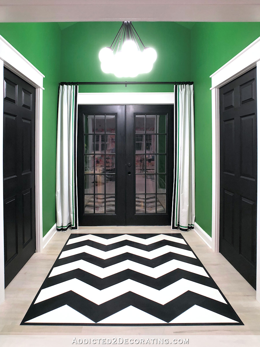
I decided to go ahead and finish up the back entry before tackling the half bath, and I had planned to make some curtains to go on the back French doors, and then make some artwork for the walls. But after getting the curtains finished and hung, I decided that I liked the back entry just like it was. Black, white and green. Simple, bold and graphic. Adding artwork with additional colors (or even just black and white artwork) only would have added busyness, and I didn’t want that.
I apologize up front for the dark nighttime pictures. I finished installing these curtains last night, and didn’t want to wait until this morning to take pictures. Plus, during the day, all of my tools show very prominently through the glass doors. 🙂 I promise that when the studio is completely finished, and I get those final “taaa daaa” pictures, I’ll take them during the day and my mess in the carport will be cleaned up.
So anyway, here’s how my back entry looks now. I’m calling it finished (other than the fact that I still need to install the door handle on the French doors).
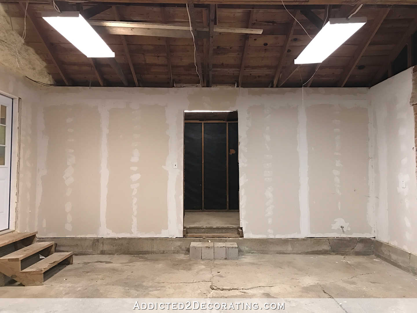
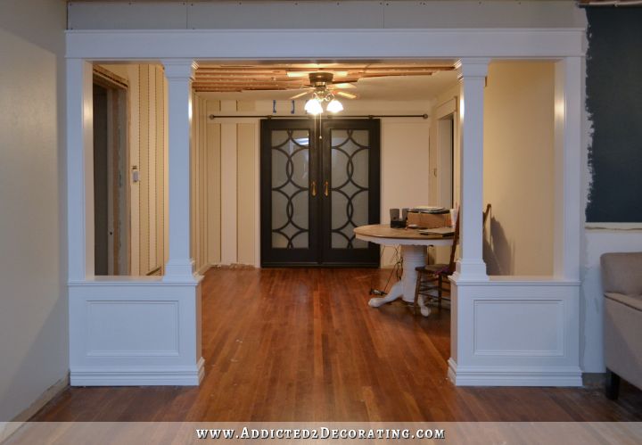
Now just as a reminder, this back area used to look like this — a very narrow door leading to a dark storage area at the back of our garage with a ceiling so low that it barely cleared the top of the door on the back wall.
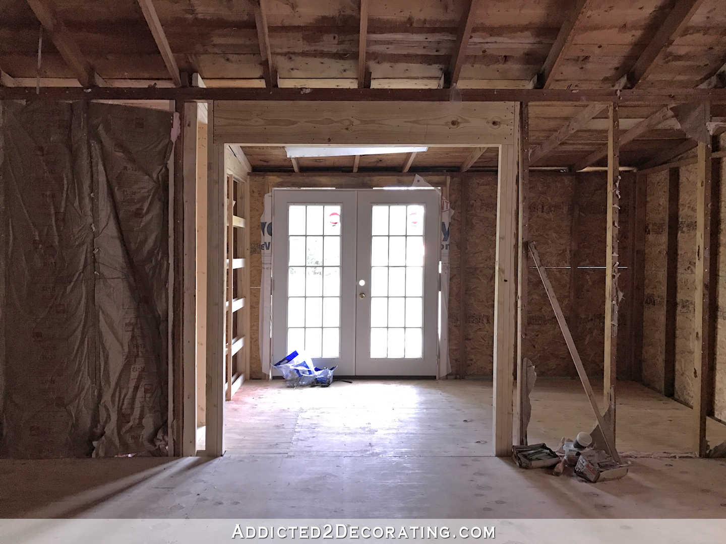
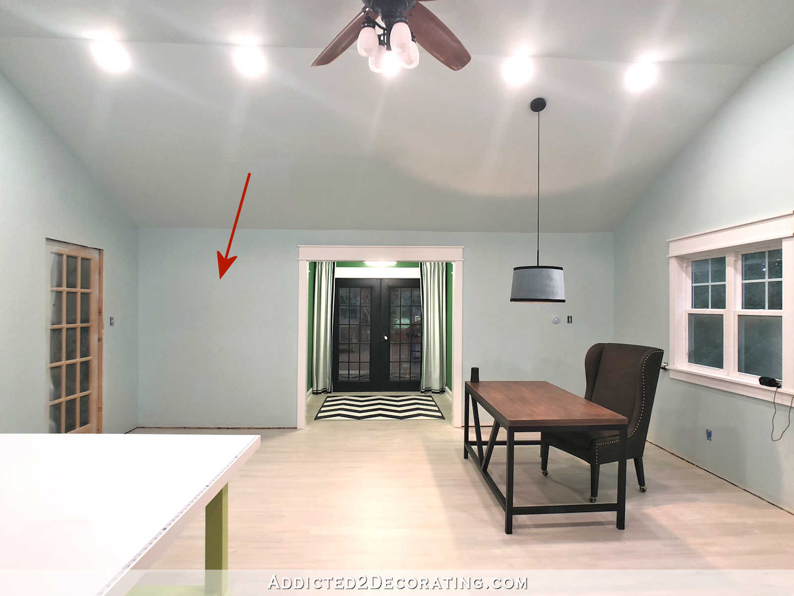
And even after the garage was re-framed and the studio began to take shape, that back area still had the very low ceiling that barely cleared the new French doors along the back wall.
It was only because of the addition of the carport that we were able to raise the ceiling in the back entry, and wow! What a difference it made!

Since some of you requested photos showing the height of the back entry, the only way I could do that is with my wide angle lens. That lens distorts things a bit, and makes the back entry look much deeper than it really is. The whole area is only about 7.5 feet deep (i.e., from the studio cased opening to the back French doors), and maybe 8 feet wide. I believe the ceiling is around 11 feet high now.
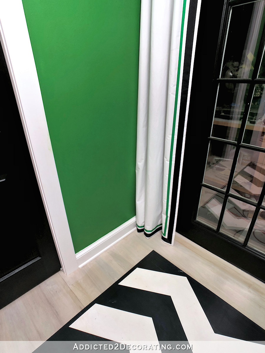
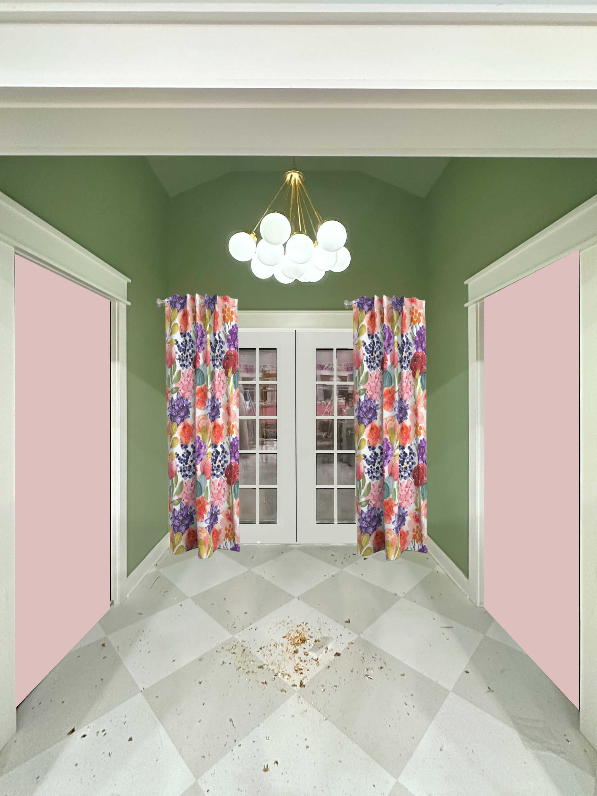
I decided to stick with very simple white curtains with black and green ribbon accents on the leading and bottom edges. I had originally thought about using a colorful fabric — maybe even the wallpaper design printed on fabric — but I think that would have been disastrous. The only one I could find that even remotely complemented the wallpaper was this Kelly Ripa Make It Rain fabric from JoAnn Fabrics.
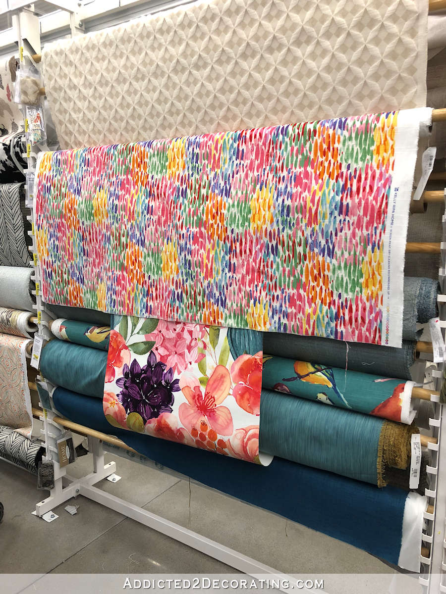
That would have been so busy and distracting, and I really think the wallpaper print would have been also. So I stuck with a very simple design. And since the only fabric I could find that was heavy enough and actually white (and not a cream color) was blackout lining, I actually just made the curtain panels out of blackout lining. 😀
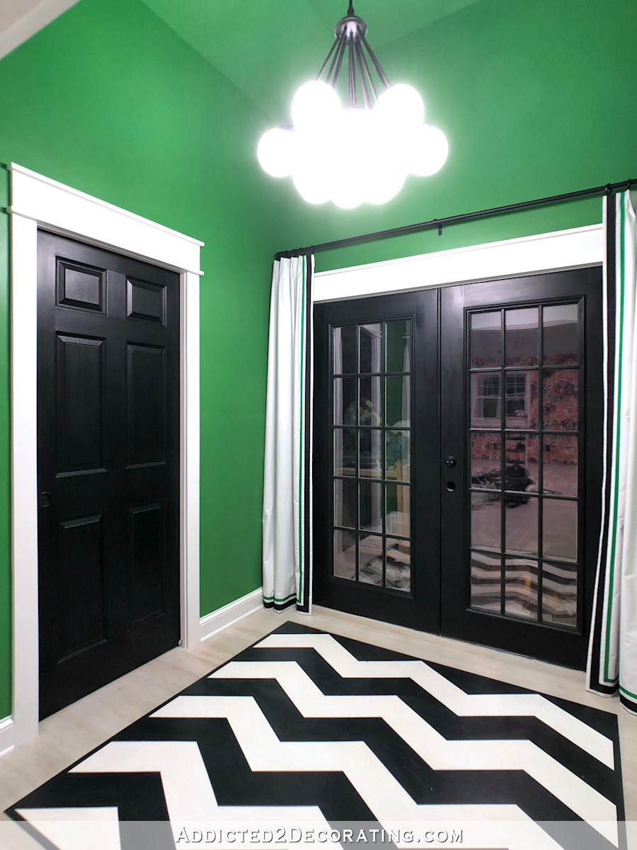
Now that the curtains are up, I’m pretty sure that they’ll only be for decorative purposes and not used for privacy. But they also serve another purpose. The studio is so big and cavernous that every sound echoes. It’s annoying to have a conversation in the room because of the echo. So I need to find every opportunity there is to add fabric to the room, especially since I won’t be using area rugs.
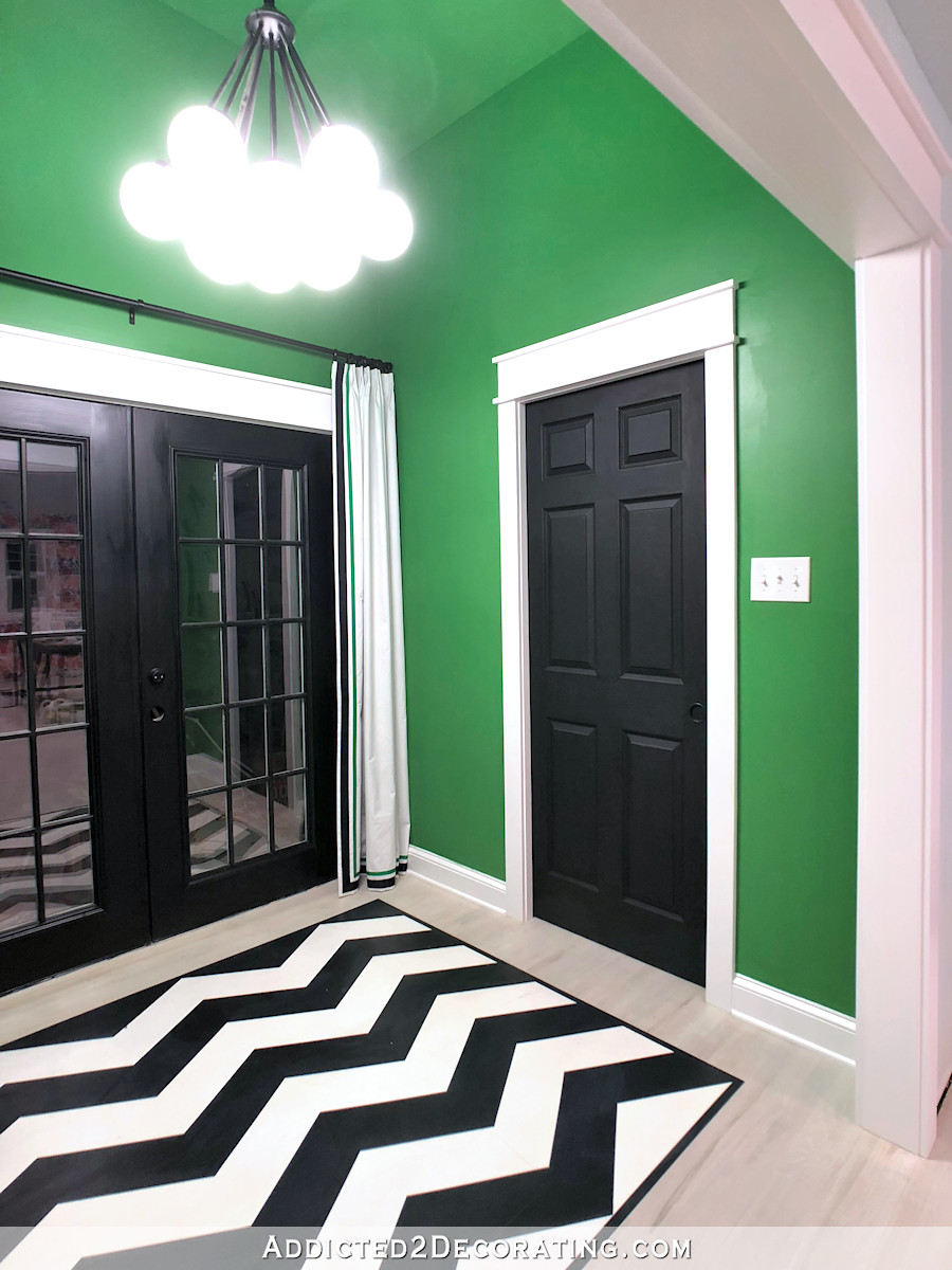
So I’ll show you how I made these curtains, although there’s really nothing to it.
Super Simple DIY Curtains With Ribbon Detail
First, I cut two pieces of blackout lining to my finished length (89.5 inches) plus about 20 inches.
With the fabric face down on my work surface, I turned the bottom edge up four inches, and then up another four inches. I sewed that hem into place by sewing through all of the layers along the top edge of the hem.
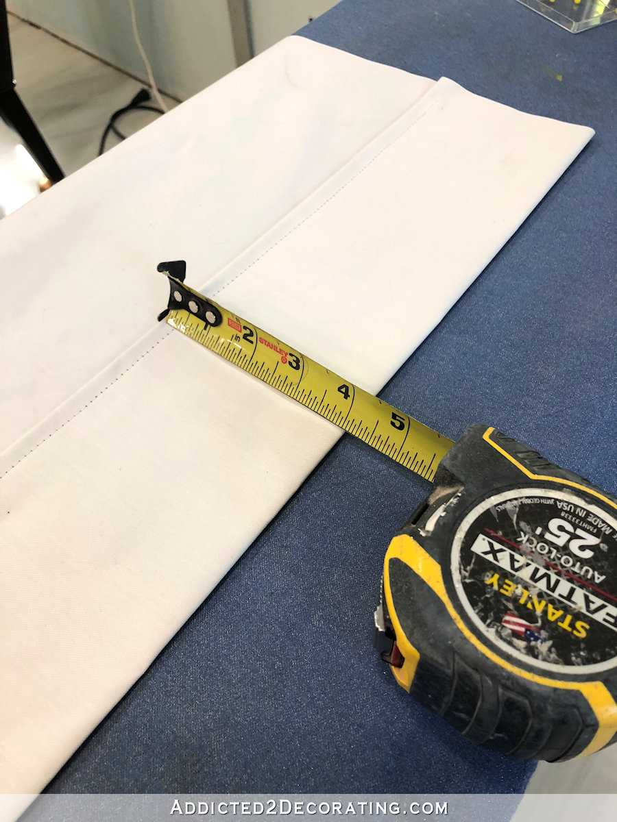
Then on the leading edge (i.e., the side edge that faces towards the window or door when installed), I did a double 1.5-inch hem, and sewed that into place with my sewing machine by sewing through all of the layers.

Next, I added the ribbon detail. I used grosgrain ribbon and Alene’s Fabric Fusion permanent fabric tape to adhere the ribbon to the fabric on the leading edge and the bottom edge of the panel. I used two rows of ribbon and two sizes of tape to complete the design.
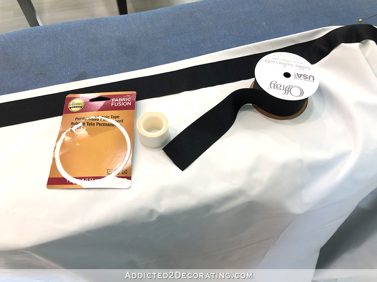
With the ribbon design attached, I then repeated the double 1.5-inch hem on the other side edge of the panel.
And finally, I did a double 3-inch hem on the top edge (after measuring my finished 89.5-inch length) and used woven header tape inside that top header hem to give it some body to hold the pleats.
I feel like I’ve done a thousand curtain and drapery tutorials covering all of those details — headers, pleats, hems, etc. — so you can check those out here if you need more details.
Now obviously, these aren’t professional workroom-quality draperies. 🙂 When making professional quality window treatments, I always avoid topstitching, and would probably sew the trim on in addition to using the permanent fabric tape. But for the purposes of a studio, where they’ll probably eventually get paint on them anyway 😀 , I think are just fine.
Anyway, I’m calling the back entry done. Now I really can move on to finish the bathroom.
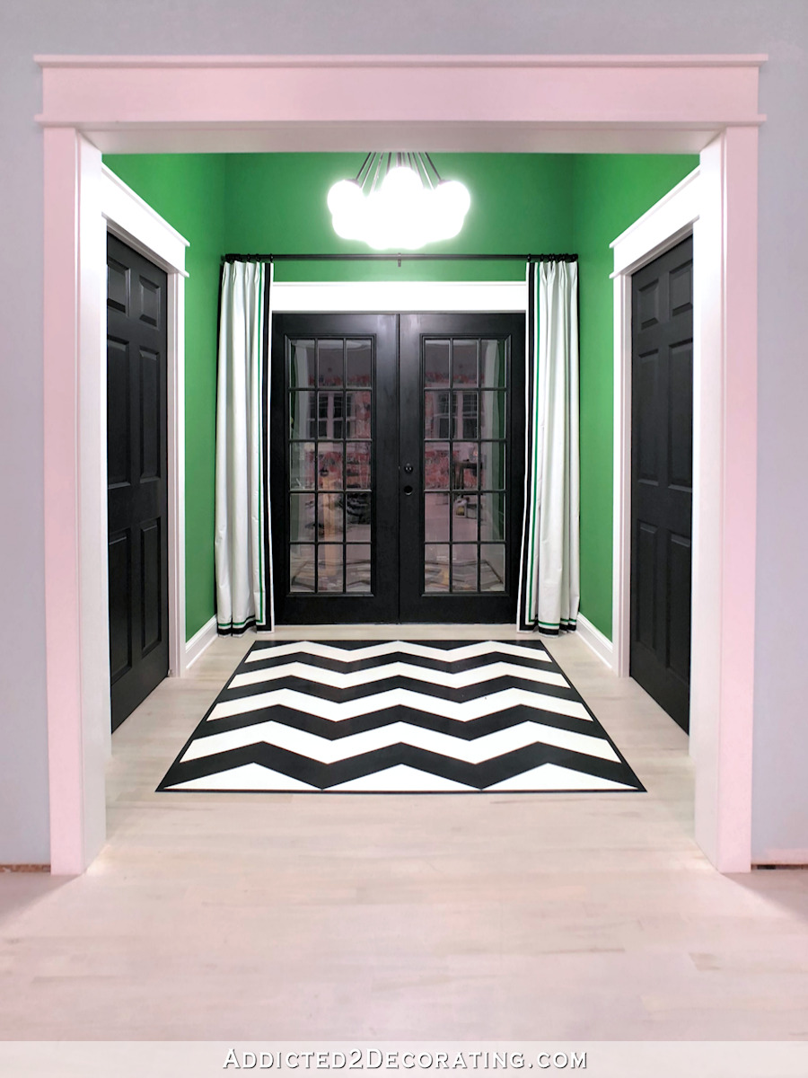
What do you think about my “no artwork” decision? Simplicity is best sometimes, right? Simplicity generally isn’t my default setting, but this a rare case where it really appeals to me.


Looking good!
The entryway is great!
I think, for now, the decision for no artwork is a good one. When you have lived with the whole studio, as a finished work, you may find that a clearer idea of what art work, if any, could compliment the whole scheme. Maybe something in a singular color gradient—I vote for coral. ~:0)
Great decision! The back entry is perfect. Really shows off the great colors/design and the painted floor! You may take a curious path to get there but in the end your decisions are sound and you will won’t second guess because you did think of all the options!
As long as you’re happy …. that’s what counts!! Possibly, with the chevron painted floor, the white curtains with trim are the way to go ….. “what I would have done” … (don’t you just love it 🤪) I would have not done the chevron floor and definitely used fabric such as “Rain” to balance the room in pattern. But …. perhaps the chevron does that for you? Either way, you’re awesome! I love your gumption, your skills and abilities ….. everything I can’t even list here!
I think your painted “rug” IS your art work! The geometric pattern is visually prominent, and with the green walls and white trim – all combine to make a stunning setting!
I AGREE…..This entry way is simply stunning the way it is..!!!
I love love the simplicity of it!! I am so glad you went this direction. I am one to fill all the spaces at first too. This is going to just let that wallpaper be the star!!
Love it! Sometimes less really is more – imho.
Love it as is! Simply beautiful…great work, Kristi!!
Love love love the green! Looks amazing!
After you put that hardware on the French door, STOP! It is simply gorgeous as is…no artwork needed.
Carry on!
I love the simplicity of it. It makes the beautiful green stand out. Great job, Kristi! Can’t wait to see how you finish the bath room.
NOTHING PLAIN ABOUT THAT ENTRY!!! Looks fantastic!!!
The curtains make the entire back entry perfect! I love and do not feel there is a lack in anything at all – artwork might just make it too busy considering that both adjacent rooms are very vivid in design/decor 🙂 I love it and am fascinated how much these curtains add to the look!
Absolutely PERFECT!!!!! Classy and not overdone. No artwork needed. Look fabulous!
Well said!
i wouldn’t touch a thing – stunning!!!
Stunning!
I was really concerned about the “busyness” when you talked about adding artwork! Rather than poo-poo the idea, I didn’t comment at all. Sometimes your vision isn’t my vision and it works beautifully anyway. But I am glad you chose to let the black, white, and green and the beautiful floor do all the talking! And I love the draperies!
This looks great!
EXACTLY my sentiments Jayme.
I love this decision Kristi!
Looks great! I love that you added a green stripe to the curtains along with the black. No additional artwork needed since the art is already on the floor.
Yes, exactly!!
Kristi as soon as I saw the picture I immediately felt a sense of completeness and balance. It made me smile 😊
Looks so good!
The raised ceiling makes a huge difference.
I really love black and white with one other color, so this is super appealing to me, but it’s not my entry! lol I love, love, love that tall, architecturally stunning ceiling. I’m sure you’re over the moon with this finished space!!
Striking and stunning art the two words that come to mind.
Love it! Very classy and for now the simplicity is the wise choice, I agree.
Yay!!! It’s perfect!! And yes… no more artwork! With the chandy and the floor “cloth” and the fabulous drapes it is already filled with beautiful art. You rocked it, Kristi!!
stunning, just as it is!
Yes! When you were talking about artwork I wasn’t sure where you were going to put it that wouldn’t make everything so busy. It’s perfect!
Love the look of the drapes! I thought artwork would be too busy with the colors and patterns in the studio.
Wow. Just WOW. That entry speaks for itself and is stunning as is. You are amazing and continue to inspire me. I like that you didn’t hang artwork – it is bold and uncluttered. Please put me on your list for your first workshop in that gorgeous space. What a transformation!
The curtains, painted rug and chandelier ARE the artwork! WOW, WOW, WOW! Fabulous!
The new drapes are very classic and classy. They are the ‘icing on the cake’ finishing off your back entryway. Well done. I think the painted chevron rug is the ‘artwork’ in this space. The whole area looks just amazing Kristi. Great job.
Isn’t it amazing how putting up those curtains, as simple as they are, completely finished it off?! Love that look.
I bet you’re still giddy about the decision to white wash the floor…. best decision ever 😉👏🏻
WOWZER!!! ABSOLUTELY GORGEOUS. YOU CHOICE OF COLORS ARE STUNNING. THE CURTAINS ARE BEAUTIFUL. NOTHING NEEDED ON THE WALLS AT ALL. PERFECT THE WAY IT IS. I ❤️❤️❤️❤️❤️❤️ It.
👏🏻👏🏻👏🏻Don’t mess with perfection! The curtains are the ribbon on the package! 🎀 Breathe a bit and then onward to completing that bathroom!
It looks fabulous!!! No artwork needed…. the light fixture and “rug” is the only artwork needed!! The simple curtains finished it off!! PERFECT
Yes, looking good with the “no art on the walls” idea that a couple of people suggested in the previous stage.
I said “Wow” out loud and classy, good job!
Excellent call on the simplicity. It’s beautiful!
With the bold paint color and floor design, it is perfectly finished. Less is more in this case! I love it as is!
It looks awesome. Sometimes less is more. Love the simple white curtains.
Fabulous, don’t change a thing. At least not this year. 😄😄😉
I absolutely love it! The green ribbon on the curtain is such a small detail, but it ties the whole room together. Bravo! I agree that this room is perfect without artwork. Thank you for sharing this with us. Your blog is a blessing.
Wow! Perfect as is. And thanks for the drapery inspiration. I have been without since painting my living room and dining room some time back. This post really motivated me to change that.
Love it. Totally agree with no artwork. The chevron ‘rug’ is the only artwork needed in that area.
I love it without additional artwork. I am not sure about the painted ceiling though. The painted rug works great with the no artwork. I saw that light fixture in Lowes, and was surprised how huge it was. I like the curtains, they are just enough.
Okay, Kristi, your solution to finish that entry was a stroke of genius. I was a little nervous that you might be tempted to add artwork, so I am delighted that you didn’t. I hope that will be a ‘forever’ decision. It really is perfect, as is. Thanks for asking us what we think of it.
Amazing how the addition of the fabric with the trim softened the effect. It is truly lovely.
The video is playing on the right side of my screen and the laugh for the day was seeing Cooper’s tail punctuating the views. He just walked through the kitchen and now he is prowling through all the rooms. That was a long time ago. So many changes in the meantime.
Best to you and Matt.
Love the placement of the drapes. Brings all the doors into balance with each other, clever. I like the area without artwork but, knowing you, you’ll create something sometime that you will want to look at and that will be the perfect wall for it. But for now, it looks finished. Good job!
Elegant perfection.
What she said!
That is an amazing entryway! I actually LOVE the curtains and how it pulls everything together. Great job Kristi!
Your curtains are perfect as they are. Looking great. You made a great decision with going a little simple look and elegant look. The “rain” fabric would not have looked good with your wallpaper pattern. It would have been too busy and wouldn’t have allowed your eyes to rest. I can’t wait for the studio to be completed.
This is an absolutely gorgeous design. I just made some very heavy fabric theater curtains for my colonial apartment, with some wild chevron stripes as well. Could have a nuclear war outside and nobody would know it!
Are these panels workable to actually close for privacy or only decorative accents? Just curious.
I agree that you have enough going on without artwork. It looks great…very “NY Studio!”
Since you asked, art/no art: I like it just the way it is. Nice! Nice! Nice!
Perfect. I agree, no artwork, would just detract from what you have.
Perfect!!! The Chevron “rug”, the chandelier, the drapes you made are the crown jewels in there. Nothing else needed or they would get lost IMHO!😋 Beautiful!!
It looks gorgeous just the way it is❤️
Beautiful job. You motivate me to do the things that I love instead of what everyone would love. You are an outstanding woman and I really enjoy your content.
This is STRIKING! I consider your faux entry area rug the artwork in this space so it isn’t lacking anything! You really have worked your magic making these colors work so well together! 👍
Kristi, you never cease to amaze and inspire me! Love your fun use of color throughout your home. Just amazing to see how far you have progressed on this house. Keep on amazing!
Have you thought about any metal accents? You have lots of color and a good bit of wood since you have wood floors. What about some simple, delicate, metal artwork?
Absolutely stunning and just perfect!
Wow! I love everything about it!! You should be so proud!!
Perfect! And the art work is there, it’s simply on the floor.
Love it as is! For sure, those explosive fabrics would have done just that…explode the bold statement already being made here! Maybe some brass hardware on the doors as the finishing jewelry? I don’t know…just know you did really well here. I think the bright colors of the bath and studio needing this grounding room and you knew that and did it well.
Looking good. I’m not (generally) a fan of bold, but you need to do you. That Alene’s Fabric Fusion is a new product to me (and I AM a sewist, but do garment sewing, so . . .) If I ever get around to sewing drapes/curtains and want to put trim on them, I’ll have to keep it in mind – Thank you! I DO have to admit, as I was reading, I was thinking to myself but she IS going to edge stitch the edges of the ribbon, right? But if it’s permanent, well go for it – I just hope it stays thru laundering/dry cleaning. What did you use for a rod?
It’s just a simple black metal rod and rings from Lowe’s.
Looks Classy and Fabulous just as it is Kristi. Well done. Nailed it again.
I love the bold look to your entryway. It’s perfect!
I LOVE your “no artwork” decision because I’m an unabashed minimalist. I often tell my clutter prone husband that space and emptiness is a luxury enjoyed by few. Not sure he buys it but he does know that it costs us less money! You may have even guilded the lily with the drapes but I do aspire to have drapes like that outside an exterior door one day, like the Italians do, in a canvas or sunbrella fabric.
I am so in love with this room. The colors are heavenly! This color combo is going right onto my inspo board!! I think I can forgive you now for changing the color of that beautiful green kitchen. (Please note, that was just a joke, I was so sad to see the green go, but honestly also loved the new color. Either way, it’s beautiful! After all-It is YOUR kitchen and I hate when people are snarky on here, you have GREAT ideas and I love that you don’t stop until you love the results!)