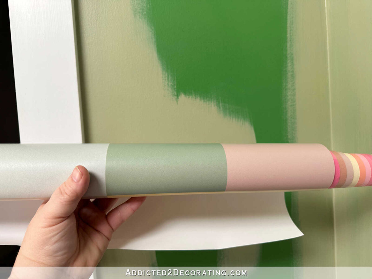
The Studio Back Entry Is Painted!
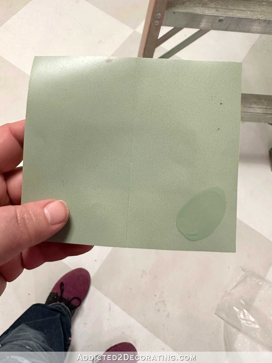
It took a few attempts, but I finally got the right paint color for the walls of the back entry of the studio. Earlier this week, I began painting the back entry walls, only to realize that the color that Home Depot had attempted to color match for me (I wanted it to match a color on the studio bathroom wallpaper) was totally off. I mean, the colors weren’t even in the same ballpark. The color they gave me reminded me of pea soup, and that’s not really something I want painted on my walls. 😀
So I took the paint back and tried again. And again, the color match failed. The second attempt was too dark and still too yellow.
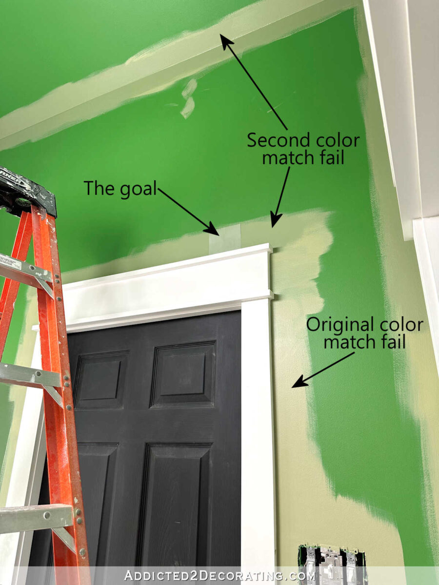
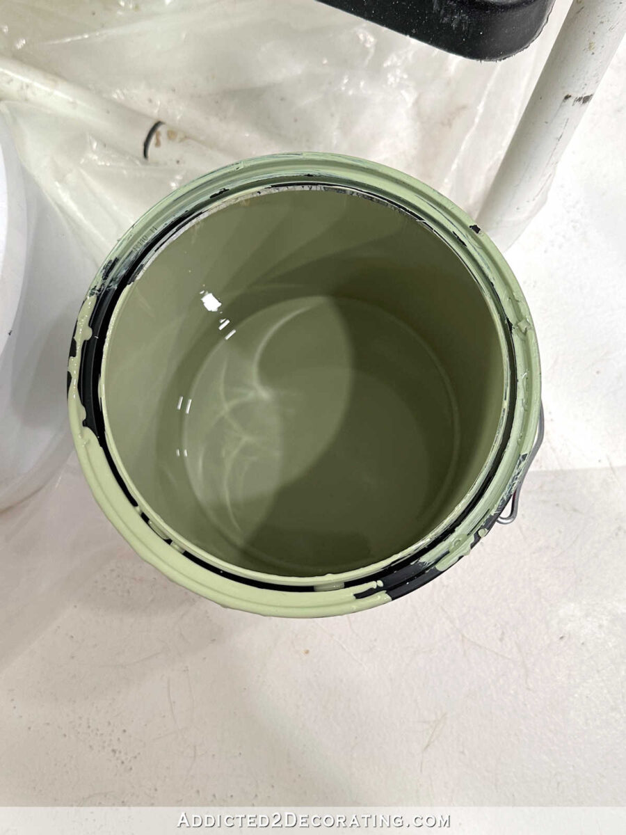
I knew the second color wasn’t right, but the woman had already worked on it for about an hour (helping me while dealing with other customers), and I just couldn’t stand there any longer and watch failed attempt after failed attempt. So I just made sure that I left the store with a color I could work with as a base for mixing my own custom color. Here’s what that second color match attempt looked like in the paint can.
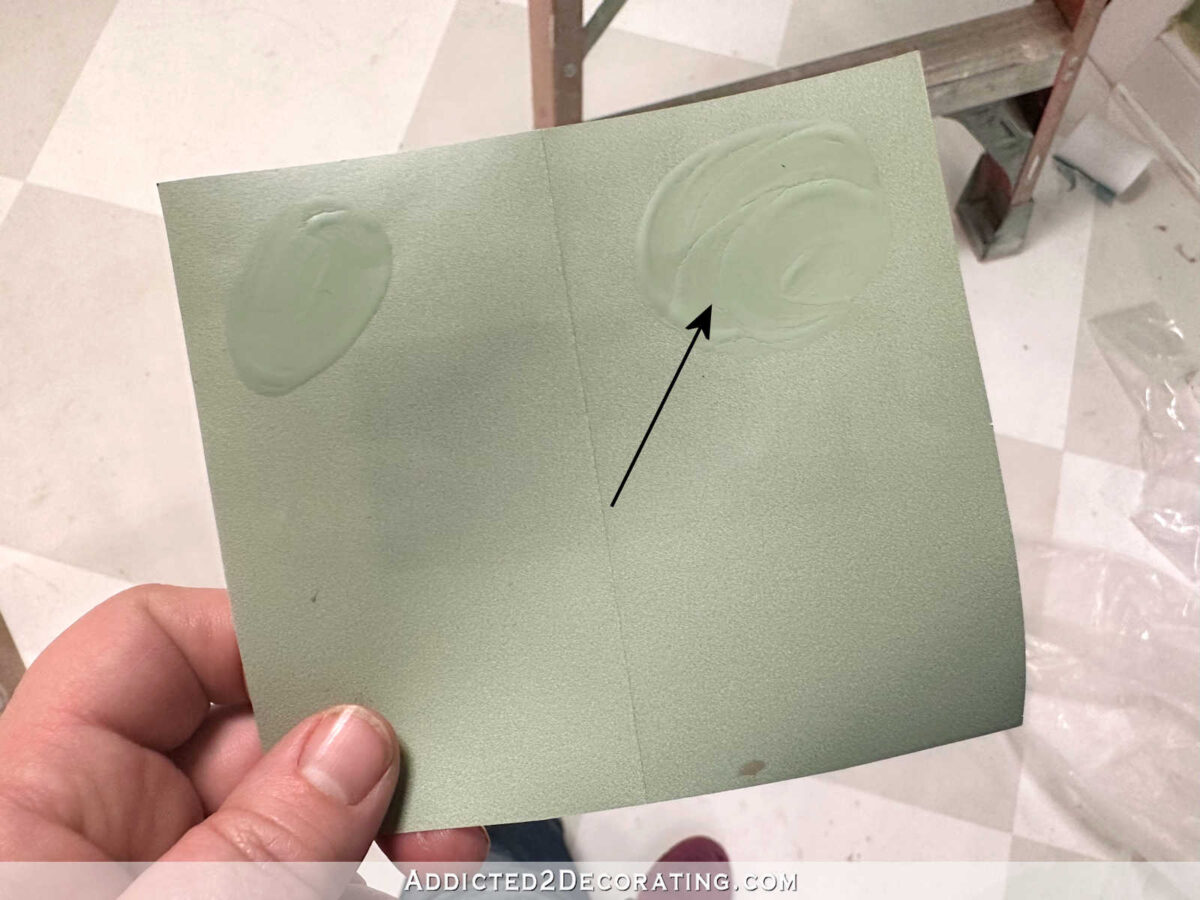
I knew immediately what it needed to get the color right. First, the paint color was too dark. How do you lighten up a paint color that’s too dark? Add white! So after emptying the gallon of paint into a new 2-gallon container, I used the only pure white paint that I had, which was Behr Ultra Pure White ceiling paint. I wanted it lightened up considerably, so I added quite a bit. I didn’t measure it, though. If I had to guess, I’d say I added at least a pint of white paint to the gallon of green paint, but it could have been more.
The second problem with the paint color was that it was too yellow. It needed to be more on the blue side. So I rummaged through my paint stash and found the deepest, darkest blue I had on hand (because adding a light blue would require much more paint, and there would be no guarantee that a light blue would get the color where I wanted it).
Well, I didn’t really have any dark blue on hand, but I figured since I was mixing it into an existing green paint color, adding a blue-green color would work just fine. So I pulled out this Behr Beta Fish color, which has quite a bit of blue in it.

Here’s what the actual paint looked like…
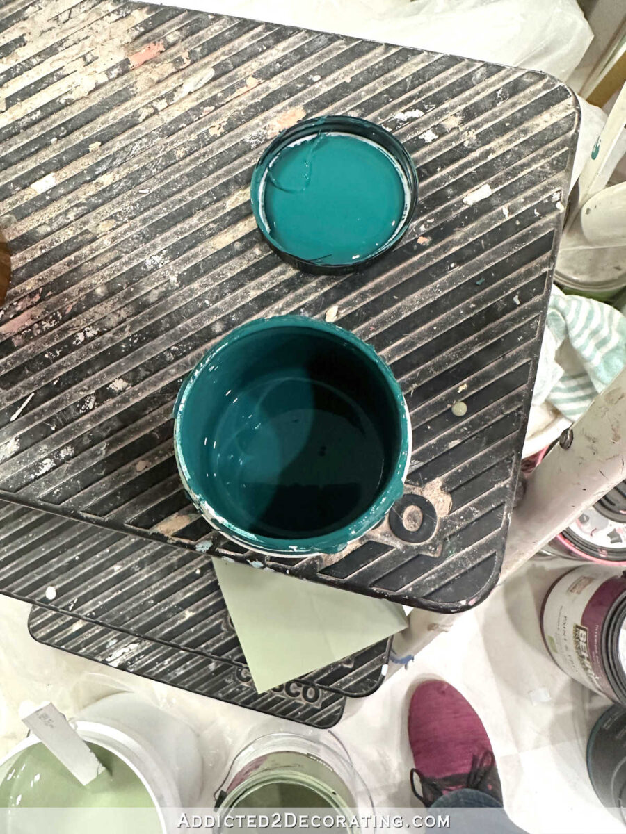
I added the entire sample container of Beta Fish into the color mix and stirred thoroughly, and then tested the color against the wallpaper sample.
My first attempt wasn’t bad at all. At least it was in the same color family, but the overall color was still too dark. So I added more white (maybe another pint, maybe more) to lighten it up even more. My second attempt was pretty spot on.
I decided to go for it. It may not have been exactly perfect, but it was close enough for me. You can see all three colors — the original color match attempt, the second color match attempt, and my custom color mix — in the photo below. See how the final color just has a brightness to it that the other two lacked? That’s not only because I lightened it with white, but that’s the result of eliminating some of that yellow in the previous two attempts. I’m just not a fan of yellowish greens, which shouldn’t be a surprise given my love of teals.
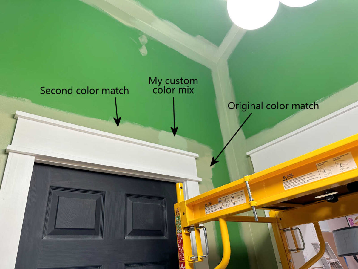
And here’s another look at the three colors together. You can see just how vastly different the original color match attempt is from the final paint color that I mixed myself.

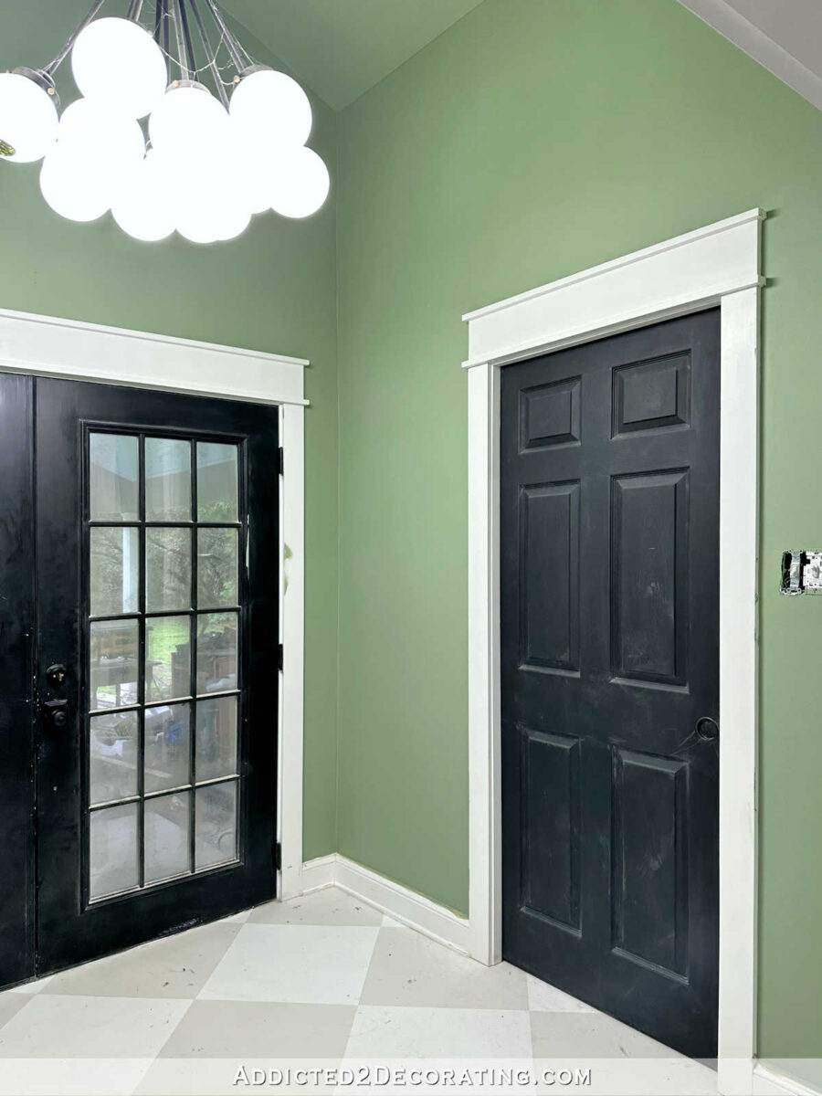
So here is the final color on the finished back entry walls. I know that blue color on the walls and ceiling in the foreground is a little distracting. 😀 Now that I have my own scaffolding (this is the one I bought (affiliate link)), I’m anxious to finish all of the painting in the main part of the studio, so the remaining areas of blue walls and ceiling won’t be around much longer. But hopefully you can look past that and just focus on the green back entry walls.

I think this color is so pretty, especially after living with that in-your-face Kelly green for so long. That Kelly green/black combo just started to look so harsh to me.

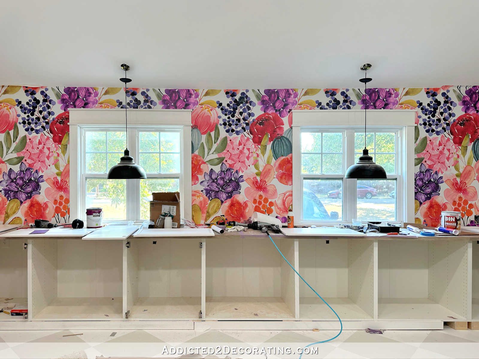
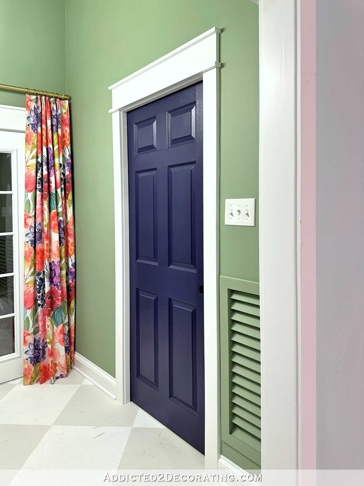
This softer, more muted green complements my studio cabinet color so nicely. It adds color to the back entry without competing with the bright, fun cabinet color or the colorful mural.

And of course, I’ll eventually be making curtains for this area using the same colorful floral print that is on the mural wall. So these soft green walls will really let that fabric sing.

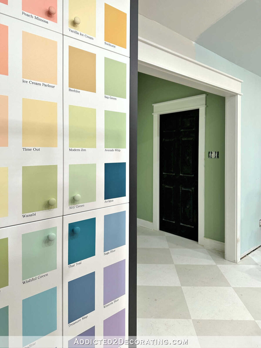
And I also like the view from the door coming from the breakfast room. The green on the walls blends nicely with the greens on the paint swatch cabinet.
I’m so glad this is done! I had been dreading painting this area just because of the height of the ceiling. But my new scaffolding (affiliate link) made quick and easy work of it. I’m so glad I finally gave in and made the purchase!

And it’ll also made quick and easy work of finally getting rid of the cobwebs on the light fixture. 😀 I’m really looking forward to gold leafing that light now that I have an easy way to reach it.
So how does the final color compare to the mock up I made a while back showing all of the colors, fabric, and wallpaper together? Here’s how that looked…

The final color ended up being a little less yellow than the color I had used on the mock up. And I’m actually really glad about that. The color difference isn’t huge, so I know the actual wall color will look great with the floral fabric and the bathroom wallpaper, and it’s just a touch more on the blue side, which is always a bonus for me when it comes to greens.
So while painting the back entry should have been a one-day project, but ended up spanning four days, I’m so glad I persisted until I got the right color. If I had gone with the original pea soup green paint color just out of convenience and wanting to finish the job in a hurry, I would have regretted it, and I would have hated it. It’s almost always worth it (at least for me) to take the time to get it right.

Addicted 2 Decorating is where I share my DIY and decorating journey as I remodel and decorate the 1948 fixer upper that my husband, Matt, and I bought in 2013. Matt has M.S. and is unable to do physical work, so I do the majority of the work on the house by myself. You can learn more about me here.


Perfect!
I love it. One’s eye really goes to those black doors. Are you planning to change them? Have you thought about painting them the same color as the walls to make that whole area pop with the fabric? Just a thought, it would make the area look bigger.
I do plan to get rid of the black doors, but I’m just not sure which direction I want to go yet. White seems like an obvious choice, but it also seems like a boring choice. I would like to try out a darker green, and then there are a few other colors that I’ve given some thought to. I just haven’t made a decision yet.
Someone had mentioned in the comment section of an earlier post, a dark grey for the doors, perhaps something like Sherwin Williams Iron Ore?
https://www.sherwin-williams.com/en-us/color/color-family/neutral-paint-colors/SW7069-iron-ore
I wonder how a grey would look on the doors?
You are a wizard at mixing colors! That green is really pretty.
Love Love Love! I knew you could do it. I have “watched” you mix your own colors for so long that I had faith you would do so again. Great job and I am so happy you finally broke down and bought scaffolding, what a backsaver for painting your ceiling. Have a great weekend.
I LOVE the green. It is spot on!!
I was thinking to myself how amazing you are. Mixed your own color. It’s all going to be so beautiful. (And the new scaffolding is fab)
I love this green so much better. I hope you paint the doors white, that black is so harsh.
Wow. I had no idea blue was in a green paint. I love green, but my mom always had a pea green cast to it… love your green!
Perfect green.
It looks fabulous! You are such a fast worker, yet everything looks so neatly done and perfect. You should call your book “The Butterfly House,” and show how you transformed it from a drab worm into the beautiful,colorful place it is now!
I think your final shade of green looks great with the fabric and surrounding colors. I prefer the softer green over the Kelly green.
I love this green! It looks so good. It was worth it to persevere and get it right!
Yes, it truly is worth it to take the time to get it right. If you don’t, before you know it, it’s ten years later and you’ve lived with your second choice while “life gets in the way”. Glad you got that scaffolding! The right tools and equipment really make the job easier and the result better. Your studio is becoming a delightful and colorful place to dream, create, and bring those dreams to life. Way to GEAUX, Kristi!
BRILLIANT! This is SUCH a happy area of your house, Kristi! I love how it is developing, with the florals countered by more simple, geometric areas that still make you smile. Great work.
Will you post more about the scaffolding? I have vaulted ceilings in the master bed and bath, so I haven’t bothered painting them. But I’m so sick of the grey color.
This is my affiliate link for the one I got at Home Depot. The price is really great! And the platform can go as high as six feet. https://bit.ly/477e01p
The new color is so calming! I would also like to see those black doors go. Maybe you could do white to match the trim or use the same color you mixed for the wall. The room would be a quiet transition to that spectacular studio.
The final color looks really nice and fresh. Can’t wait to see it all tied together with the curtains and bathroom wallpaper.
This green is really so lovely and looks great – planning a similar colour for my bathroom soon. I sometimes think about lightening up/altering paint colours I have but dont love, but am weirdly paranoid about never knowing how to re-create the same colour for future touchups!
Absolutely spot on. You do amazing work. (I know, I’m repeating myself, but you do.) Also, I found my Christmas present to me: scaffolding, but the mini platform for putting up my new ceiling tiles. Thanks for all you do – you’re a great inspiration!
That’s a beautiful color. You amaze me how you can match all those colors. It’s looking so good.
How awesome is that!!! So much lighter and brighter! So good!
I had my bedroom painted in Martha Stewart color Shagreen, a beautiful silvery sage color and I loved it. Especially after I added a beautiful crown to it in a nice glossy white. I loved that restful bedroom and miss it to this day!
Your back entry reminds me of that, however I’m not a fan of the black doors because to my eyes its too jarring. Your color block cabinet looks good as a segue to the back entry, too.
Taking the time to get it right is always a win win in my book too. Actually I like your mixed color better than the mock up color. Your entryway is now beautiful. You have a knack for mixing colors that is just amazing. When you were mixing the colors for your color pallet cabinet doors I noticed how good your eye was for adjusting one color to make the next color, whether lighter or darker, all of the color swatches looked like the ones at the paint store.
Glad you added the scaffolding link. I am looking forward to seeing the gold leaf on the light.
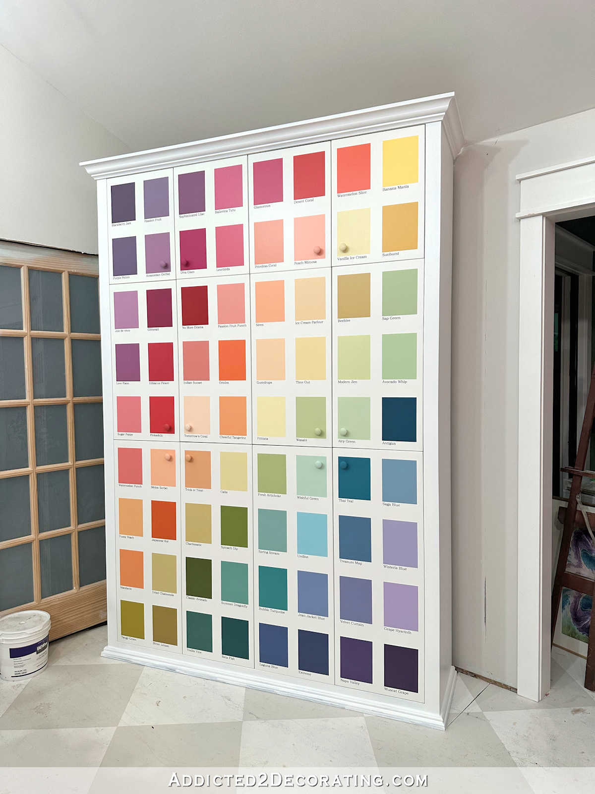
In the photo where you can see the cabinet doors next to the entry, the color looks a lot like a slightly deeper version of Avocado Whip.
You absolutely nailed it. Your patience paid off. Love the green you mixed. Can you preserve extra paint, just in case of mishaps that may occur given the traffic that entrance will have?
As for the door: yep, the black is too stark. So as to allow the fabric to shine, how about a deeper value of green for the doors rather than white. Too stark. To my eye, a blend would be very pleasing in that small space and it would lead the eye into your fabulous studio environment.
I am so very glad to know you invested in that scaffolding. I can rest easy knowing you have it now. I was wondering how you could clean the clever light fixture over your bathtub and various other high spots. Well, now won’t you have fun pushing that baby all over the house!
that is so much prettier. I like better and it a more suitable colour for your wallpaper.
I still love the blue in the main room and don’t think it clashes with the green at all. Hope you are keeping it.
You did a GREAT job achieving your goal green!
Having been a paint associate at the Home Depot for 3+ years, I’ve got A LOT of color adjustment ‘hours’ racked up…I would say with 97% success rate in customer satisfaction adjusting colors – but, it really does take quite a bit of time because we do it by the drops of colorant – we never want to ‘over color’ someone’s bucket.
One interesting thing to know – BL isn’t for blue – it’s LAMP BLACK colorant…
and, of all things, EL stands for the one BLUE colorant at the Home Depot…
DL is the one green colorant and the last ingredient in Beta Fish, AXL, is a very bright yellow…
The same color Beta Fish, if made up in a different base from the Behr collection, might actually have a different formula – using different colorants to make the same color!
The photo of Beta Fish on my phone certainly looks like it has blue in it! Though the formula hasn’t any actual blue colorant in it in the can you have! Crazy, huh?!
It’s just the different bases that affect how the colorants come together to make the color!
All that said, you did the best thing by adding paint just the way you did!
We’ve found that there is a colorant saturation point for each base after which adding more colorant will make no difference AND the paint’s integrity may be compromised. Home Depot paint associates can access the exact amount of colorant that CAN be added to a particular can of Behr paint and calculate how many ounces and drops they have to work with to change the existing color given the existing color’s formula.
The color spectrometer reads paint -doesn’t read inks well…and, old paint is sometimes harder to get a good read on…
Samples must be about the size of a nickel and a good two, even coats of the color you want matched on a flat surface for the best possible match.
You might want to see if your custom mixed color can be color matched next time you are at the Home Depot in case you want touch-up for that entry – you can have the associate name your color and, even have it show up on the printed label (!) – and, of course, have it saved to your paint registry! 😀
I need to correct myself on that last colorant in your Beta Fish! It is KXL – which is WHITE. Forgive me! 🙏
I knew you would get there! Looks awesome!
Definitely worth the fuss!
I love this room more every time you post.
Does your new scaffolding break down into an easily storable size? I can’t find anything in the listing!!! Your back entry looks fabulous!!!
It does. It took me about 20 minutes to put it together by myself. Now that I know the process, I’ll be able to take it apart and put it back together again in much less time. No tools required.
I definitely think that the scaffolding purchase was a smart choice that you will probably use a lot and will make your life much easier! Thanks for that link and info. Yes I like the new light mint green color much more than the Kelly green. Much more sophisticated and understated. New floor pattern is also more understated and sophisticated.
Can your new scaffold be used with stairs? My stairway walls and ceiling need repainting and I can’t figure out how to safely get up there. I did a passable job years ago by taping a paintbrush to a pole to cut in around the edges while stretching up from the steps, but don’t think I could manage that again.
I don’t think the scaffolding can be used with stairs.