
Storage Room Progress (Ceiling Paint Color With Wallpaper Preview)
I know I’m probably giving y’all whiplash. Yesterday, I was sharing about the dining room artwork project. Today, I’m back in the storage room. So just a heads-up, I’ll be all over the place until these last to rooms are finished.
I made an exhaustive list of every project and every task I need to do to finish both rooms, and I’m going to give myself the freedom to choose anything from that list each day from now until the end of the year. So strap in and just enjoy the ride. 😀 I know some of you are anxious to see the dining room finished, and some of you are anxious to see the storage room finished. They’ll both get finished, and right now, I just need to keep myself motivated to keep moving forward.
And yesterday, the task I felt motivated to get checked off of my list was to finish priming and painting the walls and ceiling in the storage room. That included finally selecting a ceiling color to go with the wallpaper so that I could get the ceiling painted.
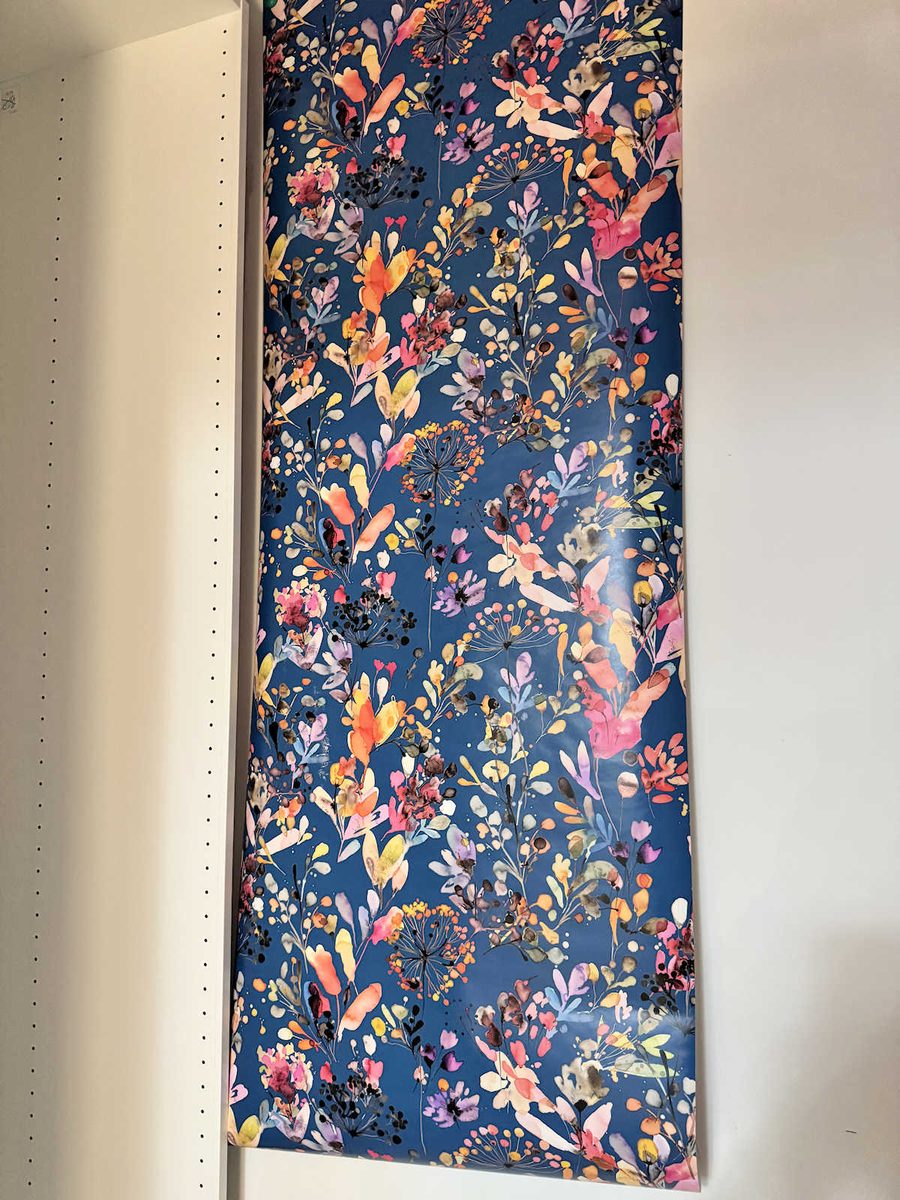
As a reminder, this is the wallpaper that I’ll be using in the storage room.
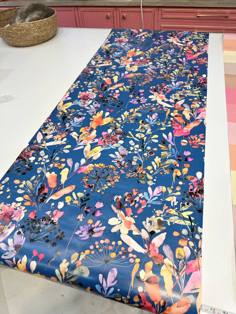
I bought this a few years ago to use in this room when it was still a guest bathroom. I had planned on doing a bathroom makeover and using this wallpaper in the makeover. But then that whole makeover was put on hold as I revamped that entire part of our house and turned it into our master bedroom suite. And now I’m finally finishing up the last room of that bedroom suite, and I’m still going to use this wallpaper in there.
Since it’s just a storage room, and I want to spend as little money as possible to get this room finished, I decided to use Behr paint. My preference lately is Sherwin Williams. I think their colors are prettier and their paint is better, but it’s a lot more expensive. Behr is perfectly fine for a storage room ceiling.
When I headed to Home Depot for paint, I had my heart set on green for the ceiling. I thought it would be perfect since the bedroom foyer has a green bench, and I’ve been using more green in the house lately. But when I unrolled that wallpaper and stood in front of the paint samples, I realized just how little green is actually in the wallpaper. The most prominent green in the wallpaper is actually a bright yellow-green, and that’s probably one of my least favorite colors used on big surfaces. It almost looked like a neon green, so I ruled that out almost immediately. The most prominent flower colors in the wallpaper are orange, pink, and purple. So I narrowed it down to three paint colors that coordinated with the wallpaper.
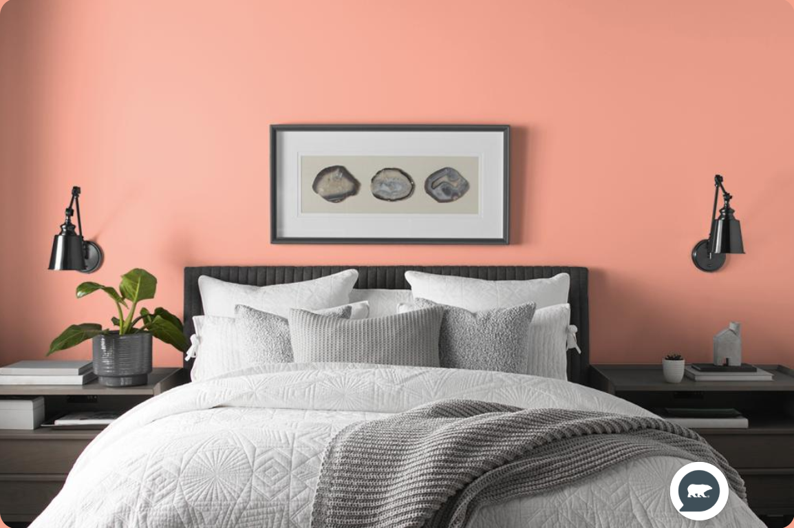
The first one was called Peach Mimosa. This is the paint color as shown on the Behr website.
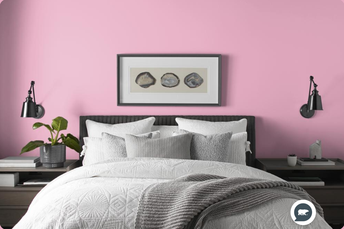
The pink that I chose is called Little Princess. I’ll be honest. The name itself made me want to choose another color. The color is pretty. The name is not something I want in my house. (Am I the only one who rules out paint colors because of the name? 😀 )
And the purple I chose is called Grape Hyacinth.
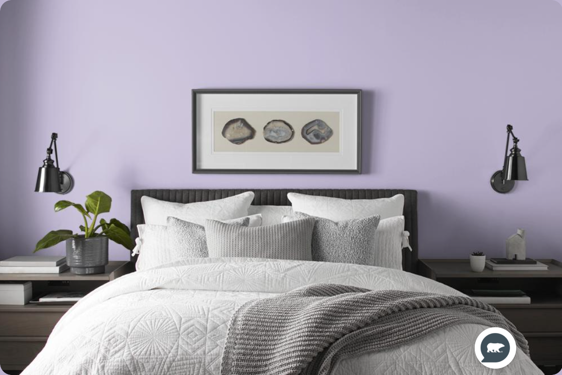
The orange and pink made more sense for our bedroom suite since pink is a prominent color in my walk-in closet wallpaper and there’s also a pink pillow on the bench in the foyer. And orange is prominent in our bedroom. But in the end, I went with the purple. I’m really picky about purples. I either like them really dark, like an eggplant color, or I like them grayed down with blue undertones. I can’t stand any purple that is bright or has too much red in it. So I knew I was taking a chance on choosing purple since I’m so picky about purples.
But this gamble paid off. I love this color. (So sorry about the lack of lighting right now! I don’t yet have electricity in this room.)
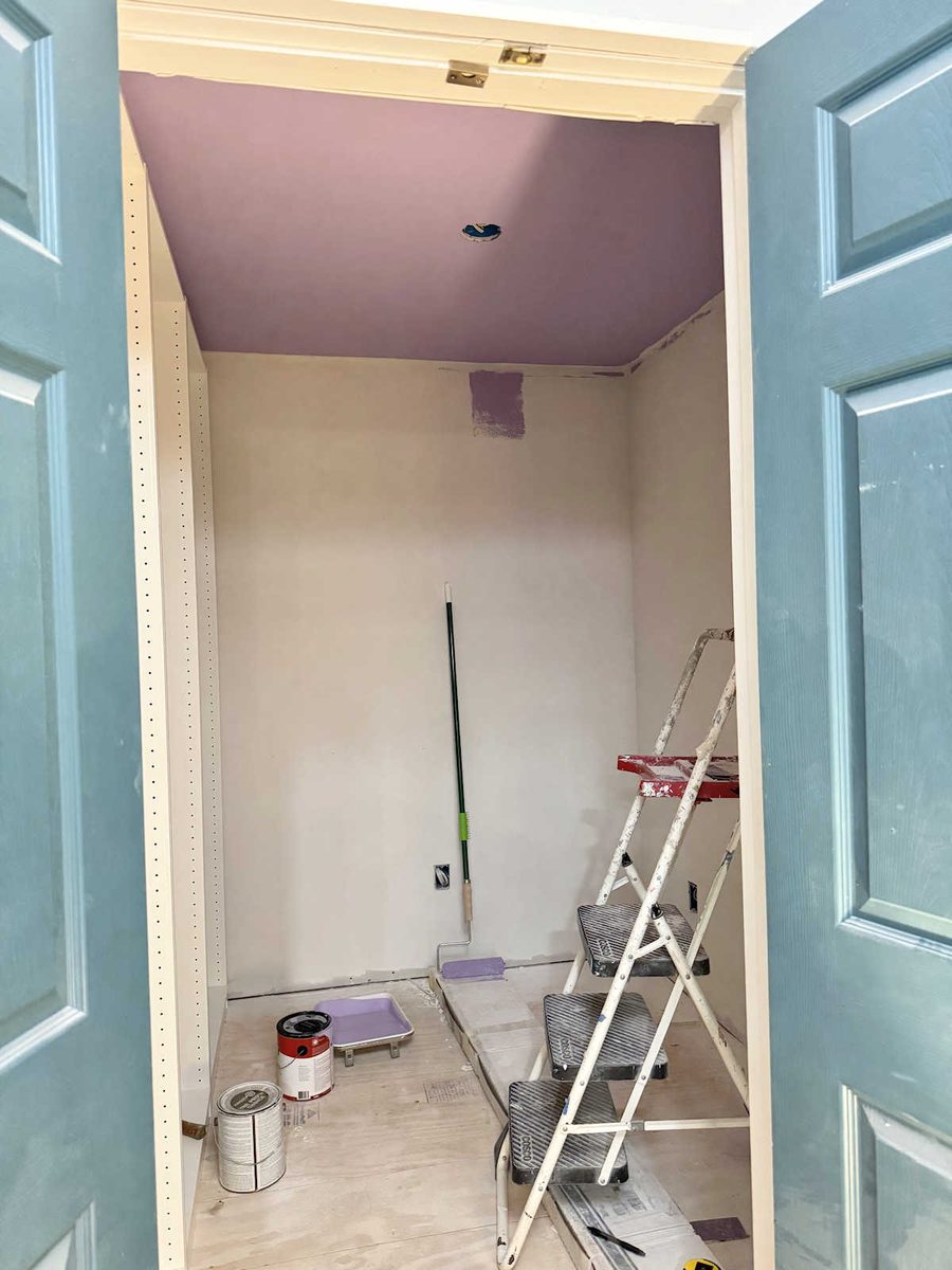
Right after I painted the ceiling, I had a moment of doubt about my choice.
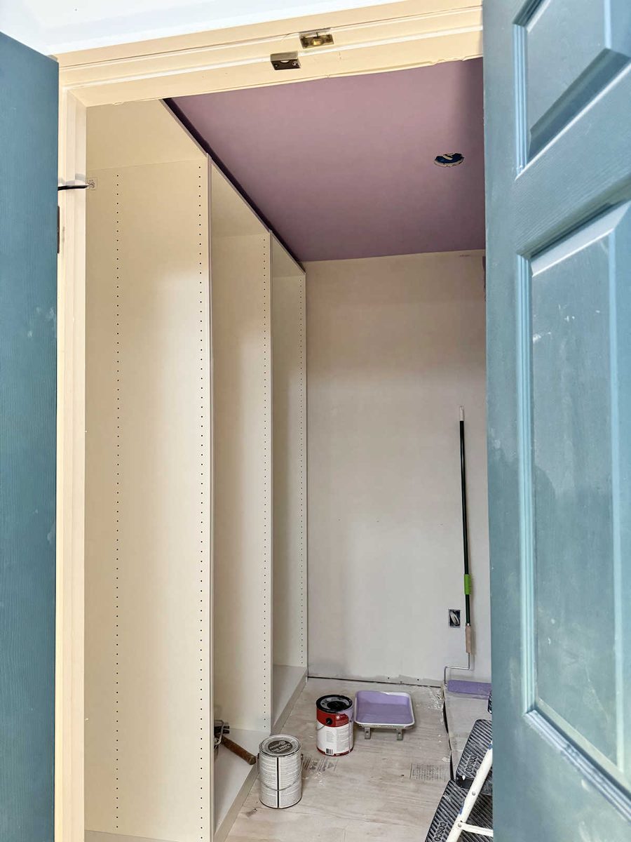
So I tacked up a piece of the wallpaper on the wall so I could see them together. See how much purple the wallpaper has in it? I hadn’t noticed before yesterday just how prominent the purple was in this wallpaper.
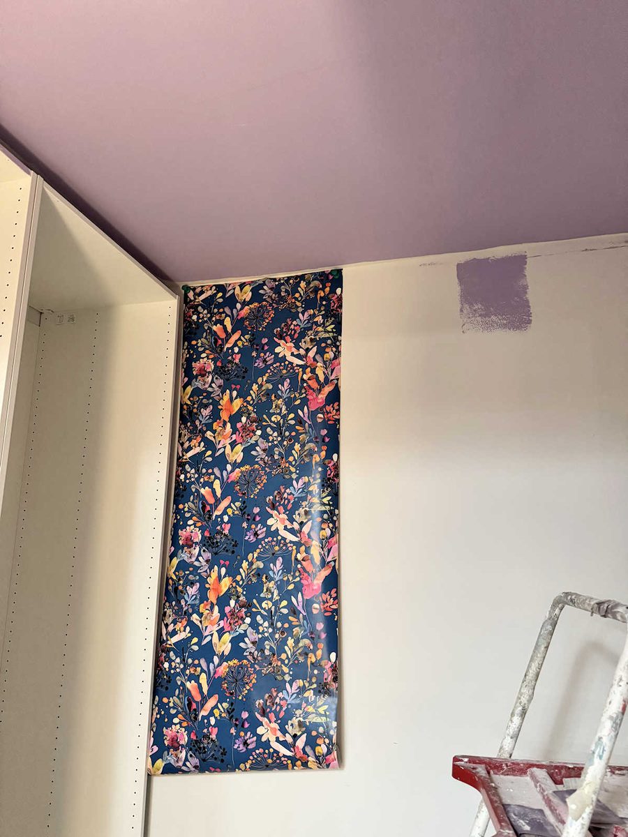
But when I got the wallpaper tacked onto the wall, I absolutely loved them together.
And even from outside the storage closet, I love the look of the purple on the ceiling. Even though our bedroom suite has no purple in it, I think it works.
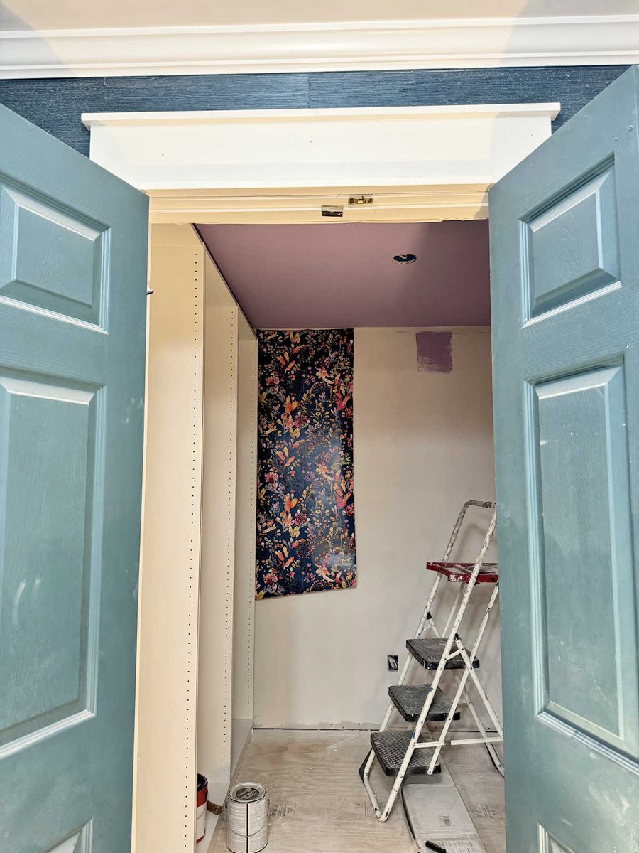
And now I can’t wait to get the wallpaper up! I need to get some lighting in here, though. So I really need to get all of the outlets and switches wired and get the ceiling light installed so that I don’t have to keep working in a dark room by the light of the hallway. But once it’s all finished, I’m hoping this is how the storage room will look.

Addicted 2 Decorating is where I share my DIY and decorating journey as I remodel and decorate the 1948 fixer upper that my husband, Matt, and I bought in 2013. Matt has M.S. and is unable to do physical work, so I do the majority of the work on the house by myself. You can learn more about me here.

I love the purple tone. It had been my favorite when you first listed your options. It’s adding color without detracting from the wallpaper.
Purple would have been one of my last choices, but it looks wonderful! I love how it looks with the wallpaper and it really brings out the purple in the paper. As always, your choices are impeccable. Look forward to seeing what you choose to do next.
“It’s just a storage room!”, she says. I would be proud to have that in my living room!!! It’s just beautiful.
prettiest storage room ever!
Perfect! The happiest and prettiest “just storage room” I have ever seen. Well done! And I’m with you on ruling out paint colors based on the name. But I also choose paint colors, fabrics, etc because I like the name 😀
Blessings from NC!
This may seem random but one of the things I love about your blog/photos (other than when cooper, felicity or tiger appear) is the inspiration you give me for quilt color combos.
You rock.
XO
Love the purple you chose—it has just the pop you need!
You always inspire me up treat ALL of my rooms as opportunities to create beauty!
That purple is such a soothing color!