Studio Painted Floor Fail
I’ve run into a bit of a hiccup with the painted studio floor. If everything had gone well, the floor would have been finished by the end of the weekend. Everything didn’t go well.
I did get the checkerboard floor in the main part of the room finished, and it looks great! But what gave me trouble was the back entry. If you’ll remember, I had planned to stop the big checkerboard at the cased opening between the main room and the back entry, and then paint a rug-type design on the back entry floor like I had before with the black and white chevron painted floor.
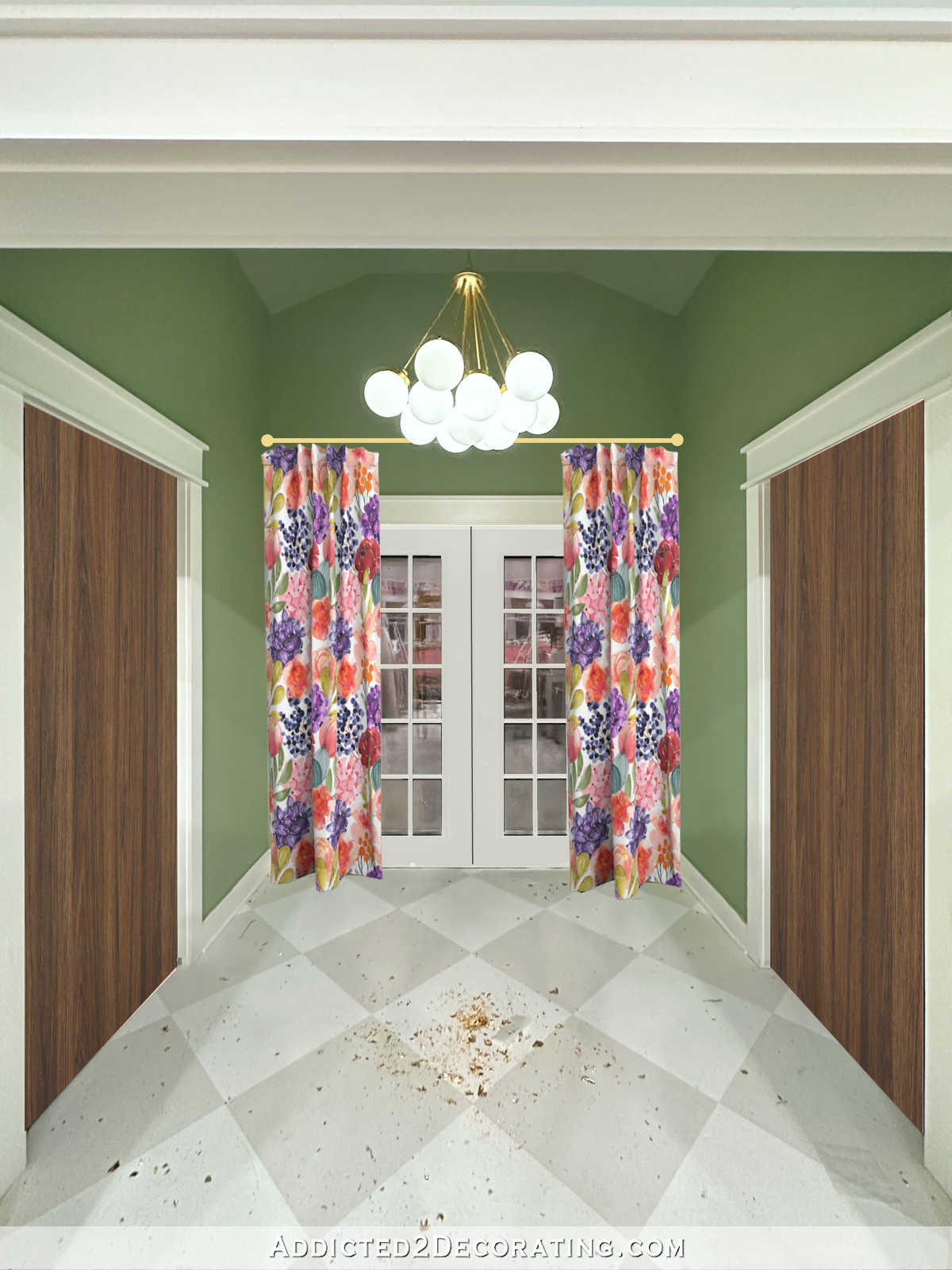
I had something like this in mind.
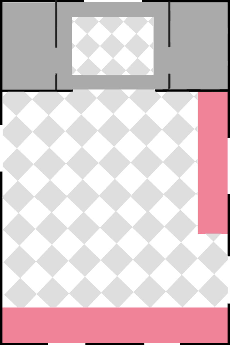
But seeing the design in real life as opposed to a small mock-up made things very different. First, having the large main checkerboard design just dead end at the cased opening looked really strange and unfinished, probably because the actual gray that I used is much lighter than the gray shown on them mock-up.
And then I got to the design on the back entry floor, and I just couldn’t see more checkerboard looking good in that area. So I racked my brain (and also spent quite a bit of time on Pinterest) trying to come up with a design that might coordinate with the checkerboard floor. I also needed to find a way to end the large checkerboard design in the cased opening instead of just stopping the design, which seemed kind of random.
For the back entry floor, I considered just about every two-color painted floor design I could think of and find on Pinterest. Of course, I considered stripes, but I also considered so many others.
I finally landed on a square two-color sunray design. It seemed easy, and since I was using the same two colors that I used on the checkerboard floor, I figured it would coordinate. And to create a stopping point where the main checkerboard design ended, I decided to do three simple stripes going the whole width of the opening in white, gray, and white.
Well, the stripes in the cased opening looked awful (I forgot to take a picture), so I painted the center gray strip white, which just left me with one 6-inch-wide stripe. I wasn’t thrilled with that, either. And then I painted one section on the sunray design, and that didn’t look great. So it all seemed like a fail to me. Here’s what it looked like when I decided to stop.

That stripe in the cased opening still needs a second coat of white over what was the center gray stripe. But I may end up sanding it down and doing something different altogether.

And then I decided to use my photo editor and fill in the rest of the sunray design to get a better idea of what it would look like. My mock-up isn’t perfect, but we can at least get an idea of what the finished design would look like. I’m definitely not excited about it.

So that really took some of the wind out of my sails. I was so excited about finishing the floor this last weekend, and then just as I got the last little area, nothing seemed to go right.
I really can’t envision any separate floor design looking good in the back entry. The only option I see is continuing the large checkerboard design straight through from the main room to the back French doors. The only issue is that I definitely do NOT want the checkerboard design in the studio bathroom or the storage closet opposite the bathroom. So I’m still going to have to find a way to officially end the design. Otherwise, I’ll just run into the same problem that I had with the floor in the cased opening.
I wonder if doing a very thin black like to “finish” the checkerboard flooring might work. That would tie in with all of the other black accents in all areas of the studio. So the new revised design would look like this…

But for now, I guess I need to get busy with some sanding. I’m glad this is a small area, and it won’t need much sanding. I just need to get rid of all of the paint ridges that always form as a result of taping off a design and painting over the tape. It’s frustrating that I’m having to take a step backwards, but at least it’s not difficult, and it shouldn’t add too much time to this project. This painted floor has been a pretty big project overall, and I’m glad to be down to the last little bit so I can move on to other things!


I think the grey and white sunburst is a good way to go.
What if you did squares within square to the center? As if looking at stacked blocks from above?
The checkerboard design all the way through looks quite nice to me.
I 2nd this!
I 3rd this. 😋
I 4th this!
I did wonder why you thought you needed to break the checkered pattern and recreate a rug in the entryway – it seemed to me to make more sense to just carry the pattern through.
I don’t know that I’d try to incorporate a black line – why don’t you do two narrow stripes of the existing floor colours to create a border between the rooms? White, grey, then solid white floor in the bathroom (which doesn’t lock you into dealing with grey in there) and the same on the other side. Stripes that are two – four inches wide will read as a border I think especially if they are confined to the space in the doorway.
I think a painted “threshold” looks great wherever you have to change designs. The thick white stripe doesn’t look out of place to me at all.
I think the problem with the “rug” in the back foyer isn’t the design but the background. Think of it as if it were actual materials. You’d have 12×12 linoleum tiles doing your checkerboard in the main space. Then you have a sold gray “floor” of some sort (maybe linoleum, maybe some other material) in the foyer with your “rug” thrown over that. I think using the same gray as your “solid colored flooring” under the rug is what’s looking awkward. Maybe using a totally different color for the background would look like you actually switched flooring for the foyer and then placed a rug on top.
As for the bathroom, I say either paint a threshold on and do whatever design you want in the bathroom (even a different color) or maybe, since you don’t really need to worry about rolling over it (is Matt ever going to use that bathroom or would you need to roll materials or a cart in there?), just use regular flooring (tile? wood? vinyl?) and a transition strip or actual threshold material (wood, marble, whatever).
I see your dilemma – what came to mind for me was to reduce the scale of the chequerbord to fit into that space – not the whole area but basically the space taken up by the sunray – just a thought….
This is what I thought, too.🙂👍🏻
I like the looks of the sunray as well as the checkerboard continuing into the entry. Either would look good in my opinion. So sorry you are feeling de-railed by this!
Just thinking out loud… What about the gray and white in a herringbone style inside the “rug” area? I know you’ll figure it out and it will look awesome!
I love the herringbone idea!
You have to continue the design, as your eye stops at the cased opening instead of the back door, where it should stop. I have dark grey and cream checkerboard tile on the diagonal in my home, which made my small condo look huge. My professional installer and the designer at the flooring store both said not to do a border strip of any kind, as your eye goes right to it then jarringly stops. Much as you want your eye to go to the horizon when looking out to sea, you want this to just go into the wall. Mine doesn’t look unfinished, and there are many examples in classic architecture where this is done (of course, there are borders and tile “rugs” in classical architecture too). When you do your bathrooms, you can have a transition border in there, because it isn’t intended to be a sweeping space. If you must have a border at the back entry, how about a white or grey one? Black seems harsh to me on that Swedish-feeling floor.
Why not try a mock up with the floor painted WHITE and the Sunday gray
So I’m picturing tiny squares lined up corner to corner to form almost an accent tile strip. Same colors but to almost serve as a trim/transition strip.
I like this idea
This!!!!
I kinda like the first picture, if the the one sun ray wasn’t there. The white bar at the end of the studio checkerboard to delineate the space, then the gray floor in the entry with a white border (maybe an added couple of white squares inside of the larger white boarder, to make a more interesting border). It looked calm and peaceful and a nice intro to the studio’s checkerboard square.
Just my two cents. I know whatever you choose will be lovely…
I have similar thought
What if you left the back area gray with a white rectangle outline and left it at that.
What if you did a smaller checkerboard design? Or just paint it solid and use a real rug?
This is the main door that Matt uses. A rug wouldn’t work for him.
At first I thought it was going to be a big compass.
I think that would have been a cool idea
I like the gray and the white stripe box – why not leave it like that and then it won’t be competing with anything else going on in that corner of the world as the design back there comes together. Good luck.
I love the sunburst with the white threshold. I think the green walls are confusing the issue. It is the perfect solution.
How about a solid color “rug” with a 6″ wide band of the contrasting color as an edge?
I always thought that you were going to do this checkerboard all the way anyhow. But in reading your delima, and before getting to your final plan, I was prepared to suggest a lattice border. Then, if you wanted, you could continue the lattice into the bath and closet. You could also give the lattice a thin “grout line” of either a shade darker gray, or do your marker trick with a marker! But I do like continuing the “tiles” all through the spaces.
How about a compass painted in the middle?
The entryway floor photo showing the one stripe is what I’m looking at. If you go with that design without the stripes…and using the same color of gray paint as is on the studio floor I think that would look nice.
I am also looking at the photo where the checkerboard design goes straight through from the studio floor and continues through the entryway with all using the same color gray paint would look very nice too.
Actually though I can’t wait to see what design you actually choose and go with. It will be perfect.
I agree with the people who are suggesting a solid square. Anything else might end up just competing with the checkerboard.
I vote to have a thick white stripe that begins the checkerboard pattern at the studio cased threshold. Then have the entry floor painted solid gray that extends under the bathroom and storage room doors to extend the eye and soften the transition. The new floor design for the bathroom and storage rooms would begin on the inside of each door. For the entry floor, I prefer a simple square outlined in white the same thickness as the thick white stripe at the studio cased threshold. Keep at it! You’re almost there!
I’d say keep the checkerboard design with no change all the way through! I once did a little border design in an area like this and all it did was make the space look tiny and claustrophobic. I hated it so much, I ended up painting over my careful work again within days!
I would also keep the bathroom and storage closet floors solid, so as not to compete, especially if you do wallpaper or keep your beautiful stencil design in the bathroom.
I actually like the gray and white starburst design. But also wondering why you just couldn’t continue your squares into that small area. I’m sure that whatever you decide, is going to look amazing. After all, you’re the one who needs to be happy with whatever you decide. I get it though. There are times that I absolutely freeze, and doubt my design decisions.
I like the idea of having the checkerboard pattern run from the studio into the back hallway. I like the idea of a thin black line to separate the bathroom and closet. What if you kept the white border that you have around the starburst and painted a second border a few inches inside of that? You could paint the white transition between the hallway and studio gray to make it less obvious.
I think if you reversed the colors you’d like it better.
I am just throwing this out there for consideration but your mother does beautiful paintings and murals. Is it possible for her to take the wallpaper that you are using and duplicate or paint a similar version for a rug? Maybe choose some of the favorite colored flowers that match as a rug? Again just thoughts.
Great idea Treasia.
Try a half sun, with the rays coming out of the sun, no pointed points.
Maybe paint a central geometrical version of one of the flowers from your wallpaper on the floor of your entryway. I’d make it shape simple in the two colors, but one that translates instantly as one from your office wall.
Or even something like a hydrangea (since those repeat in your floral mural) mandala:
Simple: https://cdnb.artstation.com/p/assets/images/images/003/863/727/large/brooke-battista-hydrangea-mandala.jpg?1478052233
Complicated: https://felt.co.nz/user-images/itemuploads/u29806/i969185/l.jpg
Stripey: https://www.floraqueen.com/blog/wp-content/uploads/2020/02/shutterstock_401259256.jpg
Nothing resolves a circle like a square, and vice versa.
Your designs are wonderful. I like the middle one, the complicated one. I’m into embroidery and this looks like embroidery.
Oh, yes I like your idea! Something geometrical, but not straight or square. That would balance the checkerboard nicely!
I vote extending the checkerboard design all the way to the french doors. As for separating the bathroom and storage closet from the entry way, can you add a transition strip (guess it would be faux since you aren’t separating 2 different materials)?
What a mess. Could you just paint it grey and use a real rug? The sunburst looked good if you just went to the center will the corners. With a big grey square in the center?
Just an idea.
Maybe go work on the porch……….
No, I can’t use a real rug. That’s not an option.
I like the solid white in the cased opening. I think it looks natural with the trim being white. I can see where not doing something would look more like an unfinished checkerboard. Not a fan of the sunburst. Can you mockup a checkerboard in the entry “rug”? If you don’t like that I’d checkerboard it all and do solid white lines in the bathroom and closet doorways to finish the checkboard. It’s like the white on the floor finishes the white box of the threshold to me (with the trim work being the other three sides of the box). It actually feels really balanced and complete to me that way. I think its the completed geometry of the square I like. 🙂
Black seems a little harsh, but maybe a dark grey?
To be honest I like the continuation all the way to the back. The thin black line is also good because it’s across small openings that have doors.
I rarely have an opinion because you know you way better than i do. I like continuing your pattern, with or without the black line.
But one other thought, since it’s your working studio, would be to keep the border in the entrance and put your logo in the center. (The A2D incorporates the same motif from the wallpaper so that could look very cool.)
Or a monogram even. You could put the lettering in a diamond shape that aligns with the pattern on the floor.
Just a thought…
I’ve been a fan long enough to know that you likely already have something up your sleeve and it’ll be very cool!
I really liked the entry rug outline. Maybe a 8 point mariners compass would work?https://www.agbarnquilts.com/shop/mariners-compass-american-garden-barn-quilt
If that doesn’t work for you, definitely check out quilt block patterns. Pretty sure you can find something you like. I don’t normally like checkerboard but yours looks really great! Look forward to seeing how you go forward. Go you!
I love it.
I honestly assumed you would do a white stripe on the floor as a “threshold” & it’s what I would do. It visually separates the spaces, which I like.
If you carry the checkerboard to the door it could make it look like one big space…unless that is what you’re going for.
I love the sunburst too.
Usually I’m a “keep going until it’s done” girl but sometimes when you hit a wall you have to shift & decompress so you can come back with fresh eyes.
Maybe your eyes need a rest.
I like the white transition stripe in the doorway, not a fan of the black stripe, but what if you continued the checkerboard design around the outside of the center square? As though treating the center square as a “rug” over the checkerboard. The “rug” could be solid gray with a white border, maybe include something in the center like a large diamond outlined in white with your A2D logo or a big script L like you do in the center. Whatever you come up with, it will be fabulous!
Oh ….. I just LOVE the sunburst and wide white strip!! Doesn’t look out of place or awkward at all. Having the chequerboard all the way through is too much for me and the sunburst just looks SO good with it.
I think it’s quite sophisticated and balanced.
Why don’t you complete the grey squares through the doorway then do the Starburst without the outline. Maybe a little smaller solid grey border. I think that would be great. I think it needs to be two designs.
A medium size checkerboard more to scale with the smaller area?
I like your last mock up w/ the black trim and the checkerboard all the way. PS I still love that green wall.
I keep thinking of the cool bubble light chandelier you have in the back entry. Consider using the design without the sunburst but with circles somehow to repeat off the bubble fixture. Use the same colors as the big floor.
Try finishing the white first? It almost makes the door look like a complete rectangle, but the fact that it’s not equally well done (or at least doesn’t seem to be in the photo) kind of spoils it.
At any rate, find a way to finish the area, since you will need it anyway, and then you can decide what to do with the entry; right now you really can’t make a good choice when you don’t have all the details in place…
How about extending the floor of the studio into the foyer, but paint a “rug” in the center of it? As if you had a real rug on the floor that has the checkerboard all the way to the back door. Hope that’s clear.
Kristi, why don’t you border the hallway one with some black which tie it in with the black doors? Just a thought.
What about a rectangle of a smaller checkerboard with the squares parallel to the doors?
How frustrating for you!
I’m so impressed with the ideas you come up with, and the work you do! I so rarely comment so wanted you to know I am a faithful reader of your blog. I’m no decorator but the thought flitted through my mind–what if you continued the “tile” effect in the entry with larger-sized squares? That’s it. I’m sure you’ll arrive at a solution you love.
I think she rays radiating from one corner would be better than from the center. But whatever you do I am sure will look good
Honestly, that sunray design is amazing. Perhaps a small black border around it to differentiate it?
I actually like the black outline.