Testing Door Colors For Studio Back Entry
Yesterday, I painted a couple of test colors on the back French doors of the studio, and then I realized that the process of testing different colors would be so much easier if I’d just use my photo editing software. So I thought I’d bring y’all along on this ride so you can see what I saw as I was going through the different test colors.
What’s interesting is that some of the colors I thought would be so nice were an immediate NO the second I saw them. And others that I thought I’d hate actually ended up being some of my favorites.
First, let me show y’all the area I’m talking about. This is what the back entry, which is mid-makeover, looks like right now. It has new floor colors/pattern, a new wall color, and a new light color. Now I’m working on narrowing down the new door color because the black looks too harsh to my eye with the new softer green wall color. (That’s gold leaf all over the floor. I still need to do the cleanup from the light project. 😀 )

What makes this back entry a challenge is that there are four doors in this relatively small space. If I were just dealing with the French doors, which are largely glass, I think the viable color options would be much wider. But since I’m dealing not only with the two French doors with lots of glass, but also two solid doors that lead to the half bathroom on the left and the storage closet on the right, some of those options are eliminated because it’s just too much in a small area.
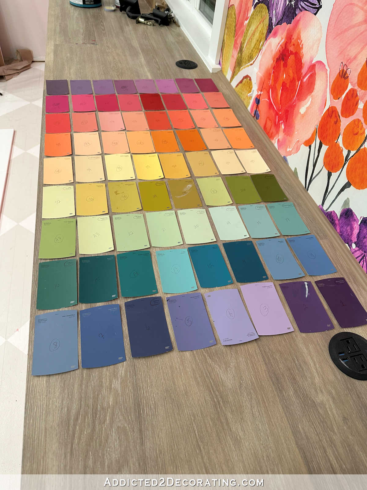
Here are the first two paint colors that I actually tested on the doors. Both are colors that I got from the 72-color paint swatch cabinet. The one on the left is called Tomorrow’s Coral, and the one on the right is called Gumdrops. Gumdrops didn’t really show up, but I thought Tomorrow’s Coral might be nice.

After trying those two on the actual doors, I decided to test out more paint colors with my photo editor. Here’s how those turned out. First up, I tried the Tomorrow’s Coral color that I thought I’d like. Umm…this gave off a real Golden Girls vibe to me. 😀 That’s not quite the look I’m going for.

So I tried a darker peach color called Peach Mimosa. That’s even more Golden Girls than the first one!

Next up, I tried my cabinet color, which is Sherwin Williams Tuberose. That was also an immediate no from me. I love the colors together in this huge room on opposite sides of the room, but I don’t like them right next to each other.

So how about a pale pink? Nope. That just doesn’t do anything for me.

After those few tries, I realized that warm colors just weren’t going to work. So I switched gears completely. I tried a darker version of the green that’s on the walls. I didn’t immediately hate it, so that was an improvement!

I tried carrying the wall color onto the doors. I didn’t hate it, but it also looked a bit bland to me.
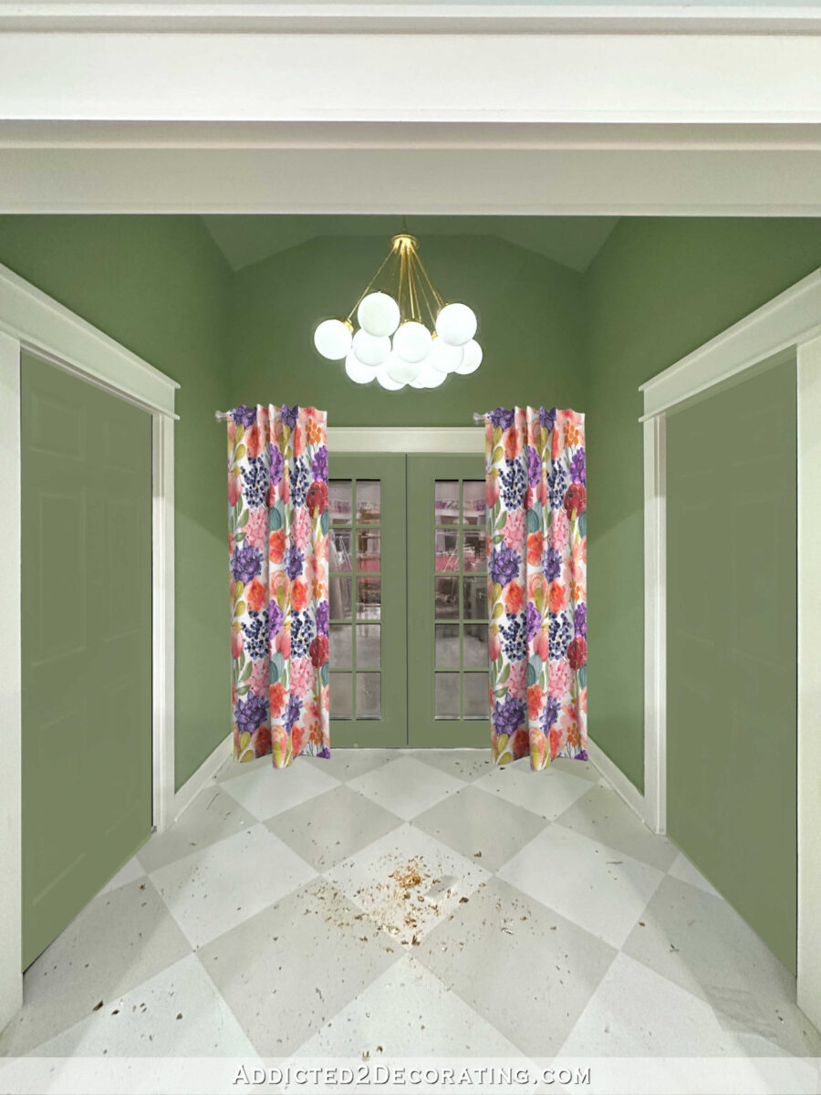
Next, I tried the gray in the floor pattern, which is also the gray on the main studio walls, which is Benjamin Moore Classic Gray. I had a hard time getting the color 100% right, but you can use your imagination. And once again, this didn’t really do anything for me.

Then I tried the white on the trim, which was also very hard to get right. That color is Behr Polar Bear. It’s fine, but it’s not anything more than just fine.

Then I tried a random super dark teal. As soon as I saw that, I thought, “Oh, wait! We might be on to something now!” I really liked the striking contrast, but I don’t think a dark teal would work so close to my black framed paint swatch cabinet and the dark charcoal gray vanity in the half bathroom.

Next up, I tried the super dark purple that’s on the buffet in the breakfast room. That color is Behr Sapphire. And once again, I liked it. I didn’t love it, but I thought I was at least heading in the right direction.

Contrary to what I had previously thought, these dark colors were really appealing to me. So the problem with the current color may not be that the doors are dark. The problem may just be that the doors are the deepest pitch black I can buy. But another dark color may work beautifully.
So I tried out a dark gray. This one is called Iron Mountain from Behr. I love it with the floor, but it seemed a bit washed out to me.

I decided to go a touch darker and try out Sherwin Williams Iron Ore. And I actually love this. Iron Ore is not black. It’s like a really dark charcoal, but there is a definite difference between this and the pitch black color I have on the doors now.
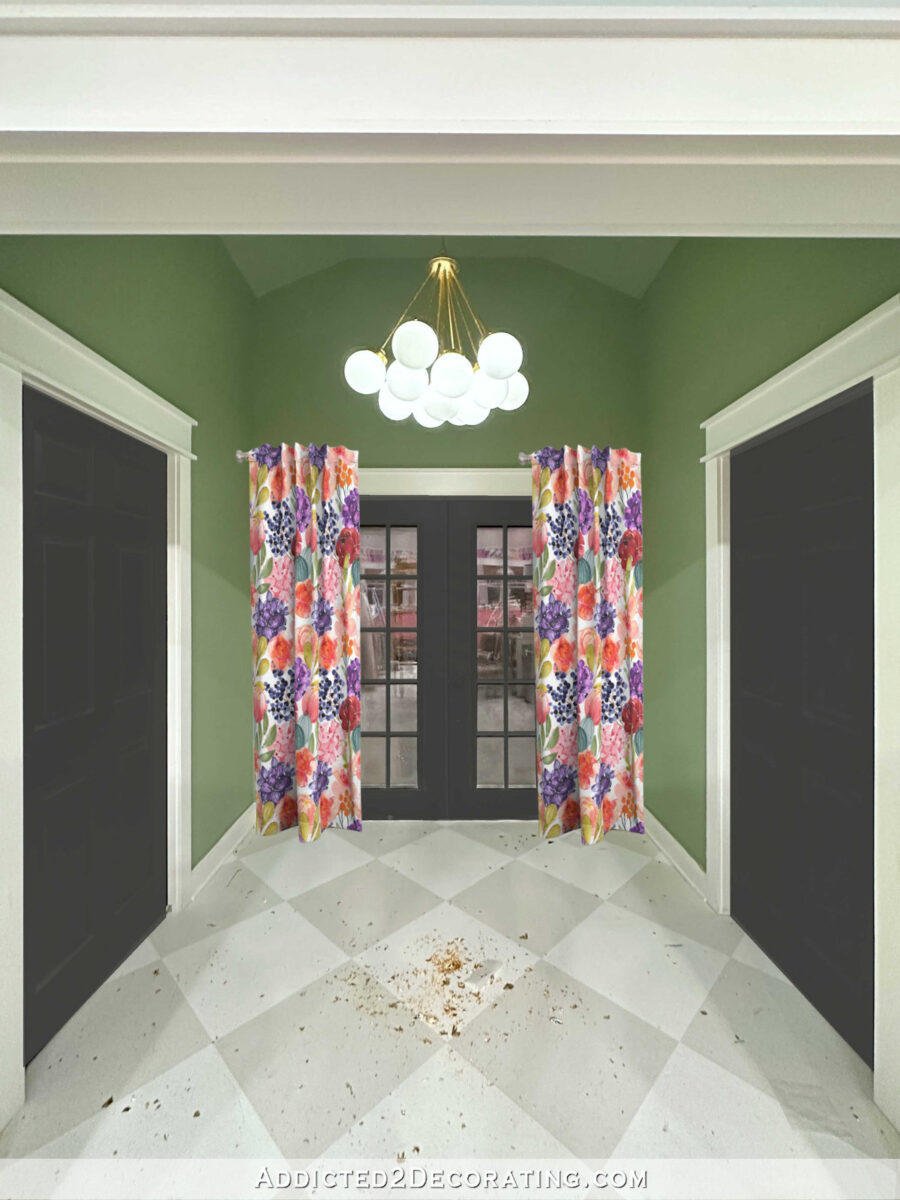
It’s amazing to me what a huge difference that slight color difference makes in the overall look. While the saturated black paint color looks harsh to me, this Iron Ore doesn’t look harsh. The less saturated color has a softness to it that I think goes beautifully with the new wall color.
So I’m going to try to stop by Sherwin Williams today and pick up a sample of Iron Ore as well as any other similar colors to try out. I think it’s funny that I kind of went full circle with these colors, and then almost ended up where I started…but not quite. Just that one little tweak makes such a huge difference in the look on edited photos. I’m hoping it’ll have that same dramatic effect on the actual doors in the actual back entry of the studio as well. Because from what I can see, the only other real option is white, and that was just kind of meh for me.


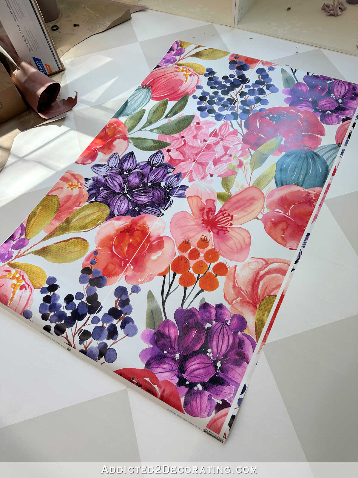

I would paint the doors and trim the same color as the wall — but in semi-gloss. Lots of designer pictures are available to see how that changes a space.
For a window treatment, I’d go with Roman shades in your fabric for an understated look that adds the privacy option. Few pics of all choices in this link.
https://paintpositive.com/blog/How%20to%20Choose%20Paint%20Colors%20for%20Your%20Interior%20Trim
I agree with Deb. Make the doors recede by painting wall color with a sheen.
I pretty much never disagree with you, and if I ever do, I certainly don’t say anything because I trust you completely, but I am loving the Sapphire. I’m actually a little disappointed by the gray.
The room looks fabulous, don’t get me wrong, but I do love that unexpected purple.
I agree with you Kristin!
the only thing you didn’t try was a lighter version of the wall color, and you could go lighter by multiple degrees….so many options.
That’s what I was thinking too, a super pale green, almost like white with a hint of the wall color.
I agree. Go super light, almost white, or even white. Paint the trim and doors a fun color that goes with the fabric (I vote for Dark purple.) Let the fabric, light, and the doors be the star of the room, and let the walls be supporting cast in this area. Right now, there are too many color elements competing. In the larger space it is amazing, and it works. In the smaller space, it is almost too busy. My eyes are going to many places to really enjoy the space.
I love your blog because you show the entire process. And I know that no matter what at the end, I will end up loving it.
My two cents. I like Behr Sapphire! It brings out the purple in the wallpaper/curtain.
I don’t care for the SW dark gray at all. Looks like a black that’s washed out. My preference is for the Sapphire. It ties the drapes in beautifully. Adds color to the area and goes very well with the new wall color.
I kind of like the way the 2 side doors recede and makes the space look more open when painted the wall color. Can the French doors be a different color to highlight them?
That was my thought! Camouflage the side doors by painting them the wall color and let the French doors shine in contrast.
Bingo!!!
Great thought girls… painting the side doors the same as the wall color to camouflage them.
My thought too. It would still work with the need for symmetry but bring focus to the fabulous curtains.
I came here to say the same, make the closet and bathroom doors recede with the same color as the wall, and make the French doors stand out with a color- I like the sapphire!
If you want the drapery fabric to be the star of the show, I think the dark green is best, for less contrast with the walls. It lets the drapes shine. Another alternative might be to make the fabric into roman shades instead of drapes — it would be a little more “tailored” but still let the fabric take center stage and relate well to the wallpaper on the cabinet wall. The entry way looks fabulous in the new green and with the light gold-leafed — it is fantastic.
I agree with Kim. I actually love the darker green doors. They are the most cohesive with both the fabric and the walls. My big problem is seeing the fabric as drapery panels – I’m not crazy about drapery on french doors. The Roman shade thought makes more sense to me. On my last house, I had a french door in a bay, with windows to the left and right. I made a simple “banner style” valance for each window and the door. They had a curved bottom and a 1-1/2 inch border of contrasting fabric.
That’s what I was thinking too. I really like the dark green and I think roman shades will be more functional. I’m not a fan of long drapes on French doors, they tend to get in the way.
That would be perfect! Making the drapes into roman shades so they don’t get tangled when opening and closing the doors.
I’m camp Dark Green as well. But I MUST add I’m cracking up at the Golden Girls reference….you NAILED it!! 🙂
I agree with you. It would make this a little box that lets the eye rest before seeing the colorful bathroom or before viewing the beautiful floral wall, if coming in from the outside.
Sheila F.
Wow Kristi the color sample photos really do tell a story. They take a lot of test painting off of your list. You’re absolutely correct about those pale colors…nary a one of them would look good. And….I forgot you have 2 other doors in that room too.
I like the direction you were going with the Behr Sapphire and the dark teal. I think your genius mode has turned onto high gear and you are going to select the perfect color and make that entryway look beautiful.
Those color sample photos are genius.
Please leave them BLACK!
I like the dark grey but would really love it without the drapes. The beautiful lines of the arch and the door will be covered by fabric. (Which I realize is probably exactly what you are going for 🙂 it’s a lovely space with the design in the floor, the arch, the doorways, and the glass. It’s quite striking! I don’t remember if you thought about wallpapering just the one french door wall? That would be absolutely 😍 stunning and eliminate the need to cover any part of your beautiful doors.
Definitely the darker colors look nice. Those first few colors remind me of the aqua & peach rooms we all used to have, but not in a purposeful vintage kind of way. After following you for awhile, I see the same color as the walls as a bore. Just my two cents but the dark green was beautiful while letting the curtains shine, then the iron ore. Oh and I do like the idea a few have shared regarding the fabric being used as roman shades on the door.
I just had another thought – could you create a cardboard or light piece of wood in the same arch shape as above the doors but slightly smaller, or even a big round medallion shape, then cover that shape in the fabric and mount it over the doors? I dunno…just my crazy brain thinking of ideas LOL
Have you considered having the trim and doors being the same color, but different sheen? I’m of the mindset if everything is important, nothing is. It’s an entryway and do you want the attn away from the curtains?
I started to suggest the gray, but I wanted to see what you came up with first. I love it, however I like the sapphire, as well!
I too wonder if the side doors and the French doors could be different colors. To me, it seems like the Iron Ore makes the side doors look like black holes. Of course, it could be just the angle in the mockup and no details on the doors, but the space is small. I know whatever you end up with, it will be fabulous and I will love it!
I’m not going to weigh in on the color, but what’s really throwing my eye off are the drapes, something about those don’t look right. Wondering if Roman shades, like a few others have mentioned or perhaps shades like what are in the studio would work. The drapes seem a little golden girls, or distracting, when the rest of the studio and BR are feminine but tailored.
The only one I liked was the dark teal. The rest all look flat and dead. What about a navy? Did you try that?
Almost fell of my chair when I read “Golden Girls vibe”! AND you were spot on with that comment. Thanks for the laugh
Love this process w the photo editing, might not be exact but what a time saver. I like the Iron Ore but the contrast with the white trim seems off to me. Could the trim in this area be the wall color and the doors be dark grey? The new green is beautiful- will you be carrying it over onto your 2 big work tables? Not sure the current green on them fits in the room anymore.
I agree with Betsy, Roman Shades would look nice on the doors! The draperies look like they might get in the way of the doors since it doesn’t look like you have a lot of room on each side.
I love the light with the change to gold!
You always make good choices on color and seeing an colors in an area in person is much different than how they appear in a photo
In the photos of the hall way and the doors, it seems like the walls are too dark, the doors should stand out more and the curtains are competing with all of it, they’re no longer the star attraction! But I’m not seeing as I would if I was there
I was previously thinking, yep, just use white, a few days ago but you’re right, it’s a no. It’s too much white in a small space with lovely green walls. I like the Iron Ore and agree that it or something similar is the way to go. Looking forward to seeing it all done and the curtains up.
After writing this comment, I was just looking back to this post regarding the bathroom wallpaper, https://www.addicted2decorating.com/new-studio-bathroom-wallpaper-plus-inspiration-can-come-from-anywhere.html
and realized that the storage closet door in the last photo of the post looks dark gray (62, 61, 66) instead of black like the French door in the photo and it looks good.
Also, I too considered Roman shades but I think the pattern is too large and beautiful for them and that maybe just not lining the drapes too heavily so they can be pushed further to the wall to open the door is a better idea.
Hi Kristi. Iron Ore is a beautiful choice. I used it on multiple interior doors, and it’s stunning. It’s not so harsh like the jet black colors but looks rich and interesting. My sister loved it so much she had all of her interior doors painted Iron Ore, and they look fantastic! It seems with all the colors in the fabric and the walls that having more of a “non-color” like Iron Ore will allow the colors to take center stage. Everything is looking beautiful so far!
Excellent ideas all around! I’m just a DIY’er and a gloss white door person but I love the gloss black. Because us reader’s can’t see what’s behind us for a 360 view to see the balance, it’s hard to decide. Another thought I had to throw out there, which isn’t a cheap option, for the closet door… they have Murphy doors that are bookshelves but it’s really a hidden door. I’m no official type of decorator but I doors seem overwhelming to me. I wonder… the darker color on the French doors and the same color (I’m not sure which) from the floor for the bathroom and the ‘bookshelf’ ?
I didn’t love any of them either, but I really liked the darker green and if those were my choices, that would be the one I’d pick. If you’re thinking gray, maybe find one that leans toward green? The first dark gray you did had a bit of that look, but it looks too brown or olivy to me. To me, grays are kind of touchy. They tend to make things look like industrial filing cabinets, so if they don’t have some “warmth” to them, that’s the feel I get. Did you try a lighter green….like maybe the lightest true green on your swatch cabinets (2nd column from the right, 5th swatch down)?
I like the dark gray, but I have SW Iron Ore on my house, and to me it looks brown. Maybe in your small entryway it won’t pull that color the way it does on the outside of my house, but mine came out very brown.
Personal opinion, anything other than white just detracts from the floral curtains. It’s just too much visual competition between the floral, the green, and the dark colored doors. Unless it’s a really spectacular door design, I don’t think doors need to be a focal point. And remember, you wanted this room to feel light bright and feminine – dark doors will take away from that. I’m currently trying to undo a few of the black accents in my house so I understand the struggle! 😀
I’m so glad you are leaning heavily toward the darker colors. The lighter ones just weren’t right. Have you thought about using the fabric for something like a Roman shade instead of the curtains? The curtains seem to overwhelm that wall.
Medium purple. Not dark. Not lavender. Color wheel says yes.
I’m shocked I didn’t like the white….at all! Even more that I liked the dark colors like the greens and hang on— the Iron Ore! Have fun choosing just the right one. And let me say, I’m so glad to see the Kelly Green gone👍👍🥰🥰
My opinion is of no real value here but please bear with me. I dislike the drapes on those beautiful doors, it just takes from their beauty. Perhaps if they began at the top of the glass to the bottom and not as much volume. That fabric is so beautiful but is already the star in the paper. Maybe even just frosting the glass I don’t know but it just seems too much. As for the door color, the darker green is my choice but in a sheen and paint the trim the same color but with a satin sheen. I know you will do what is best for you. God bless
Fundamental question: Where do you want the ‘eye’ to go? To see the whole or the individual parts? It is not a separate space. The studio is clearly part of the story. The bathroom design will tell its own tale unless you barricade the entrance at all times.
To my eye(s), I am dizzy looking at any of the color ideas you are proposing to use on three different surfaces within a very small space. Any of the proposed examples add yet another element of color interest, like a patchwork quilt. In relation to the wall: blending? contrasting? lighter? darker? A dilemma, indeed. Perhaps as a result of looking more at the trees and less at the forest?
The closet and bathroom doors don’t call for any emphasis. They would look best being the wall color using proper paint for that surface. In other words, paint them out.
The French doors? Well, they should shine. But, the more I look, the less I am drawn to any fussy way to use the fabric, such as drapes, as we usually define them. Maybe as Roman shades, or maybe as an item to delete. Coming in and out, the fabric is going to sway in the breeze. That could be quite annoying. I can see the design on the walls as wallpaper next to the door as a sweet surprise.
Happy choosing.
I’d go with the “meh” white. True, it means the doors won’t be a “design feature,” but there are some many others in the studio that I think it’s nice to have the doors become a non-entity.
The softer black and the Sapphire do look nice, but if either of those end up on the doors, I would suggest changing the frame of the “color swatch” cabinet to match (the deep black on that cabinet has that same stark look as the black doors, to my eye).
I know it will all look lovely, when you get it the way you like. Looking forward to seeing what you decide.
I commented that I liked the black. The Iron Ore is very close to black but a bit softer. I think it looks great with the green walls and the colors in the diamond floor and I know it will be perfect with the floral drapes.
I would go with the same color as the walls. When you put a sample up that was close to the wall color the room seemed sooooo much bigger and brighter.
no matter what color you pick what about gold leafing only the window pane wood?
I like the black doors, white orange, or the darker green doors. No specific reason except my taste. When you get the curtain hung, there will be plenty of color in the small area, so I wouldn’t add any other color.
Sorry, don’t know how orange got in there. My iPad has been having a bad day!
I like the Behr Sapphire myself. It is just fun & peaceful. I think the dark grey is distracting to the green wall paint & curtains & doesn’t tie in to the bathroom.
I had two thoughts. One is consider hanging the curtains in the doorway between the studio & French doors & using tie backs. Leave the French doors with no drapes & frost the windows for privacy if needed. Put art on the two walls. The other was that the bathroom door & closet door need to be trimmed out a bit to fit in with the studio & French doors. The flat no panels door are not as sumptuous as the rest of your designs which I love.
I still think a wood tone would be fabulous.
Leave them black
I love that you brought us along for the journey of experimenting with the different colors. I loved the last one you shared, followed closely by the darker green. I’m looking forward to seeing what you decide!
Adding —- A second look gave me yet another comment. The white doors will tie in to the background of the fabric, along with the floor and even the light fixture, so I would go that route, and no to drapes as they say Golden Girls to me. Come up with a different window treatment using the fabric.
I really liked the black in the photos, but I can totally imagine they might be too harsh with your vivid, floral, midtones in person…so, I’m loving the Iron Ore as it keeps the classic look in a softer way!
Another color you might consider is Cracked Pepper- Behr’s color of the year 2023!
And, for the windowless doors, might you consider adding mirrors to them to lighten the load of darkness on those opposite walls with no soft curtains to lighten them up as in the french doors? Personally, I’d be fine with the doors just in the Iron Ore, but if you still felt they needed lightening, mirrors could be an option…
Well, here’s my 2 cents, and that’s probably about what it’s worth to a professional designer. My thought was, since the space is so small, why not coordinate all the doors, meaning make the other doors glass-paneled also, and then have all the glass frosted, for privacy and to hide whatever’s happening in the bathroom and store room. I was trying to look at your 72-color cabinet, and wondered about the 4 shades of purple in the top-left hand corner, for door color. Also, when you mentioned using the fabric on the French doors, I was thinking of the style where you use tight tension rods at the top and bottom edges of the window panes, not an actual drape. I don’t know what you call that style, but I like it. Probably because it’s old fashioned – for a Golden Girl like me! I’m sure I’ll enjoy whatever you decide on, and it’s only paint. This was a cool way to experiment with the colors for sure!
Teal! Teal! Teal! Sorry, that just looked so beautiful to me. 😀
After reading your last post, I was going to suggest Iron Ore! Hope it works out, Cheers
I vote for the dark green or the dark teal…
You know you’re going to end with the teal….don’t fight it….😊😉
Just save yourself the $$ and time and accept the paint fate 🤣
Kristi, i honestly don’t like the grey at all. I love the idea of the purple but l feel it needs to be a little lighter in shade. The sapphire looks too dark almost black. Just my opinion. Go back. To your color wheel ad see whats opposite your wall color. When l’m stumped that’s what i start with.l have faith in you finding the right combo.
I follow another blogger who used Iron Ore on all her darker doors/beams etc…it looks great! Good luck and hopefully you find it’s perfect for you too.
I vote for a darkish teal would look good. It would pull the teal that you love so much through from the rest of the house and give that darker feeling you seem to be leaning toward on the doors. It also seems to me that grey on doors that you see so much of, is heading in the opposite direction of the older, more colorful you. ^_^. There’s nothing in your house like that at all.
There was a shot of your newly painted entry from the studio which had a bit of the swatch cabinet in it. That Antigua Teal on your cabinet might work.
What do you think about painting the two inside doors the wall color, and the french doors an accent color? (I vote for purple!) 😉
Correct me if I’m wrong but isn’t this where you take Matt in and out to get into the van.? (I haven’t read all the previous comments) but I’m leaning more towards what others are saying about blinds on the door for that purpose. Curtains would be a hassle, I think. As for the color, I also agree with the french doors being different then the other two doors. Good luck with your decision. I’m sure it’ll look amazing.
I’m thinking of Dorothy (Wizard of OZ – not Golden Girls). This is like the black and white room (except feminine and understated) that is about to reveal to the viewer a world of color and creativity. Knowing what’s planned for the bathroom, what waits around the corner and the full wall about to come into view, I would save my curtains for my master suite, paint all doors white, maybe add small simple pictures with gold leaf and perhaps pretty gold doorknobs and that would be all. Frost glass for privacy or perhaps find film for glass with your colors (I’d just use plain frosted). Might could add round rug with color. I’m imagining someone walking into a sedate area (no cyclones) and suddenly – WOW!! Don’t mean to sound cheesy but that’s what came to mind.
I love the second purple that was a little lighter than the sapphire! It is stunning. The charcoal just seems a little bland with all of the other beautiful colors.
I am in in agreement with the other comments about letting the side doors blend into the background and letting the back door shine with a beautiful color, such as the sapphire.
Yay! IronnOre is the color is suggested! We recently painted the exterior wood of our brick and frame ranch Iron Ore and we love it—the color takes on different tones in different light but it’s not as harsh as black. I hope you love it as much as we love ours!
I love how you were able to look at all these options! May I ask what photo editing software you use?
I use Paint Shop Pro. I purchase it on Amazon, and I buy the on that is an instant download after purchase.
I don’t remember when you quit showing up on my feed, but I found you on unroll me. Between all the ads and political crap that are showing up It makes me wonder what I am missing. I was very happy to see your posts again, I had been following you since your condo days. You are very talented and it is good to see what you have done. I have spent most of my life remodeling something. Great to see you again !