
The Freshly Painted Dining Room Walls (And My New Favorite Neutral Wall Color)
Last week, I considered several different options for the dining room walls, including different patterns (harlequin, stripes, two neutral colors, white-on-white with different sheens)…
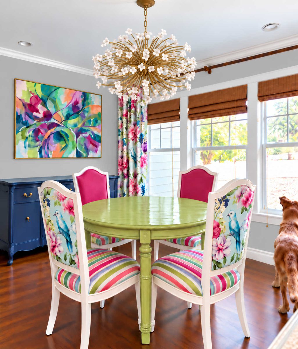
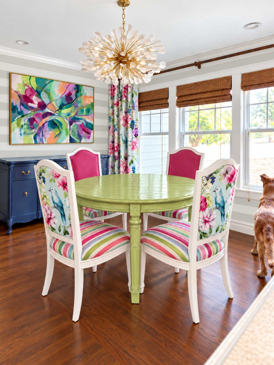
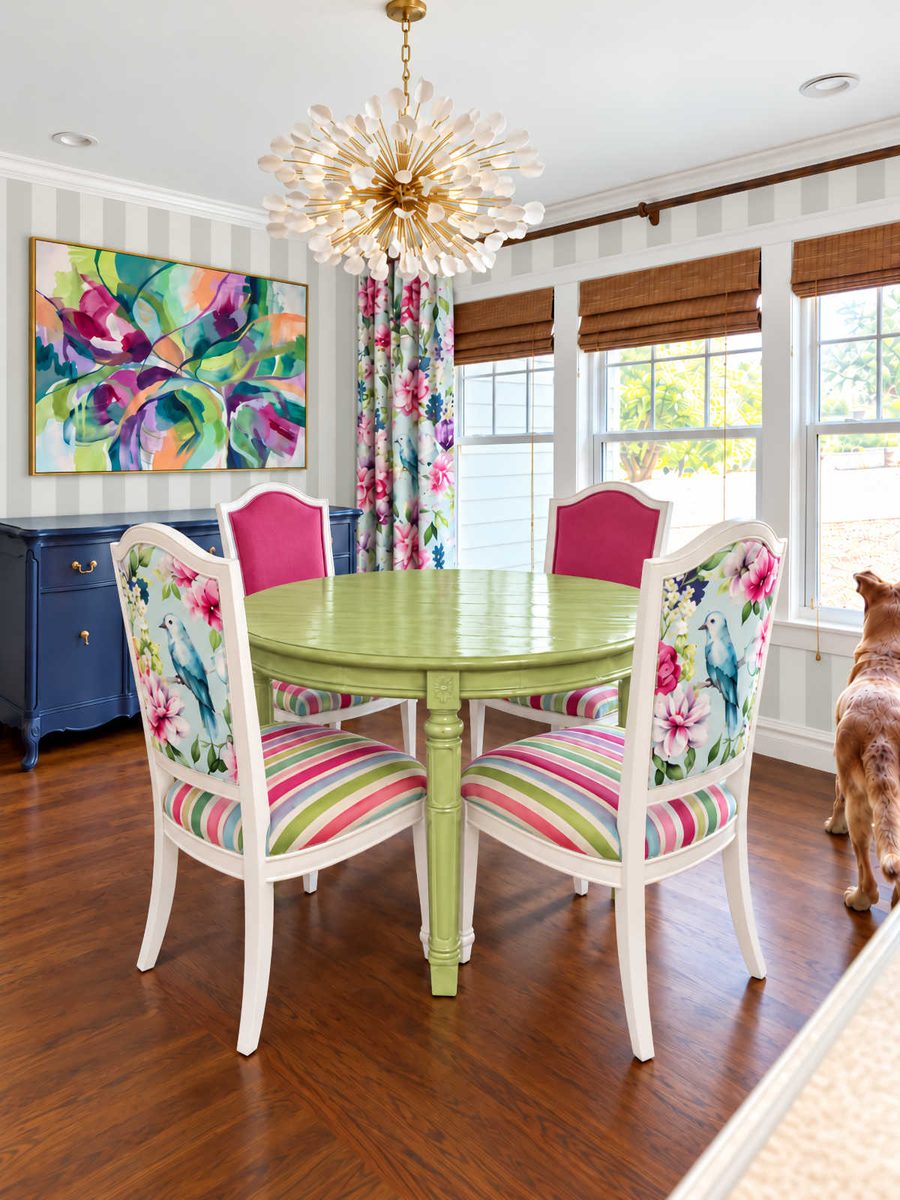
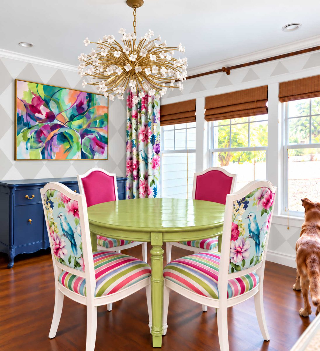
So I put it up for a vote. The vote was overwhelmingly for a solid neutral color. Initially, I wasn’t thrilled with the vote. The two neutrals I’ve used throughout our house are Behr Polar Bear (a creamy white) and Benjamin Moore Classic Gray (a really light warm gray). The dining room has been painted solid Classic Gray for years, and I really liked it with the past iterations of this room. But now that I’m trying to create a really colorful dining room, the Classic Gray just didn’t work for me anymore. Even though it looks really light and bright in the living room, it always looked darker in this room.
But if you’ve been around for a while, and you stuck with me through my failed attempt at turning the front living room into a dining room, you also know that I learned the hard way that I don’t like white walls. I like white on trim and wainscoting, but if I’m going to paint walls a solid color from the baseboards to the crown molding, I like the walls to have a contrast with the trim. It doesn’t need to be a huge contrast, though. It just has to be enough for the eye to perceive that the trim and the walls are two different colors.
So I decided to test out the idea of mixing my own paint using 50% Polar Bear and 50% Classic Gray just to see what that would look like. I had the Classic Gray mixed at Home Depot. They have the color-matched Benjamin Moore formulas in their system, so I didn’t need to take a paint swatch with me. And what I ended up with is my new absolute favorite neutral wall color.
First, let me remind you what the Classic Gray walls looked like…

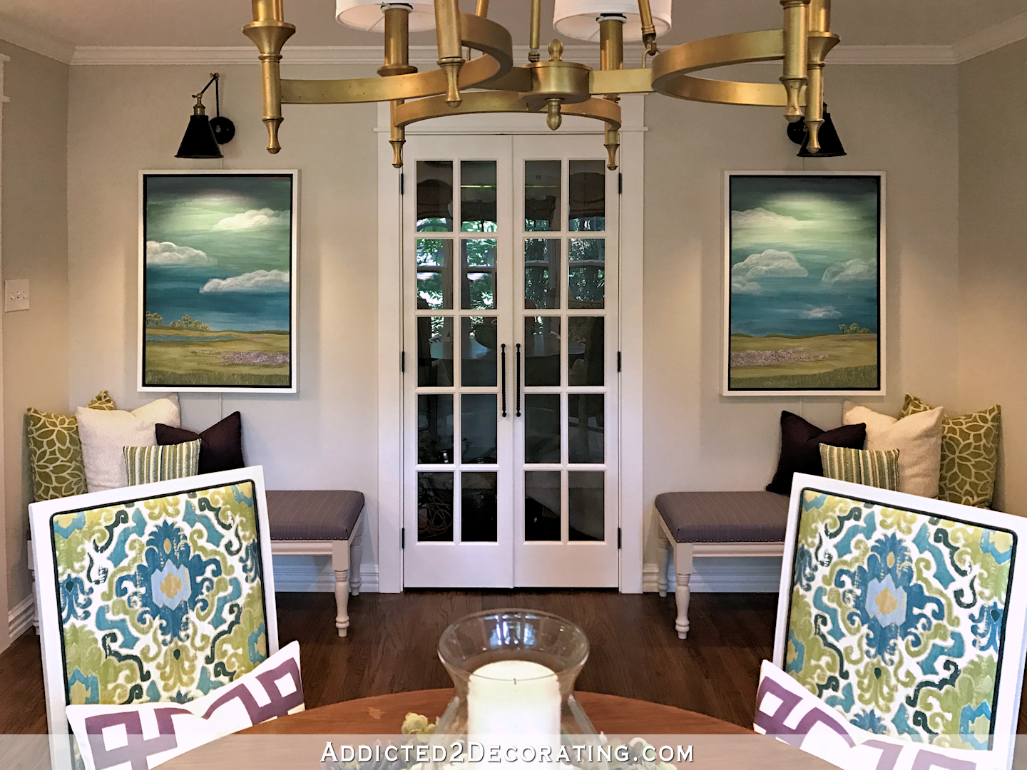
You can see that it is definitely not a dark color. It’s barely gray. And yet, with the new direction of the dining room, it looked a little too dark and muddy to me. But this new 50/50 mixture is just perfect.
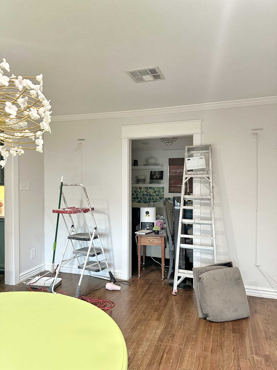
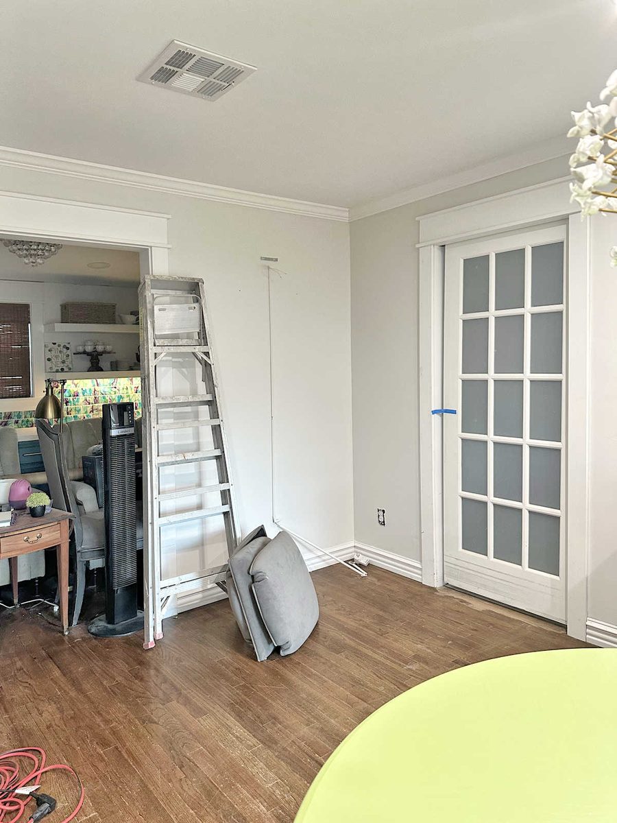
There’s just enough contrast there so that you can see a difference between the trim color and the wall color, and yet, the walls don’t look gray at all. They look light and bright and ready to serve as a background for some colorful artwork and fabrics.
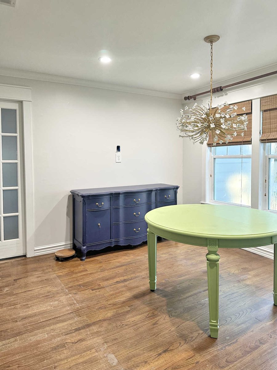
I genuinely couldn’t be more thrilled with how this looks. Initially, I felt like I was settling by choosing to go with the majority vote for a solid neutral wall color in here. But after they were painted and completely dry, I thought it was the perfect background for lots of color.
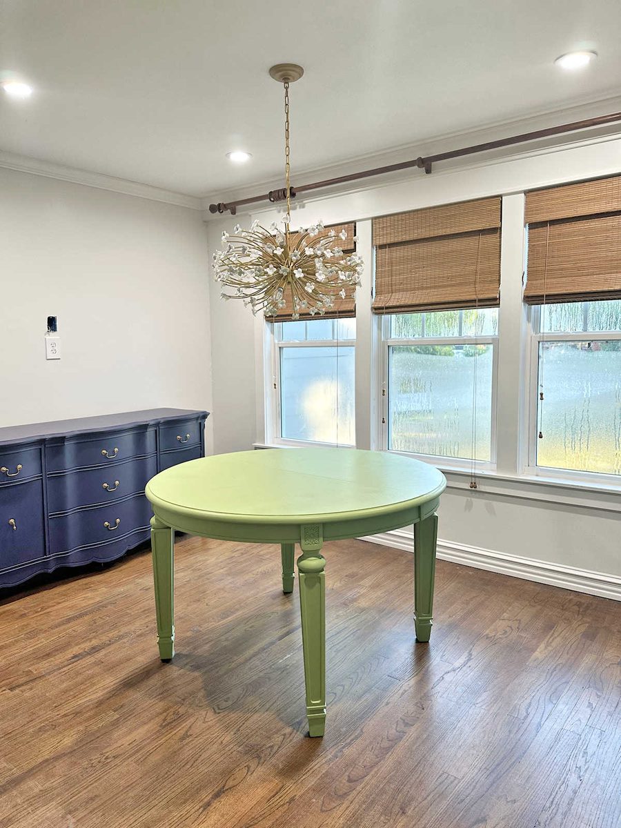
I realized that the whole reason I was leaning towards a pattern in the first place was because I don’t like solid white walls, but I also didn’t want the solid Classic Gray walls, either. The walls needed to be lighter and brighter in here, so my mind immediately went to one of the only two ways I could think of to add more brightness to the walls while sticking with my two neutral colors. And that was with a pattern that included white. The other obvious option was white wainscoting, but I already have enough wainscoting in the house, and there’s not enough wall space in this room to bother with wainscoting. Mixing my two neutrals together was the perfect solution, and it still coordinates beautifully with the other rooms.
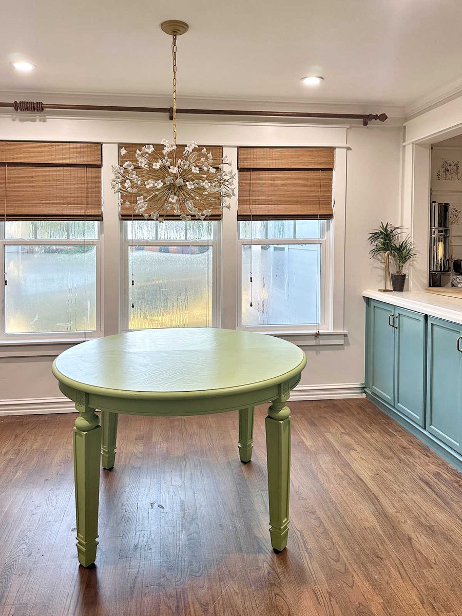
On another note, I got the rug out of the room, which was a big job because it was taped down on one edge with rug tape. I’m still struggling to get the residue off of the floor. Once that sticky residue is off, I’ll give the floors a good cleaning. But I love how this room looks without a rug! I haven’t seen this floor without a rug in years, and removing the rug immediately made the room look and feel larger.
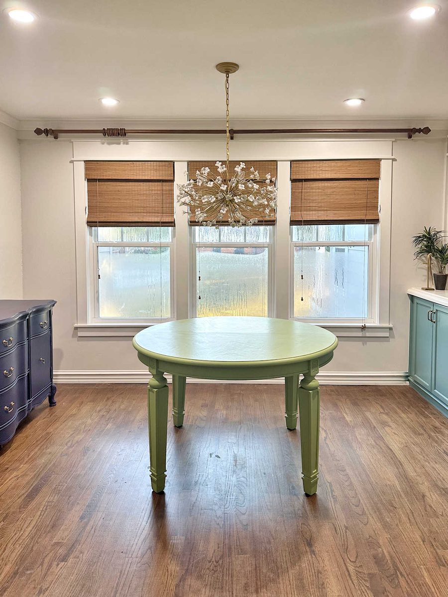
I still have a long way to go to get this room finished, and now that the walls are finished, I’m really excited to start bringing in the color.
More About Our Breakfast Room
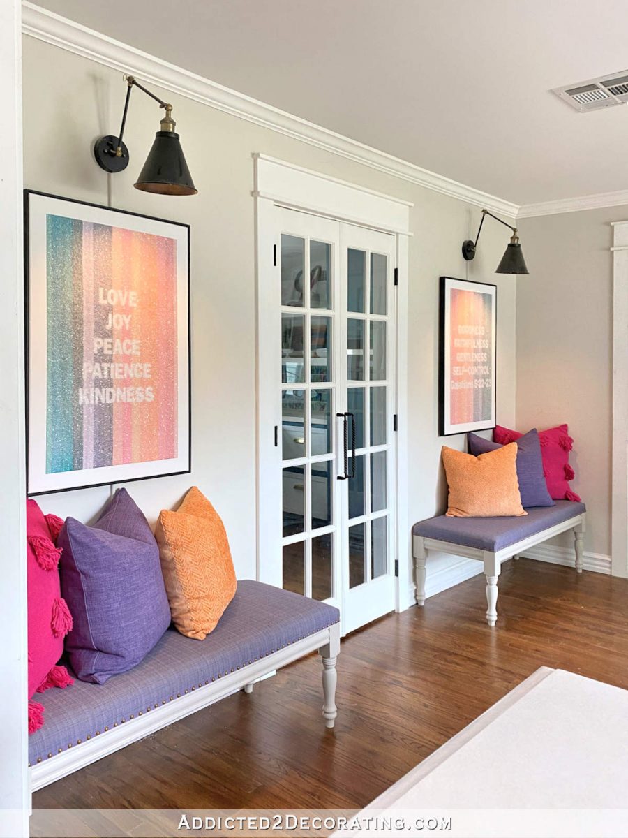
see all breakfast
room diy projects
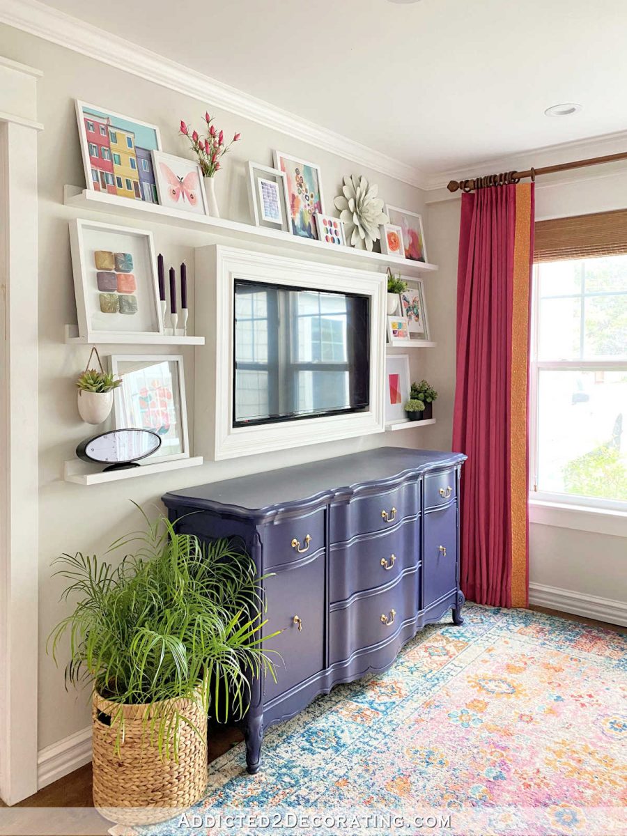
read all breakfast
room blog posts

Addicted 2 Decorating is where I share my DIY and decorating journey as I remodel and decorate the 1948 fixer upper that my husband, Matt, and I bought in 2013. Matt has M.S. and is unable to do physical work, so I do the majority of the work on the house by myself. You can learn more about me here.

That is the perfect solution. I love it!
Looks gorgeous already. I love the gray pallet, and I think it will be the perfect background for what is to come.
Cheers to you, Matt, and the Fur Help Team!
I absolutely LOVE the new wall color! It is light, bright and fresh. It’s the perfect backdrop for your drapes, upholstery and artwork. I was team Mom the minute I saw the stripes and harlequin designs in your mock ups. I am one who needs a lot of peace and calm surrounding me. I do like the beautiful floor without a rug. Will you be working on the benches next? I really liked the second choice with the sort of arched braces in the corners. Sigh.
I want to get the chairs painted and brought inside, and then I might take a break from that stuff and do the artwork for above the buffet. Then back to building the benches.
Great color on the walls! Looks so beautiful. I know you have a lot of projects going on but when do you think you will refinish your dark floors?
I’ll probably do the floors next year. In a perfect world, I’d refinish the dark floors at the same time I do the flooring throughout the new sunroom-to-TV room/guest bedroom remodel, but I doubt it’ll work out that way.
The mixed color is really pretty! Are you going to sand and restain the floors to what you have in your bedroom suite?
I will eventually be doing that, but it won’t be this year. I want to focus on finishing the dining room, the storage room, and then hopefully have some time in there for a few more outdoor projects. I’m really anxious to get some plants in the ground before winter hits, which is generally around mid-December to January for us.
Perfection, and most important – you love it!
The wall color is perfect! Will be a great backdrop for all the beautiful colors. Great solution! Blessings from NC
Its looking great! I get so frustrated with paint swatches that i end up mixing some of my own colors too. I wanted darkish blue cabinets but not navy. I chose the swatch i thought would work, started putting it on my freestanding cabinet first, oh no so much lighter than I was expecting, noo I bought behr dynasty so I’m not replacing this. Since I do art too I have paint sitting around. I grabbed some black, measured out a container of blue, added a measure of black and started to paint again, phew that worked. I love my cabinets now and told my hubby I would have hated living with that lighter version every day.
Oh, very nice soft gray and perfect background color. We can call it Kristi-gray. It will be stunning with all the patterns and colors that are coming in, and it is a very eye pleasing color, yet still shows lovely with the white trim. And thank you mom…fabulous eye for things. Getting excited to see what comes next!
Great wall color; it will be the perfect foil for all the bright colors you will add. Still getting a thrill from seeing the flower chandelier!
As I recall you had the room set up so Matt could enjoy sitting up to eat in the recliner and watch TV in the breakfast/dining room. Will he be able to roll his wheelchair up to the table once it’s finished?
I’m glad you’re happy with the solid wall color. It’ll showcase your art work while remaining in the background. Looking forward to more progress.
You got a winner! The solid wall is restful. Your floors are beautiful. What are they made of? Is that the red oak real wood? Please let me know because we want to redo our floors.
The table appears too yellow once you have it inside, but perhaps with the drapes and chairs with it, it will look greenish again.
Have a good week. How is Matt doing? How is the sunroom coming along or have you not started that project yet?
I like the color but maybe it’s because it reminds me of my great room walls. I wanted to keep a neutral backdrop for my art, rugs and fabrics so I mixed 3 Benjamin Moore colors I’d sampled, one too dark a beige, one too gray, and one too light. The guys at the store asked me what to call it so now it’s Goldilocks because it’s just right.
Are you going to be stripping and refinishing these floors in the lighter tone?
I love the color! Love your eye and ability to figure out how to mix to get the color you want.
I happened upon your dining area finished photo and found you here to follow the process thank you for sharing so much. I have a very white, blank dining area that I am wanting to bring my personality into…..color and zippy? May I ask where you found the art piece?
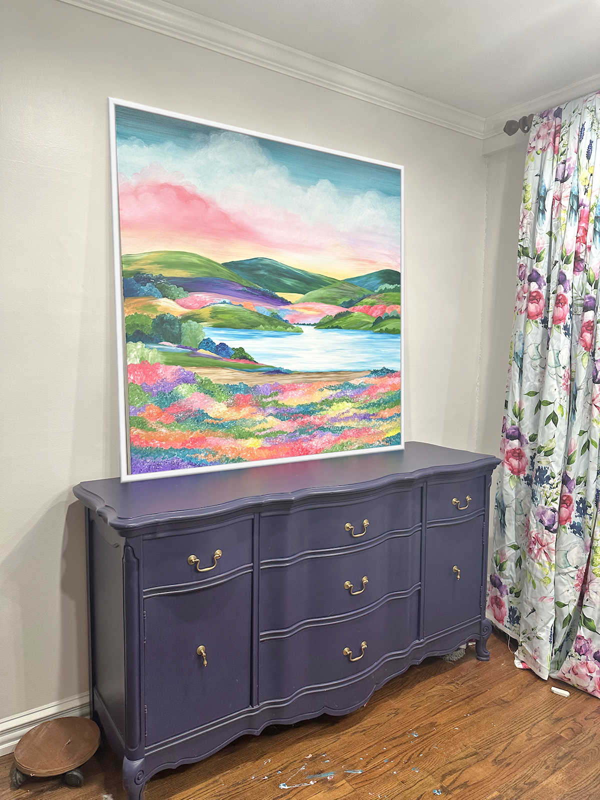
That art is AI. I should have stated that. I sometimes take for granted that my followers have been following the process from the beginning are aware that those photos are AI creations that I’ve done to test out different ideas before actually implementing the ideas in the room. I will be doing a large art piece to go over the buffet, but I’m leaning towards a huge landscape instead of an abstract.
Love the wall color and the bare wood floor!