
Options For My Statement Piece Artwork In The Dining Room (Abstract Or Landscape?)
I’m still working on getting my dining room chairs sanded, primed, and painted. But when I stopped working last night and came inside, I sat down at my desk and started going through all of the artwork ideas that I’ve saved on Instagram over the years. I have a folder with so many ideas and so much inspiration, so narrowing it down to the one idea I actually want to use (not only for the main art piece, but also for the two pieces that will flank the pantry doorway) is a challenge. I want to make/paint/create all of them!
Obviously, the piece above the buffet will be a big focal point in the room, so I want to get it right on the first try. Until now, I’ve been working with the idea of a really colorful abstract painting, but I can’t decide if I want to stick with that idea of an abstract or if I want to go with a landscape.
I love the idea of both, but the reason I’m thinking a landscape might be the better way to go is because I know for sure that the artwork that I’ll make to flank the pantry doorway will be abstract and textural. So I like the idea of having a mix of artwork in the room — a colorful landscape above the buffet and two textural abstract pieces flanking the pantry doorway.
But the biggest determining factor will be which one I can actually pull off myself. A landscape is more intimidating to me because I’m not exactly an artist and when you set out to paint a landscape, it actually has to look like something. 😀 There’s a lot more flexibility with an abstract painting.
So here’s the abstract I’ve been working with over the last couple of weeks. This one is the one a reader sent me, so I believe this painting is an AI creation. (I’ve had lots of people ask me where they can purchase it, but I don’t think it’s an actual painting that can be purchased.)
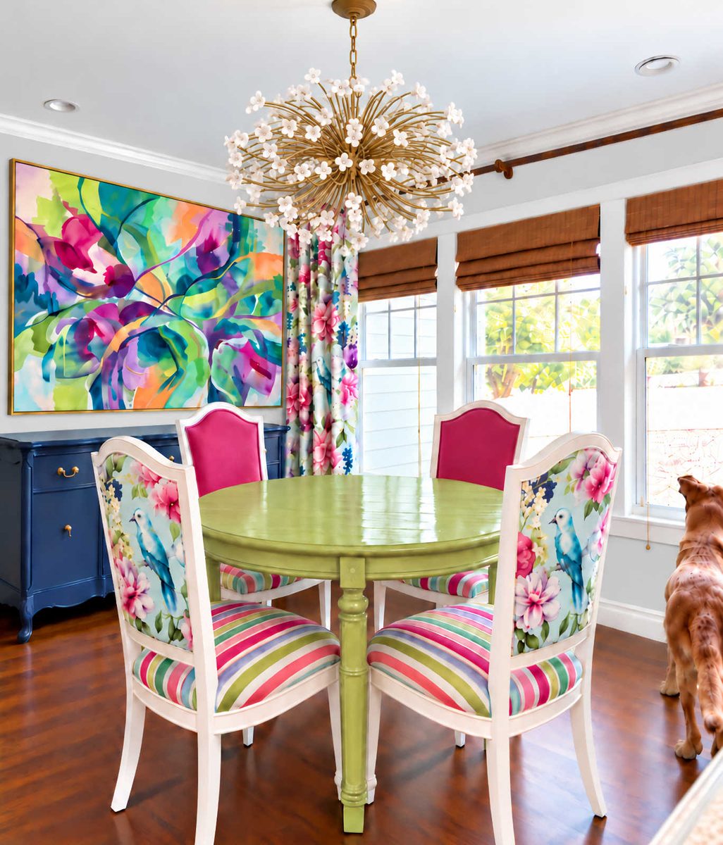
I had ChatGPT lighten the wall color to more closely match my actual wall color, but it’s still not light enough. I also had it enlarge the painting. It obviously made it too big, but we’ll go with it for now since we’re just trying out general ideas. The actual artwork will be a bit smaller and won’t be that close to the draperies.
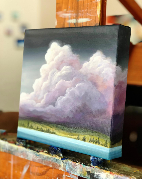
To try the landscape idea, I gave ChatGPT two images from one of my favorite artists — Mya Bessette, who I follow on Instagram. This is the first one I chose.
The second one I uploaded was the landscape by Mya that I ordered from Minted (affiliate link) and used in our bedroom.
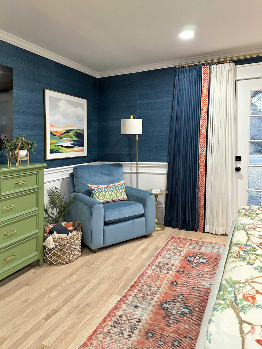
Side note: If you like colorful landscapes, you should follow Mya on Instagram. She sells little original art pieces that are actually quite reasonable in price if you don’t have the budget for one of her larger original pieces. She also sells prints of her original artwork, like the print I used in our bedroom.
So after uploading both of those, I gave it the instructions to create a landscape inspired by those — colorful, large, somewhat abstract but still obviously a landscape, and using colors that coordinate with the room. This is what it gave me…
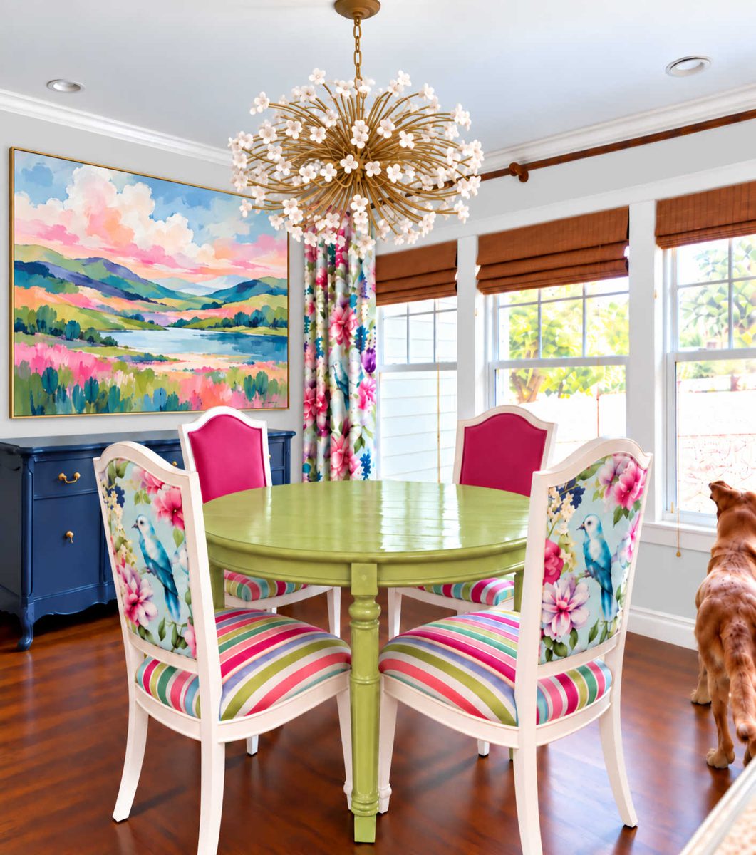
It’s probably not quite what I would actually do. I think it’s a little on the nose as far as matching the colors of the room. I want it to complement the room, but I don’t think it needs to be quite so matchy-matchy. But overall, I do love the general idea of a large, colorful landscape. And I really love seeing the inspiration of how to incorporate the colors I want into a landscape.
So right now, I’m really leaning towards a landscape instead of the abstract. But as usual, feel free to share your thoughts. And again, keep in mind that the artwork flanking the pantry door will be textural and abstract. I’m still narrowing down exactly what I want on those walls, but I have my mind set on textural and abstract.
Again, I’m not quite sure if I can pull this off myself. I’m pretty artistic, and I can pull off the abstract stuff myself. But for an actual landscape, I might have to draft the help of my resident artist (my mom, obviously) to coach me along. But I really want to paint this myself, so she’ll have to be a hands-off teacher and coach. 😀
More About Our Breakfast Room
see all breakfast
room diy projects
read all breakfast
room blog posts

Addicted 2 Decorating is where I share my DIY and decorating journey as I remodel and decorate the 1948 fixer upper that my husband, Matt, and I bought in 2013. Matt has M.S. and is unable to do physical work, so I do the majority of the work on the house by myself. You can learn more about me here.
Team landscape for sure. I think the solid color of the sky is grounding in a room full of patterns, and it serves as a much better focal point for the room than an abstract piece.
At first I was sorry you would not be using that abstract…something about that I really liked as soon as I saw it. But that landscape is really beautiful too. Just does seem a little TOO matchy. I bet your mom could help you get to something like that, in a less matchy way, and featuring some of your favorite colors in this space. I have confidence you could do it and be very proud to see it on the wall.
I think you should make a landscape painting. You got this!
The landscape literally made me say “ooooohhh” out loud. It’ll be perfect with your color adjustments!
Check out Rachel Lozeau. She’s an Oregon artist who does beautiful abstracted landscapes. Hers tend to not be as colorful because she paints the very green Pacific Northwest but there are a few in pinks. It could give you inspiration for painting abstract landscapes (she also does custom work if you want to splurge).
http://www.rachellozeau.com
Oooohhhh – those ARE gorgeous!
Her work is beautiful! Thanks for sharing the link.
Loved the most unusual, colorful landscape- absolutely stunning!
Love the landscape idea !
At first I was thinking abstract. Mainly because you have a landscape through your lovely window. But, I love the softness that the landscape brings into the room. I agree that the colors are too matchy. But, I am sure you will create a lovely painting that will harmonize beautifully.
Sheila F.
In my humble opinion, I think abstract would cause take away from the chair fabric, curtains. The first landscape picture is so soothing to look at and the birds would go perfectly with it!
I guess I’m the fly in the ointment! I’m all about the abstract, just not quite so big. Probably has to do with why I love low water immersion dyeing. You never know what abstract pattern is going to come out of the pot.
I can see a landscape but not the matchy-match one. You have the drapes with the birds and foliage. This painting needs to be different.
I realize that you are a die-hard DIYer but free is good too! Have your Mom do the large picture and you do the textural abstract paintings. Your Mom is not going to be around forever and you would have that painting as long as you live to see everyday and remind you of the wonderful woman she is.
I love this! A sweet gift from Mom. I miss mine very much and I have one large spoon in my drawer that I use cooking every day that reminds me of her.
Definitely the landscape. It’s a little softer to the eye. Good luck, you can do it!
You’ve got this. When in doubt, add a “Happy Little Tree”, and you’ll know that you are on the right track. I thought I would like the abstract better, but that landscape, even with the matchy-matchy colors, looks amazing. Can’t wait to see it all come together.
Cheers to you, Matt, and the Fur Artistic Team!!!
I really like the first landscape with the lavender clouds and think it would be beautiful if enlarged to the right size. I like that the larger area of the clouds and the narrow linear green and blue along the bottom are a different scale than the drapery fabric print. I also like that the colors aren’t exactly the same as in the fabric. I would suggest anyone looking for suggestions for the type or size of artwork to use in a dining room look at keckfurniture.com then click on blog, then scroll down to Dining Room Wall Decor:Scale Rules for Art Over a Buffet or Sideboard.
Landscape all the way!
My grandma was the artist in our family. She painted incredible landscapes of the American west Unfortunately, she is now dying of dementia. All of her talent and wisdom will be lost because no one in the family picked up her skills. I am now wishing I had taken the time to learn from her, even just a little bit. I think learning to paint a landscape with your mom as your tutor will be at least a wonderful bonding experience if not producing a successful piece of art for your wall. I hope this isn’t too more morose, but I’ve just been wishing I had taken advantage of my grandma‘s talents when I still could.
If you’re doing abstract on the sides of the pantry door, perhaps a landscape that is a bit softer, or more along a watercolor? I prefer the one with the large cloud so that’s probably why I’m leaning toward a sort of water color.
I think a landscape would be great. But being real, I think the odds that your first attempt at a landscape would merit such a visible placement are vanishingly low.
I really like the landscape and agree that maybe a little less matchy would be better. I know you can pull it off, you’ve got the talent.
I can’t pick – both are beautiful! What comes to mind is you could do something kinda in between with alcohol inks- similar to the tiles in the pantry but with a bit more direction… 🙂
Been following since almost the beginning of the journey and I don’t usually comment, but today that changes. I like the landscape idea but agree it is too matchy matchy. I like the gray sky of the bedroom landscape and wonder how this bright landscape would look with a bit more gray in the sky. Since you are creating it yourself you could add a small amount of your new gray to each color, it would tone down the matchiness and potentially still give you a colorful landscape.
Yes I love the idea of the landscape. Especially with the natural elements in your fabric and the flowers in your chandelier. It’s not matchy but complimentary. Kind of like in your master bath where you used butterflies, it gives the idea they flew out of the wallpaper. I’m probably making no sense but hopefully you get it 😄 And you aren’t just artistic Kristi you are truly a gifted artist. You got this! Blessings from NC
Sorry not wallpaper, the mural. Oops
I like the abstract more. It seems more finite. The landscape makes me think that color has jumped ship from the drapes and made its own painting. 🙂
The landscape colors are my favorite ♥️ Very peaceful and calming.