Revised House Goals For 2015
I have 77 days left in this year, and I plan to be laser-focused and get as much done during as many of those days as possible. Last night, I gave some thought to exactly what I want to accomplish during the last 2 1/2 months of this year, and I really tried to be reasonable. I generally set ridiculously unattainable goals, knowing full well that I can’t do it all. But this time, I tried to be reasonable, and actually (hopefully) set a list of goals that are doable in the amount of time that remains. Of course, I tried to factor in some downtime, and then there’s Thanksgiving. So with that in mind, here are my new, revised house goals for the remainder of 2015:
1. Get new windows installed in the dining room. My windows actually came in on Monday, but I’m waiting on the installer to have time in his schedule. He said he can probably install them next Thursday or Friday. I’ll be so glad to have new, matching, functional windows. And best of all…no more window unit A/C!
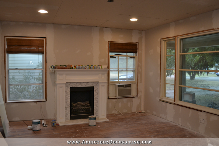
2. Finish drywall and install the rest of the picture frame moulding, window casings, and crown moulding in the dining room and music room. I got about 2.5 walls done in the dining room/entryway, but I’m at a standstill in there until the windows are installed. I’m currently working on the drywall in the music room, and am almost done with mudding and sanding the walls.
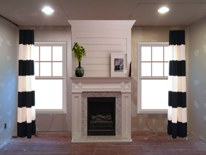
3. Build overmantel in the dining room. I almost started this project this past Monday, and then realized that I probably needed to wait until the new windows are installed so that I can get the fireplace perfectly centered. Right now, the two windows are slightly different widths, so if I build it based on the current windows, it might be slightly off center when the new windows are installed. But here’s the mock-up I did a few days ago, and I get so excited every time I look at it!
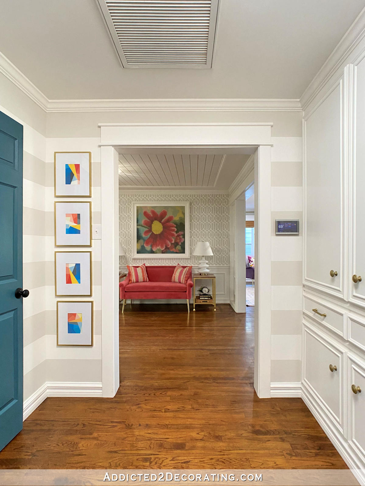
4. Choose a wall color and paint the walls, ceilings, and trim in the dining room and music room. I still haven’t settled on a definite wall color. Unfortunately, in the mid-morning light, Agreeable Gray has very noticeable lavender undertones in this room, and that is not okay with me. (Purples are my absolute least favorite colors.) So now I’m looking at two other colors. I’ve become a tiny bit obsessed with super light, barely-there colors, and I love this barely-there green on the left called Climate Change by Behr. It has such a light and fresh feel to it, and complements everything in the room beautifully. Or if I want to go strictly neutral, I’m considering Spun Wool by Behr on the right. (That’s Agreeable Gray right underneath Spun Wool, and that vertical white strip to the right of those two colors is Polar Bear, which is my trim color).

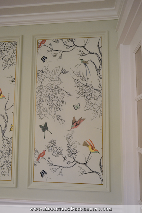
5. Draw/paint “wallpaper” in the music room. I’m so stinkin’ excited about this project, and it’s taking all of my self-control not to rush ahead and start doodling on my walls. But I need ALL of the drywall completely finished in both rooms before I start working on this. I’d hate myself if I rushed ahead, and then had to clean drywall mud dust off of my newly “wallpapered” walls.
6. Install dining room chandelier. I’ve had my chandelier sitting in the corner of my breakfast room for months now, and I’m so anxious to finally get it installed!!
7. Give the floors in both rooms a final quick sanding, and recoat with Waterlox. The ability to sand and recoat is the main reason I chose to finish my floors with Waterlox. I knew they would get scratched and dinged as I remodeled each room, and I needed something that could be repaired easily. You can’t do that with polyurethaned floors.
8. Paint dining table. It’s going to be solid black, and it’s already sanded and ready to go. This should be quick and easy.
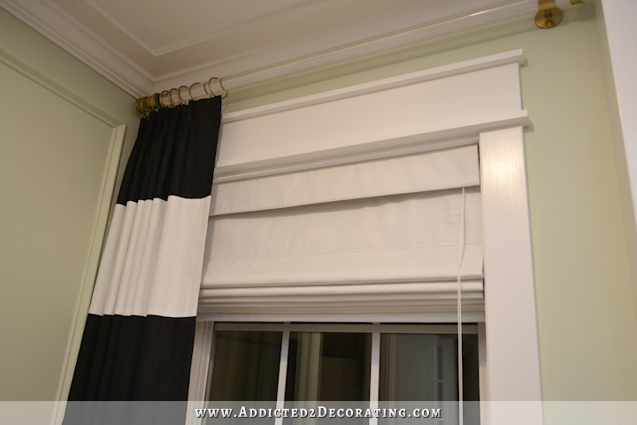
9. Make and install black and white striped draperies in the dining room. This is another project I’m very anxious to start. These draperies will set the tone for this whole room.
10. Repair hardwood floor by the expanded opening into hallway. This should be my last hardwood floor repair that I’ll need to do, and it’s much less involved than the one I had to do in the new dining room/kitchen doorway. It just needs about three small strips on the right side of that expanded opening.
11. Install casings on doorways in music room, and reinstall sliding doors.
Those are my definite goals, and I really do think 77 days is a reasonable amount of time to get that stuff done. But because I’m me, and I like to push it, I also hope to get a few more fun things done, mostly in my entryway. After agonizing over how exactly I wanted my entryway to look, and reading all of your comments and considering all of your suggestions, I finally made my decision. I did this cut-and-paste hack job of a mock up to try to convey my plans. I hesitate to even show you, because as I said, this is just a quick mock up, and I wish instead that I could show you the vision in my head rather than this terrible representation, but this will have to do.
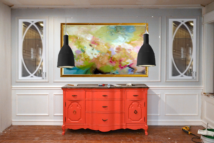
Many of you suggested sconces, but I’m just not a fan of the idea. What I do love is the idea of pendant lights since they can be “layered” over the artwork like table lamps, but they’re not confined to the width of the buffet. Sconces would take up wall space and dictate the size of the artwork. And yes, I realize those pendants pictured above are totally out of scale. Those are monstrous. 😀 As I said, I hesitated to show you this because it’s such a poor representation of what’s actually in my head. I won’t have giant pendant lights. I promise. 🙂
I did really take to heart the many suggestions of having a mirror (or mirrors) on this wall. And since I didn’t want to give up my huge colorful painting, I decided to combine the two. The mirrors will be very subtle, painted the wall color so they just blend right in, but they’ll kind of echo the design on my sliding doors.
So, if time remains after all of my other projects, I hope to also:
12. Paint a large piece of artwork for the entryway wall and make a frame for it.
13. Make and install two decorative mirrors.
14. Make and install two pendant lights over the buffet. I already have a design in mind for these. I’m missing a crucial part, though, so hopefully I can find those
I also plan to have two chairs flanking the buffet, but if I’m being realistic, I can say with almost 100% assurance that I won’t have time to get to those this year.
So I guess I better get busy, right? 🙂 No time to waste!

Addicted 2 Decorating is where I share my DIY and decorating journey as I remodel and decorate the 1948 fixer upper that my husband, Matt, and I bought in 2013. Matt has M.S. and is unable to do physical work, so I do the majority of the work on the house by myself. You can learn more about me here.
It sounds reasonable in Kristi terms – I would feel completely overwhelmed with this list for 77 days!! I like the idea of the decoration in the entryway, even though you are right. that photoshopped picture needs a lot of imagination 🙂 Have a great weekend with – hopefully – not too much work!
We renovated a newly purchased home last year and I was on a quest for the perfect light gray. After spending a small fortune on samples I discovered Polished Gray by Glidden. It has no blue or purple undertones. The perfect light gray imho.
I like the idea of pendant lights but I would put them in front of the mirrors and maybe a table lamp or two on the buffet.
I love all that you do and have done. I am very excited and anxious to see the finished rooms. My two cents are that the bones of your house should be done before you started putting any lipstick on it…I KNOW it’s your house and your choice. It just makes sense to me that the electric, plumbing, drywall, moldings, windows, etc. (the so-NOT fun stuff) should be out of the way before the beauty starts. I think your style is impeccable and I wish I had a 1/4 of your talent and drive.
That’s an exciting list, can’t wait to see the progress. Best of luck and…
I hope you are allowing for time off with the holidays in your work schedule! Don’t forget to relax from time to time (no holiday required as an excuse to do that). When you work for yourself, if YOU don’t give yourself a break no one will do it for you!
You are a go-getter! Those are some good goals and I’m sure we will all enjoy the ride along. I like your entryway ideas; those mirrors are pretty slick!
Exciting. Can’t wait to see the finished rooms. May I suggest two other colors for your dining room? Benjamin Moore November Rain which is a very pale greenish color with blue.gray undertones. It goes well with a lot of different colors or Benjamin Moore Revere Pewter which is a very light gray that looks grey with white trim.
I really like that November rain one as well. I’ve always been fond of the barely there colors on walls.
You may not have met your original goals, but you’ve accomplished an incredible amount with beautiful results!
Are you going to tape and mud your ceiling, or do something else?
Kristi,
I don’t know if you intend to use the golf frame or not but that sort of stands out to me as not really fitting. Perhaps a black frame or stained wood frame or if you want metallic what about a burnished silverleaf. However, that could all change with the lamps you have in your mind so please don’t think I’m criticizing your vision at all. I do allow there is room for your vision to pull this all together in a way I can’t visualize. I’m excited for you.
Pendants! What a great idea… I would have never thought of that but completely agree the layering will be really cool!
Wow, this “reasonable” list has me tired. You go girl! I wish I had a fraction of your energy and ambition!
I love Benjamin Moore’s “eider white” for a wall color in a room with a lot of white trim. I also like Valspar’s “Oatlands subtle taupe” for a wall color in a room with a lot if white trim.
I hope the mirrors are really what you want. I think it looks beautiful, but I know a few times in the past people told you to do one thing, and you went with it because it sounded okay, but then it wasnt really what your heart wants. I hope that we arent pushing you again and that your entry way is everything you dream it will be.
Excited. That’s all. Just excited! The FUN stuff is about to begin! (Although doing the trim, mudding, and other hard stuff is where I find myself learning/challenged the most)
Like everyone has said – the timetable seems reasonable for you. I really love how your mind works. When you finally have it all figured out – when you can see a picture of the finished space in your mind, you laser-focus it all in and it just seems to come together. It will be beautiful when done and I for one cannot wait to see it.
I got tired just reading that to do list. You are truly a machine. I can’t wait to read all about these projects. Cheers
I’ve been following your blog / decor for a few weeks now, very able DIY’er.
I just wanted to say
“In my opinion the black striped curtains dominate the fireplace tooooo much!
I think in this mock up the curtains seem overpowering. But when she layers the table and the chairs, rugs etc. It will all come together and the curtains will be a backdrop. I can’t wait to see it all done!
That’s still quite a to-do list! The Spun Wool is showing pink undertones on my computer screen. Climate Change is nice, but love the one under Climate Change! Of course, all based on how my screen interprets them lol. I really like your quick rendering for the foyer and the use of pendant lights – what fun!
I like everything except the pendant lights. That just seems like a kitchen island or peninsula thing. I would just use lamps on the console.
whew I am tired just reading all you want to get done! Please allow time to rest and maybe finish your nieces room (that will make a great holiday gift for her). I am completely against the pendant lights just feel they are not right for that area but what do I know I’m not a decorator LOL. I am sure whatever you do will be as usual ~~beautiful 🙂
You can do it, Kristin! I haven’t yet come across any other blogger who is as determined as you are. You are the homeowner I wish I was.
I realize that it’s just a quick mock-up but I think that the scale of the artwork is a little large. To me it should be smaller than the buffet.
Sorry….. Kristie!
Darn auto correct!
Don’t forget……..install overhead light in music room.
Kristi, I love your fireplace wall! The black and white drapes set it off so beautifully.
You inspire me everytime I read your blog. Thanks!!!
I would love to come spend a week with you and learn from you! #1 thing I would want to learn is how you get the molding to look perfect! I am scared to death of mitered corners! I have amazing tools…and I feel like I could do so much more with them!
Don’t forget to put dimmer switches on your pendant lights.
Wow, that’s a big list Kristi, but you are focused and determined and such a hard worker and I can’t wait to see all your progress and vision coming together. It’s going to look so stunning.
I have BM Revere Pewter on my walls. It is a very taupe-ish fresh gray color and looks fantastic with my white trim and black doors.
I like your entry mock up. I can see the vision, and LOVE the mirrors on either side.
Nice list, bet you get it done. I have two comments. I know this is a rough mock up but I would not make the painting including the frame wider than your buffet-same width is fine but not larger. And, pendants of any size, shape, or color are just wrong for there.
That spun wool looks nice. I think you should go that direction instead of green for more flexibility on future design choices. To the few that mentioned the black and white stripes are too much, I disagree. Once the room is complete with the black table, I think it will look great. I love the black, white, taupe color pallet because it’s so versatile.
The hanging pendants are brilliant!
You always motivate me to get stuff done on my house. I spent this past labor day painting my huge master bedroom. Cleaning and rearranging the furniture and mounting the TV on the wall. Just a few more things to do and the room will be done!! Thank you.
You are absolutely right. Those pendants are hideous. I simply cannot understand the reasoning behind two pendant lights in the entry way. One nice light would be more than enough. Your penchant for “different” from everyone else is once again showing and I worry that you will get through it, or half way through it and decide you don’t like it. You should really try to give it some thought before you move ahead with something else that you will have to trash. The mirrors look nice, but I don’t really see the need for the decorative wood on them. Once again, I think this about being different. I also still feel that there is something wrong with the overmantle. I don’t know what it is, maybe the crown molding at the top is too big, I don’t know but it looks out of scale. I am just trying to play devils advocate here. Blessings.
You might be trying to play devil’s advocate but it just comes across as rude, and adding “blessings” at the end doesn’t change that. She didn’t say the pendants are hideous, she said they’re montrous, in reference to the *scale*, not the appearance. Kristi is honest enough to tell us when she changes her mind and admit her mistakes, but they’re rarely from rushing or not giving something enough thought.
Also, Kristi has said before that her mock-ups/photoshop skills aren’t the best, so it makes sense that the scale of the overmantel in reality will fit much better than it looks in the mock-up. Same with the pendants–they probably wouldn’t be my personal choice, but I have no doubt that Kristi will either make them look awesome or modify the plan so that they work. And the mirror detail work is to tie in the sliding doors in the music room which makes sense.
I agree Linda….
I really LOVE that the mirrors resemble the design on the sliding doors in the music room!!!!! The mirrors also balance out a strong colorful picture. And I definitely like the idea of pendant lights! The black will anchor the table and curtain color to the other side of the room. You GO, Kristi!!!
My sister used Agreeable Gray in her home and it is a beautiful color. It does not read purple at all. Also look at SW Amazing Gray and the color above it on the paint card. I think if the entire room were painted Agreeable Gray, you would be happy. I painted my bedroom a steely blue gray. When I cut in, it looked periwinkle and I thought for sure I was going to hate it. I debated changing colors but forged ahead. Once the entire room was painted it didn’t read purple at all and it’s my favorite paint color in my home.
Kirsti, that sounds like a good list, yes get the dirty work completed in all areas. Then you can settle down to the pretty areas. This is going to be a beautiful home. Love the mirrors that echo your doors. Go with your gut feeling and all will work out. xxx
“Some people say you are going the wrong way, when it’s simply a way of your own.”
– Angelina Jolie
Take a look at Wicker by Valspar at Lowes. It (like so many other colors) is amazing. Or vanilla brandy….love it, obsessed.
So love your boundless energy and enthusiasm. Looks wonderful and the finished product will be more wonderful. Cannot wait to see it all!
I think what I love about your blob is the ability to do something YOU love and think will work and if it does you adore it and if it doesn’t you change it. We should all be so flexible.
Love all you do. I was looking at LR Fireplace. All the rom is very nice and traditional. So the mock up of over mantle seems to have a plantation look as it is right now, but know you usually make changes as you go. And always looks good in the end. Have fun.
Another pro of choosing pendants over sconces: You’ll have a lot more choices. Search “pendant lights” on any particular website and you’ll get dozens of choices. Search for “sconces” and you’ll get three or four. I’ve been trying to find sconces I like to match my funky copper metal pipe pendant for months, and still haven’t found anything I like.
i know what you mean about annoying lavender undertones! My last house I chose a gray that was wayyyyy too purple and I really regretted it. My current house is painted SW Bungalow Beige throughout and I literally cannot find a bad undertone in any room/lighting situation. (It was the most gray beige offered by my builder and I was very nervous about it but it’s perfect!!) I think it’s a very nice greige – maybe it would work better for you than Agreeable Gray?
Picking paint colors is so hard. Mainly because of the way they play in light. If you’re taking suggestions, my favorite is Dunn Edwards Almond Latte. (I don’t think you have Dunn Edwards in TX, I remember we had to color match it). Another of theirs I use for accent s Graham Cracker, darker, goldish, prob not what youre looking for. Also really like Sherwin Williams Pavillion Beige (little darker gray/beige, no undertones, not muddy). Have fun choosing.
Lofty Goals – you can do it!! PS – did you include some time to finish the nieces room too? (maybe that’s “down time”).
I laugh because purple is my favorite color and a slight lavender undertone wouldn’t hurt my feelings. However a green undertone reminds me of a hospital and would just never work (although I love the color green in general!) for me. I was more drawn to the color on the right, Spun Wool. Color is such a personal thing!
The mirrors with your wall art I think mimic your french doors? Love that it would pull the two rooms together if I’m remembering correctly! I am really looking forward to your wall paper 🙂
The black and white curtains will be so nice…..but have you thought about the stripes going vertically, instead of horizontally so as to make your walls appear higher? I’m always trying to make my 7 1/2 ft. walls look taller and sometimes those tricks work well. I do like the wide stripes you have as opposed to narrower stripes. How fun for you to be able to daydream of your end result as you do the hum-drum things!
Hi Kristi
You are amazing and I am sure you will get everything done that you can. 🙂 Sorry I haven’t been to this site in a while so if I missed it I apologize but did you sell the condo?
We chose Shirwin Williams Snowfall on all our main living areas (w/SW extra white trim) I was worried when it had lavender undertones once on the walls but when the dark wood floors went in I didn’t see that any longer. It’s a very calm color in the day and at night it turns a darker moodier color. It’s really lovely. Love reading about your DIY adventures Kristie!