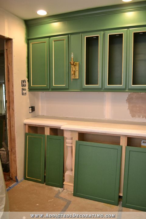
And The Kitchen Cabinet Color Winner Is…
Gentleman’s Gray by Benjamin Moore. It’s actually not gray at all. It’s a deep, rich, gorgeous blue with just the slightest hint of teal in it.
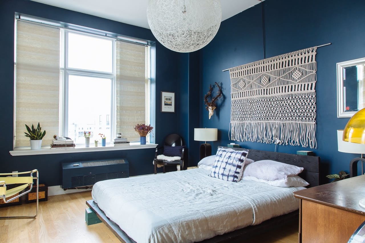 via Apartment Therapy
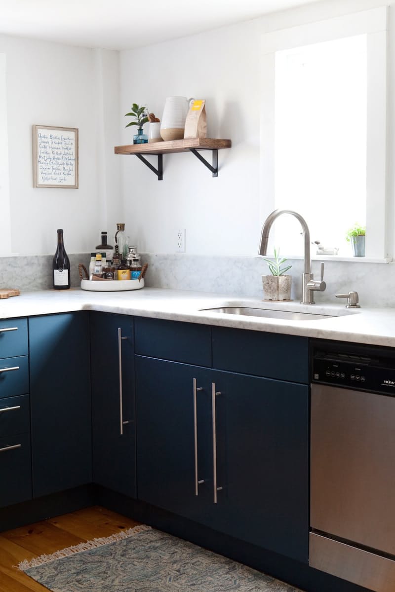 via Apartment Therapy
Isn’t that beautiful?!
The funny thing is that as people started commenting on yesterday’s post, I kept getting comments about Benjamin Moore’s 2017 Color of the Year, which happened to be a deep, dark purple color. I had no idea I was so on trend! 😀 It really is a gorgeous color called Shadow, and they have a whole color palette of their 2017 colors that complement that color beautifully. You can see them here:
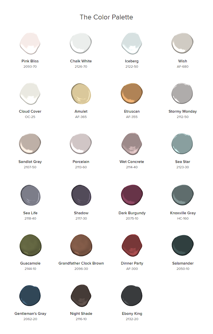
So yesterday afternoon, I headed to Benjamin Moore and picked up some samples to try out. On the paint chip, the Shadow color looked much lighter than I had anticipated after seeing the pictures online, so I also picked up the darker color just below it on the paint strip, which I believe is called Galaxy. Here’s how they looked in my kitchen. Please excuse my messy countertop and floor.
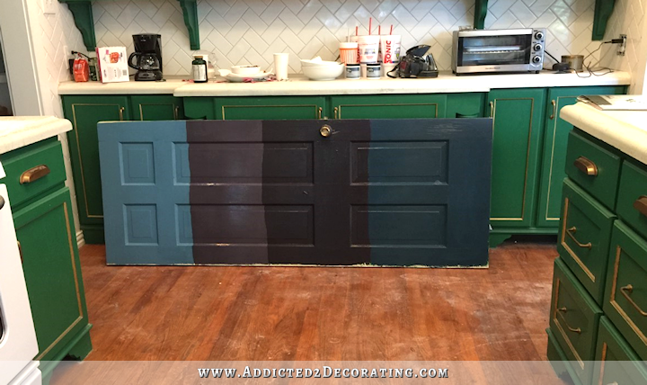
And never mind that one on the far left. I was trying to get one close to the last picture on yesterday’s post, and clearly missed the mark. That’s way too blue, where the color on the cabinets in that photo has a lot more green in it.
Then to the right of that is Shadow (which I was clearly wrong about…it’s deep and gorgeous), then Galaxy (so dark it’s hard to tell there’s any purple in there), and then Gentleman’s Gray. The Gentleman’s Gray has definitely won me over for my kitchen, but I can certainly see myself using Shadow on something else. I think the two work beautifully together. And dark blue is such a versatile color. Like someone said in a comment yesterday, it’s like a pair of jean. You can put just about anything with a pair of jeans and it’ll work. Deep blue colors are kind of the same thing.
With the change of cabinet color, obviously the black countertops are out. Many of you will be happy to hear that. 🙂 I will be trying to brighten up the countertops so that they’re more of a true white, but I told Matt that I eventually want marble countertops (or something that looks like the whitest, brightest Calacatta or Carrara marble). Marble has been on my “dream kitchen” list for a very long time now, and I want that to be the end goal, although it might be several years before I get there.
But for now, I can paint my cabinets and see about brightening up my countertops. That should be relatively cheap. And now that I have my color, I can finish up my plan for the rest of these rooms. It’s all coming together in my mind. 🙂
And thank you to those of you who pointed me towards Benjamin Moore’s 2017 color palette!! It’s beautiful, and will serve as a jumping off point for the rest of my plan.
UPDATE:
I kind of had a change of heart about cabinet color. Click here to see the color I finally chose, and how the cabinets turned out…

Addicted 2 Decorating is where I share my DIY and decorating journey as I remodel and decorate the 1948 fixer upper that my husband, Matt, and I bought in 2013. Matt has M.S. and is unable to do physical work, so I do the majority of the work on the house by myself. You can learn more about me here.

Just saw this on Coastal Living…
http://www.coastalliving.com/homes/decorating/sullivans-island-cottage/dining-room-sullivans-island-cottage
I love the Gentleman’s Gray. It will be much easier to decorate around and more true to you in the long run. Yay for getting over that hump! Can’t wait to see other elements of the plan unfold!
Part of me is so bummed that you’re changing the green…I adore it and find it so inspiring…but I admire how you are so fearless and just go for it. I can’t wait to see the change and how the rest of the house will turn out!!
Yes, I feel the same way.
Nothings better than when a plan comes together!!!! So happy for you! : )
When we bought our house early last year, I knew I wanted to paint the kitchen cabinets some sort of navy or cobalt blue. I’m pretty sure this is almost exactly the swatch I have sitting in my office – we haven’t painted yet, because you know, life, but I dream about having the cabinets that color ALL THE TIME 🙂
Awesome choice!
Thank you for showing us the actual colors on your door! I’m a purple person and I absolutely love that Shadow color – so deep and gorgeous, exactly what I was looking for for my new doors in my house. I love the Gentleman’s Grey as well – and I think it will be just the exact right color for your kitchen. Can’t wait to see it all painted!
I am so happy that you have found your path! <3
Great color so excited to see it!!! Love following you!
It’s going to look beautiful- I admire your energy. I was kinda’ hoping you would go with purple so I could live vicariously through you. As much as I love purple, I just don’t have the guts to go there on my cabinets. But maybe a piece of furniture- hmmm….
You are such a gracious lady. I have enjoyed this evolution of your decorating plan.
I love it. I think it will be beautiful when you are finished with it.
Well, I’m always a sucker for blue, so I love it! And I’m wondering where in my house I could use Shadow as well. Love it, too.
Really lovely choice!
Fabulous choice! I was in the blue camp, but that swatch on the door to the left to me gives a colonial decorating vibe. The purples are both gorgeous, but this blue is just right. Rich and with depth, yet not navy. It will be stunning with metal lighting you already have in the kitchen and music room, and it will complement the coral fabrics in a wonderful way. Now you are on to something even better than what you already have. So happy for you and Matt!
Beautiful choice! I voted for the teal, but my heart wanted Gentlemans Gray because I am considering that for my kitchen cabinets (selfish, I know!). I have orange oak and my husband is one of those who thinks painting oak is a sin. But I’ve lived with it for 19 years and I think that’s long enough. Like your Kelly green cabinets (although those were gorgeous), this orange oak is messing up my design style and plans. Can’t wait to see what you do!
I would advise holding off on repainting the cabinets until you gather all the other elements with which you wish to decorate. It is much easier to tweak your paint color to match your fabrics or rugs or other items than the other way around. Use the general color as a guide, yes, but don’t lock yourself in yet.
I didn’t read the comments section regarding the walls in your breakfast room but I loved an idea you had put out there once using a very neutral zebra-striped wallpaper from Thibaut (or Schumacher). Their papers are expensive but you have so little wall space to cover now that the room is much smaller with the pantry. The paper was very sophisticated but playful at the same time and would make a good background for many other colors.
That is a great idea! You can tweak the paint color if you have.to but you can’t tweak the colors of the other elements.
I agree 100% with the first part of ADELE’S comment!
I love, love the new color choice. Still has the richness of the green but has the element of teal. I think you will be a lot happier and your decoration scheme will take off. It will look great coming from all angles. Can’t see what’s next. Painting the kitchen or walls in breakfast room ?
I’m gonna miss that green kitchen, love it. But glad you were able to make a decision and are moving on. I’m excited to see the new direction you’re heading in.
Hooray! I just knew you’d like Gentleman’s Gray! Not so accurately named, is it? Interesting how some of Benjamin Moore’s colors defy categorization. Another one is their “Sharkskin” color, a green/gray/blue that looks completely different depending on the time of day, light, and season.
Nice pick. All my paint colors in my house are from Benjamin Moore. I always have such luck finding just the right color with them. Can’t wait to see the cabinets in this color. What did you decide about the countertop stain?
I’m just going to have to see if there’s a white concrete stain that will brighten up the countertops.
I LOVE that your color palette actually includes, you know, colors, instead of only pure neutrals. I know you’ll do wonderful things with your choices! May I ask how you generate the color palette graphic? Is there a free tool online that does that for you? Thanks 🙂
Oops, I see now that palette is taken from Ben Moore. If you happen to know how to generate a custom one, I’d still appreciate the info 🙂
I actually don’t. I see those all the time on Pinterest, and always wonder how people do that. Hopefully someone else will have that info for both of us.
I think I was more wedded to the green then you were! But if it was my house, definitely the blue. In fact I had already planned to paint a room with BM Van Deusen blue. I might have to look at your Gentleman’s Blue before I paint!
OH, are you still painting the tops white and just the bottom cabinets blue, or the whole thing?
The tops will definitely be very light. I saw a picture yesterday with uppers that were a gorgeous almost-white color but not quite white. I’m going to go back and look at that before I make my final decision. But they’ll definitely be very light to contrast the dark blue lowers.
Thanks for sharing your choice AND the 2017 paint colors 🙂 Can’t WAIT to see the b
BLUE on your cabinets — it’s a personal favorite!
In case you didn’t already know this, the more pigments there are in a paint color, the more unstable it is in different lights. I was told that the new BM colors (by someone who works there)were designed with many different pigments on purpose to make it near impossible for other paint companies to copy it. You may want to ask how many different pigments are in the color you have chosen here. The green reflected off your cupboards can effect the appearance of the color, different lighting, etc. Personally, I think you are going to find this shade difficult to deal with. My suggestion is to paint a large poster board or something like that, put it in a room away from color, maybe your breakfast room, and then bring in colors you want to use with it and see if it works for YOU! I would hate to see you do all that work painting you cupboards and then having you hate it in certain lights etc. I have done this so many times. (love it in day light, hate it in artificial light). Or find that the colors you thought would compliment it so well, just don’t do it for you. I don’t mean to rain on your parade, but I sincerely think you are making a mistake here. A true navy would be so very easy to work with, and be so complimentary with so many colors!
I wish you all the best and I am a big fan of your… YOU ARE AMAZING!
What a beautiful color! I knew you’d find one that would make you happy. Looking forward to seeing the update!
The first thing I did when I read, “And the kitchen cabinet color winner is…Gentlemen’s Gray…” was start laughing since it wasn’t green. Then I saw the color and it’s beautiful, an excellent choice.
Not that I would recommend tile on a countertop (the grout is a pain in the butt to keep clean), but I was at my cousin’s house the other day and she had what looked like plank-style Carrera marble tiles on the floor. I didn’t get on my hands and knees to inspect it, but from a standing position, I couldn’t tell if it was marble or faux marble.
I asked her later and she said it was ceramic and they got it at Home Depot. I wonder if maybe they make a faux marble countertop yet. They seem to be really good at replicating the texture and veining.
I suspect it was this, or something similar: http://www.homedepot.com/p/MS-International-Strata-12-in-x-24-in-Glazed-Ceramic-Floor-and-Wall-Tile-16-sq-ft-case-NHDSTR1224/206083674
Oh, and I love the color you chose. I really think you could get away with some kelly green fabrics with that, if you pick the right shade. I was surprised how well they went together in one of the photos you showed.
I read your blog but rarely comment. I love your choice to switch from the kelly green to the gray/blue. You can always add green accents. Keep up the great work.
Very very pretty! Shadow is a nice colour as well. It almost makes me regret going with the green apple/avocado-y green I did my cupboards in. Almost, but not quite. Maybe in a few years my nightmares from painting my doors THREE times will have faded and I’ll feel brave enough to try another fun colour. Lol.
I have BM’s Gentleman’s Gray on my corner fireplace wall, which extends from my dining room all the way through the living room and it is awesome! People tried to talk me out of it, but I was determined to go dark on those walls and I love it! (So does everyone else – now!). Great choice for me and you!
http://www.dimplesandtangles.com/2016/06/2016-summer-home-tours-my-interior.html please look at this before making up your mind. I immediately thought of you when I saw it. It has every color you like and the red can be substituted with your coral.
Love the choice of blue. I was thinking blue yesterday as I saw the condo kitchen again. You loved that kitchen so I felt blue was where you should go. I also was thinking marble for the counters and wondering if with your talent and fearlessness, why not try and faux paint the concrete counters to look like marble? I’m sure you could pull that off until you can get the exact counters you really want. Marble with that blue will be stunning. Can’t wait to see it all done!
Just wondering if you are doing anything to fill the grain of the oak? I know you mentioned the grain before.
LOVE, love, love the Gentleman’s Gray. Wow! The green was nice, fun, and bright. Gentleman’s Gray though, seems more mature, refined, and classy. I love it!
Beautiful. Gentleman’s Gray is very similar to a color that I paint with called Paynes Gray.
I love how azure blue can be upscale but still vibrant at the same time. I love this choice!
I love the blue! I think it will look beautiful! I actually loved your green though too. Even with your argument that it limited your color scheme, I saw it more like the grass outside. It goes with everything! God’s color palette is perfection!
Love the new color choice! I just re-did my cabinet colors this year with an off white color on top and a darker (gray) color on the bottom. I love the brightness of the lighter upper cabinets. ! I think your new colors will be beautiful, and they go great with your hardware!
Beautimous!
I absolutely love the gentlemen gray color! It is beautiful! Don’t let the naysayers put you off, it is your house and no one knows the angles, light etc., that you do. Go for it girl!!
This is just a theory… I think your kitchen at the condo was such a perfect decorating project that your interior design “soul” is telling you “Hey! What happened to the blue?!?!” That kitchen just said “Kristi made me, this is the color of Kristi’s personality.” I say this because I find myself returning to the same green over and over in different houses, in different rooms. That Koi Pond color from Sherwin-Williams is just MY color. I may change up the accompanying colors, but this color is the constant that is “me”.
I LOVE the new color!!!! Im so excited to see it all come together. Love your blog, it has made me try things I never thought I could because you did it!!!!
Love the new colors! I always look to you for inspiration!
Don’t forget to consider how a whiter or brighter countertop will relate to your backsplash and the new upper cabinet paint color. With all that beautiful tile work in your kitchen, the white or cream of the tile will probably dictate the color of the upper cabinet paint and how white the countertop can go and still work with the other two elements. And the blue is beautiful.
You make me change my perception of colours again 🙂 I always thought of myself as a purple girl and found blue a bit boring, but looking at your door with the colour examples I have to reassess that. The purple is still gorgeous to me but I think painting all kitchen cabinets (even only the lower ones) in it might make for a dead/dull look, whereas the blue has depth and intensity and I can just imagine having a lot of space coloured that way. Thanks for sharing the interesting thought process – I cannot wait to see what the result is going to look like.
And another thought conc. “losing” your green kitchen that I already had about the pony walls (which I loved dearly!): As I guess I will never see your house in person, to me everything exists in the pictures anyway – and I can alway go back to the pictures of the pony walls, your green kitchen, the condo etc. in order to enjoy them again.
If you, on the other hand, living in the house, are happier with another colour, design scheme or object, don’t let people get to you who encourage to keep the older style only because they like it so much – it’s you and Matt who LIVE in the house and have to be happy with it!!!
I love your green kitchen, but also love gentleman’s grey. After 40 years of marriage i am finally getting either cararra marble or bright white quartz (with a grey vein) countertops!! So again, we have the same taste!!!! I cant wait to see your new kitchen/breakfast room/pantry !
rich and sophisticated.
When we remodeled our kitchen last year, we went with thick quartz tops. They are spectacular. Indestructible. No maintenance. doesn’t marble have to be sealed and worked with periodically?
Yes. And no matter how well it’s sealed, it still etches if something acidic like lemon juice gets on it.
I LOVE this color! So much…but here is my question. You said that you definitely did not want an elegant house, but you wanted a house that felt, ” fun, bright, cheerful, lighthearted, comfortable and welcoming”.
One of the commenters said it was mature, and I have to agree. Will you fun it up with bright accessories?
That was my initial plan, but as my design plan is coming together, it’s going to turn out more subdued and mature. Still lots of color, but I’m sticking mostly with the greens and blues that I love so much. When I was thinking about what I love long term, I always go back to blues and greens. My love of the bright and warm colors comes and goes. I might add touches of warm (yellows, corals) colors, though.
I love the Gentlemen’s Gray!
If you looking for a off white color at Benjamin Moore, checkout “Swiss Coffee”. I used this as my trim color whenever we remodeled two years ago and love it.
I love that blue – it’s going to be stellar! But I’m in the club of those who’ll miss your green and gold cabinetry – I thought it was so beautiful. I must admit that I’m not crazy about the new trend of white upper cabinets/dark lower cabinets – I think everyone will be thinking, “that’s so 2016” in very short order. But if anyone can make it work, it will be you, and I know you well enough to know that if you don’t like it, you’ll change it in a flash. Can’t wait to see your kitchen’s new incarnation!
Nikki, my week has been so busy. Haven’t had the time to read and respond. So it’s a lazy Saturday here,and after reading your decision for the kitchen. Absolutely love the colour choose,what a wonderful colour to transform your decor into something that will make you happy.
I haven’t checked in for a while. the last time I was here these cabinets were being painted green. Kristy can you rename your blog The NeverEnding Story? BTW – I can’t wait to see how this blue looks and those awesome cabinets.
Great choice! I did my lower cabinets in a dark blue used General Finshes products Love love them!!!! Uppers white with bm paint good luck great job!
Well Kristy, I love Green, always have. There is sooooooo much Blue out there. To each his own, that is the thing about living in this great country of ours, we have choices. Blue is fine if that is what you like, go for it. Good luck to you.
The Gentleman’s Gray is GORGEOUS!! I can’t wait to see how it looks. I’m so excited for you – I hope this makes some of your other design decisions easier.
Hi Kristi. I like the color you picked out. I am going to be painting some bathroom vanities (brushing and rolling) soon and am researching types and brands of paint. Are you planning on using Benjamin Moore Advance paint for the cabinets again? I remember you had some problems with it when you painted the cabinets green the first time. I went back to check what you used on your bathroom vanity and it looks like you used Behr, correct (was it Behr Ultra?) I am wondering how the Behr has held up compared to the Advance ? From all of your experience, what brand/type of pait would recommend to us diy’ers if you are going to be brushing and rolling vanity cabinets (not spraying. Thanks so much.)