New Kitchen Cabinet Paint Color Inspiration
Now that I’m about 95% sure I’m going to change my kitchen cabinet color, I’ve been searching for the perfect color. This go ’round, I’m fairly certain I’m going to use something colorful but yet more subdued and neutral than the current kelly green color. As many of you suggested, I am going to go ahead and paint the upper cabinets white and see how that looks with the green. I might be completely surprised. I’d say there’s about a 5% chance that I’ll love it and want to keep it. Those aren’t great odds, but there IS a chance. But in the very likely event that I do decide to change colors, I’ve been searching for inspiration.
Right now, I’m vacillating between blue and purple. I think either one of those would be very easy to decorate around in the adjoining rooms. And since blue is always the most popular color in the entire world, I have a feeling that if I took a poll, blue would win hands down.
As a side note, do you know what the favorite and least favorite colors worldwide are? Blue, red and green are by far the most popular colors worldwide, with blue the overall winner, as I mentioned above. Yellow, orange, brown and purple are the least favorite colors worldwide, with yellow taking the spot on the list as the least liked color. So I’m actually vacillating between the most popular color in the world, and one of the least popular colors worldwide. 😀
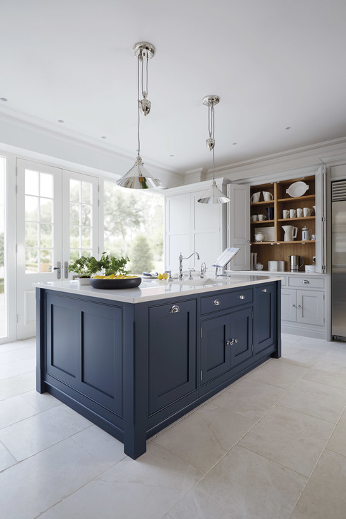
So as far as blue goes, I love something along these lines…

That one is Hague Blue by Farrow & Ball. There’s no place around here to buy Farrow & Ball, so I’d have to order online. That paint costs $110 per gallon!! And I don’t think that includes shipping costs.
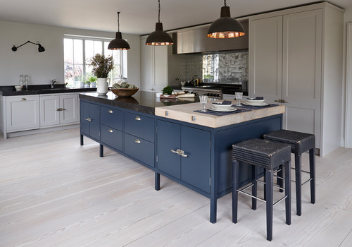
This is another favorite blue…
That color is Lithodora from Tom Howley. I’ve never heard of that brand of paint, but it appears to be a U.K. brand.
And one more favorite…
Unfortunately, that one doesn’t have the paint color listed.
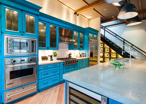
So as you can see, I like the dark, inky blues. I don’t like the in-your-face blues…
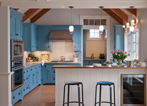
And light blues are out for me…
I could do a medium blue as long as it grayed down quite a bit, kind of like my condo kitchen cabinets were a medium teal color, but they were a very grayed down teal so they weren’t so jarring.
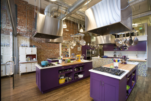
Now as you can imagine, finding examples of purple kitchens is a big harder. Most of the purple kitchens online are just out of the question for me. I mean, if kelly green was hard to decorate around, I can’t even imagine trying to decorate around a saturated purple color…
So while I know the words “purple cabinets” strike fear in the hearts of many, I can assure you that’s not what I’m talking about. I’m talking about a deep, dark eggplant color, or something along those lines. And again, finding a picture of that is really difficult. I did come across this kitchen, and on my phone, the cabinets looked like a gorgeous dark eggplant color, but on my laptop, they look black.
That color is Farrow & Ball Downpipe. Having never seen it in person, I can’t really tell you if it’s actually an eggplant color, and the pictures of it online are all over the place, from eggplant to a really ugly brownish color. But anyway, you can use your imagination and pretend that you see purple in those cabinets.
I definitely don’t want mine so dark that they look black. If I’m going to do purple/eggplant color, I want them to actually look purple/eggplant. But I do want them a dark and rich color, rather than looking like they’ve been upholstered with Barney skin.
And just as with medium to light blues and teals, I could also do a medium purple just as long as it’s really grayed down. In the question section on this next photo, the person asked, “What is the gray paint color?” So it’s very possible that you will just see gray as well. On my laptop screen, it looks like a beautiful medium grayed-down lilac color.
That color is Ito by Dulux. Are you seeing that as a light grayed-down lilac color? I am, and it’s gorgeous.
So that’s what I’m thinking right now. As much as I love the medium grayed-down tones, I think the lighter the color, the harder it will be to decorate around. The darker colors read more neutral to me, and would allow for more colors to be brought into adjoining rooms.
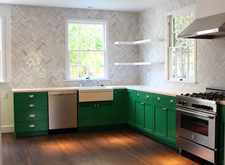
So I’m not quite settled. And of course, just as soon as I start thinking it’ll either be a dark blue or a dark purple, I come across this kitchen that stops me in my tracks.
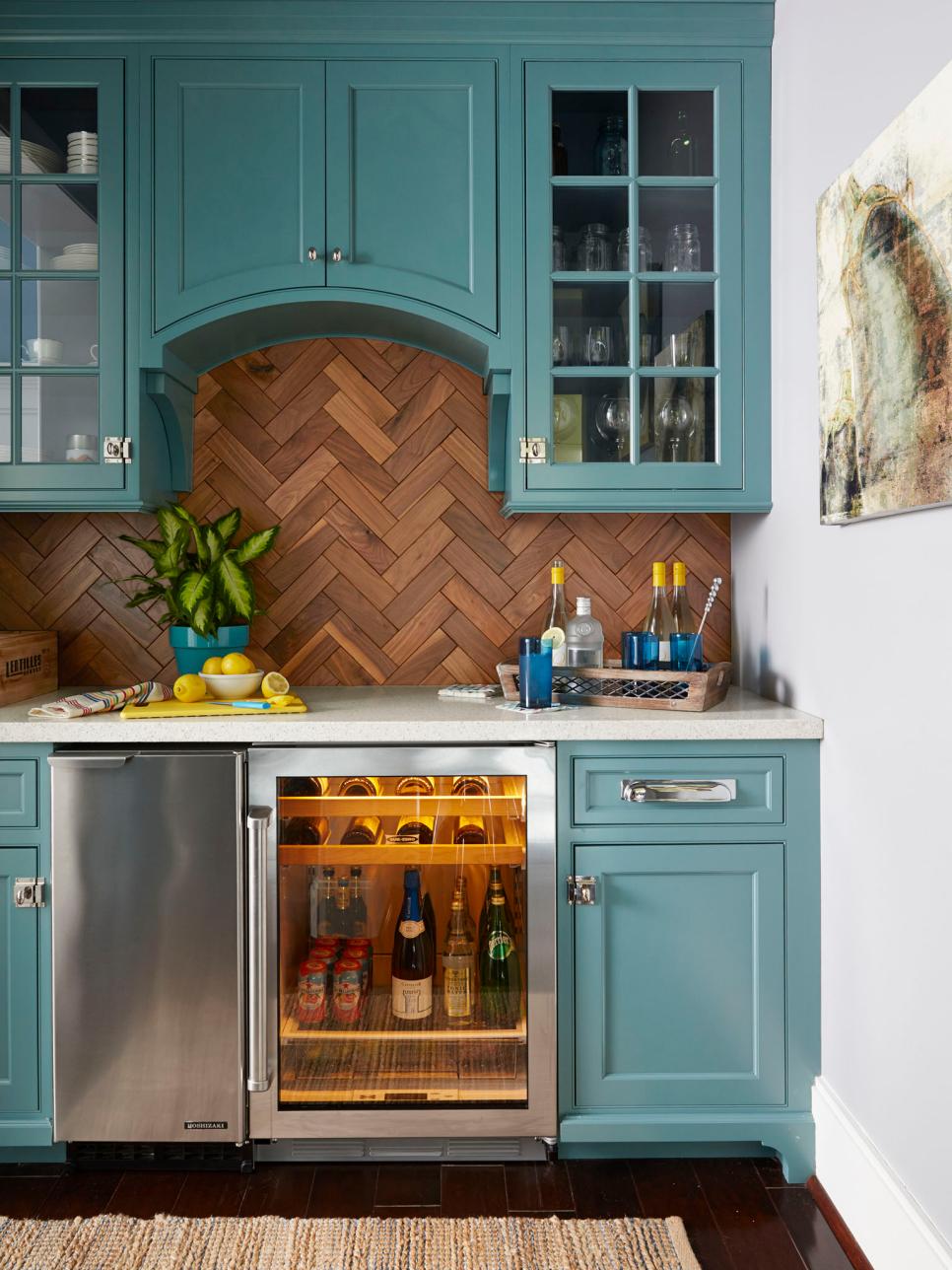 via HGTV
That’s seriously one of the most gorgeous colors I’ve ever seen. My heart will always belong to teals — medium teal, dark teal, doesn’t matter. Mix blue and green together in just about any ratio, any intensity, and I’m going to love it. And if my kitchen were a stand alone room, this would be my choice without question. But since I’m trying not to paint myself into another decorating corner, I think I need to stick with a color that reads more neutral, and dark blue or dark purple seem to open up the possibilities much more, don’t you think?

Addicted 2 Decorating is where I share my DIY and decorating journey as I remodel and decorate the 1948 fixer upper that my husband, Matt, and I bought in 2013. Matt has M.S. and is unable to do physical work, so I do the majority of the work on the house by myself. You can learn more about me here.
I LOVE the teal color in the last photo. And of course, your eye goes straight to the backsplash!
I agree, love the marine blue in Hgtv kitchen!!! I feel it’s a great neutral and that you would to look at every day!
Let’s say you choose blue or purple here. What color palette do you go with for the dining room? What color do you paint the table? The piano? Does the mural still work? What fabrics work in this new palette?
You need a plan before you paint. You can fall in love with a new kitchen color and still feel stuck in another year.
I will say I lean towards a navy/blue kitchen. Think of the color like blue jeans and how you can pair so many things with them. I own green pants and purple pants but I need a strategy in how I pair things with them. Blue can give you some freedom. But that freedom will become a prison if you don’t have a real plan this time. I don’t think the colors you are showing go with most of your projects you’ve already done (http://imgur.com/a/7k6Ph) so before you can go forward you should map out every spoke of the house that touches the kitchen.
I agree Julie. Loving that you’ve gone the blue direction though! The dark eggplant color could be a winner too, but the overall plan is more important. Love that you let us see into your thought process though Kristi!
I agree completely with Julie and Dee. I think another thing to consider is do you want grayed down colors or bright clear colors? You seem to vacillate between the two and, in my opinion the two don’t play well together and I think that is where the decorating conflicts come into play. Another consideration is that if you choose a trendy color, like something in the purple family, it will become hard to find fabrics to work with them as time goes by whereas the some shades of blues will be easier since they are more universally appealing and will be readily available. Also, on another note, why not just paint the breakfast room white for now? You can add color either in the form of wallpaper, a mural or paint later as the kitchen and rooms in the same line of sight with the kitchen dictate.
Julie has made great points. If you had an interior decorator/design consultant come in, logic says they would provide info for the adjoining rooms for colors, fabrics, etc.
I’m not a fan of a 2nd wall mural in the breakfast room. One is a stand out, stand alone, awesome, unique eye catcher. Two takes away all that. Why not incorporate the birds/butterflies in the chairs/benchseat fabric?
Also love the grayed down blues and purple or a truer navy, but not marine.
Reading through the comments I realized I still had more to say. (I know, right?) Jayme mentioned the color wheel and naturally I realized you’d be perfect for the analogous color palette. Here’s a quick mockup:
http://imgur.com/a/MQntp
I’m basing this around blue kitchen cabinets. The top middle and bottom left both show examples using wallpaper in a space. I tried to show options for using blue, aqua, green, and purple on walls so you can get a feel for that. There’s even colored drapes in many shots. I think music room you could do a rich purple on the walls with black doors/black piano and then pull in blues to accent. In your entry you can keep your bird mural but paint the buffet teal or aqua. Breakfast room can go aqua on top to pair with the white paneling on the bottom but add layers of greens to pop. I’m not sure the path you’re heading for the pantry/breakfast room but you can find one option. For a living room I pulled examples with green, purple, cream, and navy seating. You could really find a way to make this work. Keep the greens grassy or celadon, keep the purples blue undertoned, and remember blue includes aqua and teal.
Hopefully some of these photos match the look you want and you can create an active design for each room with paint color, fabrics, furniture color, and pops of color all mapped out but the freedom to work in those parameters and experiment as you make your way through.
I love the deep blues! I have considered painting my bedroom walls that color. Whites pop so beautifully against them! (I love white…antiques,dishes, textiles).
It’s probably very popular right now. This past spring’s Pottery Barn catalogue was full of blues and blue/green combinations.
I think the orange (coral?) that you used in the entry/dining chairs will be amazing near the blue. Those two colors compliment each other and are opposites on the color wheel…so the eye interprets it as balanced. The mural will look great near it too!
I would love to see the bird mural/wallpaper next to the last kitchen, because of all the colors, that teal kitchen seems to me to tie into the other rooms you have already done. Even if the teal isn’t in the mural, the colors remind me of the same family.
I agree with the previous poster that said you should map out all the rooms before painting the cabinets.
Yes, what Christine says. Match to a color in your entry room mural. I like the teal or gray or both together. The teal would go with red-orange as its compliment, and that might be a nice mix. Good luck with deciding. At least you are moving forward and trying things. That alone is progress.
that was my thought too! You already know you enjoy that color, it would go beautifully with things you’ve already completed that you don’t want to change. Plus you’re not a neutral person, you’ve said so on many occasions. Seems like that teal is that perfect muted color!
The last photo is my choice. I could see that color combining or complementing a variety of other colors throughout your home.
I love these deeper colors! I do think that you need a whole house decorating plan, though. The comment above about the piano, the mural, the chairs, the table, etc. is a valid comment. I totally enjoy your process, so if you wanted to redo all of those things, I would definitely be along for the ride. BUT, if any of those projects speak to you in a way that you don’t want to overrun, I would try to use it as your jumping off point for your kitchen cabinet color. I can’t see all of the details in the mural, but I think the feng shui (spelling?) color behind the mural would look great with a deep eggplant. So maybe start there. But, where does that leave the coral chairs and your piano? Maybe your piano needs to be toned down, too? I’m not sure. Anyway, I totally get your struggle. Hang in there!
I agree. Choose a color that will blend with the other decorating elements that you know you
want to keep (the mural wall) and what you plan to do in the breakfast area and pantry. Perhaps nail those down first. What about the curtains in the breakfast room? Will the cabinets match. Since you are going with a color and not white or beige, maybe the cabinet color should be on hold until you have made some of these other decisions.
Dark blue teal is my vote. You loved it in the condo & you are allowed to use it in your new home. It’s what you love. Look at your hallway bath vanity. It’s your comfort zone & I think you’ll be more happy with it. Go with the one that stopped you in your tracks. You can play with the shade. Go get some color seats, paint chips, fabric & get samples. Flip the door over. I think you’ll be happier than trying to make a color work. Oh look at the color of your stencil. Do you think the color may of swayed you any? I do agree with painting the top first , but please wait on the counter tops. Let them be last. Love your work.
If you go to Lowes, they have a computer in the paint department that will copy and other companies paint colors. So, if you tell them “Hague” they can mimic it into one of their brands. Just FYI. Not sure if it is at every Lowes, but it is at mine and I love it!
I have always loved muted turquoise cabinets, or perhaps as an island color with the rest of the cabinets being a neutral color.
https://www.pinterest.com/pin/1829656073912529/
https://www.pinterest.com/pin/1829656075742165/
House of Turquoise has some nice examples: http://houseofturquoise.com/
That teal last picture just looks so right to me! I feel like it fits in with your overall design aesthetic and would look wonderful in your kitchen as well as an “anchor” for your house.
Best of luck, I’m excited to see where your new color story leads 🙂
My living room is painted a color similar to the grey-lilac and I love it. It’s so soothing and comfortable. It does change with the light from lilac to grey. I haven’t gotten around to kitchen colors yet, so things may change.
I really like the blues, but the Purple/Eggplant is gorgeous! I also am in love with the teal at the end of the post but I know whatever you choose will be fantastic. I love to see/read your design process, it helps me to know I’m not the only one that gets a little indecisive and a little “squirrel” ;). Thanks for the inspiration.
Do the teal! You love it. You won’t like the purple because it only really works with gray and you don’t like gray.
Ditto. Maybe Teal is your signature color since you gravitate toward it and are confident with harmonies. I noticed in your condo you used lots of green but in off shades. Most decorators have a signature look.
I painted my dining room table that muted lilac that is on those kitchen cabinets and I loved it. It turns out to be sort of neutral, but it’s still purple. That table only had a life span of about 2 years and I was on to something else but, I did love it. (as did almost anyone that saw it-and it’s amazing how many people never even noticed)
Oh, forgot to vote. For universal continuity, I vote a blue. Love the first one.
Check out Aquamarined by Sherwin Williams HGTV collection (I got it at Lowe’s!). I recently repainted my light blue bedroom to this color, which is a deep, deep teal with lots of gray in it, and I’m in loooooooove with my walls. As soon as I finished my bedroom, I thought to myself that if I had wood kitchen cabinets, I would’ve immediately painted them this color. It made my dark walnut furniture look so rich, and I’ve literally put every color in there (I have little vases that I like to put brightly colored flowers in throughout the seasons) and I haven’t found a color that looks bad with it. I can’t find a good picture and the online paint swatch doesn’t do it justice. I could send a picture of my room if you’d like! But in my opinion, it’s the perfect neutral.
I hear you about the very saturated hues appearing more neutral and therefore more harmonious with surrounding rooms. And it seems to me that one of your (unspoken) goals is harmonious flow of color and pattern between rooms. After all, your home is a normal sized home, not a huge cavernous space that can take more extremes, absorb them and not appear too jarring. I think that’s why the bold turquoise and red-violet cabinets are definitely out of the question. Those colors say look at me alone, not this is an interesting living space with unique rooms. In a huge loft with an industrial aesthetic you can – and maybe you should – take that strategy and run with it. But from what you have written today, I don’t think you want that approach. That said, you presented so many beautiful blues. My personal fave is one of the unidentified shades that in fabric would be called Admiral Blue. It’s not navy, but it’s not cobalt either, so it has the softness that doesn’t scream at the eye but is still a very strong statement. And I think any of those darker blue hues, whether shades or more true, would go very beautifully with the great coral fabrics you have chosen for the dining room. That would be a modern, crisp and pleasing flow of color. And I don’t think the black mural’s look would be negatively affected by using a dark blue. Not at all. Great series of blog posts by the way. Food for thought!
I know I am in the minority here but I like neutral colors on permanent things like cabinets, backslashes, appliances, tile, and floors. Changing the paint on the walls, curtains, and accessories is much easier.
At the same time though it is not my house and I have no place telling someone else to do.
***I just realized that the dark/blue gray cabinets I have in the kitchen completely contradicts what I just said. ha ha****
I loved the deep purple that I saw in your paint chips yesterday. I think it could work beautifully ofnew your lower cabinets. I am not sure about the upper cabinets. But the purple would work with the coral and yellows in your home and I dare say some blues could accent.
I don’t know how many followers you have (I’m sure you do) but it seems to me that any paint company you reach out to would send free samples so you can try them out. If you end up using their paint, they get the exposure from a very popular blogger.
I also agree about your dining room tying into the kitchen decor;I thought that was the plan from the outset. I love the blue posted at the end.
I like all of your ideas, I imagine you could make any of them look fantastic. I will miss your kelly green though. 🙂 Purple is the color they say you should never decorate your kitchen with. I think you should do purple.
I see purple, taupe, yellow, darker turquoise and black with touches of red….
I’ve been loving purple since 2012. I painted the top half of my dining room in Behr Eclectic Purple, my kitchen dishes are Fiestaware Plum, and there is purple in the fabric I chose for my kitchen faux roman shades and in the abstract painting on my living room wall. BUT, I definitely think purple is better as an accent color than a kitchen cabinet color. You mentioned that your kitchen is the central room to your house. Are you going to redo your dining room to coordinate with purple or blue? White cabinets would go with what you have and you could use any accent colors with it.
Benjamin Moore’s newly-christened 2017 “Color of the Year” is a deep purple called ‘Shadow,’ and it seems pretty darn perfect for what you’re talking about. It’s grayed down enough to avoid looking like grape cough syrup. The Ben Moore website has it in a collection of colors (Color Trends 2017) that are just stunning. I also love ‘Gentleman’s Gray,’ (which doesn’t look gray at all, incidentally, but more of an inky blue with a hint of teal — another contender for your purposes! I’ll try sharing a link, but I’m not sure if it will show up in the comments.
https://www.benjaminmoore.com/en-us/color-overview/color-collections/color-trends-2017
I was just going to post this! It is a perfect color for Kristi!
Sheila, I agree! Saturated with color, but sophisticated.
Check out the purple, teal, and murals/wallpaper in these slides:
http://www.housebeautiful.com/room-decorating/colors/g612/purple-paint-color-shades/?slide=2
the purple sofa is a little too Willy-Wonka’s-Violet-Beauregarde for my taste, but MAN those colors are singing. That wall is stunning.
http://www.housebeautiful.com/room-decorating/colors/g612/purple-paint-color-shades/?slide=4
the purple lacquered door and the mural = WOW.
This could be her neutral! Love it!
Really like the Benjamin Moore Afternoon Light!!!
Holy cow, all of those colors together are stunning! I could just use that entire thing as my new color palette!
Absolutely! Looks like they were designed just for you.
I know you normally use Behr paint but is you have never tried Benjamin Moore Aura paint you could be in for a treat. I used it to paint my mothers overcrowded living room by simply pulling the furniture away from the walls and start d painting. I put a drop cloth on the carpet for the first wall and there wasn’t a single drop on it so I didn’t bother with it on the other walls. It covered almost everything with a single coat (no priming over builder white). No brush marks. Just awesome to work with. It is more expensive than most other paints but is so worth it since only one coat usually needed. Perhaps the dark eggplant would need a second coat or a grey primer first but I have used the Aura on a few different homes now and it is the only paint I will ever use now.
I have read mixed reviews on the quality of Farrow and Ball paint, but their choice of colors are beautiful. Order a fan deck and see how you like them. You know what to do from there.
I am loving your thought process here and can’t wait to see what you decide. But my vote is for a dark plum purple with maybe some smoky overtones.
How about that rich blue-purple Behr hue from Home Depot – I was looking at exterior colors – hopefully, it’s also available in interior. I’ve seen it in doctors’/lawyers’/and swanky homes’ exteriors. Looks great with stark, pure white.
Farrow and Ball Downpipe is a strange colour – there’s a lot of dark blue and green in it. No purple or grey hues at all. I painted 3 walls in my interiors shop many years ago in it. Railings by F&B is a fab colour, very dark blue and goes with all the neutrals. Our kitchen units are in Railings and we love the way it goes with our marble work tops.
Love that teal! It’s gorgeous and the best one of the bunch. That last kitchen photo is a stunner. But then again I love aqua, teal, and turquoise shades of blue. Personally, I prefer greens in the sage, hunter, and forest tones since they seem more restful and relaxing. Kelly green makes a great accent color, but just seems too bright and overwhelming when used in large amounts in a room. But that’s just me.
I vote for a navy blue, like Benjamin Moore Hale Navy. I used this color on my exterior doors and I Love it! Yound House love used this color in their show house on the island in the kitchen and also the fireplace wall. That house if full of color and it works with anything I think. 😄
Like the post above, I have also had a really good result from BM Hale Navy. I did the walls in my husband’s office with it, and it looks so good with everything
Something like this?
http://www.housetohome.co.uk/kitchen/picture/aubergine-and-cream-kitchen
Or this?
http://www.houzz.com/photos/30898631/Surrey-House-farmhouse-kitchen-london
Aubergine! That’s the word! I always forget that word. The first color is gorgeous. And I searched “aubergine cabinets” and found a few more as well.
why fight it? You are obviously drawn to a certain color regardless of your conscious efforts to branch out. I do the SAME thing! I am drawn over and over to a color palette of dark brown/light teal/sage green and bluish-gray. I am an earthy palette person. I don’t want to be. I tried brighter drapes in a busier pattern- it didn’t last. Nothing was more obvious when I chose the tile and fixtures for our house. Over and over. Every place I went, my husband pointed out that I kept choosing the same color palette, if not the same tile. I would tell him- NO! It’s different- he’s like um… no- it’s the lighting, but that is the SAME TILE! LOL I want to like bold vivid colors and I do buy them in my duvets and pillows and dishes,etc. I’m tired of spending my time and energy talking myself out of something because I “already did some version of it”. I’m saying that for my benefit. lol Because your struggle has kinda helped me process my own. I will say that grayed down lilac is beautiful. I love your process!
I keep reading “grayed down” but you don’t like gray Kristi.
Carla, I believe in this case, the word “gray” in this sense just means muted, not actually a tone of gray. I thought one of the best decorating tips I ever heard was to go a shade or two “grayer” than you think you want, otherwise, colors look garish and cartoonish when applied over large surfaces.
Yes, what TCPR said. I don’t like a plain gray. But when it comes to my colors, I tend to like the more muted versions of the colors, and you often arrive at those colors by taking the brighter version and adding some black to it to mute it. My condo kitchen cabinets are a good example. In person, they looked like a medium teal. But people would ask me for the color all the time, and then they’d come back and say, “Kristi, I got the paint chip, and I don’t think it’s the right color. This looks too gray and dull, and your cabinets look bright and teal.” But you get those colors on a large wall or cabinets, and they brighten up a bit. But the muted, grayed down versions can be the difference between a blue wall looking like a mature light blue, or like it belongs in a baby boy’s room.
Oh my goodness! That beautiful teal color took my breath away! I think I just might just make that photo my screen saver on my computer. It kind of reminds me of the upholstered headboard you made for your niece’s bedroom, that I really loved. I am always pro green which I love, but now you are truly going towards my really happy, grinning kind of colors. Whatever you choose will be
amazing! 🙂
I love the teal color in the last photo and it seems to match the most what you describe you want in your home. I also the deep blues. But it strikes me that all the inspiration photos with the deep blues are balanced with mostly white– similar to many photos using the kelly green. I’m wondering if you will be in a similar spot if you use the deep blues but don’t want to use a lot of white or other neutrals in the room. Even if you do white uppers, it sounds as if you are wanting to bring in some other strong colors and I’m not sure where you would do that on an equal footing (not just accessory pops etc.) The deep eggplant/grey color is pretty too, but seems to lean toward elegant and sophisticated– not fun and colorful etc. like you stated you wanted earlier. The medium tones seem to match that profile better. I also think part of why some of your rooms read toward the elegant and sophisticated, even if you are not going for that, is all the layers and detail you put in such as the molding, fabric trim, mural details, profile cut-outs, brass lighting, & gold leaf. I love all that you have done. But trying to see what best matches the overall look and feel you discuss wanting in your home. When I think of your condo, the fabric pulls the colors together and helps make everythig cohesive in a streamlined way. Maybe finding a patterned fabric would give you the color family you are looking for and give direction to your thought process regarding details you can add to make it unique and personal, but not overdone toward the elegant and sophisticated. Fabric is so important to me in determing feel and atmosphere that making specific color choices are much more secondary to me in the process. Good luck moving forward! I am eagerly following your decisions!
Our family has been looking for a waterfront family home (we all use it), and have been looking at Lake Travis, and LBJ (I know you’re familiar). I stumbled on this one, reminded me of you. I just love it – not sure I could live in it – but I love it!
Take the VIRTUAL TOUR
http://www.mylakelbj.com/Lake_LBJ_Best_Buys/page_2462649.html
OMG…Kathyg…beautiful home but, it comes off as garish, TOO over the top. I do love the tangerine kitchen. Thanks for the link.
OMG, Chiflipper, you’re right, that place looks all nice and sedate from the outside, and parts of the inside are a bit blah, but the rest of the inside looks like Insane Clown Posse’s tour bus exploded on the inside and left circus remains all over the place! That kitchen looks like something out of a Tim Burton movie, but not as well done. In fact, a lot of the inside looks like a combo Tim Burton movie/clowns on acid monstrosity! Yikes!
Kimberly…”ICP’s tour bus exploded” is a perfect description of this..ah..er..avant garde physical expression of “I’ve got more money than brains”.
Oh my, I loooove your green cabinets! :'(
ALL THE COLORS ARE BEAUTIFUL, BUT ALL ARE EXTREMELY TRENDY. I GUESS IF YOU HAVE A WEALTH OF FREE TIME ON YOUR HANDS TO OBSESS OVER THE COLOR OF YOUR KITCHEN CABINETS, AND DON’T MIND REPAINTING EVERY COUPLE OF YEARS, THAT’S NOT A PROBLEM.
Know thyself. Lol! I love colors, I love lots and lots of different colors. BUT, there’s always a but, right? But for large expances of walls, ceilings and cabinets, I’m going to stick with the colors that have always been my favorites. I’ll indulge my urge to have a fling with other new and exciting colors with fabric or artwork or a beautiful glass vase or a bedspread. Every room in my house is a combination of green, white, black and yellow (really? Yellow is dead last?) in varying intensities depending on the light source for that room. I’ve tried painting in whatever my current color passion was and it was great for a brief time period and then, gradually, it would start to feel “not right”. So, I went back to my favorites. All of the other colors I love look wonderful with greens and yellows and I’m not having to repaint large expances on a regular basis, lol! Go with your favorites and save the fling colors for stuff that’s easier to change out.
I just love your courageous approach to color and your flexibility when you realize you want to adjust your vision to fit your home better. I think the green is lovely but the shades of blue and purple are just stunning. Given your past great affection for blue in particular, I’m curious to see if that’s what you’ll choose. 🙂
I love the dark/navy blue color, but I’m not sure how it would work with the yellow piano. But, maybe it would work – Van Gogh’s Starry Night has always been one of my favorites with its blues and greens and yellows. Whatever you decide will be beautiful. It always is. Will you be completely stripping the green paint off your cabinets before you repaint? So much work. I recently stripped varnish from some cabinetry and I thought I was never going to get finished with it!
Oh, goodness no. No stripping required. 🙂 I’ll just sand a little, fill the wood grain, and the paint right over. I’ll have to see after the wood grain is filled if it’ll need priming at that point.
I love your last color!!! Beautiful. Do you mind me asking what kind of cabinet paint you prefer?
Ugh…such a challenging question for me.
My top preference is Kelly Moore interior oil-based paint in a satin finish. I absolutely LOVE painting cabinets with oil-based paint. It goes on so smoothly, and it’s incredibly durable. The issue with oil-based paint is that it yellows over time, so you can’t go back and do touchups if a cabinet gets dinged or scratched.
So I generally used Behr, which is my #1 go-to paint for just about everything. But I don’t think I’ve ever used Behr on kitchen cabinets, which of course, get the most wear of probably any cabinets in a house.
When I did my green kitchen, I used Benjamin Moore Advance, which I hear is probably the best cabinet paint available. My problem with that paint was that I paid the higher price for better paint, and then hated the finish. The satin finish, which is the lowest sheen they had, looked semi-gloss to me, and I hate a high sheen paint on cabinets (and pretty much in general). So I ended up topcoating those cabinets with Rust-Oleum polyurethane in a matte finish. So I spent that extra money on the good, durable paint, and then lost the benefit of that by topcoating it.
This time, I’m just going to use the BM Advance paint. Since the dark color will just be on the lower cabinets, I don’t expect the sheen to be such an issue this time. I’ll let y’all know how it works out. 🙂
Never thought I’d hear myself say this, (never been a huge fan of purple) but those grayed down lilac cabinets are GORGEOUS! And to me they read more neutral than any of the other colors in this post.
Have you seen the Home Depot Project Color app? You can take a picture of your room, cabinets, house exterior, etc and try any of their paint colors on the picture. It works great!
Although I also love the deeper blues and use them in my own home, I think they lend “elegance” to a kitchen, which I believe you are trying to get away from with this redo. They also remind me of the living room you originally put together in the front room (now the dining room), and you didn’t end up loving that room either. I love the grayed-down purples, as well, but with the other colors you’ve been using, I’m thinking that the last picture is more “you,” and a color you would be happier with for the long-term. It’s colorful and fun, but not like a child’s room, and easier to decorate around with the kinds of colors and materials you enjoy.
I personally love all the colours you picked. I would still avoid the purples simply because it’s a colour you haven’t always loved. That means you could easily get tired of it. I also think the blues you like are colours that are serious and lean towards elegant and sophisticated. So, you should go for the teal in the last photo. The way you spoke about it should be your answer…there was a lot of passion in your words. I also think this color will go with your other rooms, and is the fun loving look you are wanting.
http://www.bhg.com/decorating/decorating-photos/kitchen/?shareUrl=/decorating/decorating-photos/kitchen/bright-and-blue/
I agree the the comment about blue jeans- they go with everything! ! Pick what you love and put together your cohesive plan so you can get started on the pretty stuff 😀
You are bound and determined to make your kitchen the center of attention no matter the rooms adjoining it. Are you really sure that’s what you want to do? If you go with any of the colors in today’s inspiration photos you will be setting yourself up again for disappointment, I fear. Go for something a bit more subtle with pops of colorful accessories and you can play off that in your other public spaces. I don’t see that your existing kitchen is elegant, as you say. Concrete countertops, white appliances etc just don’t scream that to me. I agree with the post earlier that suggested not doing another bird mural in your breakfast room. Too much of a good thing, but maybe pillows to tie in. Each time you search for inspiration you change your own mind of what you think you want or like and it gets way, way different. Try looking for open floor plan spaces that show how each room compliments the other rather than one room at a time. Also as suggested, either do a plan board or hire a decorater to work with you. You may have to humble yourself but in the long run it should help you out with this stalemate. you’re in.
Yup! The last one IS you! And to confirm it… your heart went pitter patter. 😉
I’m loving this… Thanks for taking us on a stroll with you through the process.
I know I will be in the minority on this, but I think your cabinets need to be black. You need something grounding and cohesive in all the rooms. When I look back at your home, it’s black. The black buffet, the black walls and doors in the music room. Your brass sconces and lighting along with some brass hardware would pair beautifully with it. You could bring in the color with accessories, wall treatments, artwork and fabrics in the breakfast room, much like you envisioned the dining room. The kitchen would be a visual resting place for they eye before they move onto each area
I love the idea of a bold color on the cabinets, but it is limiting. I friend that wanted help decorating her bedroom and picked a purple color she loved but then every other purple thing she could find that would go in there were all differing and clashing shades of purple. Since you admit your love for that color has waxed and waned over the years, I would find a shade of blue, green or teal that you truly love enough to incorporate throughout your whole house. Otherwise, you will be singing a different chorus of this kelly green song.
I feel like I have been in a glorious time machine and we are talking about the colours from your condo. I fell in love with the “breakfront” in that beautiful shade of blue. I agree with painting uppers as white and seeing what works. I also think you have an open plan and will need to consider the colours visible from each room to look for harmony. If you have the full palate created, it will make it an easier decision, if you can stick with it. Good luck .. we are all with you!
Love your fearlessness! I’m a big fan of the “least favorite colors” . My entire home is done in those. Wake up happy every day.
In my opinion, plum, is a neutral that plays well with all colors. I have it mixed with coral, pumpkin, hot pink, gold, apple green.
On the other hand, you have stated you don’t like purples (you’re allowed to change your mind, I’m doing that concerning blues-never use them).
Here are some nice plums, eggplants from Benjamin Moore-AF 645, AF 585 and AF 600.
BTW- I have the farrow and ball paint chart. Hague blue is very similar to HC158 (Ben Moore). And the down pipe is a grey.
Have you considered black on bottom cabinets with white uppers? That can be a lovely way to play well with all the other colors you love.
I’m looking at the F&B paint chart too and agree that the Down Pipe is decidedly gray. However their Brinjal is a beautiful aubergine colour while Pelt appears slightly darker in tone but with perhaps a touch more purple. I painted my cabinets 8 and a half years ago in Elephants Breath eggshell, (described as 20% sheen) and they are only starting to look a tiny bit scruffy now around the handle areas.
I love the change to blue or purple cabinets, but I don’t think those colors go with the pale green in the mural or the corals and blacks you have going on in the dining room. Are you going to change those too?
I agree with Carmen! I would consider a beautiful shade of black, there are so many shades and your hardware and lighting would look beautiful! That will also leave you limitless options in any other room that surrounds it. The rooms surrounding it are the ones to really have fun with color!
I don’t think you will be happy with just white upper cabinets. Your appliances are white and back splash is white. Especially the cabinets with with glass, that is so beautiful with upper and lower painted a darker color, truly custom looking, just painting the top white might change that look???
Whatever you do it’s just paint! I wish I had your energy:)
Forgive me if someone noted this in the many comments here… I just happened to scroll down and notice the color in your Subscription bar: Teal.
And, at the top of the page, the word “Decorating” (as in Addicted 2): Also Teal
No shame at all in liking what you like!!!
Kristi,
I vote for the dark blues – you will always be able to find colors to match that. And, with white, it will be fantastic.
I love the teal in that last photo, but it is very restrictive to color match.
JoAnne
It’s always an “adventure in color” at Kristi’s house. I actually agree with Carmen, although I wouldn’t go a true deep black. I think the F&B Downpipe (to me looks a grayed-black) would set off your white appliances and tiling beautifully. If you’re going the blue-green route check out SW Whirlpool. I had my bathroom vanity built and sprayed with this color and everyone that’s seen it has asked for the color info.
I’m going to start my own “paint research” in the next week or so. I want to compile a listing of paint brands by the “solids” they contain. The higher the solids, the fewer coats needed to achieve the desired result. I have used Ralph Lauren in the past and was blown away by the density of coverage. I assumed F&B was so expensive because it had high solids…but then one should never assume.
I didn’t read through all the comments but we went to a home show and an island was painted SW Sea Serpant and it was very pretty. Can’t wait to see what you do!!
Julie’s board of the colors in your house speaks volumes. If you go with some of the colors that you are attracted to, I think you’ll be unhappy with other things in the house and you’ll be repainting stuff forever.
In my home, I love really strong dark blues but I put them in my accessories which makes it easy to switch things out. It took me many years to figure that it’s a strategy that works for me. I have one bathroom that has about 8 coats of various colors, trying to incorporate strong hues that I liked. Now those colors are in the towels, shower curtain, and pictures. You could do the same by extending your birds and butterflies motif from the murals with some framed prints in the kitchen.
My favorite is the second color (island.). I think painting from the bare/new stage is the hardest. Once you have decorated and lived with your accessories and paint choices in your home for a bit, it’s easier to know what you do/don’t want. I’m sure it’s harder for you right now as you are trying to visualize everything once completed. Maybe finish building out, live with primer until construction is complete, and then paint. Even though it might be easier to paint before finishing touches, you will face the same difficulties if you have to repaint due to unhappiness with the color choices. Plus, the waste of time and paint.
My personal favorite is the teal, and that’s a color you love. It’s colorful, yet soft..neither garish nor gray. I thought your original living room was too grayed down and looked dull and boring, and I was so glad to see you get away from that color scheme. Now it seems you want to head back in that direction if you choose the gray/blues. Of course, you can use livelier colors with the grayed down blues, as you know.
Right now I think you’re in danger of needing to make changes in your other rooms, and I think that would be a shame. I don’t see eggplant or purple creating a good color flow from room to room unless you have it in some small way in another room, and I fear it’s a color you’ll easily tire of. Again, you’ll make your job easier playing off your fabrics rather than a paint color. It’s not written in stone, but in this case I think the 60-30-10 rule is something you might find helpful.
Kristi,
As a longtime follower and fan of your blog, I am wondering if you have considered doing a color plan similar to what you did in the condo? You have stated many times how much you loved it (as have your followers, myself included) and those colors were so easy to work with and decorate around. The colors were cheerful, yet rich and neutral enough to go with just about anything. I am not saying to replicate the condo but the harmony of the color scheme worked so well and made you so happy, why try to reinvent the wheel? I mean come on, those teal cabinets…to die for!
There is a decorating formula that works for me in my 2200 square foot bungalow that says that each room will have some of the colour(s) from the other rooms. The Dining Room may be primarily white with a secondary colour like coral and two accent colours like green and black. Then the kitchen could be primary white again but the secondary colour would be green and the accent colours black and coral. The music room primarily black with secondary white and accent in green and coral and maybe also yellow and with the next room picking up the yellow as the secondary colour and so forth. Create colour boards for each room and see how the flow from one room to the next will work.
I’m loving the navy blue for the kitchen. I also love Aubergine but it would be harder to ‘flow’ into other rooms. Good luck.
That’s a very skilled way to get good color flow and coordination.
I vote for white cabinets on the top and charcoal colored cabinets on the bottom. My thinking is this: you will have something that ties in your awesome black and white doors, your beautiful wall mural, your colorful chairs. It will make a statement once you accessorize with your mom’s artwork in the kitchen and/or in the breakfast room. And did you mention painting floors at one point? You’ll have the colors you want and the neutrality you need.
Whatever you decide, however, will be remarkable, I know!
I love the teal in the last photo too. That is, I loved it in the photo on my FB page, not so much on your blog page – it’s too much! I like the balance with the lighter wall colour and the backsplash in the FB pic.
Hi Kristi,
Had to share this link with you, I am a teal freak and this design REALLY caught my attention. We recently moved and bought a home built in 1978 that needs serious updating, and this color scheme really caught my eye. Whether a home office, bedroom or maybe the teal color for kitchen cabinets, I just love it. Not sure which room (or rooms) I will do in teal, but definitely tons of possibilities with different shades, accents, etc. Love how the orange/salmon color goes amazingly well with the teal, all tied together with the white.
http://www.decoist.com/2015-02-20/orange-home-office-ideas/combine-orange-with-other-bright-hues/
I just found this: http://cdn.creativedesign.tips/wp/wp-content/uploads/2016/10/0611.jpg and thought it might interest you.
The full article is here: http://creativedesign.tips/17-colorful-ways-to-decorate-your-home/3
I LOVE the last kitchen pic with teal….best teal ever and it just might end up on my cabinet doors waiting for my decision. Does it have a name ? Thanks for the inspiration.
Love your ever creative mind and ideas!
I haven’t been able to find a name for that one. 🙁 I really wish I could find it! I went to Benjamin Moore today to see if I could find that color or one very similar, and the sample I came home with was WAY off.
I grabbed some samples from HD while killing time, and did it from what I remembered. Surprisingly I got really close however, a little darker. Like you, that color stops me in my tracks. I try to stay neutral but I’m ready to strike out and be brave…..thanks for that 😉👏🏻
I just wanted to bring up something….a year ago I bought a cardigan at Lane Bryant that in the store appeared to be navy. When I brought it home, I realized it had a purple tinge to it. It was almost like indigo-purple. It is gorgeous. I actually was just looking for it today, because it pairs great with my dark blue (not quite navy) slacks and this yellow and white shirt I own. Sounds crazy, but its a great outfit…turns out the cardigan is in the dirty clothes pile. Anyway, my point is, maybe consider a color that is a mix between blue and purple as it seems to compliment all sorts of colors.
If I were you I’d start with your wallpaper/mural, find some fabrics that work with it, and then pull a color for your cabinets out of that. Picking a color in isolation won’t work the second time better than it did the first time.
Well..its possible that if you put that teal next to all your current decorating choices (bird mural, fining room curtains, bathroom) your going to go find THAT IS your neutral color… hahhhhaaaaahaaa. Just sayin’ it’s a beautiful color. I love all your choices and always look to your blog first for my inspiration. Thank you for always sharing your thoughts, work and design choices.
It looks like F&B has sample pots for $8. Not sure what the shipping is. That’d be a good way to make a sample swatch to color match in Behr. 😉
There seem to be some charts out there to map all their colors to Ben Moore colors, but it looks like most people just sat there with swatches and eyeballed them. A computerized scanner would be much better.
The fact that your post say’s (I’m adlibbing here) “yeah I love the darker blues and I really like the dark dark purple” but then you come to the last picture and you quote “That’s seriously one of the most gorgeous colors I’ve ever seen”. “My heart will always belong to teals”. That right there told you that should be your color choice. As pretty as the other dark colors are, I’m pretty sure they will only play second fiddle to your one true love….teal. Why fight it?
Why end up doing a 3rd color change down the line because the dark blue or dark purple while looking beautiful, aren’t really the color that makes you the happiest. You said yourself that you wanted a kitchen color that wasn’t like everyone else’s which was one of the reasons you liked the Kelly green. Be true to yourself and you can’t go wrong 🙂
I love the last color. I am not brave enough to have my cabinets that color, but I do have it as an accent color. I also really like a grey-green. Love reading your thoughts.
Love, love, LOVE the teal in the last photo, especially against the wood. The deep blues are nice, too. And I’m with you–if you can get an eggplant that reads purplish instead of black, great! The greyed down tones don’t resonate with me so much, but I’m all about color. I say, go with what makes your heart sing. You spend a bunch of time in the kitchen.
XO,
Hi Kristi,
Wow, these could be the colors you’re looking for. I like that idea of purple.
I came across idea of purple decor on Apartment Therapy right after I read your post featuring PURPLE from Benjamin Moore. Just in case you had not seen it I had to pass it on to you. Hope it helps.
http://apartmenttherapymedia.cmail20.com/t/ViewEmail/j/5131CBF5DEF73B6A/69063C9287129CBB33C48669A65BFAC1
Benjamin Moore has it’s color trends for 2017 and it includes lovely PURPLE!!!
https://www.benjaminmoore.com/en-us/color-overview/color-collections/color-trends-2017?utm_medium=display&utm_source=apartmenttherapy&utm_content=us_email_2017coty&utm_campaign=2016National
I’m not sure I posted my first comment correctly so I did it again with more clarity. You can remove the first comment and keep the 2nd one.
Thanks.
Hi Kristi,
Wow, these could be the colors you’re looking for.
I came across idea of purple being a featured decorating color on Apartment Therapy right after I read your post.
There colors come from Benjamin Moore 2017 color trends .
Just in case you have yet to see it, I had to pass it on to you. The purple is wonderful on this site.
Hope it helps.
Apartment Therapy link:
http://apartmenttherapymedia.cmail20.com/t/ViewEmail/j/5131CBF5DEF73B6A/69063C9287129CBB33C48669A65BFAC1
Benjamin Moore color palette link:
https://www.benjaminmoore.com/en-us/color-overview/color-collections/color-trends-2017?utm_medium=display&utm_source=apartmenttherapy&utm_content=us_email_2017coty&utm_campaign=2016National
I love all but the lilac color, just not necessarily on cabinets. I have always been a firm believer that the bones of a home should feel classic, not trendy. Purple is trending right now. Blue is far more classic. I guess, that’s why one is so popular and the other less so. If we were discussing painting walls (that are so much easier to change on a whim) then I would be all over that lovely dark purple, which BTW may very well make its way onto my own master bedroom walls…Since we are discussing the cabinets that you have been fighting with, it may be a better plan to choose the safer (yet, not boring) option, especially when considering the butterfly mural, the coral upholstery, and everything else you want to incorporate into the surrounding rooms. I think it will all play with one another better 😉 Or, you could go more traditional with black. I know it feels safe, and it is, BUT your kitchen feels like the center of your universe. Go with that high contrast feel that you started in the dining room and allow the rooms around it to pivot off of the graphic black and white with the color. The sky would become the limit in each of those spaces because the kitchen grounds it all. Sometimes we need to allow ourselves to take advantage of that “easy” button.
Have you tried this website, you can create color story boards, create you own colors, or use pixilated photos of your choice to sample from, and it has really helped me with my continuing whole house palettes. http://www.colourlovers.com/palettes/add
And it is free.
I love Farrow and Ball, we have a 116 year old Victorian with 10 1/2 ceiling, painted our sons’ room in churlish green, and it is the happiest room in the house. Hague blue is very, very dark dark and was a first choice for my butlers pantry, but drawing room blue is very lovely as well and since the butlers pantry would be a high gloss if I painted it one of the blues, both “brighten” if used with more of a gloss finish, as I am sure you know more acutely than I. Arsenic for my dining, which will look into the butlers pantry, and and undecided pearly pinkish coral for the ceiling above the picture rail, along with very dark original woodwork, built in, mantle, french doors to a small sun room, and wainscoting.
As for down pipe, it is essentially gray, It was one of the considerations for my sons room with the churlish green, and down pipe as the trim, in high glass and the ceiling and above the picture rail, in modern emulsion, but have yet to choose what I am actually going to use, we also used Pitch Blue for his dresser and have Charlotte’s Locks for the two doors, The colors happen to be very close match to the curtain fabric I will use.
If you are looking for a very deep eggplant color, Pelt is more what you are looking for defiantly get the paint sample card, they help. One of the great things about the somewhat limit range of color with farrow and ball is you have to be a bit more creative as many of the colors are more about historic reference that just trend, and so when you choose the color, you are often choosing a color that has been in place in some homes for 200 or so years, they work very well in many context.
While I still plan on, but not a 100% on the vivid green with my kitchen cabinets, unlike you a tend to treat greens as a neutral, I figure it it works in my garden it will work elsewhere, and my kitchen is at least once the butlers pantry in is, not “veiwable” from the dining room, unless I alter the built in to be a pass thru cabinet like one in our friends home around the corner, but it would still be only a “window,” I was entertaining the idea of using the green for the butlers pantry and the kitchen Dix Blue for a long time, but now I think the other way round.
I really like the photo that has white cabinets, with a vivid green island and pained blue walls, but shied away from it as I was originally wanting Dix Blue and felt it would be to washed out with a painted mural wall and the Dix Blue, but was very stumped as to what I would do for the walls above the back splash for Dix Blue as I will not have any wall cabinets because all of that is being moved to the butlers pantry. For me, with the vivid green, and no white cabinets the blue, or other painted wall paper will be glorious. I am not telling you all about my place to get your input on my abode, for free, I am describing how my cacophony of color groupings work. Simply, because I was able to make a decision about my kitchen in part because of your kitchen. Bouncing ideas is always a good thing.
Decisions, decsions! I feel your pain but it you do a paint color that is deep you are just repeating what you already have. That being said what about painted uppers and stained wood lowers……more money but a unique look.
Or even more interesting how about just doing your cabinets a black on the lowers…..black is a color that is consistently in every room in your house and it would we dramatic and yet light with thte uppers done in white….just sayin’! But truly best of luxck with your choices! It always looks wonderfully dramatic!
Just a sight with sage green cabinets and white tile. Something fun to look at, http://www.themakerista.com/
While I like the blue and purple colors you’re considering, much like many of your other commenters, I love the teal cabinets! And since you said teal was one of your favorite colors, I’d seriously consider that color – it goes with coral, black, white, yellows, and many of the other colors that you already have in your house… And I love the teal so much I’m seriously considering putting in on the cabinets in the new house I’m building! But I know whatever you choose will be stunning!
Don’t forget that your red oak floors are essentially a color in your palette that is already in place. So you have two colors already set – your floors and your polar behr white. My parents have found picking paint colors in their house hard. They have red oak floors, too.
I LOVE, LOVE, LOVE that last picture in teal! That would go with ANYTHING! Coral, yellow, some purple accents, red, some greens. It would work with everything else in your house, with the other colors you already have! Perfect!!
I’ve used a dark purple in at friend’s kitchen on her cabinets. It is “Black Swan” by Sherwin Williams. It make come off too dark for you, but she wanted a dark eggplant with purple tints. Just a thought.
The jewel tones are lovely, but a pure vivid like that runs the risk of the Kelly green dilemma. Think of jeweled India style colours, that’s a clean, saturated, pure colour. Kelly green falls into the same type of category. When you lean towards the muted, muddy colours you tend to have an easier time. It isn’t so much if green goes with blue, but are you using a colour that is purely blue pigments with a colour that is mainly made of blue and yellow pigments, or are you mixing a blue with a bit of a grey undertone with a pure green. It isn’t the colours themselves, but the underlying tones that compliment. I would suggest going in to a Benjamin Moore store and talking to a sales person, they are usually very knowledgeable about colour and may have some fun suggestions for you. I’ve worked with everything from car paint to house paint and can honestly say designing based on hue, saturation, undertone and pureness of colours opens up a lot of possibilities. Aura paint has a whole fan deck of colours that work together and there is the most amazing purple in there!
On Pinterest, there are a couple of people who have listed Farrow and Ball paint colors that match Benjamin Moore colors; if you are interested in the F&B paint, you could Google that and see what comes up. And, with BM paints half the price of F&B, as well as great paints, you’re saving money and still looking good!
I have never decorated before. I just read decorating blogs. So I feel awkward offering advice. But I recently read about creating a whole house color pallette before starting decorating and I think you should check if it makes sense for you. Very logical and step wise approach here : http://www.schoolofdecorating.com/2014/05/7-steps-to-create-your-whole-house-color-palette-worksheet/
As i perused your current rooms decorated, I noticed that you are drawn to white walls, emerald green (?) & black/white doors or trim, really beautiful actually.I would say that if it were me & I was going to change the color on the kitchen cabinets, I’d chose another shade of green, maybe more in the teal family as opposed to the current green in the kitchen. I think that many of the other accents that you currently show in other rooms might need to be changed or tweaked to another shade of green.My 2 cents…Blessings, Jenny
One thing that you may not have considered: Sleep experts say that blues make you tired. Putting too much blue in the kitchen means that will make you tired all the time when you are in there. Blues are for bedrooms, and those same sleep experts say that people who sleep in blue bedrooms sleep more soundly and for longer than with any other color.
Now, I love blues. My rented apartment has a blue bathroom, and it’s my favorite room in the place. Maybe it depends on the shade of blue, I don’t know.
I loved the green you did, thought it was gorgeous. But you’re right, it’s difficult to decorate around such a saturated color.
Love those inky blues, Kristi. But will wait to see what resonates with you once you paint those upper cabinets white. In the end, whatever makes you and Matt happy is the right color selection. Cheers, Ardith
Always a YES for teal…..and a definite NO to purple. Medium/dark blue ok. Navy??
BTW, that last photo is a butler’s pantry in Chip Wade’s (of HGTV) home in Atlanta. I remember seeing it on another blog. Trying to find info on the paint brand and color used for you.
I actually found his website and the photos of this same room look a totally different color blue. HGTV calls it Marine Blue.
http://www.theinnovationhouse.us/page/5/
So not sure what photo is accurate in terms of the actual color. I like the teal version better.
Wow! I can’t believe how different it looks there! It’s definitely more striking and way more impressive in the teal color.
I haven’t taken the time to read everyone’s responses to you but with that being said I love purple. I think the eggplant color paired with lime green and yellow/ or coral is beautiful together. I had my bedroom that way once as well as living room. Am in the process of doing this living room that way again. Do yourself a scrapboard of those colors i mentioned and see them together.
I say do the colors you love. The paint chips you showed the other day all worked together because they were similar tones and would look great all in views across the open spaces of your home.
Just got an email reply from Chip Wade. (Yes, I emailed him via his website since the best way to get the info is right from the source-LOL) He says the color is called Meditative. He thinks the brand is either Porter or Sherwin Williams.
Kristi
Found these white cabinets with green trim and brass accents and thought of your kitchen. Might be a compromise and way to keep the green. To get to the picture you have to highlight the link below and right click. Sorry, I can’t make it a regular link.
https://img.domino.com/serve/16-ways-painted-trim-transforms-a-room-paint-trim-colors-home-office-with-green-bookshelves-580e6588fe579f0852272a3e-w620_h800.jpg
Oh wait, I see it became a link when I posted it.
I looked at all the pics on FB of things you did & I see teal. You said your heart will always belong to Teal. I also looked at the chair you made for the dining room & have 1 more to go. It has teal in it. The heart wants what the heart wants. Stop fighting your natural instinct & go with teal. I don’t think you’ll be happy with purple every time you come in the front door. You can use teal accessories on the dining room & music room in small amounts & then use more in breakfast room. I really like the tree in your old kitchen. Have you thought of doing something like that in the breakfast room & painting in your birds. Make different then front entry. Please leave the entry as is. Waiting to see what is next. I see you painting your top cabinets right now.
Team purple all the way. Your last kitchen was teal and it seems like you are striking out and doing different things now. I am so sad to see the kelly green go, because it’s stunning, but I completely understand why you’re changing it. I love both the deep, saturated eggplant purple and the light, grayed-down lilac. Beautiful!
I read all of your posts, and absolutely love everything you do. Having said that, I discovered your blog when you were on the music room and then the dining room. One day, you showed your kitchen and it just didn’t seem like it was done by the same person. Like you said in your post, it just doesn’t flow to the other rooms. Now, the choices you are debating above, love them all- the muted blue or purple. They seem much more you!! I think you are definitely on the right track.
NOOOOOOO! I love the kelly green kitchen cabinet color.
Still catching up on the blog lol. Binge reading is way more fun than binge watching tv shows! I can’t wait to see what you picked, even though it kills me to not get a vote lol. I feel like I suffer from style schizophrenia (probably not PCto say that!) and change my mind constantly lol. While I love looking at pinterest and houzz, I don’t think it’s helpful for my condition lol. I do know that I need teal in my life! Thinking about doing a teal kitchen floor. Did you ever find a teal color that matched that last picture?