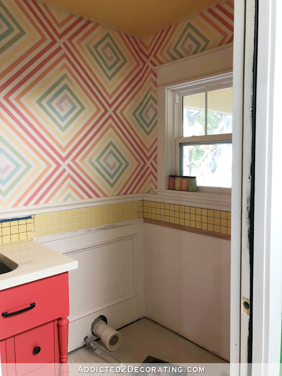
Bathroom Details: Black Wainscoting or White Wainscoting?
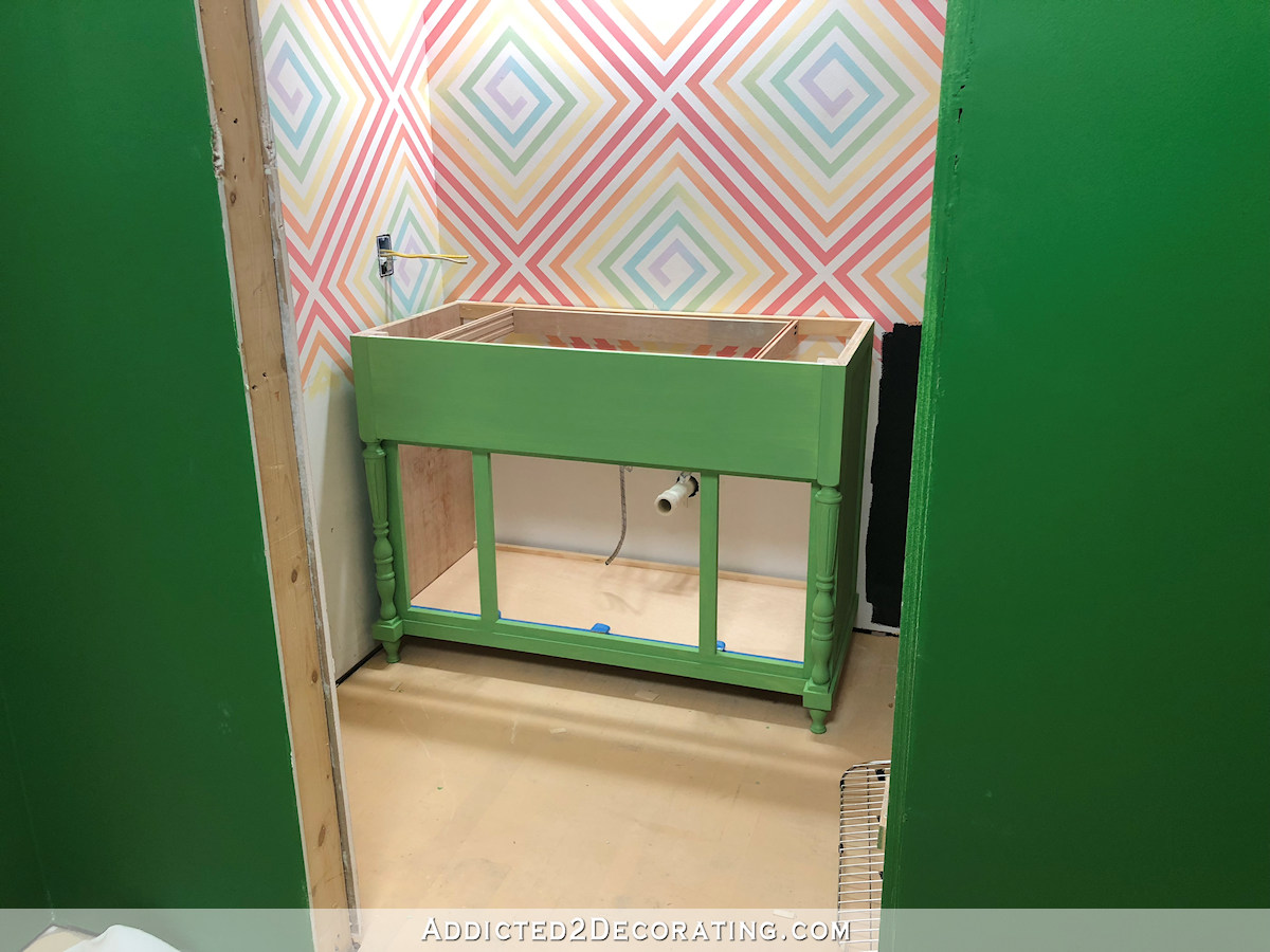
My bathroom vanity is almost finished. I just have to do one more coat of paint on the vanity and two of the doors, and then clear coat the whole thing. Then I can get everything assembled (sink, countertop, faucet, cabinet doors) and put into place in the bathroom. But before I do that, I really need to decide what color I want on the wainscoting. Black wainscoting? White wainscoting? I’d like to get it painted today, but I’m having such a hard time deciding.
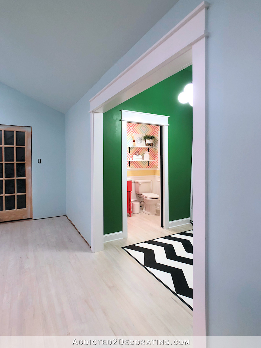
I did finally make a decision on the vanity color. I went with green. It’s a shade somewhere between the green that’s in the bathroom wall design and the green that’s on the back entry walls. (It’s all the same color — Behr Hills of Ireland — just mixed with varying amounts of white.)
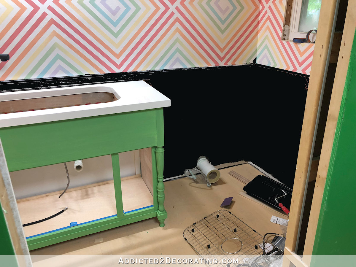
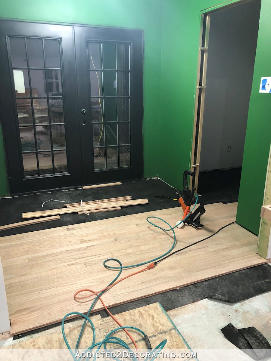
There will eventually be some wide white casing around that bathroom door to separate the green on the back entry walls from the green on the vanity. And the red oak floor, which looks terribly drab right now since it’s covered in troweled-on wood filler for hardwood floors, will be sanded and whitewashed.
But on to the subject at hand. What color for the wainscoting? I did two very quick mock ups. They’re not great (pretty terrible, in fact), but they give a general idea of what each one will look like.
First, keep in mind:
- The floors will be whitewashed oak.
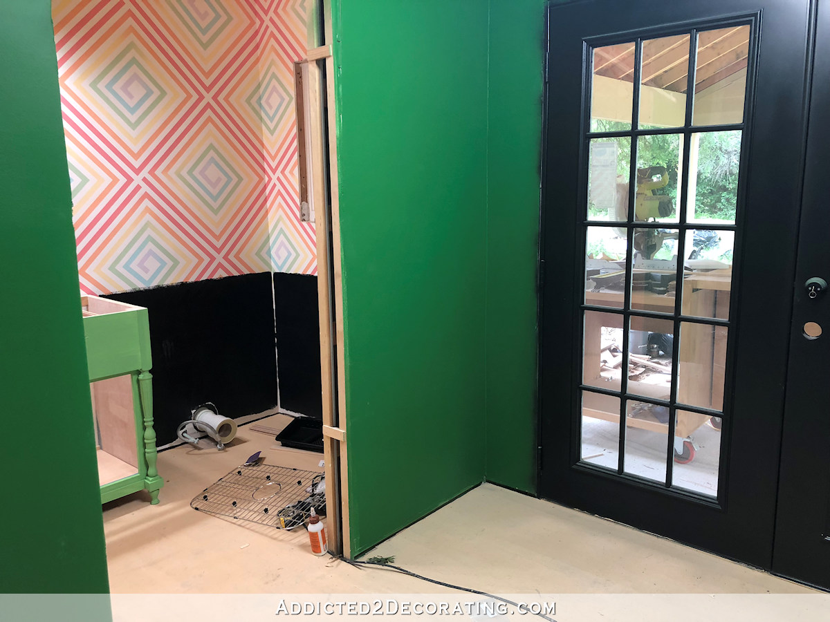
- The bathroom door (along with the French doors in the back entry and the storage closet door) will be black.
- All of the doors will have wide white casings exactly like all of the other door and window casings in the rest of the house.
- The back entry floor will have a bold black and white painted chevron design.
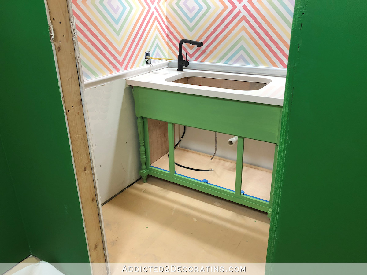
- All metal accents in the bathroom — faucet, vanity light, and cabinet pulls on the vanity — are black.
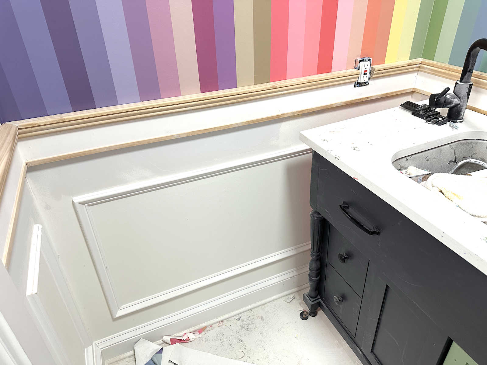
- I’m not going to have a backsplash in the bathroom. There will just be a simple chair rail right above vanity countertop level, and the chair rail and everything under it will be painted either black or white.
So with that established, here’s an idea of what black wainscoting would look like…
If I go with black wainscoting, I’ll still use white casings on the window and white on the crown molding. I had entertained the thought of doing all of the trim in the room black — window casing, door casing on the bathroom side, and crown molding — but the more I look at pictures of rooms with all black trim, the less appealing it looks to me, especially black crown molding. So the black would just be on the chair rail, the wall and trim below the chair rail, and the baseboards. So you have to imagine black wainscoting and baseboards next to whitewashed oak floors.
The other option is to go with white wainscoting. The chair rail and wall in the picture below just have primer on them, so white paint would be lighter and brighter (like the countertop), but this at least gives a general idea of what white would look like.
So I’d have white painted walls next to whitewashed floors. That’s a lot of light and bright.
There are two more things to consider. First, the toilet is white. So I’ll either have a white toilet against black wainscoting, which will make it really stand out. Or I’ll have a white toilet against white wainscoting, which will make it blend in and kind of disappear.
So that’s a definite +1 for white wainscoting, in my opinion.
On the other hand, the black looks amazing with the black French doors in the back entry.
Right?! I think that looks amazing! Of course, that black wainscoting will also have a white toilet in front of it. *Sigh*
Anyway, right now, I need to focus on finishing up the vanity and getting all of that put back together. But in the meantime, feel free to share your thoughts on the black vs. white wainscoting.

Addicted 2 Decorating is where I share my DIY and decorating journey as I remodel and decorate the 1948 fixer upper that my husband, Matt, and I bought in 2013. Matt has M.S. and is unable to do physical work, so I do the majority of the work on the house by myself. You can learn more about me here.
I thought I would be 100% team black, but when I look at your mock-ups I actually like the white better. I think it looks cleaner and I just don’t like the idea of that white toilet against the black wall. There’s so much going on in that bathroom anyway, I think the black would detract from the gorgeous wall design, while the white will point your eye there more. Can’t wait to see what you decide!
I agree completely.
White
I think white would look nice. There is something about the black that seems to detract from the colorful walls.
I am for white.
Black … it grounds it, makes it look more adult. While I don’t love the look of a toilet, I think the trend of trying to hide it is rather silly (not that that was what you were going to do, but the “blend in” comment got me thinking about it). With all the color and pattern, the eye is going to skim right past the toilet, acknowledge it then focus on the bright and engaging pattern. But no black crown, please. I only like it in Victorian hallways :).
I’m on Team White!
I agree with white!
I agree totally
Oh my GOSH! I was checking out articles on Bing.com and whose post was there? Yours about your countertop. You are famous!
No one wants to see a toilet. Have you considered a black toilet?
White. Your black fixtures will stand and your toilet will not.
Exactly what I was thinking- the White will hide your toilet and the black trim will tie into your fixtures
I think white would it pop the black is too dark, I feel like it may close the room in.
White with maybe a black chair rail?
Agree. Black wainscoting will show water/mineral splashes too more than white.
I agree…I have a navy bathroom…which I LOVE…but every single little drip of water shows up and it drives me CRAZY!!!
⬆️ I have zero taste so I couldn’t say one over the other with any conviction. But Wendy raises the point that would cinch it for me!
Exactly what I was thinking- the White will hide your toilet and the black trim will tie into your fixtures
Agree
White wainscotting with black towels, accents, etc.
White is my vote.
I agree! White wainscotting and doblack accents in other ways. I think this will tie everything together nicely!
White! The black seems to drag down the playfulness of the wall art. That’s my vote.
The black is jarring and is ALL I see in the mock-up. My vote is white.
I agree completely! White toilet, sink and countertop = white wainscoting. Otherwise, the toilet will be the thing that catches your eye — highlighted against the black wall. With the white wainscoting, the green vanity and the wallpaper are what catches your eye.
Team white!
Me too! Hope you’re already painting!
I agree the black looks great considering the entry doors, but your wall design is so fabulous that I agree it stands out more with white wainscoting.
What about the same green as the cabinet,
I like this idea too!
I like this idea. White wainscoting against the wall design reminds me of a child’s room, and the black seems like too much for a small space. The lighter green on the walls and a black cabinet sounds very dramatic and appealing.
Definitely white. Place a color pop on back of toilet.
Agree about going white. The black hits me in the face and fights against the pastel walls. Also I can see the vanity is a paler version of the green hall walls so it would be nice to carry the paler theme going. I could see small pops of black to go along with the faucet.
Or even white wainscot and black trim. It’ll look great whatever you pick.
Color fun and games. Glad to see a pro go through the same thing I do.
Agreed. White looks much better and will help settle the extreme business of the room.
Well said! I completely agree – white looks clean and fresh without detracting from the real focal point, those beautiful walls.
I would go white. Leave the black for the doors.
Agree
White.
Totally agree. Another vote for white!
I don’t like either option. Have you considered taking the blue or the green you’re using on the upper half of the wall, darkening that, and using that?
Normally I would jump on the black bandwagon since black is such a grounding color, but I agree with you, a darker blue or green might be better.
This is totally off the wall but have you considered taking a lighter color from the wall colors instead of using a dark color? The color that keeps catching my eye when looking at the photos is the lighter yellow. The commode still would not stand out much and I think it would really play up the design of the upper wall.
A color from upper is a good idea too. The coral is the color that stands out to me
I like coral, too, but I was afraid it would offer too much contrast with the green vanity and the green in the entry. the yellow I had in mind was not a the primary school yellow but there is a softer yellow in the gradient of the design (at least on my display). IMHO her beautiful design above the chair rail (and all her hard work) should be the showpiece and the color below the rail should simply be a supporting color. After all, once the floors and trim in the bathroom and back entry are done, there is going to be enough to look take in that the bathroom can stand with the unique design alone as its focal point.
I’m on team yellow
I am on this colorful team with light blue!!
White…
Or blue or green as suggested just above.
Agree. I think the white washes out all of your hard work. The black while it is bold, I am not sure it is the best bold color you could go with. Maybe another color that you are using in the pattern above that compliments the green….yellow!?!?
I vote for white. I like the black, but in smaller doses.
White! The black will is too harsh. It draws your eye to it, when really you want the other things to be the focus.
I agree! Too much black is too much!
White
I like the black. Get a black toilet?
Have you considered a coral color? I love all those shades of color on the wall and the coral that you painted your front door and studio door.
Exactly what I was thinking!!!!
Love this idea! I’m team coral (or white).
I agree, the black to too much here. I’m usually team black…LOL, but not this time. It would be great to see a mock up of some of the other colors in the wall that the others have suggested. Although the white is kinda ‘meh’, it lets the top of the wall and your vanity take the stage 🙂
team white – small room and it’s fresh and clean
White
White, for sure!
White!!!
White for sure!
I have to say white. Just like it better and I thought I’d prefer the black. Still liking the black French doors.
FWIW, I prefer the white, but I always prefer light and bright to a dark room. In this case, I think the white competes less with your gorgeous wall design and just says “bathroom” more than the black. With the slightly lighter vanity color, the black looks out of place in my mind.
There are black toilets……..
Oh, I could never. In my humble opinion, black toilets, just like black lacquered furniture, belong in 1980s bachelor pads. Only. 😀 I’m sure there are examples that would prove me wrong, but they would be few and far between.
There’s a restaurant I really like near me, with black fixtures in the ladies room – gives me the creeps every time! Can’t help but wonder what stains you are not seeing in that black toilet. Plus I know you bought that special grinder toilet because I am one of the readers waiting patiently for a review about it. So mark me as a white, but I think picking the lighter shade of green or a color from the wall would also be nice. WOW! So many replies!
Definitely team white after seeing the mockups. Like Caroline, in my head, I liked the black, but seeing them actually in the room, white seems the way to go.
The color idea is something to consider though, just because you ARE indecisive. Maybe you’re indecisive because you aren’t really sold on either option and need to look at other possibilities?
Kristi have you considered the coral color deep and rich?
Since you asked , that black just sucks the light and whimsy right out of the room. If not white , use a color variation from the top .
Yellow!
If it is between black and white, I say white. I do think testing a color from the wall design is worth exploring.
Having had a utility sink in an otherwised finished laundry/pantry in my old home…the splatter from project cleanup shows up on walls, and nearby cabinets and fixtures.
Black is definitely harder to keep looking clean in a room that is messy and also has TP lint. Speaking from experience! And fwiw- we had a black toilet and sink when we moved in to our current home. My husband called it the darth vader toilet because it also had a power assisted flush. It had a lot of mineral deposits visible and didn’t hide nearly as much grime as you’d expect. We got rid of it ASAP!
White most definitely…cleaner, brighter and with the whitewashed floor it will be beautiful. White trim also. Black is ‘in your face’ and is a huge distraction.
I love the white, or one of the blues or greens from the wall design above. Those would look stunning!
Agree! I like the white but can also see a lighter green or blue for the wainscoting. Definitely NOT black. It overpowers everything else and it detracts from the black faucet and light fixture. I don’t think it would be too much white, even with the floors.
Black shows every splatter, etc. we have a men’s powder room with dark wainscoting, and you can tell it is a men’s room.
I’d like to see one of the wall design colors on the wainscoting and keep the black as a trim color. A little black goes a long way next to the black doors. You are so courageous with using color! The white would be too blah in this space with such a dynamic use of color!
I think white bead board and black vanity .it would pull in the black from the doors and look fab with no toilet showing fab with no toilet showing up against a black wall
Definitely white!
My vote is for white.
What about white with just a black chair rail to still tie in the black?
I thought I wouldn’t care for the black. But I love it in the mock-up! And with the French doors. I don’t think you can go wrong either way. It will be stunning.
Black seems very heavy with all those beautiful colors. I vote for the white option 🙂 On aside though, I’m sure whatever you decide to do, it will look AMAZING – as you always seem have that effect on me!
My thoughts too.
White is beautiful!!!! To me, it allows the wall design and vanity to pull together. The back is dark and distracting and (again, to me) adds nothing to the space. The black faucet will be enough to tie in the hallway.
Out of the black and white I vote white. The black demanded attention and took my eye away from your incredible pattern, whereas with the white it was the pattern that shone.
I like Ishtar’s idea. I love the color green of the light fixture, maybe paint both the wainscoting and vanity that color.
Me too. White looks so clean. I wish you were staining the floor to match the rest of the house. It would tie it together and calm down all the colors.
Which is the attention getter . . . LOOK ~ Black wainscoting, or, LOOK ~ isn’t this painted wall detail (above the white wainscoting) amazing . . . ??
Wow! That’s a tough one. I just knew I would hate the black, but I love it! If only it wasn’t for the toilet. I know that space is small, but is there room to add a wall to hide the toilet in it’s own closet?
I’m glad you went with green for the vanity. I was worried any other “color” would look odd with the lighting that goes above it.
I like the white. On another note, are you going to put some kind of protection above the sink? Just thinking about spatters from washing paint brushes and pans, etc. But, maybe I’m just sloppy!! As usual, amazing!!!
I’m not, but I am going to clear coat the painted walls and the chair rail with my favorite General Finishes clear topcoat to make them really durable and easily cleanable.
I wonder if you’re undecided because they aren’t quite what you want? Your past indecisions have been because you didn’t hit on something that you really really liked, right?
In the opinion category, I think a navy or indigo would look awesome with your colors scheme in the bathroom, but that intense green in the hall is limiting your color freedom in the bathroom, I think.
Team white. This is going to be a workhorse bathroom…when washing brushes, etc, any splashing will dry to gray spots.
Since there is no natural light, I think keeping it lighter will give the illusion of brightness…IMO
I definitely don’t like the black—it screams to be looked at, but I think the white is a strange balance to the top part of the walls. I think the lighter blue pulled from the upper wall plattern would be light, not scream for attention and blend nicely with the floor.
If you go with a color, stick with the same green you used for the vanity. And I think I like that idea even better than my first choice, which was white 🙂
Black
I’m for white over black, but think a light rose or coral would be fabulous
White! The black is too harsh!
I don’t have issues with black walls – I have one in my bedroom.
My caveat is this – the black wainscotting you are thinking about is in a working area and an area that will likely see a lot of dust. Dust clings to walls – and while it is largely invisible on most walls it is VERY visible on black ones.
I find that I regularly have to dust the black wall in my bedroom because the lint from my bed linens (from flipping and fluffing the duvet) clings to the black walls.
WHITE! Yes, I am shouting 😉
Good points for both ways, but I’d personally go for white or lighter. My thinking is that while the black appears to look great with the back entry door, and possibly with the hall flooring (can’t visualize that) in some ways, overall it will feel like a cave in the bathroom and hall. I agree, too, who needs their toilet to be spotlighted? White, or a lighter color, would keep the bright, airy, and happy feel of the overall studio space. Black can be a nice contrast, but it can also be pretty depressing in large doses. With all the black already planned for that back area, I’d be thinking about overall studio balance. Just my perspective. As always, it’s your space, and you need to do what makes you the happiest. And it can always be painted again, although not as conveniently as now.
I thought I would hate the black, but in your mock ups I really like it. That being said, the toilet will really stand out against a black wall, so I really don’t think you should go with black. My recommendation would be white wainscoting and black vanity.
Voting for black. Once you get that trim up, it will look amazing and tied together.
I vote white!!
The green vanity is just right — as usual! Though I like black, it is too harsh. The black doors in the entry and the black hardware in the bathroom will be enough black to ground things without being too much.
Neither! Go for a warm complementary color to the green and black…like the reddish orange in the design. Maybe even a different shade, more warm, of the coral your putting in the main work room…kinda like the side door color… A warm complementary color would still ground the space, not compete with the toliet, but not overwhelm or washout which the black and white does.
Use the black somewhere else, perhaps as a picture frame color.
I’m not a white fan. And I usually love all of your color choices. I think you are having a hard time deciding because you don’t like either one (black or white) with the current set up. Trying to hard. Walk away and do something else. It seems to me that the focal point of the entire room is the diagonal stripe wall, which is stunning. I would tone everything down (including the ceiling, so the wall is the star. It would blend better with the entry as well that way. Just the fun pop when you peak through the door. If you want to bring in black, use black fixtures. But I would keep the floors, wainscotting, vanity and ceiling light. If it were me, I would do all in white quite honestly, maybe find another color for the vanity but something that’s subtle (possibly pale coral). Just my thoughts. I hate the heaviness that is dragging down that beautiful wall.
I was totally on team black until I saw all of the elements semi-together. I think there would be too big a competition for attention. I guess I view the design on the walls as akin to the pantry backsplash which drew your eye in directly. If there was a color that worked as the cabinets did in the pantry and accentuated but didn’t demand attention that may work. Otherwise I vote white.
The last thing I’d want to highlight is the toilet, so that’s a big enough reason to go with white. Plus, once you’re in the room with the door closed, the black just seems out of place.
Neither, I’m thinking coral!
Me too!!!! I think a complimentary warm coral would ground the space and make it polished at same time!
Well, since you asked, WHITE all the way. I didn’t think I’d like the black, and the mock-up confirmed that I do not like the black.
Question…if you do the black, how would that look from inside sitting on toilet with black door, black wainscot, divided by vertical white door trim? I just don’t see it as looking good, but may be wrong? And I think the more pastel colors–although vibrant–are more in tune with white than black. And your accents (faucet, light, etc.) will pop just that much more.
Since you asked… 🙂
White
Maybe the blue wall color from the main studio area??
White
I like the white, but reading some of the other comments, maybe exploring one of the colors in you patterned wall would tickle your fancy.
Neither – I’d go with green because it will be less stark a contrast w/ the back entry and trim. If you use black, you’ll find yourself constantly scrubbing the wainscoting because black will show every spot and drip.
I’m on Team White. To me it has a fresher look . Although I must say “Black Drama” is appealing – especially if that’s the look you want in your workshop!?!
team black! and i switched out my white toilet seats for black ones years ago, I love the way it looks, like a tuxedo (which I think classes up a toilet)!
White–the black seems too glaring, and if you put a white toilet in front of it? Definitely white.
Write in vote for light yellow!
I like light and bright in a bathroom (feels cleaner? Or just because it’s a small space), plus I think letting the toilet blend in would be a good idea. White would be my choice. I think the black and green look amazing together elsewhere, though!
Its looking great Kristi!
Team white–100%.
Black faucet, and towel bar are enough hints of black for me😁
Not a fan of either now 🙁
Black draws attention away from the beautiful wall treatment, while white seems to draw attention to it. So my vote is for white 🙂
White for sure. I feel the black is too intense in contrast and takes attention away from the gorgeous wall and sink area. The white pulls it all together.
How would continuing the wall pattern in black and white look?? That would give you some black but not be overpowering. Just a thought.
Every time you wash hands, paints, pans, brushes all that soap, splashes and paint will show up loud and proud on the black (although I love the black more than the white)
White. Or the same color you used in the studio. Blue-ish white?
Another for Team Black. It grounds all the colors in there without washing out like a white color would do.
White is my preference as well, given the other colors on the wall are light. The black is just too harsh in my opinion, for whatever that’s worth 😋
White
I’m thinking since this will be a work area with saws and dust etc floating around. Black would show all that floating debris (dust). White could hide it for a longer period of time before dusting! Personally I’m not fond of dusting so I would vote for white.
I like the white best….
I’m team white too!
White.
Any time you do white, it seems like you end up saying “why did I do white? I should have known better!” I like the idea of doing a darker version of one of the colors in the colorful wall. I also like the black. I think once the floors are lighter and the room is finished, a darker color wont’ provide such a drastic contrast. With all the color on the walls, I don’t think the white toilet in front of the dark wall is going to be what you focus on when you enter. And if you do black it ties into what you’ve done in other areas.
Team white! Just my opinion, the black takes my eyes away from your beautiful wall. Too much black.
I thought I would be team Black, but now I’m waffling! Jenna Sue did black walls to the ceiling in her new guest bath, and actually the toilet doesn’t stand out like you would think. But, it’s also all black/white, that might make a difference.
http://blog.jennasuedesign.com/2019/04/guest-bathroom-reveal-heights-house/
Which ever way you go, that wall needs to be the focus, it’s AWESOME!!
I agree in looking at this link, I think the mock-up is showing the black way darker than its going to look in real life. You see in this other bathroom that the black isn’t looking that stark.
Jenna Sue’s is totally different; in my opinion, it’s the wall design here that’s throwing the black off. I just did a guest bath in deep navy and the white fixtures look fine with that. However, the walls do show everything! I’m team white.
I vote for white wainscoting. I think the black is too harsh and detracts from the awesome wall design.
OR
since you are embracing lots of color in this area, you could even pull a color from the wall design for the wainscoting. You will still have plenty of black in the doors and the floor design.
Can’t wait to see what you decide on.
White! The black draws attention away from the awesome wall design. White is neat and clean looking. Maybe consider staining the floor differently. Just a thought.
I’m in the black camp…..few as we are. I like the way it grounds the room and ties in to your entry. I think white toilet, white wainscoting, and whitewashed floor will end up too bland for you. A studio bathroom is the perfect place to go bold. Although I think actual black painted wainscoting won’t stand out quite as much as the mock up. I don’t even mind the white toilet. It’s a bathroom, after all.
I think the black is too stark against that beautiful wall design you made – especially because the colors are soft. I would either do a soft color like the wall, or white. No sense highlighting the toilet! Just seems white will blend beautifully with the light floor and design. Trim – always love white, but I know you like the idea of the black with your entry – ??? I vote white.
Can’t wait to see what you decide.
White
I guess I’m the odd ball, I like the black wainscoting! And I thought I would like the white better, lol…
White for sure, or another lighter colour from the top portion of the walls — I would go with blue or coral. When I look at the photos of your mock-up with black wainscoting, it totally washes out your colourful walls. It makes them look weird or unmatched somehow. I don’t know exactly how to explain it. And I don’t like black with the green of the vanity, either.
White please Especially since you will have a white toilet. Otherwise the white toilet will be be your focal point instead of the cabinet or walls. If the door isn’t shut it will really catch your eyes. If you decide to go with a wall color, choose one that contrasts the least with the white. If the plumbing was reversed, you could have used a stronger color. I guess I just want your lovely cabinet and walls to stand out instead of the throne.
I am screaming for white. I never did like the idea of the heaviness of black. But I bit my fingers/i.e. tongue instead of saying so. Once you asked for an opinion? Well, here it is.
Your observation about the toilet getting center stage in front of a black wall added one more reason and made me laugh.
This is a fun space. Black accents, yes, but no more than that.
Definitely white. It makes all the other features pop. One question about the backsplash though… I know you said you didn’t want one, but if this is going to be a working sink where you might be cleaning paintbrushes and other things you will definitely be getting splashes up on your wall. Looking at your beautiful wall design I hated to think of that getting speckled. Wondering if you did something fun with the backsplash like instead of having it straight across having square tiles maybe mounted in different heights or something artistic. Just a thought. Thank you for taking us along on your journey and asking our opinion’s. It’s so much fun getting your emails each day!
I’m normally a big fan of black, but not in this room – I’m with those who suggest trying something other than either black or white. I would try a very light version of the green, so that it ties in the vanity and the entrance room without being either colour. perhaps the chair rail can be white so that it ties in the vanity top and the background in the design??
I applaud you on the plan to clearcoat the wall so that you can wipe off spots with a wet sponge – otherwise your beautiful design would be ruined within weeks of using that sink, i fear.
White is the right color.
IMO the black is too harsh with the light wall colors. Please try one of the wall colors first – it’s a small bathroom and could be changed to white fairly quickly if you didn’t like it yes??
I vote for a lighter version of one of the colors in the wall pattern that also complements the vanity, and I would do all of the trim in the same color, not just the wainscotting. Maybe a paler yellow or green? The black isn’t my favorite, but the white is fine.
Definitely white. In the picture the black on the mock-up wall kind of looks like a black hole. To me, it detracts from the beauty happening everywhere in this gorgeous bathroom
Team white.
This may sound crazy, but I actually think the disconnect is the vanity color. If you went with the white wainscoting and painted the vanity the black- you could get the same “wow” effect with the French doors, and the toilet would disappear, and the beautiful green on the walls wouldn’t be — how do I say it—sort of scaled-down (if that makes any sense) by a continuous lightening of the color from wall to vanity, to stripe.
I agree with Laura a bit here. I think the black walls are too stark. But a black vanity against white walls will be stunning. The green is very pretty but oddly seems ‘off’ considering it is the same color but lighter shade of the other walls.
But I am positive that whatever you chose you will finish into something stunning!
Yep.
I vote for butter yellow for the lower walls; pops of black in faucet and towel bar. Ideally, I’d like the vanity to be butter yellow also.
Barring that options, I’m team white.
As much as the black and pastels seem to not go together, I actually think with the fixtures and drawer pulls and the floors.. plus all the other Black in the entry, doors etc; that black is the better choice.
White
Black just doesn’t seem to go with the rainbow you have going on with your walls. I’d go with white.
I agree. Softer and gives the eye a place to rest.
white
White
If you switch the wainscoting from black to white you could make the vanity black…. just sayin’
I thought I’d really like the black but I think it detracts from the beautiful wall design. I really liked the cleanliness and brightness the white brings to it. Remember what you will be using this washroom for and if you still want to do the black, go for it.
White would be best. Making the toilet stand out maybe the one thing visitors should see is that Great Wall design you created.
Team white From the pictures but I would like to see the white with the black doors.
I can understand why it’s a tough decision… they both seem to have benefits and drawbacks.
Visually I like the black better. It’s like a frame for the wall pattern and cabinet green. It keeps the colors in them vibrant. The white makes it all very pastel. But then, that’s really just my bias against pastels.
Yes, a white toilet will pop against the black, and I understand not wanting to make a toilet a focal point… but it’s a bathroom. Bathrooms have toilets and I’m okay with that.
White
I think black give the room a modern, adult vibe and the white leans a bit nursery.
Coral!
Oh wait-not an option-I guess I like the white over the black : )
White has my vote.
White pls. Black will overpower the otherwise gorgeous room.
With that end of the room so dark and heavy with the dark green walls and black doors, how about a light color on the bottom that is in the wall design above?
Just throwing this out there: white-washed red oak bead-board (or other type wood), to match the floor. One less “element” competing for attention in this small room, and able to stand up to the utilitarian use of the sink. Just a thought.
The white is much more complimentary to that gorgeous ombré wall! It’s the star of the show, let it shine! Maybe black rugs would give the right punch?
White wainscoting. . . but my brain also said gold. Can’t always go by what my brain says. 🙂
I thought I’d be voting black, but IMHO it looks a bit too harsh and on the other hand the white looks too washed out. What about a pale blue like you used on your studio ceiling, or a soft coral color from the wall design?
It’s a water closet. a toilet is expected. The black looks amazing. you can never go wrong with green and black.
One more thing…the walls are going to pop no matter what you do. When someone goes to use the powder room, they are going to notice those beautiful walls. Once they’re mesmerized, you might want the toilet to stick out so they know where they’re going.
White! I believe that your wall needs to be the focal point more than anything else and with the white it will pop, while the black will compete with everything. If you need black… paint the vanity black. I’m guessing by the time you’re reading this you have already made a decision. 😉 Can’t wait to see what you decided.
Team white for me. The black is too harsh to me, plus, the background of the upper walls is white, and flows better together. I’m going to be honest, I don’t love the black doors, but I know a lot of people do. It’s not my house, so I can’t dictate what you do with yours. ( But you asked about the wainscoting, so I gave my opinion.) LOVE the vanity color!!
It’s really what you prefer. I had a strong negative reaction to the black. I prefer white. I think it sets off the color much better and gives it a lighter feel. Bottom line, what makes you feel good?
I really don’t like the black. It looks like a hole. But it’s not my home. I do think a black vanity would be smashing and tie in the black accents. I also suggest a black baseboard against the white wainscotting w/ the black vanity. In fact, black baseboards throughout the entire studio–I would keep the crown white, though.
Well I am going to give a different opinion. I love your wall finish it on the bottom and let it be the star. Use a clear acrylic Over the bottom half for protection it you want but I vote no wainscoting at all.
I agree. I love the wall design and colors, and think wainscoting would be too much. Wainscoting seems too heavy for your light and airy studio, BUT I cant wait to see what you decide!! You’re so good with color, I know you’re choice will be awesome.
I would go with the white.
Like others suggested, coral or yellow would be wonderful.
White cabinet and wainscoting with black hardware or
black cabinet gold hardware and white wainscoting
Love your style and admire your talent!
I don’t think you’re going to be happy with white, but that’s just from following you for awhile. The white toilet against the black wouldn’t bother me, but it sounds like it might bother you? Other than these two things, I don’t have any more ideas.
White or another color – NOT black.
White wainscoting, but what if instead of whiteqashed floors, do stained black and white squares, like checkerboard tile?
Team White. The black seems out of place against the pastel pattern. I’d bring in some black with accessories.
What if you did the pale blue that is in the background of your wallpaper, or a tint of it🤔
W-H-I-T-E!!!!!!!!!
White, your wonderful wall finish is the first thing I see with the white and the black is the first thing I see, the wall design doesn’t pop and it deserves to shine as the star of the room.
White
I would definitely go white to let the upper walls be the pop star. I’d add a mirror with a black frame and something else black to bring in more black. Maybe mock up a black chair rail? I agree that you want more black to accentuate, but I felt like an entire wainscotting grabbed the eye instead of the upper wall.
The white color looks anemic and black contradicts with amazing upper wall design and pull too much attention. Would you consider some shade of yellow?
I thought the same. Yellow in the same family as the the Hill of Ireland green would make the black door pop and blend the cabinet into the surroundings without having the toilet stand out. I thought that both the black and white would make each piece fight for your attention.
I think coral would be fabulous!
White.The black looks oppressive – there is no place to rest the eye -the beautiful pattern would be competing with blocks of harsh colour, which would be a shame becos it really is a clever work of art
I understand the desire to tie in with the black french doors and the green. Bathrooms usually have a lot of white because it feels cleaner and easier to see when it is not. That said, how about a black vanity and white trim and white lower half? Add the green as accents to the room.
White!
I actually really like the black with the walls. The white seems to kind of wash them out a little and seem more pastel. The white toilet on a black wall…eh. I think it’ll be fine. The vanity and toilet and probably a trash can between them. It’s not like it’ll be a white toilet in an uninterrupted field of black. I would have never thought I’d like the black wainscoting, but go for it!
Only because you’re asking…white or the blue in the pattern from the design. I think blue and green look great next to each other. Don’t repaint the vanity as some have mentioned, the green is fantastic. I hope you surprise us soon with whatever option you choose!
From those two options: I vote for the black. I think it gives the continuity between the two spaces. I don’t like how the wainscoting blends with the white in the pattern above and with the counter top if it’s all white. Seeing the white toilet stand out from the black wainscoting doesn’t bother me. I know you decided against a black vanity so the leg detail would stand out, but I feel like if you did the coral on the wainscoting it would tie into the wall pattern above and your studio cabinets and a black vanity with a white top would look dynamite against it. I also like the suggestion someone had above of doing the same white washed oak from the floors as the wainscoting.
Team white for this one. I love black but here it doesn’t “GO” and seems to dirty the space up. It feels too heavy not classic like the french doors in the entry. I’d do some accents in black to go with the faucet though. Like frames, a hook, etc.
I cannot believe I’m saying this, but I do like the black, especially since you will be using a semi – or flat paint, wouldn’t you? And there are many different shades of black. I also like the white, but that seemed like a bit of a let-down to me. Then again, once it is all finished it will be perfect. Then again…darn it Kristi…I’m glad this is your room as it would probably take me a longer time to decide.
God bless.
I think I like the white, but it’s hard to tell. The white pulls out the white in between your swirls on the wall and brightens it up. BUT, with white-washed floors, I have a tough time picturing it.
I definitely dislike the black, but I have never liked the combination of black and green and as much as I try, I don’t think I ever will.
I can see why you’re indecisive on this!