Dimensional Fall Leave Typography Artwork With #CanonPIXMA
Disclosure: This post is sponsored by Canon PIXMA, but all opinions expressed are 100% my own.


The other day I was in Pier 1, and I saw this cute and colorful typography artwork…

I really liked the chalkboard-looking background and the colorful letters, but I wasn’t too crazy about the saying. I also thought that some dimensional letters would look nice. So I decided to make my own, with a sentiment that was a little more “me”.
I snapped a picture of my inspiration with my phone, and printed it out right there from the store using my Canon PIXMA MG7120 and the PIXMA Cloud App so that my inspiration pic would be waiting for me when I got back home.
I started off with a 12 x 12 black canvas (purchased at Hobby Lobby) and some wood letters. I laid everything out to be sure it would fit before moving on.

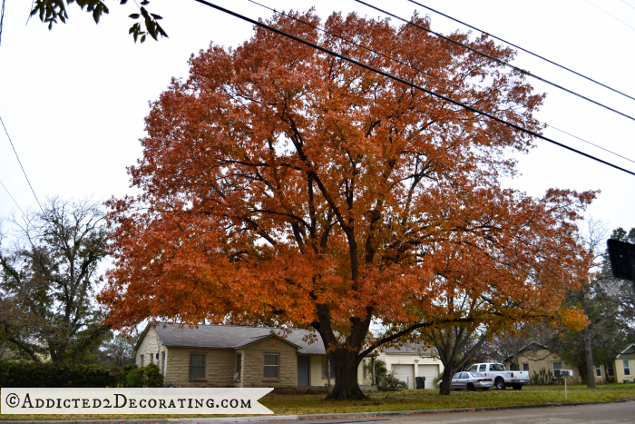
I also needed something colorful for my letters, and since it’s still fall, I thought that using pictures of fall leaves would work perfectly! And lately, the leaves here in Central Texas have been really pretty. Just take a look at the big oak tree in my front yard! I snapped this picture two days ago.
But since my mom is the photographer in the family, and she already had some beautiful photos, I had her send over some pictures that she had taken of trees in their neighborhood, and I chose my favorite one with the most color…

And I love the fact that it was taken right in the neighborhood where I grew up (and where my mom still lives).
I printed out several copies of the picture as large as I could make it to fit onto a sheet of 8.5 x 11 matte photo paper.
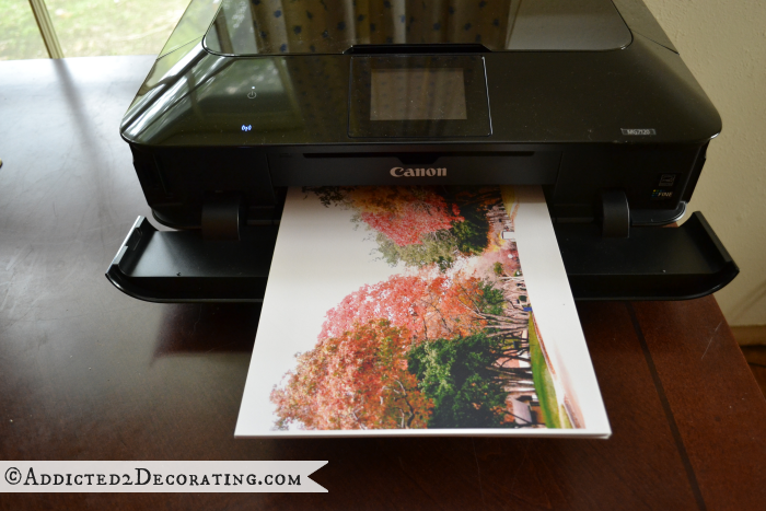
I used my photo editing software to increase the brightness of the photo each time I printed it so that I would have more variation in color to choose from.

Next I brushed on some decoupage adhesive to the front of the letters…
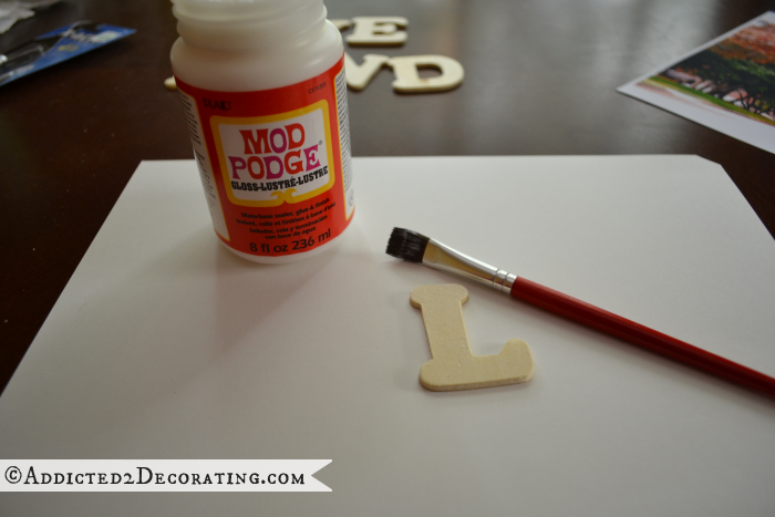
…then glued the letters to the back of the printed photos, and cut them out with a craft knife. You can see that I put the letters in strategic spots to take advantage of the most colorful areas of the photos.
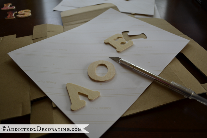
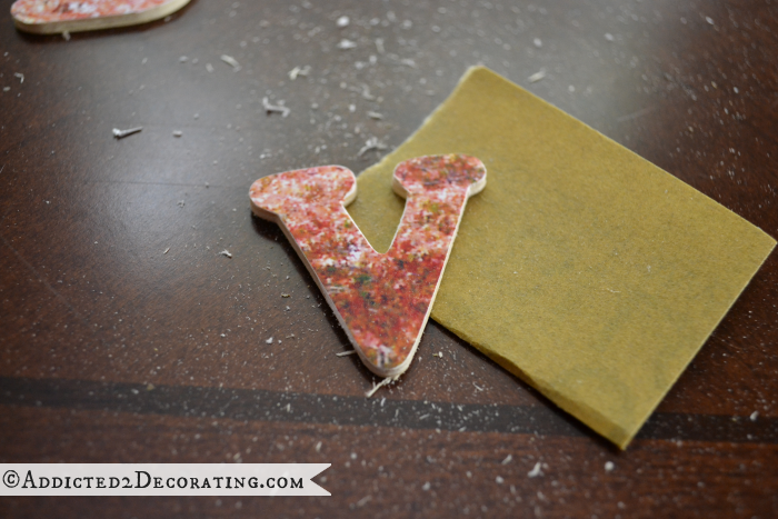
I didn’t do a great job in cutting them out, and they looked pretty rough, so I cleaned them up with some 180-grit sandpaper. It did a great job at making the edges really smooth and removing any excess paper that I didn’t trim just perfectly.
I wanted my canvas to look like a chalkboard, just like the inspiration piece, so I used some white craft paint and a very wet craft brush and washed some white paint over the entire surface of the canvas. In some areas I had too much, so I just used paper towel to wipe off the excess.
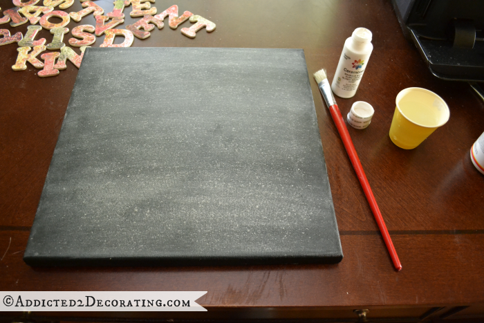
Once that was dry, I was ready to glue on my letters.

I love how colorful the letters are, and I especially love knowing that these are beautiful fall leaves from the neighborhood where I grew up.
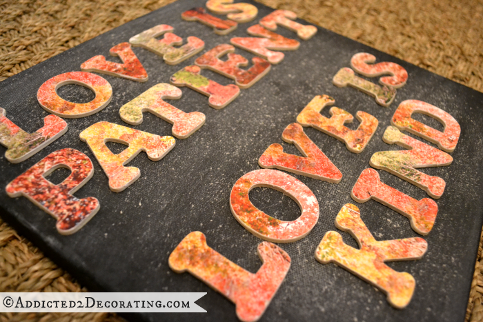
I think this will look great in my office once I start working on the decorating in there.



Great project Kristi! Love how you used pictures from your neighborhood!
Great use of neighborhood photos and the beautiful colors. I could see doing this for every season. Thanks for another great idea.
So happy you came up with a project you could completely finish while you’re feeling a little hung up on some others.
The artwork is beautiful.
The “n” in patient is upside down I think……….?
Wow, even after you said that, it took me 3 scrolls back to examine before I saw what you mean. What a good eye you have, Mary L. Kristi, I love this project. The background looks almost spatter painted. What the canvas a little nubby and that’s what made the rough texture? I’m not creative, but I’m a good copy-er. But you take it to a whole new level. Again, thanks for sharing!
Wow, Kristi! This is gorgeous, amazing and so creative!
That’s really cool. I think you should paint the edges of the letters to make them pop out.
Fantastic Job Kristi! I never would have thought to use photos. Great idea.
So cute! And I love the personal touch of the neighborhood photos.
Really like this look! You have sooooo many good ideas and I love seeing what you come up with next!
I really like the artwork you created using your printer, great job, Kristi!
That’s a neat idea Kristi.
this is great! Its so pretty and unique. I’m going to try my hand at this also.
Love this! Cool, cool project!