
Dining Room Progress — Wall Sconces, More Fabrics, and Bench Redesign
Yesterday, I shared three lamp options for the buffet in the dining room, and I got quite a few comments saying that I should use sconces instead. To be honest, my initial thought was, “Ugh! I don’t want to spend more money on this! I already have these lamps, and I just want to get this done!”
And then about an hour later, I remembered that I happen to have sconces on hand as well. In fact, I have two pairs of sconces that are no longer being used. They’re just sitting in the sunroom waiting to either be sold or given away. And one pair of those sconces just happens to have shades that would go perfectly in this dining room. So I got them out, dusted them off, and hung them on the wall.
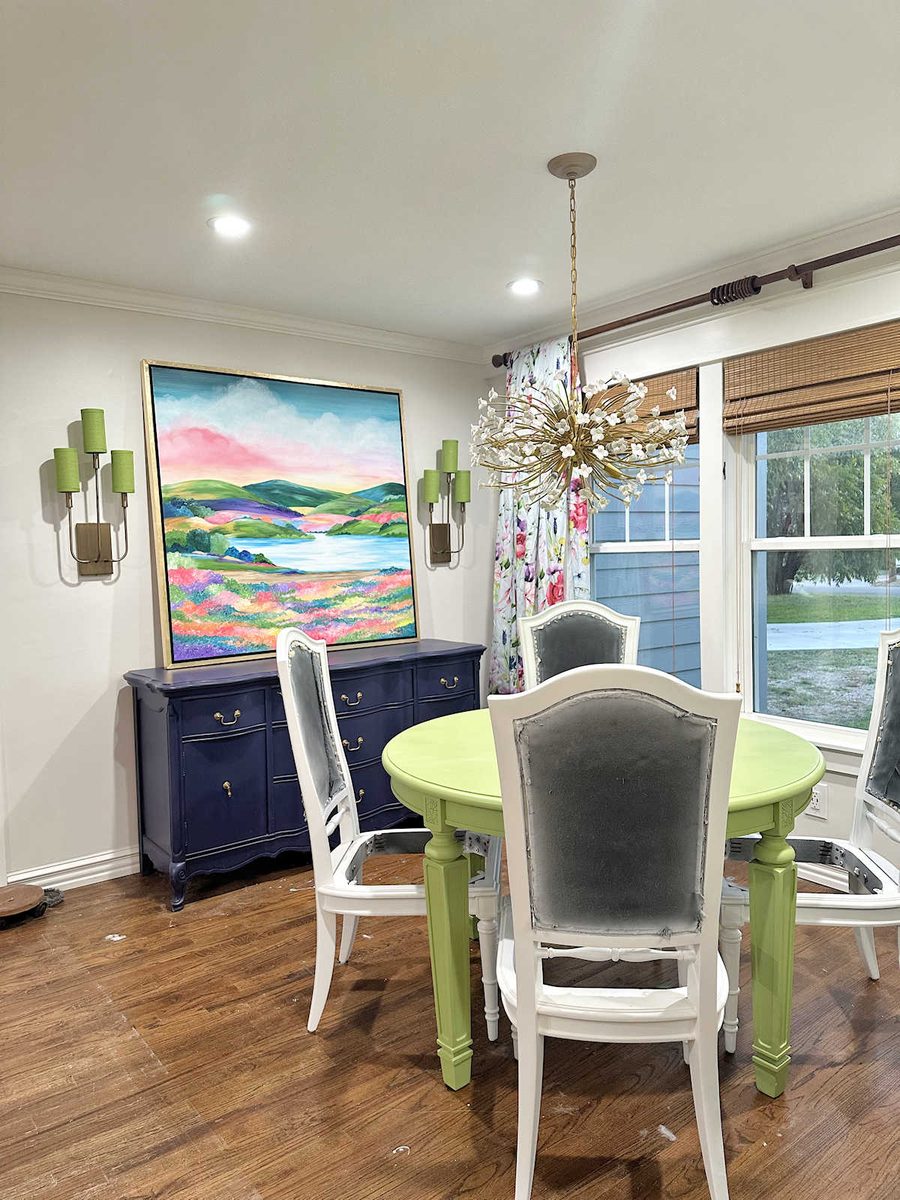
I love these in here! (I still need to hang the artwork on the wall.) The great thing about keeping a color palette consistent throughout the main areas of the house is that items like this can very easily be moved from one room to another and look intentional.
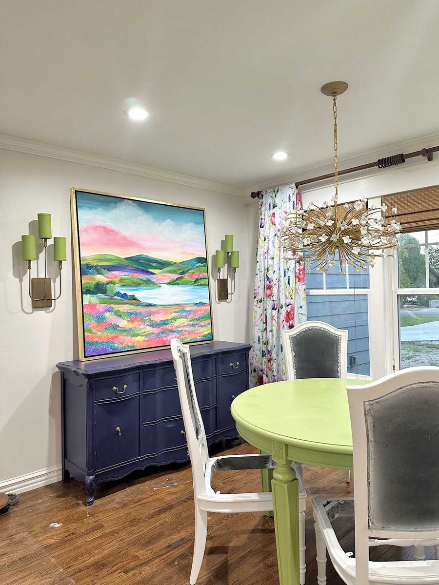
Of course, they don’t have electricity to them right now. I’m not quite sure what I’m going to do about that, but I’ll figure something out. So right now, they’re just wall decorations.
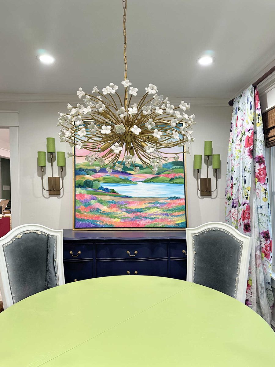
But I was so excited to see how perfectly they go in this room, and more importantly, I was excited about using what I already have on hand.
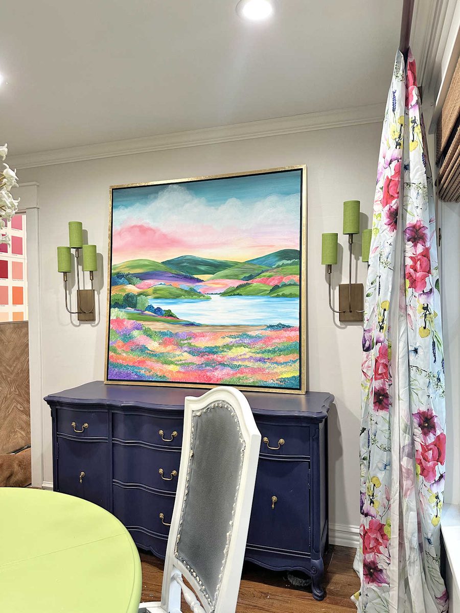
In addition to hanging sconces, I also spent yesterday planning and purchasing everything I need to build the new benches today. But also, I worked on the striped fabric again. I thought I had the striped fabric all worked out. If you’ll remember, this was the last iteration I shared with you.

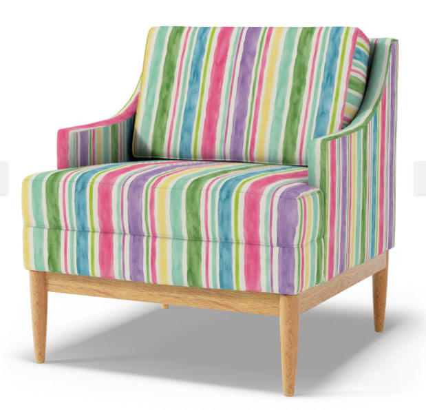
And this is how that pattern looks on an upholstered chair. Spoonflower doesn’t have a dining room chair option, so this is the best option for seeing how it looks on upholstery.
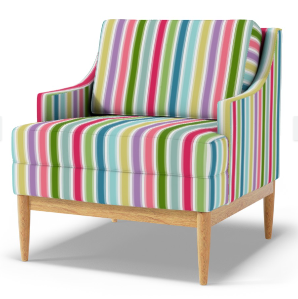
So I thought that part of the process was done. I was wrong. Enter my mom. 😀 I opened up my email to see two emails from her about my striped fabric. She wasn’t loving the stripes that I had designed and suggested that I go with a more imperfect watercolor striped design instead. She had done two mockups with this idea that she attached to her email. The first one had darker stripes…
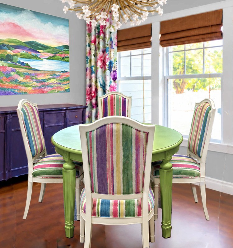
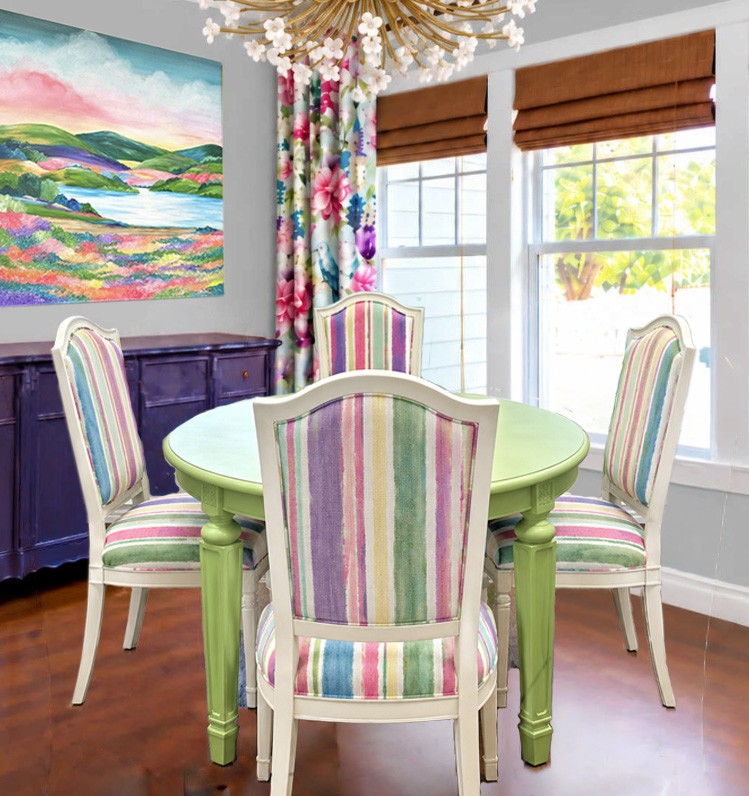
And the other one had lighter stripes.
And in a follow up email, she included a picture of the chairs in a watercolor striped fabric on all three sections of the chairs, plus a pattern suggestion and a color key.
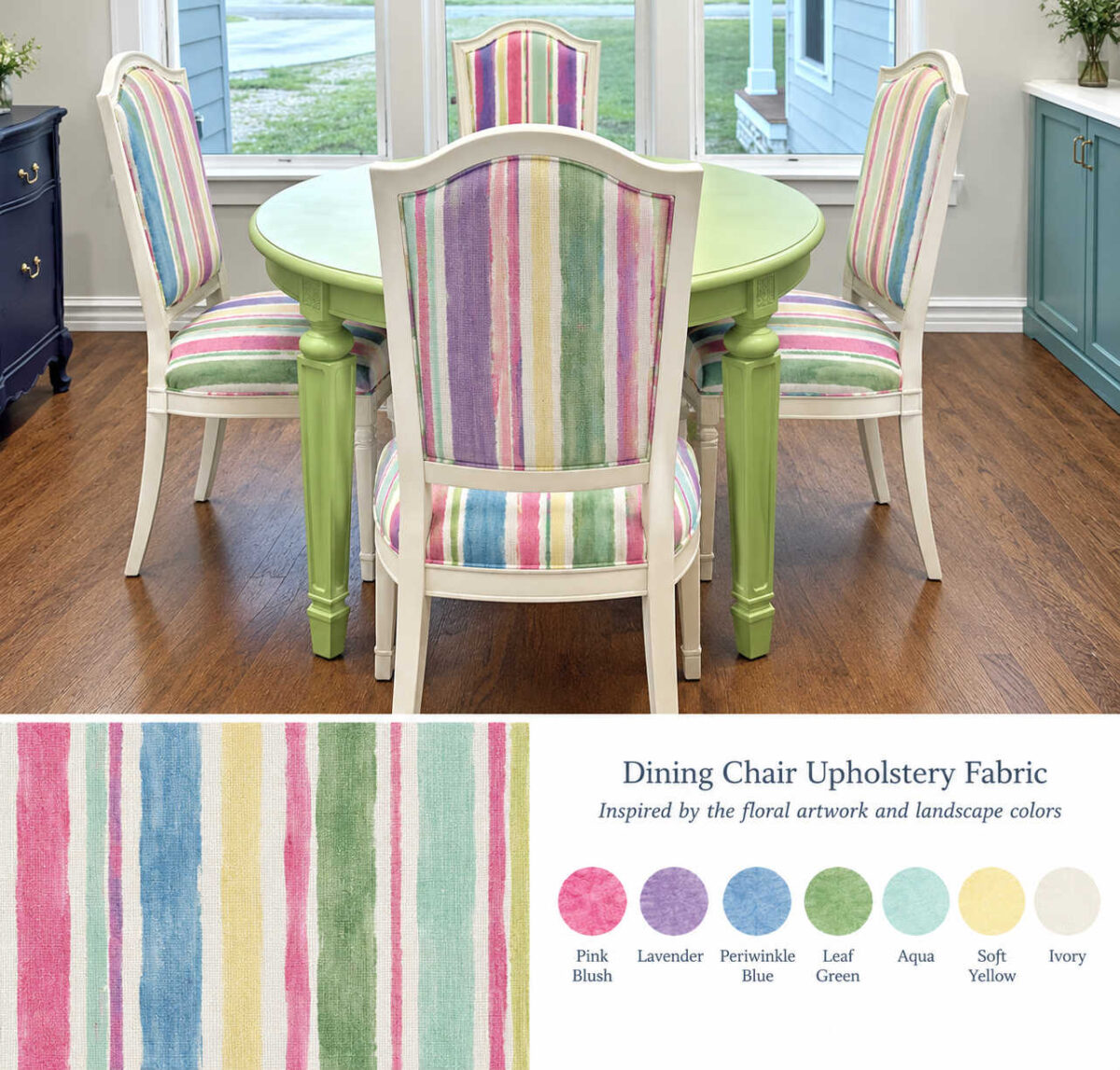
What I noticed immediately is that I absolutely LOVED the look of a watercolor stripe on all three sections of the chairs rather than using three different fabrics. It looks so bright and fun. The downside is that I had no way of making a watercolor striped repeatable seamless pattern that I could upload to Spoonflower to have fabric printed. That’s beyond the capability of the software that I use.
Then I realized that while I don’t have that capability, I bet that ChatGPT could make one for me. So I gave ChatGPT all the info, the color key, the drapery fabric, and all the instructions I could think of, including the instruction to make it a pattern that could be tiled so that it’s seamless, and this is what it gave me. This is the full width of the pattern, but it’s not the full length. The actual pattern is a seamless one.

I uploaded that to Spoonflower to take a look at it, and this is what it looked like.
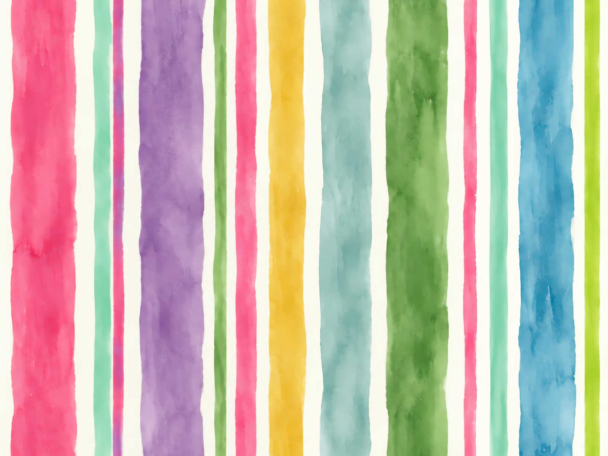
And then I made a couple of changes based on the drapery fabric. I had it make the light yellow a little more golden, and I had it make the aqua stripe a little more teal, both of which were based on colors directly from the floral drapery fabric. And this is what it gave me.
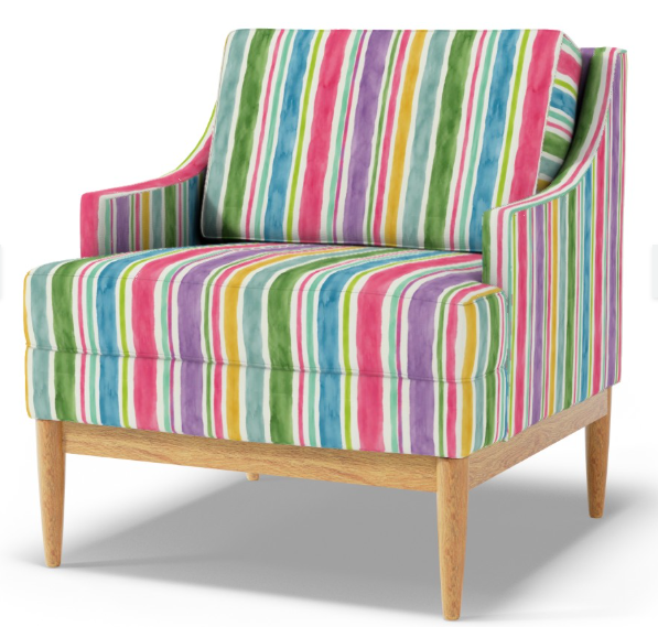
So I uploaded that final design to Spoonflower, and this is what it looks like.
So I still haven’t ordered the fabric, but this time, you can blame that on my mom. 😀 I’m glad that she sent me in this new direction. Y’all know I love anything that looks like watercolor, but I didn’t think I had the ability to make anything that looks like this. But we live in a new day and age with AI now. Love it or hate it, it’s here to stay. We’re not putting that genie back in the bottle. And it really came in handy with getting the right look for this fabric.

I’m going to work with it a little more to make sure it’s just right, and then I’ll be ready to order a swatch to be sure it looks good with the drapery fabric in the actual room. I might need to mute all of the colors to make them softer, but I loke this overall direction. And I’m going to use the striped fabric on all three sections of the chairs.
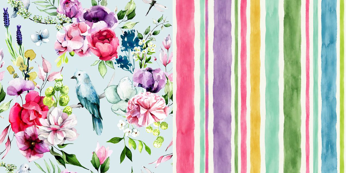
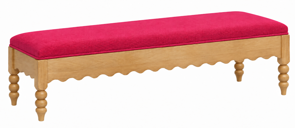
UPDATE: I just realized I forgot to mention the bench redesign! Since I’m not getting my solid pink on the dining chairs as I had previously planned, I’m going to use solid pink on the benches. And I did a little redesign on the benches as well. Here’s the final look that I’ll be aiming for.

Addicted 2 Decorating is where I share my DIY and decorating journey as I remodel and decorate the 1948 fixer upper that my husband, Matt, and I bought in 2013. Matt has M.S. and is unable to do physical work, so I do the majority of the work on the house by myself. You can learn more about me here.
I love this! I’m so excited to see the room completed!
Love the sconces! $$$ saved!
Hoorah! Love all the updates!
She shoots; she scores!!! It looks amazing and better still, it’s perfect and looks just like you. Go Mom!!! I think the sconces are out of this world perfect and once they are set with electricity, and a dimmer, this will be a great night light in the house too. This room is really coming along and looks fabulous. I think you can tell I am very excited about this room.
Cheers to you, Matt, Mom, and the Fur Babies!!!
Well I love those sconces so much! I remember when you made the shades for them. They look like they were made for this room!!
Love the sconces!!
I’m so inspired by you!
Have you ever done a tutorial on designing your own fabric? I would love to hear your process and what software has been useful.
About the sconces, you could always leave them unwired and just decorative. Or, you could convert them to plug-in type. Electricians are spency and leave electrical boxes in the walls, which would be annoying if you ever wanted to get rid of the sconces…
I was wondering where those sconces had gone. They’re perfect just like they were in the entryway. The first picture of the fabric, which was darker, took my breath away! You could consider using the pink in piping around the cushions. How beautiful your house is!
I love the new fabric direction. The other stripe had a blurry look to it like what happens when i don’t have my glasses or contacts on. I’m sure it would be better in person but was very trippy on the computer screen. I like the crisp bright colors over the white washed look. Based on just the small sample of the fabric shown I’m not seeing the yellow and wondering if its giving it too much of an easter egg look. I love the solid pink on the benches and that its a good base to add fun pops of pattern and interesting wall art. I think it will really ground the space flanking the doorway. Great job! I love seeing this room evolve.
YEA TEAM MOM!!! Your iteration of the stripes was actually looking blurry but that may have just been the pictures causing that. I am an avid watercolor fan as well and absolutely love the new design.
Sconces: can you convert them to battery operated? I can see them just as they are. More wall decor and not functional. Pays to “shop” your own stuff first before hitting the buy button.
You can get bulbs that have rechargeable batteries that might work for your sconces – would be no need to hardwire
Hi Kristi,
While you’re doing your tweaking, I wonder if you would try using the darkest tones of each color you are taking from your curtain fabric to produce “jewel tones” and see if that’s a contender for you?
I forgot to specify that I was thinking about doing that on the wider stripes of the pattern
The sconces are just right! The watercolor stripes on all chair surfaces — a resounding yes!! A suggestion perhaps — maybe a little less saturated in color on the watercolor stripes, more in line with the last two pics from your mom?? Less saturated gives the eyes a place to rest and lets the drapery fabric have a bit more attention.
I love this new direction! The chairs and the bench will be stunning!
My only suggestion, and it is minor- the narrowest pink stripes (third from the left and fourth from the right) maybe make them the darkest magenta from the flower in the drapery fabric. It might already be that color, but on my monitor it looks the same depth as the other wider pink stripes.
I absolutely love those sconces! I do think it looks a little top heavy with width of the sconces plus art being wider than your console/sideboard. But I’m sure it will all work out perfectly after decor and such!
The water color stripes are 10/10!
Loving it! Your mom is a genius. I knew there was something not quite right and she identified it.