
Dining Room — The Final Striped Fabric, More Sconces, And Bench Progress
I know some of you are probably getting tired of hearing about striped fabric by now. Actually, I’m tired of talking about it, and I’m tired of working on it. But I often hear from people who enjoy watching my whole process and my hearing about my thought process in making decisions, so if that’s you, I wanted to share that I finalized the design for the striped fabric that I’ll use on my dining chairs.
It took a while and many, many attempts before I finally landed on the right design that I absolutely love. This is the last one that I shared with y’all yesterday…
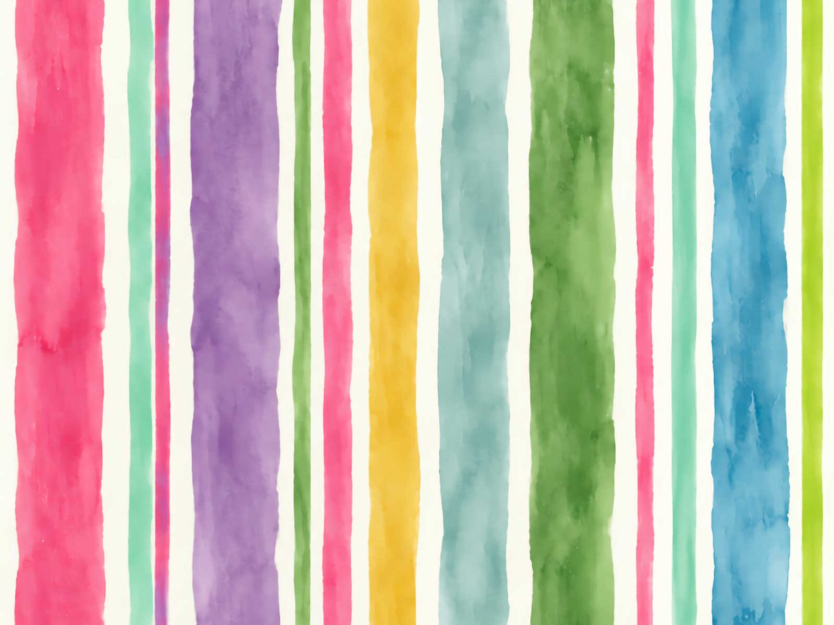
I knew it was the right direction, but it wasn’t quite right. So throughout the day, I kept coming back to it with fresh eyes, rearranging the stripes, tweaking the width of the stripes, editing the colors, etc. I did all of that using my photo editing software. Once ChatGPT gave me the original striped pattern with all of the colors and the repeatable pattern that is seamless when tiled vertically, I could do all of the rest of the editing myself using my editing software. (I use PaintShop Pro for photo editing.)
After about five or six attempts, walking away after each one and then coming back to it with fresh eyes, I finally had a design that I love. From the beginning of that process to the end, I realized two things. First, I was trying to stuff too many colors into the pattern, so I removed some of them and boiled it down to the few colors that I really wanted. And I also realized that the really skinny stripes were making the whole thing look too busy. So after getting rid of the skinny stripes and the extra colors, this is the final design I came up with.
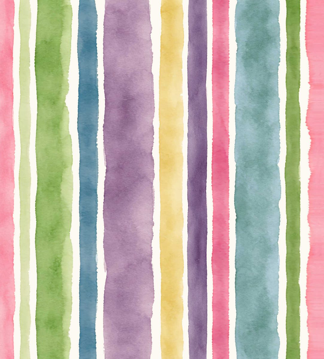
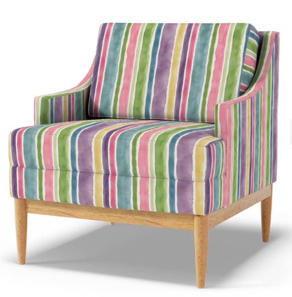
Here’s what it looks like on the Spoonflower chair…
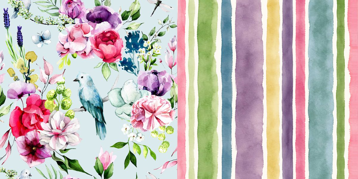
And here’s a look at it with the drapery fabric.
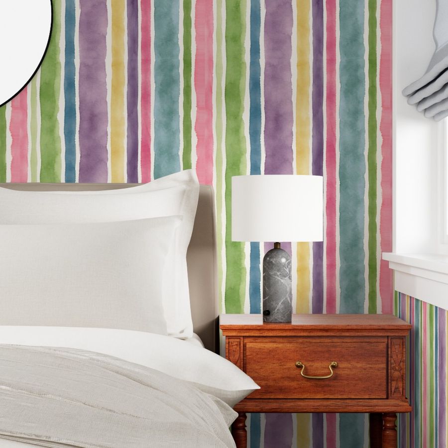
For my dining room chairs, I’ll be using a small version with a 14-inch horizontal repeat so that the all of the colors are visible on the backs of the chairs. But because I love this final design so much, I also uploaded an extra large version of it because I wanted to see what it would look like on wallpaper, and y’all know I like BIG designs on wallpaper. And, oh my goodness, I want to see this in an actual room!
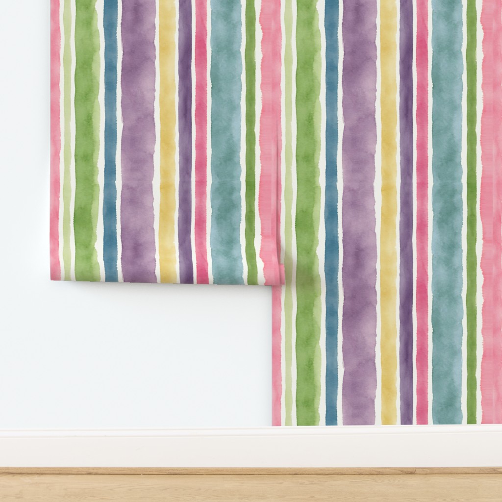
Spoonflower doesn’t have great options for showing wallpaper in a room (in my humble opinion), but this is probably the best one of the options they have. Will one of you PLEASE buy this wallpaper and use it on your walls, and then send me pictures?! 😀 Just imagine how fun this would be in a laundry room or a guest bathroom!
And here it is on a duvet cover, which is also really fun.
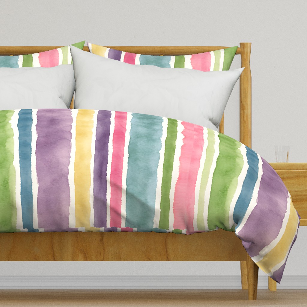
Unfortunately, I wasn’t able to make the design public right now, so it’s not actually for sale. I’m not sure why, but Spoonflower isn’t allowing any new accounts to make designs public right now, but they say it’ll be opened back up in mid-December. I really want to see that wallpaper in a real room!
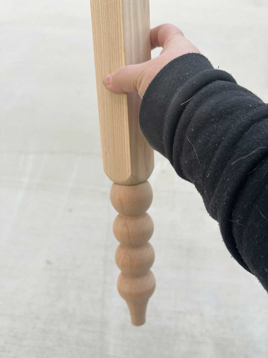
I also worked on the benches yesterday, but I didn’t get very far on those because the first thing I had to do was make the legs for the benches. And I need eight of them, so these took a while. I used some cute legs that I bought on Etsy and married those to plain, square legs to give me a top block that I can attach the stretcher boards to. I’ll go over the details of how I did this in a future post, but for now, here’s how the legs are turned out. I still need to cut them to the right height for my benches.
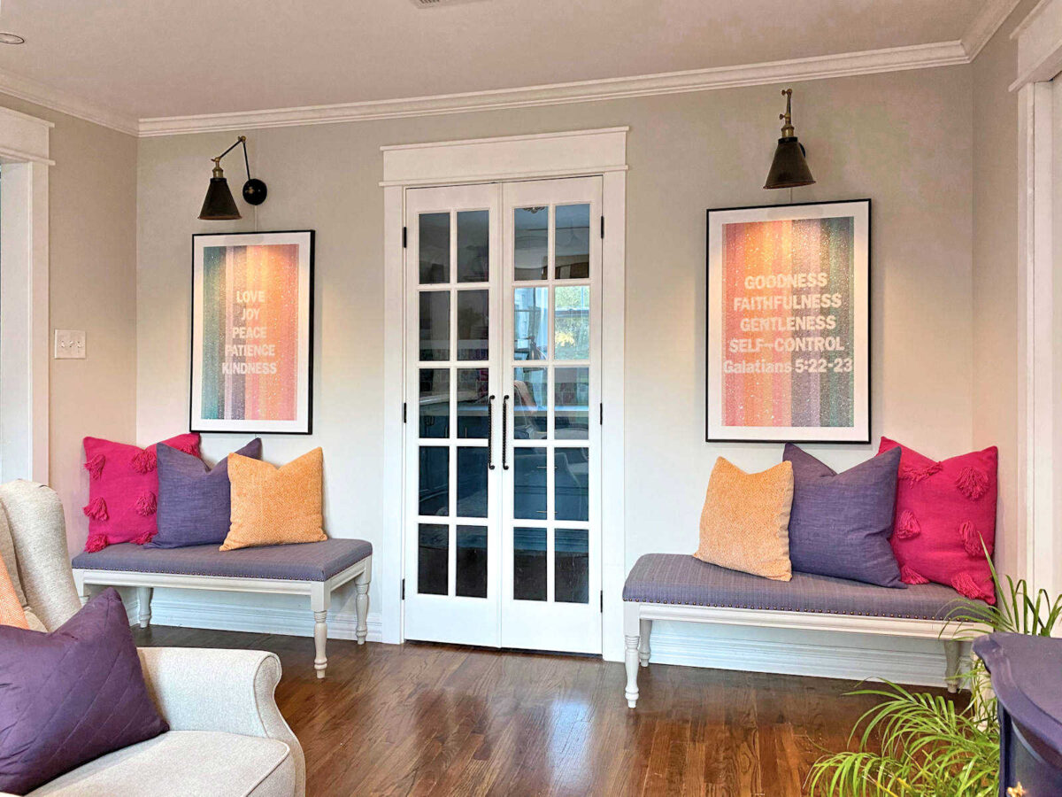
And finally, in my effort to save money and use what I have, I decided to reuse the sconces on the pantry wall. But the color is all wrong.
So I went through my stash of gold spray paints and chose this one…
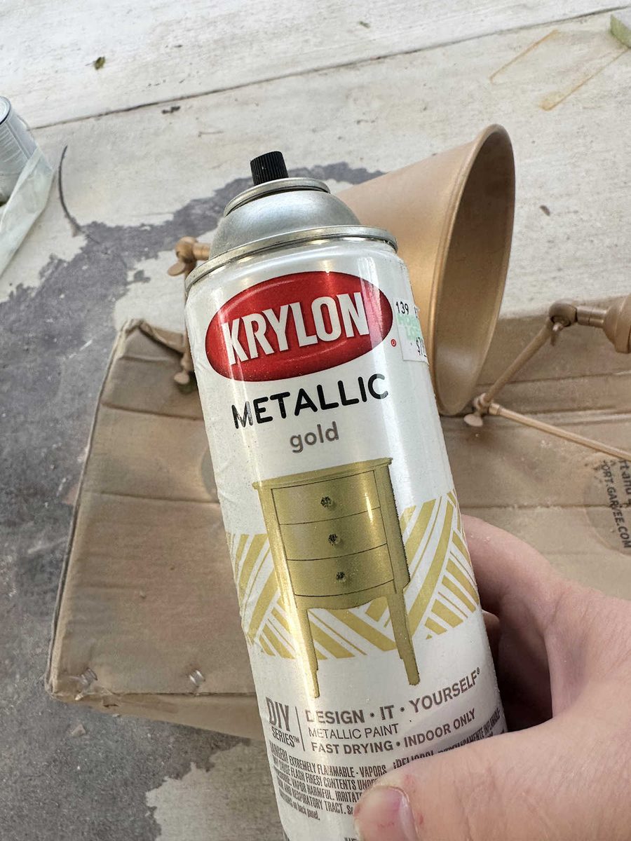
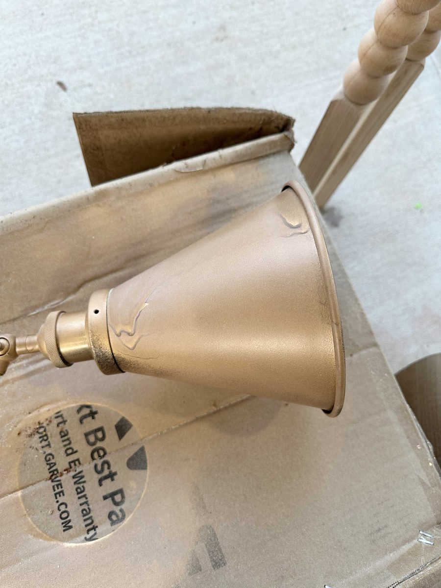
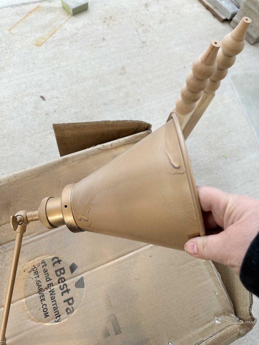
It didn’t go well. Look at the color on the can compared to the color on the sconces. It’s not even close! The sconces look more copper than gold.
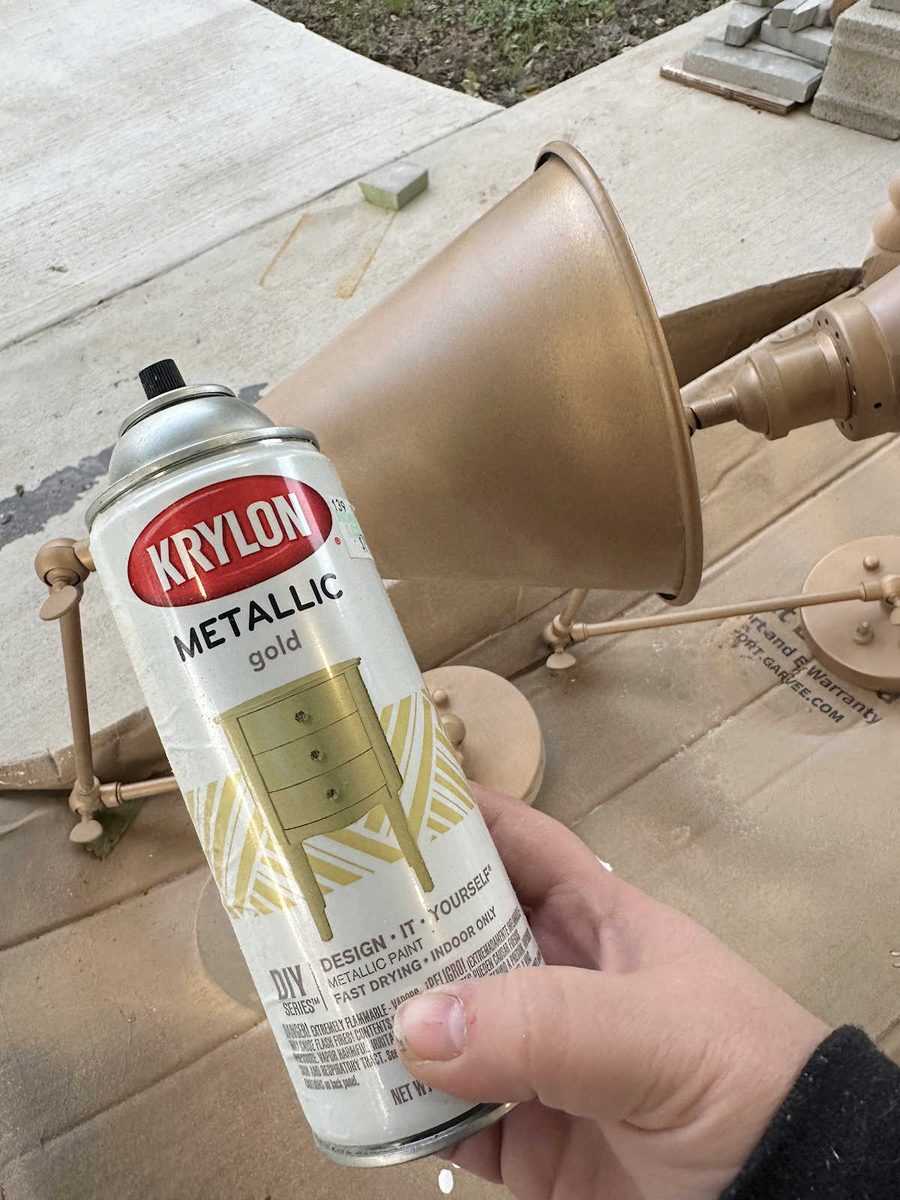
And the paint ran. I didn’t spray it on heavy. I know the first rule of spray paint — use thin coats. But it still did this on both sconces.
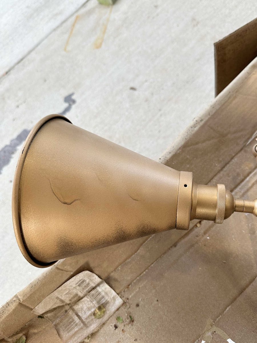
And the weird thing is that the paint is smooth. If you run your fingers over those areas, it’s not raised. It’s a smooth finish. So that’s weird, and very frustrating.
I have lots of other gold spray paints on hand that I can try, but I might end up having to use gold leaf again. I’m fine with that, but I sure was hoping to get these painted quickly and get them back up on the wall so that I could check something off of my list.
Anyway, if you’ve used a gold spray paint that you love, let me know! In the past, my favorite has been a brand called Montana (I think) that’s sold at Michael’s. But the last few times I’ve been there, their color selection has been pretty pathetic, and they never have the gold I used to love. So I’m open to suggestions!
More About Our Breakfast Room
see all breakfast
room diy projects
read all breakfast
room blog posts

Addicted 2 Decorating is where I share my DIY and decorating journey as I remodel and decorate the 1948 fixer upper that my husband, Matt, and I bought in 2013. Matt has M.S. and is unable to do physical work, so I do the majority of the work on the house by myself. You can learn more about me here.
Love the fabric! On my screen the wide purple stripe looks muddy. Is it just my screen? Otherwise, it’s so fun;)
Love the final one the best! You are amazing. I would love that duvet cover…matching everything/anything and beautiful! Keep on…it is going to be stunning!
Thank you sooooo much for the extra detail on your fabric creation process! It’s invaluable to me!
Hey, I looked into it, and that Montana Gold spray paint is still sold online. It seems to be carried mostly by Blick Art Materials. Here you go: https://www.dickblick.com/products/montana-metallic-effect-spray/
Things are coming together! Can’t wait to see it all when it’s done!
My go-to gold spray paint is Rust-Oleum Metallic Gold. I’ve used it on many things. Always turns out great, and is just the right gold color.
Kristi, My go to gold is actually a recommendation from you:
Gold spray paint: Design Master premium metals Gold Medal 231
Available at Michaels
I love it and it never disappoints me.