
Dining Table Makeover In Progress (Plus The Four Paint Colors I Considered)
I started working on my dining table makeover yesterday. I was so hoping that I could get it finished and move the table back into the room so that we could see the table and my new flower chandelier together, but I didn’t quite get it finished. And after beginning the first coat of paint, I also wondered if I landed on the right color. That still remains to be seen. But let me show you the progress so far.
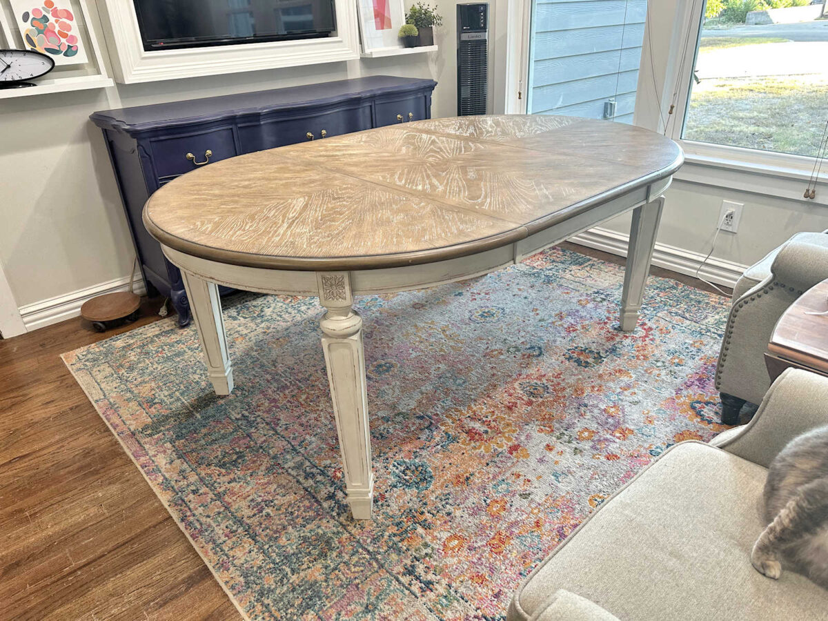
As a reminder, this is the table I started with. I bought it on Marketplace for $50, which was a huge bargain because this table retails for $650. It was in fairly good condition, but it was obviously in used condition. The top was pretty rough and the previous owner’s child had added a bit of “artwork” to the top.
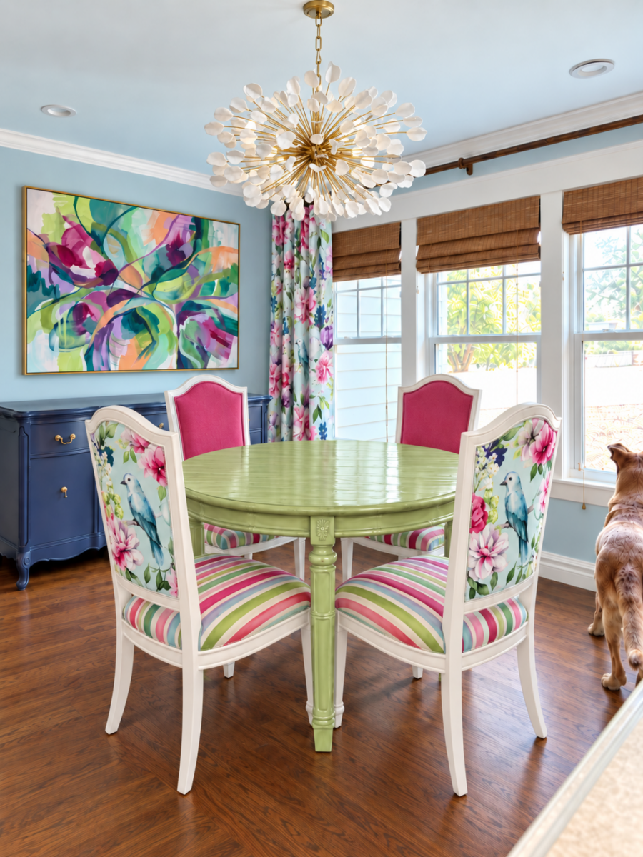
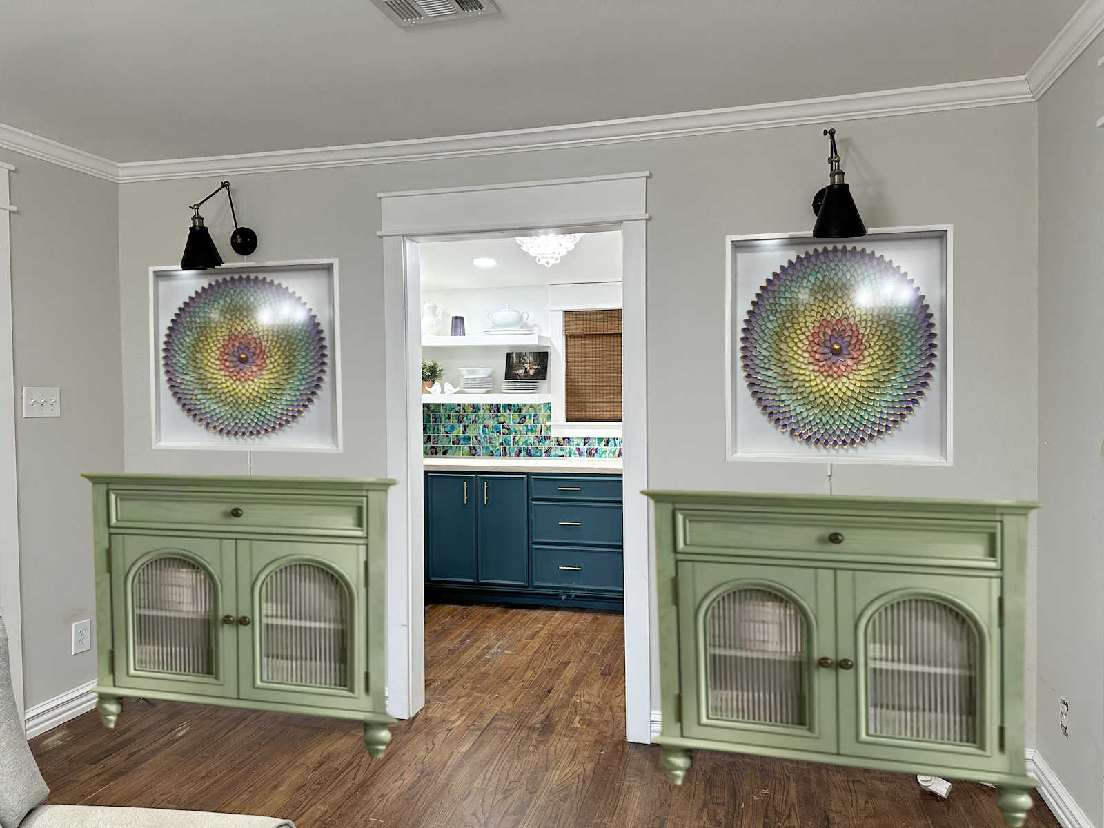
My goal was to end up with it looking something like this table in my ChatGPT mockup of the dining room. While this color is my inspiration, I also had to choose a color that specifically coordinated with the drapery fabric for the room.
I generally buy my paint (especially for walls) from Home Depot. Behr is my go-to brand. But ever since I painted my walk-in closet cabinets with Sherwin Williams paint, I find myself leaning towards Sherwin Williams for furniture and cabinets. On the suggestion of the very helpful employee, I also went with a primer that I’ve never used before — Sherwin Williams Extreme Bond primer.
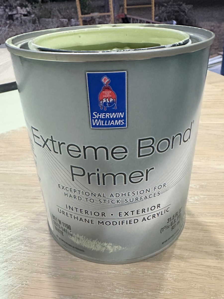
I had her tint the primer, and while she couldn’t tint it exactly to the paint color (for reasons she tried to explain to me, but I didn’t understand), she wasn’t able to match it exactly to the paint color. But it had enough color in it to do the job.
I sanded the whole top using my handheld sander with 120-grit sandpaper, and then followed up with 220-grit sandpaper. I sanded the rest by hand using the same sandpaper grits. After I cleaned up all of the dust, I painted the primer on with a brush.
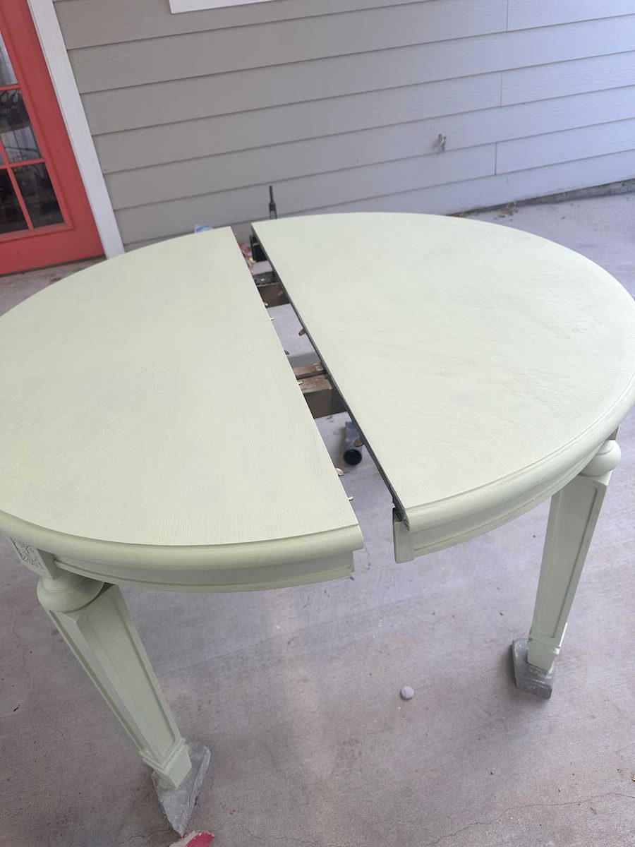
This primer went on beautifully. I was very impressed with it, and it resulted in a very smooth finish.
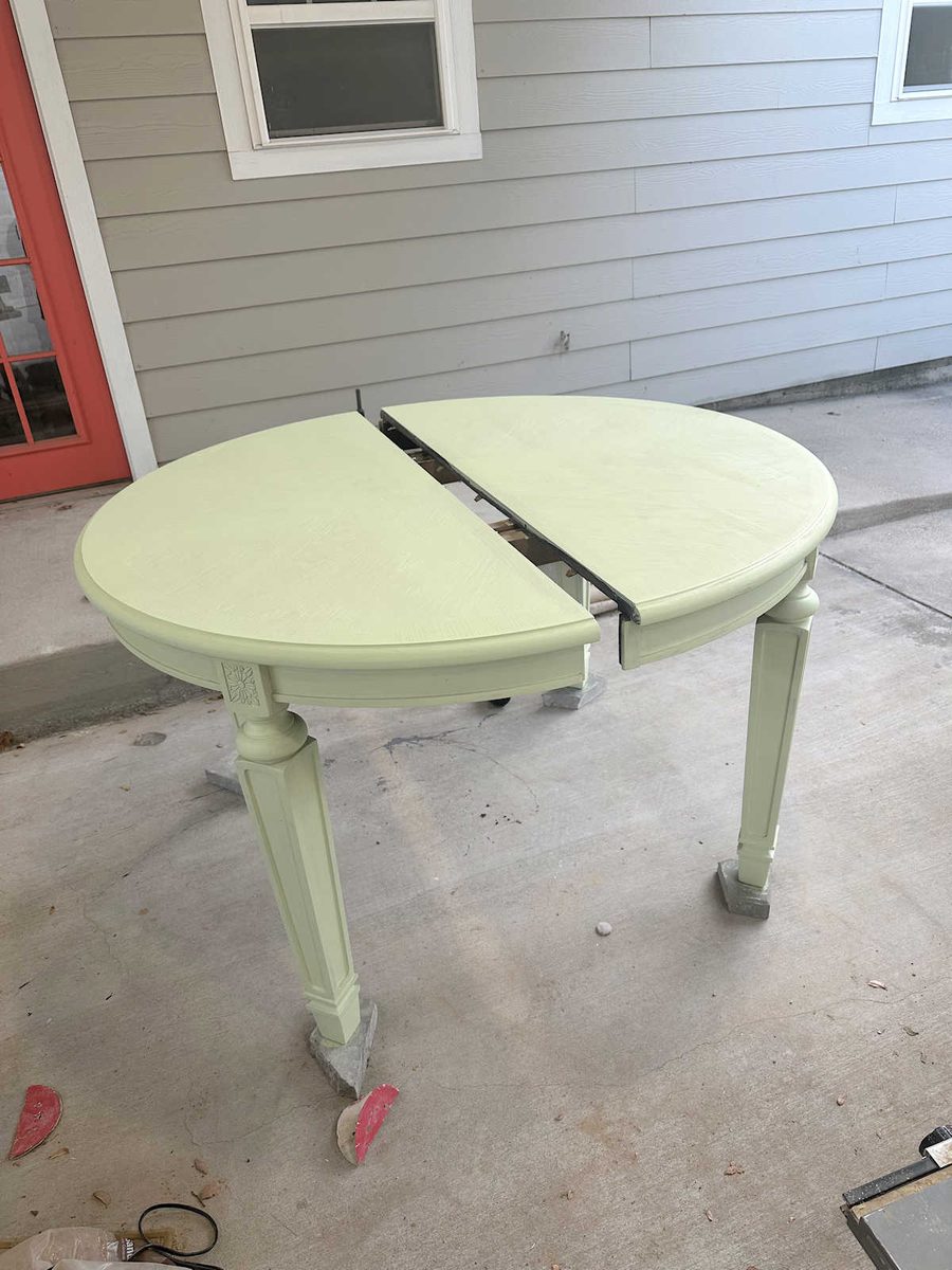
When the primer was completely dry, I sanded the whole thing again by hand with 220-grit sandpaper to give me the smoothest base possible before applying the paint.
When I chose the paint color, I started by just finding paint colors that coordinated with the fabric, which I had taken with me. I ended up with four possibilities.
The first one was Gecko…
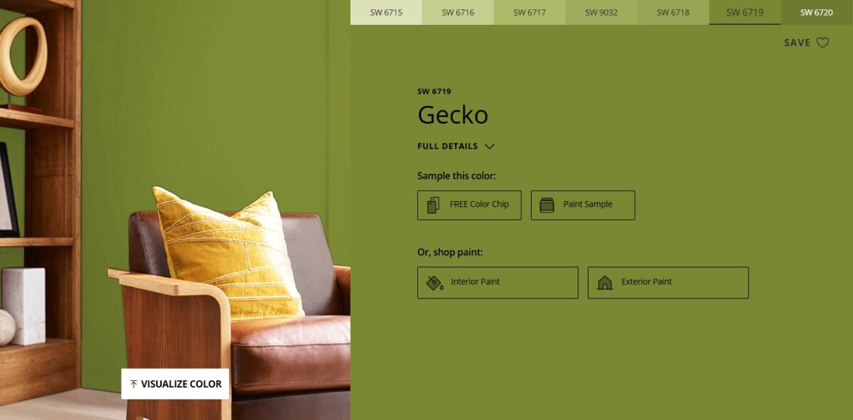
The second one Overt Green…
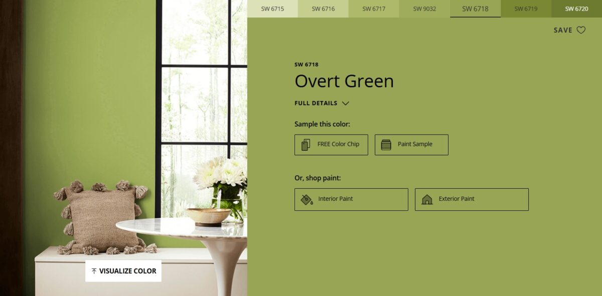
The third one was Stay In Lime…
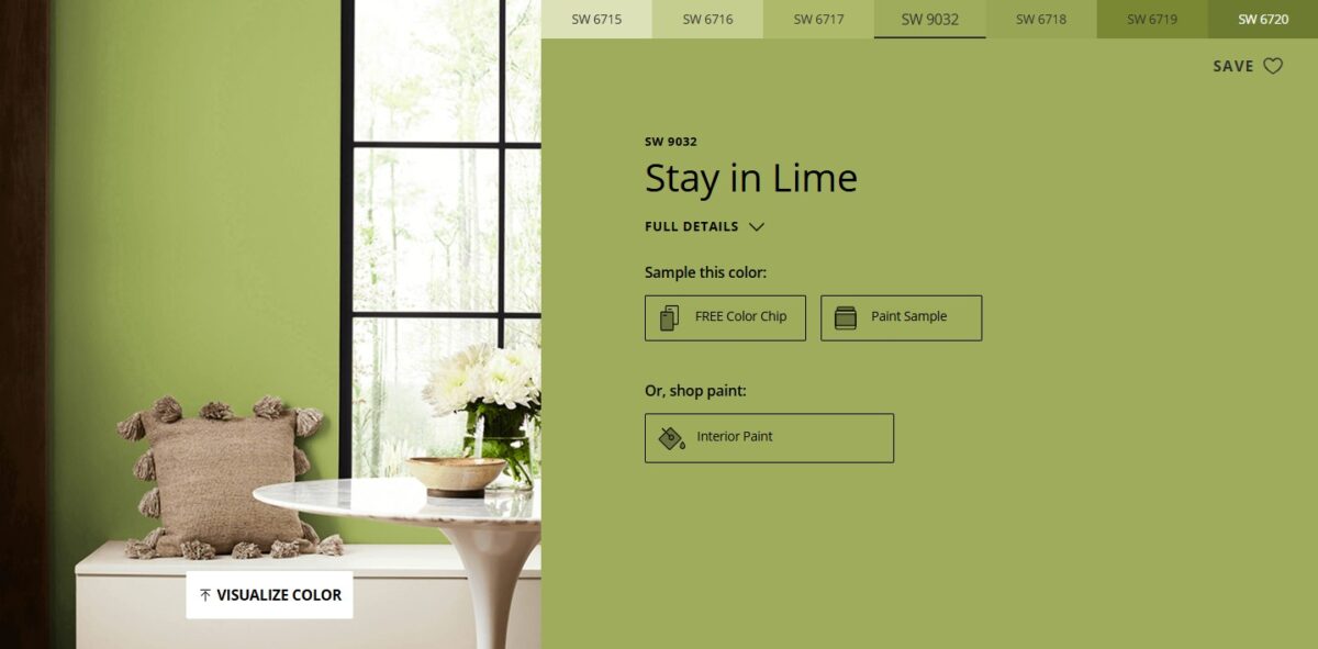
And the fourth one was Lime Rickey…
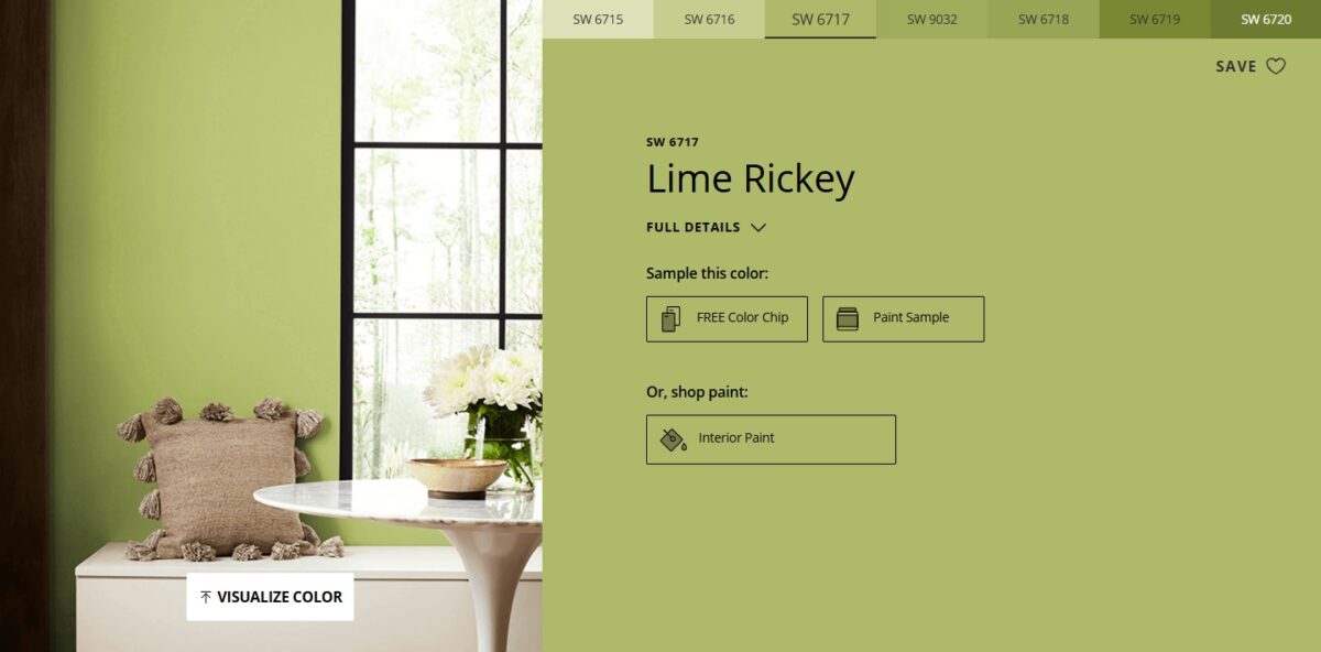
Once I selected the only four paint colors that coordinated with the fabric and seemed to be similar to the inspiration color, I pulled out my phone and compared them to the picture of the inspiration table. Obviously, I ruled out the first two immediately because they were too dark. That left me with the two lighter colors. I ended up going with Stay In Lime.
I wanted to use the same paint that I used for my closet cabinets, but again, for reasons that I didn’t understand (although she explained it to me) she wasn’t able to mix my selected color in that paint. So she said that this ProClassic paint would be just as durable and could be mixed in the color I selected.
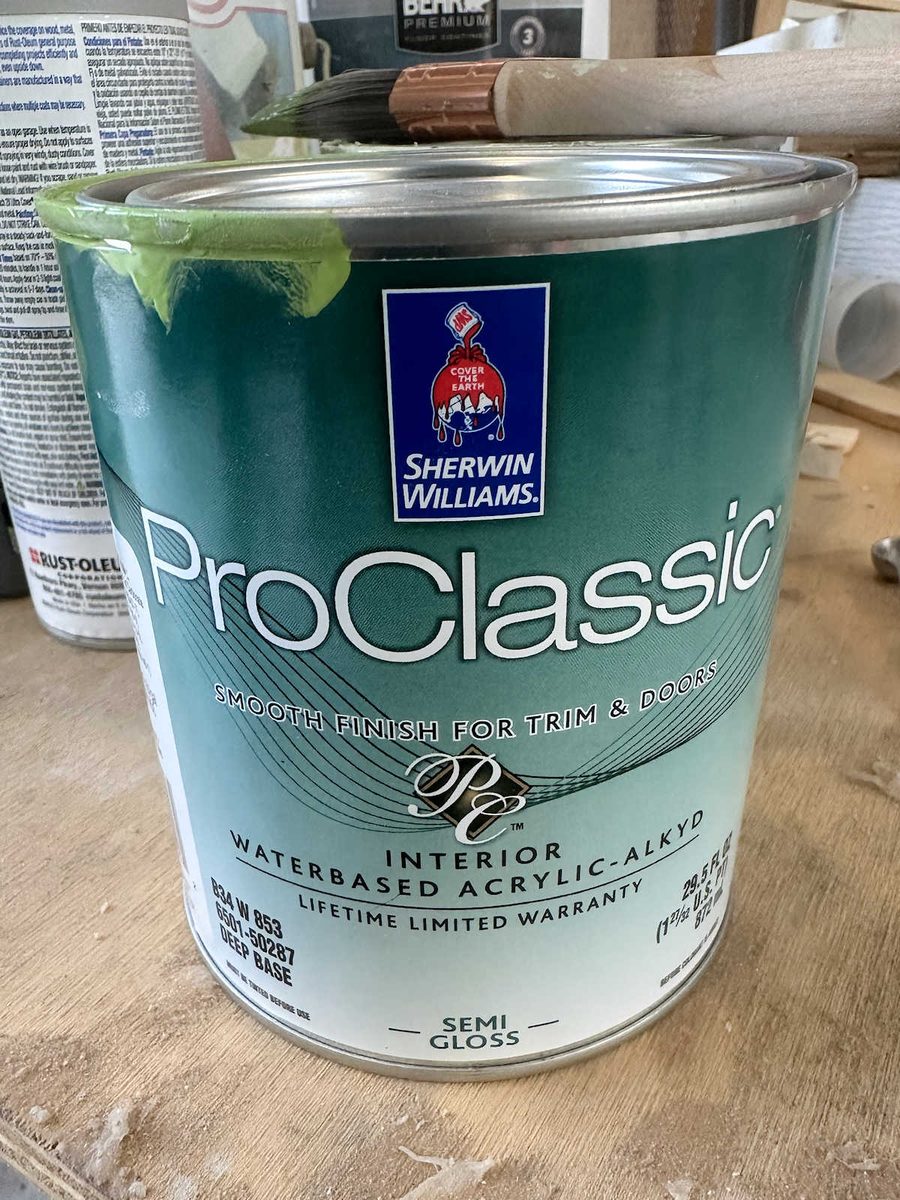
And if you look at the label, you might see something that may shock you. I say all the time that I don’t like shiny paint, but because the inspiration table has a shiny finish, I went with a semi-gloss paint. I hope I don’t end up regretting that decision.
Again, I didn’t get the whole thing finished, and I am going to go ahead and paint the whole table this color, even if I end up changing my mind on the color. But I have a sneaking suspicion that I should have gone with the lightest green instead of this one.
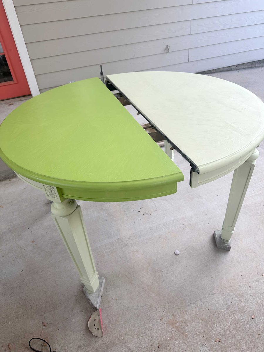
I’m going to wait until I have the whole thing painted and moved back into the room to see what it looks like in the lighting in the actual room where it’s going to be used. But I do have a feeling that I’ll end up putting a final coat of the lightest green over this one. I think this one is close, but it’s not quite right. But it’s really hard to tell when it’s sitting outside instead of in the actual room.
But at least it’s progress! And it will need two coats of paint anyway, so doing the second coat in a lighter color won’t add any additional steps to the process. And so far, the paint doesn’t look semi-gloss to me, but it might have more of a sheen once I get the second coat on. If not, I may end up adding my favorite General Finishes High Performance Topcoat in a glossy finish to the top. But we’ll see!
More About Our Breakfast Room
see all breakfast
room diy projects
read all breakfast
room blog posts

Addicted 2 Decorating is where I share my DIY and decorating journey as I remodel and decorate the 1948 fixer upper that my husband, Matt, and I bought in 2013. Matt has M.S. and is unable to do physical work, so I do the majority of the work on the house by myself. You can learn more about me here.
It almost looks like there’s a dark glaze on the paint in the mock-up. That would enhance the details on the legs and give the paint more dimension…..and also mute the color just a bit. Try a junk piece!!! What the heck….it’s only paint!!!!
I like the green you chose, it has just a bit of punch. The Lime Rickey seems a bit bland. Of course I’ve not seen you fabrics to know which works better with them. I use ChatGPT as a guide and usually make some sort of change to the real thing.