DIY Geometric Wall Design – Part 1
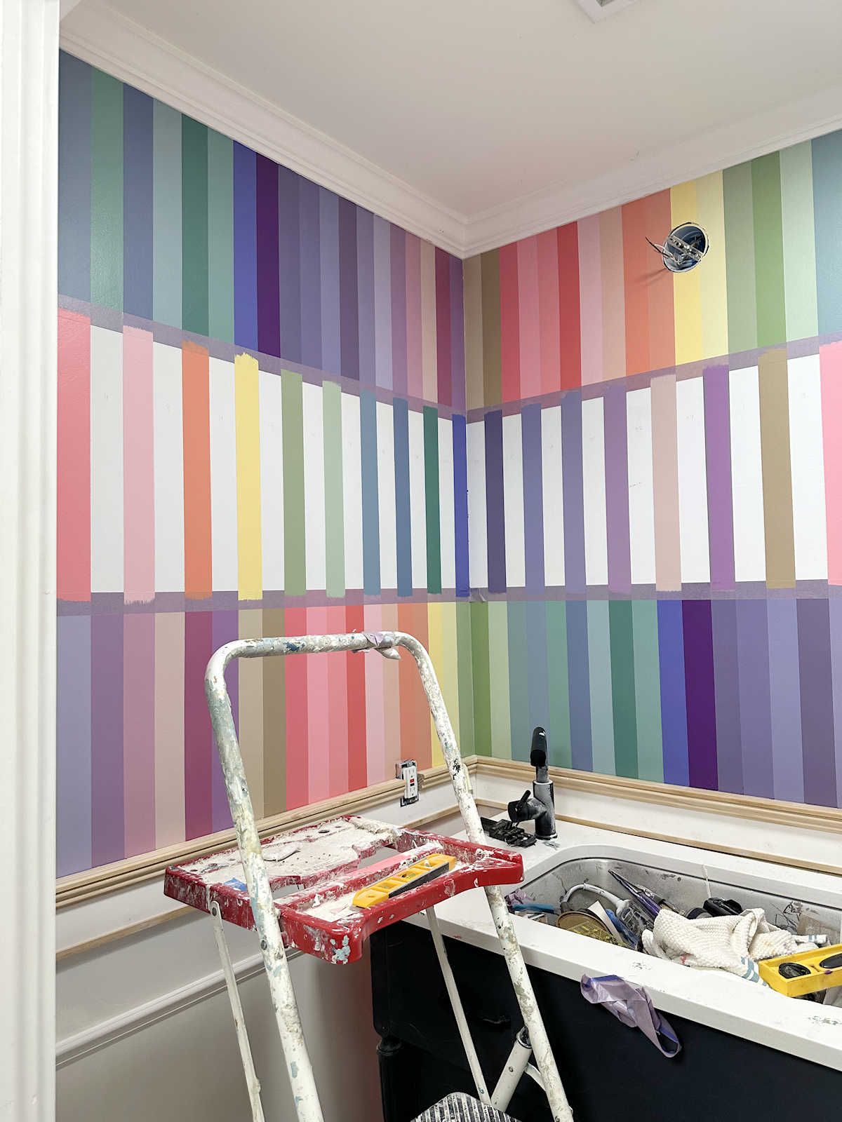
I’ve made some progress on my bathroom walls, and I wanted to show y’all the design I’m going with. I said I wanted something geometric and/or linear, and with this design I get both of those things. It’s all done with painters tape, so it’s a pretty time-consuming process. Thank goodness I’m doing it in a tiny little bathroom! Here’s my progress so far…
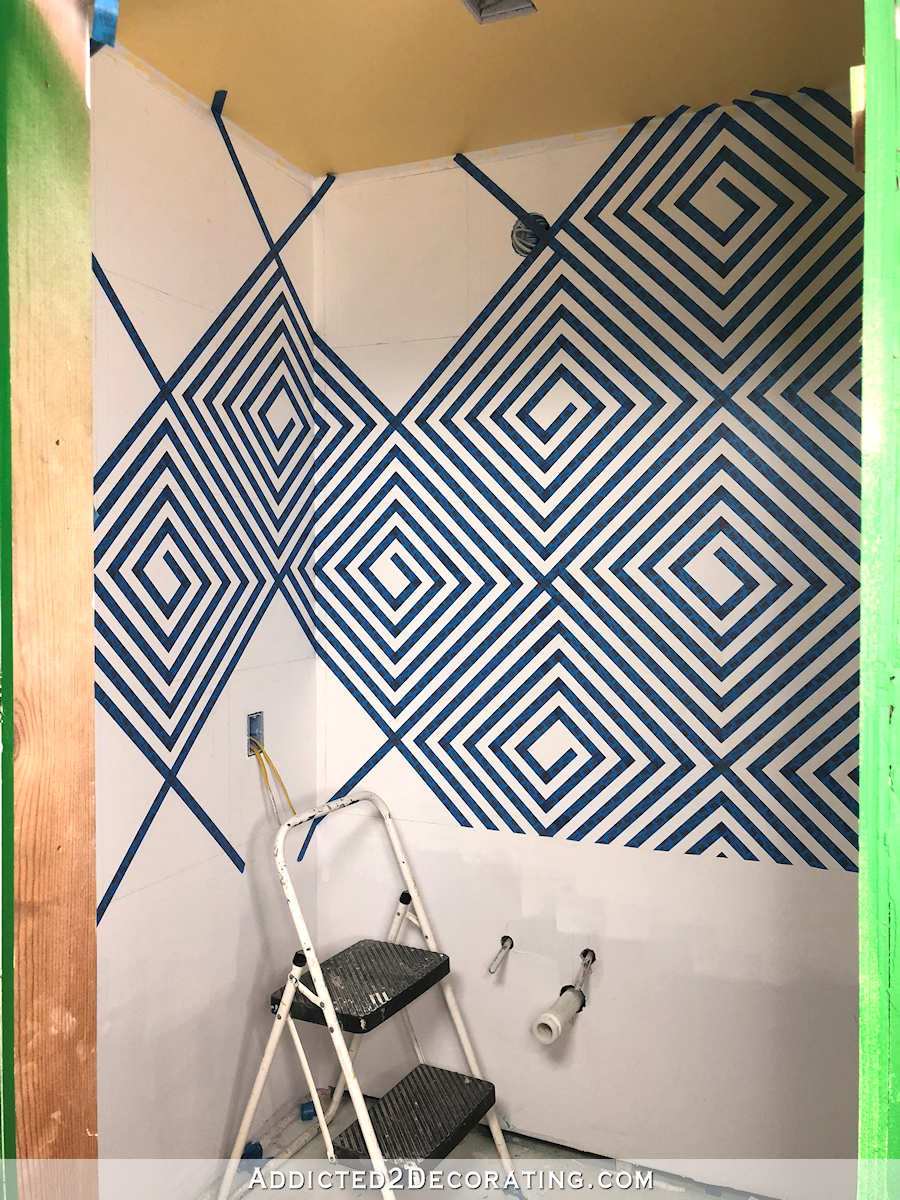
Now keep in mind that that’s painters tape. The stark dark blue and white has a dizzying effect, but the finished wall will have less contrast.
I started out trying to do this design that I found on HGTV.com. I spent about three hours and an entire roll of painters tape on that design before realizing that their instructions are junk, and the design doesn’t work as the instructions are written. Needless to say, I wasn’t amused.
So I had to start over and come up with my own design. I started by marking off 16-inch squares on my wall using a pencil, framers square and level.
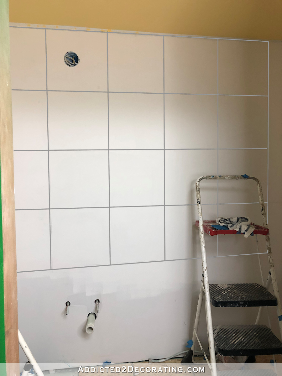
Obviously, I enhanced the lines in my photo editing software because my pencil marks didn’t show up in the pictures. 🙂
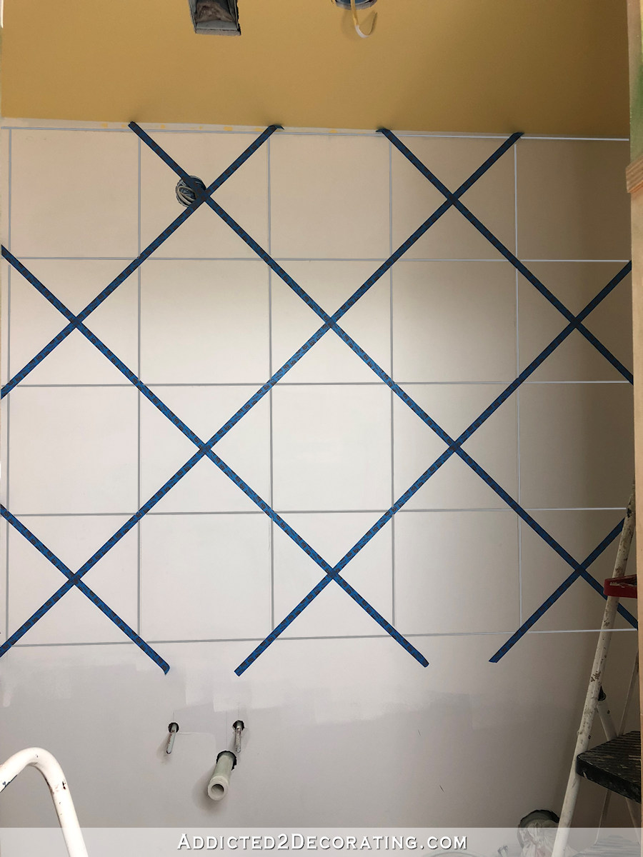
Then using those squares as a guide, I used painters tape to mark off diagonal lines going in alternating directions to create large squares on the diagonal.
And then the fun part started. 🙂
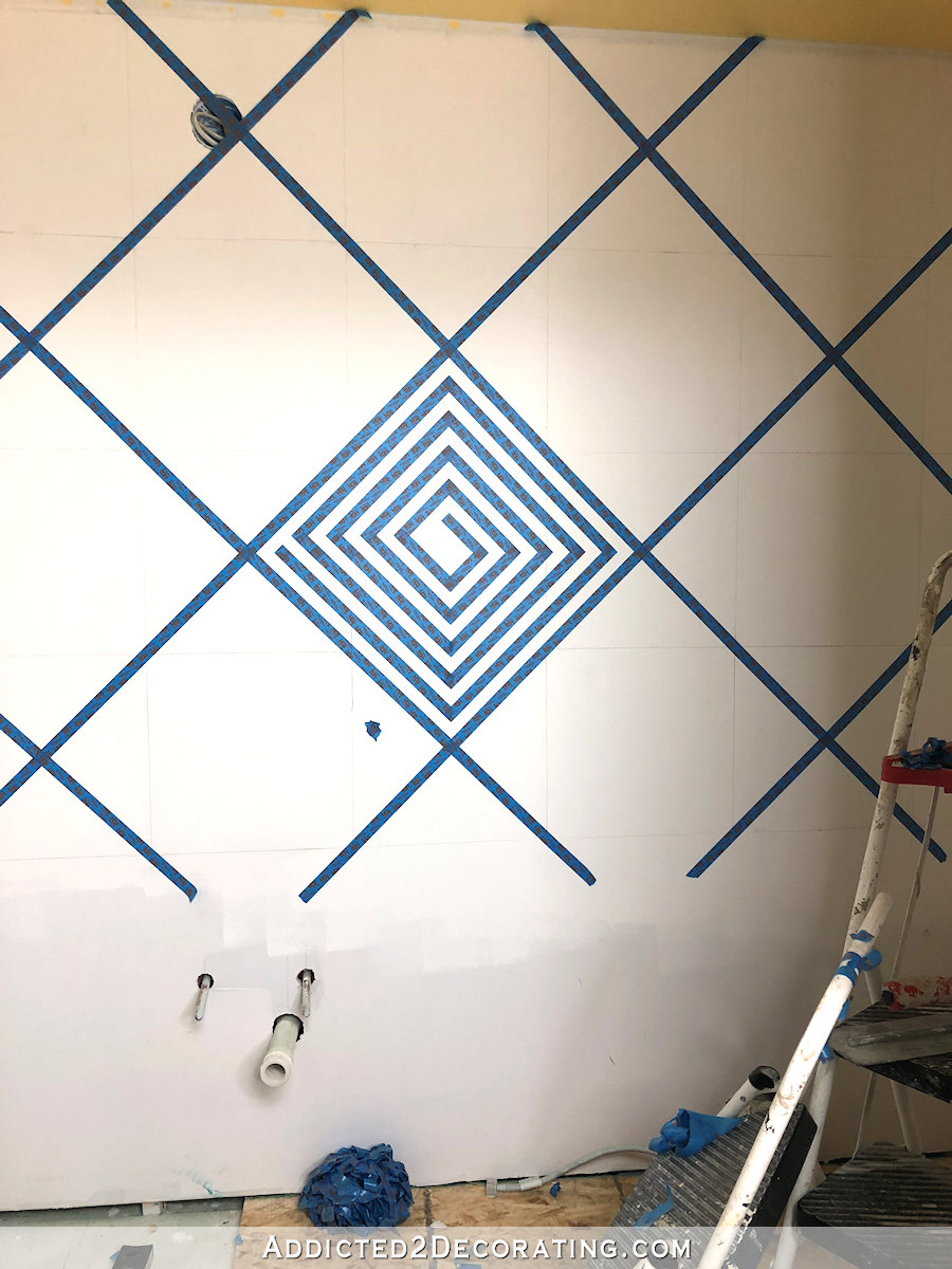
I created a series of concentric squares using the painters tape. I simply used a piece of painters tape as a spacer between each row of tape.

And then I trimmed the corners using a metal straight edge and a razor blade. You can create different looks depending on where you overlap and trim the tape. Initially, I started with this design of four concentric squares with a little Greek key-inspired square spiral in the center.

Again, that center part is nothing but concentric squares that create a spiral by extending some of the pieces of tape, and cutting the pieces strategically so that they turn into a spiral.
The design still wasn’t exactly what I wanted, so I tweaked it a bit more. I added a few extensions, cut in a few other areas, and ended up with one big square spiral.
That’s what I decided to go with at that moment, so I moved on to other squares, alternating the direction of each row.
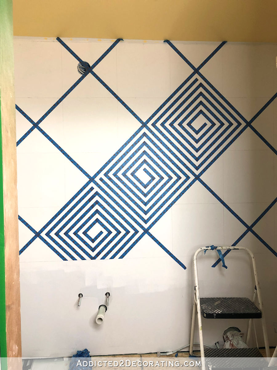
And my final tweak was to add one more extension on the outer square so that it wasn’t a continuous square, but instead it formed a complete square spiral.
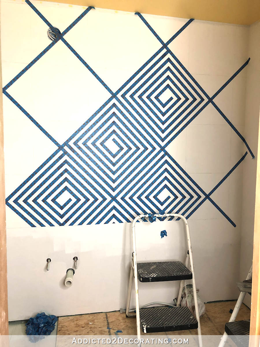
It finally seemed complete, so that’s the design I went with on the rest of the squares.
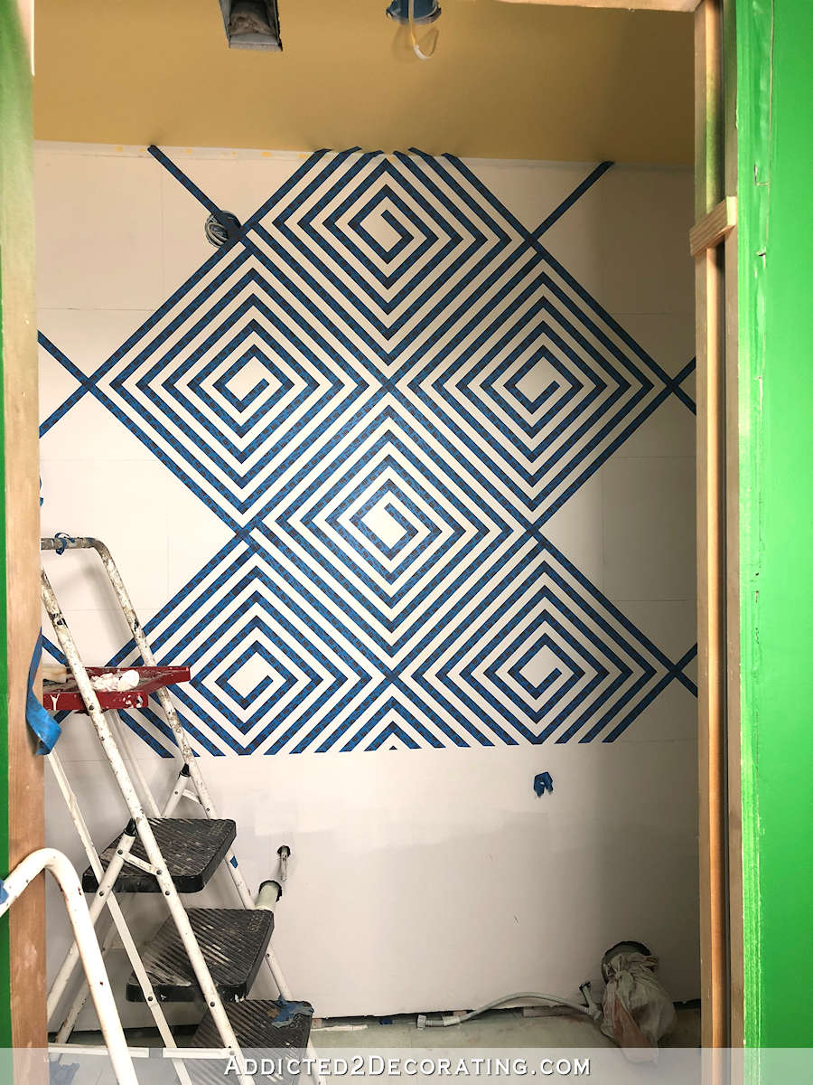
Once I finally got the design details worked out, the rest of the squares went much faster. It’s still a slow process, but I occasionally love a slow and tedious project. These types of projects are perfect for turning on a good podcast and getting lost in an intriguing story.
So this is how far I got….
You’ll notice that I didn’t go all the way to the floor, and that’s because I do plan on doing a solid wainscoting on the bottom. That’s not really a design decision I made based on a look I wanted, but more a decision based on necessity. Because of the type of toilet that was needed in this bathroom (i.e., an area where plumbing had to go up into the attic instead of down below the floor), there’s a big component of the toilet that sits just behind the wall, and there has to be an access panel cut so that it can be serviced if and when needed. So wainscoting is the only way I could think of that an access panel could be disguised.
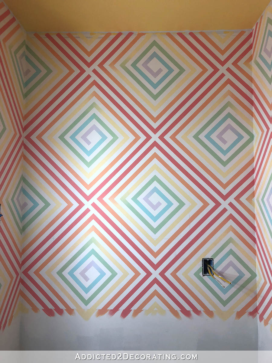
As you know, I’ve been planning on using lots of color in this bathroom. But as the design started coming together, and I realized how busy it could potentially be, I started having second thoughts about color. And then last night, I came across this bathroom…
Isn’t that pretty? I love the gray and white walls (similar to the colors on my music room walls) with the stained wood vanity. So pretty!
So at this point, I’m flexible on the colors. I do love color, and lots of it, but I don’t want to use color just for the sake of saying I’ve used color. Does that make sense? I mean, in the end, I’m less concerned about the bathroom being colorful than I am about the bathroom being pretty and pleasing to the eye.
Hopefully by Monday I’ll have some color on the walls, and we’ll see if I made the right decision.
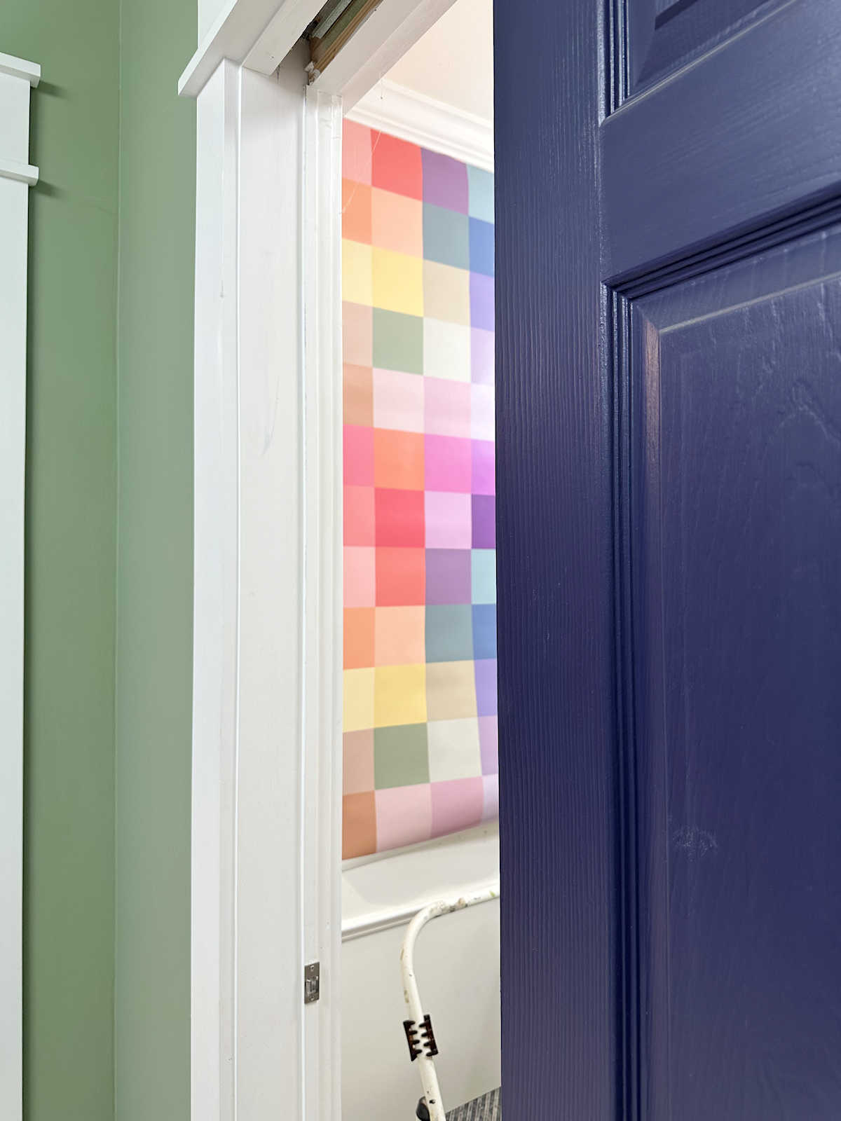
Update:
My bathroom walls are finished! Here’s how they turned out…
You can find the final post about this project here…
Or you can find a video tutorial here…

Addicted 2 Decorating is where I share my DIY and decorating journey as I remodel and decorate the 1948 fixer upper that my husband, Matt, and I bought in 2013. Matt has M.S. and is unable to do physical work, so I do the majority of the work on the house by myself. You can learn more about me here.
You never cease to amaze. … and fearless! Looking forward to finished result. Have a great weekend.
You are simply amazing! Looking forward to the finished product.
H@LY W@W !!!!
Ronnie, My thoughts exactly! If I tried something like that….well I can’t even go there in my mind! It’s too scary! But You, wonder women, will pull it off!
There pretty much aren’t words for 1) how much I love this and 2) how much you amaze me. If it were me, I’d go with gray, because I like more neutrals that you do. But, color would be really spectacular, too. So go with whatever makes your heart sing!
I hope you decide on similar wall color to your music room. That is gorgeous. The painters tape gives an idea of what a more vivid color scheme could look like and it seemed very distracting. Can you add color with wall art?
I agree with everything Peggy has said—and I love color like you do! I think your music room color palette would be perfect!!
I can’t wait to see how this turns out! Thanks for letting us know how you worked out your design.
Wow wow wow! This is absolutely beautiful and it’s going to so good no matter what colour you go with. I may have to snag this design for the basement bathroom we’ll be building in a few years. Or maybe in my own bedroom. I hardly ever like painted designs or patterns or stencils, but this is great!
Sorry, I didn’t mean to reply to your comment. I tapped on something on my iPad. I thought I was at the end of the comments, and had tapped on “Leave Comment,” but apparently I had tapped on “reply” on your comment That’s the second time I’ve done that in the last couple of weeks. 🙄
Holy Guacamole! Girl you have more patience than Job and a mind like a great carnival ride, fast and furious. I love it.
ditto—great discription of Kristi!
Could you do a 16 x 16 square on poster board and paint it with the three colors you have picked out or any other color combo? It would be less work than redoing a bathroom if you don’t like the outcome and would give you an idea of how it would look. I do like the pattern. I keep finding other patterns within the one pattern and that is always fun.
I second this idea…do some mock ups you can tape up and see with the bright colors. You have been so set on color! Would love for you to be able to try it before putting gray paint on your tape job.
Personally, I think the grey ‘sun’ design would be a perfect compliment for your large area floral wall paper design. Any maybe even incredible, if done in a cascading ombre of sun colors…???
OMGOODNESS you are amazing. That is beautiful and I can’t wait to see the finished product.
Could you do a very pale teal/green/whatever color will be most seen while looking into the bathroom, instead of gray? Gray and white is beautiful, but I think just a hiiiint of color in that example would be more in line with where your heart tends to go! Just my two cents, but follow your inner voice 😉
This reminds me of a quote from When Harry Met Sally. “I’ll have what she’s having.” Because there’s no way I ever would, or ever did, have this much energy. I’m flabbergasted and extremely envious. As for the actual design, I can hardly wait to see the finished work. You have done such a fantastic job of everything; I look forward to all of your videos.
Are you kidding me right now!!? You can do anything!! And do it well!! I wish I had a tenth of your talent!!! Can’t wait to see finished product!
A little trick, if you paint first, after you’re done taping, with the wall color or primer if that’s what’s on the wall then with the color you chose you will have absolutely perfect lines!
Can you restate this? I can’t make that sentence make sense and it sounds like it’s really valuable information!
It’s a way of keeping the paint from bleeding under the tape. You paint the entire wall the base color — in my case, Behr Polar Bear, which is my go-to white. Then you tape off
the design with the painters tape. Make sure the tape is pressed down really well, and then roll another coat of the base color over the painted design. This seals the edges of the tape. Once that’s dry, you paint the contrast color that you want the design to be, and then remove the tape.
That second coat of base paint color seals the edges of the paint and keeps the contrast color from bleeding grinder the edges. This method gives you perfectly crisp lines.
I don’t like any of those — all that would drive my eyes crazy.
Now that my mouth is gaping open, I will just say I’m making no suggestions, but am waiting with bated breath to see your finished project. Amazing.
I love this pattern! It’s perfect! Could you do a sheen contrast and keep a bright color? (Might be too late now that you’ve applied the tape though). I have a bathroom wall that is painted flat blue with a swirl pattern in the same blue but high gloss. I LOVE that wall and because it is all the same color, it isn’t too over stimulating, but you still get the pattern quite visible from the contrast of the sheens. I could see it in the Roulette or some other fun bright color working really nicely!
Just WOW! As someone else said, you never cease to amaze me! I wish I had even half of your patience to do something like this! I’m sure it will look awesome when done (and I love the soft grey – so pretty!)
This is why you are a professional and I’m not. I liked your 16″ squares! (Just like that, as empty squares but I’m such a minimalist.) But when I saw the grey and white bath I get it and do really love that bath. I also love your other stenciled room. This is a fun ride with you!
How about one of the softer colors from the floral wallpaper on the stenciled bathroom walls? And what would work with the emerald/kelly green of the back entry walls?
This is stunning! You love color, and you love purple – what about a very lightly lavender with some greyish understones as the stencil color? https://pin.it/5stnhd3mx2ag66
I am glad you informed us that dark blue and white contrast isn’t the way your final vision would turn out and therefore wouldn’t have the dizzying effect. When I first saw the geometric design – I thought the design would set my vertigo off.
I personally like the soft colors if I was using this design, but if you don’t have to worry about vertigo go for whatever colors you love.
I can’t wait to see the result.
Same here……when I first saw the pattern in navy & white, I had to close my eyes and quickly scroll past. This type of pattern will set off a migraine for me. However, the soft grey and white is lovely and I thought “wow”.
I am LOSING my mind that you are able to do this. It looks great.
Let me tell you how this would have gone for me.
I would have put up four pieces of tape , I’d get bored, I’d quit, I’d paint the wall one color.
Oh my word. You have so much more patience than me!
I ran across a quilt similar to your design. I tried to email it to you from Pinterest. Check out Interwoven quilt pattern by http://www.loandbeholdstitchery.com!
I vote muted sunset ombre. Whatever you decide, it will be beautiful.
Wow!! Not what I could do in my house, but I have full faith that you will pull this off. I have always loved the ideas you have come up with and love to see them come together. With my vertigo I would fall off the porcelain throne just looking at this as it is now…lol
Kristi, it is a good thing you don’t drink alcohol, looking at that after a few drinks would be a challenge lol….I am looking forward to seeing how it turns out
I’m going to suggest you do this in Ombre colors, but keep them light/transparent, since the ceiling is yellow. Either each square dark edges, to light in the center or opposite, or light to darker, top to bottom. And of course grey could be done that way also.
That is an amazing design, and can wait till the unveiling.
I love your creative process so much. Every time I see an email alerting me you’ve made another post, I get this little spark of happiness and click the link immediately. Your style is different from mine but we both have a love for color – something I had hidden from for a while as trends turned neutral and white. Watching your process over the years has led me to be more bold with my own style and not get swayed by the trends of the moment. Because of your influence I have COLOR on my walls and in my drapes and I absolutely love having a space that reflects ME, and not the trends of the world.
She has also inspired me to go forth with more color (also did that with accessories). I am going to paint my bathroom cabinets (they are the oak color builders grade). Master bathroom a shady of navy blue, guest bathroom maybe a pinkness/coral.
Wow. You are amazing. To not only think of what you want, but to do it, then tweak it on the fly. Simply amazing.
Hello Kristi.
I like the entry green with the wood floor and black accents and the white trim very much. Wow factor galore. Your music room is stunning and so my two cents are something similar would create a stunning back entry powder room. Also it would be a soft look.
Amazing projects. I’m not sure I’d be brave enough to take this on but you did an awesome job!
I can’t wait to see it all done! You are incredibly talented and inspirational! The way you explain how you do everything is the best I’ve ever seen/heard. 👏🏻👏🏻👏🏻👏🏻👏🏻👏🏻🏆
Just….wow.
That pattern gave me a full on headache. Wow! It’s intense.
I LOVE this and also the tone on tone IG photo, too! I think you would be very happy with a more subtle color in this room with your stunning pattern! It’s a WOW!
I think you could love the gray as a beautiful background for some bright, amazing art and towels. Or you could go very minimal with black towels and green plants. Can’t wait to see what you come up with.
I stand in awe of your skills and creativity!
And yes, what you said makes perfect sense. I love a pretty bathroom, ‘specially a little one.
Girl, I can see you in that little space taping away and I think you are out of your gourd. I just do not have the patience for the things you do. You are like that train that keeps chugging on and on. You are a marvel!
I am relieved that you are thinking about doing a more muted color scheme. With the busy pattern, I think the walls would be too much if there was more contrast between colors. Of course, I am someone who will avoid a section of a store I like because the rug pattern makes me queasy as I walk across it.
I just saw this, and I love it! However….(I hate to even say it!) I see an error. My eyes immediately saw that in the pic where you completed the (first) final spiral, if you look at the horizontal line through the center, the right is level and the line going to the left, goes up.
Can’t wait to see the finished room:)
That’s not an error. That’s what happens when you create a spiral. In order for the left and right to be on the same level, you’d have to do concentric squares, not a spiral.