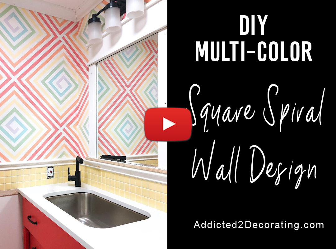
DIY Geometric Ombre Square Spiral Wall Design – Finished!
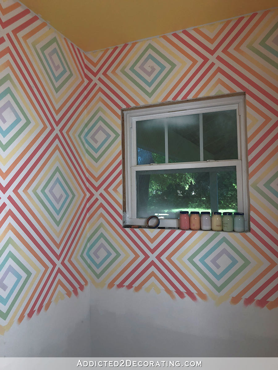
Y’all, the painted design on my bathroom walls is finished! Here’s how it turned out…
If you missed the first part of this project, you can find it here…
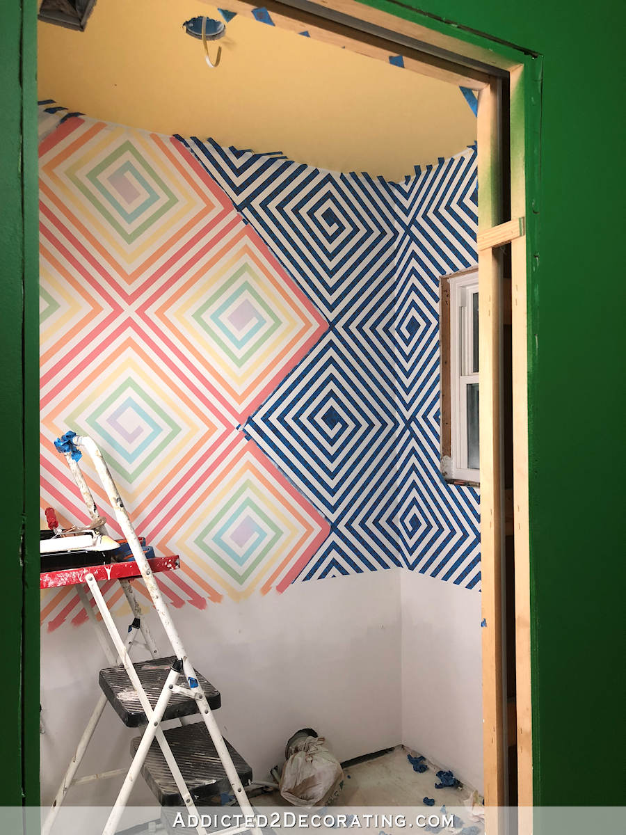
This design started with lots and lots of painters tape — four rolls, to be exact.
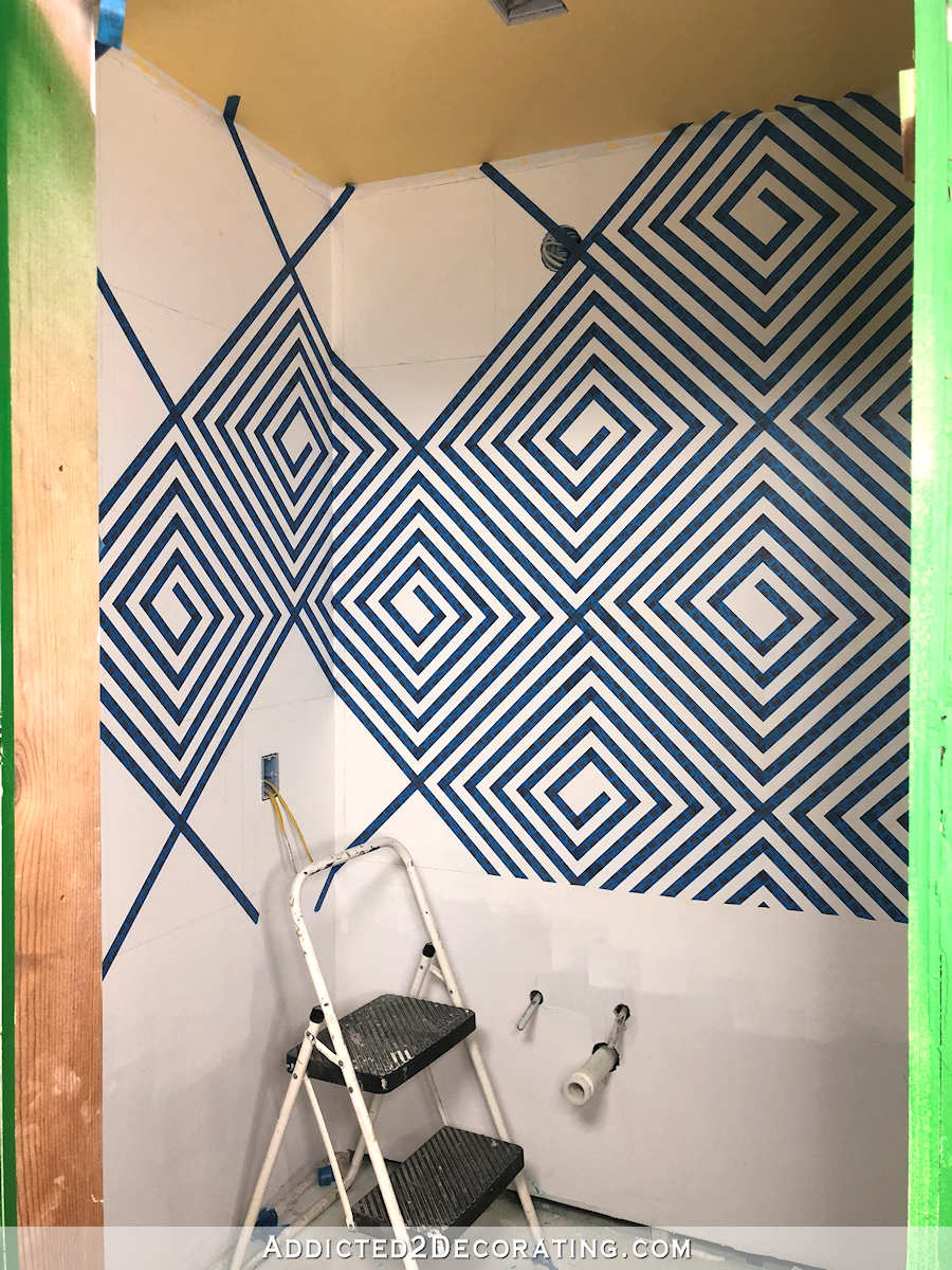
After seeing how busy and dizzying that taped off design looked with the stark contrast between the dark blue and white, I realized that the final design would have to have way less contrast. So I chose not to use the original three colors that I had purchased as they were out of the cans.
I came very close to using white and light gray, but after realizing that I not only have that combo on my music room walls, but also on the hallway walls, I decided against it.
Plus, this is a studio! I can do fun things in here that I might not have the courage to do in the main areas of my house. And when I thought about it, the last thing I wanted in my studio was gray and white. I wanted COLOR!
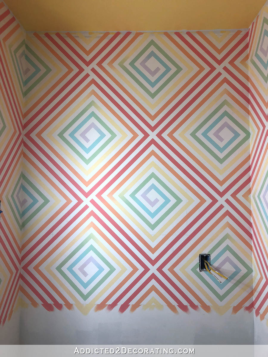
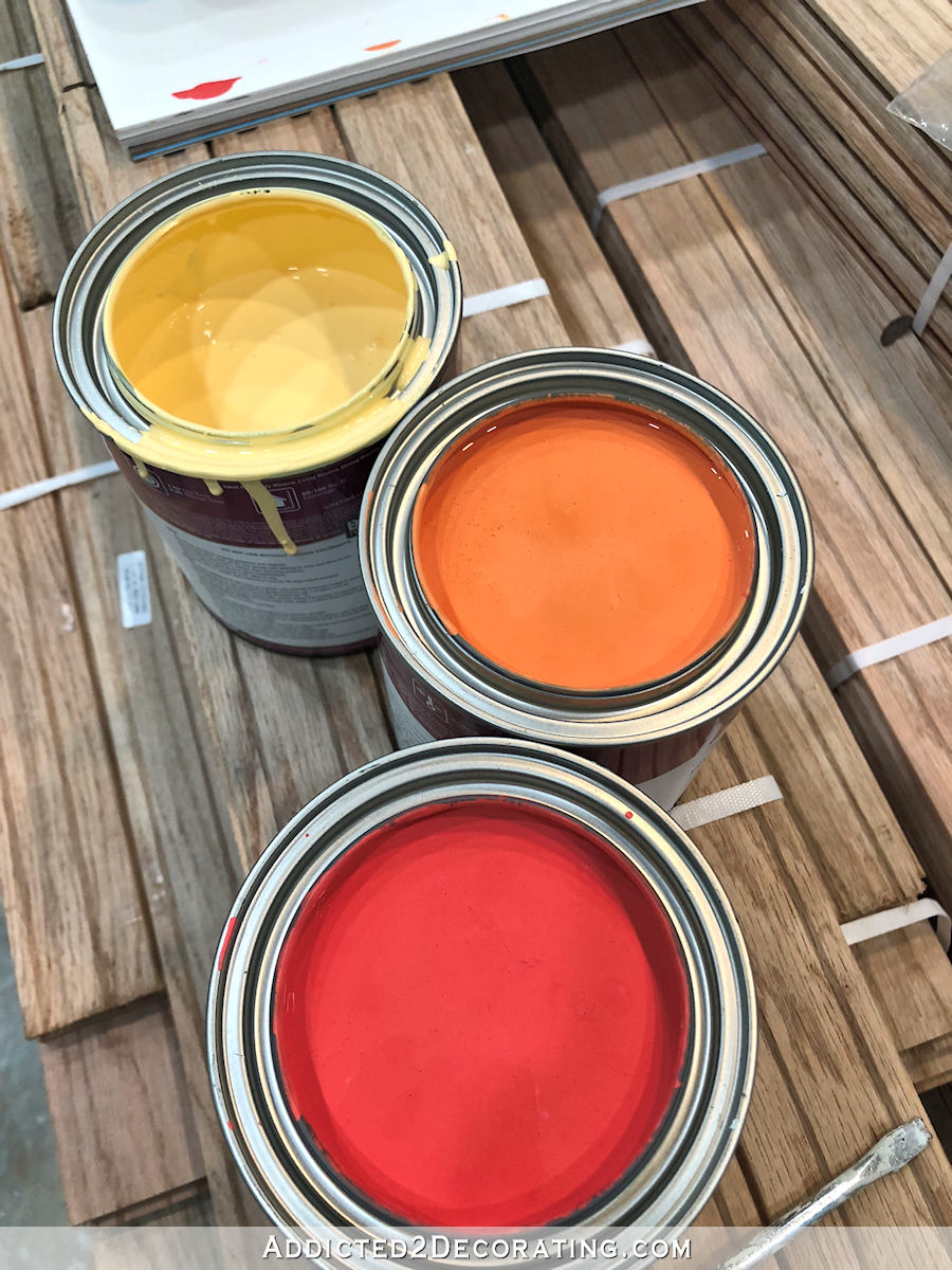
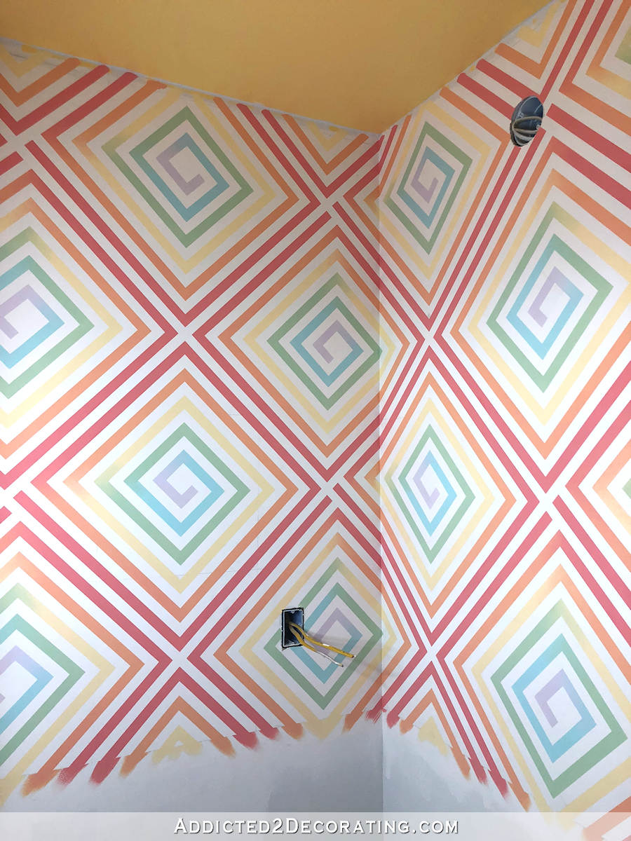
So I went back to the original three quarts of paint I had purchased for the bathroom, but instead of using them full strength, I mixed each one with white in a 1 part color, 2 parts white ratio. For the green, I used the green that is on the back entry walls mixed about 1:1 with white. And then for the blue and purple, I used the same white (Behr Polar Bear) and mixed in a little teal and purple acrylic craft paint to get the colors I wanted.

I had already painted the ceiling with the full-strength yellow paint, so I’m not sure yet if I’ll go back and paint it with the softer yellow or just leave it as it is.
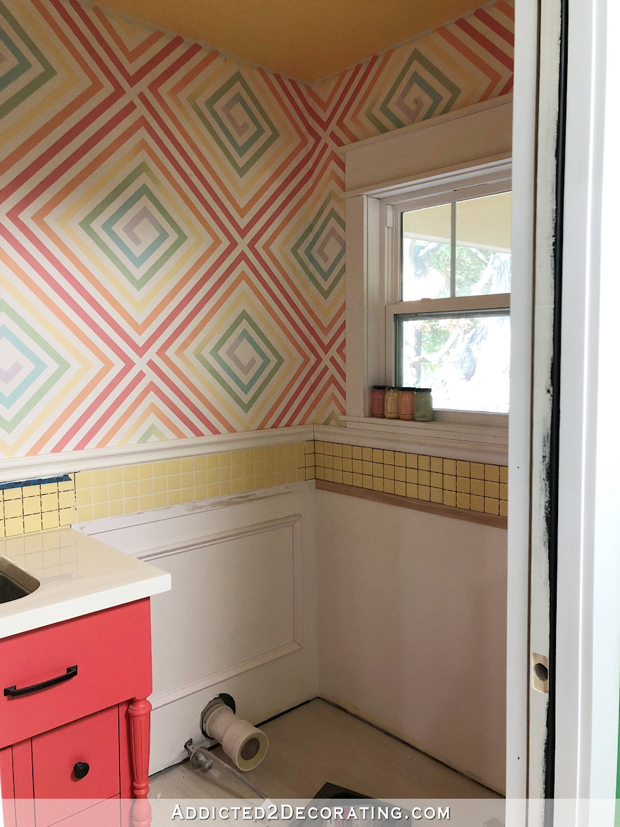
I do have one very small area (you’ll see it on the end of the purple in the spiral above the window in the picture below) where the tape took the paint off the wall, so it will need repair.
And you might notice some pencil marks here and there. I use Mr. Clean Magic Erasers to remove the pencil marks (don’t ever use pencil erasers on your walls!). I purchased one box, which contains six Magic Erasers, and I used every single one of those until they completely disintegrated, and still didn’t get all of the pencil marks removed. So I’ll get the rest of them removed today.
So each spiral consists of six different colors that create an ombre effect where each color fades into the next color.
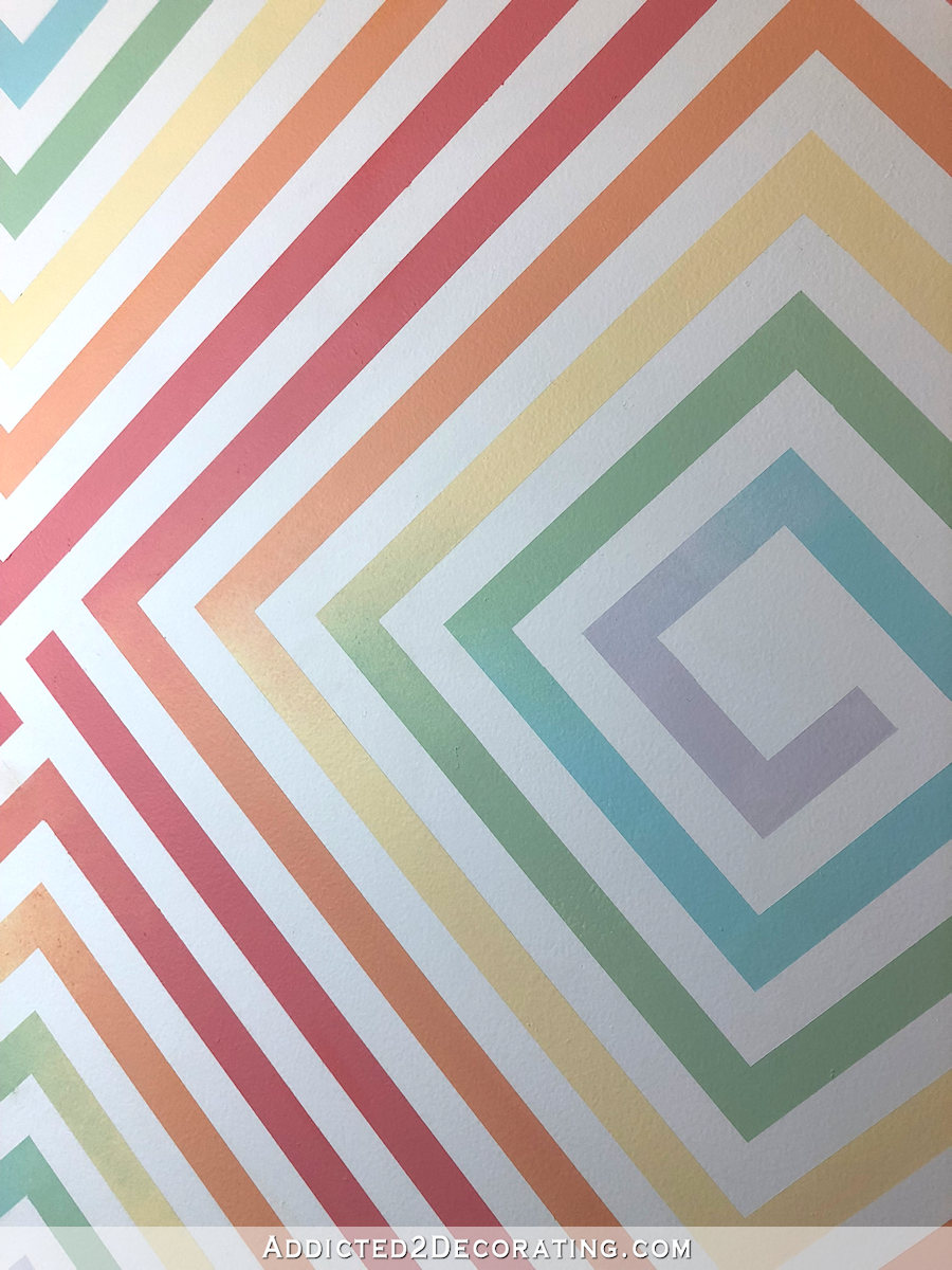
To achieve that look, I just painted the first color up to the corner, and then started at that corner with the next color, making sure that they didn’t touch so that the colors wouldn’t get mixed. Then I used a piece of a kitchen sponge (I cut a sponge into six pieces) to blend the colors into each other.
I originally tried a sea sponge to blend, but it didn’t work at all. The air holes in a sea sponge are too big for such fine blending, but a kitchen sponge worked perfectly.
Each spiral took two coats of paint. The blending on the first coat didn’t look great, but the second coat was much easier to achieve a soft gradient between the colors.
I wanted to do a video showing the process, but with me, plus two ladders, plus a work light on a tripod all in a tiny little bathroom, there was no way I could get another tripod for my camera in there. But I do have a scrap piece of drywall that I could use to demonstrate a spiral from start (i.e., how to tape it off) to finish. So I’ll see if I can get that done soon.
So that’s one thing done. Moving on to the next item. I hope to get the flooring installed today, and then I can move on to wainscoting and door casings.
EDIT:
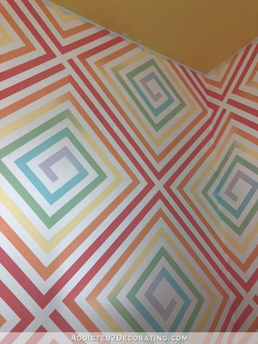
Some of you have noticed a discrepancy in the second photo in this post showing the taped design and the finished painted design. I had originally left a center rectangle untaped, which resulted in a painted rectangle that looked like this…
That center painted rectangle bothered me, so on the spirals that had already been painted, I added three strips of tape and painted the center part white. On the ones that hadn’t been painted yet, I added more tape to the design so to eliminate the center painted rectangle. You can see the modified taped design here…
Update:
If you want to see a video tutorial of this wall design, you can see it here…

Addicted 2 Decorating is where I share my DIY and decorating journey as I remodel and decorate the 1948 fixer upper that my husband, Matt, and I bought in 2013. Matt has M.S. and is unable to do physical work, so I do the majority of the work on the house by myself. You can learn more about me here.

It’s really beautiful! And I’m so glad you stuck with some color…my heart sank a little when you were considering gray (although, with my conservative streak, if it had been me I probably would have stuck with the gray–and always would have had a twinge of regret).
Can’t wait to see it complete in 5 weeks!
I just love it!
Omg!! You are so talented!! I love this!!
OMG OMG OMG this is just pure amazinggggggg!!!!!!!!!!!!!!!!
Kristi that is simply AMAZING! I am blown away by how the color pops but isn’t school yard, it’s such a wonderful happy combo… I can’t wait to see it all come together!
Love it! Your attention to detail is amazing! The fade into the colors is my favorite part. I personally would like to see the ceiling softer. But as always I bow to your judgement because you have proven time and again to have the “eye” for these things. How does it feel to be working on your studio? Is is more fun knowing this is your very own space? You can be as wildly creative as you wish as this is your very own room! Haha
Sheila F.
I’m definitely having fun doing things in here that I probably wouldn’t do in the other parts of my house. I feel like this area can be more playful than the rest of the house.
That is amazing! Love the colors and the pattern is so interesting; so much for my eyes to take in 😍. JMO, but I think the lighter yellow on the ceiling might work better. Way to go Kristi!
LOVE it! GREAT job!
OMG! that is amazing. I was so looking forward to seeing the full effect after your tease here and on Instagram. LOVE IT!
Love the design and colors. I actually really like the yellow you already have on the ceiling. Matches but not too matchy matchy. Looks awesome.
Beautiful! You can order off brand magic erasers from Amazon. They are an incredible deal if you don’t mind a box of 20.
I also get decent off-brand magic erasers at Dollar Tree. They come in 2-packs for $1 and you can get either the regular magic eraser, or one that is half sponge/half magic eraser. Way cheaper than the name brand!
I’m ashamed to admit it, but when you started, for the first time since I’ve been following, I had doubts. I was wrong. It’s fabulous! I should have known to trust you by now. My apologies for ever doubting you judgement!
Every time I think you can’t out outdo yourself, you do! This may be my favorite thing you have done yet — at least today. 😄 Another morsel for thought: could you get this made into wallpaper the way you did for the other design you made for wallpaper? I think you could sell it if you wanted to. I love the yellow ceiling — it is like sunshine.
Hi, I’m in awe of your drive and originality, regarding the ceiling it’s to soon for comments as photos don’t always show them correctly and we don’t know what’s next!
My wish is someday in the future you will have an open day.
You have done a lot of really cool projects and this is one of my favorites. I love this. In every way. The color selection, the attention to detail, all of it. SO, SO gorgeous and cool at the same time. Yay!
I just love it, Kristi. Makes me smile. I hope Matt likes it too.
Time for a wallpaper manufacturer to sit up and notice Kristi Linauer. She needs her own line!
How true, Kathy. Besides, I can see many possible streams of income, considering Kristi’s many creative projects and her unique ability to describe the steps. She can adapt along the way, as well. Anticipate and fix mistakes. I think she gives many the courage to venture into DYI in ways they never dreamed they could. Wait until the studio is done. Big things are ahead on this vicarious adventure we have been invited to take with her because she generously shares.
This is stunning. I just love it. BUT the ceiling has got to be lightened up. Your eye is drawn to that rather than the design–it just competes too much and it’s too heavy a color. I like your idea of the paler yellow.
Did you have to tape again? I feel like my mind is missing something because the ombre effect seems to be where the painters tape was as opposed to being in the area the tape was not covering (both the taped photo and the “after” photo have a large area of white in the center). Looks amazing!
I agree with Jennifer – logically that patch of white in the center should have been taped off to keep it white but it wasn’t – I’m looking forward to the reveal of the “magic” that happened here. Beautiful.
Thank goodness someone else ask because my eyes are hurting from trying to see how you did this! How did the large area in the center of each spiral have white? Please help!
Yes, this is what I came to ask! I love it, but I can’t figure out how you could do it without taping all the white areas.
Came back again because I couldn’t stop thinking about it! I looked at the instagram photo and it actually appears that the whole middle was colored instead of white. Did you start this way and then go back and paint over part of the middle with white Kristi?
Yes, that was the original design, but then I modified it a bit. I added an edit to the bottom of the post to explain.
Thank you for the edit and clarification! Makes complete sense with that final photo!
I added an edit to the bottom of the post to explain. 🙂
I love everything about this! I like the yellow of the ceiling and hope you’ll give the black wainscotting a try. I think all together it will be beautiful and sophisticated.
And yes, please give us a how-to video, and also make a wallpaper so those of us without your patience can enjoy this pattern on our walls, too! I would totally buy some (but if I had to paint it, it’d never happen!)
Rainbow victory!
Soooo pretty! Maybe you could make window coverings in the same yellow as the ceiling. I always look forward to your blog
OMG! That is amazing. Love love it!!! I say leave the yellow ceiling alone for awhile, and see how it works with the lighting once you have it in. I like it, like it is. 😋
Oh and a black vanity will pop in there 😂😂
Absolutely perfect. I love it!
Incredible!
I agree with Jennifer – logically that patch of white in the center should have been taped off to keep it white but it wasn’t – I’m looking forward to the reveal of the “magic” that happened here. Beautiful.
THIS IS AMAZING!!! The colors are perfect! and your skill at taping it off and painting it…WOW!! I’d gone crazy!! lol Can’t wait to see the flooring! Love everything you do!!
Spectacular! No other word will suffice. If you are taking suggestions, I say leave the ceiling as is. I think the difference in color saturation between the walls and the ceiling is very attractive.
I so agree!
Bravo!! This is just amazing .
One word. WOW!!!!
You are a genius and a saint!! Genius for coming up with this design and it’s execution. Saint because I would NEVER have the patience to something like this. This is so you!! AMAZING!! I think you deserve to be on Good Morning America or something for this.
Not only do I wish I were this brave and creative but also patient!!! I could never do something so tedious and precise as this. It looks so cool!
I love how you used color on the ceiling too. Yellow is my favorite! And the blending is beautiful, I didn’t even notice it at first but really takes the design up a few notches 🙂
YOU ARE……. AH……MAZ……ZING!
I, too, think the ceiling as is may be perfect with the shiny black you’re thinking of for the vanity. Going paler would be too matchy-matchy. Can’t wait to see it all put together.
Just a thought, but what if you took the wall and ceiling color from your studio and used that for the ceiling in there? I feel like it wouldn’t detract from the beautiful walls and tie nicely to your other rooms while still giving you color.
I like that idea too, although I like the yellow also. Am totally amazed that you did all that taping, there’s no way I would have even tried it! But it came out very nice! You are very good at fading the color into the next one.
That looks so unique and the colors are beautiful together! Are you putting up crown molding to finish of the area where the wall and ceiling meet? I am assuming so. Can’t wait to see the progress!
Yes, I’ll be adding crown molding.
Just a tip that you can buy generic magic erasers on ebay for pennies on the dollar. Paying full price for the “magic eraser” brand is highway robbery. Just search for melamine or even magic eraser on ebay.
LOVE, LOVE, LOVE! I like the ceiling as it is but whatever you decide will be fantastic! Can’t wait to see the rest!
WOW LOVE IT!!!
I like the yellow on the ceiling just as it is. I think it would balance nicely with the black wainscoting.
wow, love it! i wish i had so much patience ))
I love you. You are so talented and not afraid to try things. I would lighten up the ceiling because your eyes are drawn to it immediately.
Actually I never noticed when looking at first picture. I had to go back to get a better look after reading some comments here. I like it as is. But that’s just me 😀
It turned out great! I have to tell you, I was really worried about the pattern being very dizzying… however you solved it beautifully with both the muted rainbow and the ombré/fade. Love, love, love it! It’s totally giving me lots feels from my childhood too! I was the one kid who didn’t have rainbows in her room, and always loved them! (But I *did* have unicorns!)
I love how you “GO” for it and intuitively know what visually will make you happy. Another happy room with delicious colors and I salute you!
Wow!!!! It’s like a rainbow topped with a sunshine cherry!!! LOVE, LOVE, LOVE!!
Wow! Truly amazing! I am in awe of your tremendous talent.
Amazing. I’ve been following your blog for a little while and am amazed by the ideas you come up with and then figure out how to execute. But even for you, this seems next level. I don’t have the artistic/decorating talent that you have, but you inspire to me to at least try new things even in other realms of life.
Holy Cow and Wow!
This is beyond incredible. Great Job!
JoAnne
Oh wow, that is so much fun! I love it! All that taping really paid off! I am visualizing the room with the wainscoting. I can’t wait to see what you decide to do with the ceiling.
Once again, your creativity blows my mind! I can’t wait to see the finished space. Thanks for clearing up the center triangle issue. I was stumped trying to figure out why it looked different then I expected.
I like the new modified version. I say lighten the ceiling. I can’t wait to see the room finished!
Beautiful! you’re going to wow them on the make-over show!
Fantastic., and so your style! And geometric like you wanted! I was so worried you would waste time trying gray! Just perfect for your studio bathroom. Very happy place! And so creative how you came up with the design and process of achieving this look! IMO, the yellow ceiling is a bit too harsh and would be perfect toned down…but even if you don’t, you should really be proud of this design!
“Toto, I’ve a feeling we’re not in Kansas anymore.” 🙂 The tall, emerald green entrance and the swirly rainbow walls make me think of The Wizard of Oz and all it’s whimsy! And OMG….you’re going to have poppies in your studio wallpaper, right? Haha, the direction you’ve gone is so much fun and I love that you have a space that you can let your colors run free!
It’s beautiful! You have an infinite amount of talent as well as an infinite amount of patience! Well done!
Wow! I love this geometric pattern and all the color. Beautiful job with the blending.
No way could I do this…it boggles the mind. SO pretty.
When I do any kind of marking on walls for murals, I use water color pencils. Then, when it is time for clean up, it then just takes a little bit of water on a rag to get rid of any lines that show. Just be sure to use a color that blends well with your paint because the paint will dissolve the pencil in any areas that are painted over and color transfer can happen.
Kristi, the design and colors are truly spectacular. I showed my designer daughter and thought it too very creative and well executed. The only thing she questioned was why you don’t use “Frog painters tape” It does not bleed with crisp edges and is an exceptional product in which she used very successfully. There are several different tapes available in green or yellow, depending on how long it will remain on the wall. Keep in mind for next time.
That is freaking AMAZING! I just have one question, how in the H**L did you get all that tape up there straight and perfectly placed without losing your mind. I would have taken a gun to myself before I ever finished. Gotta give you kudos for tenacity! At any rate, so cool, and perfectly colorful, just like all your design choices. Looking forward to what is next.
You are seriously a genius. I can’t get over these walls. So drool worthy. Love, love, love!
Really stunning. I so admire your patience and creativity. You are a complete rock star!