Easy DIY Floral Wall Mural
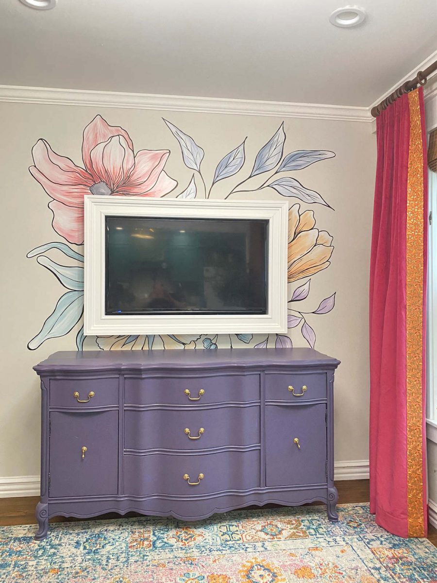
With the changes I’m making in the sitting room, I needed to find something to replace the plates and lanterns I had used on the TV wall for the first iteration of this room. So a couple of weeks ago, I had a grand idea of painting an easy DIY floral wall mural just around the TV frame. The mural was so fast and easy, and it only took me a couple of hours from start to finish.
When it was finished last night, I stood back and looked and thought to myself, “Wow, that’s really pretty.” And my very next thought was, “But it’s not right for this room.”
So while I probably won’t keep the mural (thank goodness it only took a couple of hours and not a few days), I won’t exactly call this a fail. I really do think it turned out pretty, but it’s just a little too….I don’t know what the word is. A little too precious. I think that’s a fitting word.
I do love florals. If you’ve been around here for any length of time, you know that I love flowers and have something floral in just about every room. But I generally like my flowers to pack a punch, either with bold color, or a bold design, or both combined. And this is just a little too soft and precious for me. But I thought some of you might benefit from seeing the process I used, and maybe you can use the process to design your own frame-style wall mural.
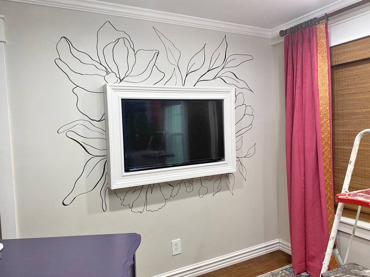
So here’s how the wall mural turned out…
So let me show you how I did it. And don’t worry. This is yet another project that takes little to no actual artistic ability.
First, I headed over to one of my favorite websites to find creative hand-drawn flowers (among a thousand other things) that various artists offer — creativemarket.com. I knew what I wanted, so I searched “line art flowers.” There were plenty to choose from, and I ended up selecting this package. Each flower or stem is a separate .png file on a transparent background, so I used my photo editing software to layer the flowers and arrange them like I wanted them. I added a rectangle to represent the position of the TV frame.
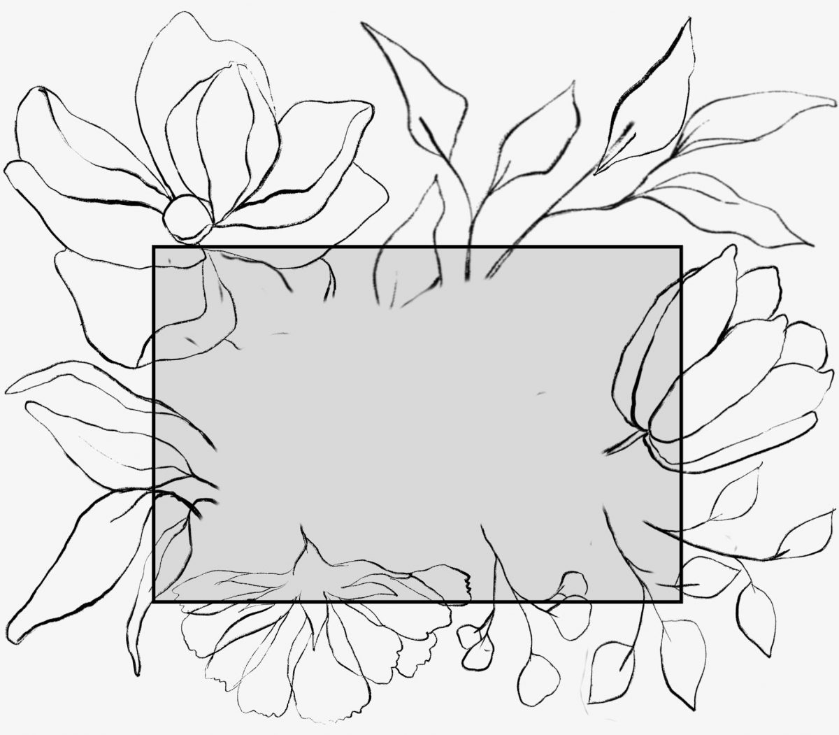
The photo editing software that I use is Paint Shop Pro. I’ve used it for years, and I love it. Even my mom, who is a retired professional photographer and photo restoration pro who uses nothing but Photoshop, has commented in the past about how impressive this software is for the price (it’s a one-time cost of under $50).
Anyway, if you don’t have a photo editing software, but you do have a printer, you can move to the next step and just arrange your flowers by hand and trace them. You might go through several plastic bags and several prints of your flowers to adjust the sizes, but it’s very possible to do it this way and skip the photo editing software altogether.
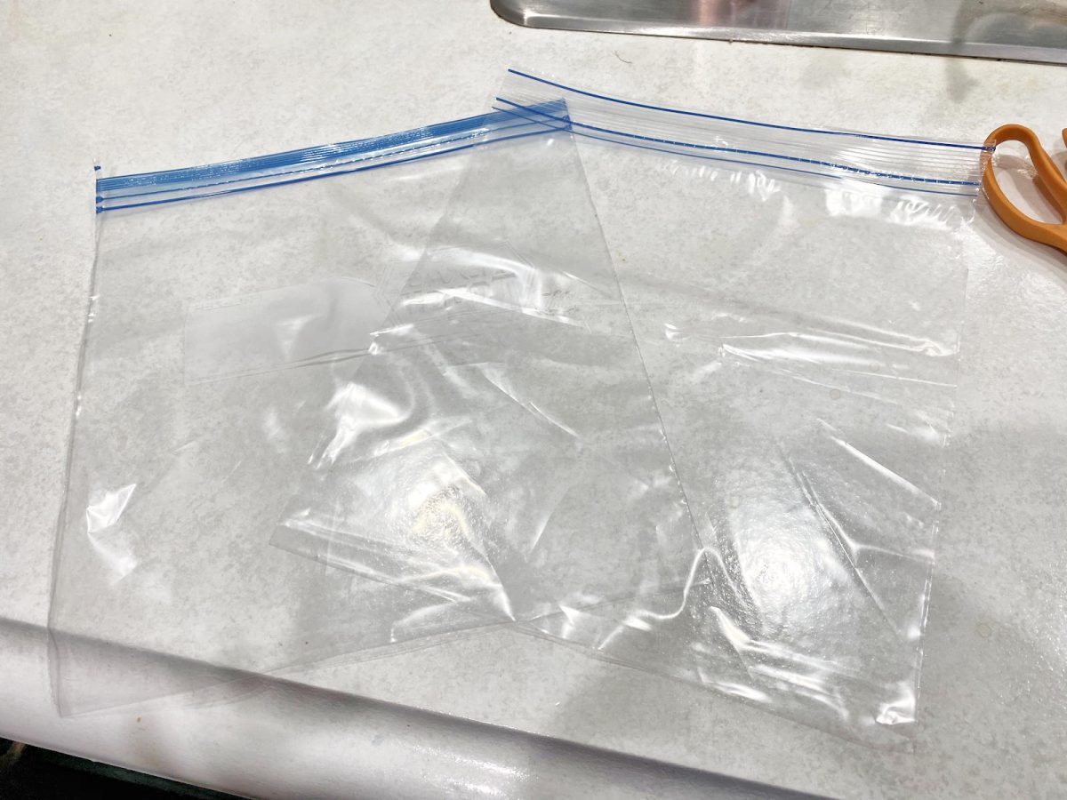
But since I did my arrangement on the computer, I printed it out on regular printer paper. Then I cut a 1-gallon freezer bag into two pieces…
And then I used the back side of the bag (i.e., the side with nothing printed on it) to trace my design using a permanent marker.
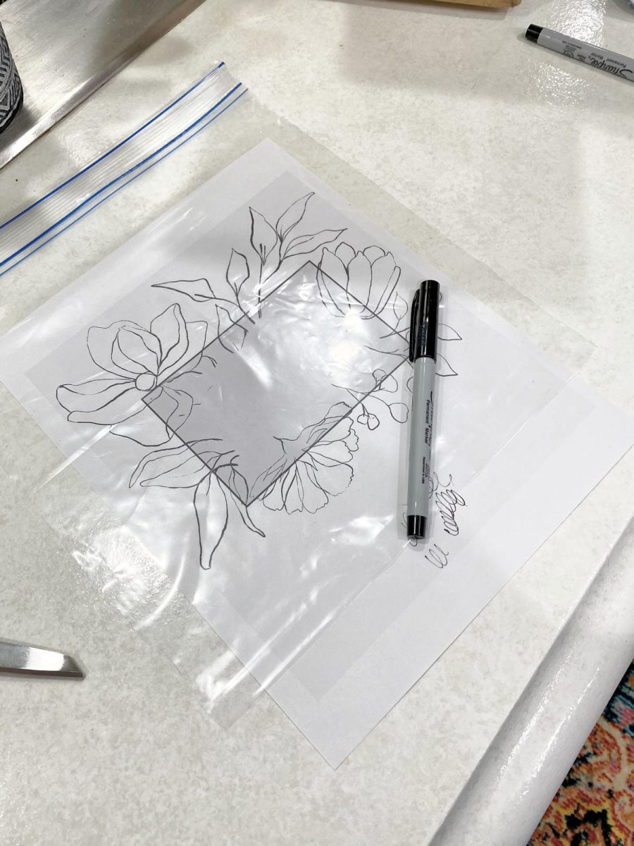
It was a quick and easy way to make a transparency for my overhead projector.

If I had a more elaborate design, like the one I did on the guest bedroom wall, I would have taken the file to FedEx Office and had them print it out on a transparency. But since this design was so simple, I could hand trace the design onto the plastic bag AND draw the design onto the wall in the amount of time it would have taken me to drive to FedEx Office.
Before removing the TV frame from the wall, I used a pencil to trace lightly around the frame. I used my photo editing software to enhance the lines on the photo below, but they were actually very light pencil marks.
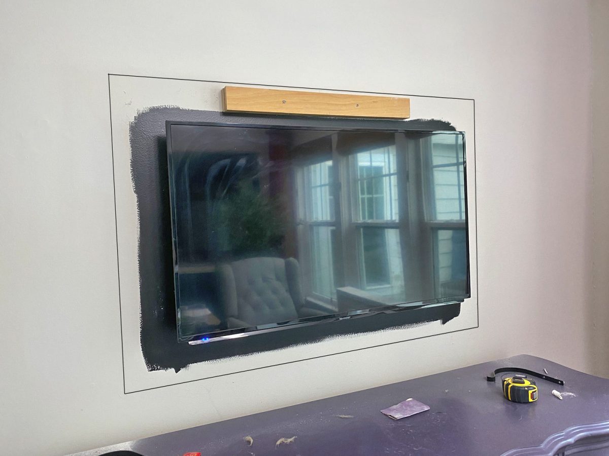
And then I set up my overhead projector (which I bought for around $50 on Ebay) on the kitchen peninsula countertop, lined up the rectangle on the transparency design with the rectangle I drew on the wall, and then traced the design onto the wall…
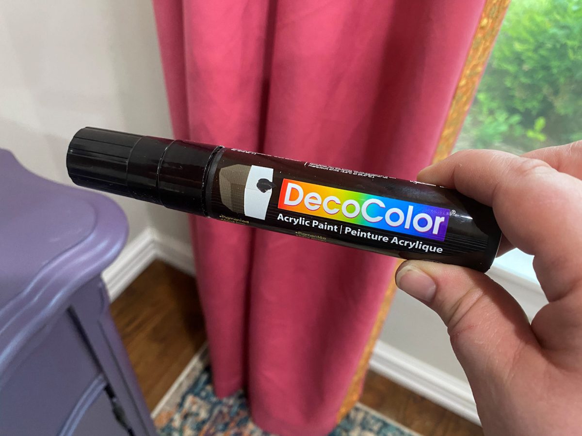
I used a DecoColor acrylic paint pen to draw the design on the wall.
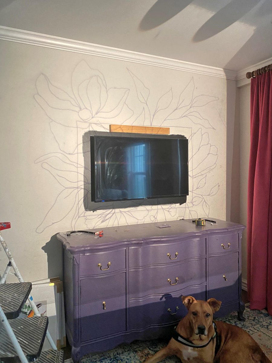
And when the design was traced on the wall, it looked like this…
Tracing the design took about ten minutes, start to finish.
I had actually thought that maybe just a simple black line art design would be enough, but it looked a little plain to me. So I decided it needed color. This was also a fairly quick and easy process because the key is to not overthink it. Starting with the tulip, I used a large brush (the 2.5-inch sash brush I used to paint trim) to fill in each petal, and then used a 1-inch square artist brush and brushed on orange paint starting at the base of each petal and going towards the tip of the petal. As I repeated this, the white and orange blended a bit and gave some depth to each petal.
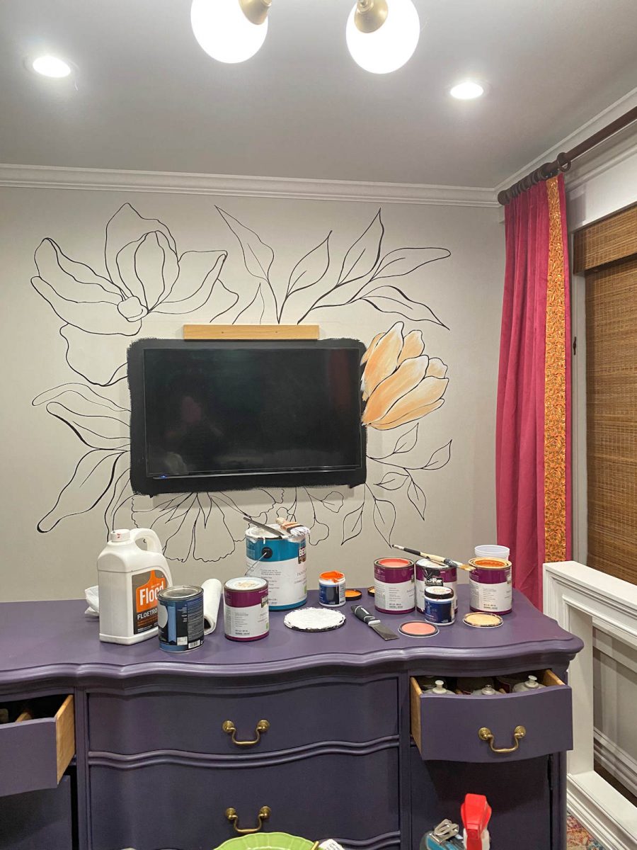
I repeated that exact process on the other leaves and flowers — fill each leaf or petal with white, and go back over it with a little color, starting at the base and brushing towards the tip.
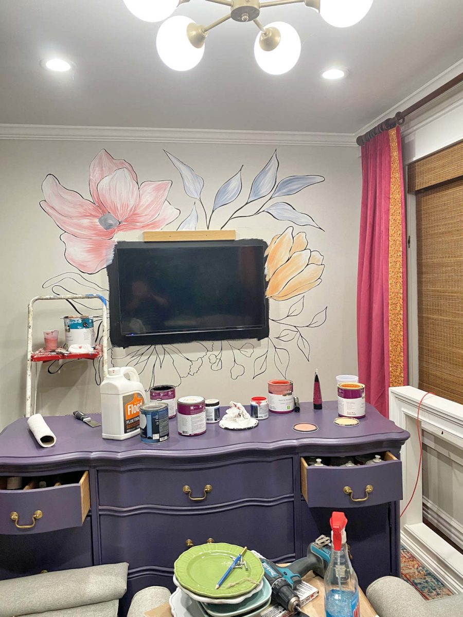
After everything was painted, I went back and touched up the black lines, and added a few more.
This was so easy and pretty fast, as far as wall mural projects go. And I really do think it’s pretty, but it just doesn’t quite seem right for this room. Oh well. It was a fun way to spend a couple of hours on a Sunday evening. 🙂 But now I need a new idea for this wall. The wall looks WAY too plain with just the buffet and the framed TV. But the mural was my one and only idea for that wall. Back to the drawing board!

Addicted 2 Decorating is where I share my DIY and decorating journey as I remodel and decorate the 1948 fixer upper that my husband, Matt, and I bought in 2013. Matt has M.S. and is unable to do physical work, so I do the majority of the work on the house by myself. You can learn more about me here.
Well. I absolutely LOVE it! Well done!!
Add some brighter color. That is more you. It’s really pretty.
I agree! I love the mural but it needs some bolder colors to really pop! Spice that mural up a little bit and it’ll be “wow!”
I like the black stenciling but once you add the color it does indeed look too ‘precious’ and in my opinion feminine, so maybe with the pink in the rug and the pink drapes that is what tipped the scales for you. Very creative and beautiful. You do grand work. Can’t wait to see what you come up with next. ❤️💜
What if you removed the large purple dresser under the TV and added a long white floating shelf (about 8” wide and kinda chunkie) to “anchor” the TV but keep the wall feeling fresh & airy?
Hmmmm maybe the flowers need to be smaller and more of them? Wow the dog has got so big, he is really filling out
Lovely. You get to evolve, pursue whatever strikes joy in your heart.
Curious, would you post the color name/#/Brand of the purple furniture please? I’m having a hard time figuring out what it is. On my computer it’s reading more lavender, less purple but that doesn’t quite make sense to me given the other colors you have in the room. I don’t have a lot of faith on how colors are represented on computer screens. Thank you.
That color is Behr Voodoo. It’s a very strange paint color. It’s actually quite dark, almost eggplant. But in the early morning hours, it looks quite bright and washed out. I hate that. I love the deep, dark, almost eggplant color that it appears to be later in the day and in the evening. I’m thinking of repainting the buffet in a truer eggplant color, maybe something like Benjamin Moore Shadow. I think that one is dark enough that it won’t have the washed out look during the morning hours when the light is more direct in this room.
Love your style and the way you use color! This is gorgeous, but I agree- it’s not quite you in this room. What if you painted the tv frame to match the piece below? Then, if it needs more, maybe some simple wall sconces with colored candles. Just a suggestion. Can’t wait to see what you come up with – I so admire you talent and energy. Happy decorating😊
I LOVE the mural! I agree with one of the other commenters…go back with some bolder colors…such as those in your logo or the work room wallpaper! So so pretty!
Love your creativity and your painting – but please cut a piece of cardboard to fit the top of your dresser!
I was worried about the dresser top while painting! I can never paint without making a mess!
So pretty. I wonder if making the frame black or a bolder color would make the area pop?
Resin art for that wall? You could DIY and customize but it would be more abstract, which I think you prefer. These look like geodes and could be kinda cool: https://www.bridestory.com/seya-artwork/projects/coaster-resin-art
Good idea! I like the ones that look like geodes.
I’d wait a few days and you will see where you can improve it to your liking. When I do artwork it takes a while to make a determination and often I don’t like it at first.
I think it’s pretty cute, but cute is probably not what you’re going for. It was a good idea, but I think for me the main issue is that it feels like the flowers and leaves aren’t peeking out from behind the TV enough. They look kind of awkwardly cut off to me. I think it would have been great if they had stuck out more, and if you had used stronger colours rather than the more muted ones you did.
Worth a try to intensify the colors and add a few flowers to extend from the TV a bit. The concept is great, it’s just a bit pale.
I like where you were going with the flower mural, but it’s the colors that aren’t right. I think if the colors were more like https://creativemarket.com/avalonrosedesign/6131844-Poppy-Love-Floral-Clip-Art. It might look better
Have you thought about just adding bolder colors to what you already have? Maybe it’s just not finished yet? Very pretty and I love how it ties the elements together.
Love the concept, but I agree that it just isn’t a good fit for the room. For me, it’s the white that reminds me of an 80s bedspread. I can picture this with bolder colors, maybe switching black instead of white on the flowers, and then adding in a turquoise “shadow” or background effect around the flowers in the same color as the kitchen cabinets.
I was picturing something more like this: https://www.icanvas.com/canvas-print/fluorescent-flower-hmk45#1PC6-40×26
Precious is the correct word! I think overlapping blocks of color would look nice. I saw somewhere how one gal defined her work space by painting an elliptical shapes on the wall. I liked the black lanterns and they would look great on either side of the blocked shapes. You will get it right. You always do! 👍🦋
To me, that type of flower mural seems more bedroom/bathroomish….imho
But I do think it’s pretty ☺️
I think it’s lovely, but agree, it’s not really you. What about using brighter, more intense colors and changing the lines of the flowers and leaves to something more modern, linear, geometric. Not quite sure what words I want, but in the general direction of Salvador Dali? A lot of your other art work has a more linear, abstract quality. Since you have it up there, I’d play with it and see how you like some changes before heading in another direction. Anyway, it’s lovely and well done, as usual!
I think it’s lovely. But I agree with those who said that the white
TV frame doesn’t work.
What a great tutorial for us! Trying to figure out a way to do this in a small powder bath on all the walls like a hand painted wallpaper or mural. For your application, I think a slightly smaller or tighter version of the flowers, in an all-over pattern covering the wall, without color, just the outline, might be very nice.
I agree with what many of the commenters have already pointed out. The biggest issue I see is the white TV frame. Your mural is lovely but my eye is drawn to the white frame. And I agree brighter, hotter flowers would look more you. I know you will figure it out. Maybe go back to the reason you wanted to paint a mural in the first place.
I like it, but think the colors are too soft, not vibrant enough for the curtains and dresser. The upper left flower seems dominant, making this look a bit unbalanced. Perhaps more vibrancy and adjust the right side with another flower?
I think its beautiful–I hope you keep it!
I happen to LOVE it!
Stripes that match those beautiful curtains would be nice!
I like it… but I believe what’s wrong here is scale. The TV is too small. and the frame around does not work. It’s all about the frame and makes everything look more cluttered and choppy.
.I’d get a bigger TV – mount it – that’s the only thing on top of the mural. Then see how it looks.
Seeing all those paint cans and lids on your beautiful purple dresser made me very nervous! I almost didn’t see the mural for that 😂🤣😂 Beautiful, but I do agree that wall needs something more. I just don’t know what 😋
It’s going to get repainted anyway. 🙂 The color is reading way too pale (which is strange since it’s really a dark purple), and in early morning light, it looks way too washed out next to those curtains. I want a true eggplant color.
I agree. It’s too….’girly’….’sweet’, I think. Before you paint it entirely over, try bolding up the colors first….more like a cartoon. Less pastel-y and no shadows. That would fit more with all your bold colors in the room. If it still isn’t right, then paint over.
I like it, I’m but I definitely think it needs some bolder colors in it. The pastels up on the wall just don’t work next to your bold colored drapes (which I love!). I would try the bolder colors before getting rid of it.
Do the whole wall.
YESssss !!!
I think this is great. What does look off to me is the bright white of the frame around the TV. Could you put color on that frame? I think that could look more cohesive.
I love the mural behind the tv!! I’d like to do something like that myself, but I have a question… have you watched any television since you painted the mural? If you did, were the flowers distracting or feel too busy when you had a program on that had a lot of action scenes? I don’t want to make myself dizzy (😂) so I may need a simpler pattern. Thx!
I personally don’t find them distracting, but that doesn’t mean they wouldn’t bother you. I’m wondering if there’s some to put up some temporary flowers (perhaps large cut out paper flowers) around your TV to see if you think they might be too distracting.
Great idea about putting up temporary flowers. Thank you so much!!!
You are so gobsmackingly multi talented! It’s so inspiring to witness!
The heavy white frame around the TV just seems too much, regardless of what’s on the wall. However, I love the mural and think it would be “precious” in a daughters room. Too bad mine are both grown & gone. Great tutorial!
What a beautiful job you did, Kristi! Is there NOTHING you can’t do??? 🙂
I’m with many of the others… if you just add a touch more of the brighter, bolder colors you love so much, maybe it would be more to your liking. Whatever you decide to do, it will look fabulous!
What about pulling pattern from your beautiful rug up to the wall? Another thought would be grass cloth inside a second “frame” behind the television.
I lovethe mural idea …. maybe a “sharper” design and stronger colours (more saturated) might work better. Something with twigs and birds, an occasional small flower. Sort of Chinoiserie style?
I really like it. It’s def in the pastel family, but it goes really well with your dresser below and the color of your curtains. It’s also not predictable as you tone changes, but remains complementary to the whole.
It’s very pretty – but I agree – just not right with the other elements in this room.
I also think it might be distracting when watching the TV and there is something off about making the TV the centre of the sign.
No artistic talent, my backside! lol. Can’t wait to see what you come up with next!
Lovely mural! Maybe metallic colors for the flowers like the guest bedroom wall will work. A complete tangent idea like going for a jute or bronze color wallpaper on the whole wall might help in making the room cozy and yet keeping the curtains and the rug as highlights of the room without competing. I was thinking lights strips behind the TV would give the mural a very glowing effect. I agree with other comments ……..with all the pretty colors in the room, the big white TV frame seems off.
The colors don’t seem to go with your style at all. Far too pastel, I think. What if you added to the mural so it washes over to the left and down towards the floor? The scale of the small-ish TV, very chunky frame, and large (but few) flowers throws me off. The frame has always seemed out of proportion to the TV to me. Maybe try bolder colors and a slightly smaller frame? I love that you just have a “Give it a whirl” attitude! You just tried it and are open to other options if it doesn’t turn out. It encourages me to take more chances in my home!
It looks like a painted dish cloth. I think it’s the white base. Before erasing it you could try doing the same technique but use a vibrant hue for the base color and a slightly lighter hue for the accent.
Just getting round to this post. I think the flowers are pretty but they lack the POW factor especially next to those fabulous drapes. I first thought bolder colors and more flowers but that could make it hard to watch the TV when it’s surrounded by a really eye-catching wall.
My thought after looking at DWF’s link to Seya resin coasters which I loved would be something more 3 dimension like fake Chihulys.
http://cdn.dickblick.com/lessonplans/classroom-chihuly/classroom-chihuly-chihuly.pdf
The copy cat Chihulys at this school are coffee filters which won’t last as long but their finished wall art, a few photos down on the page, is amazing. Can’t believe these guys are only in 1st and 2nd grade. I’d buy that art, especially the 2nd graders.
http://artwithrmotta.blogspot.com/2010/09/can-you-say-chihuly.html
You’ll figure it out, I have faith.
Great idea! Thx for sharing your technique. I think it just needs expanded to encompass the whole wall to make it more of a mural
Either I missed this or it was crowded out of my memory. I love it and I have a wall it will be perfect on. So glad I was scrolling through your DIY projects!