
Exploring Various Art Media Possibilities For My Dining Room Artwork
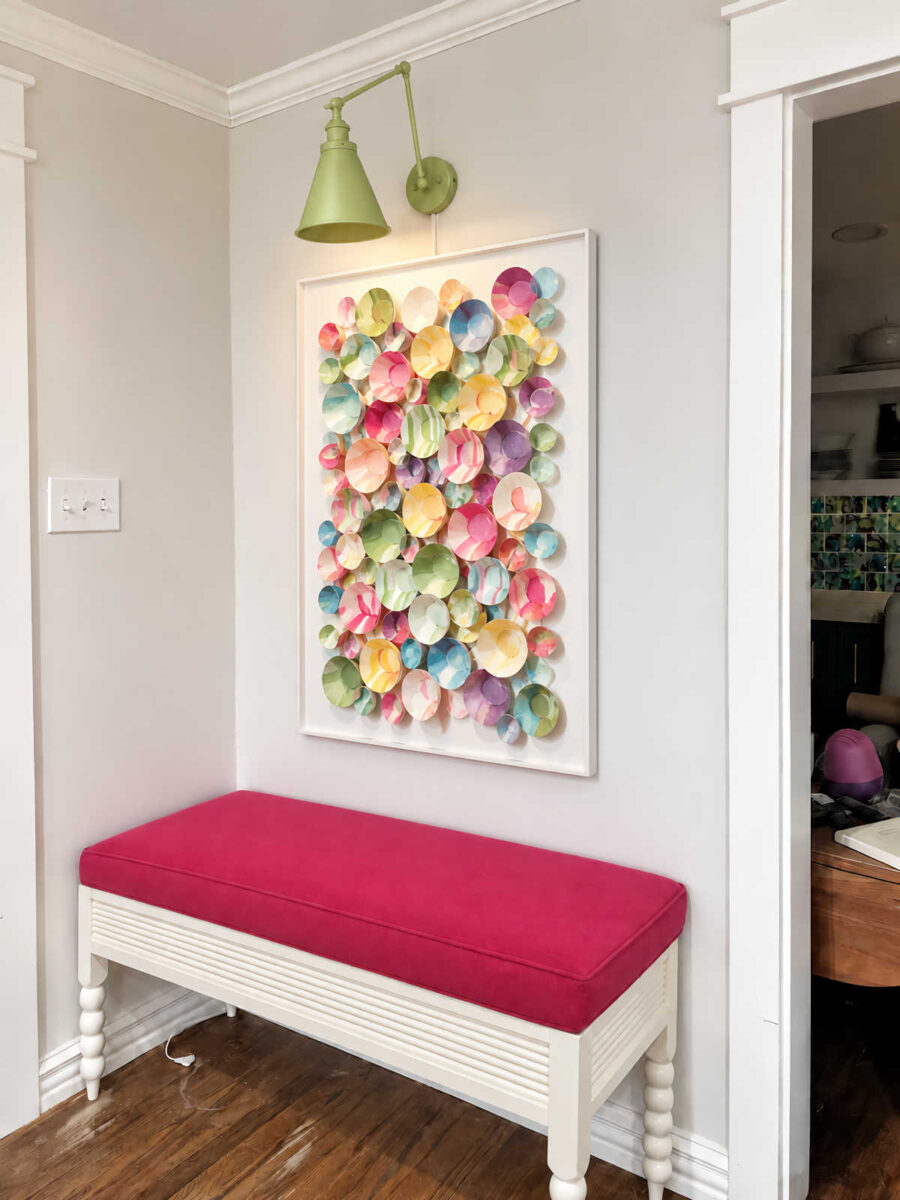
As most of you know, I have lunch with my mom every Wednesday, and at some point during most of our lunches, we talk about my latest projects. So naturally, the textural artwork that I want to create for the dining room was a topic of conversation yesterday. We sat there and discussed various ways that I can create this inspiration artwork that ChatGPT came up with for my dining room.
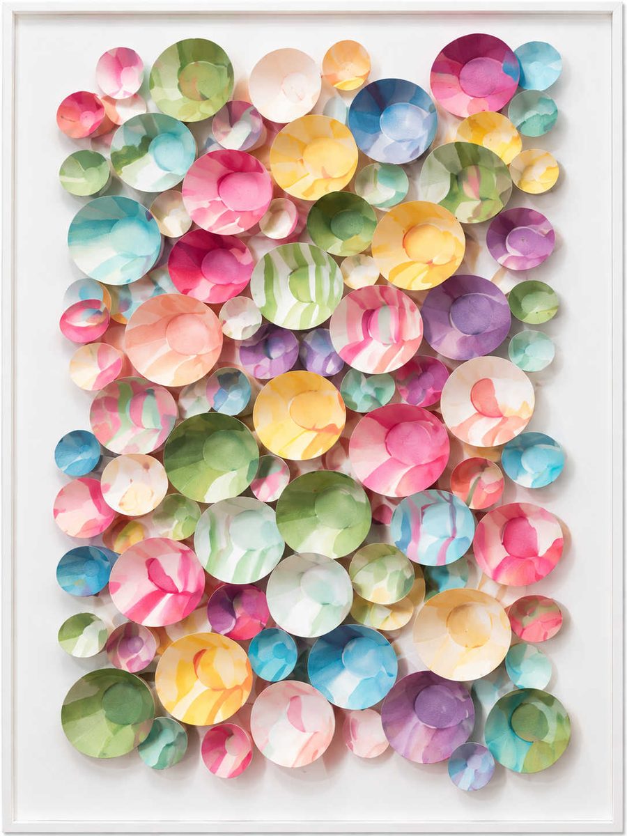
I haven’t been able to stop thinking about this. I absolutely love how this looks (with a little bit of tweaking), so my mind has been going at 100 miles an hour ever since I saw it, trying to figure out how to create it.
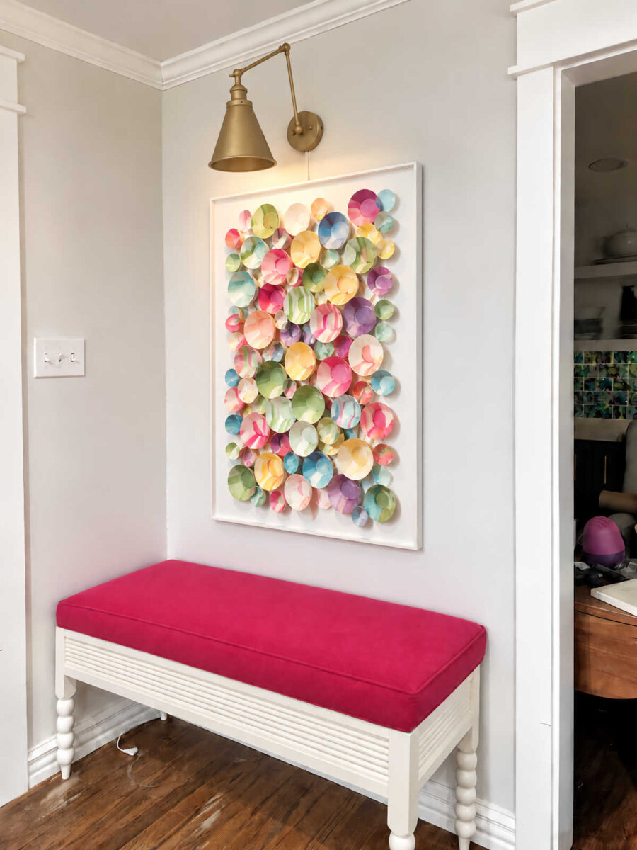
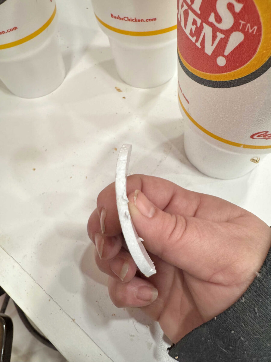
I’ve been planning for this textural artwork for a long time now, so I’ve been gathering items that I could possibly use. One potential medium I’ve been saving is styrofoam. Specifically, I’ve been saving all of my cups from my tea that I purchase every day. This has been quite eye-opening. I generally toss the cups when I’m finished, but saving them has made me realize just how much waste I’m contributing to every day, and I’ve thought that there has to be a way to reuse these in a creative way. (And I also need to start making my own tea at home again.)
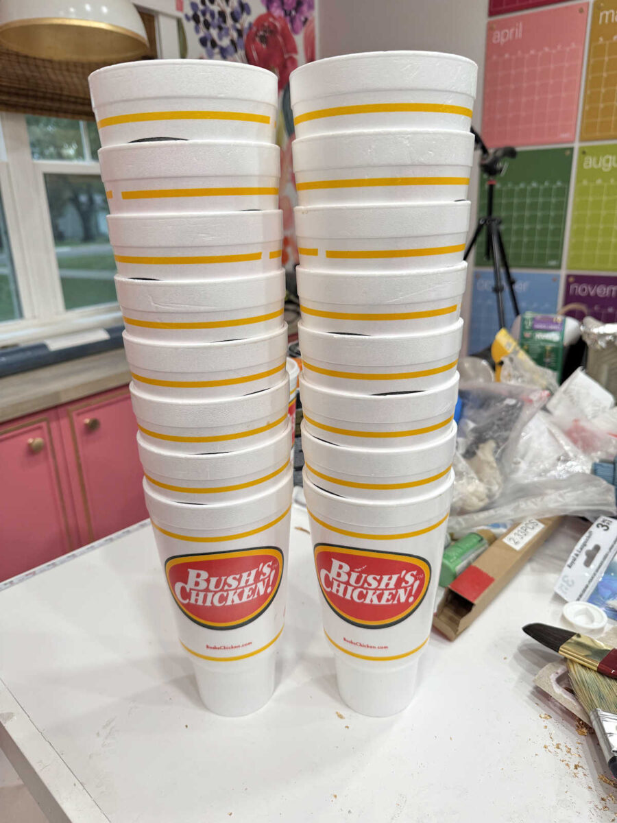
And while it wouldn’t give me the exact look of the inspiration artwork, I’ve had the idea for a long time that these could be cut into circles and mounted in various heights and then primed and painted to create some really interesting textural artwork.
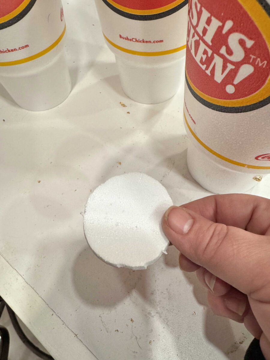
I love that they have a natural curve to them. I think that would create a really interesting look, especially with circles of various sizes.
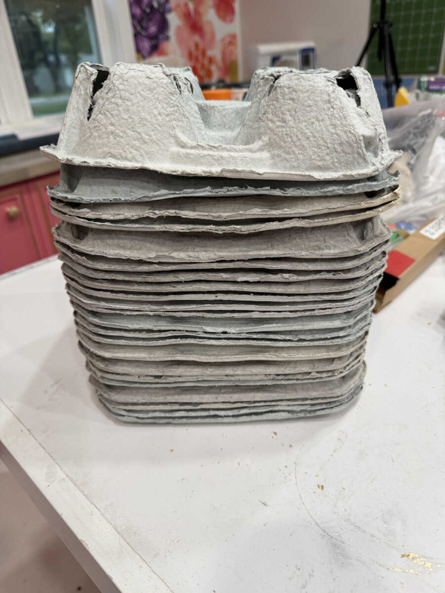
I’ve also been collecting and keeping the paper pulp cup holders that they sometimes give me with my drink order. While I don’t think I could use them just by cutting them into shapes, it’s paper pulp. And anything made from paper pulp can be turned back into paper pulp and reshaped. I’ve always had a hard time getting rid of anything made from paper pulp (drink carriers, egg cartons, etc.) because it can be such a great medium to use in artwork.
So I like those two ideas because of the recycle-reuse aspect of them. They keep disposable items I use regularly from going into the garbage, and I really like that idea. But if I want to get the exact look of the inspiration artwork, the easiest way is going to be using clay. And of course, my favorite air-dry clay is this Creative Paperclay. I tested out the idea by cutting a circle of clay and shaping it using a ball. It was quick and easy.
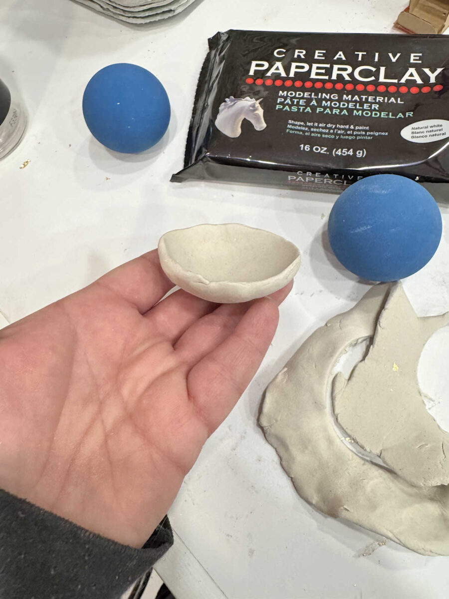
One thing I don’t like about the inspiration art is that it looks like actual bowls with flat bottoms. I don’t want that. If I use clay, I want the whole thing to look rounded and not like an actual bowl that you would use for food, and I also want it to look more handmade, perhaps with a “torn” look around the top edge. I’ll have to experiment with that and see if I can get that look with the Paperclay.
And another option that my mom and I discussed was using papier-mâché, using regular white glue, water, and paper, and shaping it over various sized balls, from small golf balls to ones probably no larger than a baseball.
So I have lots of ideas, and lots of options. Even if I don’t use the cups or cup holders on this particular artwork, I’m still going to save them. There has to be a creative way to use these and keep them from being thrown away. As I said above, this little experiment of collecting these items over the last few weeks has really opened my eyes to just how much I’m throwing away, and I’d love to reduce that and come up with some creative options for using these mediums (media?). And I’m going to be way more conscientious about just how much I’m consuming in the future.
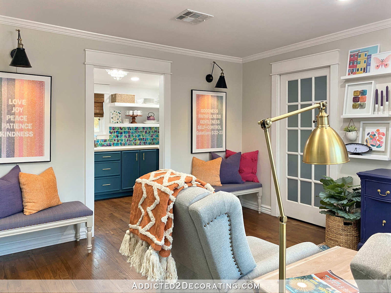
On a different note, while we were talking about this, my mom really surprised me. When I was deciding which color to paint the sconces, one of the thoughts that went through my head as I was standing there, green spray paint can in hand, and about to spray the sconces green, was, “If I paint these green, I’m going to get an email from Mom.” 🤣 I just knew that she wouldn’t love the green. And it’s not that I make my decorating decisions based on what my mom likes. Believe me, we have a lot of disagreement, and a lot of laughs about our differing opinions. She’s way more conservative and traditional in her decorating, while I love loads of color. But she does have a good eye for decorating, design, and art, so I value her input.
But when we were talking yesterday, she actually told me that she prefers the green sconces with that colorful artwork! WHAT?! I couldn’t believe it!! All I could do was laugh. I just can’t figure her out sometimes. 😀
So I might be repainting them. I’ll wait until the benches are finished and the artwork is done and then make that final decision. But what do you think? Do you like the gold or the green better?

Addicted 2 Decorating is where I share my DIY and decorating journey as I remodel and decorate the 1948 fixer upper that my husband, Matt, and I bought in 2013. Matt has M.S. and is unable to do physical work, so I do the majority of the work on the house by myself. You can learn more about me here.
I am wondering why you don’t make your own tea and use your own reusable glasses.
Honestly, it’s because I’m a full-time caretaker and I work full-time at home. That 20-minute break that I get every day to get in my car, sit, relax, and not have a care in the world other than my pleasant drive, by myself, to and from Bush’s to get my tea, is like a little respite from the rest of my hectic and demanding day.
You deserve that little respite too! Being a caretaker very hard no matter how much you love your husband. Enjoy your little corner of sanity!
Would they consider a reusable cup? Sometimes Starbucks will..
I totally get this Kristi. It is healthy mentally, emotionally, physically and spiritually for caregivers to take a break. For years I didn’t and now in my 50’s I definitely feel it. My prayers are always with you 🙏🏻
Thank you for your reply. I totally understand needing to take a break, get out of the house and treat yourself to something you enjoy.
When looking at your inspiration artwork what came to mind for me it’s those cardboard muffin/cupcake cups, not the ones they get baked, I think they are mainly for packaging. I’m sure they come in different sizes and you could do water colour in them if they are already white. Then with regards to your sconces, maybe try the green on the shade part first?
I had the same thought about the muffin cups! Paint them with alcohol ink or watercolor paints.
Is it possible that your decisions on colors could be thrown off by the current color of the wood floor? You may find it helpful to do your mockups with your lighter floor color.
Kristi- Hi! I actually was disappointed that you didn’t go with the green lights. Lol! I love the gold too but I think you were being too conservative on this decision. We’ll see what you think and decide after your artwork! I’m getting so excited to see this room come together!
I prefer green
Kristi, I like the gold sconces. Also, you don’t need to throw egg cartons away as they can be recycled.
I prefer the gold! I think you table being green is a statement!
Instead of repainting the whole sconce, have you considered painting or wrapping the shade in green?
This way, the base of the sconce stays gold, which is consistent with the other two above the sideboard, but makes a statement by reiterating the table color.
You might make the wrap out of some sort of fabric, maybe one with a little texture for interest, like a green suede or textured linen?
Yes! This!
I guess I’m the odd ball in the corner about the sconces. I loved them black.
Artwork: if you got with the clay or the pulp idea, there are texturizing plates that you press into the clay/pulp before it dries. Probably a better result with the clay.
I had to laugh when I saw your stacks of disposables. Resembles my stuff, only, I collect things that would make an interesting stamp using dye, print paste and fabric. My one daughter is the only one allowed to sort my things. She’s also a dyer. Other daughter would hook up an industrial shop-vac and get rid of everything!
Green
I love bright colors, but I like the gold sconces. To me they ground the space and connect it with the other lights and the other wall. For the art, I wonder if you can make a workable papermache from the cup holder pulp.
On the topic of sconces, although I think they look cute painted green when I just see them on that wall with that artwork; I wonder if that’s the best look for the room overall. Maybe show a picture with the rest of the room and colors included. Overall I think the gold might look more cohesive. Just a thought.
I’m constantly amazed by your creativity.
Gold
I think Mom’s right. Green is more whimsical. I like the bench and the fabric cover. Adds a degree of order. As for the two art pieces (one each side— will they be twins or kissing cousins?) I like the delicate thin effect of each cup inside the frame. That sells it for me. Too many irregular edges would complicate the design.
I anticipate you might choose 3 puffy pillows with possibly more patterns, which would compromise the clean look you would preserve by keeping it simple. The bench area is part of the whole area the eye can see. Already a lot going on.