Home Gym Wall Design – The Final Three Options
*This post contains affiliate links.
I’m finally starting on our home gym today! My goal over the next couple of days will be to clear out the rest of the stuff from the room (my paint cans, tools, and scrap wood from other projects always seem to land in that room), get all of the lights installed (six recessed lights and one ceiling fan/light combo), get the walls and ceiling primed, and then get the rest of the hardwood floor in the closet area installed.
But as you might expect, it’s not these basic projects that occupy my mind. It’s the fun stuff — the colors and designs that will go into the room. So this past weekend, I tried to finalize the design for the walls. I was having a hard time visualizing things in my mind, so I went to my favorite free floor planner, drew up a quick floor plan for the room, and saved some pictures of the room in the 3D view. Then I used my photo editing software (I use Paint Shop Pro) to add some color and design to the walls.
First, here’s the two-dimensional look at the room. When we made the hallway smaller to square up the future master bathroom (which has been delayed, but is still going to happen soon), it made the entry into this room longer. It’s an atypical room entrance, but I kind of like it. So as you can see, the wall with the two windows is the first thing you see when you walk into the room.
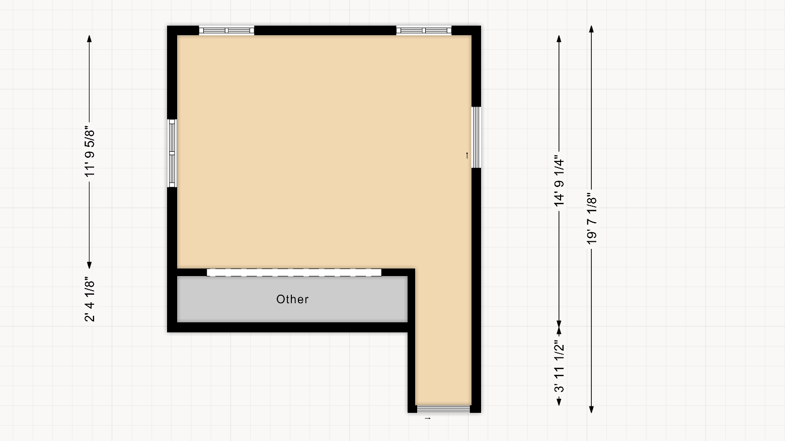
The middle of that wall is where I’m going to build a Swedish ladder. With that in mind, I don’t want a busy wall pattern behind the center 36 inches of that wall. I want that to be a solid color that extends onto the ceiling just a bit. So the wall design will have to start on either side of that solid 36-inch center part.
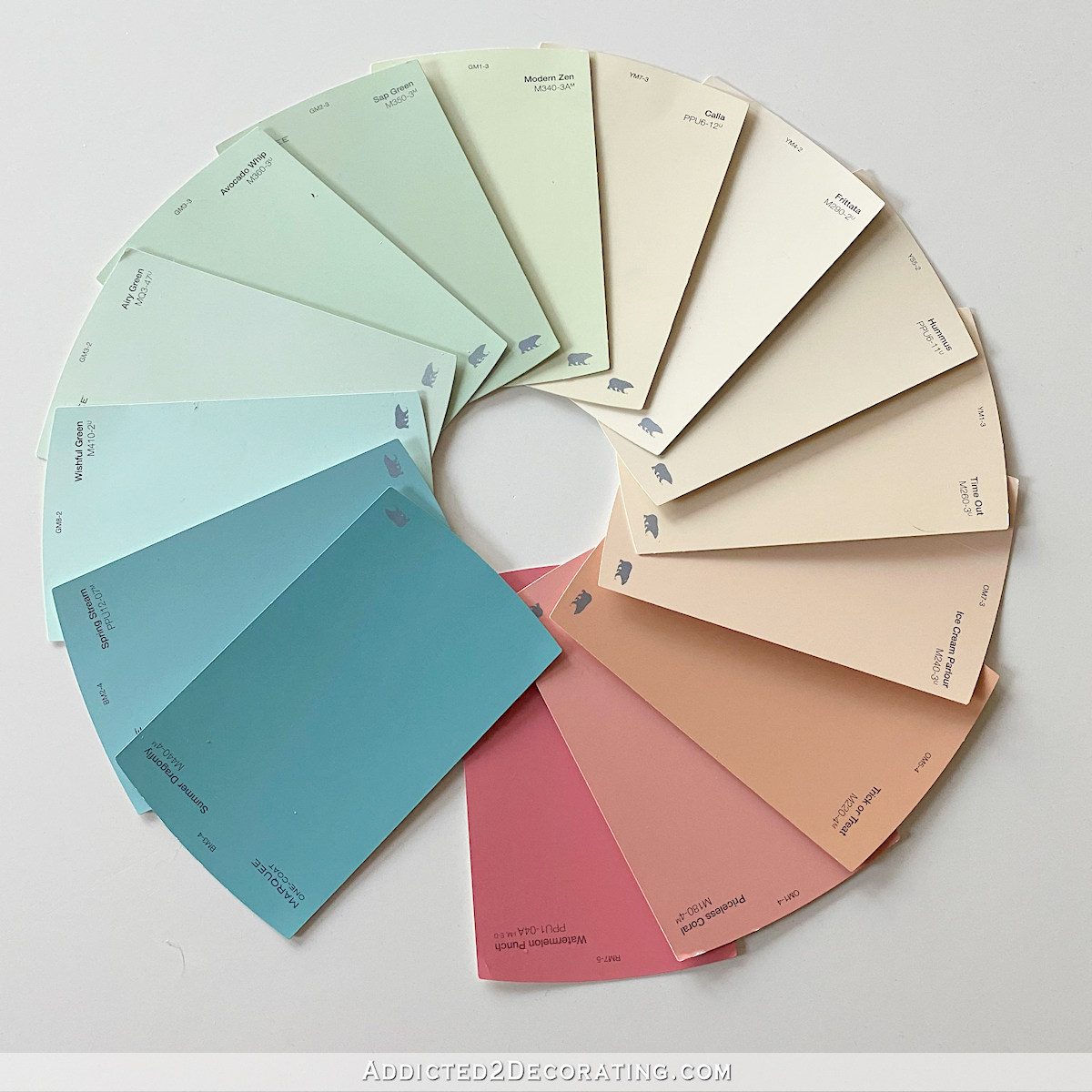
And just as a reminder, these are the colors I narrowed down for the room…
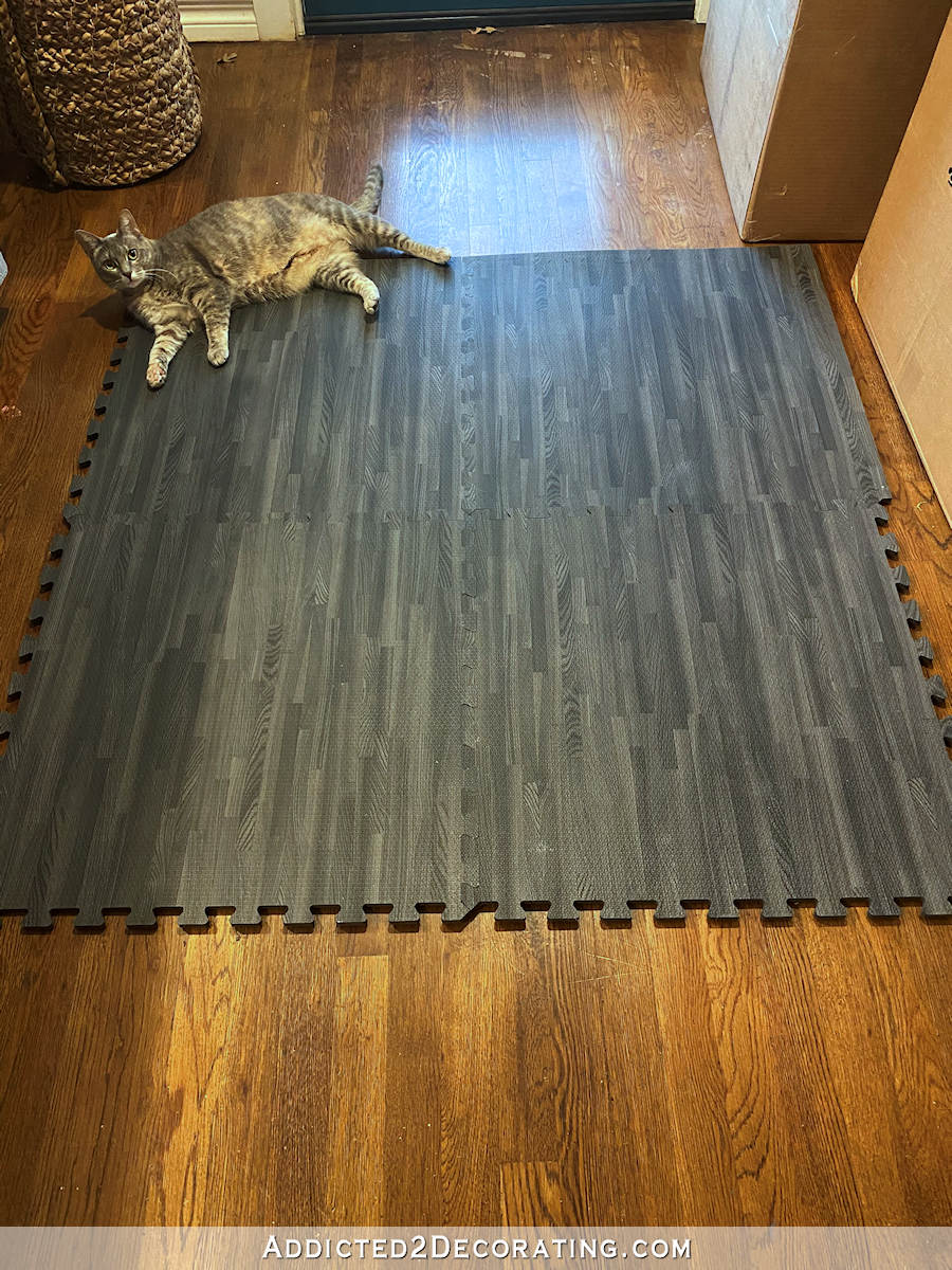
And this is the flooring that will go into the room…
(Note: If you’re reading this post on any website other than Addicted 2 Decorating, that means you’re reading on a site that is stealing my blog content. I hope you’ll consider joining me on my actual blog by clicking here.)
After trying to simply visualize the walls in my mind, and not having much success, I tried doing a very simple mock up just using my photo editing software. Those looked like this…

That was my attempt at trying out a horizontal stripe wall. But it’s hard to “see” it without windows and doors. I really don’t want horizontal stripes in that room, though. I have horizontal stripes in the hallway (neutral stripes in white and light gray), and I think it would be too much to have horizontal stripes in a connecting room as well.
And this was my attempt at a vertical stripe wall with a chair rail and white on the bottom.

It’s still hard to tell anything about that when it’s very two-dimensional.
So that’s when I made a 3D floor plan and then started copying and pasting some stripes onto the walls. I didn’t do the whole room because that would have taken forever. But I did three different options for the main wall (i.e., the Swedish ladder wall) that you see when you walk into the room.
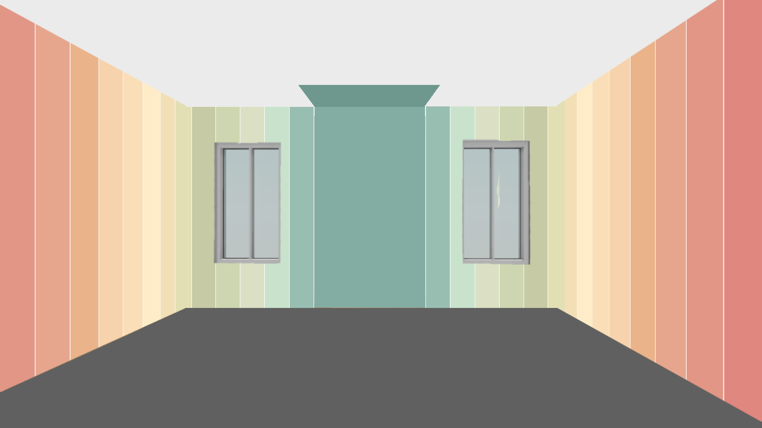
First, I tried out full floor-to-ceiling stripes with a white ceiling and the dark gray/black flooring. I didn’t put the baseboards or window trim in the picture, but those would be white. And I’m still undecided on crown molding. You can let me know if you would put crown molding with those walls. I do have crown molding in every other room of the house.
Then I decided to try out stripes just in the middle of the wall, with white on top and white below, inspired by something I saw by Racheal at Banyon Bridges (@banyonbridges) on Instagram. If you love color and pattern, and haven’t checked out her Instagram yet, you must! I have spent so much time perusing her photos and videos. It’s all so inspiring to me.
So here’s how this center wall design looked…

I love that one. It has a much more modern look to it than full floor-to-ceiling stripes. My only concern is that entire colors are eliminated when the design crosses windows and doors. On the doors, I could carry the design across the doors. But I’d still be missing full colors on the windows, and that’s kind of a bummer to me. Those colors would be repeated in other areas of the room, so I’m not sure if it would really be a big deal in the end. Maybe not.
And finally, I took it in a more traditional direction and turned it into an upper wall design with a chair rail and white walls underneath. I like that with this design, it’s not as in-your-face as the full floor-to-ceiling design, while you can still see all of the colors even in areas with windows and doors.
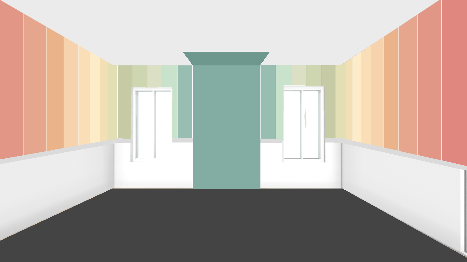
So this is as far as I got, narrowed down to three options. I can’t seem to get from three to one. But I do know the final design will be one of these three. Between the time I shared my initial thoughts with you a few weeks ago and this past weekend, I feel like I’ve looked at hundreds of wall options for this room, and finally came back around full circle to stripes. Stripes are just my happy place, especially when I really want to use all of these colors, and I want them to be in this order to get the gradient effect. That’s hard to do with any other design. Stripes are just perfect. Of course, I’d put stripes on everything if I could. 😀 For me, stripes are always the perfect option.
As of right now, the second option (center wall design with white above and below) is probably my favorite. But I don’t love the idea of entire colors disappearing in window areas. Is that a big enough issue that I should choose one of the other designs? What are your thoughts?



I think the 2nd option gives you color without overwhelming the room. As you will have equipment that will take up space, I think you could live with the stripes for a long time.
I agree! I love the stripes….but this option is fun and new! The added white along the top is unexpected and different! The color around the windows wouldn’t be an issue for me…maybe white shutters would look nice! You’re the expert, so whatever you do will look great!
I went to that Instagram of Racheals you mention and the picture of the wavy stripes really caught my eye! Would you ever consider doing that in the center of your walls, like in picture 2? Just a thought.
I agree!!! The full height stripes make the room smaller, less airy and light in comparison to the second option.
The last option feels top heavy in comparison to the second option as well as the ‘expected’ treatment of stripes and explosive color…
The second option is UNexpected, delightful, light, cheerful! It also creates a more spacious feel especially after walking thru the hallway and then seeing the gym space just open up – awesome with option two! Makes you want to just burst out and move that body!
During the day, what do you see outside the windows? Green foliage? Might the colors seen thru those windows satisfy the need for the lost green colors?Depending on your need for privacy – even during the day, you could do a frosted film on the windows- even halfway up them – color and light will still come thru them…for the top half of the windows, you could do horizontal, irregular thicknesses of frosted in combo with opaque white stripes (generally thinner than the frosteds) for max light, yet stripe mixing! The widow’s neutral, horizontal stripes to be in contrast with the colorful, vertical stripes on the walls in the second option…and you might not need the window treatments- possibly, even at night since the films keep the windows from appearing like black holes AND they still give you privacy above the level of peeping Tom’s eyes…
I also like the second option the best. Enough color without overwhelming the room
I think the second option is FANTASTIC. By far, far, FAR my favorite! It just feels fresh and different. The missing colors in the window areas don’t bother me a bit since they will be repeated on other walls. I just LOVE this design!!
Yes, I agree. You need some white space to appreciate the color and rest your eyes.
Yes this!
I like #3
I love the second design as well. Maybe get rattan shades that could be painted to continue the missing color stripes?
I was going to suggest something like that as well. Curtains, roller shades or some other window coverings could be painted or dyed in whatever a solid color would be next in the pattern or if you want the same dimensions as the stripes on the wall, you could continue the stripes onto the window coverings as well.
Yes, definitely #2! And the missing greens don’t bother me either – I rather like the calmness on the window wall of fewer greens, and those missing greens will show up on the other walls.
Option #3! It gives you a look similar to option 2 but does not take away all the colors at the windows. When I saw the second option, it looked like something was missing…just too much blank space. As far as crown molding goes, you can always try it once everything is finished to see if it suits you.
Just my opinion. Choose what makes you happy!
2nd option …. clean and modern.
I like the second too! Could you do something on the window coverings to carry over the colors? Maybe white fabric shades you could paint the stripes directly on them. Or maybe a wooden curtain rod you could paint with colors?
I had that same thought. I had considered getting some of those roller window shades for the windows. I know I’ve seen people customize those by attaching fabric and even painting them. Maybe I can buy one (if they’re still as inexpensive as I remember), and test out some ideas. If I’m in the room exercising after dark, I’ll want the windows covered anyway, so carrying the stripes onto the window shades seems like a perfect idea.
My thought was something on the windows like a shoji screen, inset on the window interior. You could make that yourself and add the stripes, but in a more sheer fashion so light would still come through. I really like #2 the best, then #3 and last #1. If you did crown, would you paint the color on the area between the windows onto the crown as well? Because it would look weird to have the crown cut through that wide stripe there.
If I do crown molding, I’d paint the teal on the crown and onto the ceiling, much like Racheal painted her design right onto this shelf that’s made with crown molding. Or if you click to the second picture of that mural, you can see that she actually did paint right over the crown and onto the ceiling.
https://www.instagram.com/p/COdu_kqntyR/
Problem solved!😆
I love the colour in the middle option! It is a unique idea so it is a perfect Kristi design. How about doing the stripes top to bottom on the window wall and centre the rest?
I like #2 as well. Maybe create roman shades out of drop cloth canvas and paint the stripes on it. During the day it would be gathered towards the top and at night the colors would just flow across that wall uninterupted.
I like the second option the best too. Couldn’t you just adjust the colors so they start after the window (not omitting any)? It tones down the stripes but is still super colorful…not as in your face!
I love it!
Exactly my thought as well!
That’s what I was thinking too!
Yup second option and leave the window wall clean. Maybe use posters , charts or a Kristi original., or even mirrors which will reflect the other walls
I like the second option but the third option works if you can’t get over the color missing because of the windows. I do have a question. Window treatments? Have you thought about what is going there? Where the color stops and where traditional window treatments would hang, is that going to compete with each other? For a gym, I would imagine just having some sort of blinds or shades and not curtains. In that case, it probably wouldn’t matter, but my brain kept trying to picture what goes on the windows with option #2. 🙂 Can’t wait to see what you pick!!!
Way back at the beginning when I started envisioning how I wanted the home gym to look, I envisioned simple white curtains. But now that I’ve settled on a wall design that has the most impact when all of the colors are as visible as possible, I’ll just stick with simple window shades or blinds. Blinds aren’t really a favorite of mine, so I’ll probably try to find a window shade that won’t draw too much attention OR that I can carry the striped design onto.
The second is the most unique and gives your eye a chance to rest. Assuming there will be no art in this room? Your other rooms are quieter but still full of color. The crown molding will make the ceiling look low, which might not work with the strips as it has with the solid colors.
Right now, I’m not planning on art for the room. I’ll let the walls be the art.
Third option all the way! The second is like a staccato of color. It’s a gym, it could use some energy from the colors going to the ceiling.
Love the colors you picked! The 2nd option, with the stripes in the middle only, is my favorite. Would there be some way to get those missing stripe colors in on a window treatment or something? Maybe painting them on a roller shade or curtain?
We’re thinking along the same lines. I actually googled “how to paint roller shades” this weekend. It looks like that might be an option.
You could also get the matchstick roller shades in white (lined) and paint the stripes on those! I have some custom ones (although mine are fake matchstick in plastic) and they are way nicer than I expected!
Really like number 2 as well, and am not understanding why you have to skip any colors? Just pick up with the next color on your rainbow after the break for the window.
This is what I was thinking. It’s not like it’s wallpaper that you have to match a repeat…it’s paint. I would think you just pick up with the next color after the window instead of skipping anything that might occur in the window space. Seems like a simple solution.
Ist option for me.
Floor to ceiling, omit the coving, clean white skirting.
Sorted.
As you will have gym equipment in the room, any short paint job on the walls, may make the effect “bitty/busy”.
Go for glory : top to toe!
No curtains. Just do white wood blinds or pleated shades in white with second option.
#3. Best of both. Two is nice but seems too modern for your house.
I prefer number 3 first and then number 2.
I like the last option, it’s more clean and contemporary. Not feeling floor to ceiling stripes or narrow stripes. It feels forced, too intentional and busy, to me.
Love the options! Question – I’ve been looking at the same mat to use in our home gym. Is it safe to put directly on a 1950’s hardwood floor? Is there potential for the mats to damage the finish?
I haven’t put these down yet, so I can’t be 100% sure, but the only potential I see for damage is if you spill a drink or put a plant on the floor, and water gets down between the foam. Since it’s foam, it’s not really breathable, so any moisture underneath would have a hard time evaporating. (At least, that’s my guess.)
But if you’re using it in a area where there’s no real chance of water getting between the mat and floor, I can’t see that there’s real potential for damage. The mats are a rigid foam, but they’re not scratchy at all.
Thanks for taking the time to answer!! I love your blog and all your projects!! You’re amazingly talented.
I guess I’m the only one so far who just loves option 1. I’m just not a fan of white. But #3 is beautiful too! Can’t wait to see it finished!
You’re not the only one! I like it best, too! I’m really not into the other 2 options. Too much white and it looks unfinished.
I like option one the best.The floating stripes seem unfinished and the one with stripes only on half seems too white to me. I don’t like the patch of color on the ceiling either. I do like your color picks and look forward to seeing your decision.
#1 is overwhelming.
#2 is too modern for your house.
#3 is the perfect choice!
What if you did curtains—one side matching the first ombré color that disappears, the other side continuing to the next shade? You do so many kinds of curtains, I bet you could come up with a window treatment that is even more clever. (Like painting the glass with acrylic paint?)
I guess I’m in the minority. I love option 1. To me, it’s the most calming.
What came to my mind as I was reading about your concern for the missing colors with option 2 was to use them above and below the window. It would echo the full length of the center of the wall while also being symmetrical.
I like the second too, but would probably just continue the color on each side of the window to be the same and make it the width of a single stripe of the others.
Okay, I like this idea!
Kristi, Will you be installing mirrors in the room?
I will, but I have no idea where. That’s one of those issues I’ll let Future Kristi figure out. 😀
I like the third option. It’s cohesive with the rest of your house and seems to anchor the stripes.
What if you used option #2, but made the stripes horizontal? Perhaps it would be different enough from the stripes in the hallway since you will have the big swaths of white above and below. You could even start the stripes lower on the two side walls and let them swoosh up in a nice curve to a higher spot on the far wall containing the Swedish ladder. Do you still think it would bother you to have horizontal stripes in both rooms?
When I went back to look again, I decided I don’t like the colors on the middle wall. I think they jar the eye since they aren’t repeated like the other two. I would stick to the warm tones and leave off those realm green shades. You have plenty of those colors vin other rooms.
I like option #2
I like option 3. It allows all the colors to be visible.
Option 3. I’d consider using navy or a darker teal on the bottom of the wall as that’s where there likely will be scuff marks from equipment.
Option 2 looks like it’s just floating on the wall. A bit of molding at the top and bottom of the design would give it an “anchor.”
I love the second one also. What if you did window covering (Roman shade, curtain, indoor shutters, etc) and had them match the colors you said would “disappear”. You could also make the stripes wider like the width of the windows and/or doors and use them like that. Hard to explain but it looks good in my head! Whatever you decide will be awesome.
I’m agreeing with the majority who like option 2. My reaction to 1 and 3 was positive, but option 2 was an “Oh, yeah!” I think crown molding will look great with it, and provide continuity with the rest of the house. I also thought of painting a roller shade or flat curtain to continue the stripes. Maybe a roman shade or just a loosely gathered pull-up shade.
One question: you said you wanted that color to continue on to the ceiling. I’m just curious as to why. You always end up with beautiful results, I’m just puzzled by this one.
Again, I really like option 2!
I like option 2, but keep coming back to the colour distribution – the wall with the windows displays the calming green palette, which I personally like best, whereas the long walls both display the more vivid/energizing red palette. I like the overall combination, but would put the focus the other way round and that way would not be so miffed if colours are missed out because of the windows 🙂
I do like the idea of finding a window treatment to continue the stripes, that would be so you – to come up with something even more original. Whichever way you go, I’m looking forward to the journey!
A thing that appears to me but might be remedied when you attach that Swedish ladder: When looking at the middle bit and the colour continuing to the ceiling, to me it feels like the colour is a bit oppressive (perhaps bc it is a darker shade?). Why do you want to continue it to the ceiling in that specific part?
and another afterthought – as you asked: for once I would omit the ceiling molding here, as it seems both too fancy in a gym and not to fit so perfect with the modern feel of your design (and I say that as somebody who loves the molding!!).
Karen, I agree with you on the color distribution, but is it actually a matter of personal preference? I lean toward blues/greens, you lean toward greens, Kristi leans toward lots of color.
I have no reason for extending that color onto the wall other than I like the idea. I’ve seen it done over beds, chairs, etc., and I think the shape of a Swedish ladder (where it extends out at the top) lends itself to having that ceiling design over it.
Here’s an example of it over a seating area:
https://www.decoist.com/2015-08-20/color-blocking-paint-ideas/bright-orange-reading-nook-that-goes-right-up-to-the-ceiling/?chrome=1&D2c=1
If I do it and end up not liking it, it’ll be an easy remedy to paint over it.
I also keep going back and forth in my mind regarding the color distribution. I finally landed on using the darkest teal color behind the Swedish ladder because it will be built in all natural wood (probably a combo of oak and pine, or if wood prices miraculously come down between now and then, maybe all oak), and I much prefer the look of natural wood against cool color like teal than I do against a warm color at the other end of the color spectrum that I selected. But I could also change my mind between now and the time I actually start the walls. 🙂
Option #2 is fresh and amazing.
Are you planning on having curtains on the 2 windows in the room? If so, maybe a crisp white drape with panels using the missing colors?
Even without the curtains though, design #2 is spectacular. That would be my vote
I like option 2, but wonder if another color other than white on the bottom would look better.
I love the middle of the wall version!
I like option 2 all the way! Instead of skipping over colors for the windows why not treat it like the windows don’t exist and continue the same color on each side if the window? So it would be like that window space is just cut right out of the equation and the color continues? You could split the size of the stripes down the middle and put 1/2 stripe of the same color in each side of the window and continue the pattern from there. I hope that makes sense! Kind if like if you folded the wall over on itself at the windows you wouldn’t know they were there and the pattern is repeated based in that.
If you go with option 2 why not have the stripes start at the same level as the top of the window? Leaving the windows different from the stripes would seem to calm the effect, rather than matching every inch of the wall. You would have white (?) at the top and bottom of the walls anyway. And it would be simpler since your room will be full of machines, etc.
So how did the breakfast room rug choice turn out? You probably have decided by now if you got it Friday.
My rug wasn’t delivered. 🙁 It showed that it was out for delivery all day Friday, and then it never came. I got a notice yesterday that it was rescheduled for today, but when I check the tracking, it says there’s no info. So it looks like it’s lost.
I love the second option as well. When you add the trim around the windows it will make that space without color even bigger…why not start the colors on the outsides of the windows? The middle section would be the deepest teal and then instead of skipping the colors that would be “under” the windows you would start the second colors directly outside the windows. I don’t see a need to skip colors at all.
Option 2 all the way!!
What about option two with a Roman Shade to carry the colors through the window areas?
Hi Kristie, I like the second option but with a twist- would you consider doing the stripes in different lengths? You could mirror the lengths on opposite walls with varying amounts of white above and below but still have some symmetry.
Well, I’m in the minority. . . I prefer #3. The white above and below is too stark for all the lovely colors. Did you ever consider using the palest color for the lower section of the wall? White is not at all you!
I agree that solid white walls aren’t me at all, but when I look around my house, I’m actually surprised at how much I use white + color on the walls. My kitchen walls are white (tile), the music room and both bathrooms have white walls from the chair rail down. And my pantry has white walls above the tile. Solid white is a no go for me. But lots of white + lots of color seems to be a regular theme for me.
I’m a fan of option three–looks very classy! 😀
Option 3 is a big win for me! It will show off your equipment and let it stand out. I think it has a more “expensive” look to it. More polished.
I like the white at the top and bottom. If the missing color around the window is that big of a deal you can always get the rolling blinds and paint your stripes on them. If you decide to do curtains and want to have the sun come in through the windows leave the blinds up. If you want to pull the blinds so everyone is not watching you work out at night, you have your stripes. Regular roll blinds may not be the most appealing but, you’re the best person to show us how to make them look awesome! I have watched you tackle window issues many times and you’ve always made it work.
I like the second option the best also. It didn’t bother me in your mock up that some colors are missing at the windows. On the plus side, painting is easier!
I like option 2 or 3. Could you do shutters or blinds on the windows to continue the flow of color?
I guess I’m kinda in the minority! I like the last picture the very best. I like all the colors up top with the white bottom! I think it’ll be beautiful no matter which you decide to do.
Option 2. I would make some kind of plantation shutters and continue the stripes. I like the crisp continuation against the wood. Or make the size of the stripes slightly larger so they go a little above and below the window.
Option 2, for sure!
I like # 3 best because it carries the color over the windows. I did like #2 but it had too much white space for me. Maybe do a hybrid of #2 with the stripes ending 1′ to 8″ from the ceiling to have some space but not all above the window painted. So… crazy Out-of-box ideas for carrying design on window treatments. Get 2″ blinds you can take apart. Take them apart, and paint the colors seal and re-install. It’s time intensive. but it uses the paints you got without many custom extras. I suggest 2″ blinds for a reduction in slats to deal with. Additional idea, get a roller shade you can apply a fabric to. Order from Spoonflower a color blocked custom piece to adhere.
Why skip the colours in version two? why not figure out the spacing without the windows and just use those colours to the far side of the windows.
Could you carry the color onto blinds (while keeping the street-facing side whatever color your other blinds are)? That would give you the color continuity you want.
I would have chosen the ‘white walls underneath’ color palette.
Love option #2. You could create window coverings (shades, blinds or curtains) that would incorporate the colors in the order you have them planned? Would that be an option?
Oh, number two is my fav! Can’t wait to see what you pick!
Have you checked out what Ann Upton Art (on IG) did to her studio wall recently? It’s not a stripe, more a rainbow mural, but it might spark some ideas:
https://instagram.com/annupton.art?utm_medium=copy_link
I’m voting for option 2. It reminds me of energy in motion. But it doesn’t feel overwhelming. It makes me happy just to look at it!
I love the second option as well. What were you planning to do for window treatments? That may make all the difference.
When I scrolled down and saw Option #2, I was actually stunned how much bigger it made the room appear compared to Option #1. I don’t know if it would actually translate to a bigger appearing room in real life but in these mock-ups, I think the difference is significant. So for me, Option #2 is my favorite. Not a fan of Option #3, at all. It seems disjointed to me.