It’s Getting There! (One More Day Needed)
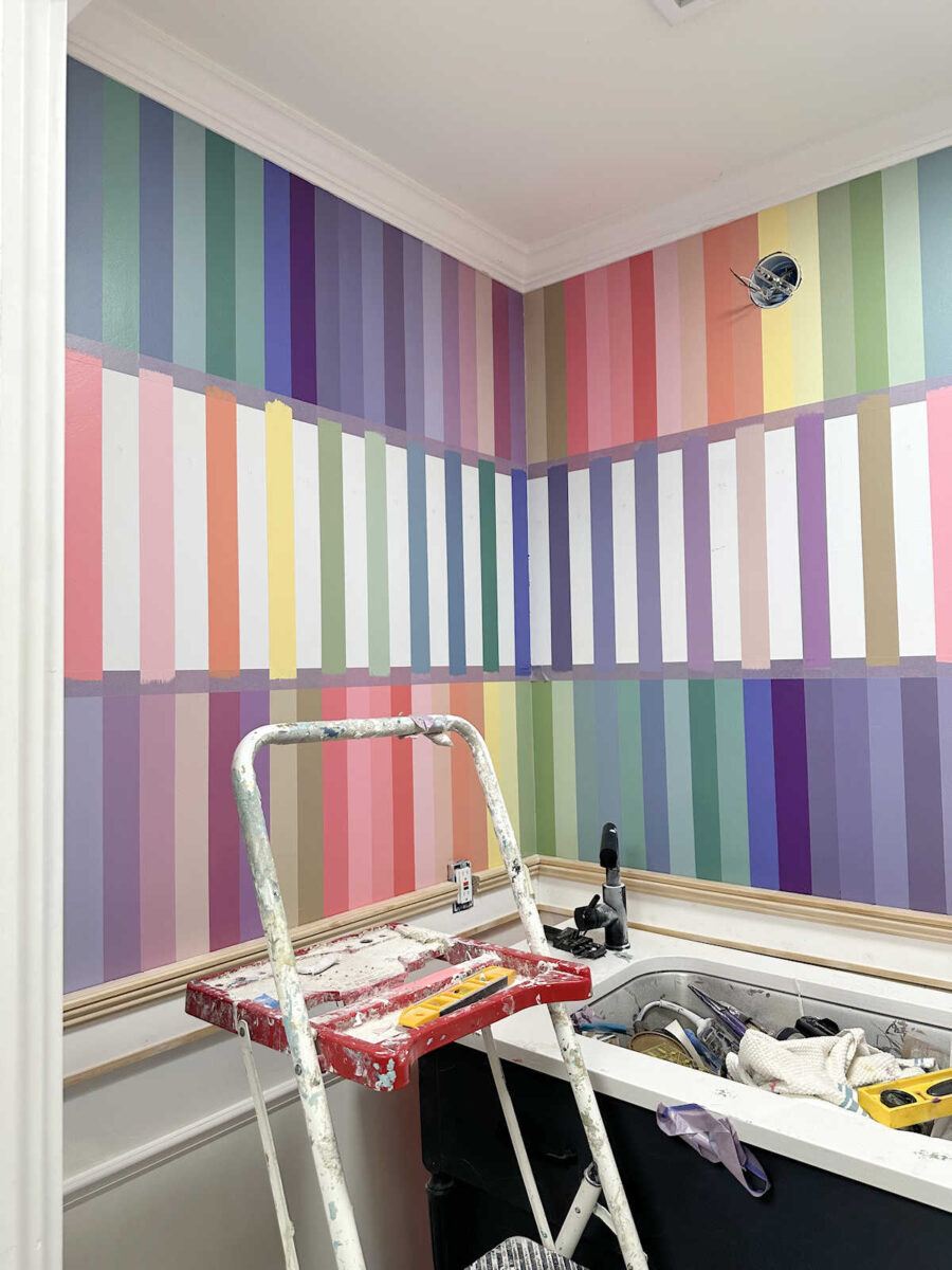
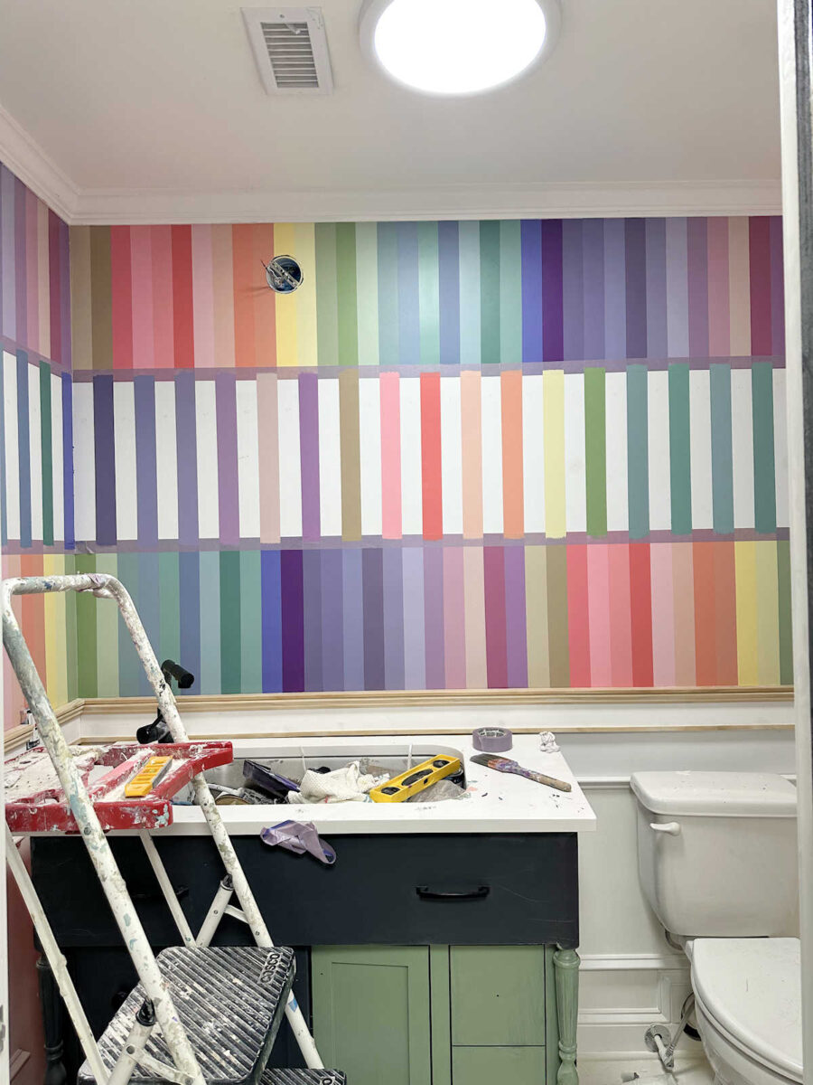
I almost didn’t post today because I’m still over here working on the same project — the bathroom walls — and I know this is getting kind of boring for some of you. I knew I couldn’t finish all of them yesterday, so I decided to get the first round done, and then I’ll finish up the rest of them today.
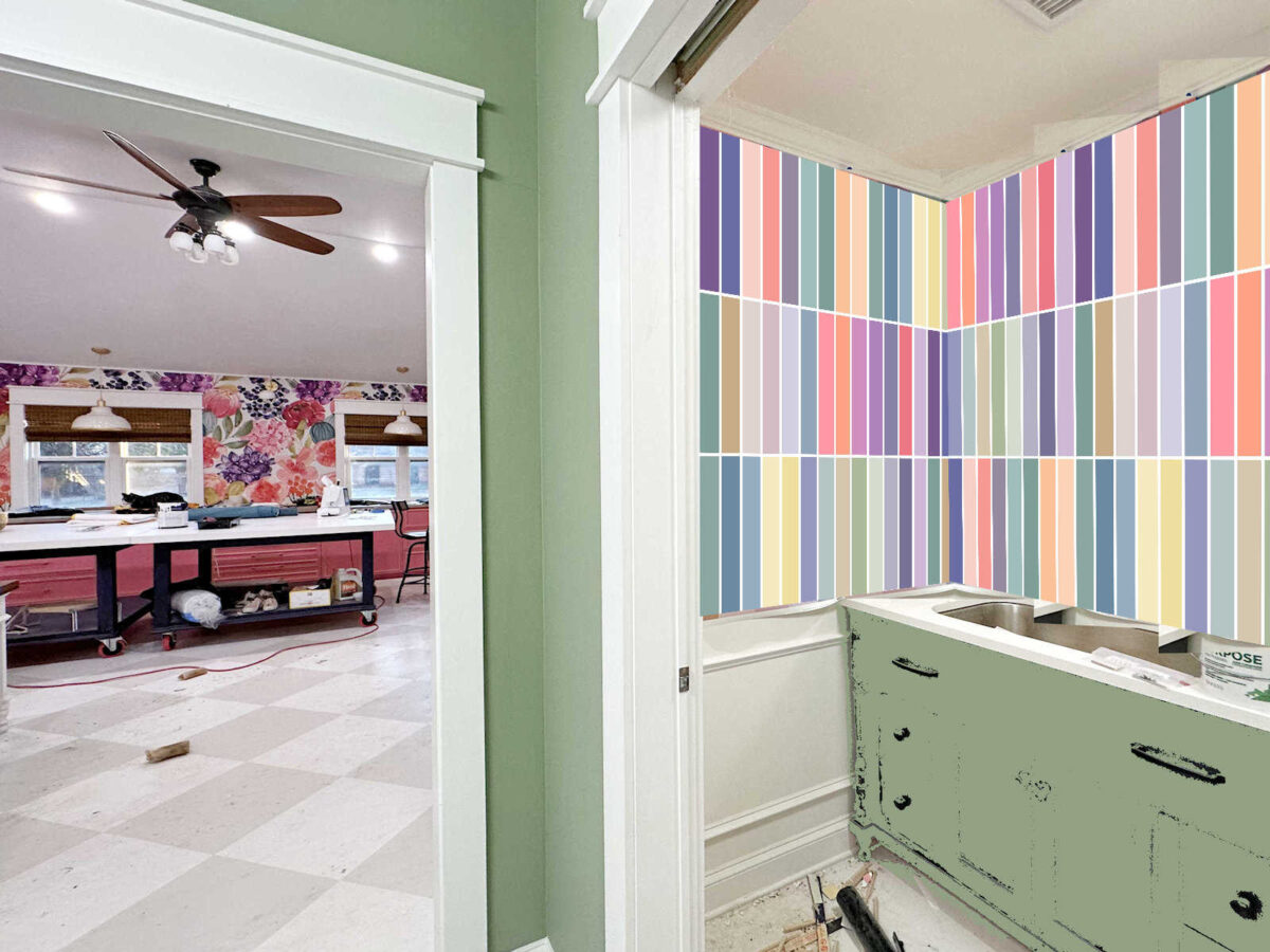
But I decided to show you the progress anyway because once I removed all of the painters tape last night on this first round of colors on this row, I was amazed at the difference in the rows with no white and the row with the white.

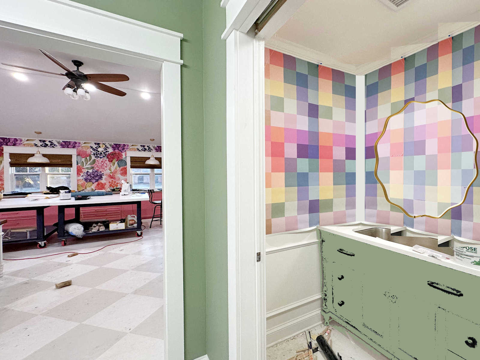
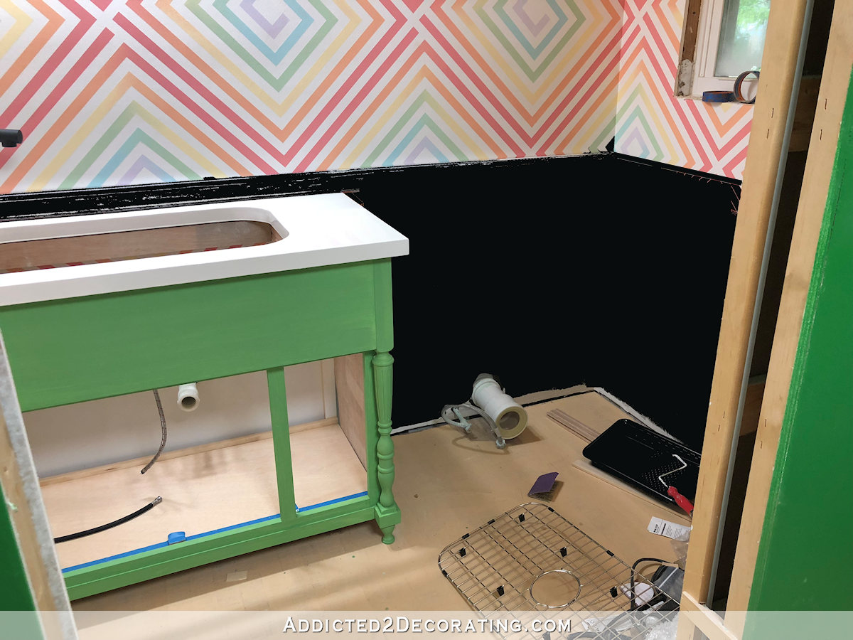
If you’ll remember, I had actually contemplated doing a design with white lines separating all of the colors like this.
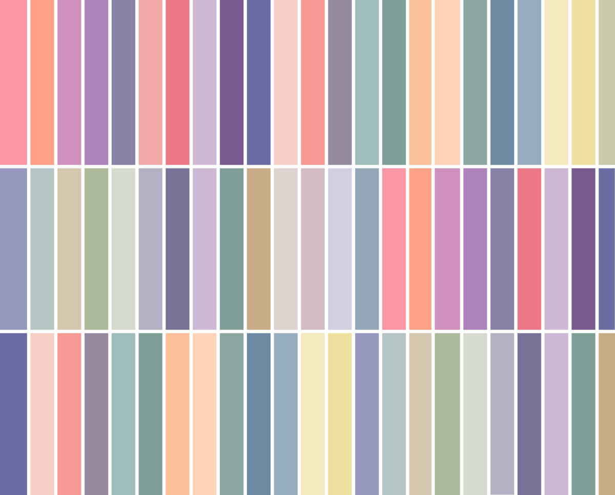
Here’s a look at the mockup I did with that design.
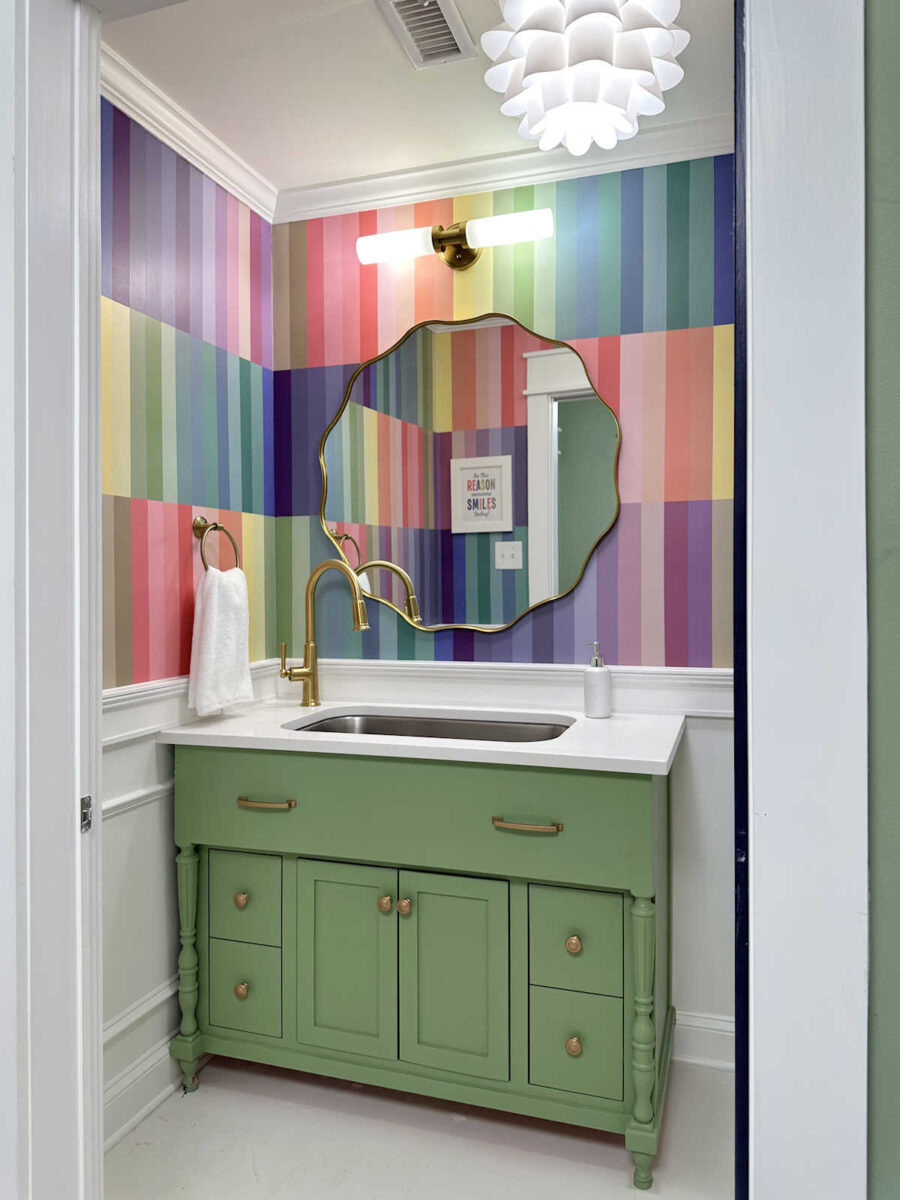
Of course, there’s a vast difference between a mockup and the real thing. Plus, I changed the order of the colors for the actual walls to keep like colors together. And had I gone with that design, the white would have been much narrower than what it looks like on these walls. those white lines wouldn’t have been nearly as thick as these white stripes, but I think it would have had the same effect overall. And that effect is that it makes the walls look really busy.
Keeping all of the colors together, with no white added to them, has a much softer overall look to it. I mean, don’t get me wrong. I realize that the walls are still colorful and busy, and probably way too much color overload for a lot of people. But the rows without white seem much more calming to my eyes, while the row with the white seems jarring to my eyes. It almost makes me dizzy looking at it.
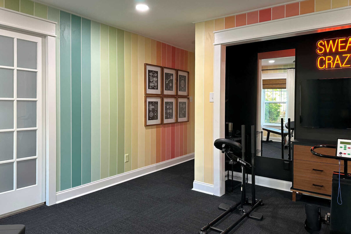
Of course, had I gone with solid stripes the entire height of the wall from the ceiling to the top of the wainscoting, the addition of white wouldn’t be quite so jarring. It would be more like my previous home gym walls with the addition of wainscoting.
Anyway, I just thought that was a very interesting observation, and I wanted to share that with you for comparison just in case any of you are considering a similar pattern for a project, whether it’s a wall, a quilt, or an art project. I definitely prefer the design without the white, but I’m sure there are people who prefer the white.
So I have one more day of painting ahead of me before the main walls in this bathroom are finished. I hope to be back here tomorrow to show you the finished wall design, complete with the new mirror!
More About My Studio Bathroom

see all studio
bathroom diy projects
read all studio
bathroom blog posts

Addicted 2 Decorating is where I share my DIY and decorating journey as I remodel and decorate the 1948 fixer upper that my husband, Matt, and I bought in 2013. Matt has M.S. and is unable to do physical work, so I do the majority of the work on the house by myself. You can learn more about me here.
I like the lack of white lines its more artful – room to creatively interpret what you like. I think a funky pixelated picture. Less of a pattern, white lines turns focus on a grid.
I forget how you work through these longer-taped out projects. I know there are touch ups, but how do you not get into analysis paralysis on order and removing the horizontal tape because half the colors are at different level of dry. Do detail what preventative things you do. I know its best to remove tape while a little wet. On designs like this there are parts you have to keep it there until more is cured.
I don’t want to remove any motivation, but your posts are never boring. You have an interesting mind and I like to read whatever you post!!
Your patience and perseverance with a project like this is beyond my comprehension. Bravo! I am really looking forward to seeing the final result.
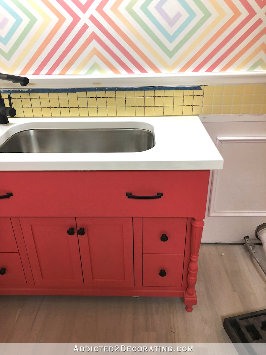
I would like to put a word in here regarding the vanity. The large flat slab of the top “drawer” seems out of place. The word “looming” comes to mind. I think it would look better trimmed out to match the lower doors.
I think the whole cabinet is set for new paint…color to be decided yet.
My comment was about trim and, I guess by extension, dimension, not color. That big flat panel has looked off to me in all it’s color iterations. I realize it may not appear that way in actuality or in other people’s opinions.
You made the right decision. I like it a lot more now without the white and with like colours with like colours. Looks good so far, even though I did t think I’d like the stripes.
Looks amazing! Not something for the walls, but how would a piece of artwork look that takes the color stripes and blends them slightly in between? Like taking a blush rush and gently making an ombre style?
Without the white looks really good, and as you said, much less jarring! Thumbs up!
Kristi, you are the little engine that could and does and doesn’t stop. You are an amazing artist and I love this bathroom. Slow and steady wins the race, so keep on keeping on. I know this sounds strange, but the room seems very calming to me, I love the rainbow of colors, and it just feels peaceful, which is something I wouldn’t think could happen with all those stripes, but they don’t feel like stripes.
Cheers to you, Matt and the Fur Babies!
I’m wondering how you chose what color to butt against another color? Complimentary? Analogous? Whatever pleases your eye?
I’m no expert in color theory but I assume analogous might not work.
Anyway it’s looking good and I agree the white bits would add unnecessary businesses in a small room. Have you decided on a vanity color? Ceiling color?
Bored? No way–I am way more invested in these stripes than I should be…… lol
Love, love, love
Without the white is SO much softer – you are exactly right! The thin white lines worked in the gym because it was one solid stripe, top to bottom. For me, anyway! 🙂
The colors were not so bold as these are as well. I love it all.
Lots of work.