Studio Bathroom — Can The Wallpaper Be Salvaged? One Idea That Might Work
Okay, y’all. I’ve read all of your comments and suggestions about my studio bathroom wall issue. I ignored the handful of comments that told me that the wallpaper was hideous or too busy. Let’s please get back to understanding that we all have different tastes, different levels of tolerance for busyness, pattern, and color, and that our homes are a place where we should feel free to express our own unique personalities. 🙂
I realize that I like a lot more color and pattern than a lot of other people do, but I especially like it in my studio. In the rest of our home, I feel like I have to be a little bit restrained for Matt’s sake (and sanity). And I’m happy to do that. He pretty much lets me do what I want to do in the rest of the house, but I know that if I were to truly let loose and do whatever my color-loving heart wanted to do, it would be too chaotic for him. I would relish it. I would thrive in it. He would feel suffocated.
But my studio is the one area in our home where I don’t have to ask for his input on anything. It’s my studio and my creative space. This is the one area where I’ve never once asked for his input, and he’s perfectly fine with that. And since it’s the one area where I can truly remove all of the guardrails and do what I want without restraint, I’m going to take that opportunity. I felt even more emboldened after taking some time to scroll through a few Instagram accounts that I follow of my fellow color maximalists (Banyan Bridges, Colordrunk Designs, and a few more), most of whom are way bolder with color and pattern throughout their whole homes than I am. So I’m determined to move forward with my color maximalist bathroom.
A while back, I almost made myself hold back considering that this bathroom will have to serve as our guest bathroom for the foreseeable future, but then I had a change of heart. I don’t want to hold back because, again, this is the only portion of my home where I don’t have to have any restraint, and I don’t want to give up that opportunity for the occasional visitor who might possibly need to use the restroom while they’re here.
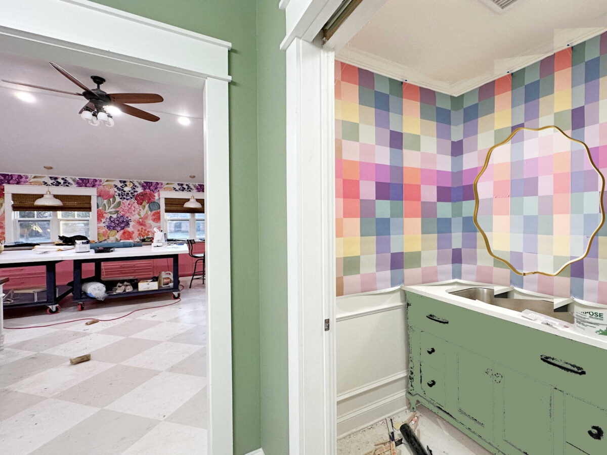
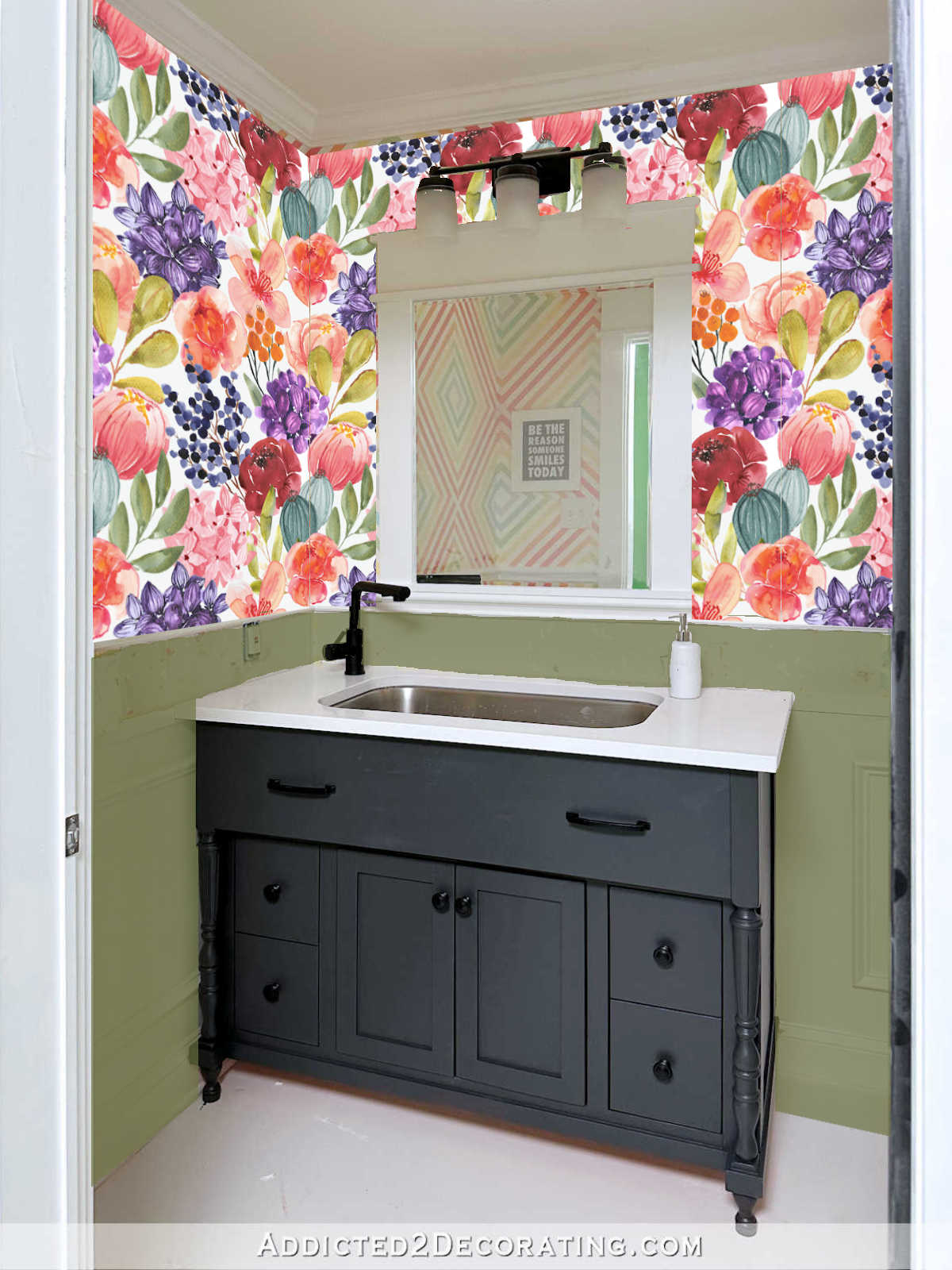
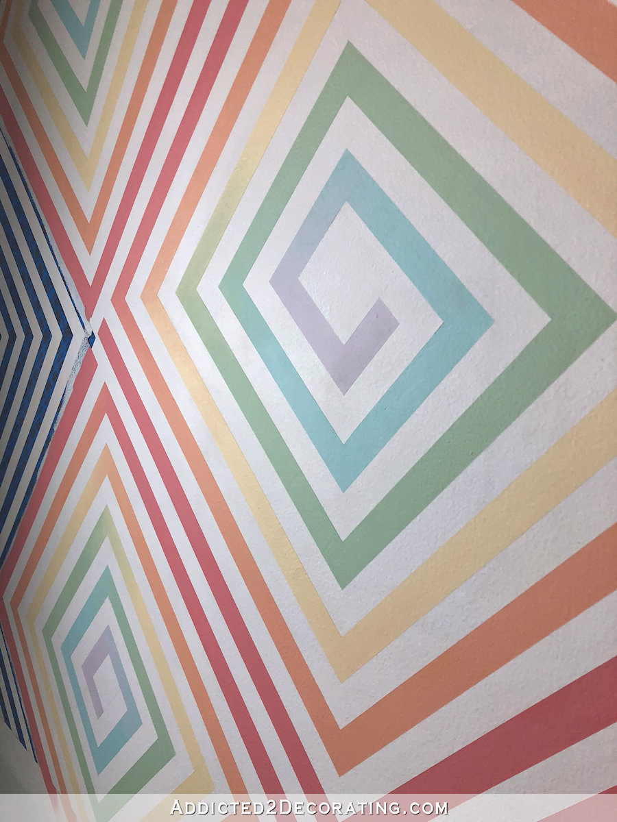
So with that said, I’ll get back to your comments and suggestions. One that really stood out to me was a way that I could move forward with the wallpaper by using it in panels on each wall rather than trying to wrap it around the corners. I initially wrote off that idea because I couldn’t envision it. In my mind, if I did panels on the tops of the walls, they would have to match the wainscoting panels (picture frame molding panels) on the bottom portion of the walls in width. But if I did that, it would affect the placement of the mirror and make that look off and uncentered with the vanity.
But then someone suggest just using trim in the corners of each wall, and I wondered if that might actually work. It’s kind of hard to know from a mockup exactly what that would look like, but I would paint those strips of trim in the same color as the crown molding and the wainscoting (Behr Polar Bear, which is a creamy white) so that the top of the wainscoting, the crown molding, and the corner trim would create a big frame for the wallpaper. It would simply eliminate the need for the wallpaper to wrap around the corners. It would look something like this in each corner of the room, but you have to use your imagination to “see” all of the trim painted in the same color. And you also have to imagine the finished wainscoting that will extend about six inches above the vanity countertop.
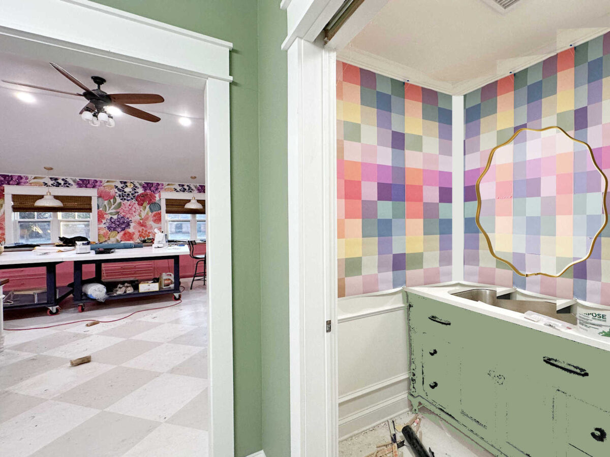
That’s really the only idea that stood out to me. I don’t want to change course completely. At this point, I have my heart set on a square or very linear design with loads of color.
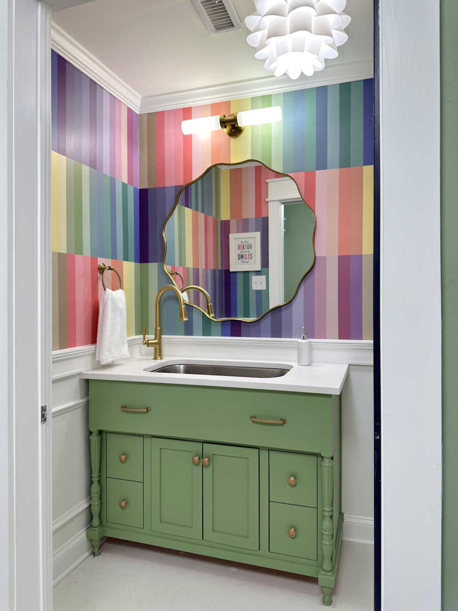
If that won’t work, or if it would look like an afterthought, then the only option is to paint the design. One thing I noticed this morning is that I didn’t even do a mockup of the vertical line design without the white between the colors. Immediately after I created that design in its large format, I just wrote it off and moved on to the next idea. But this morning, I decided to try it out on a mockup of the room. I thought perhaps I dismissed that idea too quickly, and I wanted to see what it might look like on the walls. And I have to admit that I really love it.
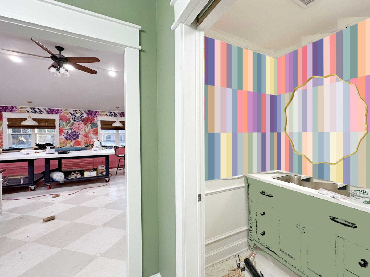
In fact, I like it so much that I really can’t decide which one I like better — the vertical lines or the horizontal stripes.
So I’m down to those three options — wallpaper with trim in the corners, painted vertical stripes that wrap around the corners, or the original square design in paint to wrap around the corners.
I’m going to finish up the wainscoting and paint the vanity today, so I still have time before I make my final decision. But by the end of the day, I want to have a plan. I promise that this will be the last time I present ideas or mockups of these walls. 😀 By the end of today, I’ll either be ordering more wallpaper to make up for the wallpaper that I previously used and then pulled off of the walls, or I’ll be heading to Sherwin Williams to purchase a ton of paint samples and painters tape. But it will be one of these three options for my studio bathroom walls. Feel free to weigh in, but again, if your opinion is, “It’s too busy!” or “That’s hideous!” just know that I’m okay with you sharing your opinion, but it will have no impact on my final decision. 😀
More About My Studio Bathroom

see all studio
bathroom diy projects
read all studio
bathroom blog posts

Addicted 2 Decorating is where I share my DIY and decorating journey as I remodel and decorate the 1948 fixer upper that my husband, Matt, and I bought in 2013. Matt has M.S. and is unable to do physical work, so I do the majority of the work on the house by myself. You can learn more about me here.

My favorite look of the three is the stripes, but that seems like it will be so much work. I know I wouldn’t want to do it! With the wallpaper I really like the look of the white trim in the corner – I prefer that to the look of it wrapped around the corner. So that’s my vote. You can use the wallpaper you love and hopefully it will be the easier option!
I live through your creative mind like a train widing through the mountain valleys. Can’t wait to see what you decide on 🙂
I really thought that I would love the squares with the trimmed corners, but when I saw all the options side by side, I actually liked the stripes a little more! I feel like the corals/pinks “speak up” a bit more than in the square pattern, and it balances better with all of the blues, greens, and purples. If you are going to go with the squares, I would scrap the idea of painting them. It seems like it would be so much work just to get the same look as you would with the wallpaper/trim, and I actually like that the white trim brightens it up a bit! So I think you should go with either the wallpaper/trim or vertical stripes, whichever speaks to you the most!
I really thought that I would love the squares with the trimmed corners, but when I saw all the options side by side, I actually liked the stripes a little more! I feel like the corals/pinks “speak up” a bit more than in the square pattern, and they balance better with all of the blues, greens, and purples. If you are going to go with the squares, I would scrap the idea of painting them. It seems like it would be so much work just to get the same look as you would with the wallpaper/trim, and I actually like that the white trim brightens it up a bit! So I think you should go with either the wallpaper/trim or vertical stripes, whichever speaks to you the most!
I know what ever you decide will be beautiful. Looking at your mockups, I really like the square wallpaper with the trim in the corners. The paper is so pretty and I don’t think that it makes a big difference whether it is wallpapered around the corners or not.
Wallpaper with trim! I think it would look amazing!
The corner trim seems like the easiest of the options for sure, but I feel like you are still going to be fighting the slanting walls/ceilings with the wallpaper’s squares and the wainscotting and crown being straight lines. SO, I vote for the stripes, but I’d love to see them just straight up and down stripes instead of the interrupted stripes, but that’s just my preference and more pleasing to my eye. I’m sure whatever you choose will be perfect for you!
I *almost* suggested trim in the corners the other day! I still think the wallpaper squares would look fabulous with the trim. Can’t wait to see what you decide!
I agree! I love the squares on the wallpaper and the way the pinks/purples are sorted on the, it’s truly beautiful!
Team wallpaper with corner trim for me!
Absolutely, do what you love! I thought I love color, and some businesses, you them even more than I do😄. I have noticed on so many decorating posts people are always saying paint it grey or white, when obviously the person posting wants color and pattern! I am so glad you are showing both are beautiful. We should all decorate with what we love.
Oh, I personally love the rectangles! You won’t go wrong either way!
I like the stripes. You could do it in stages with no pressure on you. It’s fresh and fun. Whatever you do it will be gorgeous.
Yay! So glad you reconsidered the stripes. Love them!
I vote for the painted vertical stripes – they’re glorious!
The vertical stripes give the eye a place to rest. It makes it a calmer less hyper color feast. The blocks make you tired with your eyes trying to find a square to rest on. The white trim also gives a place for the eye to rest after scanning the squares. They are both beautiful designs and I love the colors used in each, however my eyes prefer the vertical rectangles over the small squares.
Is the mockup using the approximate size of the molding you’re considering? Or would you use the smaller size of the panel trim? It strikes me as rather large in the mockup. IDK! I just know you should do what you WANT to do and not settle. If you’re ready to settle, then just paint one color and come back to it later.
I was imagining that the trim wouldn’t be any more than one inch wide, but probably even narrower.
What if you did a corner trim that was (at least visually) the same width as the squares and painted the repeating squares on the trim and then picked up with the wallpaper. It might look kind really cool. You would likely have to cut off the first row of the wallpaper since you’d have that one row in the corner painted on the trim. Maybe too much work and effort because you’d still have to match the paint, but I think it would be look cool and intentional.
I re-read the comments from the prior post…and you really only had one rude comment out of all of them…that’s not a bad ratio, by all metrics.
On here. That doesn’t count Instagram, FB etc etc.
Oh yeah…I forgot about those places. I’m more used to Reddit, where 60% of the comments are rude.😆 Then again, that’s why I stopped using Reddit…🤔
I like the idea of “framing” the original wallpaper. Either way it’s gonna be so cool.
Sharons must think alike….
Use the wallpaper with corner trim and a bold color on the ceiling. (Pink, maybe?)
Have you thought about maybe printing that pattern in a fabric from spoonflower and then hanging the fabric on the walls. I wonder if that would be easier. Good luck.
The vertical stripes being not continuous is messing with my need for symmetry. I do love the wallpaper with corner molding.
I think that I like the vertical stripes just slightly better than the squares, and I think that the trim in the corners is a totally workable idea, if you decide on the squares.
Oh I’m really digging the long rectangles mockup. It makes your walls look taller!
I do love the way the squares kind of look like someone “censored” your floral wallpaper with a mosaic filter though 😆 (in a good, makes-it-match sort of way!)
Looking forward to seeing your final decision!
Man, I really think I love the vertical stripes best!
Keep going and maximize this room!!
I like them in the order listed – trim in the corners, then vertical stripes, then painted squares. I love the trim idea, both because it solves the issue and allows you to use the wallpaper vs. having to handpaint all of that, but I also legitimately love the look. I’m a color girlie too, and I think the white really helps the color to pop.
Why does the corner piece need to be so thick? Why not a thin piece? I didn’t read your previous posts about your headache with the squares, so I don’t understand what the address with the square wallpaper is. I’m not a fan of the lines though. Sorry. For me it’s the squares only. So I’d figure out how to make it work. There’s my 2 cents.
The corner trim wouldn’t be thick, but it would wrap around and be on both walls. Each piece would be no more than an inch wide. You can see why the wallpaper didn’t work the first time here: https://www.addicted2decorating.com/i-gave-up-my-disastrous-wallpaper-installation.html
Throwing this out there in case it leads you annywhere—any way to incorporate gold where you were considering white?
That’s an interesting idea! I love the idea of incorporating gold in some way.
I failed to ask the other day when you had given up, but did you use a wallpaper primer under the wallpaper? If you did, that’s great, but you should ideally let it cure for at the very least, a week. Especially in smaller spaces, where air circulation isn’t great. Also humidity will slow down drying time too. Anyway, I am liking the “frame” idea a lot!
I used regular primer. I knew I was putting it up way too soon, but I decided to risk it. Usually, my risks pay off. This time, it didn’t.
I personally do not mind your busy wallpaper but I have worked in a situation where several women have epilepsy and busy patterns can trigger a seizure. The term is photosensitivity. Just a piece of information for you.
I do NOT have epilepsy, but the photos of the square wallpaper do make me feel dizzy. Interestingly, the stripes don’t have that effect, so for that reason, I vote stripes! Though I feel like I need to apologize for the extra work it would require.. 😬
So that’s why so many of those old crooked houses in the U.K. have a narrow band of ribbon running around the corners of the wall. I just assumed it was an aesthetic choice.
I love the squares best! But an idea, perhaps you could put the trim over the wallpaper in the corner without trying to wrap the corner or trying to cut it to the trim? Just square up your wallpaper on each individual wall and make sure it is wide enough to go behind the trim pieces? For some reason, the rectangles seem choppy to me, but the other option of having to paint each little square, although doable, seems like a lot of work when you are on a roll to get other stuff done in the house.
Sorry you have to deal with that rudeness, tsk, tsk. Your aesthetic is way different than mine, but I can totally appreciate it. It also opens my mind and makes me braver. I am always blown away by your courage and ability to let these comments go. Thanks for the great example.
I think I like the frame idea. It would be interesting to see your take on it. You always come up with interesting ideas!
To me the squares dont look as busy as the stripes. I also love the muted colors a bit better (on the squares). My vote would be squares with the white corner trim. Jmho
I like the stripes the best.
I think the wallpaper with corner trim is 100% the way to go. I thought the wallpaper looked so nice on the walls – super smooth, consistent, crisp. Like you found with the other designs you have painted on your walls, there is no way to avoid that little bit of texture between colors. I’m sure it would turn out well if you painted it, but it isn’t going to be the same look as smooth wallpaper.
And for what it is worth, I think the scale and form of the squares matches wonderfully with the size of your bathroom, vanity, and the beautiful mirror you got. The rectangles throw me slightly off balance and take away a bit of the room’s 1:1 ratio consistency.
Framing with trim all the way, all day long! Maybe a narrower trim piece, though. Maybe quarter round in the corner?
Trying to be a mind reader here: Were you thinking the corner trim would equal the width of the surrounding trim? I understand needing symmetry, if I read your mind correctly. 🙂
The stripes seem somewhat jarring to me, and that may be the way the colors are aligned. The wallpaper squares colors seem softer to me.
I would not want to have to paint all that by hand. Holy patience, Batman! 😀
I wasn’t thinking the spacing needed to match the lower trim. I was thinking that if I use the trim in the corners with wallpaper, the trim would be no more than an inch wide on each wall. So the entire corner with two trim pieces put together at a 90-degree angle would total 2 inches or less.
Once more proof that I cannot, in fact, read minds. 🙂
Would quarter round work or do you think it would be too narrow?
It might be too narrow. I think it would at least have to cover 3/4″ on each wall.
I’m not so colorful as you are, but I like the framed squares best. There’s something intentional about it that appeals to me. My preference is also the squares rather than the vertical stripes. But, as always, it’s your home and it should be pleasing to you, and Matt when it matters to him. So, go for “you!”
Could you pretty please use the wallpaper, but instead of WHITE trim separating it … could you paint the walls the same color as the vanity or another color from the design around the wallpaper (like one of the beautiful purple hues)? I’m not good with mockups, but what I’m imagining is the wallpaper serving as gigantic wall art, framed with trim (in a pretty color) and with the walls beyond that painted in the same pretty color as the trim.
I really like the squares with the white border. It gives the color you love, and a place for the eye to rest. That wavy edge mirror is the bomb!
The wallpaper with the “frame” looks really good–you could even paint the frame to match the vanity if you wanted more color instead of the white. I hope it works out.
I LOVE your squares wallpaper, and when I read about your struggle the first thing I thought of was using trim in the corners. I think that would look great. Maybe a half round?
LOVE the first one with the corners — you can’t go wrong because it will totally hide anything not aligned perfectly.
I think the wallpaper trimmed at the corners, to mesh with the crown and wainscoting. But that’s probably because I can imagine the tedium of painting. But really, I think the white corner trim tames the chaos of all the color nicely. I’m sure what ever you decide will look great!
You already have the wallpaper. I think it’s a great idea/solution to add trim to the corners.
The only thing I would worry about using the wallpaper is how level are your ceiling? Are you going to have a 1/2″ of a square showing in one corner and 3/4″ of an inch in the other corner? Will that drive you crazy? When you paint it, you take take that into consideration and fudge the squares if necessary.
I really hope you can make the wallpaper work. I love the idea of the trim in the corners.
I saved a video on Facebook and wish I knew how to send it to you. Basically it’s about matching your second piece to the first. Overlay the second one by about 2″ then with a exacto knife cut a curvy line through both pieces then lift second piece remove the excess of first one and lay it all flat. No lines showing. I hope I explained it right.
Okay, you sold me on the rectangles. I now like them better than the squares! That paint job is not for the meek but you’ve done much more tedious things!
I like both designs! Have you considered making/ using a checkerboard stencil for the design, rather than taping off all those squares?
Do you have enough wallpaper left to use it as an accent on just the vanity/toilet wall? You could try that first, then decide if you want to order more for the other three walls. Or you may be inspired to paint them a coordinating color!
Regarding the wallpaper & trim:
Depending upon how unsquare the corners, ceiling, and walls are, it seems that the corner trim would need to be placed over the wallpaper after it was hung plumb. Then the trim could be run exactly along a parallel lines of squares. But…this creates a nightmare of scribing two pieces of trim to meet in a corner! And I think the vertical width changes in trim would be obvious.
The above seems undoable. Perhaps this is why wallpaper of this type is not manufactured? I vote for painted stripes.
I really adore the original wallpaper. My vote is to do it with the molding strips in the corners.
I like the trim in the corners! Great idea!!
One pro for painting the design rather than using the wallpaper, is that you could match the colors in your studio wallpaper to the design in the bathroom. Although it would be a totally different design, it would pull the 2 rooms together.
It would actually look the same. 🙂 I designed both wallpapers, and I pulled colors directly out of the floral wallpaper to use in the squares. 🙂
The vertical blocks work for me. I feel like it’s a bit more modern and unexpected than the squares. You do what makes your sun shine!
Maybe consider covering the white corner molding with the wallpaper. It would give a finished look in the corners. Just match molding to wallpaper.
I really like the thin stripes without the white. It’s more interesting to my eye and it’s not obviously repeating a pattern like the squares. I think turning them sideways as horizontal skinny stripes in wide columns could be interesting too. If they’re slightly different widths to handle the non-square corners, it wouldn’t show. I wondered about using trim in the corners too but that’s the first thing my eye goes to in the mock-up.
In my order of preference:
1. The corner trim version.
2. The vertical stripe.
3. The squares.
Can’t wait to see which one you choose Kristi 😀
First option: wall paper with wood in the corners. Solves all issues, is the easiest and fastest, and looks great. I would personally go with a wood strip that is thinner.
Love the white in the corners. That’s my vote.
I thought the same thing as Yvonne… that the squares are a softer look than the stripes which is very pleasing.
Also, I saw the FB video in which someone was cutting wallpaper in a curved line so they could get a perfect placement for the next piece of wallpaper. It was interesting.
I actually like the corner trim as it gives the eye a brief resting spot in the room but prefer the stripes. Have you considered making the stripes in a wallpaper?
I love the squares with the trim (maybe a color instead of white), but no matter what you decide, it always turns out fabulous!
Welp, I love the wallpaper with the white trim in corners. Since I was on the road yesterday and am catching up today I know that I am a day late to weigh in. But I love the wallpaper and was so disappointed when it didn’t work! I liked the suggestion of framing the wallpaper but when I looked at the pics, didn’t think it would coordinate with the lower part of the walls. So this is the best option IMHO.
It will be awesome regardless 😎.
XO
Paint the squares. The trim in the corner looks like you are trying to hide that corner. The vertical lines make me feel like I am seasick.
But it is your bathroom.