Decisions, Progress & Indecision
Some of you will be very happy to know that I finally started painting the rest of the ceiling in the studio last night, and I hope to finish up the ceiling and the rest of the walls today.
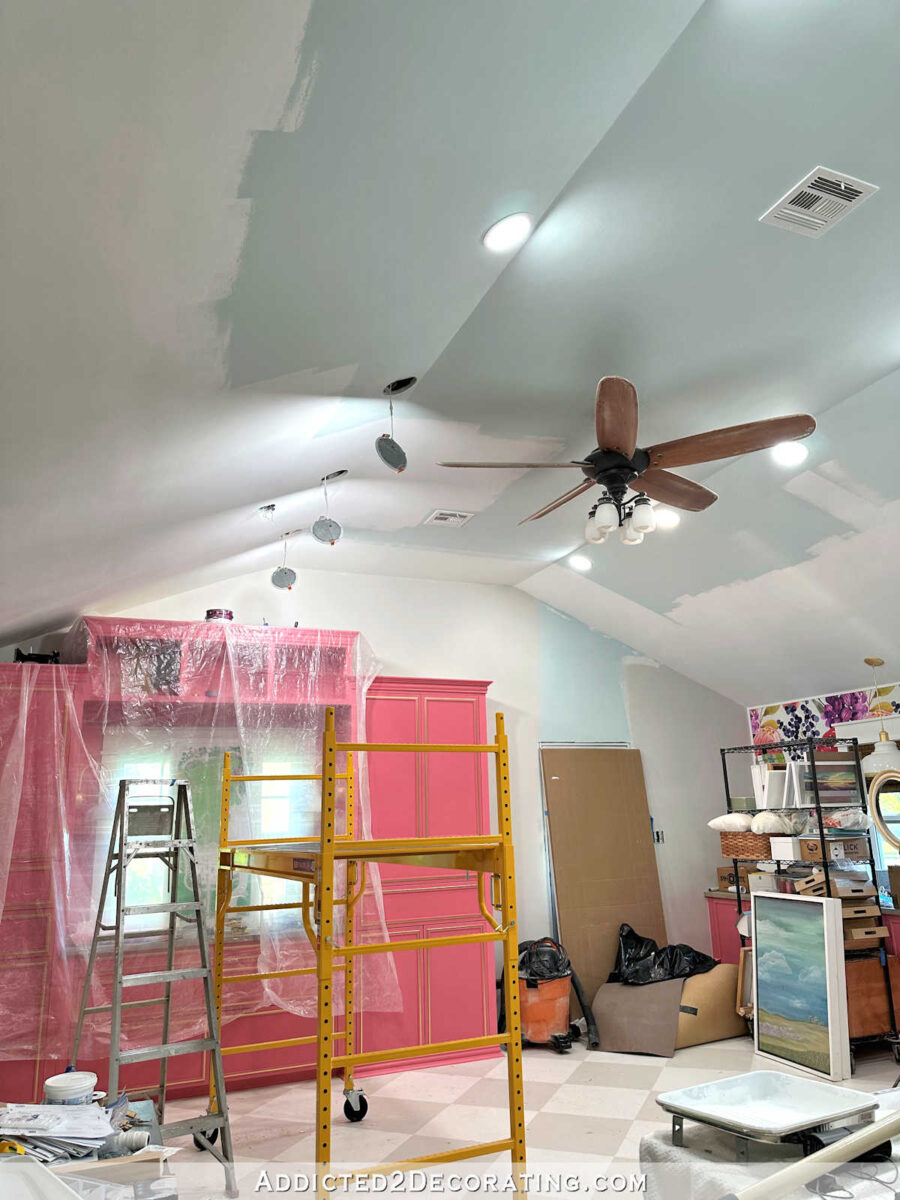
It’s a huge room with a tall ceiling, so this is a job that I’ve been putting off for quite some time now. Not only was I not thrilled about the idea of painting such a tall ceiling and having to spend so much time on the scaffolding, but I also procrastinated because in order to paint the rest of the ceiling, I’d have to work around some pretty large items. My work tables are so large that they can’t be moved out of the room. And I don’t have anywhere else to put the desk, either. So I’ll just have to work around those items, as well as several other items, as I go.
I spent quite a bit of time yesterday cleaning up and putting things away to make the job easier, but I still have quite a few things that I’ll need to work around. But it’ll feel so good to finally have this job done! I’m ready to be rid of the blue, and have a white ceiling and Benjamin Moore Classic Gray walls. I only have small portions on two walls to finish, and then I have this one big wall that needs to be painted.
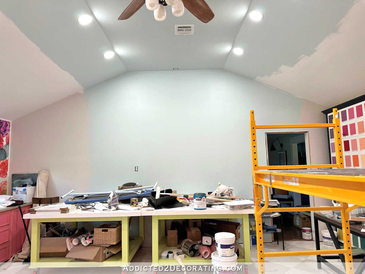
I will be so excited if I can get all of the painting done today!
In other news, I’m so glad that I mentioned the wall vent that I need to put into the wall to provide air circulation for the HVAC unit that sits in the storage closet! All this time, I’ve been planning on putting the air vent right here on the wall next to my desk and perpendicular to my pink cabinets.

But when I mentioned it, several people had other suggestions. One suggestion was to swap out the door to the storage closet with a louvered door. I don’t think my brain would allow me to have one solid door in the back entry (i.e., the door to the studio bathroom) and one louvered door. Having mismatched doors like that would probably drive me crazy.
I did actually consider cutting out the lower two panels on the door and adding one large vent in that area, but since the door is a pocket door, my concern was that anything I added to the door might add too much thickness to the door for it to operate smoothly and properly in the pocket.

But several of you suggested putting the vent in the wall in the back entry. I loved that idea, but there was only one place where it could go — to the right of the closet door. Again, since the door is a pocket door that opens to the left, I can’t cut out a rectangle of drywall to the left of the door. So this narrow area was the only option for putting a vent in the back entry wall.

That area is 17.25 inches wide, and I cut out enough of the drywall on the closet side to make sure that there was nothing in that bottom portion of wall. And fortunately, there’s nothing in there! No studs, no wires, no nothing. So it was the perfect place for a vent as long as I could find a vent that size that I actually like.
Since I still have quite a few DIY projects I need to finish for the studio, the last thing I wanted was to add a DIY vent to my list. So instead, I went in search of pretty air return vents, and I came across Worth Home’s primed wood luxury air return vents (affiliate link), and they had one that is the perfect size for that space! I bought the one with the rough opening of 14″ x 30″ and the overall dimensions of 16,8″ x 31.5″, but they have just about every size imaginable. I mean, this is going to be a near-perfect fit since I have 17.25 inches of space!

I’m very excited about getting this done, and I think it’ll look great (or disappear altogether) once it’s installed and painted the wall color. And I’ll finally be able to close the closet door! And the best thing is that I ordered it Saturday night, and it’s out for delivery right now. I love DIYing, but there’s nothing like that quick gratification of speedy deliveries. 😀
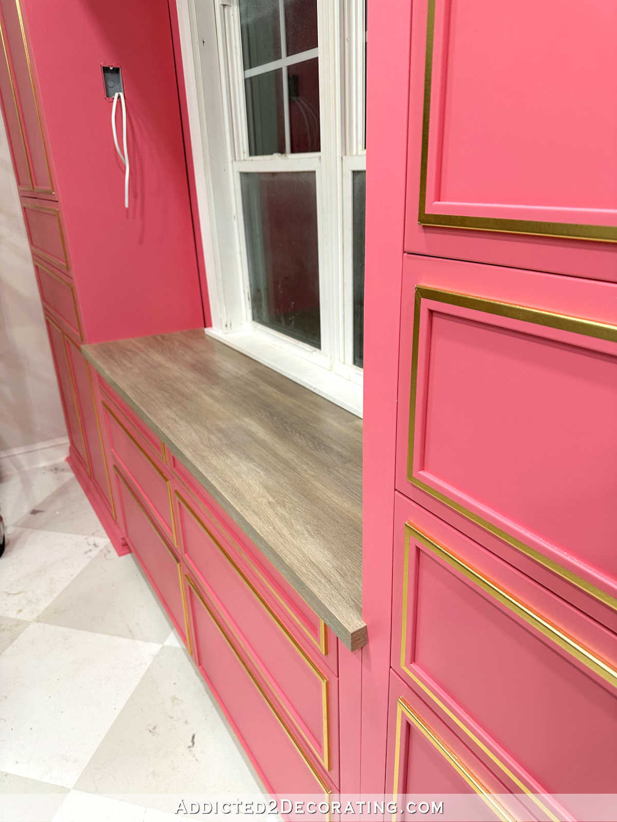
And finally, I’m still undecided on the cabinets. I know that the overwhelming number of people who voted (I’d guess about 95% of the over 450 votes) said that I should paint the area around the window and the backs of the cubbies the wall color.
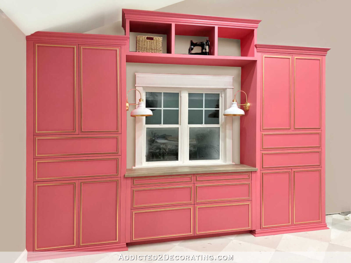
I totally understand why that was the most popular choice. I get it. And like I said last week, it was the clear winner of the three choices when my mom, my brother, and I were weighing the options.
But for some reason, when it came right down to actually painting those areas, I just couldn’t make myself do it. There’s something about the wall color showing on the backs of the cubbies that I just can’t get on board with. To my eye, the wall color showing there cheapens the look of the cubbies. And no, removing the bridge isn’t an option. I love the bridge, I just need to figure out this one nagging detail.
I did try putting wallpaper on the back of one to see what that would look like…

I love the look, but as my mom pointed out, it’ll be covered up as soon as I put things in those cubbies. So I just don’t know what to do. I will figure it out, but I haven’t figured it out yet. What I do know is that I’m sure those cubbies need some lighting. And maybe once they have lighting, I’ll realize that’s all they needed all along.

Addicted 2 Decorating is where I share my DIY and decorating journey as I remodel and decorate the 1948 fixer upper that my husband, Matt, and I bought in 2013. Matt has M.S. and is unable to do physical work, so I do the majority of the work on the house by myself. You can learn more about me here.


For sure, Paint the back of the cubbies the pink cabinet color!
Did you try a gold leaf insert in the cubbies? I thought that idea was good and would allow the light to bounce off the backs of the cubbies.
I haven’t tried it yet, but I will. I think it would be very pretty, especially with some tape lights helping to brighten it up.
Could you just gold leaf a strong piece of pressed cardboard to fit the back of the cubbie? That would be easy & would fit snugly.
It appears that you went all pink on the cabinets?
I was in the minority, with liking the all pink, so I’m kind of grinning ear to ear. 😀
I was and still am in the minority. I love the pink around the windows, I think it looks cohesive.
I am with you Margie….all pink looks cohesive.
I’ll go one more step than that even – I think that entire wall needs to be pink. 🙂 The cabinets wouldn’t stand out as so dominating with an entire huge painted pink wall. I recall the inspiration pictures had painted cabinets on the same color on the wall; I love that monochromatic look.
However, I do understand that that is A LOT of pink and maybe toooooo much.
I didn’t vote because by the time I read the post the overwhelming majority vote was white but I’m definitely on Team Pink. It’s cohesive, makes a statement, and is just beautiful to look at! Plus, Kristi, it’s you!
I think the sconces look great but blend in with the window trim. No matter tge color of the actual wall, the sconces get lost, therefore, drawing too much attention to the cubbies. Just my opinion. Usually the best decorated rooms are those that evolve. You’ll figure it out.
What if you gold leaf the entire inside of the cubbies instead of just the back? I agree that to do the wall color feels like it cheapens the look. Perhaps for now, you can try just painting around the window to see if that helps.
I love this idea! There would be enough gold to really tie the bridge to the cabinets, and once the cubbies are styled, just enough would peak out to add a nice glow.
I enjoyed reading every word of your blog today. I’m happy you found the perfect vent for the size and aesthetic look. Instant gratification is wonderful. I like the way you searched every wall area to find the perfect spot for it. Everything is really coming together for your studio now.
I think you are on the right track in finding the perfect outcome for the back of the cubbies, and the wall around the window. Trying out the wall paper and making mock ups of paint are your genius ways of ending up with the perfect solution.
The painting left to be done using your scaffolding is time consuming, but it sure is nice having the scaffolding. Get in some rest periods when painting around those big work tables.
I enjoy you telling us about your Wednesday lunches with your mom and brother…and your eating with them on Sundays after church. I like that you are family oriented.
I just love this positive, encouraging comment. ❤️
Kristi, Vent solution was genius! Don’t stress about the cubbies yet. What is showcased in them will make all the difference, especially when you add the strip lights. The pink now looks too dark and throws off your eye. I love the old sewing machine!
I like the vent solution but would move it straight up from where you’re putting it now. It would be hidden by the doorway leading into the back entry so you wouldn’t have to look at it.
That portion of the wall below the light switch is the only area that is empty. Everything above that has wiring I’d have to work around, and everything above door height has framing and wiring.
I haven’t read the other comments from the past week but I personally prefer it as is with the cabinet color also around the window and in the backs of the bridge cubbies. It appears more purposeful and finished to me. Not sure what you have planned to place in the cubbies but maybe once you have items there, it will naturally visually “break up” the pink. Maybe some beautiful gold accessories in the cubbies would really pull out your gold leaf? Say gold storage boxes, binders and/or a gold lidded vessel. If you wanted to keep the gold less brassy and more of your gold leaf look, you could always gold leaf something yourself for a fun project. If not all gold, you could also use a color or two or three from your wallpaper for accessories to mix with the gold. You did this on your music room shelving and it’s very stunning. These items would provide storage but also would give you a little break from the pink. And if you tire of items or need a change, they’re much easier to change out than repainting later or removing wallpaper. You’re doing an amazing job! Just trust your vision 😊
I TOTALLY AGREE….!!!!!
I still like the idea of wallpaper back there. Even though it may be mostly covered with pretty things, it’ll look better than solid pink or the wall color. Meaning it won’t be the wall color. Lol
I am so glad you decided to keep as is so far. I agree that the open cubbies does cheapen the look and lighting, in my opinion, is all that is needed to finish them up. The cabinets are beautiful.
Having the wall color at the window and in the cubbies makes it feel like the area can breathe to me. I don’t think it cheapens it at all. The cubbies definitely need gold some how. Whether you leaf the wall or via the accessories. They feel very disconnected from the rest of the cabinetry without any gold. But you’re, for sure, painting the wall around the window the wall color, right? Having it pink looks bizarre to me. Like it’s trying to pretend that there is a window IN the cabinetry rather than cabinetry ON a wall AROUND a window.
I’m with you on this. The pink on the wall looks strange for the reasons you said. I much prefer the wall color on the back of the cubbies. I feel like it looks the opposite of cheap compared to the pink backs. The pink cubby backs just look clunky and too heavy. But Kristi will probably prove me wrong in the end.
FWIW, I agree that the area around the window should be wall color and that the back of the cubbies should match the cabinet/cubby paint! I have serious studio envy!
Maybe once you put the things in the cubbies, it will help you know what to do about the backs? Just a thought.
I love the painted wall. It makes it look like it has a back and is complete. I wondered about wallpaper, glad you tried because it cheapened the look.
I still think you need some gold on the cubbies.
I love diamonds and shiny things, too.
Kristy, for your wall cubbies. Consider, getting a small amout of paint in 50% saturation. It would still look pink but not the same pink all over. I would look a bit more custom.
Just a thought. Also having the entire room painted may make the room feel whole for you. Power through. You really are getting an amazing amount done in here!
Sheila F.
I LIKE the wallpaper up there – who cares if the large pattern gets somewhat covered up – it would still brighten up the backs of the cubbies…
Lighting them will put them up another notch!
Painting the area around the window trim in the wall color will help bring some balance to the whole wall composition. 👌
Another easy way to add a bit of gold as well as lighten the cubby backs would be to purchase small 12″ diameter (or so to leave say an inch of pink margin around them) mirrors with a gold frame – just simple modern gold rim style…you could mount them with command strips so they could be removed easily if necessary.
Really, why does the cubby color have to be of concern right now? Once all the other items in the room are in place: desk, covered chair, wall pictures, repainted big cabinet with paint swatches, and more, more, more, plus what you will be displaying in the cubbies, the solution is bound to be obvious. At this point, it is the ‘cart before the horse.’
I am not the only person to hint, imply, or suggest this decision can be deferred. A bit of a running theme if you read carefully.
Have you thought about putting mirrors in the back of the cabinets?
Love the wallpaper on the back of the cubbies and wall…you may only see a little of it but I think it will look great. I have a shelf with fabric on the back inside and I have my cutting machines going up 4 shelves…so you just see a peek but I love it!