My Modified Bedroom Plan
I took some time yesterday to solidify my plan for the bedroom. I’ve had a general roadmap for the direction I was heading for a while now, but I kept getting hung up on the details. I shared a couple of those details that were tripping me up in yesterday’s post.
I read your feedback, but then it came down to me just needing to decide what was and what wasn’t working for me. I know we all have different styles, different taste, and different preferences, but Matt and I are the only ones who have to actually live in this bedroom. And of the two of us, I’m the only one who actually cares what it looks like. 😀 If it were left up to Matt, he’d be fine painting the walls all white, moving the bed and TV in, and that’s it. He doesn’t care what the room actually looks like.
So I just needed to figure out what exactly about this general idea, this roadmap, this mockup, wasn’t quite working for me.

Since so many of you have said over the years that you enjoy reading my thought processes, I’ll attempt to share what I was thinking, and how I worked it out.
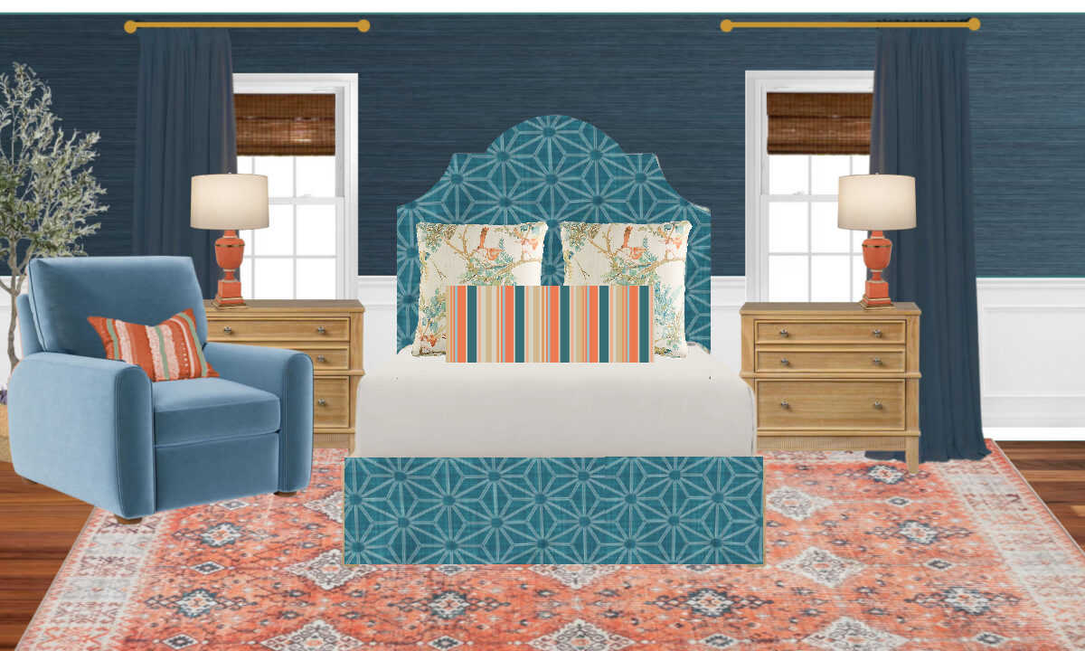
First, there was so much dark, rich teal on the walls and draperies, but then the entire middle section was light — the headboard, the rug. It’s almost like it divided the room into two halves.
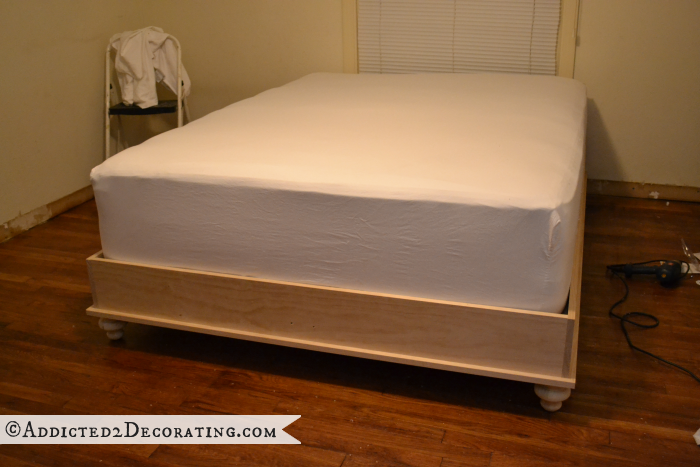
Also, with the light, bright bird fabric on the headboard, that left me at a loss when it came to the actual bed. I had been thinking that I’d build a wood base for our bed, but I don’t love matching sets of furniture, and I also don’t having too much wood furniture in a room, especially not lined up next to each other. So two wood bedside tables with a wood base on the bed wasn’t working for me. Even if the wood base didn’t match the bedside tables (thus, avoiding that “matching set of furniture” look), I still didn’t like the idea of three wood pieces lined up next to each other.
I really wanted fabric on the base of the bed, and it could either be an upholstered base or a bedskirt. I’m perfectly fine with a bedskirt as long as it’s tailored/pleated. I don’t do ruffles. 🙂 But with the light, bright bird fabric on the headboard, that really limited me with the fabric that I could put on the base of the bed. It would either need to be the bird fabric or a color from that fabric, and preferably the dominant color from the fabric, which would just be that off-white/cream background color. Anything else would command way too much attention and draw the focus away from the bird fabric. And I just don’t want an off-white/cream bed base.
Also, I thought the bed needed to be more “grounded”. I don’t even know if I can explain what I mean by that. But in my mind, the bed itself (the headboard and the base) needed to be darker and more grounded, and then it would serve as the background and base for the light bird fabric.
And finally, I realized that I wanted more patterns. I know I like more of a mix of patterns and texture than a lot of people, but I have to be true to my own likes, taste, and style, and I just needed more. That bird fabric alone wasn’t going to cut it for me. I love it, but that fabric alone wasn’t going to carry that entire wall for my liking.
With all of that said, I remembered that I had just ordered ten fabric samples for the foyer bench. They should all arrive today, so I don’t have them in hand just yet. But I went back to those online pictures because I remembered that there was one in particular that I thought might work as the headboard and also the bed base/bedskirt.
So I did a mockup of that fabric on the bed and then put the bird fabric on the pillows in front of it. Ignore the chair with the pillow. Obviously, the chair won’t be right there by the bed. I’m just focused on the things that will actually go on the bed wall. I also used the fabric just as I copied and pasted it from the Spoonflower website. I don’t think the color is exactly right, and if it needs to be tweaked a little bit, I’m hoping that particular shop owner is one who will do custom colors, as many of them offer.
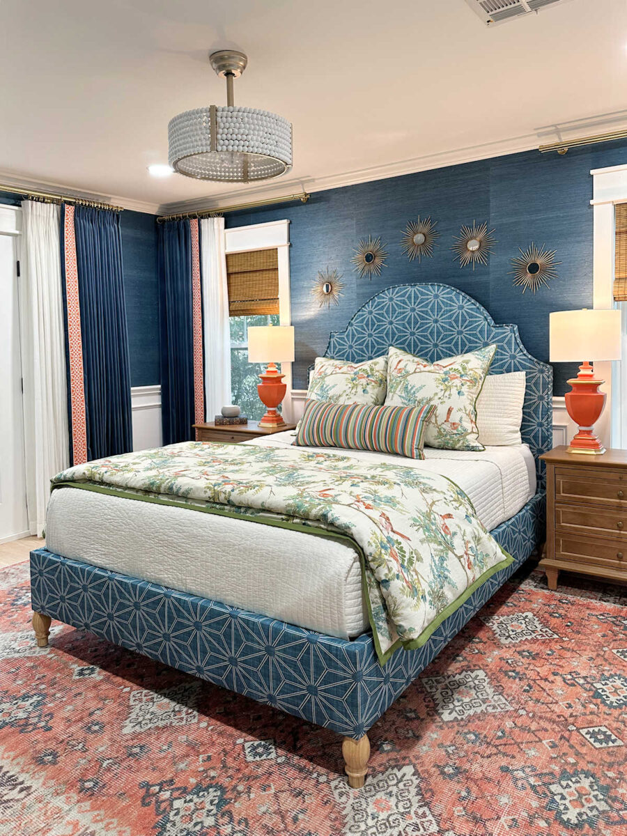
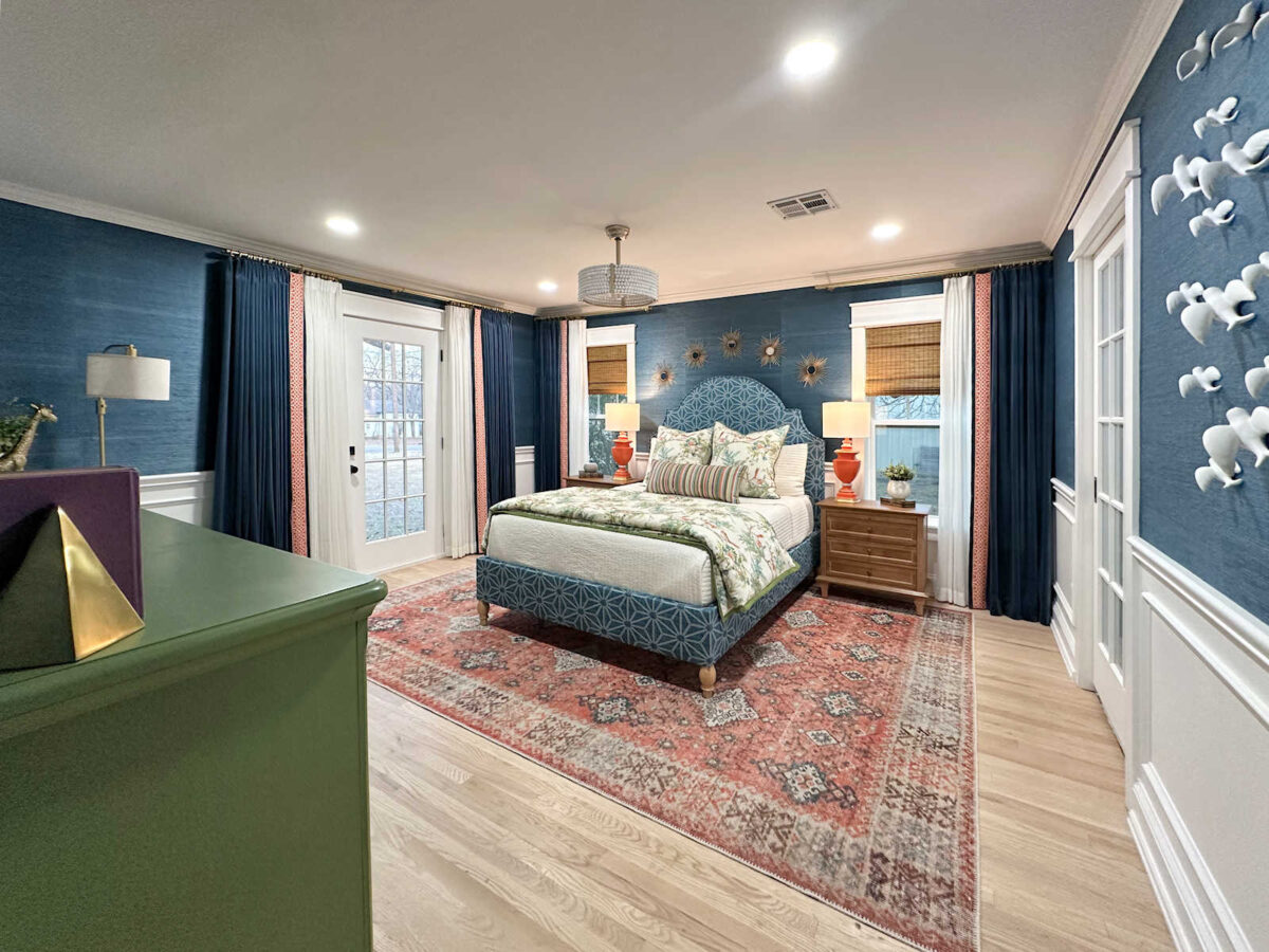
But this is definitely more me. It’s more exciting and interesting. It gives me the mix of patterns that I love. It gives me that look of the bed being grounded that I thought it needed. And that grounded bed gives a beautiful backdrop for the bird fabric. What I didn’t add to the mockup is that I’d also use the bird fabric as a throw or a duvet cover, and I would have that throw or duvet folded at the foot of the bed so that I can have more birds. And since I’ll have extra drapery fabric, I’d also use that to make two pillows to go behind the bird pillows to bring it all together.
So that is the new direction, and that helps me to solve all of those issues that I’ve been putting off dealing with and making a decision on for months now. I’ll have to wait until I have the fabric samples in hand to see if any of them will actually work out how I envision it.
I’d like for the actual fabric that I use to be a bit darker (just a touch darker than what is shown above, and just a touch lighter than the grasscloth wallpaper and drapery fabric) and with a little less green than how it looks in the mockup above. If it were just a little bit darker and a little bit bluer, it would be perfect. So, I’m really hoping that the actual fabric, once I have it in hand, will work out perfectly, or that this particular seller is willing to do custom colors. Or maybe one of the other samples will end up working out perfectly.
And in a perfect world, I’d also have my recliner here so that I can compare fabrics to the actual recliner rather than having to work with a tiny sample of that recliner fabric, but it’s not looking like that will work out. The recliner is still hasn’t shipped, and I really don’t want to wait to make the final decision. But I’m also not going to stress about getting this room done by the end of the year. I’d love to get it done, but I also want it to be just right. So if I have to wait on some decisions, I’m okay with that, but I’d like to keep the forward momentum going.
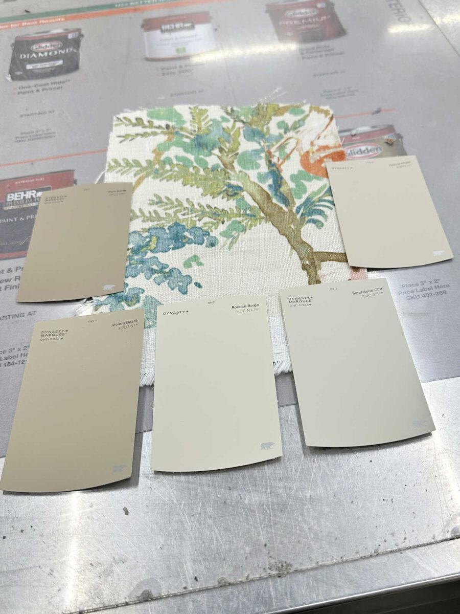
Speaking of, I went to Home Depot yesterday and picked up some paint samples for the dresser. I decided to go with a neutral color. I know that’s completely out of character for me, but I really want to keep the headboard wall the focal wall in the room. So these are the samples I picked up. I’m going to try these out today. My favorite ones are the two on the right. The top one is Behr Casual Khaki, and the bottom one is Sandstone Cliff. But I’m going to try out all five and see which one looks the best in the room’s lighting and with the rug and bird fabric.
Note: Sorry if you got the email teasing a “closet addition” on this post. I decided to hold off on sharing about that because I’m still making that decision, but I want to make that decision without any outside input. 😀 I already know that some will love it and some will hate it, but I need to make the decision based on what I want before sharing.
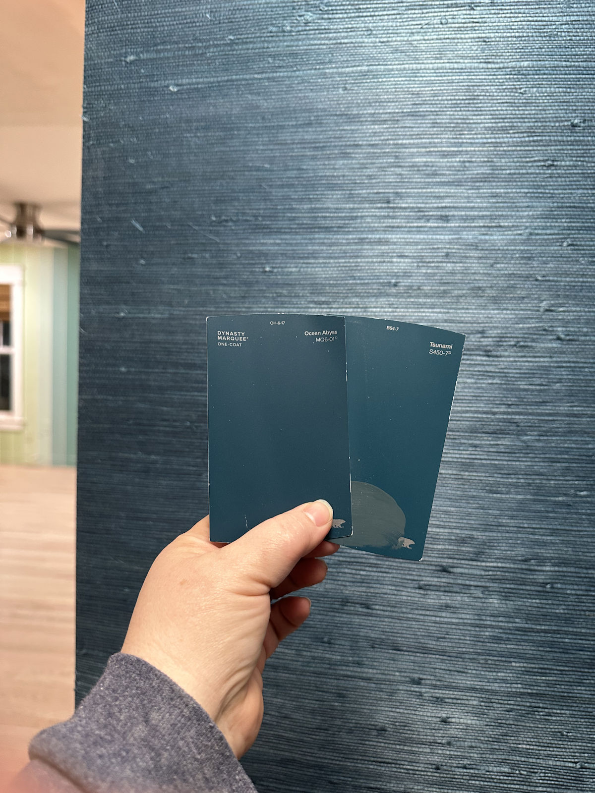
UPDATE: I received the samples, and I think the one I had in mind might work out perfectly. It’s bluer in person than it looks in the mockup above. Here’s what it looks like with everything else. I also brought in the sample of the recliner fabric. It’s the small velvet piece sitting on the grasscloth wallpaper.
Here’s what it looks like from a distance…
And here’s a closer up view…
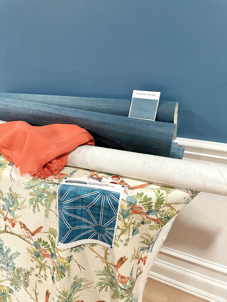
And here it is with the drapery fabric over on the side.
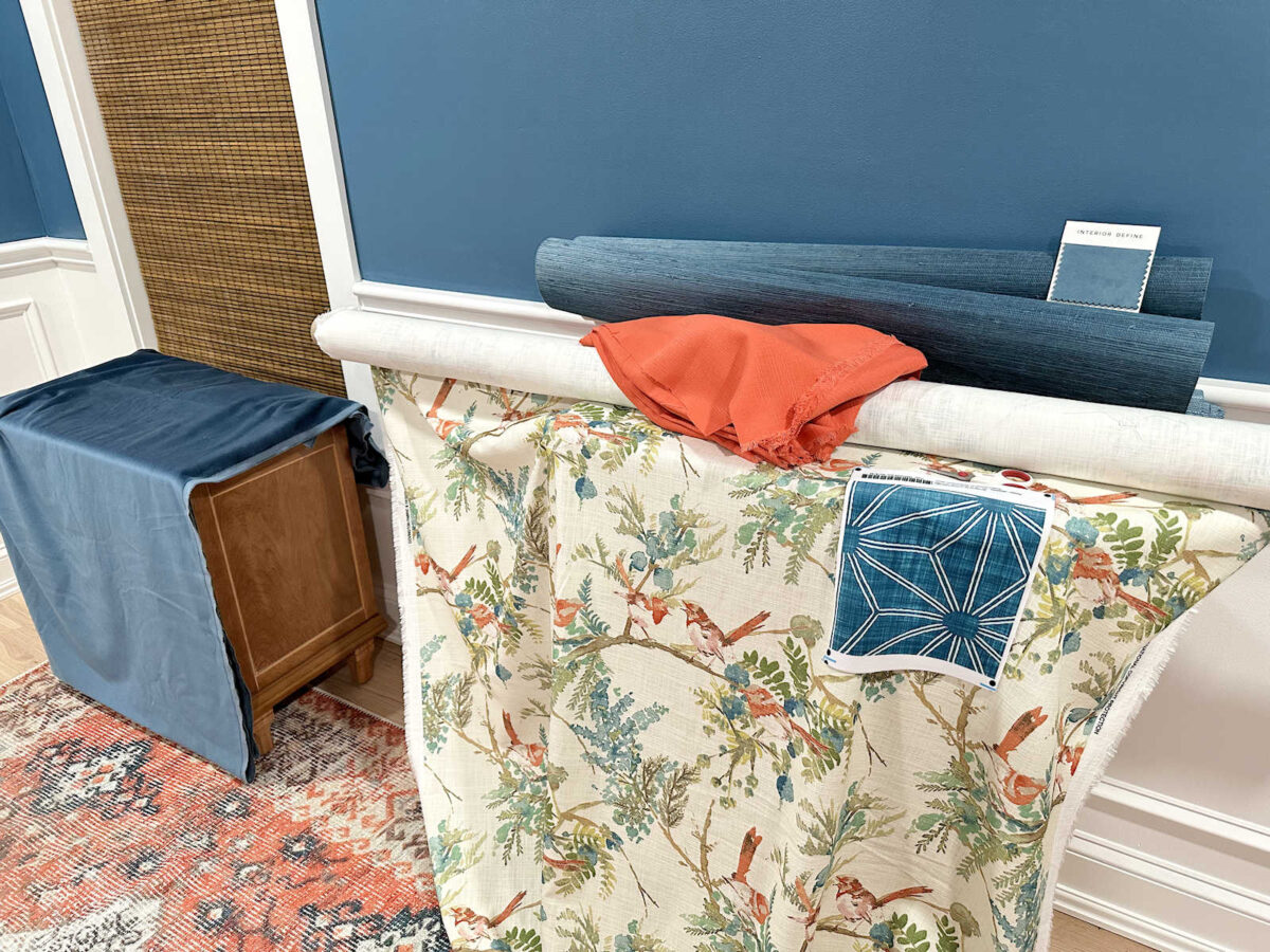
It’s definitely bluer than I thought it would be, so I was very pleasantly surprised about that. I put one of the other samples next to it, and you can see that the other sample has more green in it. That much green definitely wouldn’t work, but I think the sample on the left is pretty perfect.
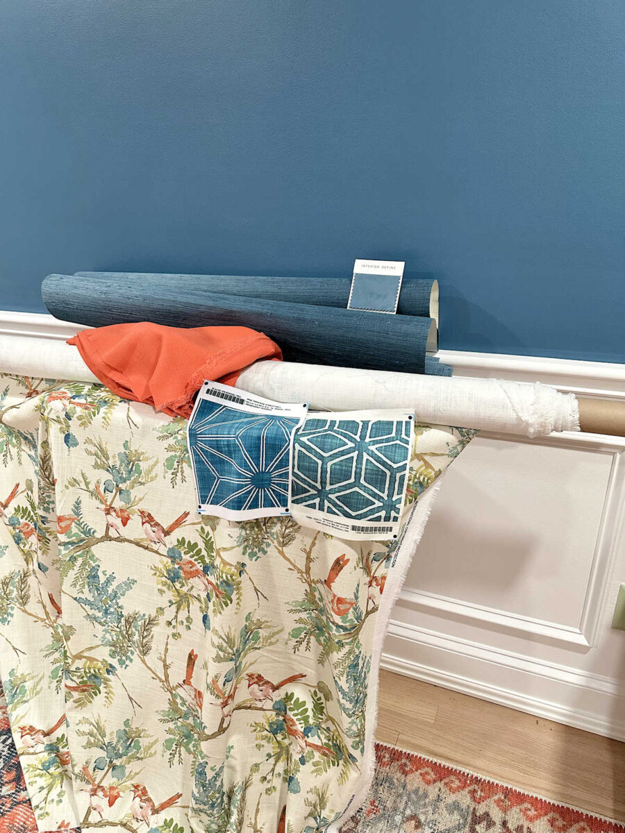
The chair fabric is a bit bluer than the potential headboard fabric, but the chair will be sitting over in the corner of the room, so it won’t be right up next to the bed.
And here it is with the drapery fabric. Of course, the headboard won’t be right up next to the drapery fabric, either.
More About Our Master Bedroom
see all master
bedroom diy projects
read all master
bedroom blog posts

Addicted 2 Decorating is where I share my DIY and decorating journey as I remodel and decorate the 1948 fixer upper that my husband, Matt, and I bought in 2013. Matt has M.S. and is unable to do physical work, so I do the majority of the work on the house by myself. You can learn more about me here.
Oh, I love your new vision, so much! While I liked the previous plan, this is simply amazing. I cannot wait to see how it all plays out. You have mad skills, and I always look forward to your posts.
You always surprise me! That’s why you are the Pro and most of us, are not! Your new plan looks even better. Yay! I really hope the fabric works in your favor. It’s going to look great (as usual).
I love the new vision! It looks more cohesive to my eye! And the colors you have planned for the dresser are all lovely! I love it when a plan comes together!
I really like the open, airy feeling the bed’s wood base you have pictured gives to the room. Maybe a slightly darker stain than the nightstands such as the window blind color would be good as you don’t want the bed to match the nightstands. I also think painting the base the off white background color in the bird fabric would be nice. I think the bright, bold print fabric is overpowering in the room. The solid upholstered base looks very heavy.
LOVE the new rendition…. SOOOOOO happy to see the “Bird” fabric not fighting for its existence to be noticed…. In my humble opinion….. It needed the contrast of the darker fabric to really show it off….
What about using the bird fabric as draperies and the velvet on the headboard and footboard.
I, personally, am so glad you are moving away from the bird headboard. The pillows with the bird fabric look so nice. Might the bird fabric with the trim you have be another option for drapes, to add more bird fabric?
The mockup of the bed is so pretty!
I’d love to see the headboard fabric for the drapes and bed skirt and accent pillows, and a color found in that print on the headboard in a larger floral or even a stripe. I’m stuck on the drapes being invisible. And the beautiful, bold, dark color on the walls is such a BIG thing that the delicate print on headboard looks timid. A bolder floral print, similar to the size of the florals in your closet room, would stand up against the dominant and very bold walls.
Yes! This makes such a statement. I agree that “grounding” the bed makes a huge difference. Love how you chose to use the fabrics.
Now you’re cooking with peanut oil. A good direction and cannot wait to see the samples. Keep on keeping on, this is a good time picking out those finishing touches. I love it.
Cheers to you, Matt and the Fur Contractors!
I love the last mockup SO much better than bird headboard. It’s gonna look so elegant when finished. I can’t wait 😁
I have to admit the darker bed frame looks better. Glad you are still using the bird fabric for pillows. Do you have enough of the bird fabric to do the bench? I like all your paint colors but the top left is my favorite.
I’m curious about what you are going to do in the closet. I can’t think of anything that needs to be changed.
I, personally, am so glad you are moving away from the bird headboard. The pillows with the bird fabric look so nice. Might the bird fabric with the trim you have be another option to add more bird fabric?
The teal print for the headboard and skirt is gorgeous. The thing that bothers me the most is the blue on the chair. Everything else is cohesive but I’m hoping that is not the actual blue for the chair as it is “too blue” for the other teals in the room. Colors don’t always look the same in person, as you well know, compared to a computer picture. I am crossing my fingers that is the case here. I’m anxious to see this room finished so you, Matt and the furry supervisors have a comfortable bedroom to relax in.
I’m crossing my fingers, too! The sample I had to go by looks much closer to the drapery fabric, so I’m really hoping it is. If not, at least it’ll be in the corner, and I can cover a lot of it with a throw and a pillow. 😀 At least it won’t be right by the bed.
I absolutely LOVE this. Great balance of color and depth in the room now.
SO much better!! I love the new direction.
Me too!
Ha ha ha, I LOVE reading your thought process ! Just when I think that you’ve nailed a design, you turn around and change it and I love it even more !
Yes yes yes to a more grounded, darker bed frame with more pattern. I can see it now that you’ve explained it.
Like every room in your home, I am going to love your colourful patterned bedroom. Keep being you, Kristi !
Maybe you could use some of the bird fabric for the bench outside of your bedroom/closet?
Looks good! I hope the fabric will be more what you want too. Having the bolder fabric on the bed headboard and pleated dust ruffle really DOES ground the room! Before, the bed almost looked as if it were floating, lol.
Since it seems that you’ve made your decision on the curtains, can you work on those and have them ready when the bed comes together? Rather than moving on to other things. Or maybe the dresser will take your time until you’ve received the fabric you like. I do like the iteration of the bed you’ve come up with now and always appreciate how you come to decisions.
Love the new bedding mockup!
Love it. I agree that this is a good direction.
Looks MUCH better. I don’t like to yuck someone else’s yum, but the previous version was looking very ’90s to my eye. This looks so much more cohesive and fresh. How will you deal with Felicity and the fabric, though?!
I’ll buy it in velvet. 🙂
Hey Kristi,
Been following you for years.. and I finally have something to chime in about! 🙂 My house is Sandstone Cliff throughout the main living areas/kitchen/basement. I LOVE IT. While I do love it, it can read green in a certain light. A green that may go well with your bird fabric, yet not well to your room as a whole with the teal.
Jill
I love the new direction you are going! There was always some THING with the headboard that concerned me, but I always thought it was the height. I now realize it was the bird fabric against a dark wall! I also like the top right color for the dresser (but I like the top left also!) to lighten the room across from the bed. I have one other “bug” that I will bring up, and that is the window shades. I would love to see the shades in the same color (or close to) the dresser color, instead of a dark wood. It would look really nice with the frames of the door and windows, and add some more light to the dark. How about that idea?
I might give that a try. I don’t like how similar the shades and the bedside tables are in color.
I really like the changes! I would put a quilt at the foot of the bed in the bird fabric to bring more of that print into the room. Others may have already said this, I just didn’t read every reply.
All that matters is that you and Matt like it, but if it were me I’d use the bird fabric as the drapes. I feel like the solid drapes just mush into the color of the grass cloth. I’m sure it will be lovely no matter what you do.
Perfect! I love the layers of color and pattern. It’s so YOU!