My Studio Floor Decision — I’m Going To Paint The Whole Thing
After giving it much thought and considering different options, I’ve decided that I’m going to paint the whole studio floor, including the bathroom and the storage closet. Here’s how this decision came about.
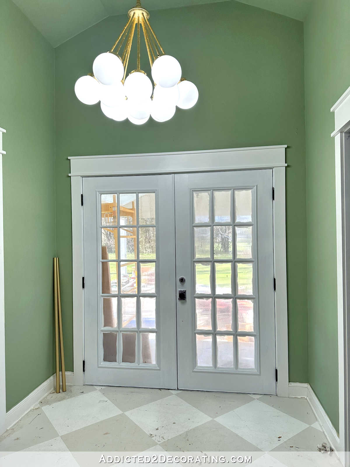
The studio floor is red oak hardwood flooring. I installed red oak because that’s what we have in the rest of the house, and I wanted the wood to match just in case I ever decide that I want to change the purpose of this room and have the flooring in the studio match the rest of the house. But as long as the room is being used as my studio, I didn’t want dark stained wood floors in here. So immediately after installing the red oak, I did a whitewash finish on the floors.
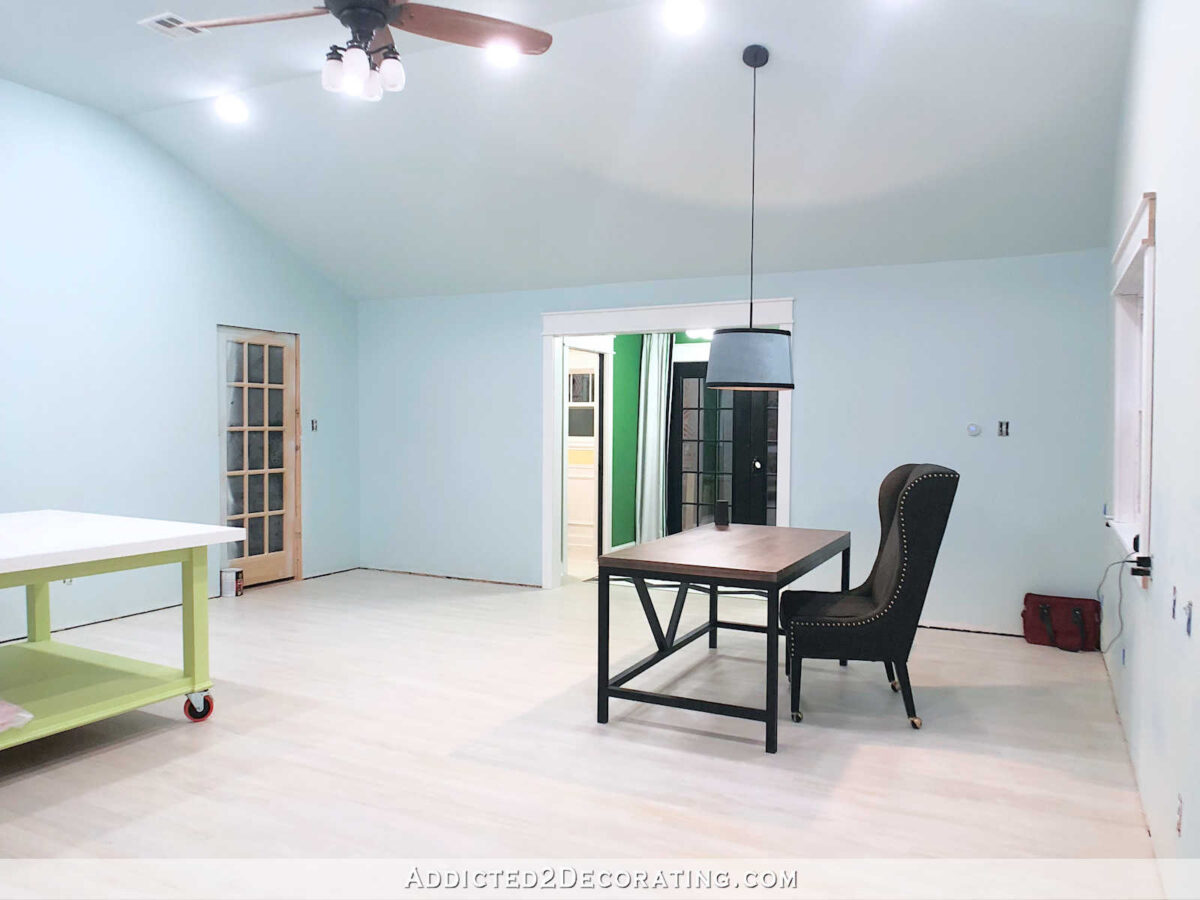
And then, because I wanted a “rug” in the back entry but couldn’t have an actual rug because of Matt’s wheelchair, I decided to paint a design on the floor.
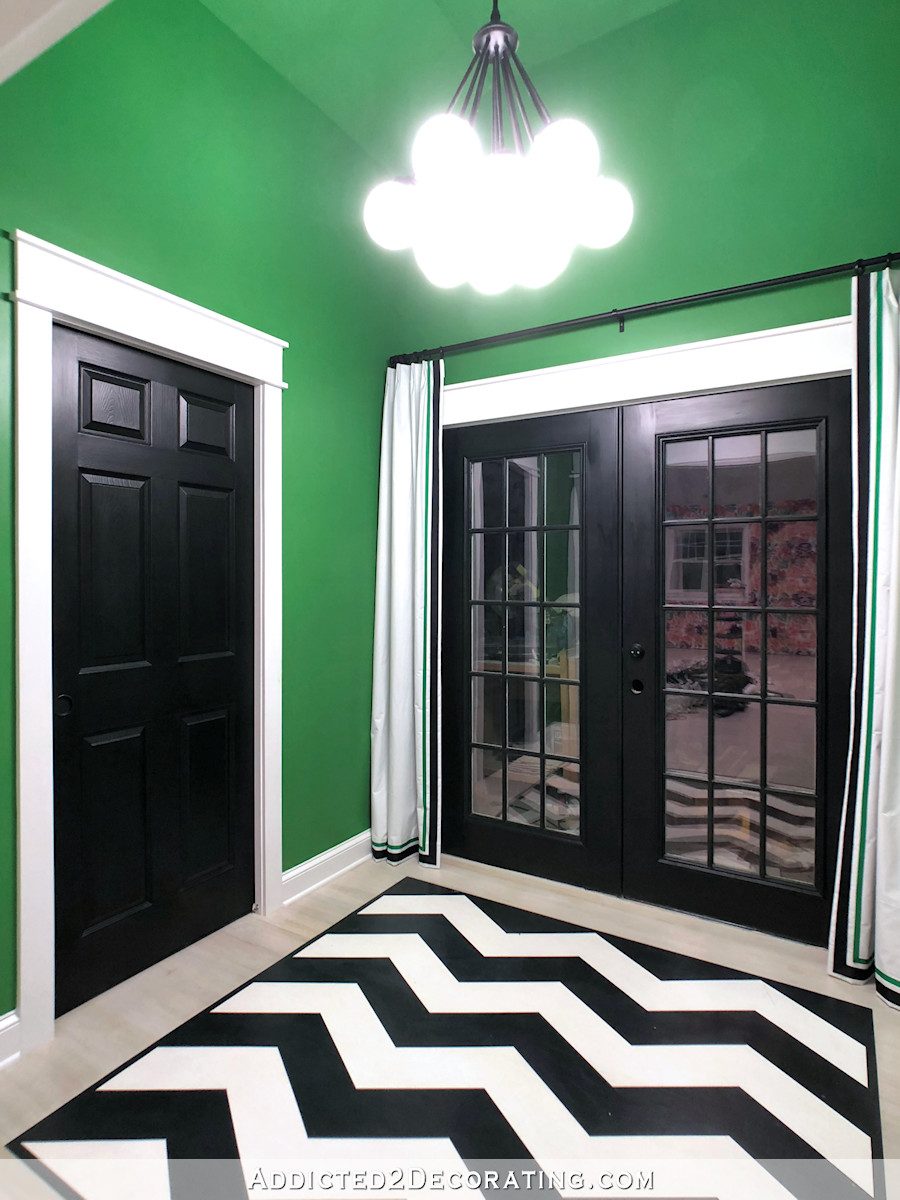
After living with this back entry for three-and-a-half years, I’ve decided that it’s just too much for me. I don’t like the stark black and white paint on the floor, and the green is overpowering for me. So then I had to make a decision about how to get rid of the black and white on the floor.
While pondering how to do that, another problem arose. I had some water damage on the floor by the side door. Before our big winter storm (Snowmageddon) in February 2021, we were stocking up on food and water because we were being warned that everything would be closed for several days and we might lose services like water and electricity. So I bought a bunch of water (the three-gallon rectangular containers with the spout) and set them inside the side door of the studio just in case.
We ended up not needing them during the storm, so they just sat there for months, and we’d use them on occasion. What I didn’t realize is that the very last one was slowly leaking, and evidently had been leaking for a while. So the floor in that area (about a 1.5 foot square) swelled up and needs to be sanded and wood filled again.
The final consideration is the fact that this is a studio floor. While I haven’t used this studio as much as I plan to in the future once it’s finished, I’ve already gotten a few paint splatters and drips from art projects on the floor. So once the room is finished, and I’m using the room even more than I have been, there’s no question that I’ll be getting even more paint on the floor. It happens. That’s the nature of a studio that’s used for art projects.
So with all of those considerations, I decided that I need to do a finish that will (1) cover up the back entry “rug”, (2) cover up the water damaged area once it’s wood filled and sanded smooth again, and (3) be easy to fix when I want to cover up the paint splatters and drips that will inevitably occur when I’m doing art projects.
The answer is obviously a painted floor. So as ‘ve scrolled Instagram over the last couple of months, I’ve been keeping my eye open for painted floor design ideas.
As of this moment, I’m leaning towards using light neutral colors, like the Behr Polar Bear and Benjamin Moore Classic Gray that I used on the floor in the guest bedroom.
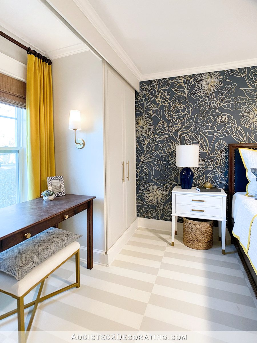
Those colors offer a subtle backdrop and pattern without demanding attention, and just like in the guest bedroom, I don’t want anything on the floor that will take attention away from the walls. And since those are colors that are used throughout the entire house, it makes sense to bring them into the studio for continuity.
All of our trim and wainscoting are painted Behr Polar Bear, and it’s also used on the walls (used within the designs) in the music room, hallway, and home gym. And Benjamin Moore Classic Gray is used on the walls in almost every room. So I like the idea of bringing those colors into the studio as well. But after looking through some inspiration pictures for painted floors, I could also be persuaded to bring in a darker color. No black, though. As I’ve learned with the back studio entry floor, black and white are just too jarring for me.
I was needing some inspiration as far as the design goes. The obvious, and probably most popular, design is a checkerboard design. This would be relatively quick and easy to do. Since I’m dealing with such a large room, I don’t want to do a complicated design that will take a long time. (All of the pictures below are screenshots from Instagram. They’re all linked to the Instagram accounts where I found them, so just click on the pictures to see more.)
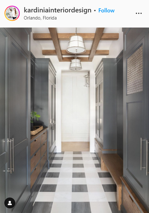
I really like the large scale of this checkerboard design.
But I also really love this three color design as well. I’m pretty sure this is tile, but it could easily be done with paint.
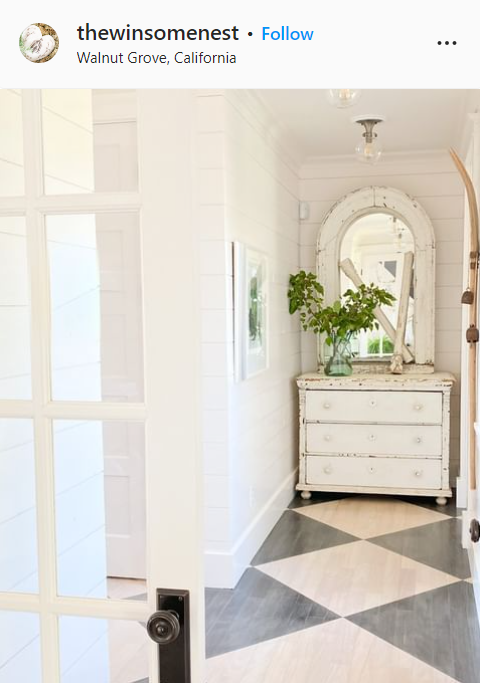
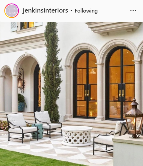
This was the original floor design that inspired me to paint the studio floor. I like that it has a more modern look to it, but it can still be a subtle background without demanding attention.
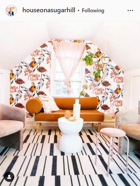
This one reminds me of our guest bedroom floor, except that the stripes are random instead of equal width. And I love it paired with that fun wallpaper. That gives me an idea of how it would look paired with my colorful floral wallpaper. But again, I won’t be using black and white.
And finally, this is a painted checkerboard floor with a gold outline, which I absolutely love!!! I don’t think I would go to the trouble of painting veins to mimic the look of marble, but oh my goodness, that gold detail!! I love it so much.

So I’ve narrowed my choices down to those designs. I’ll give it some more thought as I start to box up things in the studio this weekend and get ready to work on the room. I’m so excited to get this project started…and finally finished!!!
And yes, the home gym is finished. I just need to do a little dusting, vacuum the floor, and take some photos so that I can share the whole before and after with you. WOOHOOO!!! Y’all, I’m down to one room. One room!!!

Addicted 2 Decorating is where I share my DIY and decorating journey as I remodel and decorate the 1948 fixer upper that my husband, Matt, and I bought in 2013. Matt has M.S. and is unable to do physical work, so I do the majority of the work on the house by myself. You can learn more about me here.
I love the gold accented floor. So unique!
I really like the fifrst one, the diamonds. The second one is also appealing. For me the third one is too busy znd makes me feel dizzy. Of curse, the last one, without the gold, is just a classic that will never get old. The choice of course is yours.
I’m a sucker for the classic checker board or a harlequin design.
Am I the only one who’s concerned that Kristi is “down to one room”? Then what?
I’m going for the gold, Kristi! Beautiful!
I love the gold accent on the floor. I was wondering if a patterned floor wouldn’t cause more problems when you make painting drips etcetera? Maybe one color with a gold trim around the edges or would that be too boring?
A solid color is a bit too boring for my taste. 😀
But it wouldn’t be solid after the painting drips 🙂
You could always go with the GORGEOUS black/cream floor, then add the gold detail after get cabinets installed–just along the edges of cabinetry!
I think the white washed finish on your floor looks great and would provide a subtle backdrop for the art you’ll be creating in the space. I’d just refinish the hallway the same way and move on to installing cabinetry.
Refinishing the back entry and the area that’s water damaged by the side door would be more work than just painting the whole thing, and the chances are slim that I’d be able to get the finish to match the original.
I really like those two colors together. Any design you pick out for the hall and bathroom would be great.
But honestly, I would do a single color on the studio floor, since it will probably need to be painted multiple times due to art project drips and splotches.
I can just see myself doing a bang-up job of painting a checkered design with precise corners and edges, then having a meltdown the first time I dropped a container of paint!
I really like the first diamond one … it’s simple and classic and would be fast and fade into the background. (I really like the colors in that picture as well.) If you wanted to pull in the gold elements, I might suggest using them as a “rug” element in the entry-way rather than using it across the whole floor.
I LOVE the oversized checkerboard, especially set on the diagonal. I also love the outdoor pattern which is similar in effect.
I like the idea of a painted floor especially since you’ve already painted the back entry but given the size of your studio, have you considered doing a painted floor cloth to put under the work area instead? I remember your painting the back of a vinyl piece at the condo but my mother had a 12 x 16 ft painted floor cloth made from artist’s canvas. After painting, I think she sealed it in polyurethane and most things just wiped off or could be gently scrubbed off.
I love the floors in your studio as is. Could you paint over some areas in the “rug” to change the starkness? I agree, the green is too intense on the walls.
I’m thinking that paint drips on the floor would give you an effect like Jackson Pollock. Could even help it a little along the way with a few spatters matching WP colors. Also wouldn’t rule out using the gold stripe along the walls either.
Agree with everything Crystal says!
My first thought when you said you decided to paint the floor in your studio (and it already has drips and drops from previous projects) was to paint it black and spatter-paint colors all over it. I can’t help wondering if you go through all the trouble of making a beautiful floor, how are you going to keep it that way?
Am thinking of a neutral go with everything base, then a “design” that doesn’t really have a specific FORM, but would accommodate all the spills, dents, etc. that might occur and simply add to the “artistry” of the room and then seldom have to repaint anything. All the drops, spills, etc. would add to the flavor of the room. Especially since you tend to already use colors you love. Just let the room become its own “picture on the floor.”
I have an art studio & if I could do it over, it would be sheet linoleum/vinyl or sealed concrete. Easy to clean, cheaper & can get just about any design you want. Too many spills on wood floors means they look dirty & you can’t just wet mop them. If you want to go back to natural wood, it means sanding, & starting over. Just my experience with different paints & solvents. Yours may be very different.
I can’t envision any of the floors working well with your wallpaper. That’s quite a bit going on in such a large area.
LOVE the large scale checkerboard!
I am surprised at the third not throwing your sense of symmetry off. It did for me 😬 The other options I can see, the gold was unique!
Looking at those examples, I have to notice they are all in relatively small areas. Yours is so big and a working studio, I think those patterns are all a bit much. And then you also have a large pattern wall paper as a focal point. I actually like the simple floor you already have, and since it is a studio, it will also be easier to cover the drips/drops later. It also keeps it light and clean looking. I’m glad you are toning down the entrance…that I think would look nice with the first option – staying a bit simple and clean as an entrance. Of course that last one with the marble/gold is really elegant…for the place it is in. A formal entrance in a historic looking home. Kind of genius. All that being said, this is a working studio, and I would keep it a bit toned down and simple, but of course I know that might not be your wish. I hope you don’t do all that work to be disappointed like the entry – now feeling it is too much – too jarring. There will be a lot going on in that studio as you set it up, and begin working in there…YES! Looking forward to your projects as always.
This!! And Maybe consider a vinyl rug as someone else suggested
I love that floor the way it is. But it’s your house. I’m sure it will be beautiful.
I personally think a solid color would be better and easier to maintain over time. If you are working in there a lot, then the floor is going to get “beat up” more and will need more attention more often. I also wonder if a patterned floor is going to compete with the wallpaper or make it all look too busy. Out of the options shown, I like the outdoor one the best. It is beautiful and more subtle than some of the others. You have to do what you love, though, since you will be living with it.
What if you paint the floor whatever base color you like (probably something light like you have now) and then you add subtle paint splatters in the colors of your wallpaper. That way the colors tie in AND the best part—you don’t have to worry about future painting projects accidentally getting on the floor, as it will just add to it!
I really like the design of the one that was the original inspiration, the Jenkins Interiors. The others feel too regimented and boxy for the studio. I think you could also consider doing it at an oversized scale too, to keep it from being too visually busy in such a big space (and keep the taping time a bit more manageable!)–having the design “pieces” be larger could come in handy when doing touch-ups. Instead of having to tape and fiddle with lots of intersections, you’d have fewer and larger spaces of one color to re-do.
My first choice would be Winsome Nest extra large size. My second would be Jenkins also extra large. Maybe have your cabinets behind your desk area in the dark gray and on the the front wallpapered wall in the light color.
I LOVE a plaid floor, but a lot of work for such a large area. My second choice would be the diamonds.
https://pin.it/4PNIPii
Look online at Jackson Pollock Floors. They’re gorgeous and wouldn’t compete or clash with anything. Far less work plus never having to do touchups, sold!
I don’t think the gold detail will hold up on a studio floor. Stay as simple and as neutral as possible, especially with the wallpaper.
Sorry about that leak in the entry. Ouch. Personally, I’d do that entry over in one of the styles you showed, then make a “rug” ow two somewhere in the studio that copies or coordinates. And then put on many, many coats of sealer so that you can clean up your messes that are inevitable. Everything else seem very busy for such a huge space. Your floor now is so beautiful!
Many years ago, in another home, I remodeled the entryway foyer in a house on a slab. I took up the old flooring and got down to the bare concrete, then taped it off in large diagonal diamonds with 1/4″ masking tape. I then used the colors on the exterior of our home to sponge inside those diamonds, adding more white to alternating diamonds for a muted checkerboard effect. I used white, light gray, woodtone stain, and a soft yellow. I then coated the floor with several coats of water-based polyurethane varnish. A number of years later when we put the house on the market, the realtor thought that the floors were terrazo marble. This entryway was used often and stood up to water and mud tracked in by four kids. I’ve read several other comments on this thread, and I too think that a spattered floor ala Jackson Pollock would look great and not compete with the large floral wallpaper and other furnishings in your studio. Any new spills or spatters from future art/craft projects would just blend right in. Congratulations on finishing the home gym! I’m looking forward to the big reveal, lol.
If I have to pick, my favorite is the Jenkins Interiors, my second favorite would be the oversized checkerboard. The stripes are too busy and the gold too over the top. After all, it is a working studio. But I am so sad you are going to paint the wooden floor. Paint is less durable than stain and if you ever decide to go back to hardwood it is not a easy task. All I love beautiful hardwood floors. That said, it is your house and you need to do what works best for you. And it will be beautiful when you are finished.
I really like either #1 or #3, subtle but very pretty. And you could always add gold to those, if wanted.
I absolutely love the first one from The Winsome Nest. I love those large diamonds.
Not that it matters, but I like the outdoor floor the best. It is easy on the eyes and looks like it wouldn’t be to hard to repair when you decide to get rid of the paint drips. It wouldn’t take away from the wallpaper that I am guessing you are going to do over.
The last one with the gold that you love looks like a kitchen floor. The first one looks like a fancy, fancy house but not a working studio. The plaid one is ok but the outside floor is easier to look at with your busy wallpaper.
I hope you don’t mind, but I always have an opinion.
The hallways in the newish hospital building near me have hallways with 12″ or 14″ tiles (I think they are Marmoleum or some other heavy duty linoleum-like product), but that’s not important) set in a harlequin pattern with a very subtle color difference, much like your guest bedroom. They do have a very small, light, terrazzo-like pattern. They look clean, bright, and, even, sophisticated. I admire them every time I am there and mentally applaud the designer. Those halls are longer and narrower than your studio, of course, so I think larger pattern would work in the studio.
I will also comment here about your cabinet colors, specifically those that are not on the wallpapered. You might consider painting them the same color as the walls so they blend in as part of the background to your creative projects. This will also allow the spotlight be be on any artwork you decide to hang on the walls.