New Plan For Our “New” Guest Bathroom
I didn’t get any work done yesterday because I almost never have a chance to make any progress on projects on Wednesdays. As y’all know by now, Wednesdays are my “family and friends” day. But I have a whole uninterrupted workday ahead of me, and my goal is to make as much progress as possible on the bedroom trim. In the meantime, I’ve been revisiting my plans for the studio bathroom, which will be our one and only guest bedroom for an unknown period of time between when I turn the current guest bathroom in the foyer into a storage closet and when we get our addition built with the new guest bathroom.
A couple of weeks ago, I shared that I was going to calm things down a bit in the studio bathroom since it was going to be our interim guest bathroom. While I’m fine with lots of color and wild patterns, I didn’t really want to subject guests to that. I mean, let’s face it, the original pattern I did was fine for me and fun to look at in pictures, but it could be a bit overwhelming and dizzying for a lot of people.
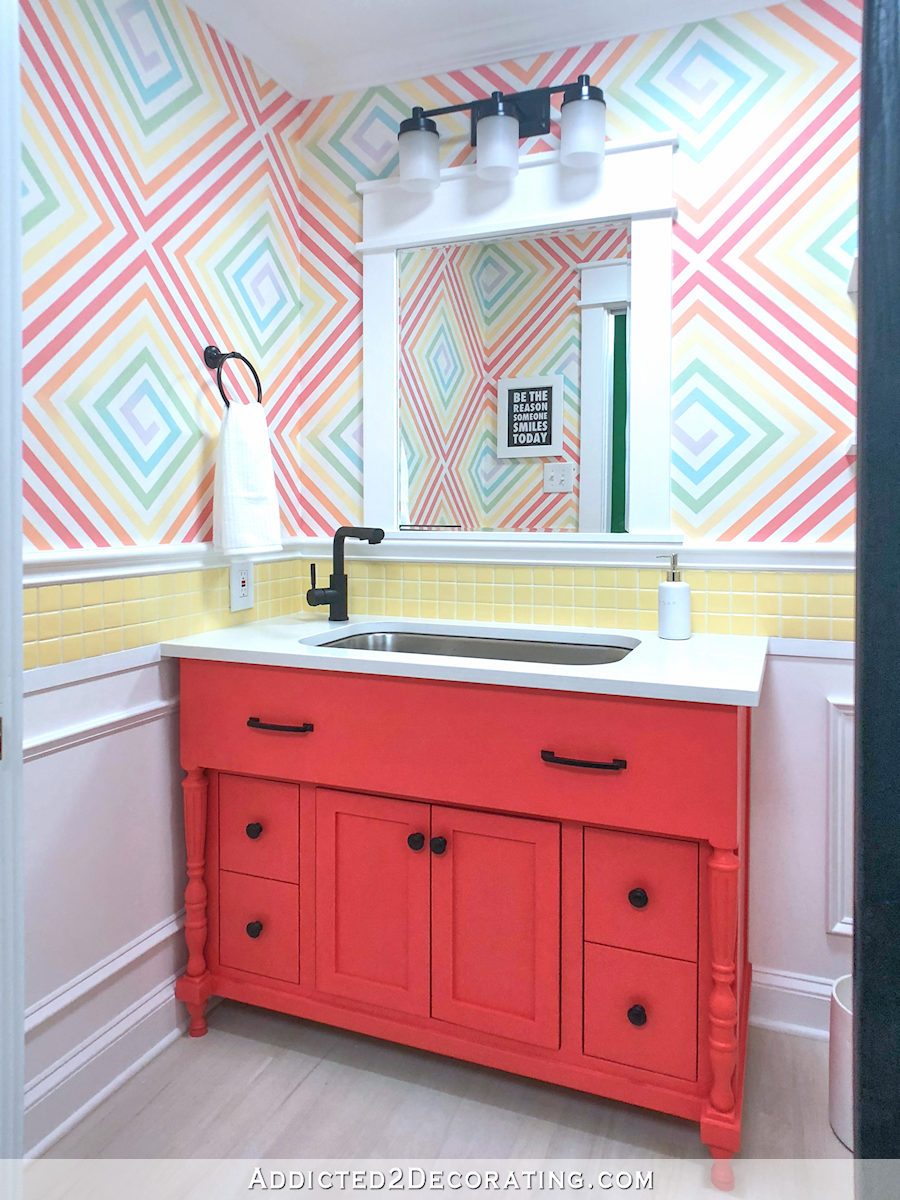
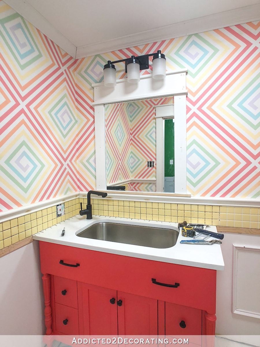
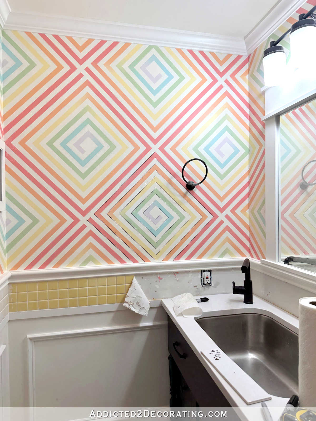
And I think the same is true for the wallpaper that I had designed for the walls before the whole detour over the last year when I planned to turn the bathroom in to a walk-through pantry. I never got that wallpaper installed, but it would have looked something like this.
Again, that would have been fine if the bathroom were just for me. But I think it’s too much for a guest bathroom.
So I suggested that I would just paint the upper walls the same green as the walls in the back entry, paint the wainscoting white, and pretty much be done with it. But several people pushed back on that idea and said (I’ll paraphrase) that just because it’s a guest bathroom, that doesn’t mean that I have to completely strip my personality and my love of color out of the room.
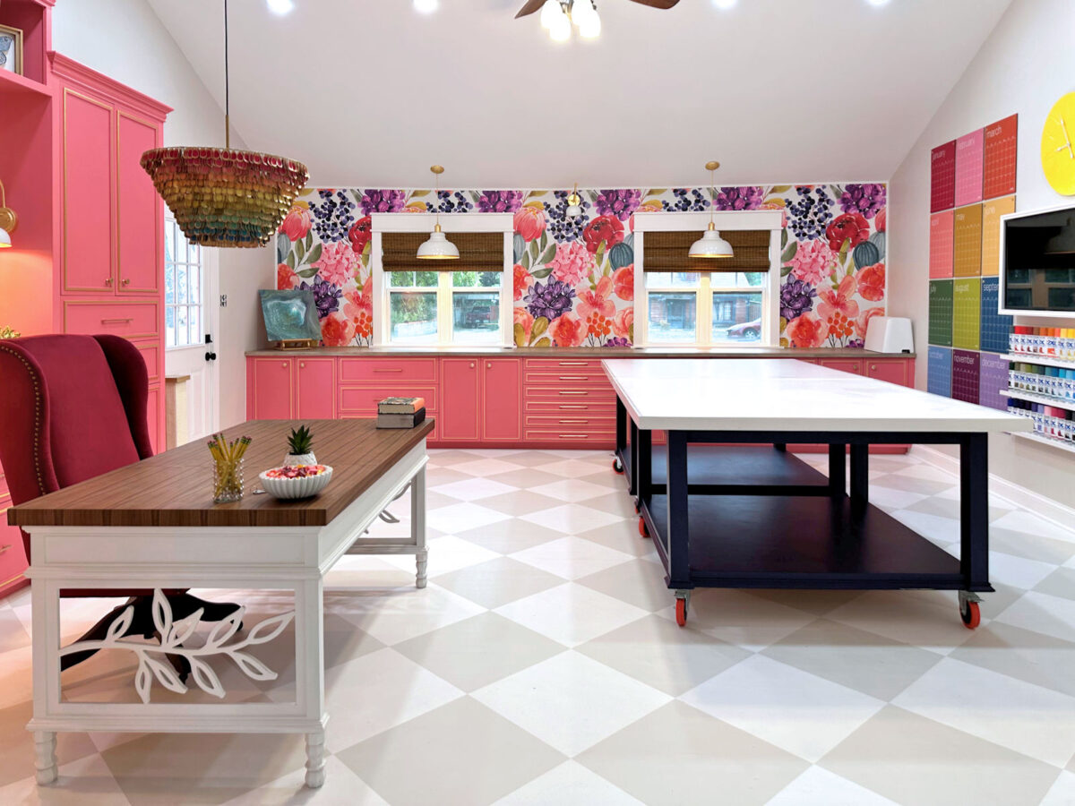
I start every single morning, seven days a week, sitting at my desk in my studio.
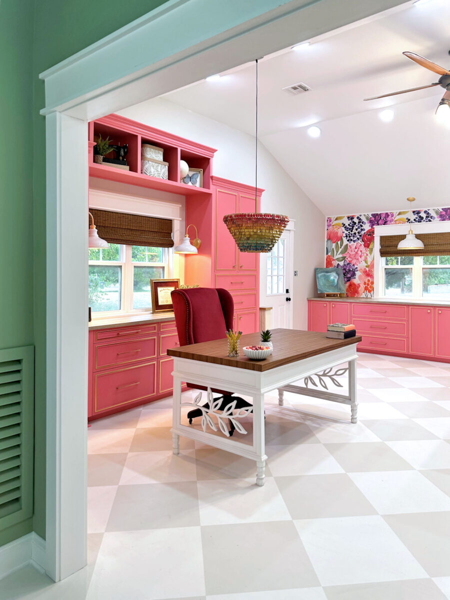
And from that view, I can see into the studio bathroom. And over the last couple of weeks, as I’ve sat at my desk and looked into that bathroom, I’ve considered that input more and more. And I think it’s true. While I don’t want the bathroom to be dizzying, overpowering, or seizure-inducing for guests, I think it can be more “me” than what I had originally planned. And I think I can do something that is more in keeping with the overall look of the studio.
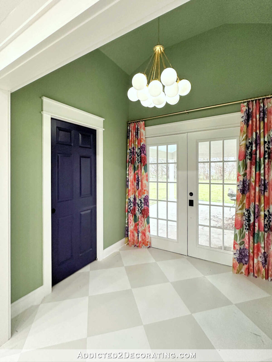
Just as a reminder, the bathroom sits right behind this door in the back entry of the studio. And once the bathroom is finished and looks nice, I’ll probably won’t keep the door closed when the bathroom isn’t in use.
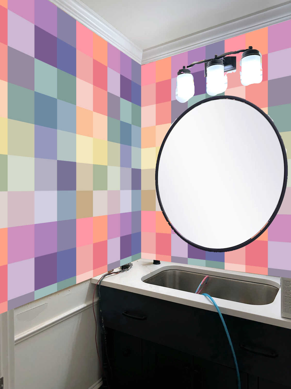
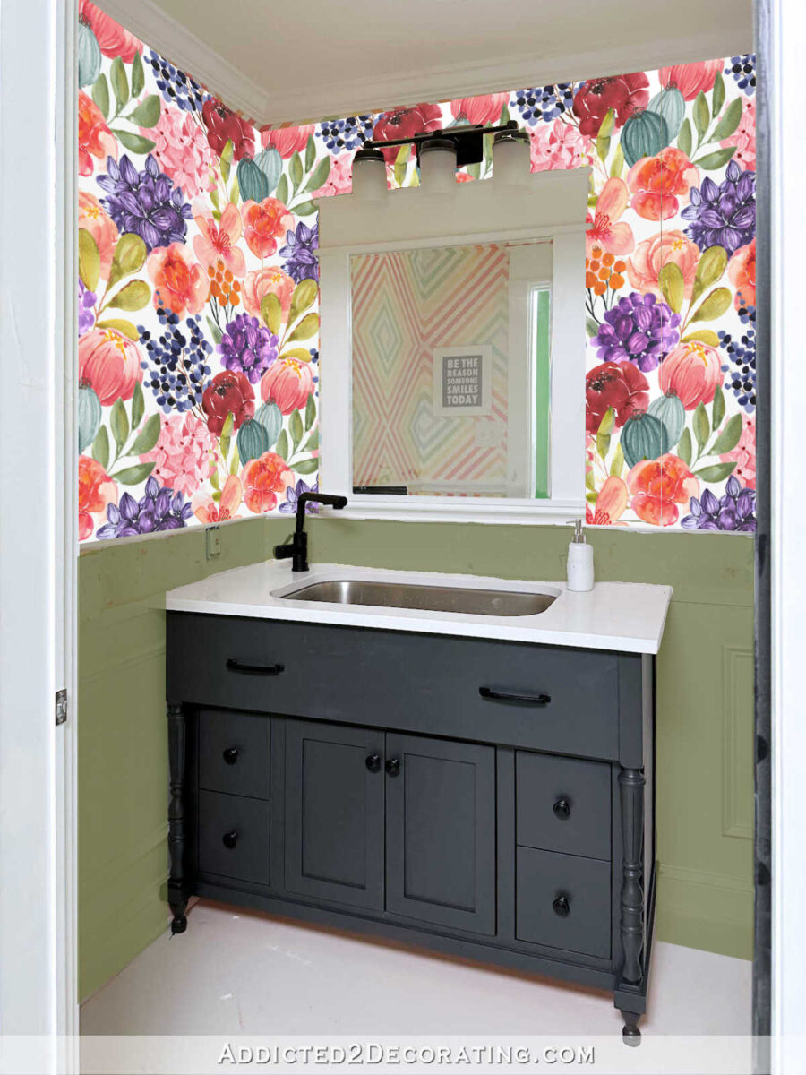
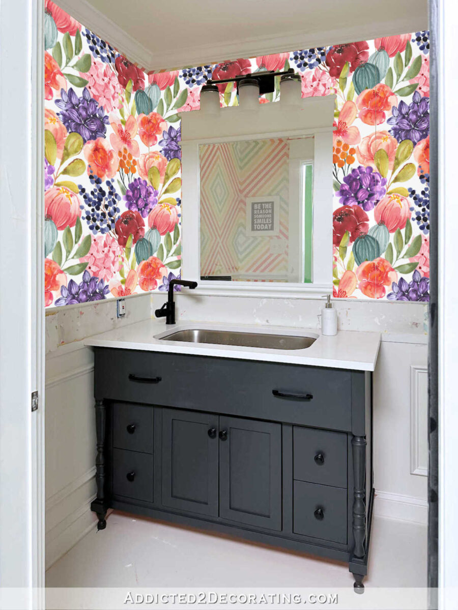
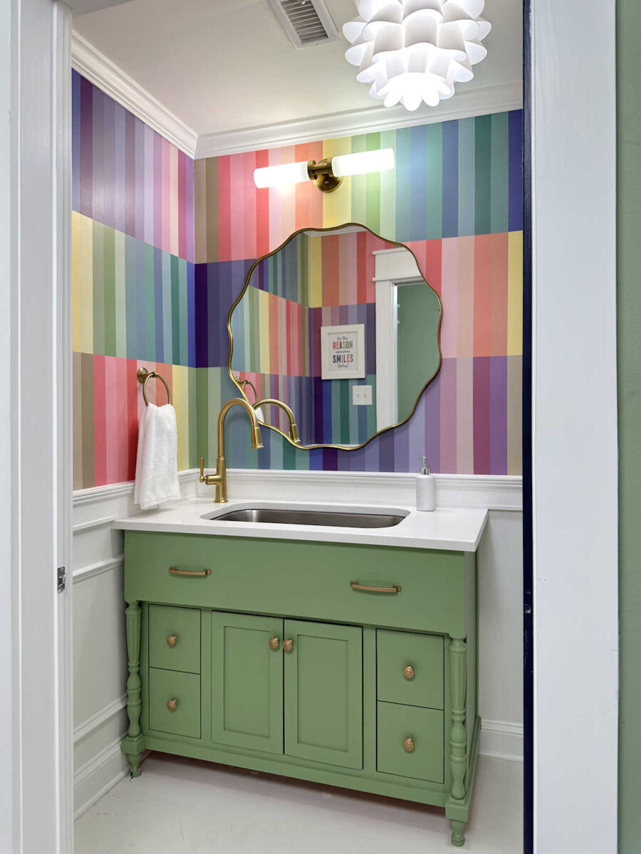
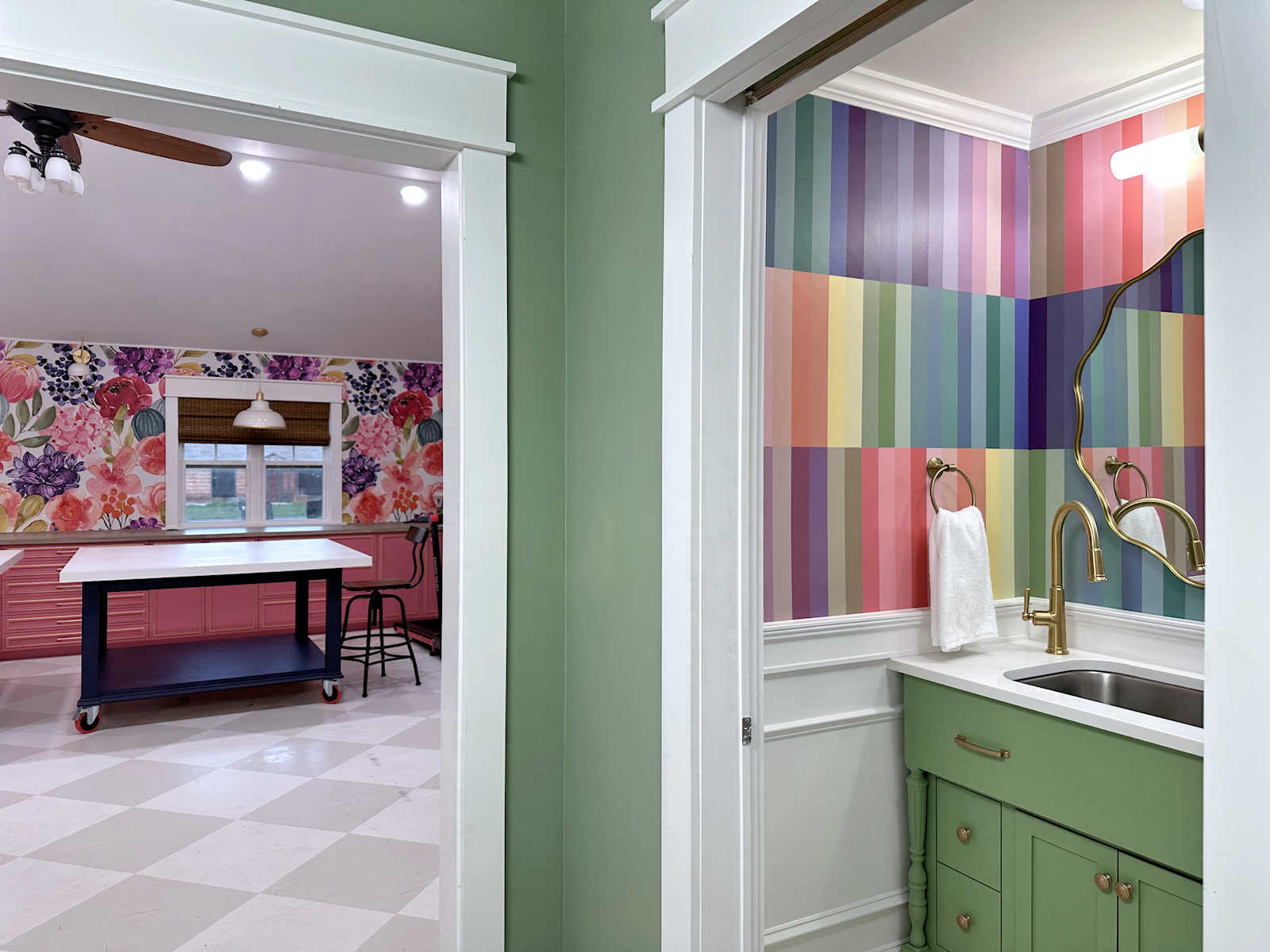
So I have now decided to have my floral wallpaper printed smaller (actual repeated wallpaper instead of the larger mural size that’s on the studio wall) and use that on the upper walls in the bathroom. I still haven’t decided on the wainscoting color. I did two mockups to test out two colors, and then I left one of them white. You’ll have to ignore the reflection in the mirror, but here’s what it might looks like with green wainscoting. I’d use the same green that’s in the back entry of the studio.
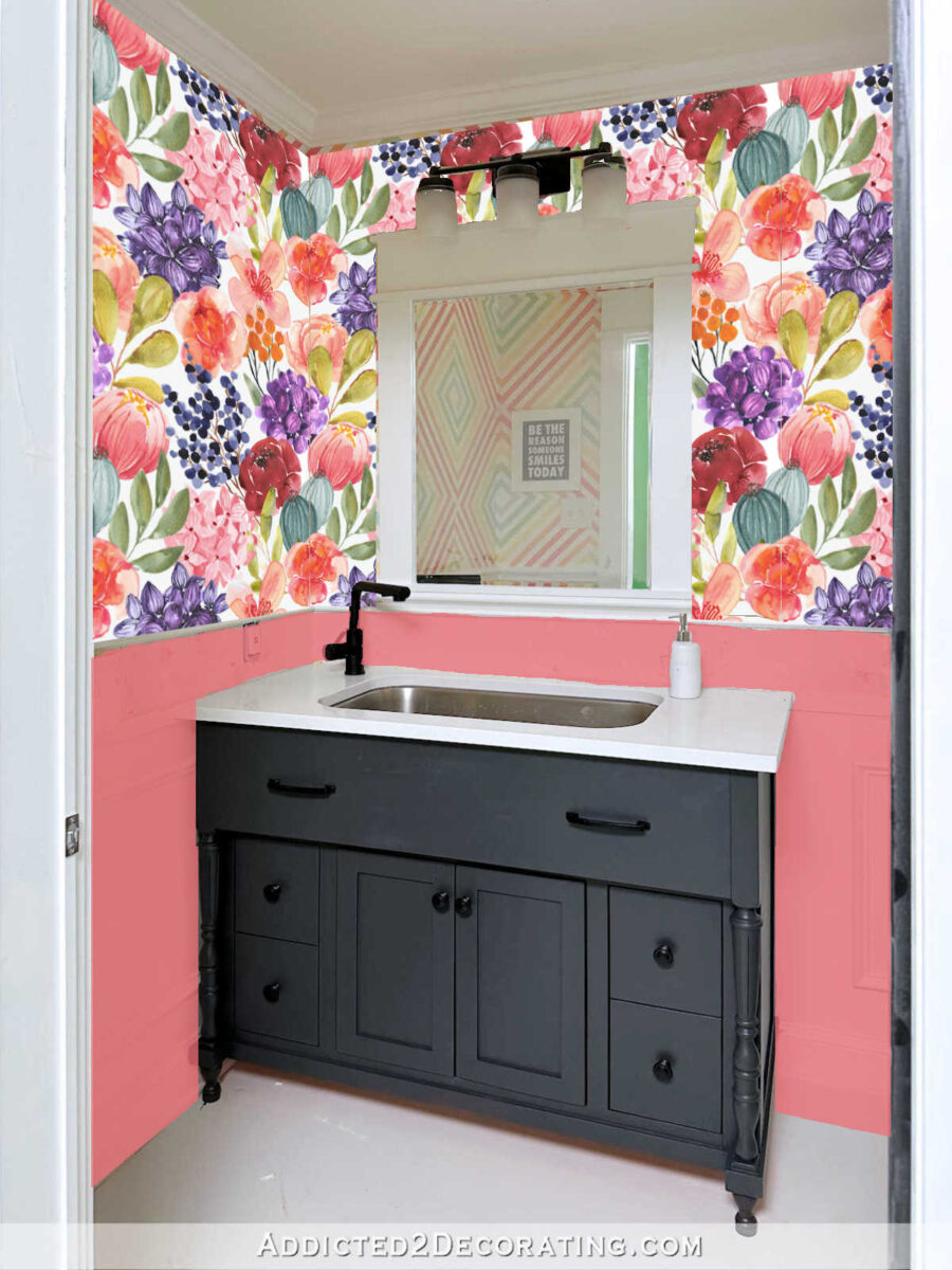
The other obvious option would be to use the same pink that’s on the studio cabinets (Sherwin Williams Tuberose) on the wainscoting. That would really tie the two sides of the room together, but I fear that it may be too much pink since I have a whole lot of pink cabinets in the studio.
And then the third option would be to leave it white.
Right now, I’m really leaning towards the green. I don’t think I need more pink in the studio, and I love that the green would tie in nicely with the back entry walls. So that’s the direction I’m going to head with this bathroom. And I’m actually really glad that some of you pushed back on my plan a couple of weeks ago. After all, this won’t be our guest bathroom forever. At some point, it’ll go back to being just a studio bathroom, and I’ll pretty much be the only person who uses it. So I think it’s okay if it’s a little more “me” than what I had planned a couple of weeks ago.
More About My Studio Bathroom

see all studio
bathroom diy projects
read all studio
bathroom blog posts

Addicted 2 Decorating is where I share my DIY and decorating journey as I remodel and decorate the 1948 fixer upper that my husband, Matt, and I bought in 2013. Matt has M.S. and is unable to do physical work, so I do the majority of the work on the house by myself. You can learn more about me here.
Excellent choice! When I started reading I immediately thought “use the wallpaper”. I also think green is the best choice to balance out the vibrant color and pattern of the wallpaper👍
I think if you left the walls painted as is would be great. However if you just don’t like that look any longer I love the floral. This is temporary for your guests. They don’t live there and if they are your friends they already know your love of bold colors and they still choose to come to your home.
I think the matching wallpaper will look great!
What about one of the darker purple-blue colours from the wallpaper flowers, for the wainscoting? Maybe even the same colour as the purple door? (With the same pink as your cabinets on the vanity? Though having both the same dark colour might be nice too.)
Love the wallpaper top and green bottom. It really ties the space together and is calming. The white paint looks unbalanced with the floral paper and the pink is too much for the small space. You always have the best ideas!
A designer I know once told me that having more than one of an item lessens the perceived value of the items. I think that would apply to using your studio wallpaper in the guest bathroom especially since you have the drapes in that print on your French doors. I think it’s a great floral design in wonderful colors but I would suggest finding a different design in those colors for your guest bathroom and use the green for the cabinet.
I agree with this 100% maybe a small print small floral wallpaper in a coordinating color, repeating the same floral again is too much in my opinion
Please leave wainscoting white. Love the wallpaper, but using pink or green is a bit much. Takes away from the wallpaper. Maybe paint the vanity pink or green. Just my opinion.😊
Your home is lovely!
This is what I wanted to say. white on bottom, wallpaper on top and then darker pink on vanity.
I thought the same, and like green for the vanity
I too like the white wainscoting. I would shrink the design of the wallpaper to as small as you can, making it a more mini print, and paint the vanity green. I don’t think you need the tile backsplash, but if you want it, make it a shell pink, not anything striking.
The green walls will look beautiful with your floral wallpaper!! (I absolutely love the “multi-colored squares” wallpaper, though. If you installed that wallpaper and I were your guest, I would find reasons to go into that bathroom just to look at that wallpaper. lol.)
I love the multi colored squares as well!
I think I’m the only one who likes the original geometric design. I feel like it compliments the floral and the colors without being overly matchy. I’d paint the lower half of the room and the vanity the same color. Again, just my thought..
I vote for green wainscoting. I feel it grounds the wallpaper.
Yes green is perfect!
Love the smaller scale of the floral wallpaper with the green. So pretty.
I really like the green. I also like the repeat use of the wallpaper.I think this will be a lovely powder room.
Sheila F.
How about the gorgeous almost-black purple you used on the door in the entryway to the studio with white trim above and below the wainscoting?
If you use this wallpaper, green wainscotting. But I think your style is too diverse and interesting and you are too creative to repeat the same wallpaper in the bathroom, no matter how much you love it. Find something complimentary but still different. Could you do something like your feature wall in the previous guest bedroom? A hand drawn mural using some of these flowers as outlines and colors and then gold highlights?
I vote the green!
I think the white really allows the wallpaper shine, and would be really fun with colorful accessories. The pink also compliments it, while the green seems to dull it and detract from the lovely wallpaper.
What about keeping the tile border area white (or adding some sparkle like the glass tile border you used in the other bathroom) and then using the green (or whatever color) beneath it?
Hmmm… Wallpaper, drapes and more wallpaper? I think you can do better. Something fantastic will occur to you. Just let it percolate.
I’m with cyd… please don’t use the wallpaper again when you have it on your curtains and in the studio. I love the geometric design and the colors are gorgeous. Keep those colors and maybe try a different design that’s more toned down.
I am a lover of all things pink…was voting for it for your new closet! The green I’m not feeling and white, in my opinion…is too blah. I know you won’t use the pink…but it’s your home….and will look beautiful no matter what you decide.
Hi Kristi: Definitely do what reflects your personality, even if it is a “tone down” version. Just a thought, instead of doing a scaled down in size version of the wallpaper and curtain print, consider designing a complementary wallpaper using the individual flowers in the wallpaper/ drapes just in a much smaller repeated scale – like possibly patterned in a stripe or some type of trellis pattern or a combination of stripes and the scaled down flowers. This way it continues the wallpaper theme but isn’t too matchy matchy. I do like the green on the bottom half of the walls. Just think the exact same patterned wallpaper might take away from focus on the wallpaper. A complementary pattern would add some depth and additional interest. You are doing a great job on your Master bedroom suite. It’s coming together very well and you are making good progress!
Repeating some elements from the studio and entryway is a great idea. Love the green under the wallpaper. Love the wallpaper! What about making the wallpaper pattern even smaller?
What about painting the wainscoting the burgandy color in the wallpaper?
You should try one of the plum/purple colors that is in the wallpaper. I think it would tie in nicely with the studio and the back entry of the studio. I think certain greens and purples/plums are great together. The green feels to matchy matchy to me but I love the wallpaper idea and that does not feel matchy matchy… weird I know 🙂
I love the white, it doesn’t compete with the wallpaper. It’s going to be beautiful!
For sure use the green.
I think I would go either green or white on the wainscotting and white on top, then accent with towels and rugs in the spoonflower floral.
What do you think of the light blue green of those ball shaped flowers in the wallpaper as the bottom paint? I think that would be pretty together.
I agree with this. Since it (obviously) tones with the other green in the wallpaper, I think this softer green – almost a light teal – would blend beautifully with the green foyer.
The light teal is “soft” – where the pink and green seem pretty harsh to me. And I hate the white for the wainscoting – IMO it creates a very unbalanced look as the wallpaper is so powerful.
I vote for using the deep purple/plum from the doors on the wainscoting, and then using the green from the walls on the vanity.
You could also consider using a wallpaper that was like watercolor flowers on the top in coordinating colors that is mostly (or more) white with the same purple/green combo above.
I really like the pink, the green is to subdued. Definitely not white. It is your studio bathroom so I don’t think the cabinets should rule out the pink.
Just what I think.
I think the green would look nice with the wallpaper and not be too overpowering. Can I suggest painting the vanity the same purple color as the door? I think it would tie in nicely and you already know that the two colors work well together because of the entryway.
I’m still not a fan of the green–to me it looks out of place. Everything has clean, happy colors, then the back entry is a drab, yellowy avocado green. It just seems out of place to me. But that’s just me. I like the wallpaper idea, but the green under it still looks drab. How about white on the wainscoting and paint the vanity a dark purple, pulled from the paper? My 2 cents…
This may seem off-the-wall. What if you “framed” (using trim) the colorblock wallpaper on the left-hand wall like it’s artwork and painted the rest of the bathroom the lovely green color with the white wainscoting as it currently is? The vanity would be lovely in that eggplant purple like the door. Then you will have a little bit of “you” in the wallpaper, the calming green ties into the entry, and the white balances out the rest.
I agree with the commenter who said the floral studio wallpaper should be treated as having special value so only use it once.
What about painting the wainscoting the same green as the walls in the back foyer, and repainting the vanity in the pink of the studio cabinets?
If you’re going to get wallpaper made, I would just go with the initial color block you were planning. It will be different but still in the same color world so it will coordinate perfectly. Personally, I would do white wainscoting and pink vanity. No one is going to have a seizure walking into your bathroom because of too much color! 😂
I agree with others who have said the wallpaper may be too much of a good thing. Using it twice with curtain and wallpaper already, I feel like there’s another answer somewhere. Lots of floral already, so something more geometric like a stripe or check would be nice, but think smaller scale than the wallpaper you already designed. Maybe pick 1-3 colors out of the wallpaper to add above the chair rail? Gosh, why are some of these choices so hard!?
I vote for the white or wallpaper on only one wall
Could you use a more white version of your wallpaper with more like….colored outlines of the flowers/shaded petals or something? So it’s not the full color version, but it’s the same colors used less, if that makes sense. I’m thinking about an effect similar to shading with stain.
I guess I agree with others who question using the same print on the main studio wall and the back door drapes, but trying to figure out a way to use it in a different way, and thinking about the commenter that suggested using the same technique from the hand drawn blue/gold wall.
Or does spoonflower do textured wallpaper? A solid color of your floral wallpaper, but textured could tie in nicely. But not be very colorful….and feel kinda 80s?
As one of those people who really does get dizzy with certain “busy” patterns, I thank you for thinking about us. I think the floral wallpaper with the green works nicely, and wouldn’t bother anyone’s equilibrium.
I think any guests will expect the guest bathroom to echo your personality. I would be so disappointed if I visited and your bathroom didn’t live up to expectations.
I think the block print would be a great choice. A peek of it since the door will be open, would be a fun surprise. The smaller scale of the studio print would not be interesting to me. Sensory overload. You have tons of it showing already. (Mainly, as I understand it, this may not be a bathroom for guests down the line.)
Your guests will like anything you choose. Not their house in the first place. People don’t analyze like you do. Or like the rest of us. Put up whatever pattern you choose, then choose the wainscoting and cabinet. You will get exactly the look you want. I can’t see white since you usually rule it out.
I agree that the wallpaper would be too much. One of my favorite things you’ve done was the guest room walls. What about doing a darker moody wall color with the outline of the wallpaper florals in a bright metallic color?
I like it with the green too, but from a guest perspective I would prefer the flowers to be one size down to better suit the scale of the room. Overly large prints in a small enclosed space tend to make me feel like I’m about to be eaten (by carnivorous flowers, LOL)
The green is ok, but I think the cabinet needs to be some color besides black. That black is so harsh. Maybe green cabinet with purple wainscotting. That is probably too much color to. Just get rid of the black.
Could you do an orange-ier coral instead of the pink matching the cabinetry? I do think the pink would be too much but the green feels boring to me. Especially with so much of it right outside the room.