Walk-In Closet Paint Color Options (Testing Six Different Blue Paint Colors)
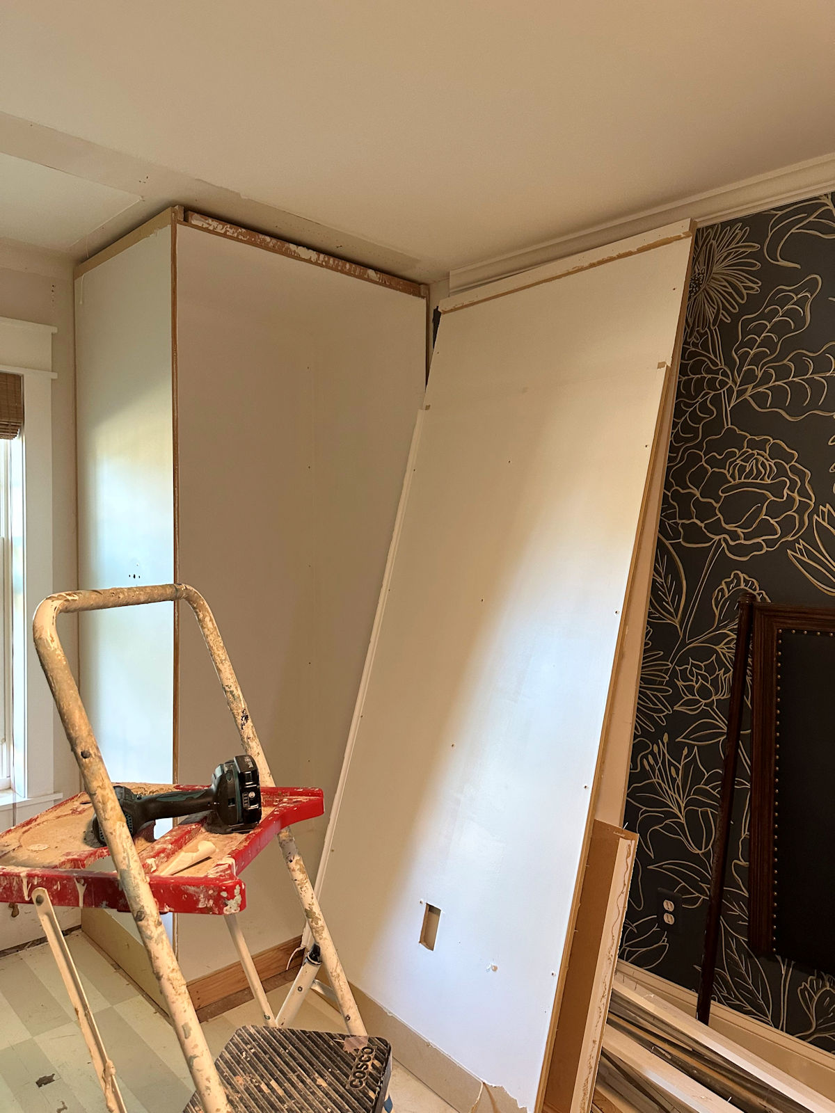
I didn’t get nearly as far on my closet project this past weekend as I had hoped. The weather turned rainy and cold, and I didn’t want to stand out in the cold while cutting molding. But I did get a lot of priming done, and I also selected six different blue paint colors to test out for the cabinets. Before this project even got started, I had my heart set on a pink closet, but the more I looked at walk-in closet paint color ideas, the more excited I got about the idea of a light blue (or light blue-green) closet.
Five of these paint colors are new. I haven’t tested them out before. The reason I went with new colors is because the previous colors I tested just didn’t look right to me. I had previously tested out Behr Clear Vista and Behr Tahoe Blue (which you can see here), but when I looked at those again against the wallpaper in natural light, they didn’t seem to work at all. I had also previously tested out three Sherwin Williams colors — Annabelle, Matt on Monday, and Soft Shore (which you can see here). But I chose those when I was planning to use tile on the walls around the washer and dryer area. And now that I’m not planning on using that tile, those colors didn’t really seem to work, either.
So back to the drawing board I went. I selected five new colors and tested those out on the actual cabinet.
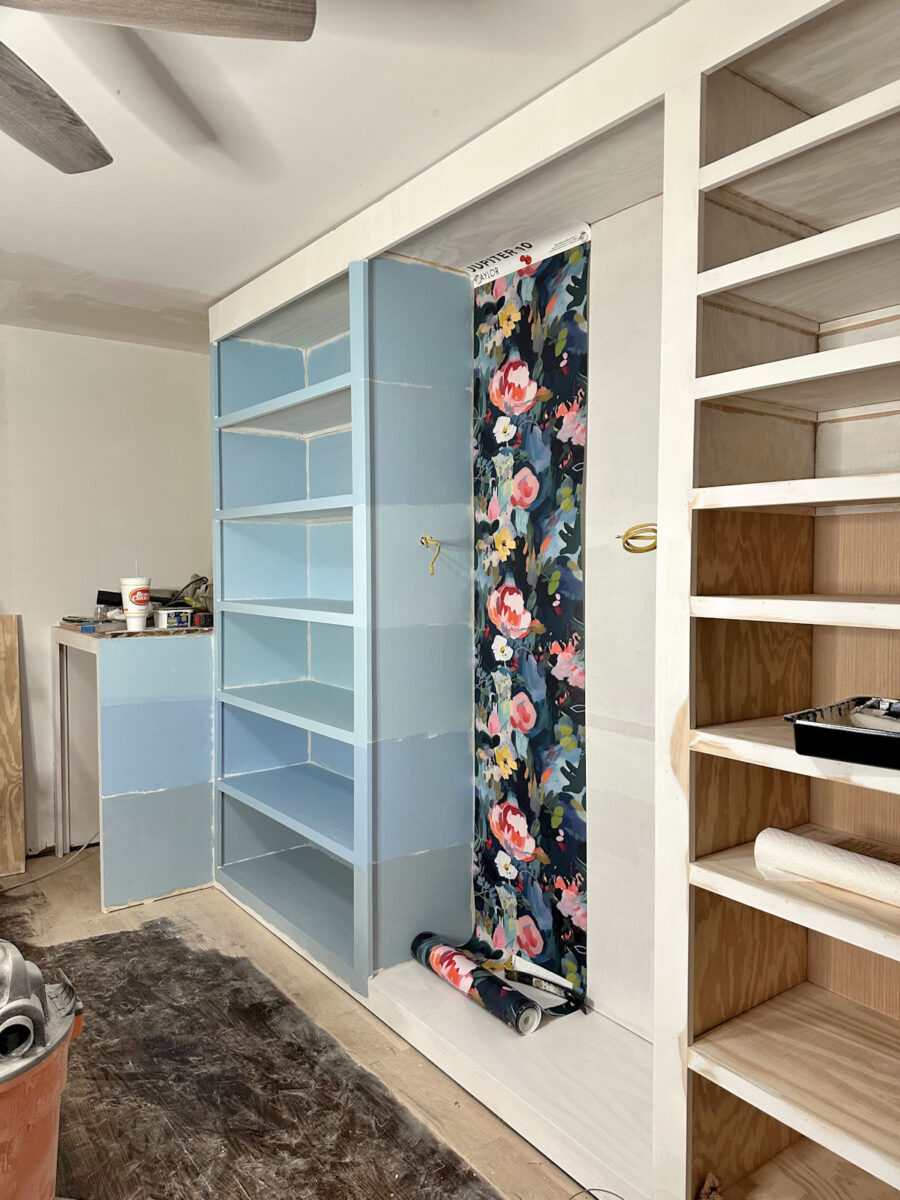
From top to bottom, these are: (1) Behr Drip, (2) PPG Paints Sonata, (3) Behr Air Blue, (4) PPG Paints Midsummer’s Dream, (5) PPG Paints Blue Bows, and (6) Sherwin Williams Matt on Monday. I went ahead and tested out the Matt on Monday again, even though I was pretty sure it wouldn’t work, just because I love the name and hoped that it might possibly work.
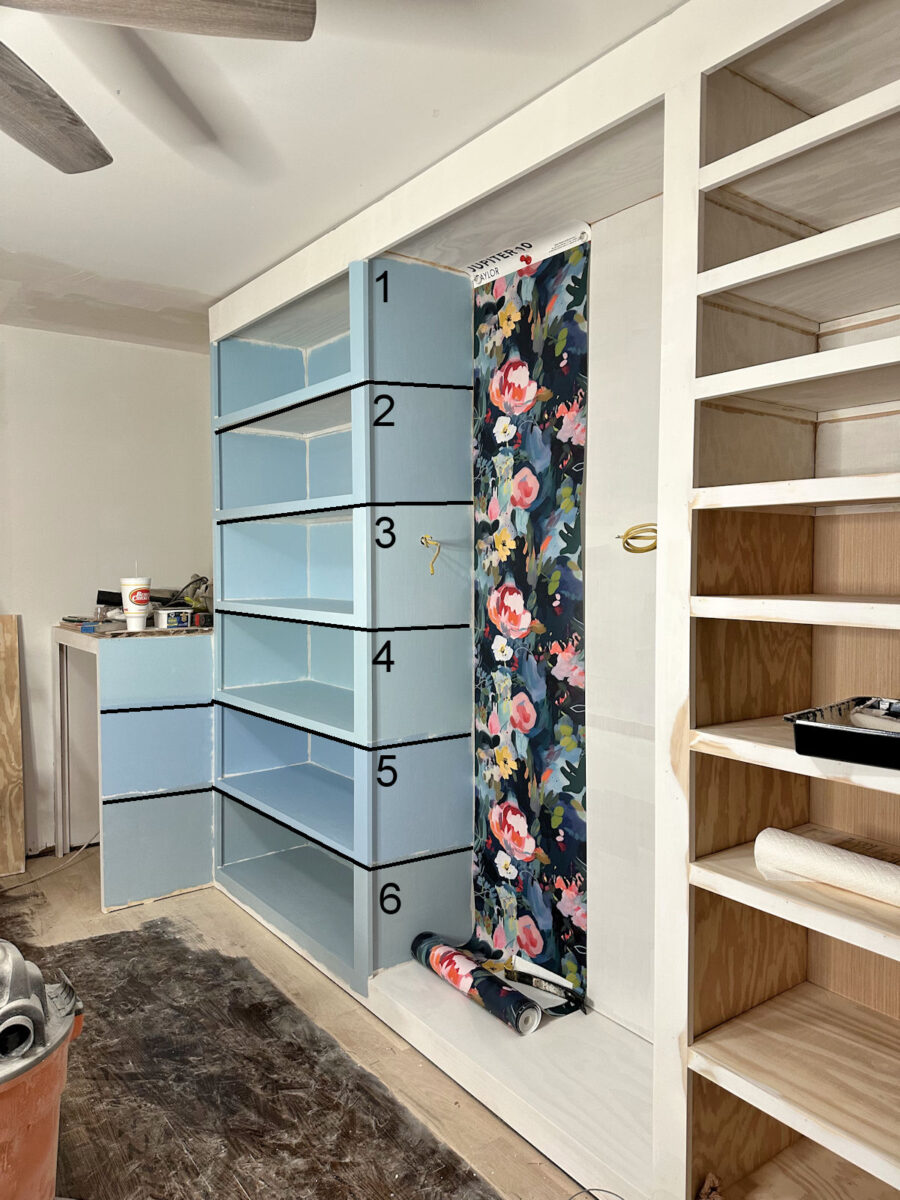
Since I’m no longer trying to make that blue tile work in the room, I decided to stick with colors that weren’t quite so gray and leaned more towards a clearer blue-green.
Picking out a blue paint color can be tricky because the last thing I want is for my closet to read “baby boy’s room”. And some of those blues in the wallpaper, if used on all of the cabinets, could very easily look like a room intended for a child.
I also have to consider that I’m trying to bridge the dark blue wallpaper and appliances in the closet with the dark teal grasscloth wallpaper that will be predominant in the foyer just outside of the closet, as well as our bedroom. All of these areas will be clearly visible at the same time, so while they don’t need to match, they do need to coordinate and play nicely with each other. So I unrolled the grasscloth wallpaper and draped it on the other cabinet to see how all of these colors work together.
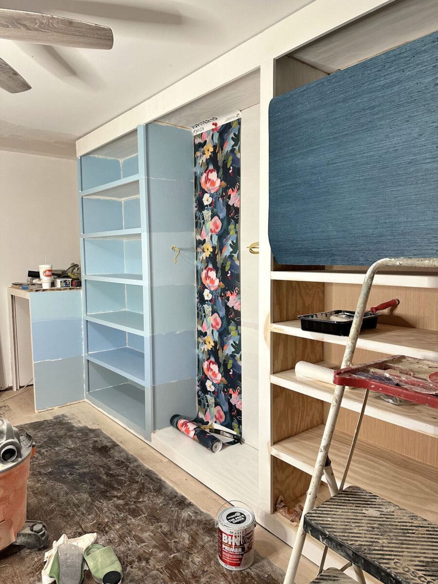
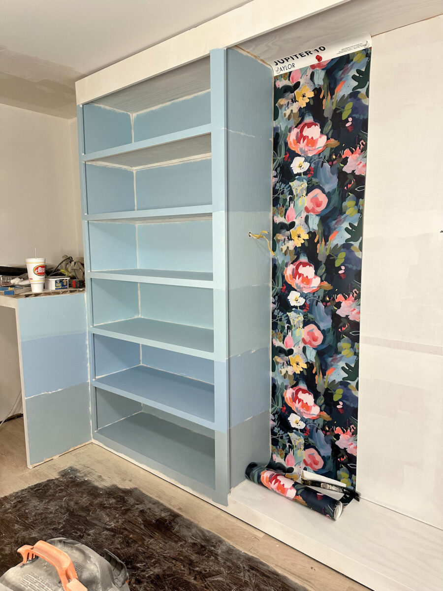
I took most of these pictures last night after it was dark outside, so there’s no natural light coming in through the window. And since I still only have the single light on the ceiling fan in this room, I brought in extra light. The room will have more light when it’s finished. I’ll be adding at least five recessed lights in the room, as well as swapping out the ceiling fan for a chandelier and adding two sconces to the wallpapered section.
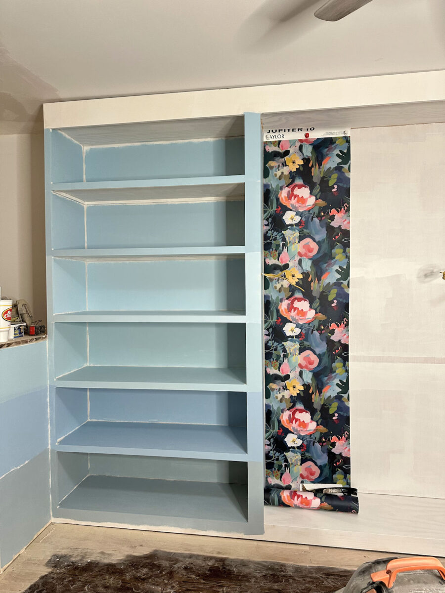
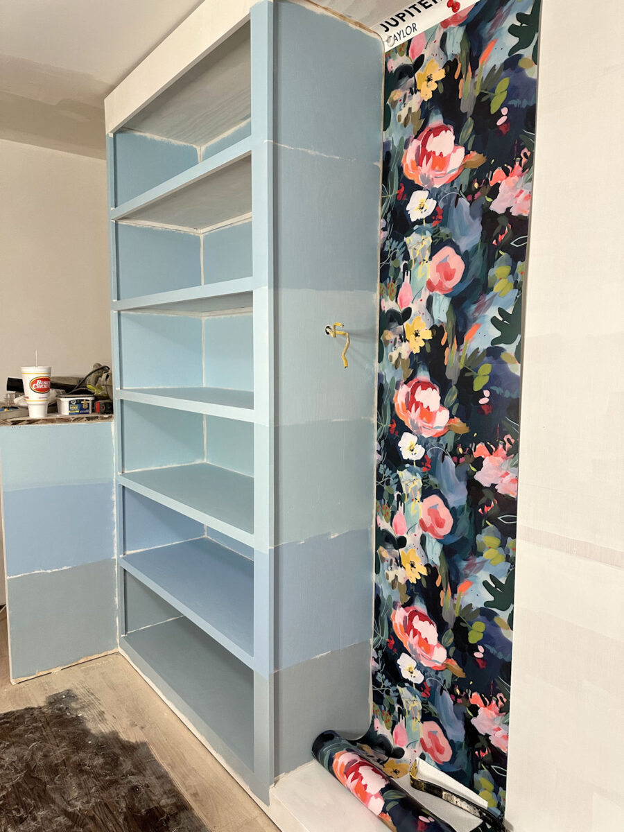
I took this photo this morning after the sun came up, so this is a truer representation of these colors with both natural light coming through the window as well as the additional light inside the room.
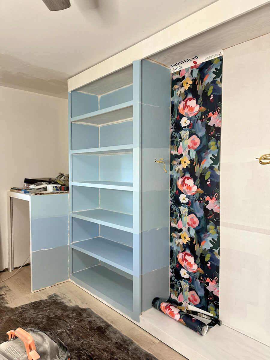
Sadly, I immediately ruled out Matt on Monday, the color on the very bottom. It’s way too gray for the wallpaper. And I ruled out Blue Bows, the color just above it, because it reads to purple. I also immediately ruled out the first color, Drip, because I think it’s just too much color. I think I also have to rule out the forth one, Midsummer’s Dream, because it seems too green for the wallpaper. So that leaves these two colors — PPG Paints Sonata on top and Behr Air Blue on bottom.

Of those two, I really like Air Blue, the lighter of the two. It seems to go with the wallpaper better, and I do like that it’s lighter. I think the lighter color will let the wallpaper be the star rather than trying to compete with the wallpaper for attention.
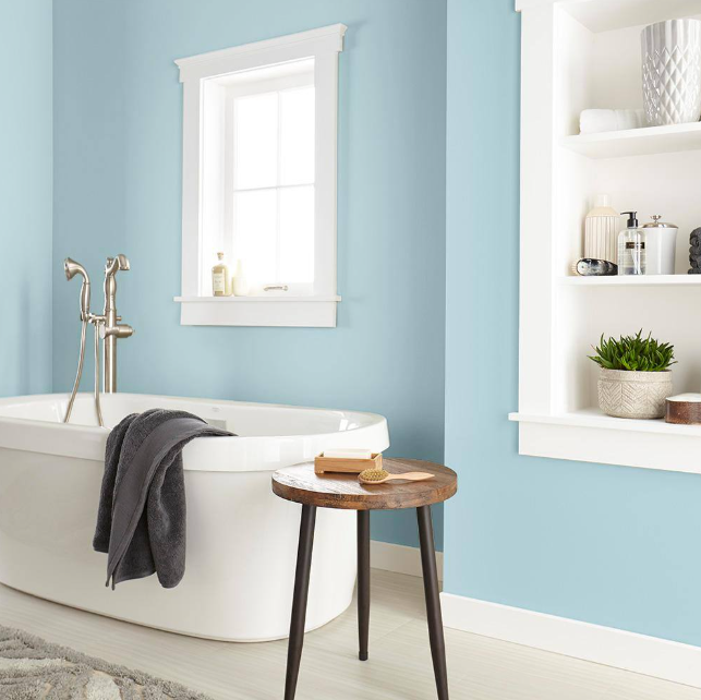
Here’s a picture of Behr Air Blue from the Home Depot website:
And here’s a picture of PPG Paints Sonata from the PPG Paints website:
Based on those marketing images, I definitely like the Behr Air Blue better. The PPG Sonata is really teetering on the edge of that kid’s room blue, in my opinion. And the Air Blue seems to have more green in it, which I find preferable, especially considering that this color need to coordinate with my teal grasscloth wallpaper.
So that’s the direction I’m leaning right now. Behr Air Blue seems to be my pick. But I’m going to continue priming the rest of the cabinets today, and I’ll keep an eye on these colors to see what they look like at different times throughout the day with the wallpaper. But as of this moment, my money’s on Behr Air Blue. Do you agree? Which one would you choose?
The A2D Daily:

Addicted 2 Decorating is where I share my DIY and decorating journey as I remodel and decorate the 1948 fixer upper that my husband, Matt, and I bought in 2013. Matt has M.S. and is unable to do physical work, so I do the majority of the work on the house by myself. You can learn more about me here.
air blue is the bet choice for sure, Kristie!
Color me wrong, but I really like #6, the gray is moody enough to go with the darker wallpaper. The lighter colors just don’t do it justice…my humble opinion!
I agree. Go with #6. Once all the cabinets are painted, any of the other colors are going to read baby boy blue only because there’s a lot of them. #6 will be more of an adult color, but goes wonderfully with the wall paper and the grass cloth.
It’s what I’d pick as well. A dirtied-up color is always going to lose votes side by side with a clear bright color, but they usually end up looking the best as paint colors for home walls.
My vote’s for #6 as well … I really don’t care for any of the lighter blue options en masse. Obviously just my two cents and not even worth that much cause it’s not my closet. 🤷♀️
Air Blue….full speed ahead.
I liked #5 the best which you have ruled out as too purple. The depth of color is what drew me to that.
However! My 2nd choice was #2 which is still in contention! I like the purity of the color with a deeper tone than #3 which strikes me as awfully twee and baby blue toned.
I agree. #5 was my favorite as well.
Kristi, I love reading your thought process on choosing and selecting items for your home. Always so insightful. Thanks for sharing. Love your journey.
I was wondering how close air blue is to the background in the mural in your bathroom. I kind of like the idea that it would tie in with your suite of rooms. It’s the first one that drew me too and pulled those colors from the wallpaper.
I loved the air blue even before you ruled out the other colors! We can always rename it Matt’s Air Blue 😉
LOL, my favorite immediately was #4 and #3 looked “baby boy” to me. 🙂 You pick what you like though. You’re the only one truly seeing the colors in your space. You’ve made so much progress!
I agree with #4. That color looks great with both the floral wallpaper and the teal rice paper. #3 just screams baby boy blue to me and I’ve made that mistake before. Just like you, I stopped painting after the first wall and had to go back to the drawing board. Whatever you decide, I’m sure it will be beautiful.
I agree, #4 looks the best to me. It compliments the wallpaper best, (in my opinion) as the wallpaper also has dark green in it, and it is more teal-ish than the others which voice baby boy to me. 🥰 I agree that the last one has too much grey, for my taste.
Behr Air Blue
Air blue was my choice at first look.
I choose #6-Matt on Monday for the neutral tone. You have blue walls in your master bath and blue wallpaper planned for master bedroom. The hanging clothes, shoe display and gorgeous wallpaper will need a little rest for the eyes.
Agree
Air blue was my first choice, followed by Midsummer.
No comment on the blue but I found a similar trimmed out but non-curved image of your walk in closet that you plan on building.
https://www.thenordroom.com/wp-content/uploads/2025/04/antique-art.jpg
I immediately liked #1 the best. #2 is a close second choice, slightly grayer than #1. #6 looks gray #5 has lavender in it #4 is too green #3 is a bit turquoise and brighter than I’d like. Of course these are just my opinions and it is hard to tell the true colors from photos. Picking out paint colors is so hard!!!
Air Blue is the winner! I chose it as soon as I read “choose paint color”, then I went back & finished reading the update. Seeing the Air Blue in natural light sealed the deal with me!
This was my reaction too. Air Blue was the obvious favorite for me.
My preference is for the Air Blue, not just because I think it coordinates better with the wallpaper but because once you get that much blue in the room it is going to seem much more intense in colour because of its prevalence and the fact it will reflect off itself. So, the lighter the better IMO.
^^ That said, the colour right below it would be my second choice for coordinating with the wallpaper. I like the slightly green undertone, it’s a more “mature” colour, but I think it might create an unflattering overall light in the room given that you are using it to dress.
I still think your original idea of pink or coral would work … and perhaps create a more flattering overall light in the room.
Kristi, you didn’t want to be outside cutting wood. What is your back shop building for? Is it just empty or do you have tools in it? I thought it was to be a shop for that kind of thing, freeing your carport for your car.
It will eventually be set up as my shop where I can use my tools. But for now, it doesn’t even have electricity. One thing at a time, and right now, our priority is to get into our new bedroom suite. I haven’t decided what I’ll work on after the bedroom suite is finished, but I’m leaning towards getting my shop set up.
As soon as I saw the first picture of them all, Behr Air Blue was my choice. I think it’s perfect.
Air blue, for sure.
Team #2
I vote 1 or 5.
That was my pick! I think it will be beautiful but not too much. I had a similar blue in my bathroom and it was soothing and lovely!
Without finishing reading the post or other answers, my first reaction was 3rd from the bottom or aka #4
Not that it’s the only choice of course, just my first gut reaction 😊
My first choice was Air Blue also – for all the reasons you mentioned.
Without finishing reading the post or other answers, my first gut reaction was 3rd from the bottom or aka #4
Being a bit red-green colorblind, I’m thrilled that my wacky color perception actually agrees with your assesments and I can actually SEE the colors you’re writing about! That said, I did like #6 for the gray and of the two you landed on, the lighter Behr Air Blue would be my choice. I also liked the one with some green undertones, just to give a break from the blues…Full Speed Ahead!
I know I sound like a broken record based on your last two posts about the floors, but your blue cabinets are going to make your floors read more orange. I know the order doesn’t work to refinish your floors first, but I think you are making choices here without the full picture of the room. I really think you should be determining your floor finish options ASAP. Otherwise, I predict you will repaint all of the cabinets again in the future, or will try endless washes or stain combinations to get the floors you want. Do you have a mood board with all the colors, finishes, and wallpaper you can look at and assess in the room under various lighting conditions?
I made my flooring decision and ordered all of the products. They’ll all be here by Friday. I’m sure the floors will end up being a bit red/orange, but that’s not really possible to avoid with red oak. But I spent about three hours on TikTok watching videos of floors being done with Bona products, and without exception, there was one color that I liked. Even if it ends up with orange undertones, it will be perfect for my orange and teal bedroom.
My first choice right away before I even read the blog post is #3 and then #2 and then #4. After reading the post and looking at the colors again, #2 is still my first choice but I keep going back to #4 because it has more green in it and feels more mature.
I loved Blue Bows #5.
I immediately leant towards Air Blue as well.
For me it’s Sonata. I fi d air blue too babysh.
Of course, I might be very well wrong, who knows how my phone alters the real tone. And it’s your dream dressing.
My first choice was air blue
My first thought when I saw Matt on Monday painted on the shelving was, “that is NOT a Kristi color” BUT that IS a Ruth color. So I went to look it up and it’s not an S-W color, it’s Valspar (though S-W does have one that looks almost exactly like it called Languid Blue – I’ve ordered a color chip).
My other thought is that it’s a shame that you’re not getting the pink you were hoping to go with. I still feel like there must be a “pink” out there that’s right (maybe one of the coral or salmon colors from the wallpaper). I know you’ve tried some, but have you tried ALL of them 😀 Not that I dislike blue – not a fan of baby blue, though.
I was down to Air blue or Sonata also. I am just so anxious to see it all completed. I know it will be gorgeous
#2 for me. I think you really need chartreuse or a blue with more green to flow better with the wall grass wall paper.
Haha, I hate airblue! It was immediately my least favorite and stayed that way through all the photos, then I got to your opinion! Too clear, too baby, too 1950s grandma color. 3&4 don’t work well IMHO with the paper. I like any of the rest of them. There are multiple good choices here – sadly we are not on the same page about which ones those are.
Just wondering – is there a dominant color or colors in your clothes (for example do you have a lot of pink, or pink and orange) or do you have a little bit of everything?
I really have a bit of everything.
Yep! 3-Air Blue all the way. Makes the wallpaper sing.
Before seeing the colors near the grass cloth, 3, 4, 5 were my top picks.
After you added the grass cloth and the lighting, 3 and 4, because 5 went purple. I can clearly see 2 in the grass cloth, but it is very muddy next to the floral wallpaper. I like 3 showing in the grass cloth and floral wall paper.
With my aging eyes, I appreciate contrasts more now and needing that bit of lightness to show closet items clearly at all times of day in all seasons.
I don’t remember you mentioning every cubby having light inside. And things do darken in the winter, windows or not.
When I first saw the lineup of the paint choices, my eye immediately went to the middle color. It was not too dark, not too light, it was juuuusssstt right. So glad you’re making progress on the closet, and I, along with many others, are eager to see it done!
Love the Air Blue! The lightness of the color will brighten your closet even with all the new lighting. It seems to be more of a neutral which works great.
100% I see every color the same as you do and reached the same conclusion. For #4, another note is I see too much grey in it, when you said you were looking for something clear.
One thing you might want to consider is how does your skin tone look with so much of that color. When you are getting dressed and looking in the mirror, will all of that blue reflect in a good way or will it cause shadows. Even with lots of light the reflection of color can have an impact.
#3
What about the explosion of color once the closet is filled with your very colorful clothing, shoes, purses?
That’s actually one reason I think the lightest blue is the best option. I think the lighter blue will read more neutral, and will be a nice backdrop to all of the color that will be added with those things.
At first glance, #3 was my immediate choice. Then, looking further, #5 looked great with the wallpaper. Until I got to the picture with the grass cloth, and I was back to #3. But, I am glad I don’t have to make the final choice!
I know whichever one you choose, it will be beautiful when all pulled together.
I 100% am in agreement on Air Blue. It was my immediate first choice.
When I first looked at the choices ( where you’d numbered them ) My immediate choice was Air Blue! Then I waffled between that and the 1st color at the top, but only briefly before saying nope! My thought is that I would like to have a very light color, so even though you will have ample light, it would be nice to have it be as bright as possible. (Now I wouldn’t give up on pinks, if you went with a whisper of pink! Or lavender???) Just kidding! And I hope I didn’t offend you with my comment on FB yesterday.
My vote is number 1, it goes well with both papers.
I liked both of these, as well as #6. My final vote is for Sonata. IMO, it works better with the grasscloth. But I know there’s very little difference in the shades and either of them will be splendid. Can’t wait to see more progress.
Air Blue was my pick as well, it’s light and airy. Not one of your choices but I also think Behr’s Basin Blue which has a touch more green would be nice as well. It’s hard to say since we don’t have the wallpaper, grasscloth and appliances in front of us as you do.
Everything you do Kristi always works out amazingly & while we see the colours through our screens, you see the colours in real light.
My first choice initially was #3, but the more I looked at the colours, my choice definitely changed to #6.
The more I looked the more confused I became. Question: what time of day are you going to be in your closet? What difference does it make in paint colors in different times/lights? Go in throw on some clothes, throw in a load of laundry and back out to go to work, right? Maybe you are overthinking the color. It doesn’t seem that any of those blues go with the blue in the wallpaper. Have you taken your scrap piece of wallpaper to each of the paint places and actually matched the blue. Or could they mix it to match? Just asking. You will get it right and if you don’t, you will redo it!
I like #3 at first sight. So light and gentle. It does remind me of your master bath, though. Have you tried that blue out in the closet?
I can’t believe how fast this huge project is moving along!!!
Just to throw one more color into the mix – take a look at Benjamin Moore Quiet Moments. It is the perfect blue/green/gray. I just had my primary bedroom and bathroom painted this color and everyone that sees it loves it.
And I paired it with teal towels and bedding and it looks beautiful.
All those pale blues do rather look like a child’s bedroom colour, and l would definitely go with…… Yellow!
A tonal colour picked out to go with the small yellow flowers in the wallpaper, would make the room always look like it was full of sunshine.
Ultimately, whatever you choose will be your choice, and that’s exactly how it should be.
I think this is a great idea, if her tones work with yellow 😉
I can’t figure out why you are looking at these “baby blue” colors. Go bright! That’s you.