Six Monogram Options For My Dining Chairs
Happy Monday, all! It was a busy weekend, so I didn’t really get much of anything done on the house. There were more important things to do, like celebrate my amazing grandmother’s 104th birthday!
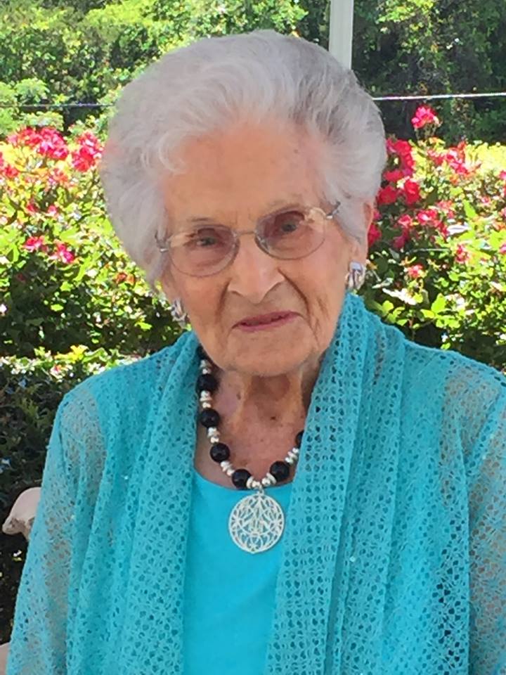
She’s an incredible woman, and I wish each of you could meet her in person. I wrote a post about her when she turned 99. She’s been through so much in her life, and wasn’t expected to live past her early 60’s when she suffered 3rd degree burns over 54% of her body in a house fire, but she beat the odds. You can read my post about her here.
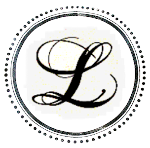
Anyway, with that and some other things going on, I didn’t give the house much thought other than looking at monogram ideas for my dining chairs, and coming up with a few that I liked for my chairs. I think at this point, I’ve seen every single monogrammed chair that exists on the whole of the internet. 😀 And in all of that, I decided that I like the simple designs the best. This is one of my favorites, but it could just be the combo of colors and patterns that caught my attention. And the white monogram on the coral color is pretty close to what mine will look like.
 Lily Pulitzer via Lonny
So after playing around with some different ideas, and combining different monogram design elements that I found online, here are the six that I came up with as possibilities:
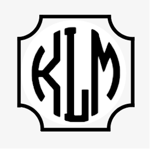
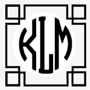
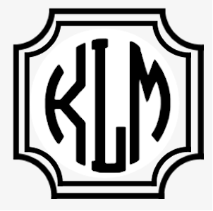
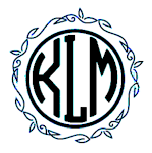
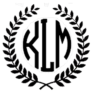
As you can see, all but one use the same monogram style. My two favorites are the bottom two, but I hesitate to use anything with leaves/vines/flowers because I just think I already have enough of that with my entryway wall mural and the floral fabric I’ll be using on the backs of the host dining chairs. But I could be making more of an issue of it than it really is. Of the other four, I’m really not sure which one is my favorite. I think the Greek key might be my least favorite. It looks a little busy to me.
So I don’t know for sure which one I’ll end up with yet, but I’m about 99% sure it’ll be one of these.

Addicted 2 Decorating is where I share my DIY and decorating journey as I remodel and decorate the 1948 fixer upper that my husband, Matt, and I bought in 2013. Matt has M.S. and is unable to do physical work, so I do the majority of the work on the house by myself. You can learn more about me here.
I love these- except the Greek key motif, and the swirly L. (I agree about the busy-ness of the Greek key, and I think the swirly L is not crisp enough.) Looking forward to your ‘voila!’ I think my fave is the very last one.
Happy Birthday to Granny! My Granny was 103 when we lost her. Still sharp as a tack! Anyway go with the monogram that you love! The leaves won’t matter. You are getting so close to another finished room! So excited for you.
I like the idea of a simple design instead of a monogram. I am always thinking of resale when I get tired of something though. Actually just not a monogram person but I really like 3 and 5 would be my second choice.
I like the single letter, the others at a glance seem to spell KIM.
Happy birthday to your grandmother!
Your granddmother looks amazing! Happy birthday to her.
As for the monogram, my favorite is the one with the double border (middle row, 1st column). whatever you choose will look great.
This was my favorite as well: double border. Clean, clean lines. Beautiful.
Happy birthday to your grandmother!
Happy 104 to your grandmother! I can’t imagine living that long. I know she has seen a lot in this ever-changing world – it’s mind boggling!
Not that you asked for opinions, but I lean towards the top left. Simple and understated. But that’s how I am, not necessarily you. Good luck deciding! Glad you had some time away from DOING, I’m sure it did you good! Happy Monday!
My favs are top left and bottom right. Go with the leaves if you like. It will give some continuity of design to the floral patterns you have going on.
Your Grandmother looks great for 104! I hope she has many more happy, healthy years to come. The Lily Pulitzer room is inspirational. So much going on but it all works. The monograms all look great for different reasons. Don’t over think it. Print them all off. Tape them to the backs of the chairs. Whichever one catches your eye first, go with that one. You can’t go wrong. Your taste is impeccable.
I agree with Brad’s method. And I think your grandmother is beautiful! Hard to believe she’s on the other side of 100.
I like 1, 3, and 5. 1 and 3 are elegant and simple. 5 I think ties in with the mural wall.. I know you said you do not want to much vines or branches, However I think it is just subtle enough to tie it in in a nice way. That is just my opinion. 6 seems to be more greek looking to me so I don’t think that is to much with the mural either, to be completely honest.
I can not wait to see what you pick! And I am even more excited to see the finished room! I absolutely love your page. It is the only one I follow where I have the post show up on the top of my feed!
I agree that 5 will tie in with the mural. It is simple enough to mirror it without competing for attention.
The other choice would be to use just the monogram without a frame.
I vote the first one (top row, left). Simple but beautiful. Gets the point across but the simplicity won’t compete with the various colors/patterns of the fabrics.
Happy Birthday to Grandmother! She looks amazing. Many happy returns!
I like the one with the vines (the 5th one) but maybe without the circle? Not sure how that would look. It seems so heavy and the vines are dainty. The letters being heavy (thicker) and the vines dainty is fine but the circle takes away from a bit of the design, I think.
I keep seeing Kim…lol…maybe the L needs to be bigger? Or I like just the L by itself too.
Congrats to Gran! That’s amazing! Hope I make it that long! What does she say is her secret?
Happy Birthday to your Grandmother! What a blessing it is to have someone you love so much live out a long life! I would not think she was 105, looking at that picture of her, she looks more like a woman in her 80’s. I like #3 on the monogram choices. Have a great day!
Happy birthday to your Grandmother. You are very blessed as I / mine lived to be 103 . The wisdom of her long life was wonderful & the special moments we shared will always be a treasure to me.
I love all the monograms but I have a question. how do you decide the monogram to put on the chairs ? I’m married & not sure if I should include my husbands?
The KLM is Kristi and Matt Lineaur (not sure if I spelled the last right or not).
I think the standard is (wife’s first name’s initial) (last name) (husband’s first name’s initial). Of course, I’m not sure if she decides to keep her own last name, if it’s a wife-wife or husband-husband pairing, if there’s more than one wife or husband, or if they just plain want to include middle names, lol. I always thought it was something you decided yourself, as opposed to there actually being rules for it! :’D
I like the last one on the right. Though I tend not to like the borders…just the letters
Happy Birthday to your grandmother!
Congratulations to your grandmother, easy to see where you get it from. Can you put a picture up of just the letters no border, please. As I like the picture you put up.
I’m sure your choice will be stunning. I think it would look find without any border at all, like the photo with the coral chairs.
Thanks for a creative boost every day. I appreciate you!
I can’t remember what chair style you decided on,but if you have exposed wood do you need a border around your monogram? Always look forward to your updates.
I like the simplicity of the lone L for myself but all the others are great too. Hard decision, I know, but you’ll pick the best one for yourself.
Wow, you come from good genes! My G-Ma lived to 98, her Mom to 102….Give yours a H-B hug next time you see her, they love to get those anyway.
So, my favorite is the most plain of all. I really love the example photo, not sure if it is because of the colors in the materials they used that added the interest, but I really am a linear girl, oh those simple monogram lines just “sing” to me!
Good luck in whichever one you choose.
It’s not easy to live to be 104, congrats to your Grama!! You have tiger blood for sure!
Your grandmother looks great! Happy birthday to her!
I never realized before, but I guess I’m not a fan of monograms, especially on home furnishings. I like the idea of a single L, though. Not crazy about the one you displayed above but I’d vote for a single initial or some other simple graphic design.
The room has a lot of miniscule details that all add up to big impact. I would do just the letter with NO border. But I like low contrast when I think high contrast might detract from the rest of the room and that might be a design faux pas!!!
Typo above. I would do the three letter in a circular design with no border!
Wow! What an incredibly beautiful woman, your grandmother is. Yes, you are truly blessed to have her. Hope you have her several more years! On the monogram….I like the simplicity of the “Lily Pulitzer via Lonny” picture best of all. I’m not much into monograms, but that one wouldn’t clash with your mural, IMHO. I know that whatever you end up with, will no doubt be beautiful when the room is finished 🙂
In the image above, absolutely everything in a color is a pattern, except the ceiling and back of the chair. It definitely needed that solid color and a simple but bold monogram font to ground all that pattern going on. So thinking along those lines, does your room need that simple but bold lettering or can it handle more pattern? You can’t go wrong with just the circle font and no border, that will look great no matter what.
Happy Birthday Granny! And many, many more to come! <3
I would say it depends on your fabric pattern, art pattern or rug pattern. (or wallpaper if your using it) If you have circles in one of those I'd go with a circle to carry that over. Or circular motif's. Same with the squares. Or even the shape of the light fixtures. Something that will play off the other shapes in another area. Just my thought.
Thank you for sharing your Grandmother. She sounds like all woman, in the true sense of the word. Queen Elizabeth has nothing over on her. A great legacy & model. You are fortunate.
I kinda like the one with just the L. Very elegant. I really like your inspriation monogram though. I like that it’s a simple style but the font itself still has a bit of flair. I don’t see that flair in the monogram samples though, those fonts are very blocky. And the sample monograms are VERY rounded. The sample is less rounded, more oval maybe? I like that MUCH better. I don’t like the first and last “legs” of the letters being so much shorter than the rest of the letter.
You might print them out to scale and tape them to backs of your chairs to get a better idea of which one you like best. Can’t wait to see your finished product
All nice monograms but I agree with Brad W. that you should print them out. You can turn the letters white with a pale grey border so that you cut them out and see them on the coral fabric.
Each individual item you’ve chosen for the dining room is great but my concern with doing anything on the chair backs at all is that there will be no where for the eye to rest in the room. In addition to setting up the letters on a few chairs, I would set up the black and white curtains, put a wing back chair at the table draped in the lovely flower fabric you chose, and lay down a rug. With 3 chairs in a row and especially if you’re still doing white piping and tufting, perhaps even the initials in tone-on-tone coral are going to look really busy with everything else.
I love the room in the Emily Rudo photo from your “My Dining Room Fabric Selections” post but despite the raspberry color on the dining room chairs and the wing back in the living room, the room is restful. The same goes for your Shades of Light inspiration photo. There are two statements made in each and everything else is pretty but subtle background.
Your grandmother looks incredible. Happy Birthday to her!
I like the monogram idea but think the simpler the better so I am voting for the first one. : )
Happiest of birthdays to your fabulous grandmother! She is one inspiring lady!
Happy birthday to your grandmother! As others have said, she looks great!
A very Happy 104th Birthday to your Grandmother, Kristi. She looks absolutely incredible and I would never have guessed her age; she looks young. I like the style of the font for your KLM, but I have to say when I first saw it, I thought it looked like KIM and not KLM. Of the KLM initials, I like #3 and #6 and I’m very partial to your ‘L”. What about a smaller ‘L’ inside the leaf design?
I like monogram #1 – plain and simple, and to the point. But more importantly, WOW – your grandmother is a beauty!!! You can tell she is a VERY special woman – how fortunate you are!! I am heading over now to read her story!!!
Congratulations to your grandma from here, too! She looks amazing for her age and very sweet, too – what a blessing to still have her around!!!
I love the monogram with the leaves (the last one) and think about nicking it from you – with different initials, of course 🙂
My favorite is Bottom Right _ I love the leaves! 2nd choice is Middle Left. Looking forward to your choice!
A very Happy Birthday to your Grandmother! I should be so blessed to live that long! She sounds like an amazing woman.
The single letter reminds me of Laverne from the “Laverne & Shirley” TV show. She had a single cursive L monogram of everything she wore. I like the bottom 2 as well.
Well Kristi, so close and the choose is what your heart is telling you. I love either of the last 3. Wishing your Granny a very happy Birthday. xxxxx
I like the first one, or no border at all.
Also happy birthday to your grandma. She looks fantastic, I bet most people don’t believe she is 104.
I have to be honest that once I saw your lovely Mernie I wasn’t really focused on your monogram styles. I also read your blog post regarding Mernie’s 99th birthday. What a nice tribute to an awesome woman in your life, I hope she is here for many more years!
If you like the leaves, you can have them embroidered in thread that matches the fabric and have the initials in white.
I would ask them to do a sample. You can always make a small pillow with it later or a small table runner. That way you can see how your design selection looks.
My fav is the second from the bottom.
Whatever you decide though will be very nice!
That’s a great idea to do the leaves in a match to the fabric! I love the last one especially!
A very happy birthday to Mernie! Loved the blog that you wrote when she turned 99, thank you for sharing with us, made my day.
I love what you wrote for Mernie’s 99th birthday. What an amazing woman—and indeed, how fortunate you and the rest of your family are to be related to her. Just thinking about her living through everything that went on for the last century boggles my mind: astounding inventions, wars, the Great Depression, Pearl Harbor, computers, social media, putting a man on the moon, air travel and the shrinking globe…I could go on and on. What an incredible view of history she had.
Happy Birthday, Mernie!
Happy Birthday to a lovely Lady My 2 cents is the top left.
Wishing your Grandma a very Happy Birthday. She looks great! You are so lucky to still have her.
My vote would be 1st one on last row with the vines. They could make it look very delicate.
I like the circle with the dots around it, of course with your initials instead of the L
Happy birthday to Mernie (hope I remember the spelling). She sounds like an awesome inspiration! As for letters, I prefer the simpler versions as there’s a lot going on already with shapes and colors. It would be timeless. (Upper left). Good luck choosing, all great choices! I love the Texas references. I grew up near Texarkana.
#3
Happy Birthday to your Grandma!! Your monogram samples are great. For some reason the single “L” reminds me of a 60’s tv show, maybe Lawrence Welk?? I love the others!
I asked my husband how old he thought your grandmother was, and he said 80’s. She has the most beautiful, smooth skin. She sounds so wonderful! Wish I could meet her.
Happy birthday to your grandma! You’re so lucky to have her. I never met either of mine but I know I carry a little of each of their personalities from what I’ve been told about them.
My dining room chairs have the laurel wreath (like your option on lower right), but each has a single script letter in the center instead of a three-letter monogram. I love my chairs. I’m sure you will love yours, too — whatever you choose!
The left column, middle row is my fav (would that be #3?).
More importantly, thank you for telling the story of your grandmother. I read the post from 4/22/11. Funny, in this post, as I looked at the photo of her I thought, “My, her skin looks great!” And then I read about the fire. How amazing that the burns didn’t do any lasting harm to her lovely face.
WOW..!!! Your grandmother looks twenty years younger… what wonderful genetics you have!!
As for the monogram… bottom left without the swirly bits. No doubt it will look fabulous whatever you choose.
What a blessing for you to still have your wonderful grandmother with you. Happy 104th birthday to her!
A Happy 104(!!!) to your wonderful Mernie. The human will is an amazing thing. Now I understand where you get your drive and determination. What a lovely gift Mernie has given you.
As for the monogram, my personal preference is the simplicity of the one in the photo. My second choice is #6, the laurel wreath. Classic is classic for a reason. 😉 The single scripted letter L (#4), but without the border, would also be nice.
Happy Birthday Mernie! So how is she doing now that she’s 104? Is she still living alone and doing all of the things she was doing at 99? She looks great.
I think whatever monogram you chose will be great. I like the ones on the chairs in the picture best because they’re not so busy. I also like the L.
Happy belated birthday to your incredible grandmother! She’s an inspiration to everyone. =)
I think the first two are my favourites, but you aren’t so big on the Greek key. The L is just a bit too swirly, and the last one reminds me too much of a frat house. DX Will they be able to embroider these?
I like the sample of the three initials on the coral chairs – no border. My second choice would be the “L” alone. You have a lot of attention-getters in that room. I would let the color of the chairs be the star, not the monogram. Maybe do the monogram in a similar shade thread, or something not so bold? Whatever you pick will be gorgeous! Can’t wait to see it!
Your Grandmother looks like a Texan. Congratulations to her for reaching 104. She is dressed beautifully and with her hair and makeup she looks very much like a family matriarch. Reminds me of Barbra Bush. Very elegant and polished. She must come from a long line of Texans who worked hard and did well for themselves. Is she from your mothers side or your fathers?
You should go with the first monogram that you said you liked. The white on the almost coral. It is more suitable for furniture. The rest of them look like they belong on handbags or tote bags or sweaters from LL Bean, or Lands End or just about anything they monogram.
WOW!!!
That’s awesome!!! Congrats to your grandmother! I want to look like her when I’m 80!!!
I had not heard of Lilly Pulitzer until this post and wow! All that color and bold patterns! I love it! It speaks to my soul! lol I’m obsessed and I think I googled enough to have seen every Lilly inspired room that exists. Now everything I have done in my house and everything that I have wanted to do in my house seems dull and boring! I was all ready to Lilly Pulitzer my home but then I looked up the fabric. Some are over $100 a yard! What?! Imagine my devastation at the cost of those fabrics!! I never knew fabric could cost so much! Now I don’t know what to do! Not sure I’m talented enough to pull off a Lilly inspired room without her fabrics. I think you have just ruined my life! hahaha jk Lilly did hehehe ;P. I know that I need more color in my life though! =D