Studio Bathroom — Artwork Options
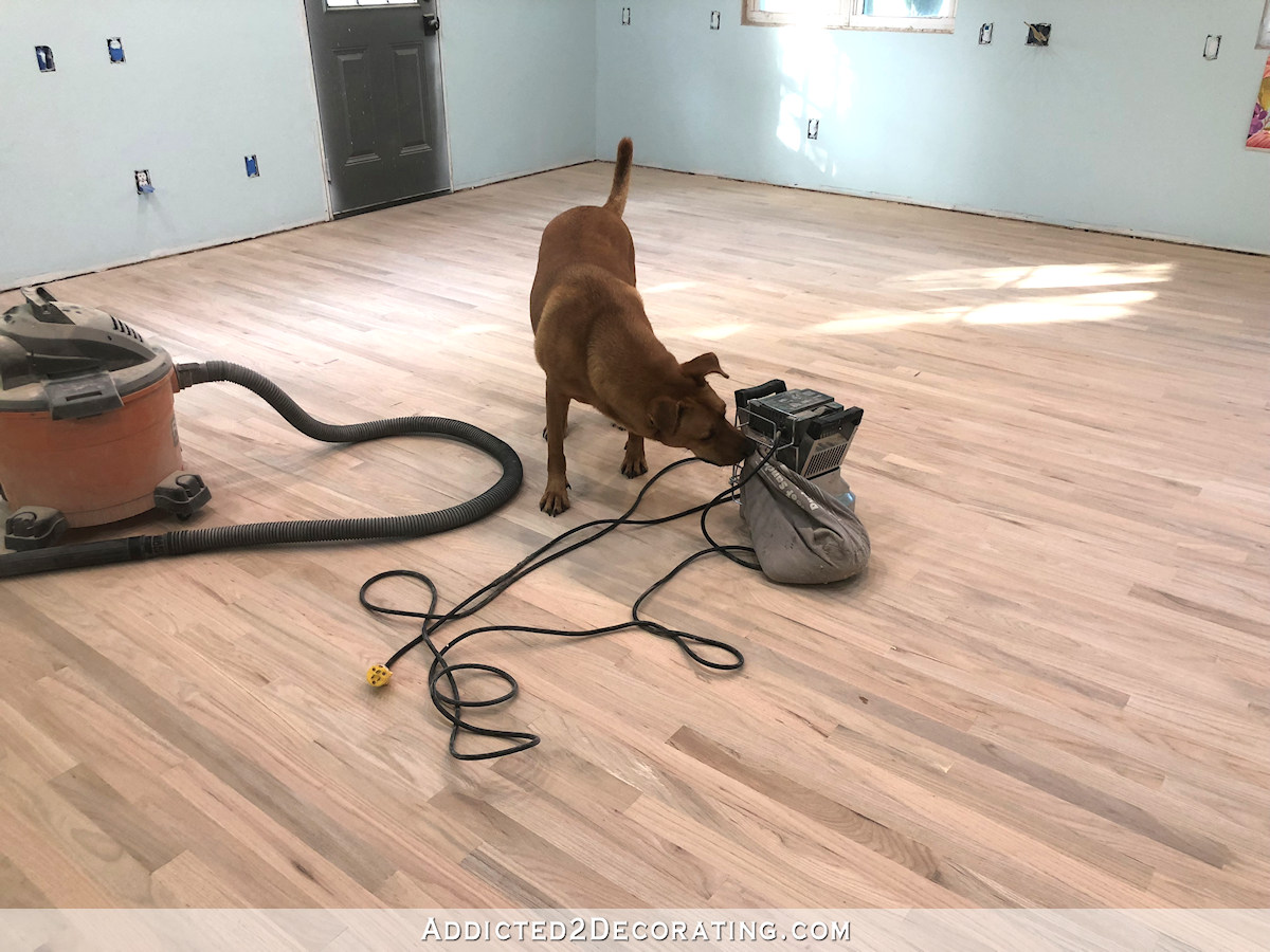
I’ve been trying to decide what I want to put on the wall above the toilet in this small studio bathroom. I’ve gone through several different ideas in my mind. I had originally planned on putting up some shelves.
Shelves on the wall above the toilet seems to be my standard go-to option when designing bathrooms. I’ve been doing it for over a decade now. Shelves in that spot just make sense to me. Here’s our condo hallway bathroom…

In did the same thing in the hallway bathroom in our current home.
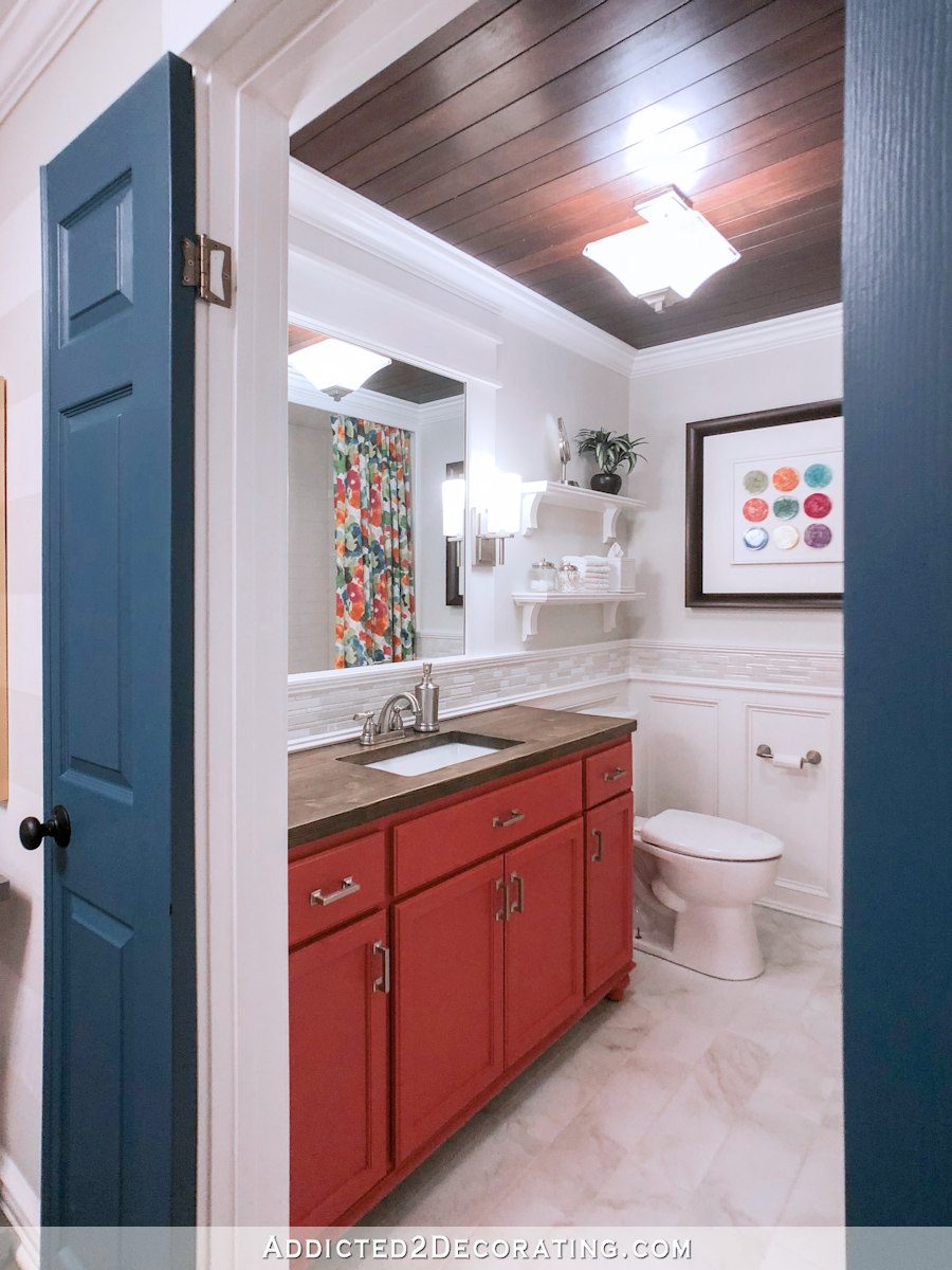
And I had shelves in this studio bathroom prior to this current makeover.
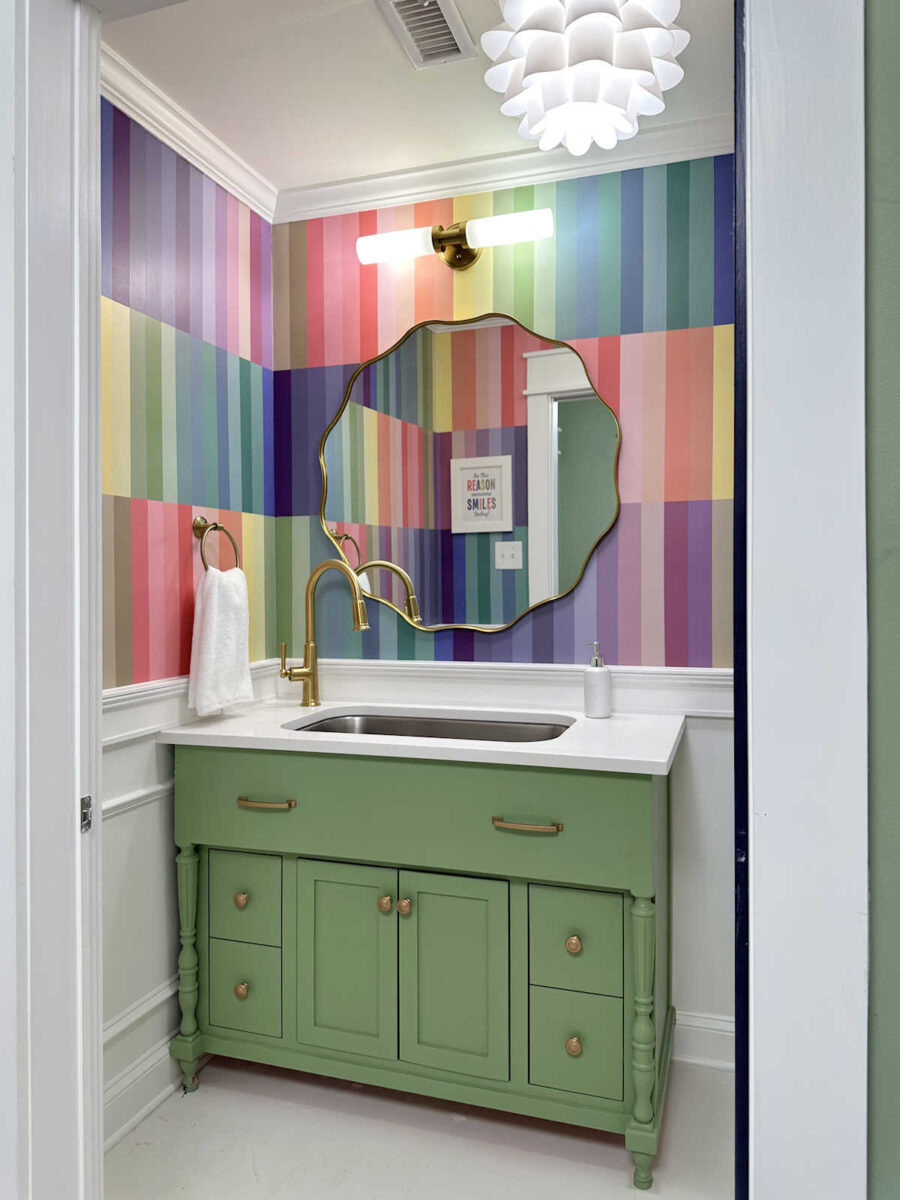
Shelves over the toilet just makes sense to me. But in this new version of this bathroom, I really don’t want to use shelves. The walls are already quite busy, and shelves with various items lined up on them would create even more busyness.
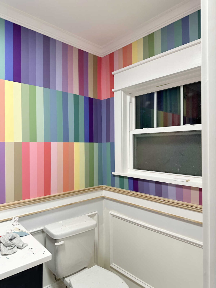
So this time around, I think I’m actually going to break out of my go-to shelves option, and I’m just going to hang one large, framed piece of artwork. But since there will only be one, it needs to be just right.
My initial idea was to frame a piece of the floral wallpaper from the studio, but I really don’t want to repeat that pattern for a third time. It’s already on the main wall of the studio…
And I have that pattern in the curtains on the back doors of the studio.

Having that pattern in those two areas is enough for me. Repeating it a third time would be overkill for me. So I headed to Etsy to see if I could find any downloadable printable artwork that might work. Obviously, I want something colorful, and I imagine putting the colorful artwork in a white frame with a thick white mat.
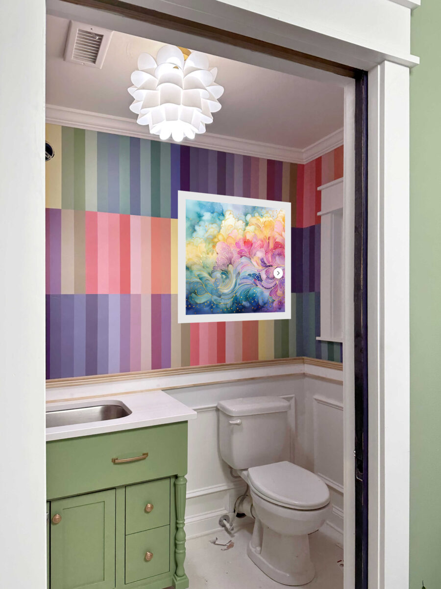
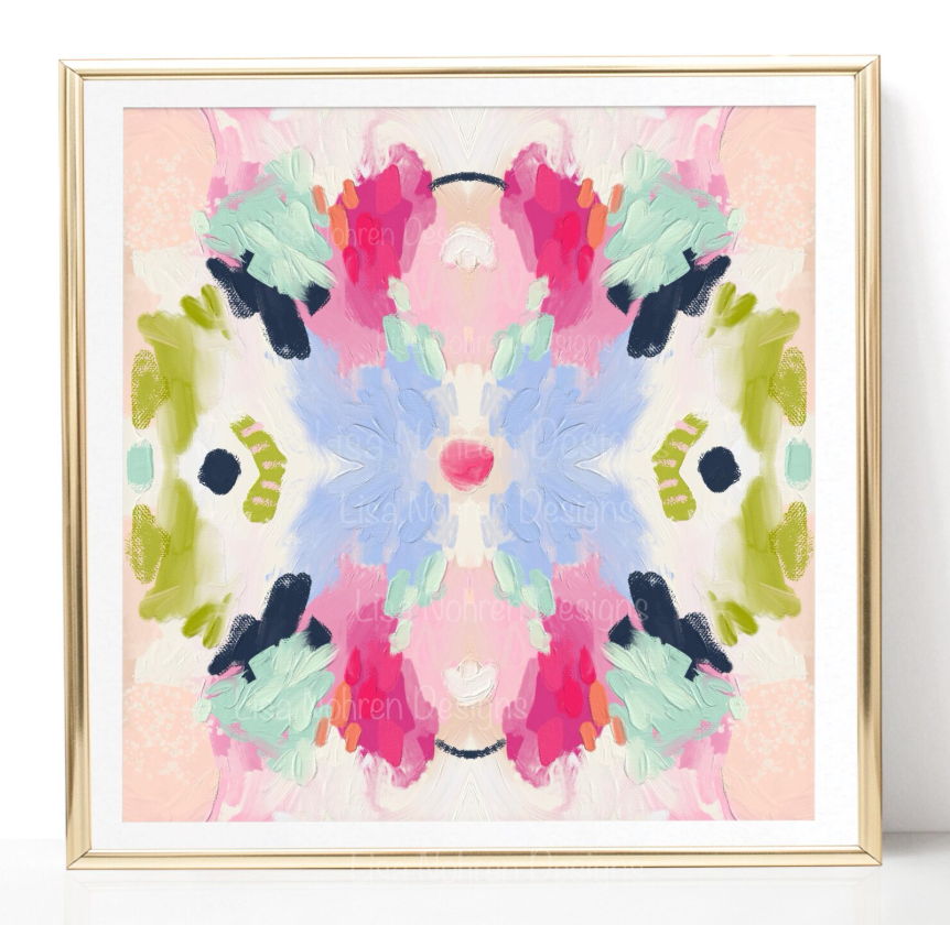
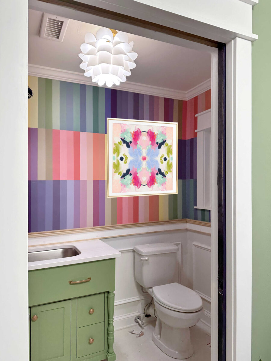
I found this series of colorful artwork with gold accents, and this particular print from that series really stood out to me. I like the juxtaposition of the swirly colors with the linear design of the wall.
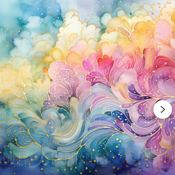
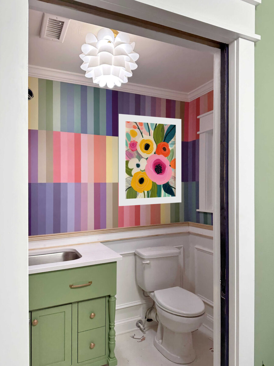
I did a quick mockup, but in reality, I think I would want the frame and the white mat to be even wider for more visual separation between the artwork and the wall.
Next up, I found this bold floral print. On its own, it looks kind of dark, but I decided to try it anyway.
And again, I would have a wider mat and thicker frame, but this is the general idea.
I really love this colorful abstract print. I like how light the actual print is, I just with it had more colors in it. But I decided to try it anyway.
Even with the limited colors in the print, I really like how it looks against the walls. The lightness of the print really appeals to me.
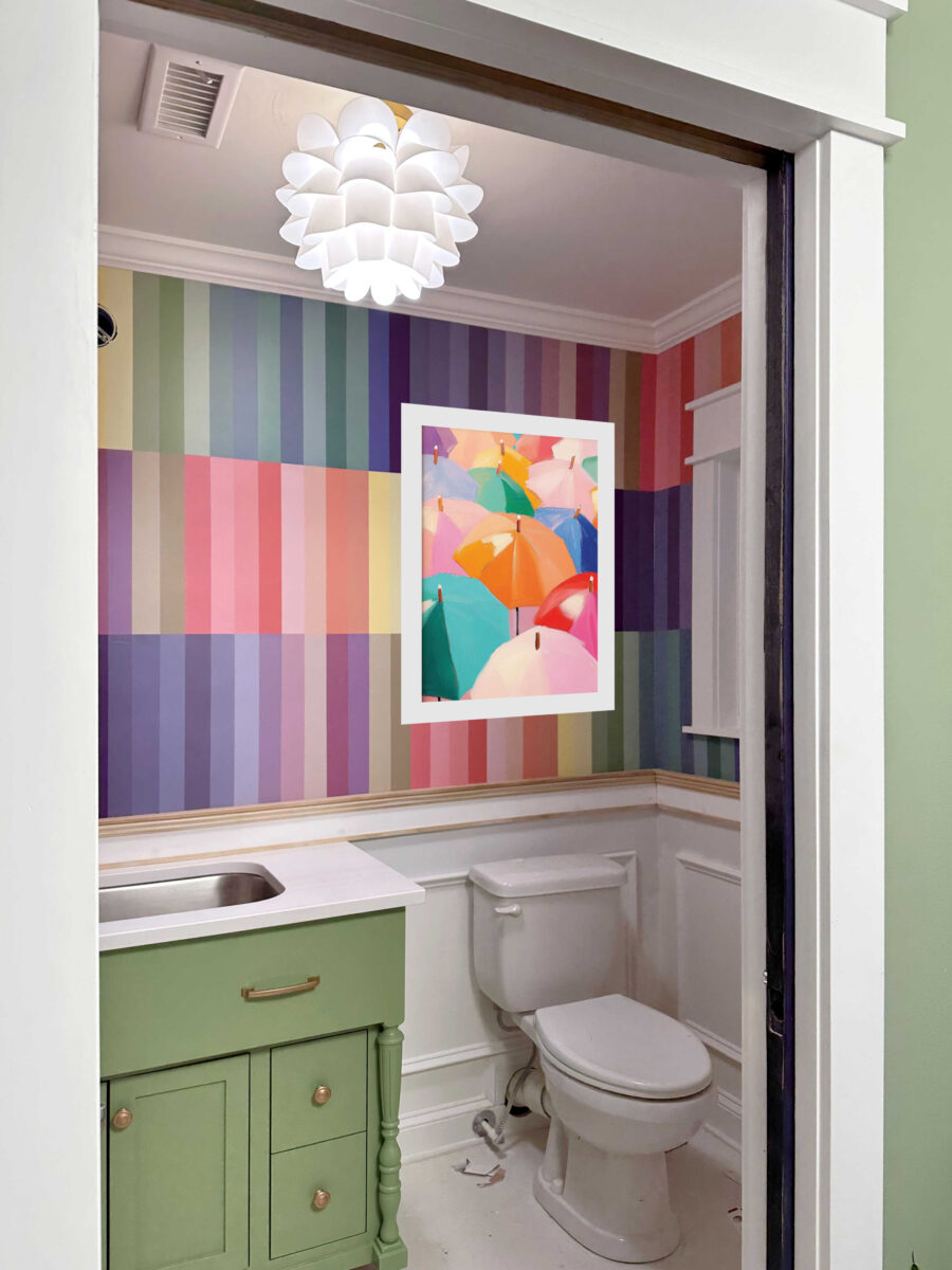
Then I came across this colorful umbrellas print. I do wish there was so green in it, though.
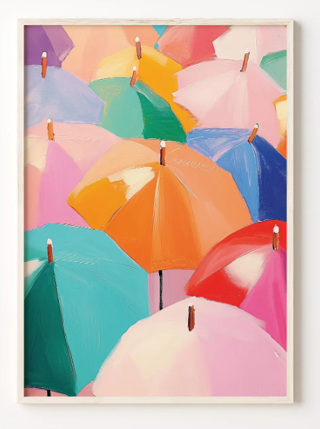
I really like this one. But again, I just wish there was at least a little bit of green in it. I’d also put a wider mat and thicker frame on this one.
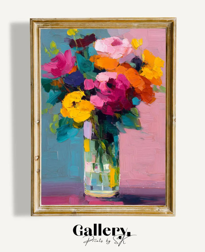
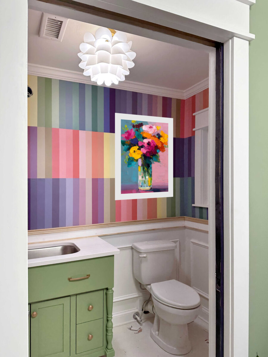
And since I can’t seem to stay away from flowers, I found a second floral option — this bright modern floral print.
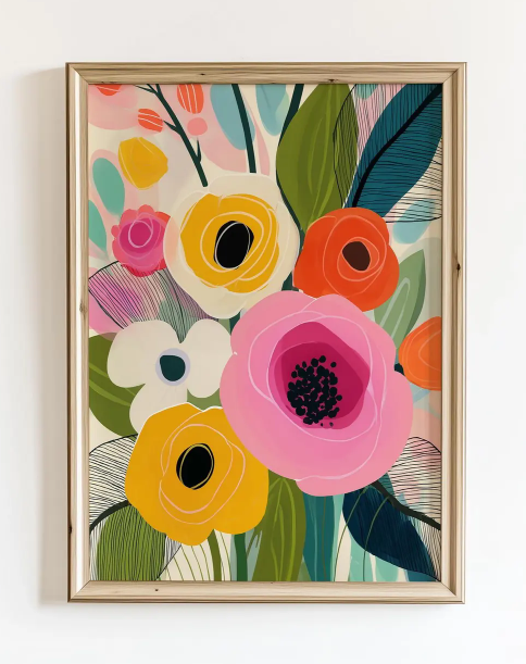
I really love how bold this is, and it seems to complement the walls really well.
So I’m stepping out of my norm, out of my comfort zone, and I won’t be putting shelves back up in this bathroom. I think one of these prints will look great in this bathroom. I just haven’t quite decided which one I want to go with.
More About My Studio Bathroom

see all studio
bathroom diy projects
read all studio
bathroom blog posts

Addicted 2 Decorating is where I share my DIY and decorating journey as I remodel and decorate the 1948 fixer upper that my husband, Matt, and I bought in 2013. Matt has M.S. and is unable to do physical work, so I do the majority of the work on the house by myself. You can learn more about me here.
What about the exact floral wallpaper design, but doing it in just shades of white and cream with some texture and a little gold leafing or small gold accents on the textured flowers with a bold colorful frame, maybe the egg plant of the vanity color? Bold and fancy like your chapel print frame in your bedroom.
I’d leave out the artwork and just let the beauty of the walls carry the room, plus I think it would detract from the mirror.
I agree, especially since the mirror is on that same wall. Why diminish the impact of those stripes? That said, if there must be artwork, the first floral print (the dark one) looked best.
I love the umbrellas I think they are perfect!!
Me too!
The last option is my favorite but I’d wait until the mirror and additional light is up to decide.
Hmm, I’m not convinced by any of these. I feel like they actually disappear into the wall pattern. I feel like it needs to be just 1-3 colors, have more texture or something. It can still be colorful and interesting without having alll the colors.
If I had to pick one of those it would 100% be #1, I feel flowers look like you were trying to match the wallpaper and just didn’t quite get there.
I agree with others that something with more texture and maybe just one or two solid colors, like a canvas coated with different texture plaster and then painted one bold color. But, I’m sure whatever you pick will be perfect.
I like the abstract design, the pattern and the lightness of the colors in the room.
They all look good to me. I marginally prefer the vase of flowers but I doubt you’d regret any of them!
I really like option 1. I feel like there is a nice repetition between the colors in the print and the colors on the wall. In addition, I feel like the shape of design on the print mirrors the shape of the ceiling light in a really appealing way.
I love the fist option. The color flows and gives movement against the stark rectangles of the wall. The gold makes it stand out just a touch. All choices are lovely but option 1 is so very pretty.
I like #3 the abstract, but the last one even more. The leaves in that one stand out nicely with the vanity color. One of the flowers reminds me of your mirror frame a little too.
The artwork feels like a lot of competition to me.
What about something 3-D and a neutral or single color like
the birds in your bedroom?
Totally agree with CathyR!!
When I first saw the waves/swirls I thought they would be perfect. After seeing the waves mocked up on the stripes I think it’s too busy looking. I like the vase of flowers. I don’t care for the abstract ink blot print. The colors seem washed out next to the striped. The bold flowers are nice but seem to take attention away from the stripes. I absolutely LOVE the umbrellas! I think they are unexpected and unique.
Funny how cell phones work but I can see one green umbrella w/2 shades of green and another one with blue/greens.
I like it the best but also the modern one!
I look forward to seeing your choice and the completed room.
Love to your furry friends!
The art is distracting instead of enhancing for me. The walls are perfect. I would leave as is. No shelf, no art. Maybe a complimentary style guest towel rack with pretty hand towels is enough?
I think a picture in one color gradient with gold accents would be beautiful – like green foliage with gold trace work or pink (or some color) flowers with gold trace work.
Of these options, I like the umbrellas the most by a wide margin, though!
I think less is more here – looks great without art.
I love the vase and the last floral picture. They make a statement against the recto-linear lines of color and soften it. Don’t like the umbrellas. Too much orange which is not the colors in the paint. The abstract looks like a kid tried to paint a butterfly.
If the mirror is going to be round-ish, a large picture would be great. The rounded subject matter should help soften the straight lines.
If my bathroom was that small, I’d be very tempted to have one large wall to wall mirror. Then I wouldn’t be facing these decisions! Lol.
Kristi – To me all of the artwork detracts from the wall and is overpowering. It’s a small bathroom, you don’t have to put anything above the toilet.
Completely agree!
I agree with this….
but if artwork is required, my vote would be 3, 4, or 5
Wow! What different opinions we all have. I guess beauty is in the eye of the beholder. I really like the last one. It doesn’t get lost in the stripes while not taking anything away from them
It’s so hard to 100% judge colors from renderings/online photos, but I think that all of those look good with the wallpaper but clash a bit with the vanity. Either they have little or no green, or the green they have is very different/not complementary to the vanity color. I like another poster’s idea to have a print that’s mostly green with some gold, which carries over the color and contrasts more with the wallpaper, versus blending in so much.
What about your petri resin pucks? Are those currently in your main bath? Could you use them in this space?
They are already installed on a wall in her studio.
I love this bathroom, and I love all that color. I am an art fiend, which means I have saved my pennies through the years and picked up art at auctions and garage sales. I love the fact that today we can go and get art online, print it out to our size and colors for that matter, what wonderful times we live in. I loved them all, I know you’ll pick out the one that speaks to your heart the most and this bathroom in and of itself will become another piece of art in your lovely home. Every room is a jewel. You rock girl!
Cheers to you, Matt, and the Fur Babies!
Not 100% sold on artwork, however saying that #1 or #3 look good to me. Think the wall colours are enough for me.
Personally I’d love to see 3d flowers in white with gold edging – a bit like your birds or the your dressing room light fitting flowers but bigger. Maybe much bigger – dinner plate sized?
Would give texture.
Me personally, I really like either the first one OR next to last one with the umbrellas. Either of these, but # 1 is my absolute favorite. It’ll be interesting to see which one you pick. 😁
Something about those umbrellas…
As soon as i saw the print of flowers on the post I thought it was perfect and seeing it on the wallpaper i love how its extending the green from the cabinet over into that side of the room too. It also looks really cheerful. I know in the end you’ll make the right choice for you tho.
Modern floral print definitely. It is bold and colors blend well.
Your walls are very busy. Return to the shelves. A photo of what you have shown is going to add more movement. No place to rest your eyes.
I vote for either the first or the last. The colors just seem to pop.
I won’t weigh in on image options, but will say I find the rectangular pieces more appealing than the square ones. I wanted the art to be a bit lower, but expect you’ll hang it dead center to match the wallpaper pattern.
I really love the first one. The colors go so well with the walls and the swirly pattern softens the bold stripes and it also looks fantastic with the ceiling light.
My vote would be 3, 4, or 5.
I really like the umbrellas!!
I like #1 the best. I would like to suggest an alternative — Plates!! Search for “Arhaus magnolia plates” on pinterest as one example of very textured plates in different sizes hung on a wall. Other plates might work well, such as Bordallo Pinheiro cabbage plates though the green might not be the right hue.
I adore this idea!
I think the shelves above the toilet in the bathroom you’re about to rip out could work really well here painted the same color as your vanity, with some small accessories on them. I think the same as several others – the wall treatment is the art. Adding a large scale piece seems to take away from the star of the show.
That said, you always do your thing and I always love it in the end, so what do I know lol
Why anything? There doesn’t have to be anything on an already busy wall. Less is far more in this room. It really doesn’t need anything more.
I love the last one 💐
You are on the right track with thinking large white mat and I also agree that the lighter ones are best. Otherwise, it looks far too similar to the stripes. So, I would vote for the very lightest one or the last floral one which includes some white. Or maybe someone else has a great suggestion that you haven’t considered.
Actually, I’m mystified that anyone thinks the art is not necessary. It’s exactly what is needed to HELP the eye rest on something besides the walls and give focus. Perhaps they’re just not sold on any of your choices so far.
I really like the two florals the most, with wide white matting. Either would be perfect.
Have you considered something white? Maybe something like the birds you put on your bedroom walls but flowers instead?
The last picture looks best with your lovely stripes. I love the umbrellas…but not enough green. Hmmm, if only there was someone who could paint one with more green in it. Like someone who creates beautiful things, who isn’t afraid to think outside the box, who also loves to paint. If only…..
This what I was thinking – goodness knows you have plenty of paint to match your colors, and if you could outline with gold, that would be lovely. I pretty much liked all of them, except the one that looks like a Rorshach inkblot test…
Did I miss the plumber coming? I’m so curious about this special toilet, and wondering about the original cost and now the maintenence cost.
They finally came yesterday and got it fixed. So the bathroom actually works now!
The original cost of the toilet with the pump was about $1200. That was in 2017. This is the first time I’ve had to do any repair on it (although it has been out of commission for over a year now), and the cost to repair (part plus labor) was about $750.
The 4th one speaks to me. I think you would like it.
I love, love the swirly art, option #1. Please go with that!
I love the last floral- you are doing a great job in using bright colors, makes the spaces joyful.
Agree with someone above that something more monochrome with gold accents could be amazing. Like the blue/gold wall treatment in your former bedroom, but in white/cream and gold? I’d like to see the artwork be a pretty place for the eye to rest in that room. And color on color just seems to be getting lost to me.
Agree on the extra wide white mat to create more separation – I really love the flower bouquet in a vase option! The last floral is too much like the wallpaper, and the abstract swirl is not definite enough of a subject with the striped walls.
Love the stripes! They look absolutely perfect! Great job. As far as art for above the toilet, what about choosing something dimensional that is one solid color that would not compete with those beautiful stripes.
Kristy, if you like the umbrella one, could you paint over it with colors that you like, especially if you want more green in it? Make it your own!
One year, my daughter gave me a tall, narrow print in sepia tones of a church with a steeple. I didn’t really know where to put it, but the wall above the toilet in our guest bath was vacant, so I hung it there. Everyone commented on how nice it looked there. The next year, she forgot she had bought that one, and sent me an oil painting of a church also, and this one was very colorful, and about 8×10″ so I said why not, and hung it above the towel bar, and found bold orange towels to match the orange in the painting. Again, lots of compliments, and comments like “I never would think churches work in a bathroom, but somehow you made them work!” With the addition of a couple small candles and a ceramic church diffuser for a scent, My family calls it the confessional! LOL!
If you end up going with the 1st print…what about creating relief with something like Pebeo Vitrail Gold Outliner on the gold dots and the thicker gold lines?