Studio Bathroom Details — New Vanity Color, Faucet, Mirror, and Ceiling Light
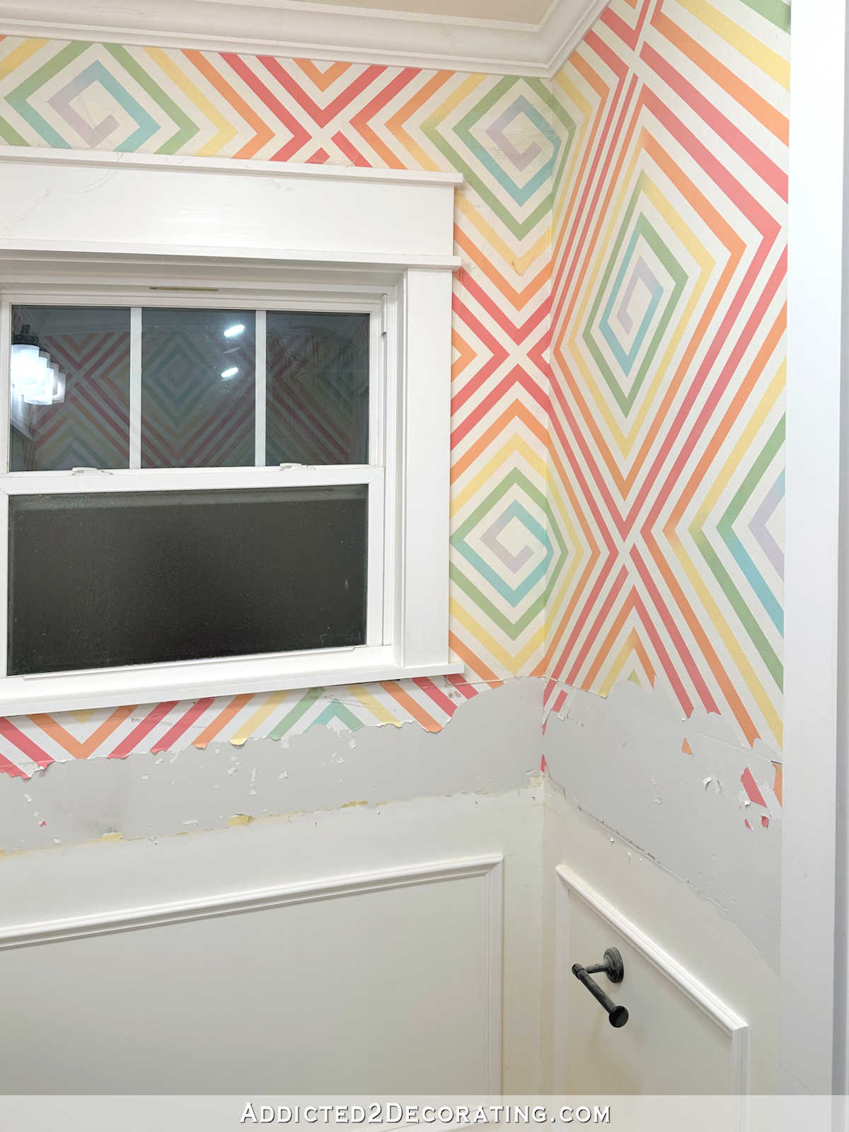
I spent another day yesterday working on the walls in the studio bathroom. I think I finally have them ready for wallpaper. That was definitely a more lengthy and time-consuming project that I had expected it to be, but when you start out with a crazy painted design that had been painted using about two rolls of painters tape (which creates a subtle texture) and then add to that lots of damage caused by removing a glued-on mirror, tile, and trim, plus a section that had been outlined with a black Sharpie marker that can’t be covered with water-based primer, it all added up to a whole lot more time than I had originally anticipated. But I think the walls are finally ready, which means I can start putting up the wallpaper TODAY!
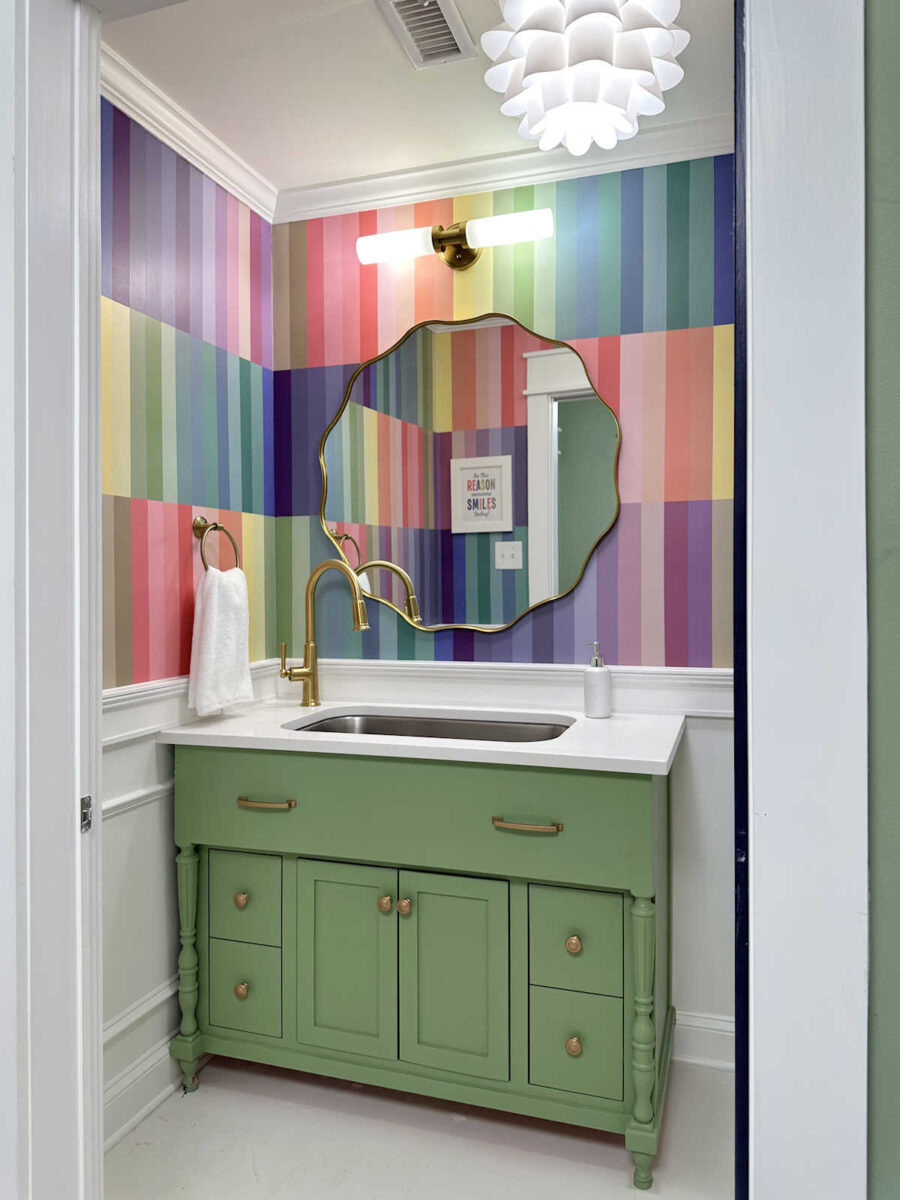
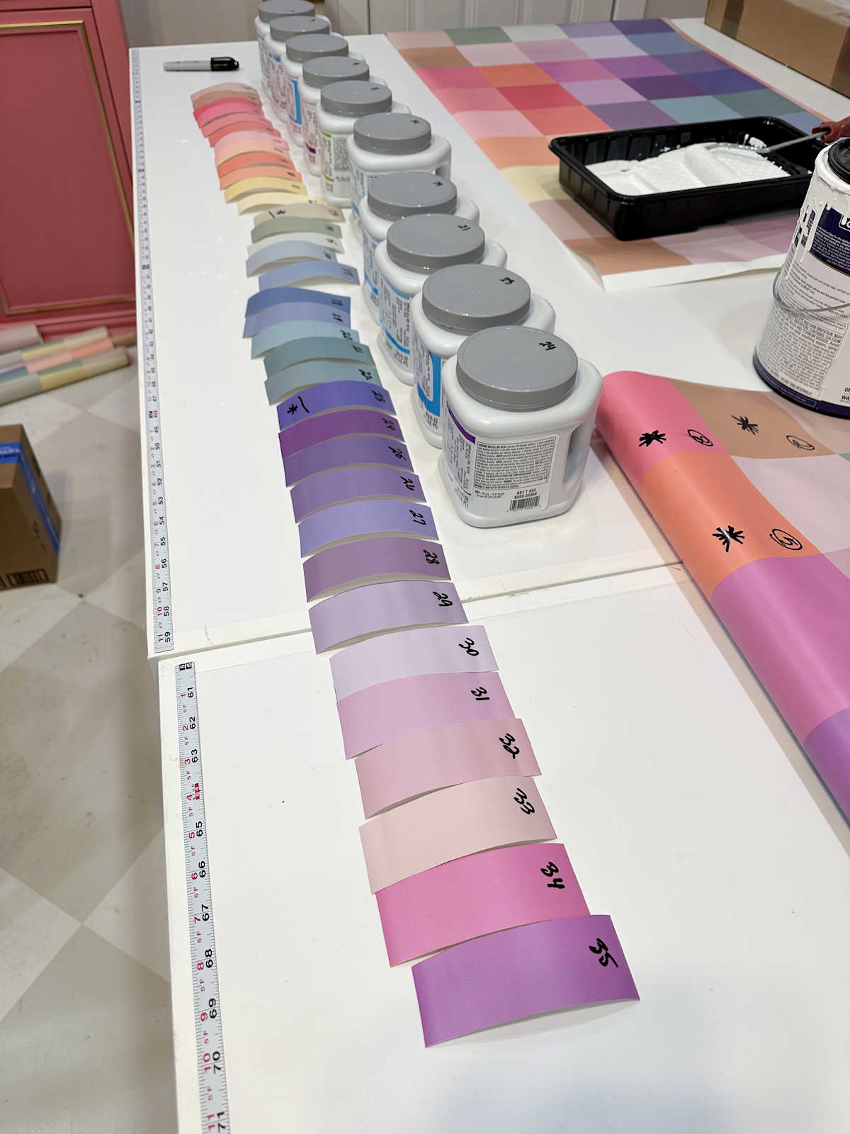
I also took some time yesterday to go to Home Depot and make the final decision on the vanity color. The crowd favorite for the vanity color was the eggplant color with the white wainscoting and white ceiling.
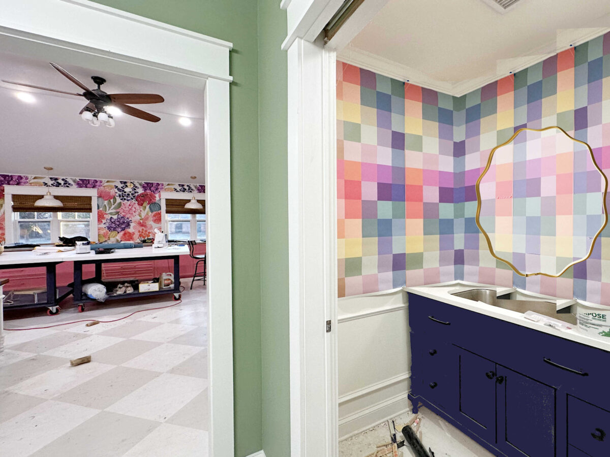
But a lot of people voted for that one with the caveat that it should be a bit lighter with less blue and more purple so that it actually matches (or comes closer to) the darkest purple in the wallpaper.
So that’s where I started my search. But purple is one of those tricky colors for me. While I love color, and I love really colorful rooms, there are certain colors that I’m very picky about, especially if they’re going to be used in large amounts. And purple is one of those colors. I actually have an eversion to almost all purples with just a few exceptions. I like really deep purples, like the eggplant on the doors and the bases of my worktables. But if I’m going to use a lighter purple, it has to have quite a bit of gray in it. That means that there’s basically no mid-range purple that I can even tolerate unless it’s in really small accents. I looked at every single purple that Behr had, and I gravitated towards all of the really dark ones and the medium and light range that were toned down with gray to the point that I could tolerate them and even like them, and not a single one of those worked with the wallpaper.
So in the end, I went with green. I like all kinds of greens, so I knew I could find one that would work. The funny thing is that I chose a green that was slightly darker than the walls of the back entry of my studio, which had been color matched to the green in the wallpaper. So I thought if I went just a bit darker, the vanity would still complement the wallpaper without matching the back entry walls and the wallpaper exactly.
But when I got home and tested it out on the vanity, it actually looked a tiny bit lighter than the back entry walls because of the different lighting in the two areas.
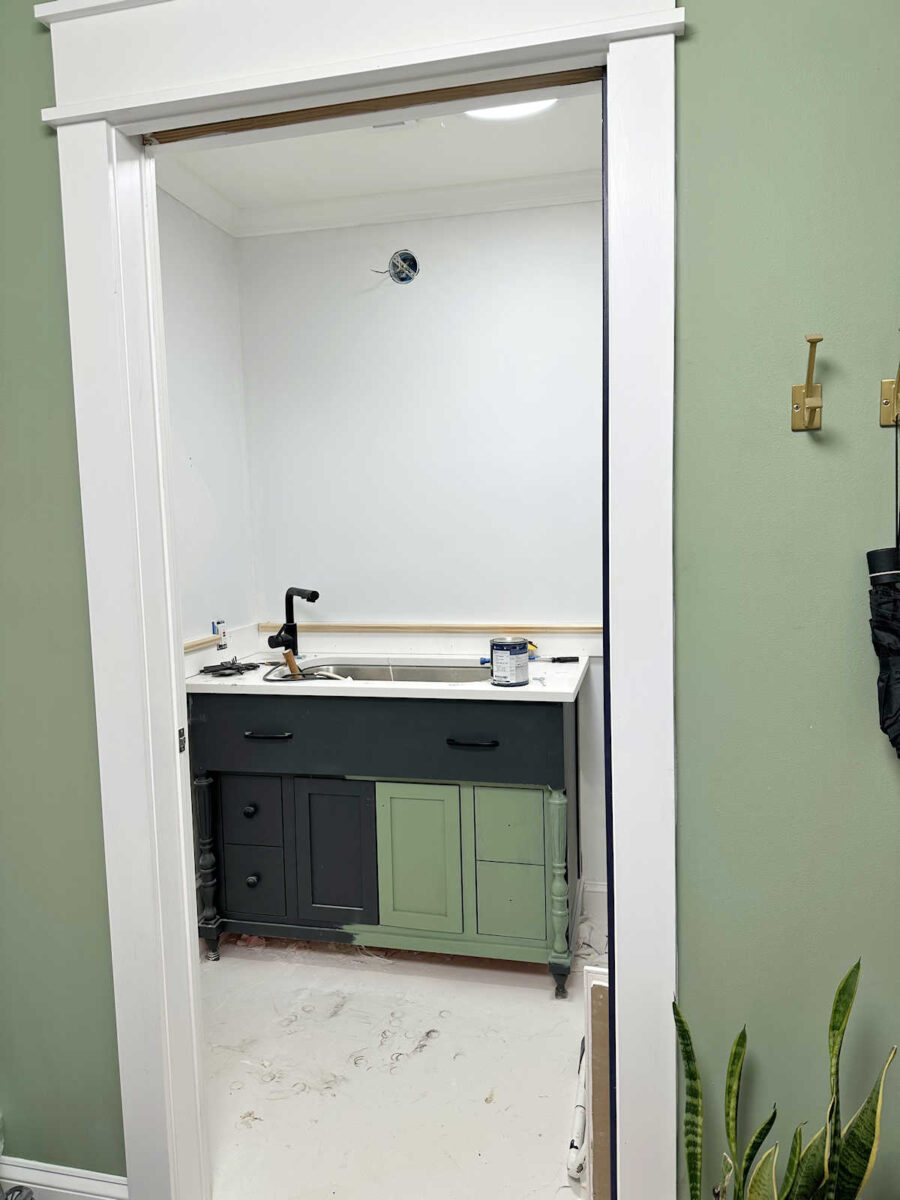
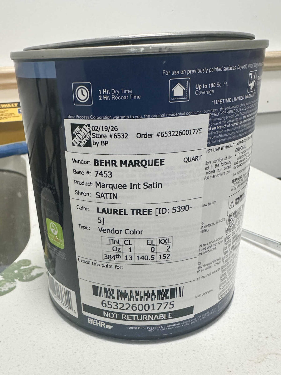
I’m going to stick with this color, though. It’s a Behr color called Laurel Tree, and I was actually shocked at how close it was to the green on the walls.
If you were around back when I painted those walls, you may remember that I had Home Depot color match the green in the wallpaper twice, and both attempts were terrible. So I ended up purchasing a gallon of one of the color-matched paints (that didn’t match at all) that I thought I could work with. And then using that paint as my starting point, I mixed my own color for the walls using some paints that I already had on hand. You can see their color matching attempts and how I mixed my own paint color here. Here’s the color that I used on the back entry walls compared to the green in the wallpaper. You can see that they’re almost identical.
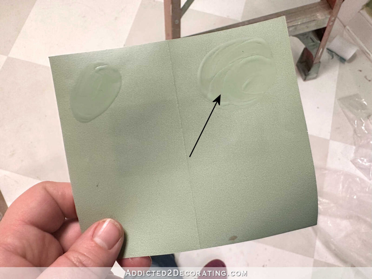
Laurel Tree by Behr is pretty close to the walls, but it is just a little darker than the walls. Here’s Laurel Tree compared to that same green in the wallpaper.
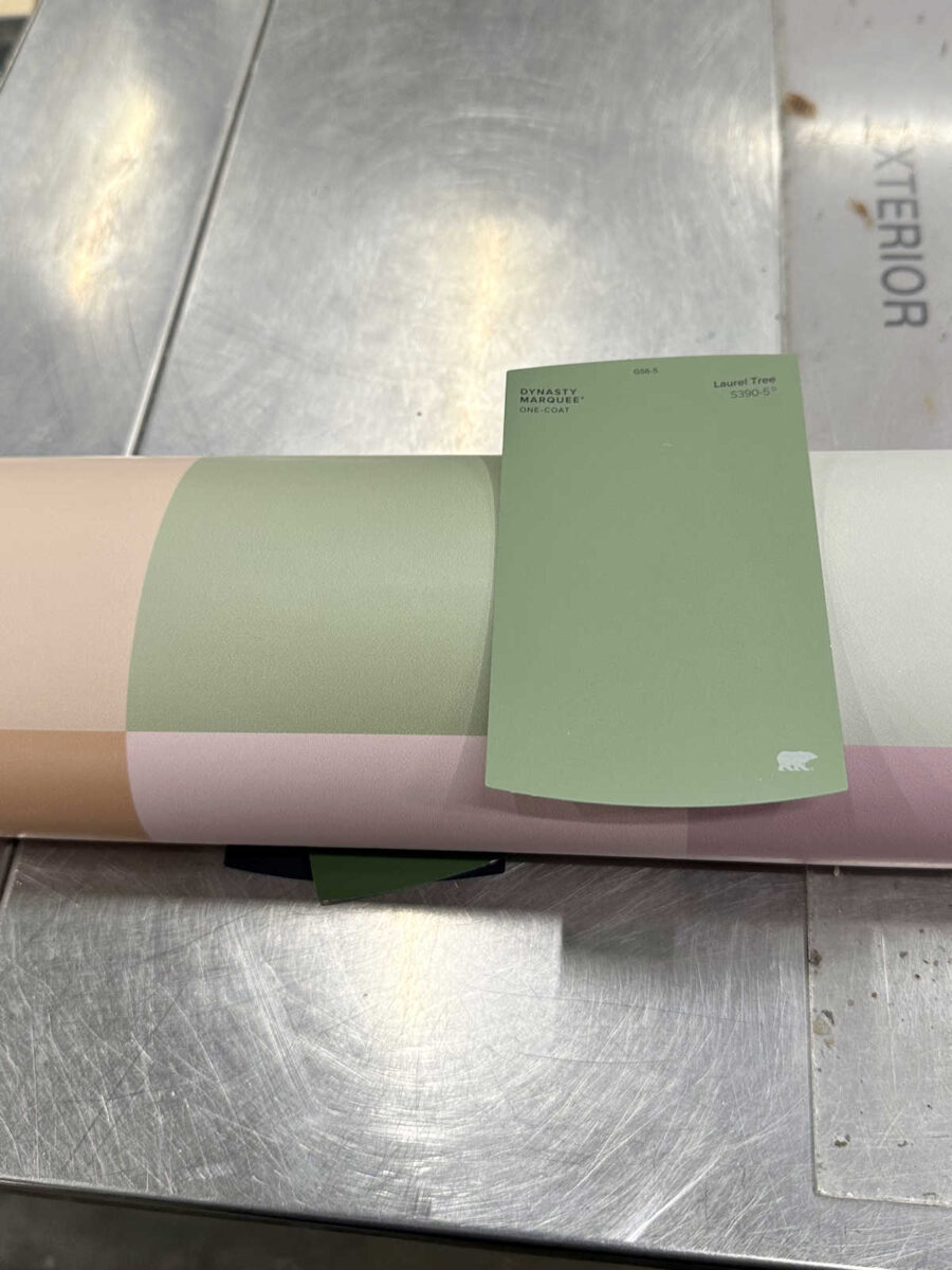
Maybe when the vanity is all painted, it’ll look a bit darker. I kind of hope it does because I really don’t want it to be an exact match to the walls, and I definitely didn’t want it to be lighter because I don’t want this room looking like a basket of Easter eggs. But the fact that it looks lighter right now just goes to show how much of a factor the lighting in a room plays in how paint colors look in a room.
Anyway, moving on…
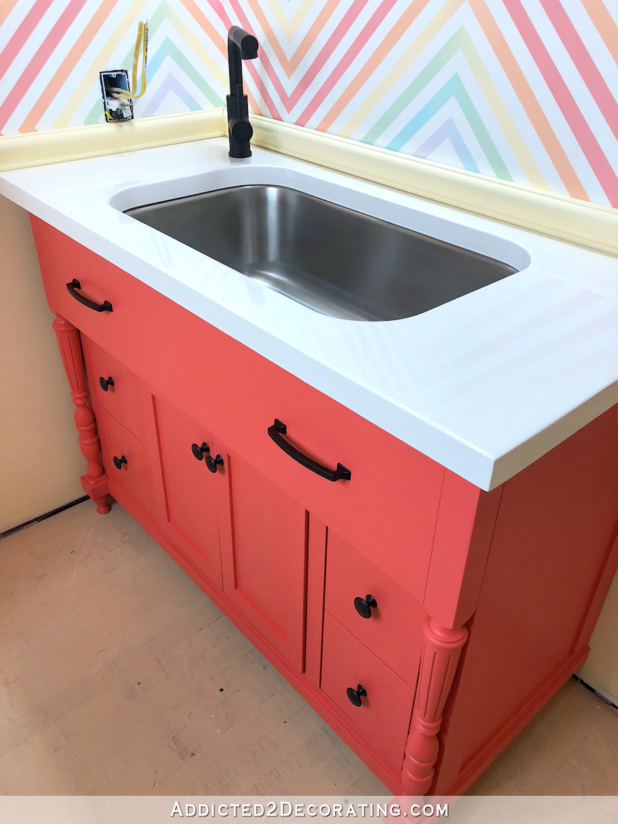
I also bought a new faucet for the sink. I picked up this American Standard Highgrove faucet in a brushed gold. I’m anxious to get it installed, but I’m going to wait unit all of the trim is finished because it’s difficult working around a large faucet. I don’t want to take a chance on it getting scratched.
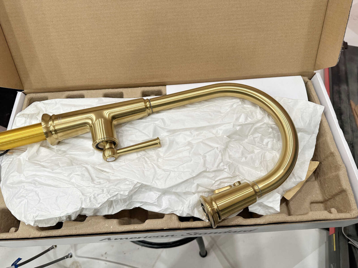
I know it’s kind of different having a kitchen sink and kitchen faucet in a half bathroom, but the reason I chose kitchen fixtures for this bathroom is because this is still my studio bathroom. I wanted a large sink and a faucet with a pull-down sprayer in the studio, and I chose to go the route of a kitchen sink and faucet rather than using a large utility sink in here.
I also went ahead and ordered the mirror for the room. I ended up going with the round wavy design (affiliate link).
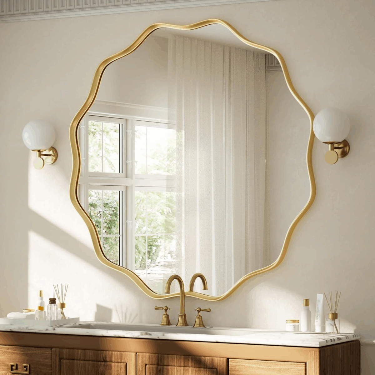
For me, it came down to this wavy round mirror and the one with the large bead frame. But in the end, I thought that the large bead frame mirror was a bit overpowering.
And finally, I want to replace this very simple ceiling light that’s in the room. I remember when I installed this light, I got several comments from people saying, “I’m really surprised by your choice of light for the ceiling!” In hindsight, I am, too. When have I ever used such a bland ceiling light other than in this room? This is definitely not me.
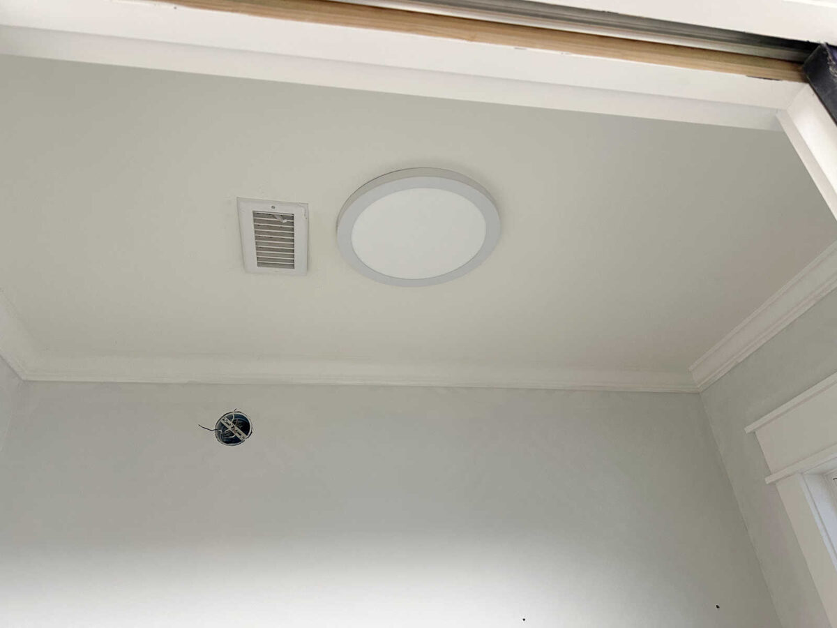
I really wanted to choose something floral. (I know you’re shocked! 😀 ) But I didn’t want it to look busy or draw too much attention away from the wallpaper. I wanted something gold and white in color, and I wanted texture. So after looking at several flush-mount light fixtures either had flowers on them or were flower-inspired, I ended up going with this Possini White Flower flush-mount light from Lamps Plus (affiliate link).
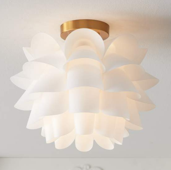
I like that it’s white, so it won’t stand out too much from the ceiling and demand too much attention. But it also adds a bit of interest and texture to the ceiling. It’ll be an upgrade from the plain utilitarian light that’s in there right now. And with that, I think I have all of the main elements I need to finish up this bathroom.
More About My Studio Bathroom

see all studio
bathroom diy projects
read all studio
bathroom blog posts

Addicted 2 Decorating is where I share my DIY and decorating journey as I remodel and decorate the 1948 fixer upper that my husband, Matt, and I bought in 2013. Matt has M.S. and is unable to do physical work, so I do the majority of the work on the house by myself. You can learn more about me here.

The green will be lovely on the vanity! I also really like the light, but was curious about the placement in the room though. How high is the ceiling? I see that the light is only 12″ tall, but will it interfere with line of sight from the doorway to the light over the vanity?
Yay for green!! I am bias since I dislike any shade of purple 😆
So excited to see the progress happening in this room. Have fun wallpapering- it’s such an instant color boost!
It is going to look gorgeous and complimentary to your studio.
I love the shade of green for the vanity. I love white for the wainscotting and ceiling. I love the faucet. I love the mirror. And most of all I love the light fixture!
DITTO!
Great progress! Just out of curiosity, how does the green from your bedroom dresser compare to these vanity and wall colors?
Love it!!! Can’t wait to see all of it in action.
Cheers to you, Matt and the Fur Babies!
Off topic but do you have affiliate links to the panel molding and the unfinished flooring you use on your projects? My daughter and I were at the blue box store this week and could find nothing close or suitable. I have searched your site but unable to find specifics. Thank you.
I love the plan and especially the green vanity. I was surprised though that you went with Behr paint. I thought you’d be using Sherwin-Williams again, my favorite paint company. 🙂
I’m sorry you didn’t go with the deep purple, but the green is also very nice. Thank you for the reminder that lighting can really affect how the color looks. The room is coming together nicely, and I’m so pleased with the mirror choice. It’s spot on.
Alone in our home, I yelled “YAAY” when I saw the paint color for the vanity. I didn’t weigh in on it yesterday but that was my choice. I always choose green whenever possible! (😂).
Will the new light fixture stand alone or will you use both? I liked the eggplant but green is my color. Can’t wait to see it!
I’ll use both.
I love the light you chose—we have the same one in a large guest closet and people love the surprise when they open the door! The only downside is it’s more difficult to dust but I would still choose it again!