Studio Bathroom Progress (Plus, Testing Out Three New Wall Designs)
Since my wallpaper idea for the studio bathroom turned disastrous (you can read about that here), I spent some time yesterday trying to come up with a new idea for the walls. While I was mulling over some ideas, I worked on getting the wallpaper off of the walls and then finishing the wainscoting trim installation. I got all of the trim added, and I’m really pleased with how this is turning out.
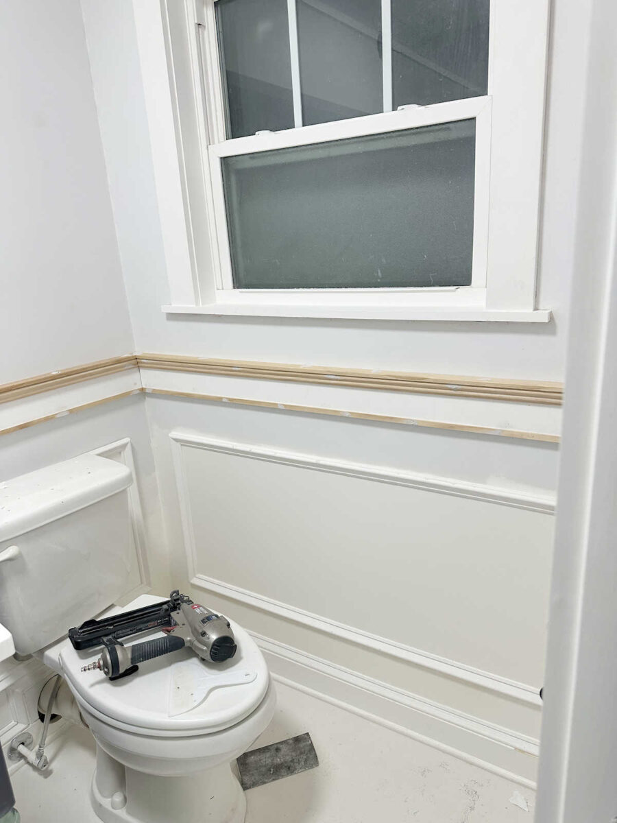
I think once it’s all primed and painted white (my go-to white which is Behr Polar Bear), it’ll look great.
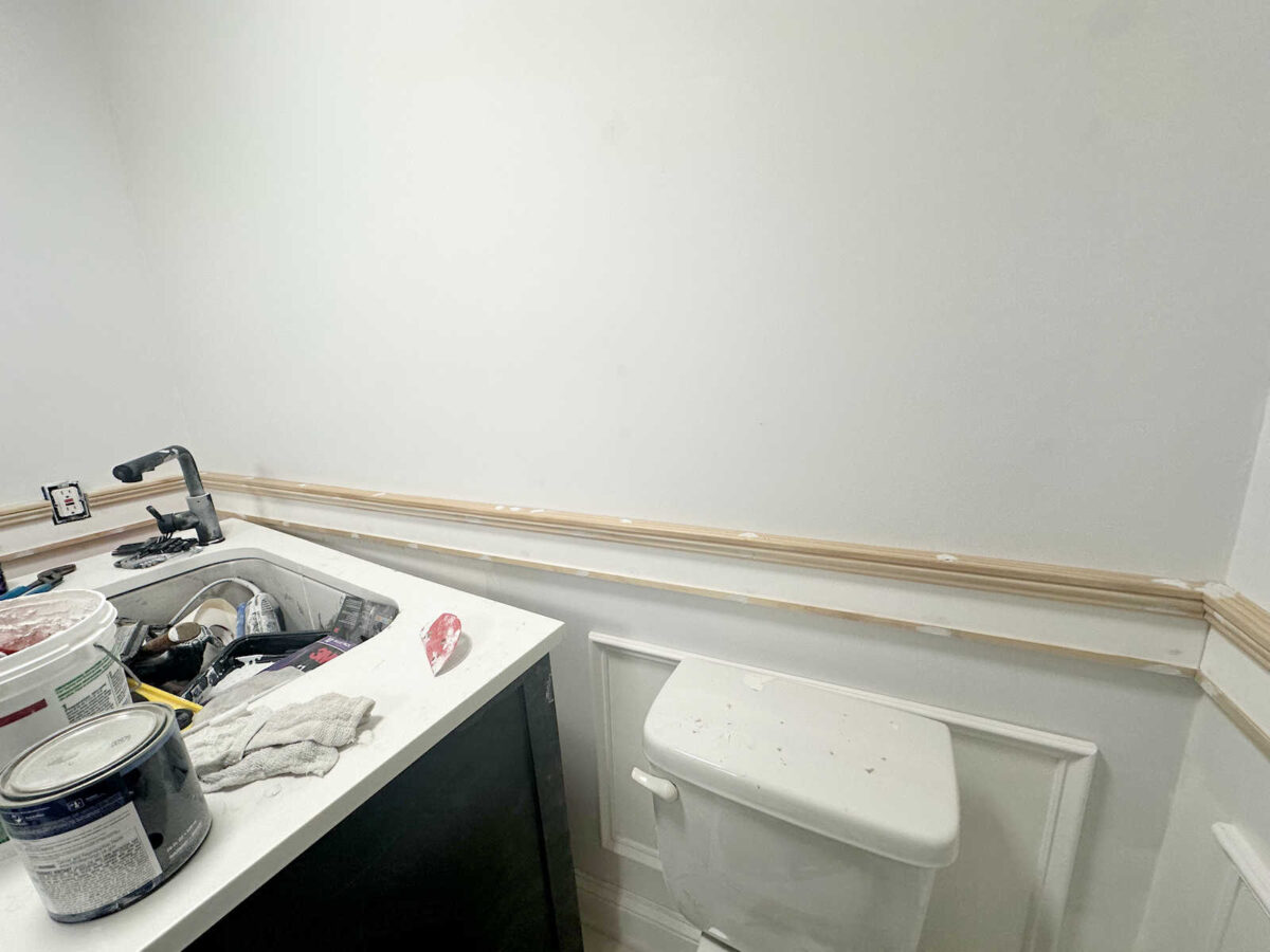
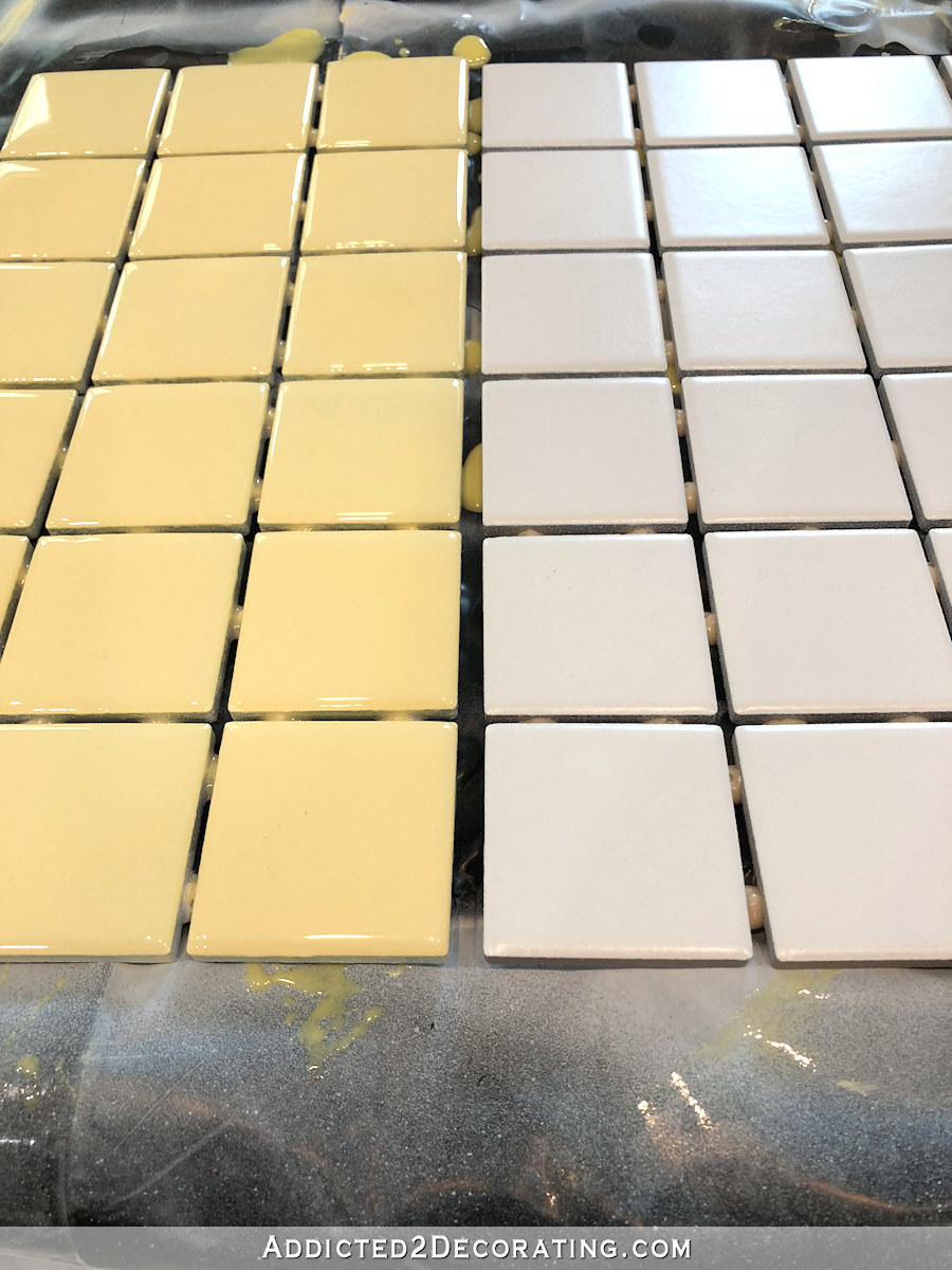
I’m really glad that I went with this simple design instead of trying to find a new tile. I think that any tile would have looked really busy with the wall design. And even though I wasn’t sure about the wall design when I was installing this trim, I knew one thing for sure. The wall design would include loads of color. So keeping the lower portion of the walls as calm and neutral as possible was important to me. I also figured out how to trim around the outlet, but I didn’t have time to finish that yesterday.
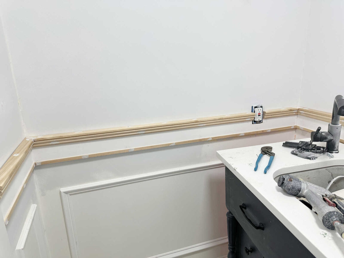
So now, I need to sand the wood filler on the nail holes, and then get the new trim caulked, primed, and painted. So at least the lower half of the walls is almost finished.
After having that time to mull over some wall ideas, I sat down at my desk and started creating some patterns that I had come up with. And I’ll show you why I do mockups. An idea can seem so great in my mind, but once I create a mockup, I can actually see if that idea will actually work.
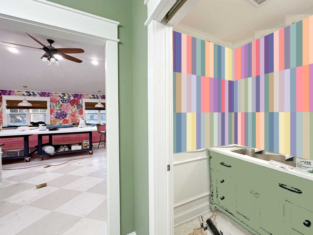
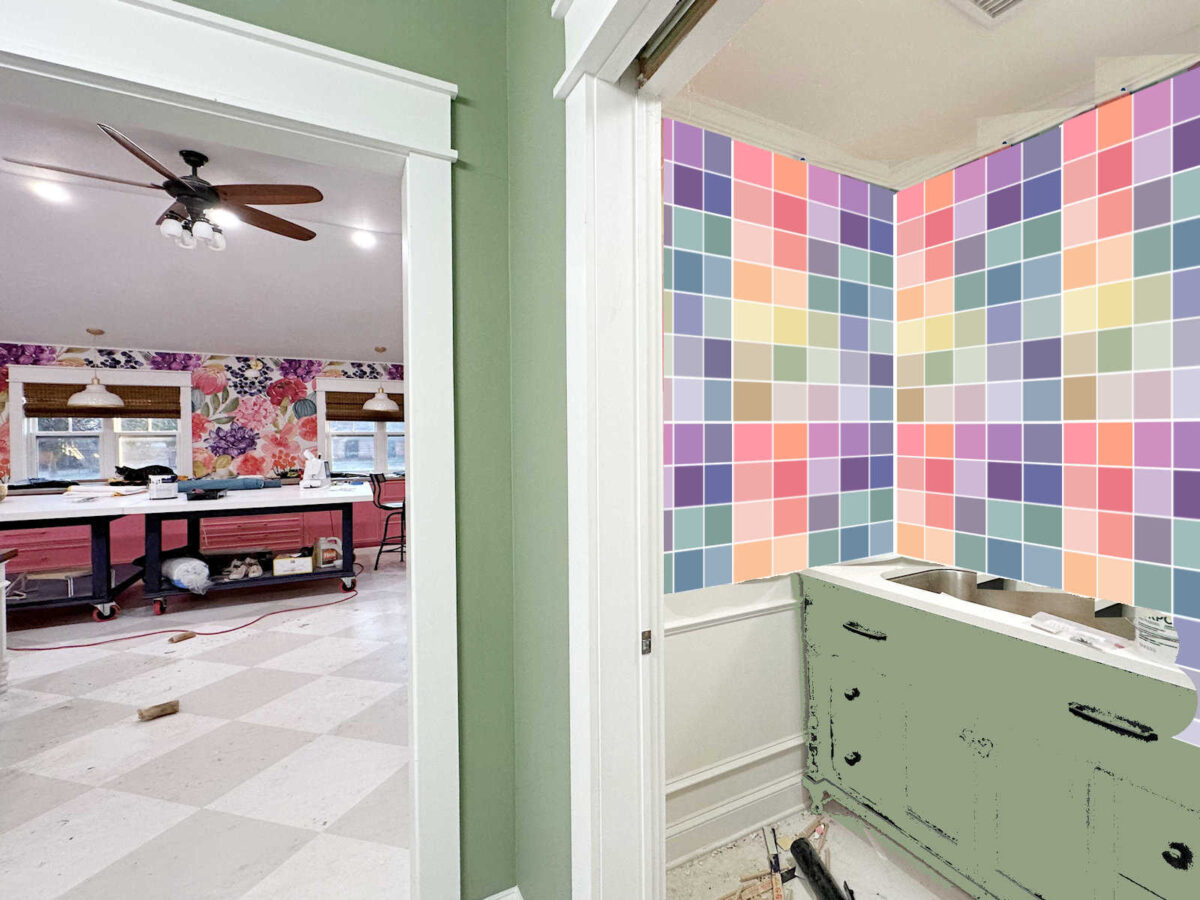
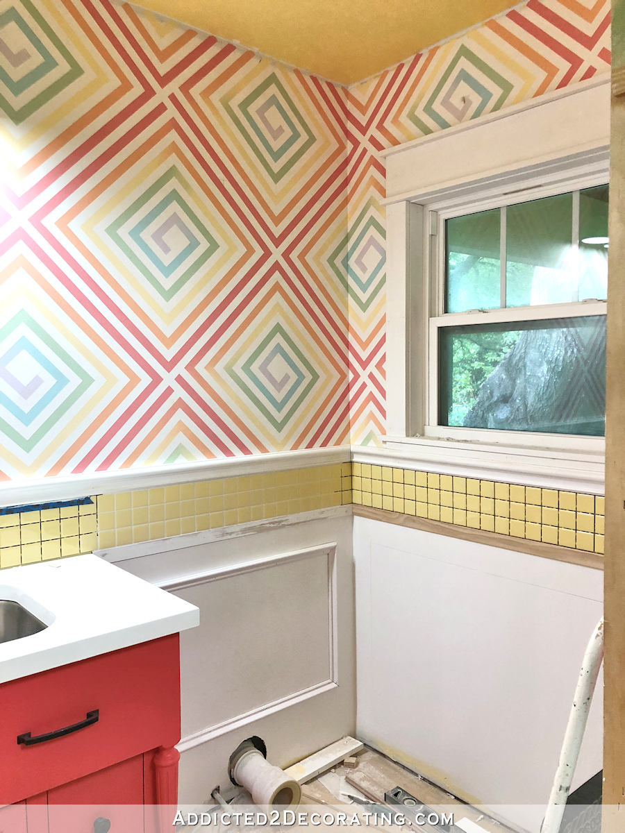
The main idea that I kept envisioning was using dividing the upper walls into thirds, and then painting vertical stripes in all of the colors of the wallpaper. But as soon as I got the mockup created, I could see that this probably wasn’t going to work. I thought that the squares looked busy (but I love the busyness of the squares), but this design looked too busy even for me.
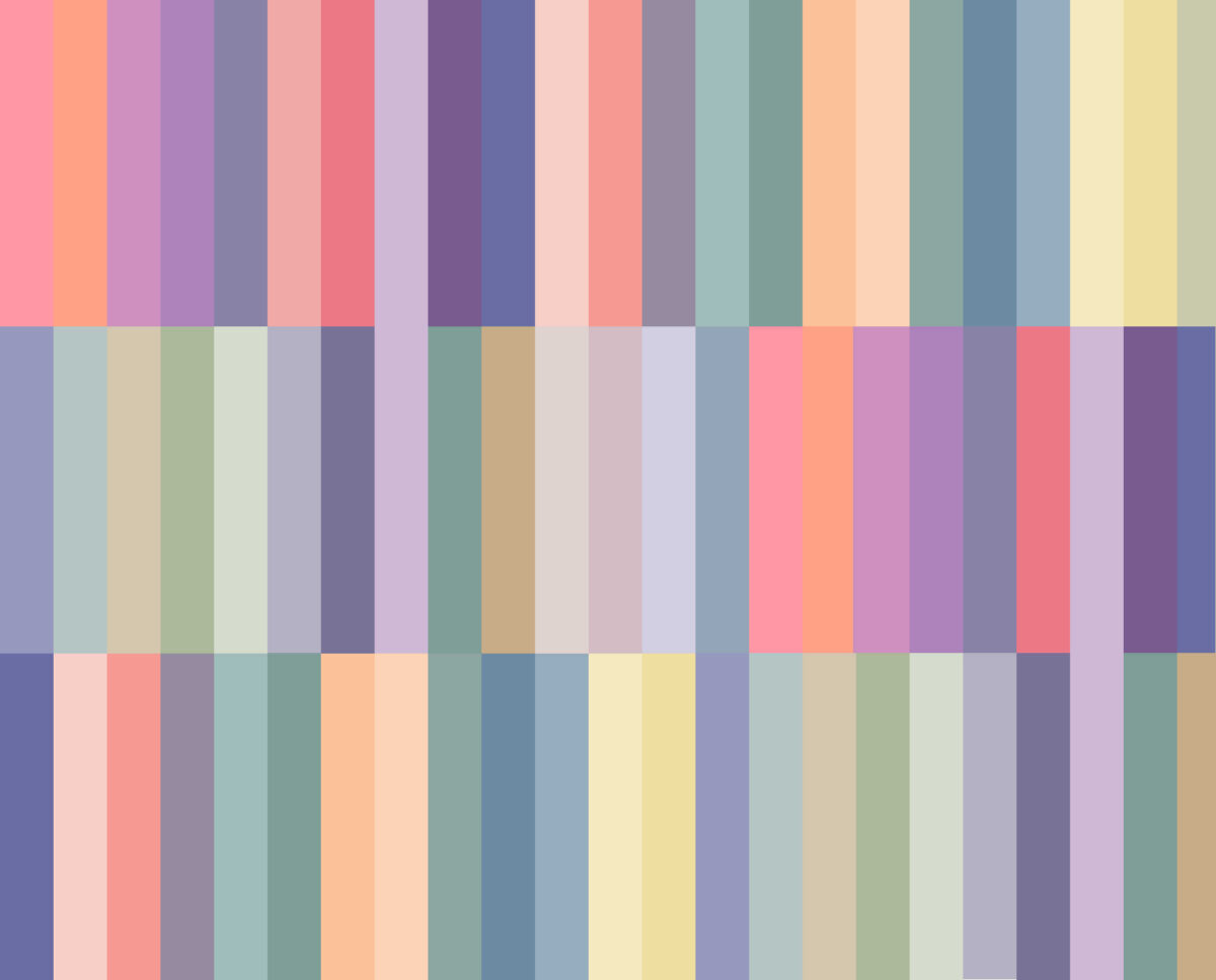
Here’s what that design would look like in the bathroom…
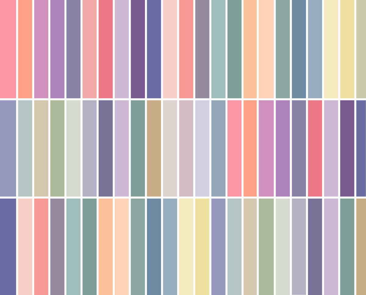
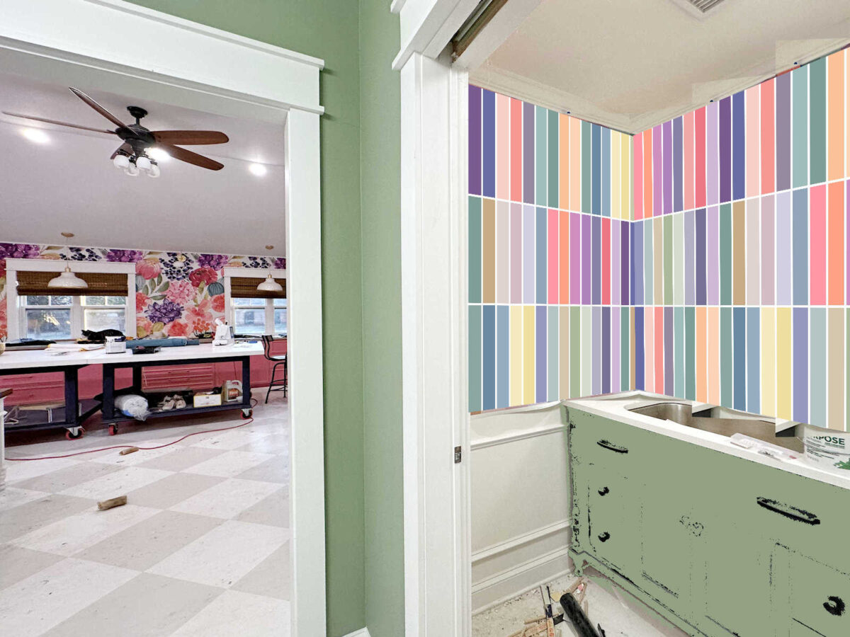
I thought I could tame the design a bit by adding white lines between the colors, but that had the opposite effect. Adding the white made it look even busier.
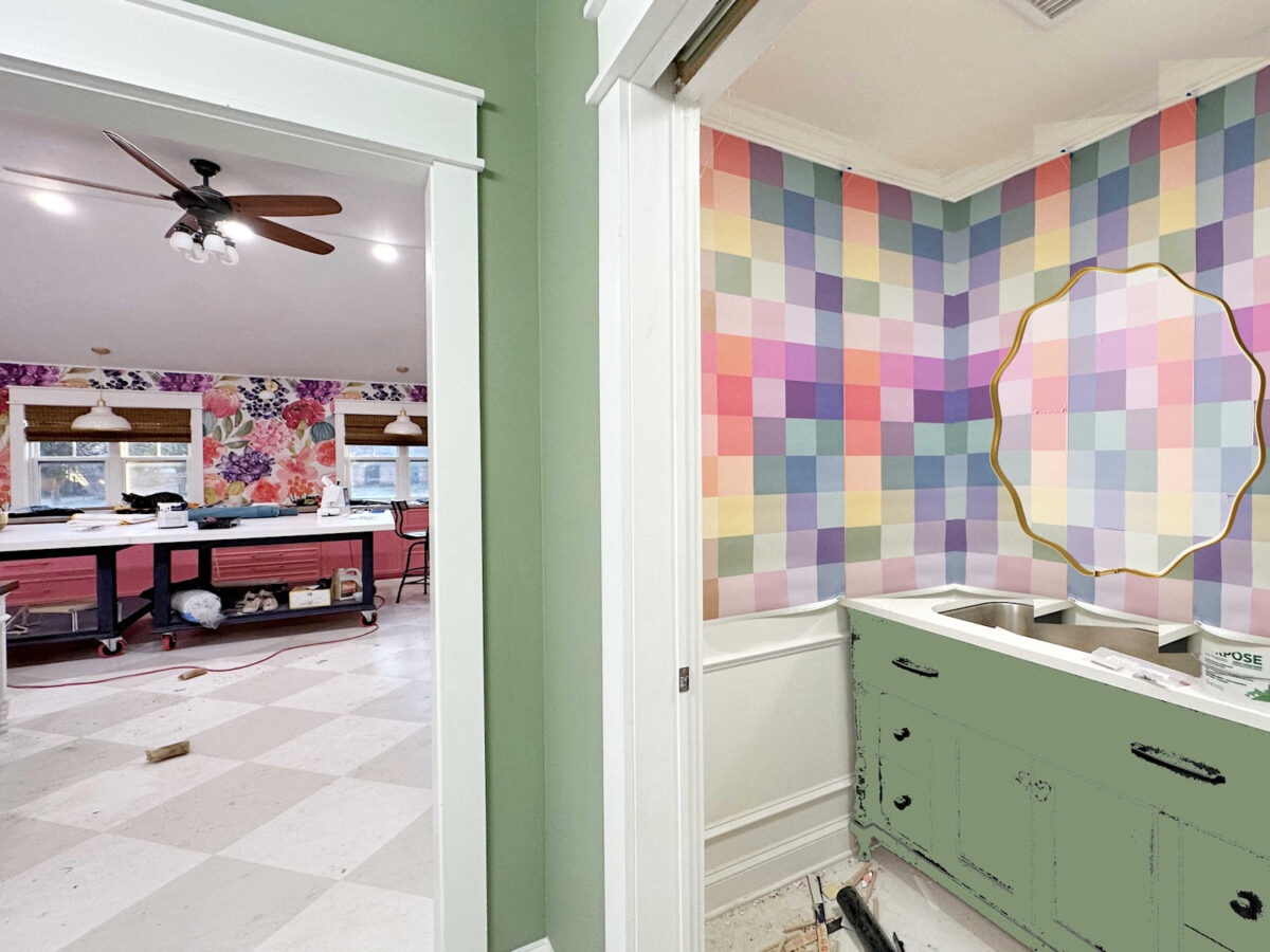
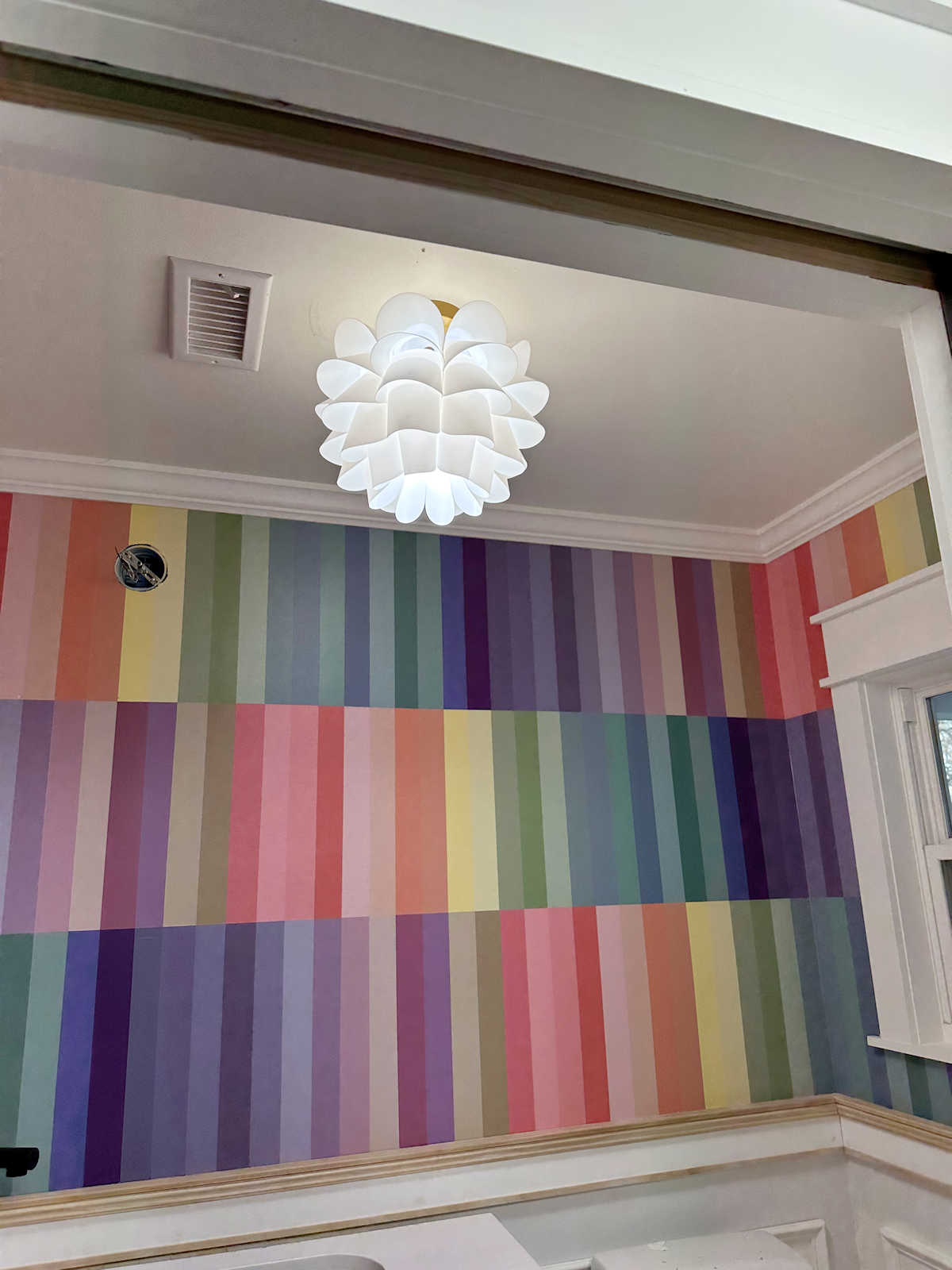
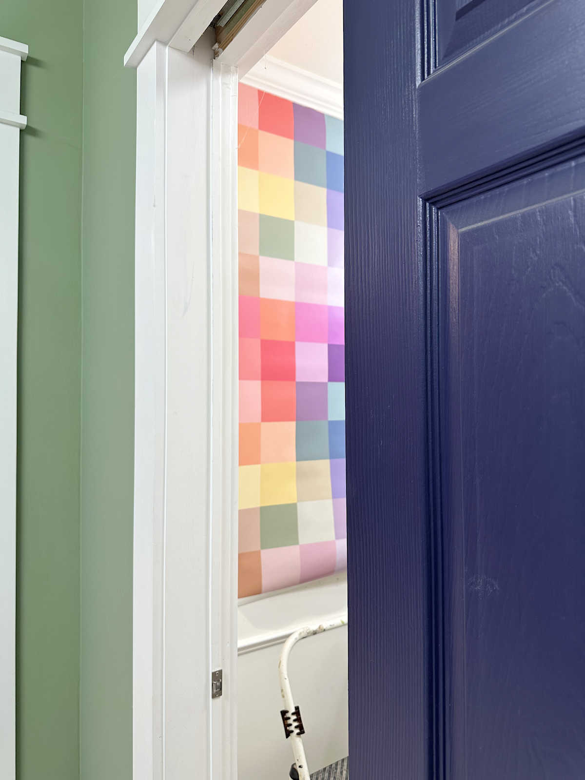
I went ahead and tried it out on the walls of the bathroom just to see what it would look like. Of course, I’ll have a large 36-inch round mirror on the wall, and I’ll also be adding artwork to at least one wall (behind the toilet), but even with large portions of the wall covered, this was still too busy for me.
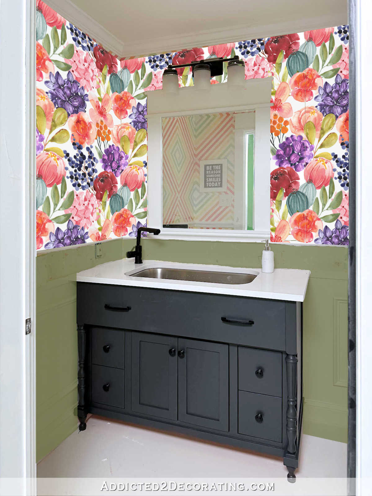
Another idea I wanted to try was adding white lines between the colors on my original square design. I liked it when I saw it like this…
But then when I put it on the walls, I wasn’t quite sure about it. It almost looks like grouted tiles, and I don’t want my walls to look like tile. On the other hand, I do like the brightness that the white adds to the design. It does look busier than the original design, although it doesn’t look nearly as busy as the vertical stripes with the white lines.
But when I compare it to the original design, I think I still lean towards this one.
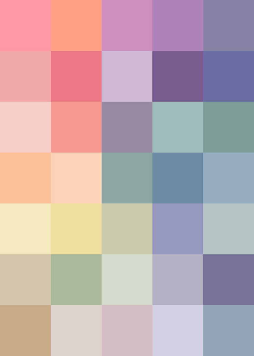
There’s something about this design that seems more pleasing to my eye without the white lines.
Here are the two side-by-side.
I’ll be honest. I was really hoping that the one with the white lines would work out because it would be SO much easier and faster to paint. I could tape off all of the squares with 1/4-inch painters tape in one step and then paint the squares in one step. Without the white lines separating the squares, it will be a process of taping off certain squares, painting them, and letting them dry. Then taping off more squares, painting them, and letting them dry. I’ll have to do that over and over until they’re all painted. But I think it will be worth it to get the look I want.
So after that whole exercise, I’m back to the original design…in paint. I have no idea how long it will take me to paint all of those squares, but I’m up for the challenge. I’ve done much more tedious painting projects before, so painting squares might end up being very relaxing and enjoyable. I’ll just need to find a really good, long podcast to listen to, put my headphones on to drown out any distractions, and get busy.
More About My Studio Bathroom

see all studio
bathroom diy projects
read all studio
bathroom blog posts

Addicted 2 Decorating is where I share my DIY and decorating journey as I remodel and decorate the 1948 fixer upper that my husband, Matt, and I bought in 2013. Matt has M.S. and is unable to do physical work, so I do the majority of the work on the house by myself. You can learn more about me here.
Do they need to be so small? Would the same vibe, but less busy or overwhelming, be possible with larger squares? Just a thought!
I like this idea too! Interesting for sure.
I was wondering the same thing.
I know you will find the balance that will look gorgeous. Have fun, that’s the important part.
Cheers to you, Matt and the Fur Babies!
I love it!! It’s going to look amazing!! Can’t wait to see it finished !!
I can’t imagine painting all those squares. My back hurts just thinking of all the time spent on a ladder. I would prefer a calmer solid color wall with some artwork along with the pretty mirror and ceiling light fixture as features in the space.
Same, but it’s not my house.
Could you just lightly pencil the square borders and freehand paint the squares? Start with one color of paint, do those squares, and then on to the next.
It will be worth it!
Cut the squares from the wallpaper and just glue them individually to the wall. I’m sure that would be less time and effort than recreating it with paint.
Then there would be the edge lines where the wallpaper ends, which was part of the original problem.
If she overlaps it, then yes but if she layers them purposely then it would be part of the design. If she buts them up to each other, then it would be just like when seams meet putting up strips/sheets of wallpaper.
She’s also going to have the “original problem” of edges with the paint like last time, if she paints sharp, clean edges with the new design. It seemed to be only a problem if she was overlaying the wallpaper over the paint which showed the edges below.
What if you did a wider white border around the colored squares, similar to the paint sample cabinet in your studio?
I like this idea …. a lot 🙂
Make a large stencil and paint several squares at once.
Do you think you’ll have the same issue in the corners with paint, where it was obviously un-plumb? Or do you think you can get the illusion of straightness as you’re sooo good at figuring out how to work around the quirks? I can’t wait to see!
I could disguise the issues if it’s painted. The wallpaper is very unforgiving.
I love, love, love the one that you went back to without the white lines in between! I really like the mirror with it and it looks great with the vanity (although my vote was for the eggplant!). Have you considered having a custom wallpaper instead of paining each square?
The plaid was a custom wallpaper she had made.
Will be interested in how you organize/plan the painting so you get the colors you want where you want them. Honestly, I feel the no white lines looks busier to me…its like my eyes are trying focus it? But with the white lines it’s orderly to my eyeballs already. The no white lines reminds me of the pixelated pictures from the 90s where if you stare long enough an image appears. Remember those?? I keep looking for the image in the no white lines. LOL
Will you still have the problem with uneven walls that you had with the wallpaper? It seems that squares are squares.
Painted squares can be slightly off without being too noticeable. It’s a more forgiving method. Wallpaper is very unforgiving, so every wrinkle is noticeable.
I love the squares without the white lines….they made it hard to rest the eye. I think it’s going to be stunning – and the mirror you chose is to die for! I love colour as much as you! I’ve always said I don’t live in a beige world…I get the heebie-jeebies when I see rooms in light neutrals!
Cannot wait to see this bath when you are done….it’s going to be gorgeous!
I do like the orderliness of the one with the white lines. It looks cleaner and brighter and less chaotic to me. I wonder if the comparison would be more realistic if you removed the reflection in the mirror, put the mirror in both mockups, and maybe added a print to the left wall?
But having said that, I do know that whatever you choose to go with will look amazing when you are done !
I’m wondering if you go with a slightly larger square if it would still give you the effect you like but would not be as busy.
I actually love the vertical stripes with the white lines. I’m a stripe lover, and I know you are too. When I look at the squares with no white, I see plaid and I see Easter. The stripes I see as fresh and an overall more updated look.
I like the one with the white lines. I saw a lady painted her room with a gingham using three colors, I think. It looked really pretty. Have you seen that?
I’d love to see a mockup of the painted squares, in a more limited array (white, green, pale purple? or white green and darker green) so it comes out as a diamond display, or a buffalo plain, or even the squares of the original design, but more muted.
What if you took a 9 square section directly from the paper and repeat it? For instance the top left 9 squares. You have all the colors used in several projects in the studio. This would tie in more with the entrance and be similar but different. Might be faster using fewer colors. Just a thought.
I like the white stripes! Also, like you said, a lot easier. Once installed you can paint over all the tape at once with white paint so you’ll have no bleed through. Can’t wait to see the final product!
Perhaps the squares need to be larger. It makes me dizzy. And perhaps a more grounding color on the bottom instead of white? You’ll make it look good whatever you do.
By painting every other square, you’ll only have to tape twice, right? Although it would involve taping the whole wall twice, right? Trying to wrap my brain around this.
I’m glad you’ve landed on a solution that is very doable and keeps your vision alive.
I was wondering if you made the squares the size of four of the current ones so the squares are bigger. It would be easier to paint and might not look as busy.
Another thought would be small ticking size stripes in the assorted colors.
The colors are yummy and go so well with the other room. What a fun bathroom this will be.
Have you thought of larger squares less repetitive movement (saving wrist and shoulder joints) instead of the smaller ones? I like the colors in the wallpaper but it seems really busy for such a small space. Pick out a lesser amount and go bigger in a mock up see if you like it. Oh and you will be able to move on to the next project sooner. Have a blessed day.
I like it – looks pixelated!
I love most of your house and your ideas. But I am sorry but this is just atrocious!!
Just rude!
Isn’t it wonderful that we all have different taste, and you can do what you want in your own home, and I can do what I want in my own home? Imagine how boring the world would be if we all had the same taste and style. 🙂
Hi Kristi
I like the green colour you have…such a nice colour. One poster posted about having the squares bigger…I would like to see that modeled. I don’t think I would like a lot bigger, just some. I love the mirror
.
I’m hearing a lot of geese overhead these days (I live in southern Ontario) so spring isn’t far off. Our prayer group still has Matt (and you) on the prayer list. And as Lori Ann says, say Hi to Matt and the fur babies.
You and your mother are both so talented so why not create via drawing and painting the wall of this bathroom. You love birds so could draw birds and use the colors you have chosen. Amazon has several wallpaper patterns that could work that are large enough patterns that the issues you faced with corners shouldn’t be a problem. Here is one suggestion : VEELIKE Vintage Bird Wallpaper Stick and Peel Floral Wallpaper Blue Floral Contact Paper for Cabinets Walls 17.7”x354” Self Adhesive Removable Bird Wall Mural for Renters Bedroom Bathroom https://a.co/d/0hQpmGb7
Spoonflower has a very similar called Birds of a Feather.
I really believe you and your mom could draw and paint a beautiful wall for your guest bath using the colors you have chosen already – birds and add a few flowers similar to wallpaper in your studio to tie it together!
I’m not sure if you have enough wallpaper left, but have you considered “framing” the wallpaper with trim in the corners and along the edges where you encountered issues? You would still get your squares without painstakingly painting each one on the wall and avoid the issue of matching seams/pattern so tightly? No worries about the corners not laying smoothly either.
The process of painting each square and using the right color would kill me! 🙂
OR you may consider creating the same type of panels on the upper walls, but larger, like you have on the lower portion with the wallpaper in the middle of the panel. You would have color, use of the wallpaper, and depth with the trim surrounding it.
*thought of this after posting my previous comment
Everything you do is fabulous. Just a thought. What about a white background and multi colored dots like stars. It seems like you paint a lot of squares. Your vanity is square, sink.
Just a thought
What about a diamond pattern?