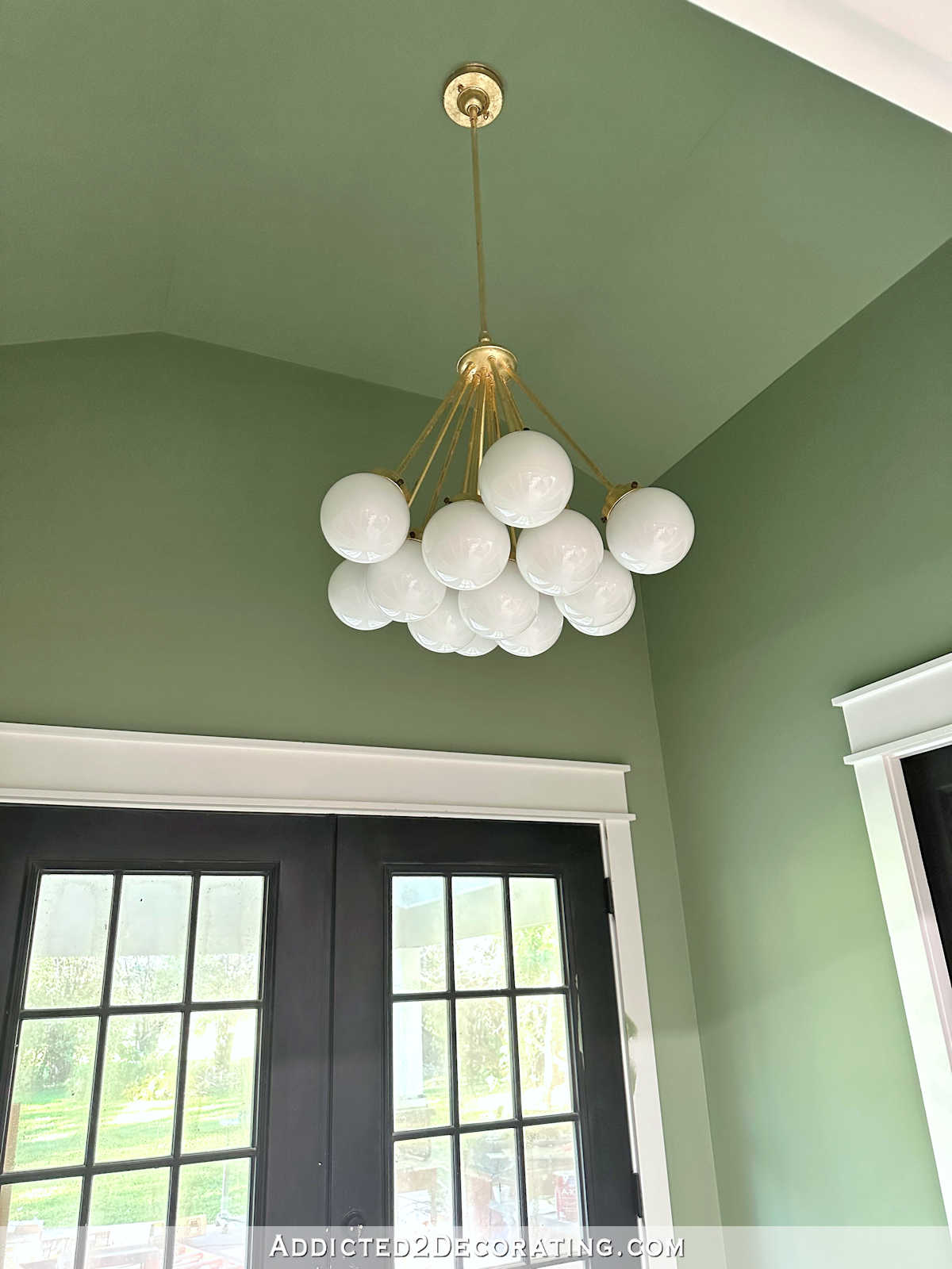
Studio Cabinet Color Options (From Eighteen Options To The Seven Finalists)
On Friday, I used my photo editing software to pull out 18 different colors directly from the studio wallpaper to see what they might look like as a cabinet paint color. I’ve done this exercise before, but (1) that was way back in 2019, and I’ve changed my mind approximately 273 times between then and now, (2) that was with the original wallpaper with the bolder colors and now I have a new edited wallpaper design, and (3) that was before I made a cabinet decision, but now the cabinets are actually ordered and on their way.
So I’m starting the process over again, and I isolated 18 potential cabinet colors from the new wallpaper. I thought it would be a fun exercise to post them on my Facebook page to see what people thought, and people definitely had some opinions! 😀 This morning, the post had almost 600 comments, and most people offered not just one suggestion, but multiple suggestions. Here are the 18 different colors.
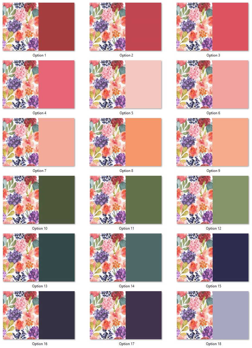
From those pictures alone, my favorites were #3 (coral), #8 (light orange), #11 (green), and #17 (dark purple).
I actually totaled up the votes from the comments, and the clear winner was #14 (medium teal) with 115 votes. The next ones, in order, were #4 (pink) with 88 votes, #12 (light green) with 87 votes, #5 (light pink/blush) with 72 votes, and #17 (dark purple/eggplant) with 70 votes. Those were the top five.
The least favorites were #10 (dark green) with 15 votes (navy blue), #2 (pinkish red) with 17 votes, #16 (midnight blue) with 17 votes, #1 (red) with 20 votes, and #13 (dark teal) with 25 votes.
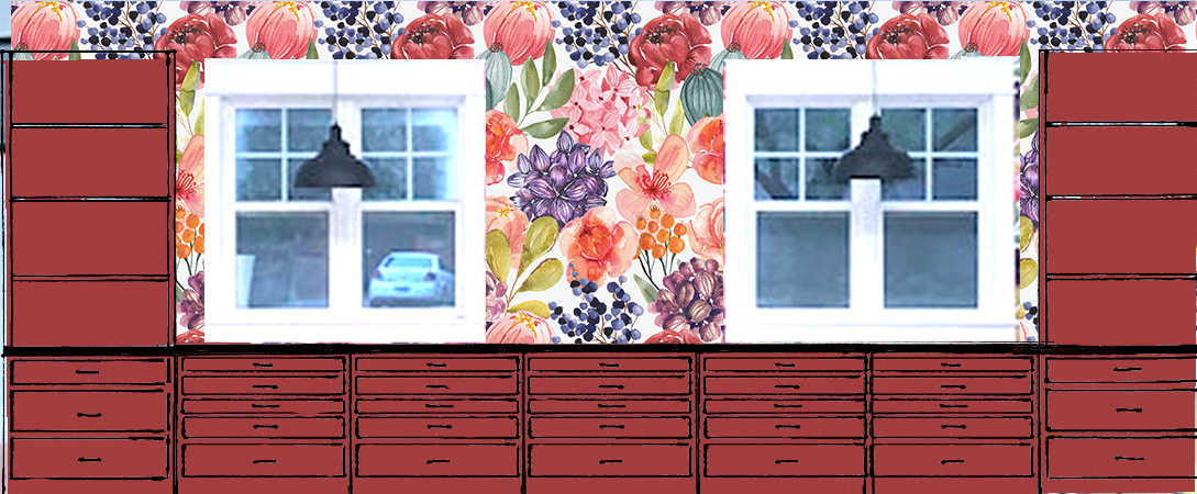
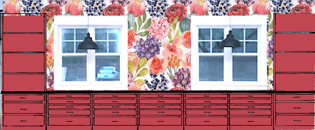
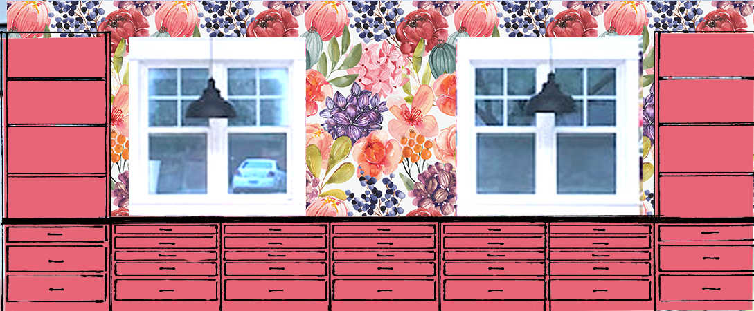
Then my mom decided to do mock ups of all eighteen colors to help me narrow down the options. Not only did this help me rule out some colors immediately, but I was a bit shocked to see that some of the colors I really liked in the samples above actually looked pretty awful in the mock up. Here’s what those looked like…
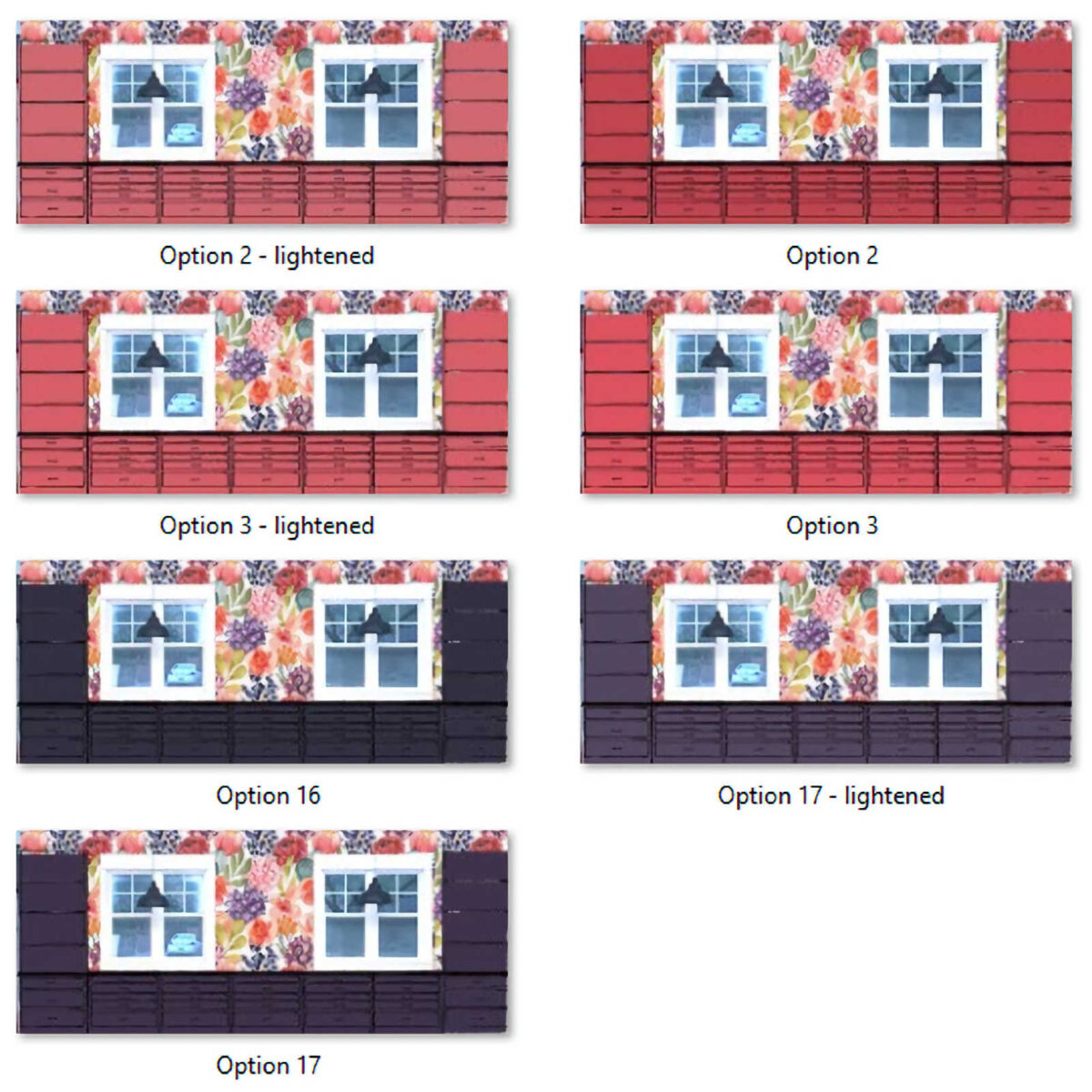
The original 18 options, in order:


What do you think? Did those mock ups change your mind? Did you see a color that you really liked with just the swatches, but didn’t like at all on the mock up?
That happened to me! With just the swatches, I loved the orange (#7) and the medium green (#11). I think both of those look pretty awful in the mock ups. Those were very easy to rule out, as were several others.
My Favorites Based On The Mock Ups
After looking at those, my favorites (two of which were least favorites on Facebook 😀 ) switched to #2, #3, #16, and #17, which are in order below:


Three Additional Options Added
Three more options were added to the finalists when my mom lightened #2 and #17, and I lightened #3. Here are those new options:


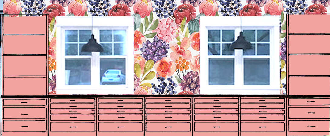
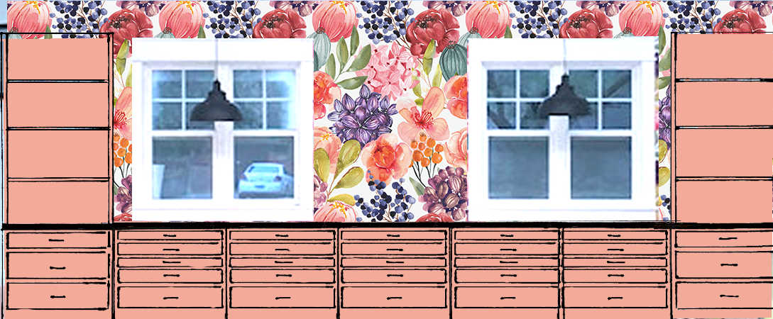
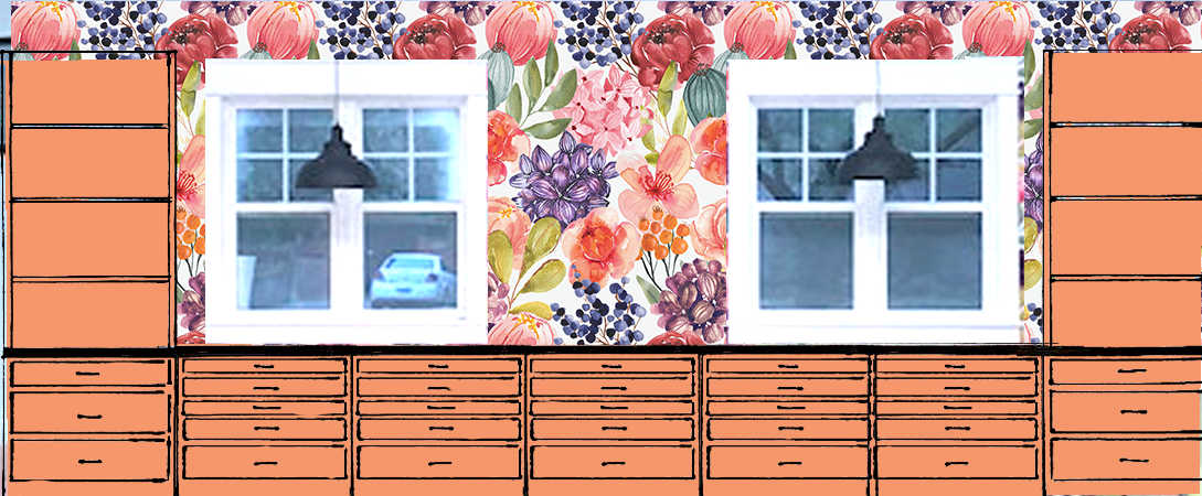
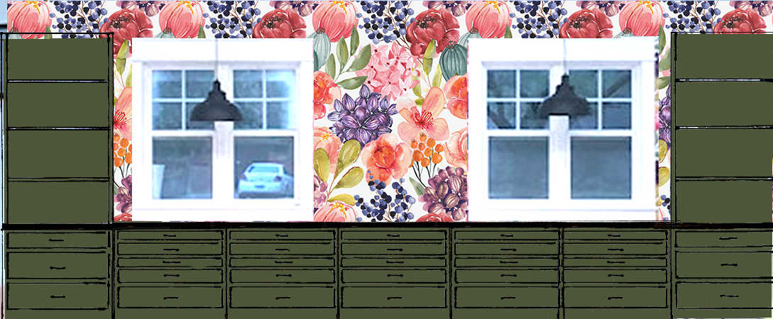
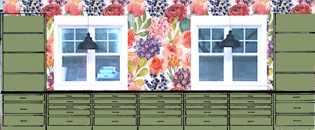
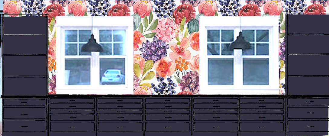
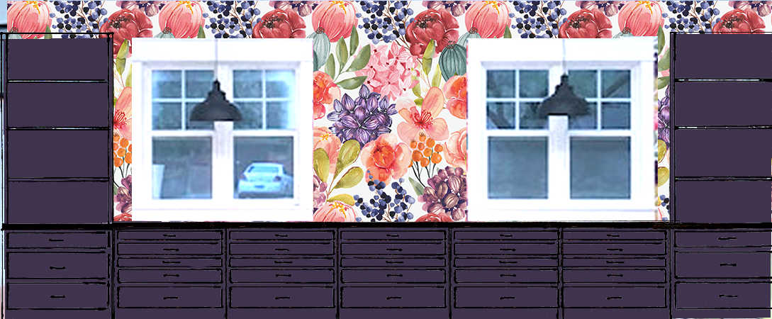
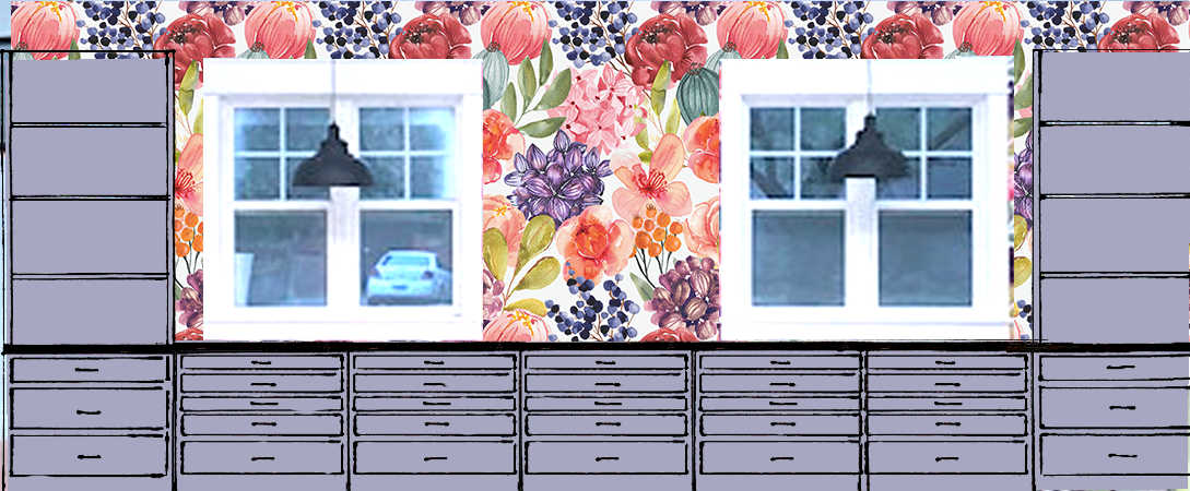
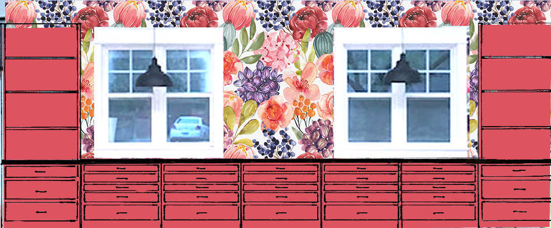
All Seven Finalists
So, after aalllllllll of that, it boils down to this. My mom’s favorite is Option #2 lightened, and my two favorites that I can’t seem to decide between are Option #3 lightened, and Option #17 lightened. But here’s a glimpse of all seven of my final favorites:
I have a feeling that the final color won’t be any of these exact colors. The chance of me selecting a paint color from this post, having it color matched in actual paint, and thinking it’s perfect right out of the can, actually in the room, with the actual wallpaper, is approximately 0.0012793%. I’m sure it’ll need some tweaks. But this at least helps me to rule out certain colors (orange, green, and teal are a no go for me, as are any light colors like blush or lavender). And it helps me to narrow down the specific characteristics of the colors I like. For example, I may like a slighter lighter, grayer purple over a deep, super dark purple. And I like a lightened pink with a touch more vibrancy to it than what my mom likes. And navy blue is always a good idea. 😀
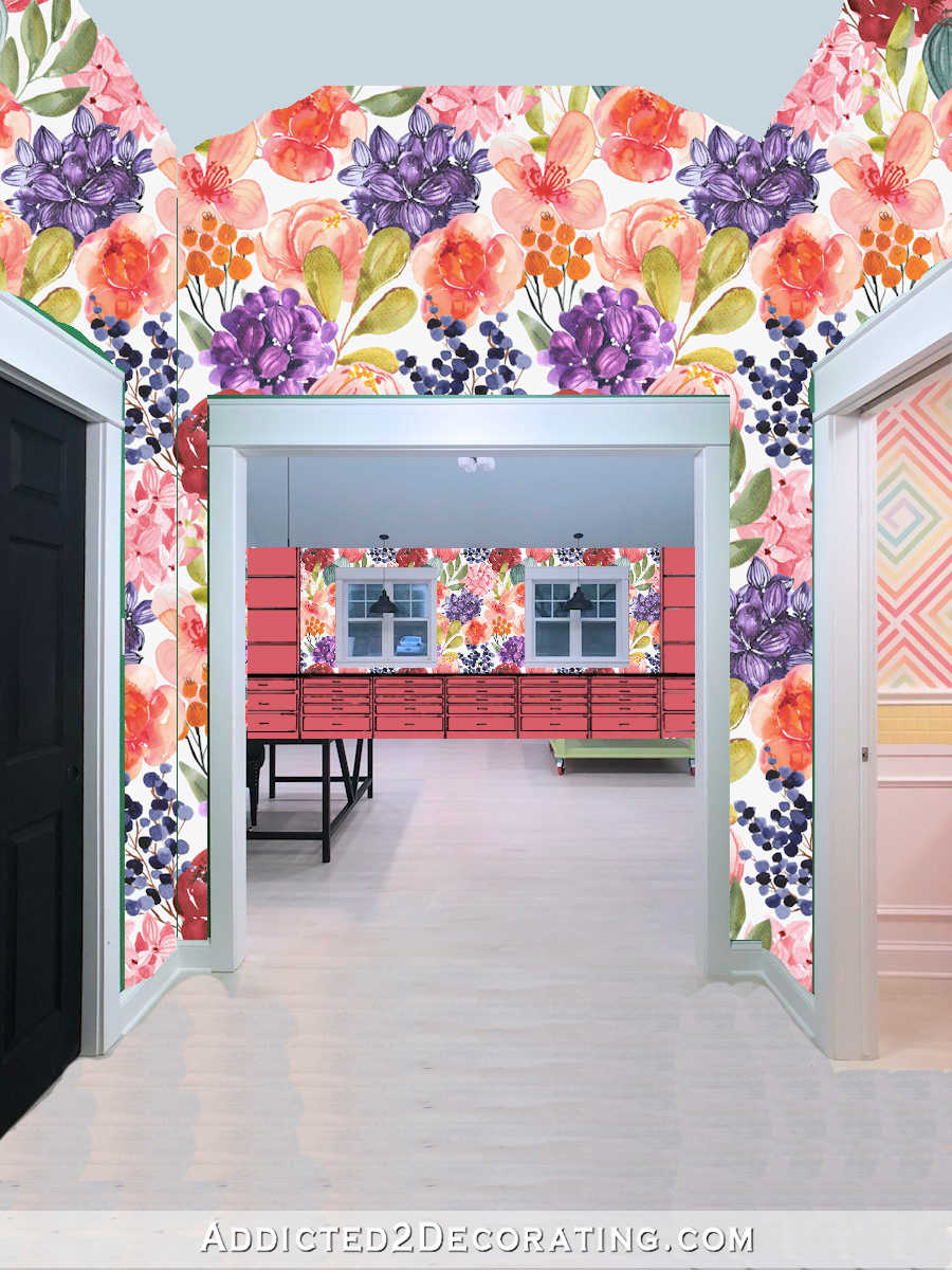
Now I want to hear what you have to say. Just keep in mind that (1) the wallpaper will only go on the long main wall, and the print will be larger than what is is now, (2) I’m planning on the walls and ceiling being white, unless a better option presents itself, and (3) the floor will be a geometric white and very light gray pattern.
So, what say you?
EDIT: Y’all, I cannot stress this enough. White is NOT an option. It’s just not. If you love white cabinets, go crazy with white cabinets in your own home. I don’t like white cabinets, and I don’t want them in my studio. 🙂 There is a 100% chance that my cabinets will be painted a color that isn’t white.

Addicted 2 Decorating is where I share my DIY and decorating journey as I remodel and decorate the 1948 fixer upper that my husband, Matt, and I bought in 2013. Matt has M.S. and is unable to do physical work, so I do the majority of the work on the house by myself. You can learn more about me here.


I would do white to match the woodwork around the windows. It would also lighten up the room.
I feel like I cannot stress this enough. White is not an option.
🤣🤣🤣 Kristi is serious about white! Really serious.
My vote is for some version of “#17 lightened” purple. Can’t wait to see what you choose!
Throw color out there–have you thought of black?
I have. And as much as I love black, I think that would be too much for me.
The wallpaper is amazing and should be the focal point. So even if I like #17 lightened, I would paint in one light color that would keep our focus on the wallpaper. It could be another color that wasn’t considerate yet.
I’m with your Mom – #2 lightened would be my go to. It’s a big expanse for one colour and the darker ones would be too heavy for me, even lightened.
I’m for #3. I love $#17, but I feel like it could be too dark. If it were closer to your living room chair color, maybe. #3, or whatever iteration mike make the final cut, is just so lively and cheerful and happy!
Just a thought – Call me crazy but I love that wallpaper and can barely see any! Remove the wallpaper, paint the cabinets and wall the same color, and use your wallpaper on another wall that showcases it better.
I agree mostly with this comment. The wallpaper loses its punch with so many cabinets. I too would move the wall to another wall. I would paint the cabinets the same gray as in the floor and paint the walls around the cabinets whichever color you decide on. Try a mock up of this. You’ll be getting your wallpaper, color and painted cabinets.
Agreed. The wallpaper fades away and loses its impact. The cabinets would have to be much lighter than the wallpaper for the wallpaper to stand out and be the focal point.
I totally agree with you!
I like any version of number #3. Pink/coral has got to win, since it is your room. Lol!
#2 was my immediate choice! I hate the purple, sorry 😞
Same, #2 was my favorite, even when offered the lightened colors.
I like either 2or 3, lightened. But then it occurred to me that they might be close to the hall bathroom vanity that you’re planning to change. Would that make a difference?
The problem with the bathroom vanity is that it’s too orange. As long as I stay on the pink side, it’ll be fine.
I’m a color girl too! White – no way. Blinding to say the least.
I’d do #17 Lightened in a heartbeat. A really beautiful rug on that floor, some hints of other colors in the paper with a dash of similar purple – BAM. Happy.
ps I think it also provides continuity w/the living room and the splashes of complimentaries throughout your house……
My vote is the lightened #3 or a variation of that warm tone.
#17, lightened is it for me!
I like #17 lightened. Have you considered white on the upper cabinets and the bold color in the bottom?
I am more pleased than I probably should be to see that my 2 of my 3 facebook favorites made the final cut. (And the third was, as you noted, an unequivocal NO once the mock-ups came onto the scene.) I can get on board with lightening #17, but I prefer the unlightened #3 (coral). Any of the Final Seven will be fabulous, though.
Side note: I’m delighted by your odds calculations in this post.
Not white: 100%
Straight from the can: 0.0012793% (which is roughly 1 in 782, btw…. which seems low). 🙂
Of what you presented I’m with your mom on option 2 lightened but I’d really love to see you paint them the green color of your work table.
On a different note, I really wish you’d find a way to have your ads remain the same size as they switch. It’s annoying to be typing a comment and then have the box be no longer visible because the add changed and bumped it off the visible area of the screen. Thanks
I like number 4
I vote for #17 lightened. You’re going to paint your hall bathroom cabinet coral so give purple some love. 😄
For both options, I keep coming back to #6. But, maybe because that’s just my personal preference. I like it best because it’s neither too light or too dark, allowing the wall paper to be the star, and because I always like cool (blue toned) colors better than the warm (yellow/orange toned) colors. However, as I always say, it’s your home and the place where you will spend a huge amount of your time, so should go with the option that makes you happiest. Looking forward to seeing the finished room.
#17, lightened
I’m for number 16. I know, I’m the only one so far… 😀
I think I do like that #17 lightened color quite a bit. Just one little question…do you not care for blues? I see those little dots of flowers that I love in the paper, but only the very dark blue…I also like that lighter gray/blue in the paper. Wonder what that would look like. BUT, I don’t see a lot of blue in your home…lots of teal which I also love. I guess my favorite is the lighter purple, but you will be looking at it the most…can’t wait to see what you decide on. PS) that #2 lightened looks nice with the paper!
I like dark blue. The exterior of our house has navy blue on the shutters and our bedroom has blue. But if I’m going in that direction, I almost always prefer teal.
Loved 16 on your Facebook post and would pick it again! Maybe a greyer navy blue if you don’t want the saturated color. Anything you pick will be amazing and you can always change paint!! Love your work! You are so inspiring!!
I’m sticking with my previous pick of #17 but lightened…or maybe a brighter purple.
Seeing the layout helps bring it into perspective I wish we could see the wall paper between the countertop and top cabinets…unless they are shelves? Whatever color you pick I’m sure it will be beautiful!
I think a Navy Blue would look great or one of the Pinks but please NO Purple.
Both option 17s are the best next to the wallpaper. One of the two is the lightened one.
17 lightened is my fave of your finalists. I personally like the dark green #10, but it doesn’t really feel very Kristi to me. Can’t wait to see what you choose…though I do feel like we should take bets on how many times you have to repaint them to get the color right for you. 😉
I wish I could edit my comment so I’m adding it here. My personal feeling is you will get tired of the coral or pink on the cabinets. The purple looks great with the wallpaper and I think you will enjoy the darker color longer than a bright color like the coral and pink. You have just recently decided you are repainting your coral vanity in the main bathroom. So you have decided that coral isn’t working for you there anymore. Just a thought.
The issue with the bathroom vanity is that it’s too orange. I’ll be taking it more pink with the new color. So the lesson with the bathroom vanity is that if I do coral, it has to have more pink and less orange.
If you want to do color-true photography in this room, that much pink is going to throw it off, even if it’s not visible in the photo. For that reason above all, I choose 17. To me, all that solid unbroken pink looks a little too candy store or Victoria’s Secret garish. But our tastes have not aligned but maybe once or twice in 13 years! 😂
How about a lighter green, like a celery? My current favorite green is Yeabridge Green by Farrow and Ball. My Home Depot had it in their system so I could use Behr paint.
I like #3 lightened. Most are picking #17, but I think it might make the room too dark and depressing.
Whatever color you choose I would simply make sure it is one that functions well while working in the space on objects that might be other colors, the cabinet colors are not impacting the light reflection such that the project’ s colors read off. Obviously you have lighting to improve function. I paint, find that I have to pay attention to these factors.
Have fun.
Another vote for #17 Lightened! The wallpaper is already dominated by pinks (not a bad thing), so it makes for a nice contrast and pulls those purples out a bit.
…but also a second place vote for option #3 😁
#3 my favorite all along or lightened a bit
I would go with Option 2 or 3, possibly even something a little lighter. I think the dark colours suck the life out of the wallpaper – the warm pink/coral colours seem to fit with the predominant tones in the paper.
The towers at each end bother me. They seem to overpower the wall and the windows but I think I recall you saying you were thinking of open shelving with the wallpaper as backing? That would definitely be a game changer and lessen the heavy feel at the edges of that wall and allow the wallpaper to be a real feature again.
I can’t edit my comment but I actually prefer option 6 from the original batch. It seems to overpower the wallpaper less than the others.
I like #2 in the mockups.
I am still liking #17
HI Kristy,
I love the direction your design is going. My suggestion is to change the white trim color around the windows. I Think you should treat it as if it were part of the cabinetry and paint it accordingly. The white is definitely jarring. The second idea I have is to paint the case a slightly lighter color and the door/drawer front a slightly darker version of your chosen color. I think that might play better with your wallpaper.
Though I’m not normally a purple girl, I really love #17 lightened. Also a fan of the navy. Either would look beautiful with your wallpaper!
Kristi….loved #17 as is from its very first appearance with your “Mock Up”…. Still love it……… the lighter version looks washed out to me… YOU LOVE COLOR….
Hmm, of your original colours I liked the ones that were more saturated, because they seem to “ground” the multi-colour, extra-bright wallpaper. I don’t know if you get what I mean by “grounding”, I can’t think of another way to describe it; or perhaps that the colour, a single colour, has to hold its’ own against the very striking wallpaper. And it has to form some sort of “base”, “pedestal” for the wallpaper.
Now seeing the mock-ups I realised that the cabinet colour is getting extra strength because of how many cabinets are there, BUT: It’s kind of overwhelming because it covers the lower part of the entire wall. And somehow, I think it would be better if you had two colours; maybe a darker on the sides and a paler in the middle? Still doesn’t seem quite right…
Maybe do a mock-up of the other wall that has fewer cabinets? Or a mock-up of the original design with the gaps, so there is a better balance between wallpaper and cabinets?
Also, I’m not sure if you ordered the extra drawers for this wall, but IKEA has a system where you can have a bigger outer panel and some internal drawers when you open the lower one; this could help things get less busy (though it could be annoying to use).
I like lots of the colours, I just don’t like the shape they get around your wallpaper… they are not framing it properly…
And I also notice that your favourites are the two colours that kind of merge with the wallpaper, or the one that is acting a bit like a frame and completely separates itself from the rest of the wall… I would consider shapes before deciding on the colour.
I think that I would go with either the purple or navy
#17 Lightened.
Very surprised at the difference between the side-by-side swatches and the mock-ups because I quite liked #5 but not at all in the mock-ups. Can’t wait to see how this comes out!
So, I can’t get past that it’s one massive block of cabinet color with that little burst of wallpaper color. I know the studio is huge and it might not be that much of a mass of one color in reality, though if these drawings are to scale, it’s just making my eye twitch a little bit. What about something like doing the back of the top shelves a different color (or continue the wallpaper?), or doing the shelving up top a different color altogether? That might not look like what I’m imagining in my head, but I feel like it needs a little something to break up that major mass of one color. Especially if you choose to go dark. I like the two lightened colors better, they’re more coral than the originals, which seem more red.
If you already mentioned that you wanted it all one color my apologies, I’ve missed a few posts as I’ve been waist-deep in garage storage and organization projects for the past 4 days 🙂
3
I liked option 3 in the swatches and the final mockup, so that would be my vote 🙂
I like #17 either original or lightened.
Option 3 Lightened.
I like Option 2.
This is a tough one since that wall is so overwhelming with all the cabinets and the big print wallpaper. Glad I don’t have to decide that. LOL
Somehow, I thought it was for the wall behind your desk. I don’t know what I was thinking. But it is quite an overload with all the massive cabinets and the wallpaper.
I’m with your mama, and #5 was my fave as a sample and on the mock up.
#17, lightened.
White or Cream. It’s way too busy. Don’t take away from the wall paper, but let the cabinets recede and the wallpaper shine.
I liked 3 from the beginning and even better lightened.
I’ll say 3, lightened, but I’ll be honest – 6 was my favorite. 😀
I have read all the comments here and it seems I am the lone person who prefers Green option #11 or #12. With the green cabinets, it looks like a garden with the wallpaper. Also, green is the least represented color in the paper so it allows the flowers to shine.
My one lone voice crying in the internet wilderness says green. 🙂
Whatever you do will be beautiful and perfect for you – as it should be! Good luck making a decision. Go with your heart.
I really liked 11, too. It was my favorite. Alas.
I like the green too & basically for the same reason, but she said green is out so my next choice is a shade of purple.
I love how #5 looks and Pink in general. Good Luck and can’t wait to see what you choose!
I don’t care for the purple shades. All four of the others would work for me, especially the lightened shade.
Love the three lightened options! But I think my fav is Option 17 lightened. Can’t wait to see what you land on 🙂
So exciting to watch this project!
I just wonder what happens when the window trim is the same color as the cabinets?
I think the lightened purple is a very grounding color and would be beautiful. I also predict that approximately a year from now you will repaint them all teal! Lol. But, that is why I love to follow you in your decorating adventures!
Sheila F.
#17 Lightened. Which I didn’t like at first but it kind of grew on me!😁
Yep, this changes everything. My first two choices are now awful 🙂 My new favorite is 3, not lightened. I like the value and tone of that pink. To me, navy and purple, even lightened, are to dark, even for a light room.
I like #3 the best – to me it had a kind of depth to it that I liked. When lightened, it lost that, at least in the computer pictures. But I know you will get the color just right for that wall whatever it is. That’s the Kristi way!
100% for #16. I love the deep deep blur!
Option 3 caught my eye before I even scrolled down to see the whole post. And when I saw it lightened. That’s the one! It doesn’t overpower the wallpaper & the wallpaper doesn’t overpower it.
The darker colors overpower the wallpaper way too much & makes the wallpaper look like an afterthought.
Go 3 lightened! 😊
I’ll be honest, and you can chuck my opinion right out the window —- I’m not crazy about any of the colors, and I realized it’s because I’m not crazy about the wallpaper. Sorry, but it’s too bold for my taste, so my opinion doesn’t matter. I said I was being honest! In wallpaper. I like a monochromatic design. preferably a scene of trees or mountains.
I would have gone with white ~ the eye needs a calm, neutral place to rest.
Option 2 lightened is my second vote…. My first vote was option 1….
I vote for 17-lightened as well !! Unfortunately, I don’t see color very well so this may not work, but what about painting the uppers a “17-lightened twice”? I wonder if a shade paler color on the upper cabinets would allow the wallpaper to really shine?
Yikes!! I’m glad I don’t have to decide the color. I’m sure you will pick a beautiful color.
I agree with your Mama Bear! I think it works well with the wallpaper. Best of luck!
Option 2 lightened pink
Number 17 lightened is my favorite! It anchors the darker color in the wallpaper and looks nice with the white trim. What a sweetie your mom is for doing all the mock ups!
I love the navy! It’s a classic! And, if you decide to change anything else in the future, it would go with anything – yet give you the dynamic contrast that pops and balances your large-and-in-charge wallpaper!
It would still be a bold choice that is in character with your aesthetic.
It is, essentially, a ‘neutral’ – albeit a colorful one!
It would, also, allow you to pick out fun colors from your wallpaper to use in various accent pieces without the room becoming too busy…after all, you’ve got to be able to get work done in there – navy can be the substance and calm in a room that will support a lot of action!
As a color-loving designer, myself, I really appreciate the large calms that spotlight those bursts of colorful, joyful accents that I can effortlessly change up at whim…
Option 4!!! – Seriously take another look. Hands down, it’s the best color. Trust me! 😉
I like all four of the pink/coral finalists.
#17 all the way!
I like #2 lightened because it allows the wallpaper to make a statement, more than the other colors. While I like the idea of the lightened purple, in the picture, it looks bottom-heavy.
I’m only going to mention green because I know you tried it in the kitchen & changed your mind so this would be a chance to have it.
But my personal vote would be a shade of purple….17 lightened-ish.
I am sad that so much of the wallpaper will be covered by the cabinetry. I’d consider using the wallpaper on an additional wall, perhaps the one opposite of the cabinetry. I think the coral colors look better than the purples when you stand back and view them, as you would in the room. There seems to be more coral tones in the wallpaper so the coral cabinetry doesn’t jump out at you as much as the purple. Option 3 lightened is my favorite of this group.
I’d vote for the lightened options of #2 or #3. They feel more cohesive with the wallpaper. I know all the colors are pulled from the wallpaper, but for so many cabinets the darker purple just feels like it’d be overpowering. In the mockups, my eye is drawn to the cabinets when they’re purple, instead of the wallpaper.
For me the pink cabinet options let my eye focus on the wallpaper. The cabinets feel like they more seamlessly integrate into the wallpaper with this color option, while still being bright and beautiful 🙂
I like the lightened 17. I think a darker color will show less dirt and also does not compete with the wallpaper. And I think this goes well with the other colors in your home.
You have so much fun picking out stuff. Makes it fun for me too. I like #3 as is, not lightened. It really spoke to me. I want to go paint something that color!! Im so excited about your studio room. Have you been working on the porch?
No help here as I can only narrow down to #3 lightened and #17 lightened at this point!
Didn’t just change up the wall paper because you didn’t like the dark purple flower from across the room? Not sure why you’d lean that way for the cabinets.
I wanted the flower to actually look like a flower and not just a dark purple blob. It wasn’t the color I had the issue with. It was the fact that there was a lack of definition and highlights, so from a distance, it wasn’t even obvious that it was a flower. That’s a very different thing from painting cabinets purple.
I know you say white isn’t an option, but I would do white on top and then pretty much any of the colors you chose would look great! I like the dark purple the best I think.
I’m with you on the vibrancy of #3 lightened. It’s my pickl.
ummm *pick*, I pray neither of us is in a pickl! lol
I second your opinion on white!!!!