Studio Storage Cabinet Design Ideas
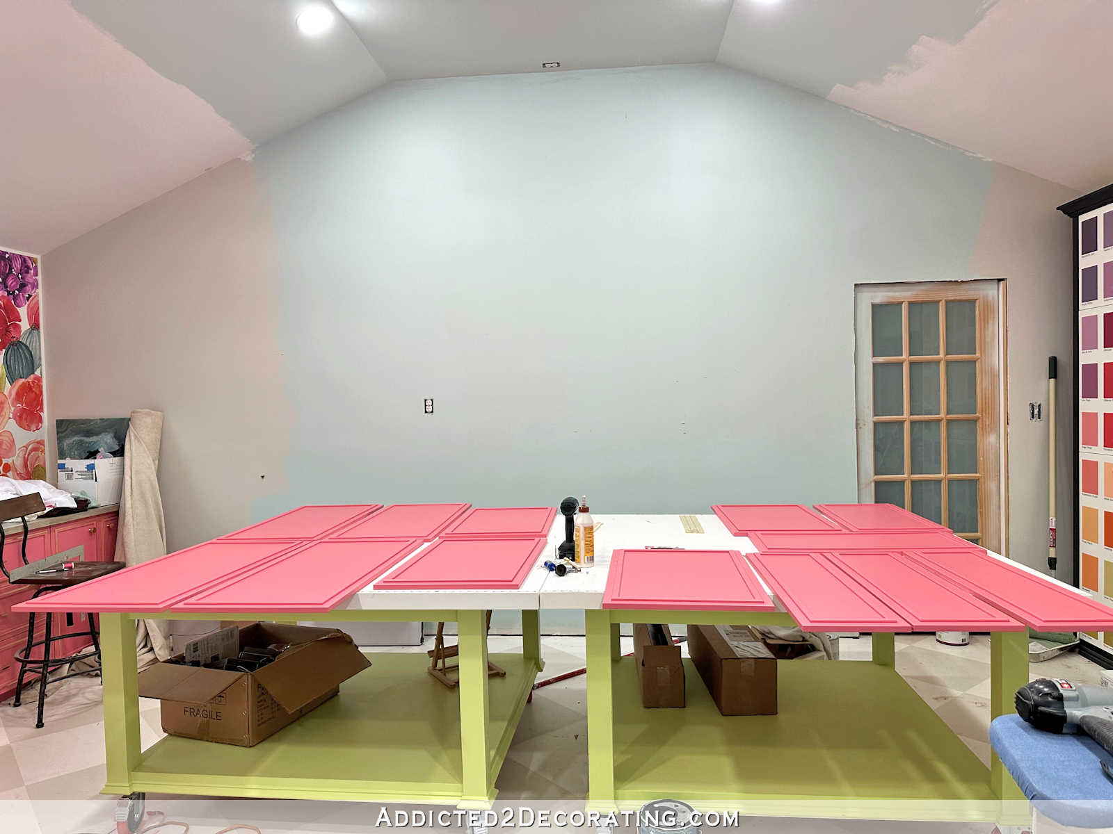
Y’all will have to wait until next week to see the mural wall cabinets because I got them all painted and clear coated, but I didn’t want to risk putting the doors and drawer fronts on too soon. I’d rather give the clear coat a couple of days to dry before messing with them. And I know some of you have lots of questions about the painting process, products used, etc. I’ll share all of that next week.
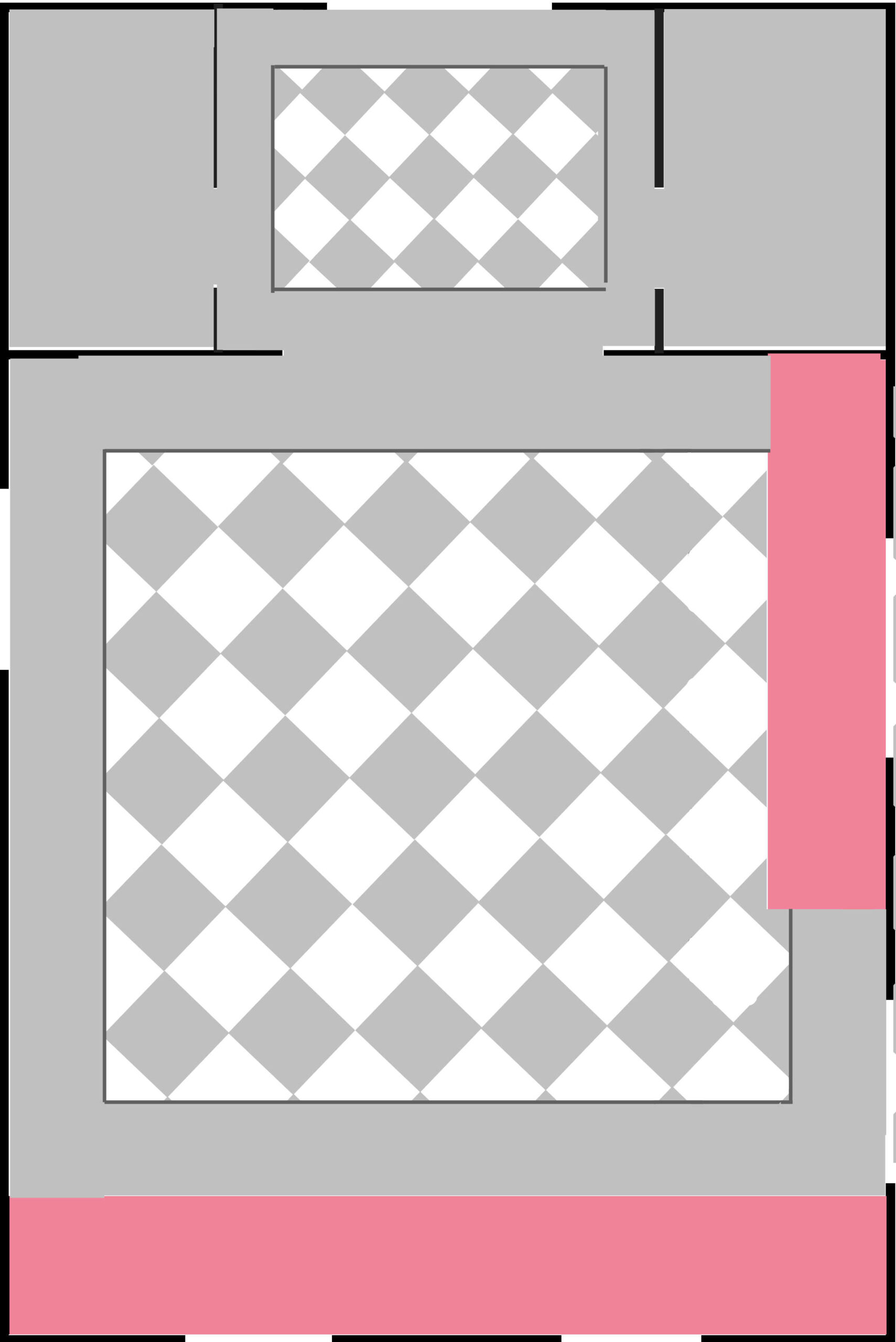
In the meantime, I can’t stop thinking about these cabinets just inside the door from the breakfast room. As I’ve already shared, I hesitate to paint them pink and treat them just like the other two sections of cabinets in the room.
If you’re new around here, and haven’t had the chance to get caught up on my studio project, these are the two areas of cabinets I’m talking about that will be pink. First, there’s the mural wall that will have 20-feet of lower cabinets painted pink.
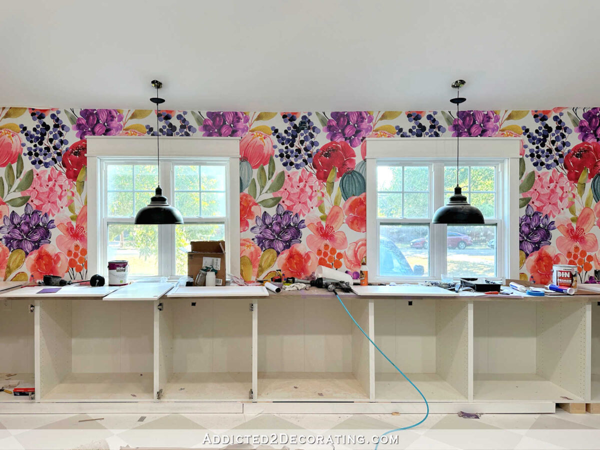
And here’s the a peek at the pink.

The second area of cabinets that will be the same pink is this corner that I call the office area of the studio.
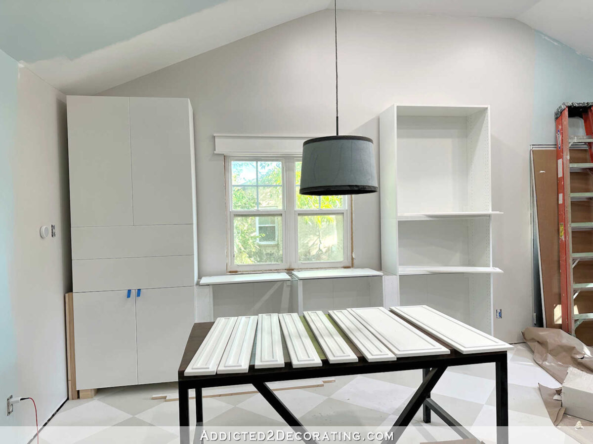
I love the idea of those two areas of cabinets matching in color and style. But when it comes to this third area of cabinets just inside the studio door, I just can’t quite get on board with these matching in color and style. I think it would be overkill.

Obviously, I’m still working on putting that section together. 🙂 My original plan had been to make them look just like the rest. You can see that I put the same functional-but-not-pretty feet on these that I made for the other sections because I planned to make this section look built-in just like the others, meaning that those utilitarian feet would be covered with baseboard-type trim.
But now I’m thinking that instead of making them look built-in, I should make them look like a completely separate piece of furniture, just like I did with the cabinet in the water closet area of our bathroom.
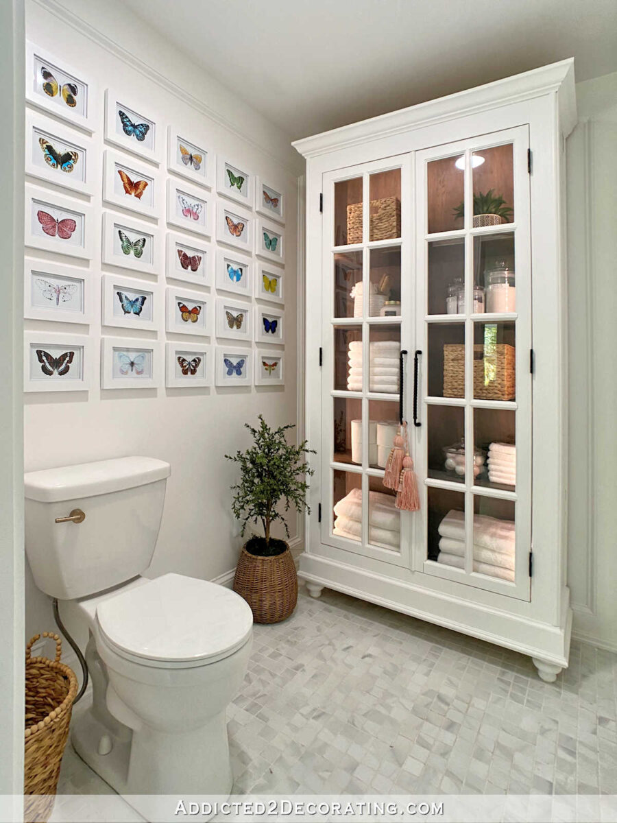
If you followed the master bathroom project, you might remember that I had initially planned to add built-in cabinets to that area, but I ended up making this cabinet as a separate piece of furniture instead. And I’m so glad I did! I think having this cabinet as a separate piece of furniture instead of built-in cabinets looks so much more interesting.
So I think that’s the direction I’ll head with this section of cabinets in the studio. I’ll have to start by removing the utilitarian feet and adding some pretty furniture feet.

And then I need to move it away from the side wall and center it on the wall like I would any piece of furniture that I put there.
Those are the easy decisions. The harder decision is what in the world I’m going to do with the rest of it. 😀 I’ve spent some time on Pinterest trying to find ideas that I think would coordinate with my pink cabinets with gold accents, and would also look good from the main areas of the house since it will be visible when the studio door is open. Here are a few that caught my eye.
I love the look of the doors (not the legs, just the doors) on this Ehren Rattan Sideboard from All Modern (affiliate link).
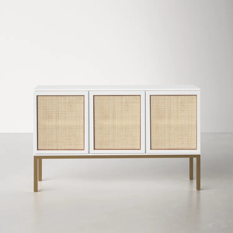
I like that the rattan has white behind it to keep it light, and the color of the rattan looks so good with the gold accents. It needs door pulls, though.
Next up is this Scale Pattern Sideboard (affiliate link) from Homary.

I love the design on the doors, but I have no idea what color would work. I almost think it would have to be various shades of white with the gold scale design over it. And since my cabinet will be so much larger than this one, I would probably only use the design inside a framed area of each door rather than doing it on the entire door. After all, I’ll have 12 full overlay doors on my cabinet.
This next one is the perfect example of being able to find inspiration even in things I don’t necessarily like. 😀 I don’t really like the look of this geometric credenza from Society 6 (affiliate link), but I do like the idea of doing a geometric color block design and adding in some metallic gold.

But I would use much softer colors to coordinate with the room. This black, white and gold design seems very harsh for my taste. So you’ll just have to imagine a color block design done with soft, pretty colors pulled from the floral mural. Actually, there are a ton of painted designs I came across that would work. Everything from stripes to small geometric designs, and just about everything in between. When it comes to painted designs, the options are limitless.
Here’s another example of a color block design on this Jonathan Adler Harlequin Chest from Perigold (affiliate link).

Another idea is to do a textural design similar to this small accent cabinet from Hulala Home.

And I already know how I would recreate that look. It would be a very fun project! But it could also get pretty expensive.
And finally, I would do a simple metallic design like this geometric gold pattern credenza from Society 6 (affiliate link).

I don’t particularly like that specific design. It looks too busy to me. And if I did something like this, it would be gold on white, so it would have a softer and more subtle look. But I do like the idea of a simple metallic design.
So at this point, I have no idea which direction I’ll go. Of course, anything with paint and a little trim would the most economical. Anything that involves a lot of trim to create a design on the doors could be quite expensive with such a large cabinet and 12 doors. But I want to do something pretty, something interesting, and something that will coordinate with the studio and the main areas of the house.

Addicted 2 Decorating is where I share my DIY and decorating journey as I remodel and decorate the 1948 fixer upper that my husband, Matt, and I bought in 2013. Matt has M.S. and is unable to do physical work, so I do the majority of the work on the house by myself. You can learn more about me here.


Okay, here’s my wild out of left field suggestion. Soo many of us still grieve over the birds and flowers mural… Could you have your mom draw a similar motif on the door fronts? Something like a Chinese painted chest.. (https://chait.com/ItemImages/000318/318846A_lg.jpeg but with different colors of course) It could be a stand alone piece of furniture that’s also a stand alone art piece… And still follow the botanical theme of the studio wallpaper…
Beautiful idea ❤️ Gold birds!
The white in your bathroom is really lovely.
Making that stack of cabinets look like one piece of furniture is great ideal! How about bringing your wood countertop over to this side?
I think I’d pull out and match that dark purple from the wallpaper for the freestanding cabinet. Gold hardware or stencils would look good with purple too. If you don’t want it solid, gold metal mesh instead of glass is nice. I have metal mesh in an antique cabinet in my kitchen. I’m sure whatever you do will be lovely.
Love idea to look like piece of furniture than just so much more cabinets.
Maybe keep it simple with simple trim, nice feet and paint it white. 1) In a couple years, after your addition is complete, you’ll most likely want to change the current breakfast/TV room. Having something colorful that matches the current room may not fit in with what you decide to do in the near future and will create more work, and 2) you’ve got a lot of pattern and color in the room already with colored cabinets, wallpaper and fabric curtains. A simple white cabinet will blend into the background and make those design elements, and any art work you create for the walls, pop and be the stars.
What about doing something like you did with your guest/master bedroom, but use the floral pattern of your wallpaper, with the flowers outlined in gold on the white cabinets?
Love the white cabinet with the rattan inset or even a white cabinet with gold mesh inset that you can find at Home Depot or Lowes.
OOOh!! I love the scale design…but how about adding all the colors from that gorgeous new square multicolor wallpaper/poster you just ordered for the studio powder room for all the scallops? Aren’t those all of the colors also pulled from your mural as well? Or would that be too busy? Anyhow I just love the scallops with the gold edging, its geometric yet it softens the hard lines of cabinetry, plus the gold!
Would love to see you explore this idea further.
This!!! Everything you suggested ❤️
For the textured one maybe pole wrap would keep it economical.
good idea!
I suggest doing wooden rods like in bathroom backsplash.
What about some kind of drawn floral that coordinates with the guest room wall?
Hello Kristi,
I always enjoy your designs and creations. I’ve been following you for several years and you are inspirational. Check out Nate Berkus and Jeremiah Brent’s Ikea wardrobe hack for their Montauk cottage. I tried to include a link or even a photo but was unsuccessful. It’s similar to one of your ideas for the cabinets. I believe People magazine has it but if you Google it you’ll find it.
I think they are all good ideas. I think something like the Ehren rattan and the Hulala door fronts and legs would look best in your studio because they have simpler designs that would not compete with the wall of tuberose cabinets with the wallpaper behind them. I also think a simple design in white with gold accents would look nice from the kitchen area.
Personally I love the idea of caning the door insets. Everything else for doors seems like it might compete with the wallpaper.
I forgot to say, I love, love the piece of furniture looks. Brilliant!
With all the color you have going in the room, I think you need some texture. I would go with the rattan or maybe a gold wire mesh.
I love your cabinet in the toilet area, so what a great idea to do something furniture like for your studio. I like the all, but the rattan one is my choice.
You could maybe repeat your bathroom wall squares design on the cabinet.
Love the rattan!
LOVE the rattan with the gold accents on white cabinets. Think it would look nice from the kitchen and sitting/breakfast room without competing for attention with the colors & patterns in those rooms. Kind of a transition piece between the spaces. Then, once you come into the studio, BAM pink cabinets for a massive punch of color!
I like the first the best, and am really not a fan of the color block design. What about using the mesh like you did in the kitchen? As the two spaces can be seen together, it would kind of help in tying the spaces together?
When I saw the photo of the scales my mind clicked ‘loving this’. Using the colors from your wall paper mural for the scales. Scattering the colors about, but yet some of the like colors being close enough to create strength in like colors. With the scallops done in gold. Just a thought.
Looking forward to the reveal next week…I think our minds will be blown! Those doors look absolutely beautiful, and I, and probably lots of other followers are waiting to see how you got that finish. As soon as I find out, I’m ordering that finish product. I hope you have a link to get some credit for all our purchases. I have purchased some of you recommendations before, but never saw any links. Maybe you do that on purpose? Anyway, I want my painted items to look like THAT! I also like the idea of making those cabinets by the side door more like a piece of furniture…the one in the Master Bath is gorgeous. I’m with the camp of keeping it a bit quiet to transition in between the two rooms, and I love the idea of white or a soft color with the gold trim or mesh, or the rattan insert. Maybe any of the other colors you like in the mural but light with a gold drawn design or the painting your mom could do would be awesome.
ALWAYS nice to have some art from your mom! What a nice canvas! You must be getting so excited to see this coming together!
Love the rattan. White with gold accents. Perfection.
What about a line drawing based on your studio floral wallpaper, done in gold on white or pink, similar to the feature wall in your guest room?
Could you cut out some of the wallpaper flowers and paste them on? Or make stencils from the wallpaper pattern and paint them on? I did that with botanicals on a white armoire once and loved it. Making it a stand alone furniture piece is a good idea. The one in your bathroom is gorgeous.
Or, what if you drew the wallpaper flowers in gold on a white background? It would mimic the wallpaper but just be gold outlines on a white background. It would tie them together while still keeping it less busy.
I love the rattan choice. I really like different textures in a room. The making it look like a piece of furniture is a great idea! It will wonderful to watch how you put it together. Have a happy weekend!😊
I would choose the Rattan. My only concern is will it attract dust from any projects you might do in the room? (I would consider using a wallpaper that looks like rattan instead of the real thing if there will be a dust issue.) All of the other designs seem a bit busy or costly, and I would stay away from adding color, since your comment that the wallpaper is the statement for the space. Whatever you choose, it should be simple and understated. I also like the white cabinet with what looks like half-round dowels on the front and gold pulls. Very simple and understated, but could cost a bit.
Put some wallpaper inside the cabinet. In the insets put the palest of pink and the trim gold. The rest white.
I like the idea of the texture. My suggestion would be to paint your cabinets gold with the textured pieces in another colour from the mural over top. If the texture is slats then the background colour of gold would peek through in between the slats. Also,the slats could be placed in a geometric pattern instead of just vertical or horizontal.
Not exactly this, but the idea of it. But birds. What if you did birds on each door as an inset. Either from that fabulous botanical account you shared a few years back. Or done as a gold outline/drawing.
I was completely unable to find something closer to what I saw in my head, so this may not resonate at all.
https://www.invaluable.com/auction-lot/chinese-black-lacquered-cabinet-decorated-with-ja-43-c-c7849b7986
I made a card that had large flowers but I also had the matching die cuts for the flowers. So I cut out just the outline in gold and put it on velum and it was beautiful. You could do that within the small trim – beautiful.
There’s so much going on in the studio, I really like the first rattan option. It’s a nice design without being busy or screaming “no, look at MEEEEE”