Studio Updates: Floor Progress, Bathroom Decisions, Cabinet Paint Colors, and Back Entry Options From Reader Suggestions
Actual progress on the studio has been a bit slow lately. I’ve had a lot of non-house-related things taking up my time since last Friday, but I’m coming up on three whole, uninterrupted work days, and I hope to get quite a bit done. But there are a whole lot of things rumbling around in my mind regarding the studio! And I think I’m edging closer and closer to narrowing down some decisions that I’ve had a hard time with.
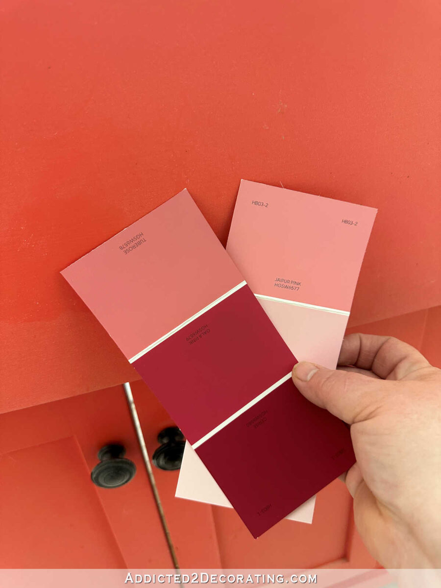
First, let’s talk about the paint color for the studio cabinets. I told y’all a few days ago that I went to Home Depot to find paint colors, and they didn’t have anything even close to what I was looking for. Their colors jumped from too purple to too pink, but what I needed was somewhere in between.
But a couple of days ago, I went to Lowe’s (I don’t think I’ve ever bought paint at Lowe’s), and they had two colors that might be just perfect! They’re both HGTV Sherwin Williams colors. The darker one is called Tuberose, and the lighter one on the right is called Jaipur Pink.
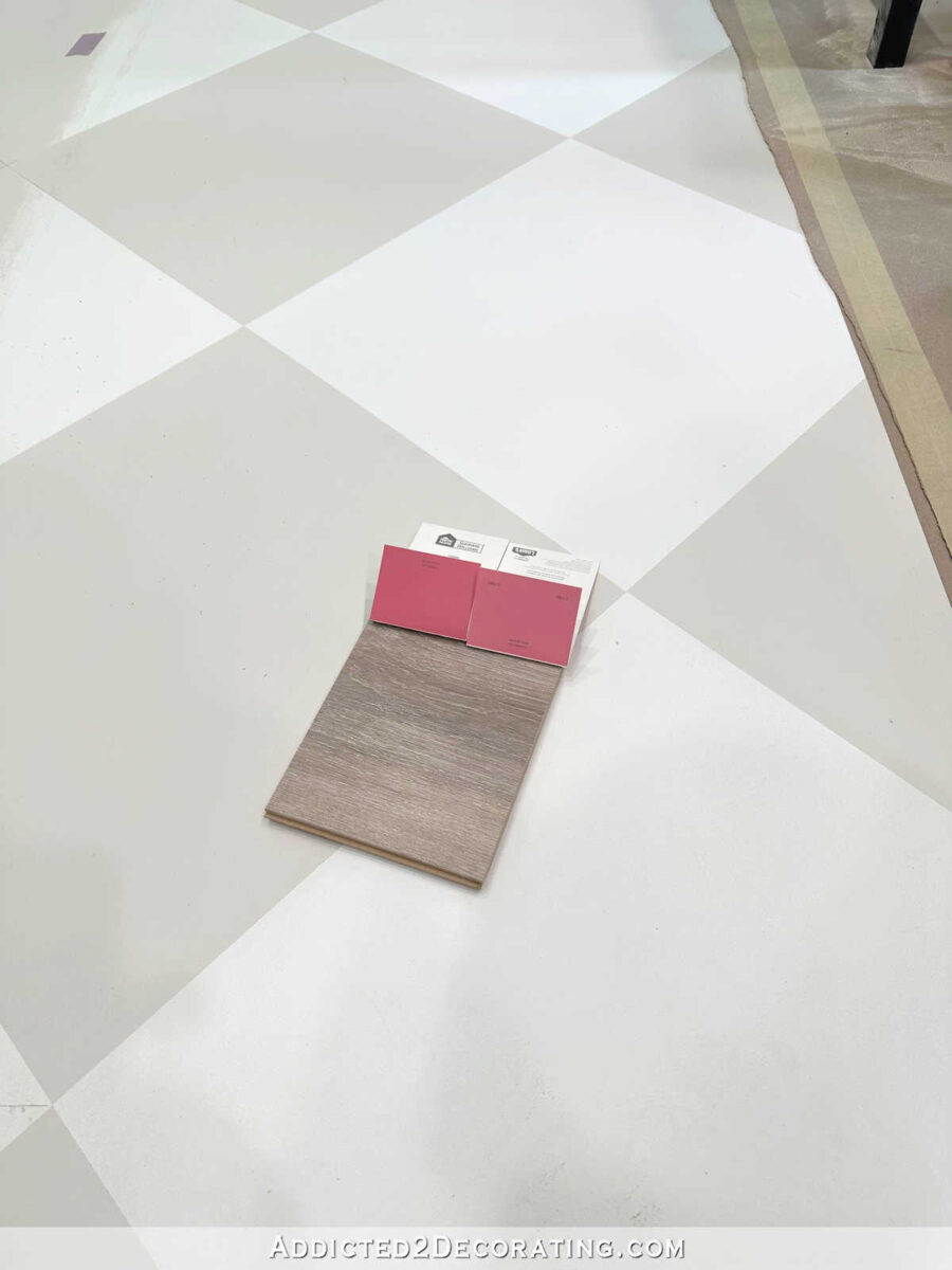
Here’s a close up of them. It’s hard to tell when they’re standing alone, but they have a touch of purple in them. And it seems to be just the right amount of purple without actually reading as purple.

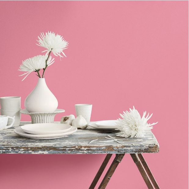
Here are the colors from the HGTV Home by Sherwin Williams website, with Jaipur Pink on the left, and Tuberose on the right…

I’m hoping that one of those will actually end up working, because I really don’t want to have to do a custom color for my cabinets.
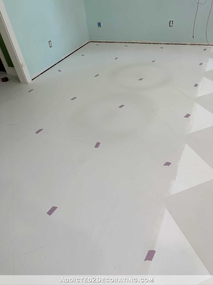
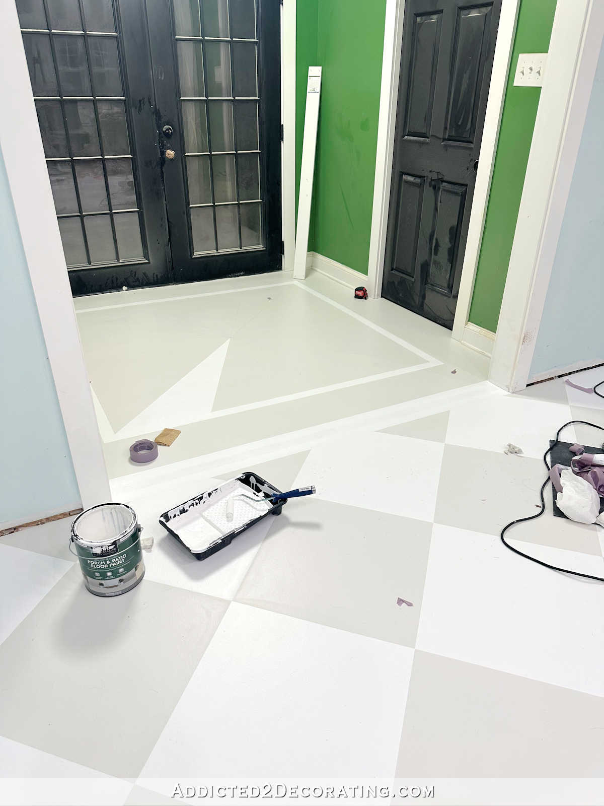
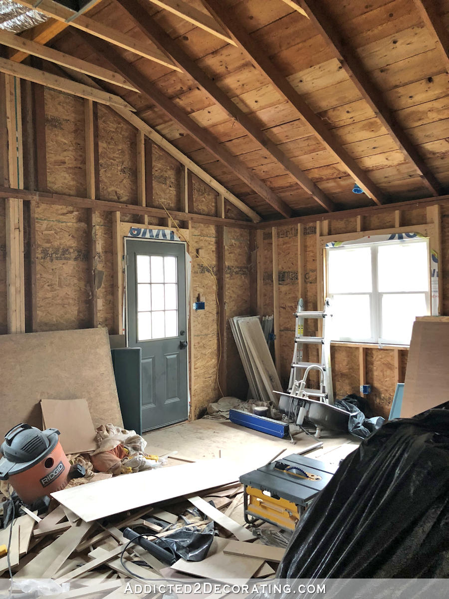
Moving on to the floor, I finally got all of the design for the painted checkerboard floor marked off, and I’m ready to tape off the white squares and get those painted. If everything goes as planned, I should have the floor finished by the end of the day tomorrow.
And regarding yesterday’s post about perfectionism and how it affects me, I wanted to show y’all exactly what it was that had me paralyzed for at least 30 minutes (probably more like 45 minutes) while I sat on the floor and tuned out of “real life” while I avoided the floor and scrolled Instagram. It was this 3/8-inch discrepancy. The distance from the wall to the first point on the floor design on this side of the cased opening is 9 inches…
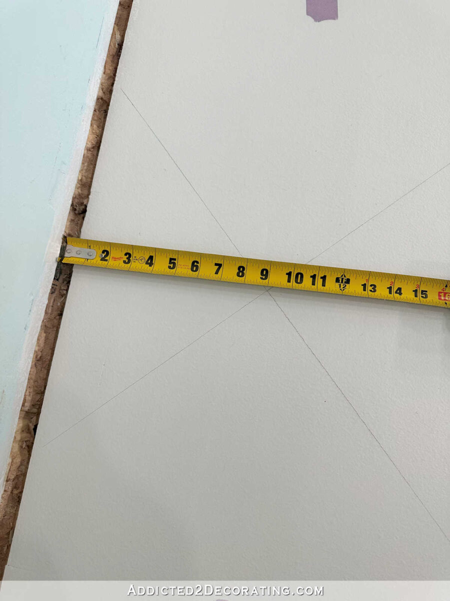
While to the right of the cased opening, the distance is 8-5/8 inches…
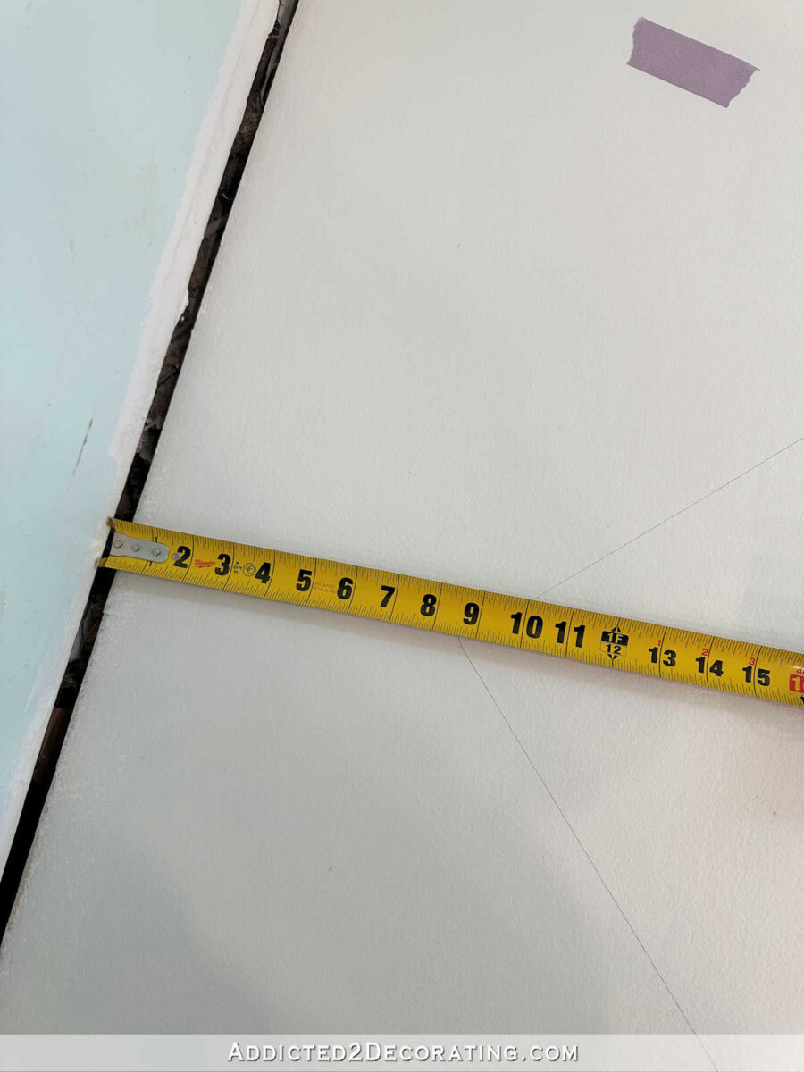
I know that probably sounds so stupid to some people to be worried and anxious and overcome by a sense of dread over what turned out to be 3/8 inch — a measurement that the overwhelming majority of people would never even notice. (To be clear, I didn’t know at the time what the measurement would be, but I knew it wouldn’t be perfect. In my mind, it could have been an inch, or an inch-and-a-half.) But, like I explained yesterday, that’s the effect of perfectionism. It’s not pleasant, and it doesn’t lead to a peaceful mind. But I finally made myself get up and continue working. I got it done, and I’ve moved past it. Once I got over that hill, my mind relaxed, the dread left me, and I can now peacefully move on to the painting stage of the project.
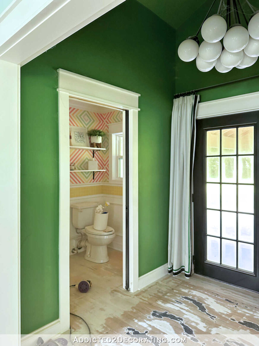
Now about the bathroom, I may try to make the wall design work. The more I look at it, the more I think it’s the yellow tile that needs to go. I think taming the accent tile by replacing it with white will actually make the wall design look softer.
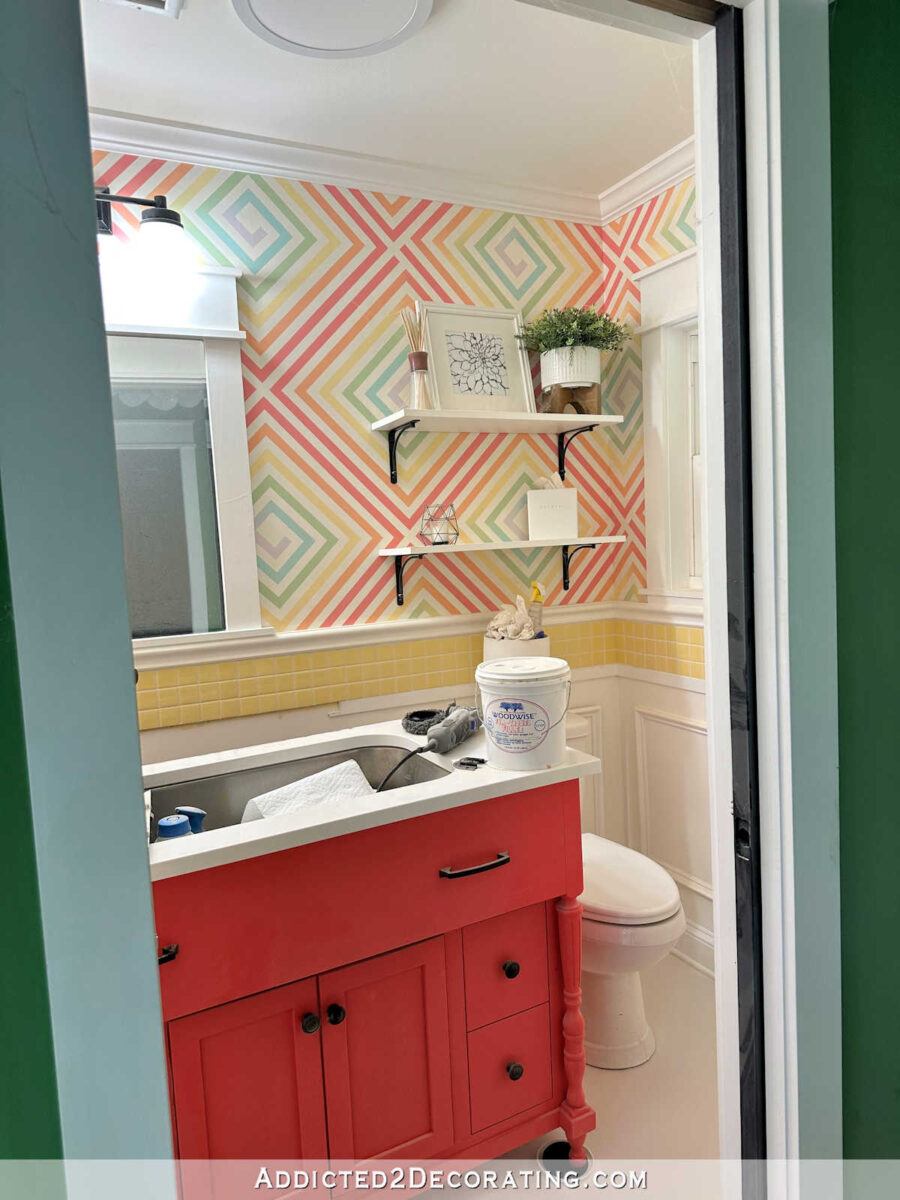
I’m still not sure if I can make it work because the vanity color needs to be changed. and the colors on the wall design may still end up being too bold.
But you can see below the vast difference between the original direction I was going with the studio, with the much bolder colors, and the new direction I’m going, with the softer pinks. The vanity color, much like the hallway bathroom vanity, looks very orange compared to the pinks I’m considering for the studio cabinets. And when compared, you can really see the touch of purple in the new paint samples.
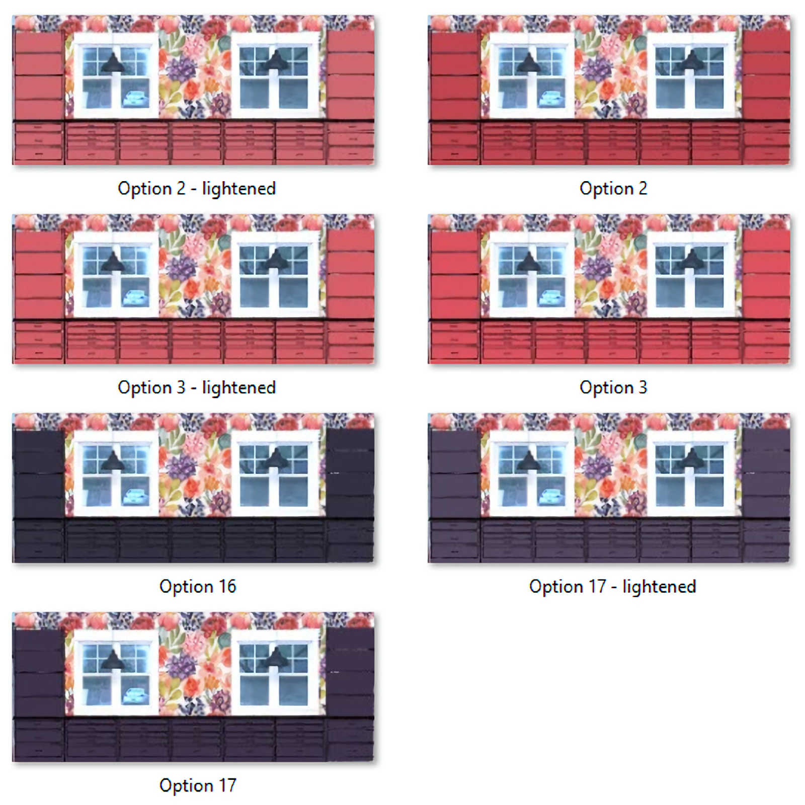
And finally, several people suggested that I use the flower mural on the ceiling of the back entry since wallpapering the walls is too expensive for my budget.
I love the idea of a wallpapered ceiling, but I do wonder if the ceiling is too high for that. I think the ceiling is about 11 or 12 feet high, and unless you’re standing in the back entry or very close to the cased opening, the ceiling isn’t even visible. So I’m not 100% sold in the idea, but I do love the idea of a wallpapered ceiling.
The other reader suggestion that really appealed to me is loading up these walls with my own art and crafty creations.
(That’s an older picture. The floor is now primed and painted, and ready for the white areas to be taped off and painted.)
One thing I thought about was making a whole lot of resin petri dishes in colors that coordinate with the studio colors, and using them on the walls in a loose “floating bubbles” design, similar to the way I hung the ceramic birds on the corner wall in the living room…
…or how I hung the plates in Cassandra’s dining room MANY moons ago. (Wow, that was 12 years ago!)
But you get the point. It’s that random floating/drifting design that I’m talking about, as opposed to my standard “everything symmetrical and square” design that I’m generally so drawn to.
So I’ve narrowed down the back entry options to those two — wallpapered ceiling with a solid color on the walls, or paint the walls a solid color and use something like a “floating bubbles” design of resin petries all over the walls.
Things are moving forward, and I’m hoping to get a lot accomplished on Thursday, Friday and Saturday!

Addicted 2 Decorating is where I share my DIY and decorating journey as I remodel and decorate the 1948 fixer upper that my husband, Matt, and I bought in 2013. Matt has M.S. and is unable to do physical work, so I do the majority of the work on the house by myself. You can learn more about me here.
Showcase your art. The more the better. Perhaps a rotation of your particular style. Free advertising!
Personally, I like the richness of Tuberose which gets my vote….
As far as the Bathroom… remembering all time and effort you put in and the challenge you gave yourself, is a testimony to your amazing TALENT …it is truly YOU… Vibrant and Valient! Totally agree the yellow tile should GO! It is and always has been too bold and bright and “Fought” with the wall and the vanity from the get go…. Also… rather than jump into a new color right away for the vanity… why not just give it a coat of white and with the yellow tile gone you will perhaps can take a breath…and have a better “View”.
….and as far a Perfectionism goes… we all have our “Jiminey Crickets” to deal with… and when “he” comes calling that’s the time to give ourselves permission to be kind TO OURSELVES …see it is an asset.. as it helps makes us that best person we strive to be….
I have to confess that I have never cared for the yellow tile in that powder room. I think if you install some white tile and repaint your vanity in the same colour as the cabinetry in the studio you’ll be happier. (I also liked the black frame on the mirror that you originally toyed with better than the white frame but that may be water under the bridge now.)
I’m on team Jaipur Pink for the cabinets.
Can your vanity be the same as the studio furnishings? That would keep it in line with the wall design. If needed, it could be a shade or two different in either direction. I still like the design you did, but agree that the tile throws it off. It would be fun if you could find a tiny amount of tiles in the wall designs colors, to sprinkle into the white tiles here and there….maybe at a stained glass supply store! (Very random and sparse.) I would leave the entry ceiling as is, and lighten up the walls. I like the idea of a pale shell pink, and add your talented art.
Love the idea as using the entry as a gallery for your creations! And maybe try painting the yellow tile white and see if that does what you want it to. If it does, then you can move forward with redoing the tile. If it doesn’t, then you have that knowledge to work with as you plan the new bathroom direction.
I landed here first? That’s a first.
Quick opinions. (I am looking at the two-color comparison in the picture with the table items to be clear) If the Tuberose name on the right is correct, yay! It is my absolute favorite color! I wear it and decorate with it and love it. Ditto as my vote to use. It has a depth to it that seems to fit the expanse where you would use it. A bit quiet and soft so as to let the wallpaper have center stage.
Bubbles, bubbles, bubbles. Please, please, please. It would be so you and you could do such a great random (if you will) display. I would love to see that. It’s much more fun than the ceiling idea.
Right, the yellow tile is the major problem. I always did think so. Cabinet color? Why not delay that decision until after the other colors are in place? Seeing the whole will make it so obvious you won’t be needing or juggling any opinions. You will just know.
As for grumpy critics: No need to say more than, work any way you need or want to. Sit on the floor and play all you want looking at any place that is fun. It just feeds your creativity and I really believe it percolates inside your brain leading to even more possibilities. “Takes one to know one” as I confess to doing the same thing.
I adore those two colors you picked for your cabinets! You have such a wonderful eye for color❤️
I’m not disagreeing with you about the yellow tile, but in the picture above where you don’t see the vanity, the bathroom with painted walls with yellow tile looks FABULOUS. Maybe it’s just the vanity that throws it off. You’re going to repaint it anyway – maybe wait on replacing the tile?
So happy that you’ve finally gotten to this studio – I’m enjoying your progress!
Have you ever considered doing a gallary wall with some of the before pictures of what the house looked like in the beginning? Kindof a “Look what I did” wall or a historical look-back to see how far it’s come over the years.
Fantastic idea!!!!
That’s an interesting idea! The most I’ve ever thought of is keeping a “before” pic of each room somewhere in the room (like tucked away in a drawer) so that when someone new comes over and sees each room, I can pull out the before picture to show them how it started out. I’ll have to think about the gallery wall idea! That seems like a fun idea for a hallway, and we’ll eventually have a hallway from our future family room to our future master bedroom. Or maybe in the future laundry room! 😀
I love the Tuberose color for your cabinetry, but both look nice. Re: your perfectionism post, you might find Dr. Amy Johnson’s book, Just a Thought, helpful. It suggests ways to calm the lower brain chatter in your head. It’s short and useful.
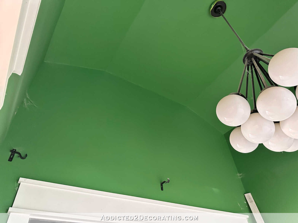
I’ve never been a fan of the yellow tile. It didnt seem very Kristi. and I have to confess those deep green walls in the foyer are stunning and I’ll be sad to see them go. I understand why they have to, but they are stunning. I’m sure whatever you come up with will blow us all away and I cant wait to see!
You need to get yourself a color fan deck! Something like this: https://www.amazon.com/Sherwin-Williams-Colors-collection-Complete/dp/B01M254YD8.
You can buy the fan deck, but last time I went to a Sherwin Williams store, I told the guy behind the counter that I’d lost mine and he gave me one for free! The fan deck has EVERY color that the company makes, not just the 10% that Lowes or Home Depot carries color chips for. And you don’t have to buy Sherwin Williams paint. I know you like Behr. Home Depot’s paint center computers have the color formula to ever major paint on the market, so you can use a SW color in Behr paint.
It’s so much easier narrowing down a color when you can see all the shades lighter and darker next to it. Makes it easier to identify the underlying colors as well.
Yes, Katy is correct! Kristi…get the deck. The Sherwin Williams store I stopped by just gave me one as well. Otherwise I think they are inexpensive to buy in the store, and you would make so much use of it…And, SW paints are pretty great – lots of choices in finish and quality. And those colors…divine! And yes, I would go right to the store. Lots more to pick from in the store, rather than Lowes. And, they have made me colors from other charts, and even made a custom color match for something that I could not match at all…but lots of failed attempts in the box stores. So glad you are getting back to things. We are all looking forward to the newest update. PS) I love that deeper color. Tuberose
Yep– love both of those pinks with faint purple undertones. And I love your bathroom walls. Changing the tiles and the vanity color are great ideas. And your idea to use the entry as a gallery for your artwork is brilliant! It can be static or change as you desire and try different kinds of artwork. Love the idea of unstructured placement of your art. You are on the way again !!
I’ll never understand how they name paint colors – to me, tuberose is a flower that I only see in white. But the paint chip is a gorgeous color!
Tuberose would be my choice. I almost like both equally though, so it wouldn’t matter which one. I do hope that the color of your choice will go well with the fabulous bathroom wall design for it would be sad to me to have to do away with that design. Changing the tiles to white is a good choice too.
Oh, one more thing….Yes, do display your art work on the entrance walls!! Great idea!!
I’m inspired by sooooo many of your ideas an I love how your vibrant colors never look gaudy!
…Thinking about how to wall-display my mother’s doilies in a fresh way…
I’m fully on board with first trying out a more neutral tile for the bathroom accent strip before getting rid of the painted wall design. I think that this, plus repainting the vanity (and I would suggest just repeating whichever color you choose for the studio cabinets for the vanity,) might do the trick.
I also really like the idea of doing something in the entryway that has a more organic/freeform shape like the Petri dish idea, plates, or birds. I think that could really sing!
If you still want to use Behr paint from Home Depot, they can make Sherwinn Williams colors! Ask them to choose the ‘Snap Fan Deck’ or the Behr version of the formula – Just thought you might like to know that!
I’ve worked the paint department there for a couple years and the formulas come out right on the money! Get samples first, of course!
Regarding your studio bathroom – yes, change out the yellow tile – and if you keep the painted wall design, why not re-do the design using colors that coordinate with the wall paper in the studio? I love that geometric design! And, it’s one that would mix great with the floral wallpaper like pattern-mixing pillows on a sofa – even if the two patterns are in two different rooms, won’t there be views of both as you enter from that side of the house?
It could be lovely to keep that pattern and just coordinate the colors with the studio wallpaper!
Apologies for being negative, but my least favorite of all your rooms is the powder room as it is far too ‘busy’. Those yellow tiles and the geometric design need to go. The geometric design will jar with the flowers in the studio wallpaper.
Ditch the wallpaper idea in the back entry and a gallery wall of your own art.
Tuberose for units in studio and vanity.
I hope you can 1. Leave the walls of the bathroom alone OR 2. Paint a different color on some of the lines to match up better with the new color scheme. I remember when you did it and how tedious it was.
Either color is great, as to the walls…showcase YOU! You can always change when you want to try new artwork or new ideas. Personally, I would make the bathroom cabinet the same color as the cabinets in the studio, I like the idea in another comment of painting the tiles white and then you could see how that looks and decide…in fact try several different colors, as you plan on replacing the yellow tiles. I like where you are going, I know I would be painting the walls and cabinets white! Boring I know, but I would have wood floors, table and desk tops. A ton of artwork and I love, I mean LOVE your 2 work tables! I am so happy you are still blogging…I bet you would be great on YouTube!!!
Glad you are considering keeping the wall design in the bathroom, it’s one of my favorites. Have you considered just painting the yellow tiles white? I know you painted some of the mosaic tiles in the hall bath when you didn’t like how it was reading. This would save you the headache of ripping it out and putting new in.
Also the studio floor is looking great!
What about just painting the yellow tile, or covering it with decorative molding? Either would be easier and less mess than ripping it out!
What about just putting some white paper over the yellow tiles temporarily while you ponder other things? That might help tell you if white is the way to go for the tiles without actually doing anything drastic yet. Love the direction you are going in for the studio cabinets color. Also, love the idea of a bit of randomness in the form of your petri dish bubbles for your entryway walls. No idea on the ceiling, but think same color as your studio would not be bad.
Kristi,
I cant thank you enough for your perfectionism post. Now I FINALLY know why I can’t make a decision. You have been a blessing to me in so many ways.
Thank you, thank you, thank you!!!!
Here’s another direction to consider – it is your house and ultimately only your decision. You’ve got multiple styles and horizontal lines going on in there. When does juxtaposing elements and styles become too busy? Is it time to edit? Does the very contemporary “mural” style wall speak to the formal vanity style? Does the wainscoting bring the feel you want around a toilet? How about the farmhouse style shelving? I’m going out on a limb here, but what if you painted the vanity white, ran the yellow tiles down from their current height to the floor (which would also remove an additional horizontal lines, removed the wainscoting, and papered the upper part of the wall a much smaller version of the beautiful floral wallpaper in your studio? Paint the shelving brackets white. Reducing the patterns and colors would allow “the eye to rest” as they say in landscaping. Conversely, you could change the wainscoting to vertical tongue and groove style, paint it white, then paint the vanity one of the coordinating colors from the wallpaper. Just another way to look at it.