Surprise! They’re Not White! (My New Upper Kitchen Cabinet Color)
Well, since I’m still not quite ready for heavy lifting projects (e.g., building pantry cabinets) because of my back, and my wallpaper still hasn’t been delivered for the breakfast room walls (I was so hoping it would be here this week!!), I decided to go ahead and repaint my kitchen cabinets. And while I originally said I was going with white on the uppers, I changed my mind and decided to go with a light neutral non-white color.
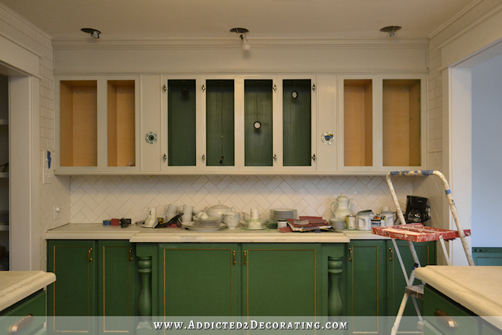
The color I chose is Benjamin Moore Revere Pewter, and I do expect it to darken up just a touch with the second coat.
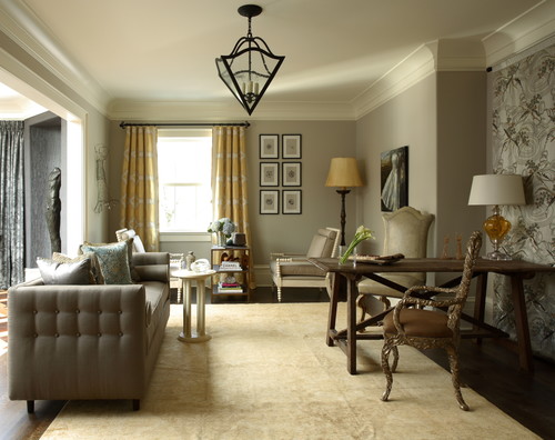
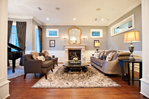
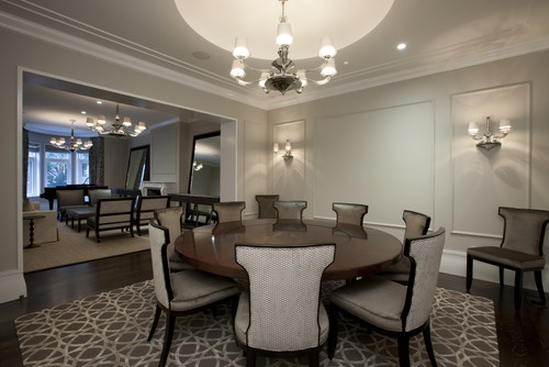
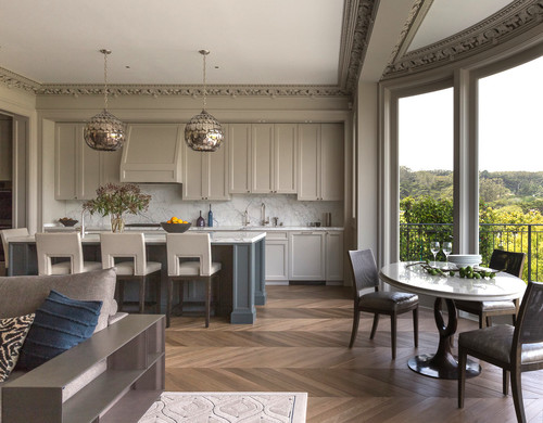
The man at the Benjamin Moore store said that it’s been their most popular color for several years now, and if you look on Pinterest and Houzz, you’ll see that it’s certainly a popular color. Some call it the most perfect neutral paint color, and the most perfect greige. To me, it doesn’t look gray at all. It looks like a very light khaki color. Of course, the color all depends on the lighting in the room, but you can see that same paint color in these rooms:
And I even found a picture of it on cabinets.
Yes, this is a complete departure from where I’ve been heading for the last year. I told y’all that there would be some unexpected surprises, and this is just the beginning.
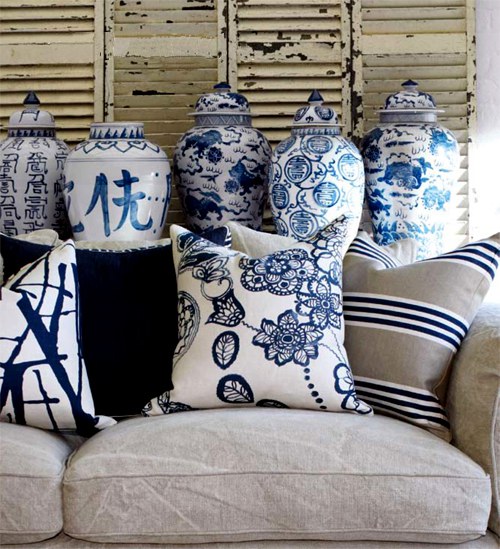
So why this instead of white? Well, I love white. But I just don’t like so much of it. I did really want the upper cabinets to be a light neutral, though, and to me there nothing more classic (well, probably more 80s and 90s classic) than white, khaki, and dark blue.
 via Unique Fabrics
Yep, it’s a classic combo, in my opinion. So I’ll be brightening up the grout on the backsplash/wall tiles to make the tile look whiter and brighter, and the countertops will be refinished so that they’re whiter and brighter. (I’m still undecided on whether or not I’ll try the marble look. Still waiting on the guy to come look at my countertops and give me his advice.) Then the uppers will be the Revere Pewter (which looks light khaki to me) and the lowers will be the dark blue Gentleman’s Gray.
A complete departure. And the ride is just beginning. 😀

Addicted 2 Decorating is where I share my DIY and decorating journey as I remodel and decorate the 1948 fixer upper that my husband, Matt, and I bought in 2013. Matt has M.S. and is unable to do physical work, so I do the majority of the work on the house by myself. You can learn more about me here.
My kitchen, dining and family room are all painted Revere Pewter and I love it!! It does change colors based on the time of day. Sometimes it looks khaki and sometimes it looks grey. Your cabinets painted that color are going to look wonderful with the blue. Can’t wait to see it!!!
Hahahahahaha! You are crazy! Personally, I love it! It’s more classic, which is my taste. But, my taste is irrelevant. The green with the gold leaf were a very different style. I can’t pick the right word for what they were. I definitely liked the green and gold, but I would not call it classic. Anyway, I like the greige. I think it will go great with the wallpaper and I think it will be a nice contrast against the other white in the kitchen, like your tile and appliances.
And, regarding the folks who give you a hard time about redos. TOTALLY IGNORE THEM! First, this is your house and your money. You get to do what you want. Secondly, this is your art. All of your changes make for legit blog posts that not only educate the rest of us, but are what you’re in the business of doing. You are an artist. I kind of think of your house as your studio where you create your art to share with the rest of us. Not every artist creates a masterpiece in one shot. Look at Van Gogh’s sunflowers. He painted that work at least 30 times before he arrived at the final version.
Anyway, have fun with the redos. I, for one, love them. 🙂
I agree with everything you just said!!! Kristi is an artist! Love the Van Gogh analogy. I think a lot of the rest of us fall in the same category with enjoying our home as a canvas of artistic creativity. Love all your ideas!!
Theresa, I couldn’t have said it better. Kristi absolutely IS an artist and her house is her canvas. 🙂
Did you use a primer before painting? If so, can you share which primer you used.
I actually didn’t prime them this time. Since they were painted with latex paint and water-based polyurethane, and I’m using latex paint again, there was no need for primer. I just sanded by hand to rough up the surface a bit for better adhesion, and painted over it.
But my favorite primer is oil-based Zinsser Cover Stain. It’s the only one I use on furniture and cabinets. The only time I use a different primer is for brand new unpainted drywall. And I only use the oil-based one. It can be coated with both oil-based and latex paints.
Would you recommend this primer for my lovely Honey Oak turned “orangey” cabinets? I want to paint them but am terrified of messing them up. Also, did you spray them or brush and roller them? Love your posts. I get inspired when I see what you do. You make it look easy and doable!
Yes! Absolutely! See my painting tips here: https://www.addicted2decorating.com/how-to-paint-cabinets-with-a-paint-brush-and-get-a-near-perfect-finish.html
Oh, I think this will be stunning and you are going to be happy with this color combo. It will have an understated elegance about it, which will allow for either dressing it up or dressing it down, as well as being relaxing. Now you’re cooking, girl!
I find neutrals make white appear whiter, which gives it more power when and where you do use it. This sounds gorgeous, and I’m looking forward to (vicariously) seeing it when it comes together!
I’ve been trying to find the perfect grey color for my guest bath and spare bedroom, painted it what I thought was grey and it looks baby blue and I hate it. I’m definitely going to get a sample of the color and give it a try. It looks perfect! I’m loving the direction you are going & can hardly wait for the next post.
❤️
Wow, Kristi……..you’ve done it again, and completely surprised us! This new upper cabinet color is going to look so awesome with the Gentlemans Gray on your lower cabinets and also with your breakfast room grasscloth paper! I can’t wait to see it come together, it’s going to look FAB-U-LOUS……although, I’m going to miss those gorgeous bold green cabinets, but I can also understand why you’re re-painting after the gold leaf not working out long term. Hope your back keeps improving Kristi.
I think that will look really good with the color you chose for the lower cabinets. Can’t wait to see it complete. (Will you be painting the inside of the cabinets with the blue or the neutral?)
I’ve been undecided on that, which is why they’re still green. But I think I’ll go with the neutral and get mirror for the backs of the cabinets to reflect some light.
Ooo a mirror for the back would be so pretty! I’m also imagining the grass cloth would look great in there!
Love it!!
Love it! I was a bit worried that the white might be too much. This is just beautiful!
Revere Pewter is so popular now. We are using it in our new home. We haven’t started construction yet, so I am not sure how it will look with our lighting. I think you will love it on your cabinets!
Correct. There are no windows directly in my kitchen, but it gets a great deal of natural light from the five windows in the front room, and the three windows in the breakfast room right next to the kitchen.
EDIT: Oops! Sorry! I responded to the wrong comment. 🙂
It’s funny how we know what colors we like (I prefer brights) and what we don’t (no green, gray, black, or brown for me, thank you) and yet we get pulled into someone else’s idea of the perfect color scheme. (compromising with a spouse!!!!)
So glad you found your ideal colors!
This should brighten your kitchen considerably and make an important difference. Based on the pictures your kitchen doesn’t seem to have any windows.
Correct. There are no windows directly in my kitchen, but it gets a great deal of natural light from the five windows in the front room, and the three windows in the breakfast room right next to the kitchen.
Good color pick. It’s going to look lovely with the blue. Can’t wait to see it all finished. Are you keep the hardware gold or switching it to a different color? I think something in the silver family would look the best, but that’s my opinion.
I’m keeping the gold for now. After 2+ decades of only ever using nickel and other silver finishes, I’m just not quite ready to jump back into that.
I love the gold with the blue. That screams classic to me. 🙂
Looks great! I chose that color for my bedroom but it looked awful! So then I tried it in my living room and it looks beautiful. As you say, it’s all in the lighting. I have it in my living room, dining room and foyer. Sometimes it links very light khaki and other time much more gray depending on the light.
I think this will look perfect with the blue. I can’t wait to see it!
Girl, I kid you not, just this week, I decided I want to change my bedroom from blue and green (the color scheme that lead me to your blog) to navy and khaki with touches of gold! It’s got to be the right navy and right khaki though! Maybe you will help me not have to go through soooo many samples and still end up painting the room twice to get it right, like I have had to do in half the rooms I’ve done.
Hahaha is all I can say….I LOVE LOVE LOVE it! Can’t wait to see finished room 🙂
I think this is a lovely color that will pair well with the lower cabinet color.
I like it! I like it!
I have khaki-taupe cabinets and they are very elegant and lend themselves to all sorts of color schemes. They are the “straight man” in my humorous kitchen decor. I love them, they can be dressed up of down and they look timeless but I guess we’ll see in a decade or so, lol.
Love the color choices. This will look awesome. I read the comment asking about the hardware. What about spray painting the hardware black? It’s classic, every room should have a little black and I think it would be striking. Just a thought. I’m so happy you are following what’s truly in your soul with your love of blue. This will be a calming combination, timeless and very classy. I enjoy your blog so much because you are the real deal. So many have their “hubby” do all the work. You do it all from concept to execute. And teach us all along the way. Good job!!! Can’t wait to see it all done! Enjoy the process!
What a classy look!!!
What perfect timing! I was just at my doctor’s office, and they’re in the process of redecorating. I kept thinking “That is the perfect color. Not beige, not gray, but… Graige! Of course, nobody knew what the color was. And then you post this. Thank you. ☺
Perfect! How will you brighten the grout?
I’ll paint it. 🙂 When I grouted my kitchen tile at the condo, it didn’t turn out as white and bright as I wanted it, so I painted it. It worked perfectly and still looked great the day we sold it, which was about six or so years after I painted it. I also painted the grout in my current hallway bathroom for the same reason. I also did the floor and tub surround in the bathroom, but since those were high traffic/water areas, I went the extra step and used the Grout Renew product from Home Depot. Worked perfectly. But on areas where you won’t walk on it, and it won’t be subjected to water on a consistent basis, then just regular latex paint does the trick.
We just painted most of our new house in a color similar to this, and our master bath cabinets are a color I call Putty – it’s very close to the walls in your first picture.
Our walls change depending on the lighting also. With the sun shining in now, there’s a hint of green, but at night it seems more ashy gray. Goes with soo much, a versatile color! I think you are going to be happy with your choices, and I can’t wait to see! Hope you feel better soon!
Great comments about you being a sharing artist with your home. Lovely combination and will certainly look fabulous. Hope your back gets better soon. Love your work,and thanks for sharing.
I LOVE IT! I’m a navy, white and gray girl and this just puts me over the top! Can’t want to see it all done! Hope your back feels better soon. Don’t push it! The house is looking fabulous!
This is so much Fun!!! Love following your process and admire you greatly. You are superwoman. 🙂
Yay! I’m SO glad you’re not going with white! I know that’s the “in” thing to do right now, but white is so cold and sterile, not to mention, hard to keep clean! I had a hard time envisioning you with a white kitchen when I know you love color so much. You keep inspiring those of us who are afraid of painting our cabinets – my husband loves wood and tells me I can only paint our custom made oak cabinets over his dead body. Ha! But I’m looking forward to showing him your finished cabinets – maybe he’ll change his mind! Thanks so much for sharing your colors and your plan, but especially your creativity! Can’t wait to see your finished kitchen and breakfast room!!
You are so creative Kristi! Can’t wait to see this done. I’m sure this would be so lovely. The color combination of the tiles and cabinets is just perfect. Such an inspiration!
Big thumbs up!
Perfect!