The Fabrics Arrived! (Foyer Bench Fabric, Bedroom Headboard Fabric)
I have high hopes that today will be my last day working on the grasscloth wallpaper. I think I have four more pieces to hang in the foyer, two more light switch plates to cover, one doorway trim header to reinstall, a bit of trim to install around the closet doorway, and a few nail holes to repair in all of the door trim headers. And then that project will be crossed off of the list and I can move on.
And it’s just in time because the two fabrics I ordered from Spoonflower arrived yesterday, which means that I can make all of those final decisions (like the final decision on which direction to use the drapery fabric, which I shared about two days ago), and get started on all of the soft furnishings in the room.
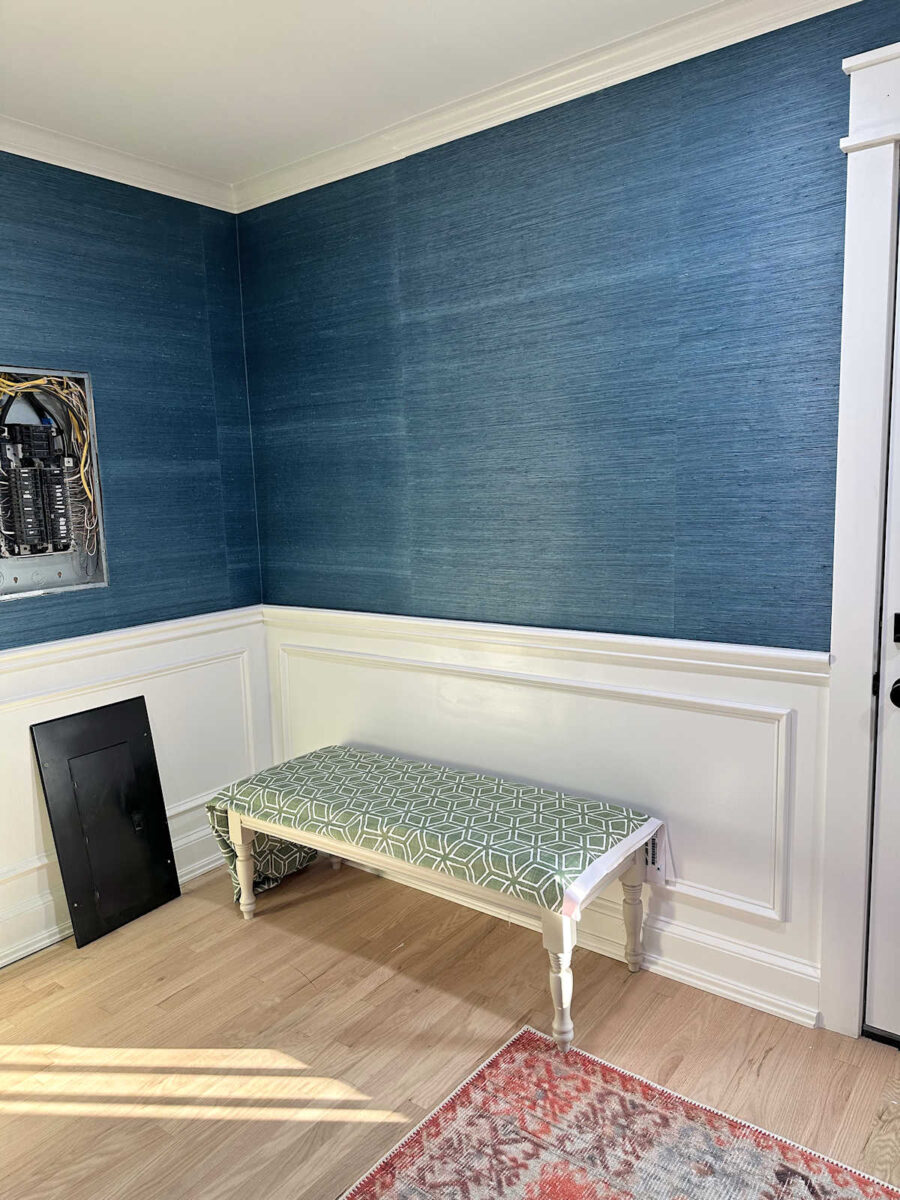
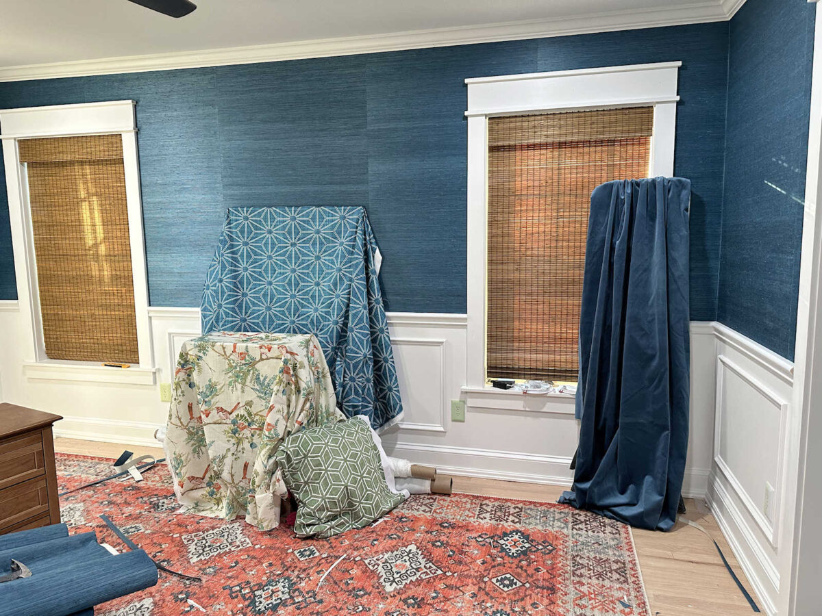
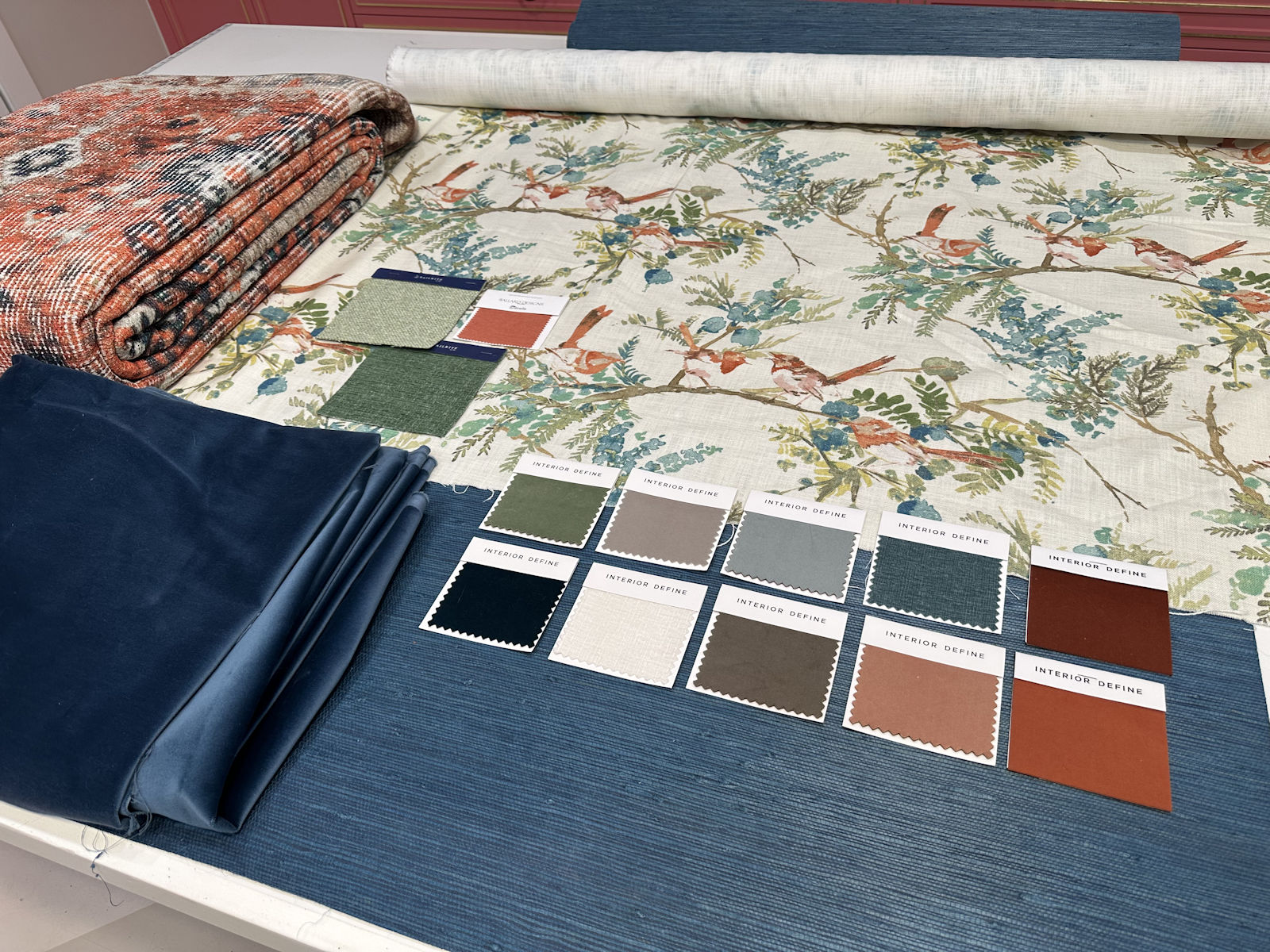
First, here’s the fabric for the foyer bench. I absolutely love the fabric. This is the pattern I chose, and I had it printed on performance velvet.
Spoonflower velvet is kind of interesting. It has a very low pile, so I don’t think it’ll ever have that really luxurious look that most standard velvets have. I could be wrong, but I doubt it. And it almost feels like a cross between a velvet and a felt. It’s different, but I still think it’ll be good against kitty claws, which is why I tend to choose velvet for all of my furniture when I can. Velvet is one of the most durable fabrics when it comes to cats who like to scratch. (Of course, if you don’t keep your cat’s claws trimmed, they can still do damage.)
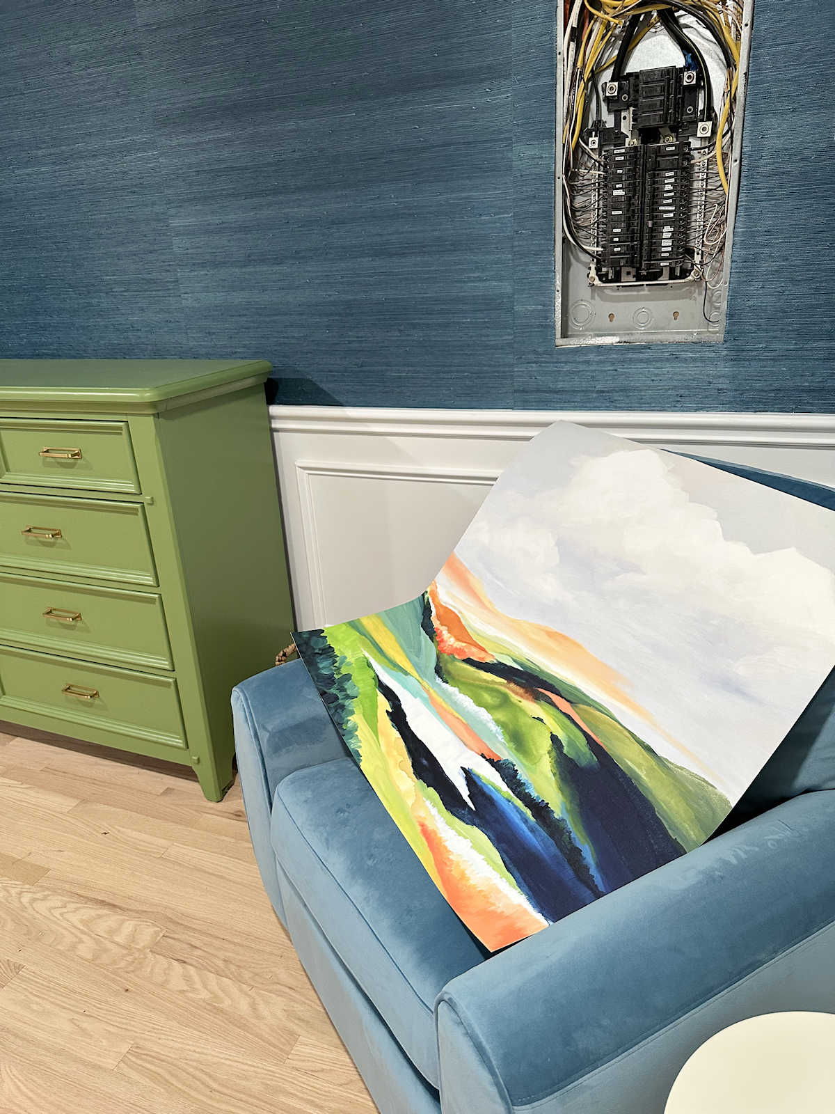
The green matches the green that I used on the dresser almost perfectly. That was intentional. I chose a paint color that was the closest I could find to the fabric color without having it color matched. The dresser color is Glidden Moss Point Green from Home Depot.
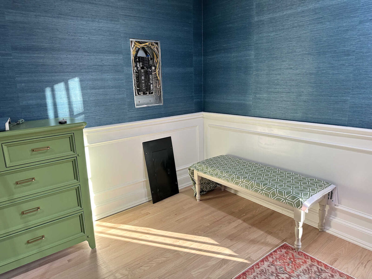
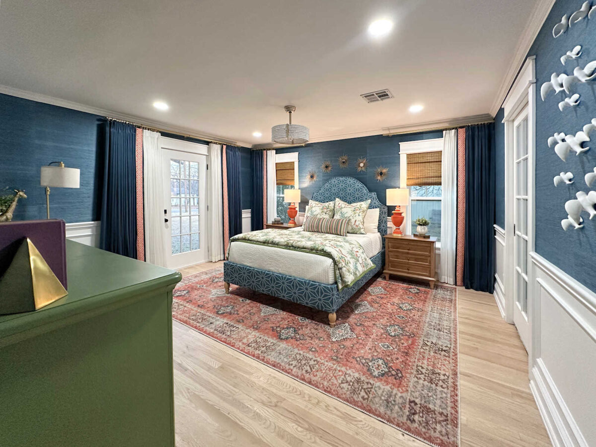
I think I’m going to paint the base of the bench in the same green so that it has more impact. It’s sitting in the corner of the bedroom right now so that I could see what it looks like against the wainscoting and the grasscloth since the corner in the foyer where it’s actually going to live doesn’t have grasscloth just yet. But I think it needs a little extra punch of color with a green base so that it stands out more against the white wainscoting.
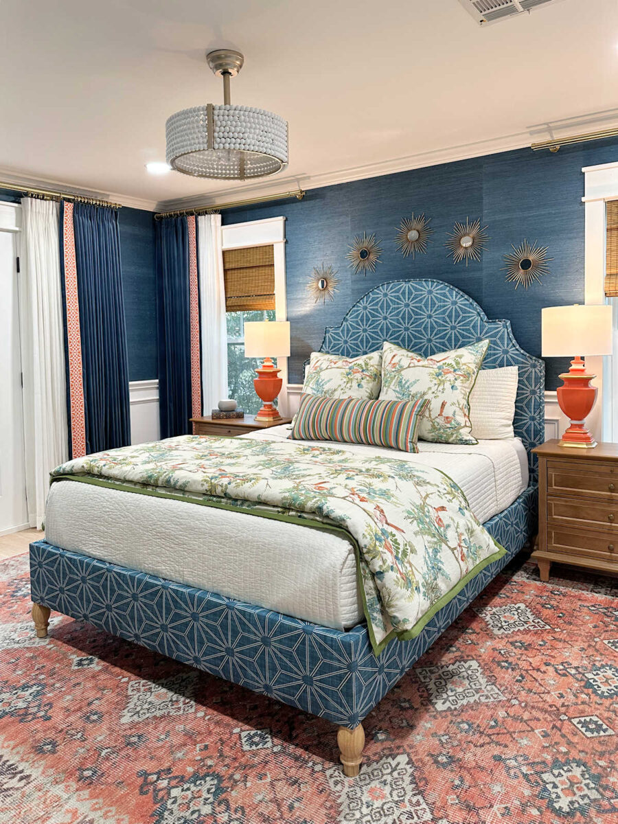
But of course, the most exciting fabric that I received is the one for the headboard and bedskirt. I chose this pattern for those items, and I had it printed on 6.5 ounce wide cotton sateen. The fabric is 116 inches wide, which means that I won’t have to match the pattern or have any seams on the headboard. I was pretty excited to see that they offer extra wide fabrics! And the 6.5-ounce cotton has a very nice weight to it that’s perfect for light upholstery, curtains, pillows, etc. I wouldn’t cover a sofa with it, but it’s perfect for a headboard and bedskirt.
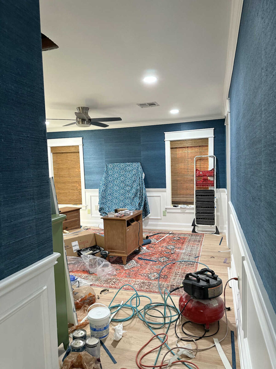
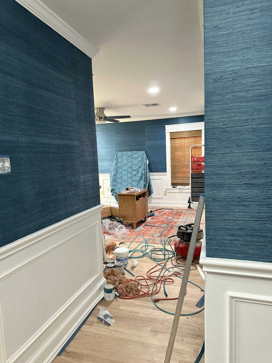
You’ll have to look pass the mess in the room right now. I hope to get all of this cleaned up by the end of the day today. But I just love this view of the fabric against that wall from the foyer.
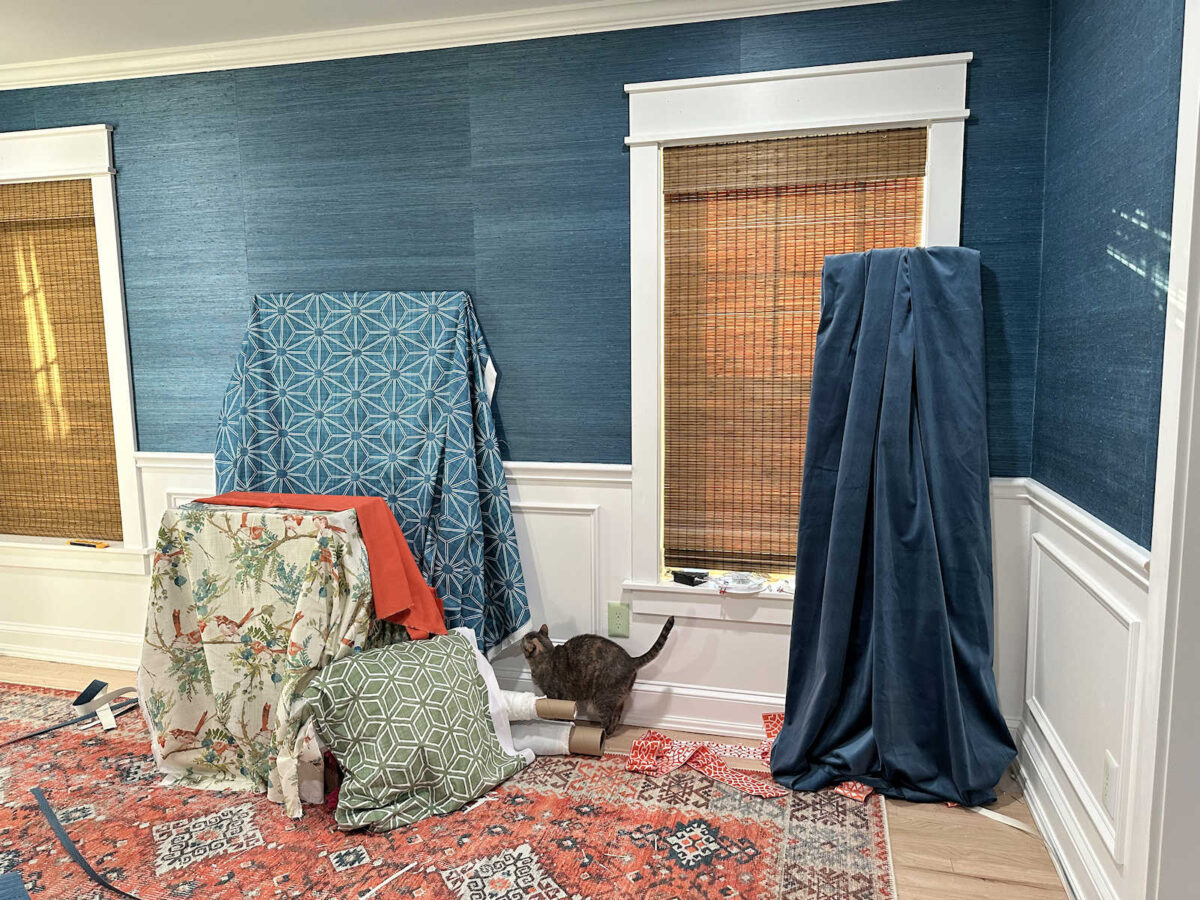
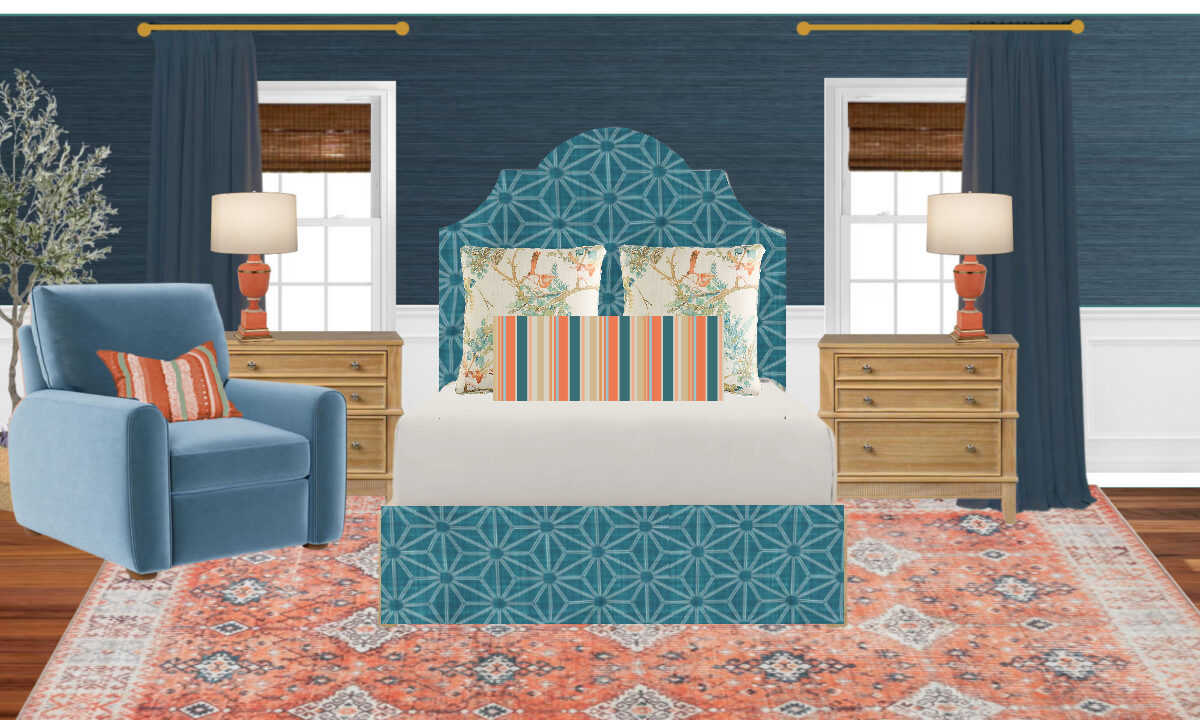
So naturally, I had to bring in the rest of the fabrics to get a sneak peek of everything together. I won’t be using that green fabric on the bed, but that green will be on the bed somehow. What I would really like is to make a striped fabric with all of the colors, including that green, to use on a pillow.
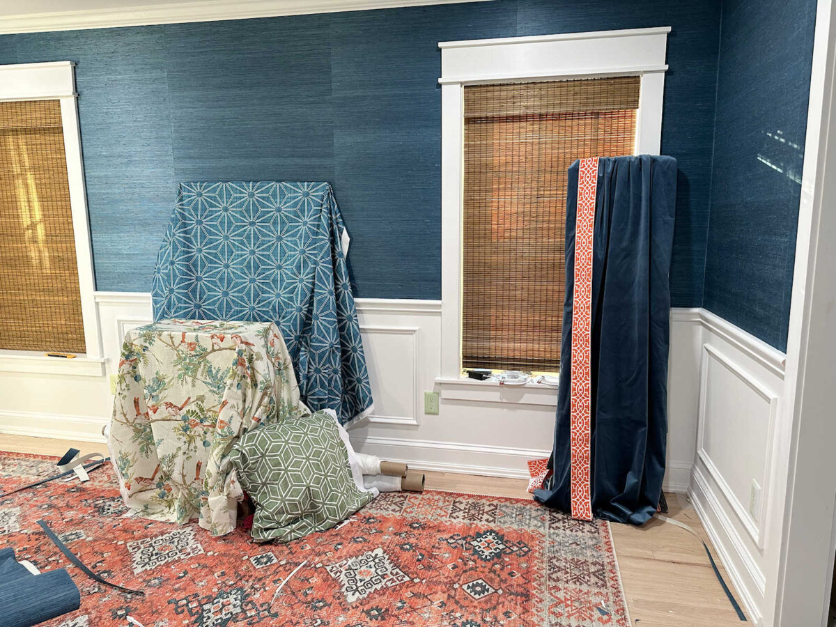
I hesitated to include the drapery trim in a photo because I know a lot of you can’t see my vision for it. Just understand that if I can’t tone it down just a bit, I won’t be using it. It’s way too bright and too white right now, but I’m hoping I can do a tea stain (or coffee stain, as someone suggested) to tone down the color, make it more in line with the corals in the room, and tone down that bright white design. But I was also able to see how the drapery fabric looks with the rest of the fabrics going each direction. This is the dark version of the drapery fabric (i.e., nap of the velvet going up).
And this is the light direction of the drapery fabric (i.e., nap of the velvet going down).

There’s a clear winner in my mind. The dark seems to work much better. But the bed also needs some coral on it, so I brought in the only coral fabric I have. I want to use it as an accent somehow. I love my blues and greens, but I always love them more when paired with warm colors, whether it’s pink or coral. And obviously, I’m not using pink in this room, so adding coral on the bed is a must. Here a peek at that with the light version of the drapery fabric.

And here it is all together with the dark version of the drapery fabric.
So I’m still working out in my mind exactly how I’m going to add coral, and what fabric I’m going to add since I don’t plan to use that green geometric pattern on the bed. My heart really is set on a striped fabric, so I guess I need to start playing around with some design ideas for that so I can have it printed ASAP. In the bedroom mockup I did, I added a striped pillow, so that’s my vision. It’ll need more green, though.
I also need to start testing out some ways to tone down the trim for the draperies. It’s just a touch too bright, too orange, and too white. If I can tone it down just a tiny bit, I think it’ll be perfect.

I’m very anxious to get started on all of these other projects! Let’s hope that things go smoothly today with the rest of the grasscloth wallpaper so that I can finish that up today. I think I want to tackle the draperies next.
More About Our Master Bedroom
see all master
bedroom diy projects
read all master
bedroom blog posts

Addicted 2 Decorating is where I share my DIY and decorating journey as I remodel and decorate the 1948 fixer upper that my husband, Matt, and I bought in 2013. Matt has M.S. and is unable to do physical work, so I do the majority of the work on the house by myself. You can learn more about me here.


How about a striped, cylindrical bolster pillow instead of the one in the mockup? I think you would see more of your bird fabric that way.
I was going to suggest just that. 😉
I definitely need to comment on the fabric: You have chosen my favourite pattern for the bed and I love it already! It is a traditional Japanese pattern called asanoha, which means hemp. In Japanese lore, it stands for vitality and resilience, and I love that aspect for sure, but also I’m a sucker for stars and love the intricate way of this star pattern so so much!
I made striped throws for my bed which has a larger middle section of asanoha and then smaller stripes at both ends (symmetrical 🙂 ) including different colours and patterns which match my bedroom. Just a thought if you like to do more than a pillow? cannot wait to see the finished bed!!
Kristie
Love all your choices especially the grass cloth! It makes such a huge impact. However in my humble opinion I don’t think painting the bench green is a good idea. The base off white makes the fabric stand out much better. But that’s my opinion. Can’t wait to see the final reveal!!!! Bravo Kristie. Your posts are the first I open. They bring me such joy! Thank you
I don’t know if anyone mentioned this already, but to tone down a color you could try overdyeing it with its compliment, in this case blue. It might not work with the white in your trim, but as a rule of thumb it works to tone down or mute a color. I would worry about using tea or coffee as they could fade over time, being an organic dye. Just something to consider. Good luck, love seeing everything you do!
It is beautiful! Let the fun begin!!!! Like you, I like the darker drapes.
Don’t forget to try Rit dye in color tan to see how it affects the drapery trim.
Depends on whether the trim is a poly type fabric or if it is cotton. RIT does well on poly fabrics but fades on cotton after awhile. Cotton does much better with Procion dyes. Since it attaches molecularly, it does not fade. Too expensive for manufacturing. RIT is a direct dye that sits on the surface of the fiber. That’s why it isn’t good for anything that will be washed frequently or will be subjected to sunlight. I’ve been a dyer for over 25 years. I don’t use RIT for anything. It’s great for stuff like theater or costume needs but is not stable for long term use.
Personally, I think the drapery trim takes away from the focus of the beautiful bed fabrics you’ve curated, and makes the drapes stand out too much. But that’s me, you do you for your space ❤️ I am really liking where this is going!
I think the white/cream color of the wood bench base is lovely, so would you consider leaving it and not painting it green?
If you add coral piping around the base of the upholstery, it would tie the bench in with the touches of green and coral on your bed.
I can’t remember why you nixed the bird fabric for the headboard. It was so lovely against the grass cloth.
Is there any news on the creepy cyber stalker?
Nope. He seems to have slithered back into his hole. 😀
I’m wanting cording instead of trim. I would love to see that trim folded along the edge of the drapery fabric (I can’t picture it in my mind, but as it is now, I am not a fan of the width of it) I would make cording out of the coral, and not a 1/4 inch cord, but at least a 1/2 inch, if not bigger.
Meant to say the cording could be used to tie all of the fabrics together, used on pillows, headboard, bench and maybe even drapes. Also, I would rather have the bench base in white, to tie in with the white in the pattern of the fabric.
This is going to be such a relaxing place to rest. I have to admit that no matter what you dye that trim or how on the drapes, I really think it is going to be an interruption to the flow of all the beauty in your room. You have so many beautiful fabric designs that the trim may distract from them. As another reader said, perhaps coral piping on the drapes and on the pillows on the bed and bench. Hope I haven’t offended, just my humble opinion. May you, Matt, and the furries have a beautiful rest of the week.
Love love love the integrated green!
I love how everything is coming together and I know no matter what we say, you’ll do you, and it will look fabulous!! I have zero vision abilities but I feel like the headboard wall might be too blue and needs color. Of course, i have no vision about but I’m sure that will add color. I was going to suggest color block curtains with coral or bird print. But, not sure you’ll need extra color on the curtains with artwork.
The trim looks good with the fabrics, but gross with the blue velvet going in either direction. Cut the trim in half and that might work. It just makes the blue velvet draperies look like a circus tent to me. Just ruins the whole appearance of the room, in my opinion. My opinion is the only one I have so I am blunt about it.
I’m with you, Lauranette, on the drapery trim. I think it “cheapens” the luxury of velvet. My $.02
I like the idea of the green bench.
Maybe use some of the coral fabric for piping.
What about the striped velvet you thought about using on your desk chair?
How would the bird fabric look in a pillow on the chair? I am undecided about a trim on the drapes, at the moment just the drapes in the velvet without trim appeals to me until I see how the bed comes together with the other fabrics.
The rug is really pulling everything together beautifully.
No one else has mentioned anything, but I wanted to point out that this post is showing up in a weird format for me. Maybe mobile format? It almost looks old-school. All of your other posts and pages look normal, it’s just this one. Not sure what the issue is.
I love the headboard fabric.
For me too but then I kept exiting and retrying and it went back normal
That’s strange! I’m looking at it on my laptop, and it looks normal.
Wow, I just hate to see your tools and stuff all over your new bedside tables and rug. I would hate to see them damaged before you even get to use them. All the colors are looking so good.
Hi l was wondering if it was only me who was getting this post in weird form. So many pop up ads l had to keep going in and out , barely made it thru. Can’t wait to see it all done. Looks great so far!!
Pop up ads? I shouldn’t have any of those, so if you’re getting popups, something has changed. I’ll have to check on that.
I am getting pop-ups as well. 🤷🏻♀️
Can one of you send me a screenshot of the popups you’re getting? That will help me get to the bottom of it since I’m not getting any popups on my phone or my laptop. If you can take a screenshot, you can email it to me: [email protected]
I was having this issue too. But I recently switched to DuckDuckGo for my browser and no more issues with ads! It is fantastic! (and no, I’m not paid to advertise DDG. I’m just amazed at the differen e it has made!)
Hi Kristi,
The picture showing the bed and the room set up with a stripped pillow on the bed and chair is absolutely gorgeous. Study it again Kristi. This is the first time I am aware of, that you’ve shown the trim in with the other colours. Although you’ve added pillows, etc. in diagrams, the trim was not included in on the curtains. I love the picture without the trim. I love the stripes. Your room is outstanding!!. God bless.
I agree with toning down the orange trim. You may want to experiment with coffee as opposed to tea stain. In my experience, tea stain has more of an orange tone and coffee stain will be more umber.
Give it a try. You may agree!
Loving the colors here! Great fabric choices.