Bedroom Drapery Options (One Fabric, Two Options, Two Different Looks)
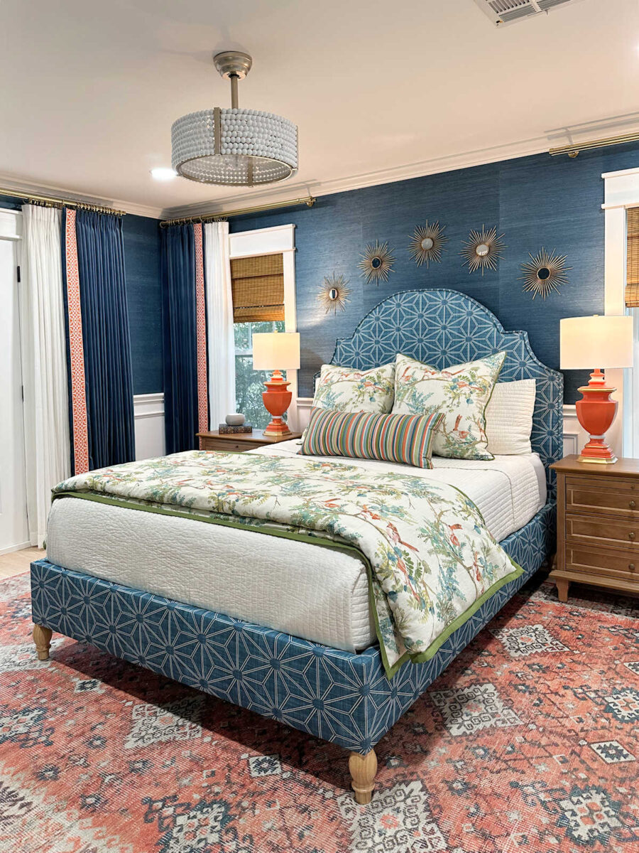
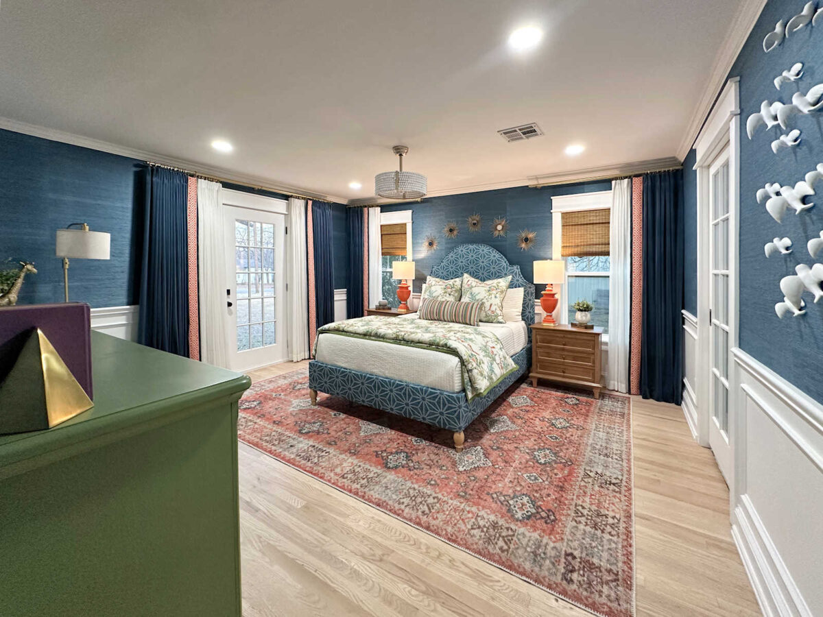
Yesterday, I got all of the grasscloth wallpaper up in the bedroom, but I didn’t quite finish the wallpaper in the foyer. I’ll need one more day to do that. In the meantime, I’m looking ahead to my next project, which will be the draperies. I thought I might do the headboard next, but for some reason, the fabric still isn’t here (even though I paid for express processing/shipping so that it would be here last Friday). No problem. At least I have all of my drapery fabric, so I’ll just move on to those next.
The fabric that I bought for the draperies is a beautiful teal velvet. But the interesting thing with velvet is that you can get two very different looks from one fabric depending on how you hang the fabric. Since velvet has a nap to it, meaning that the fibers of the fabric lie in one direction, that means that it will look different depending on the direction you view it. That means I can get two really different looks with this fabric depending on the direction in which I sew the fabric.
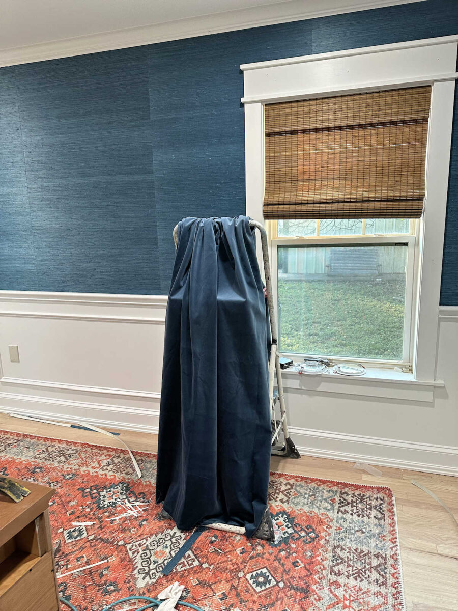
I haven’t had time to install the curtain rods yet, so I just draped the fabric over my ladder to get an idea of how the draperies would look. Here’s how the fabric looks with the nap of the velvet going up. You can see how hanging the fabric with the nap going up gives the fabric a deep, dark, rich look. Going this direction, the draperies would be a little bit darker than the walls.
And here’s how the fabric looks with the nap going down. This direction will make the draperies a little bit lighter than the walls.

Here’s a close up look of the two options side-by-side.
I backed up to the entrance of the bedroom to see if the difference between the two options was as stark as it is when standing close to the fabric. Here’s it is from a distance with the nap going up and the fabric appearing darker.
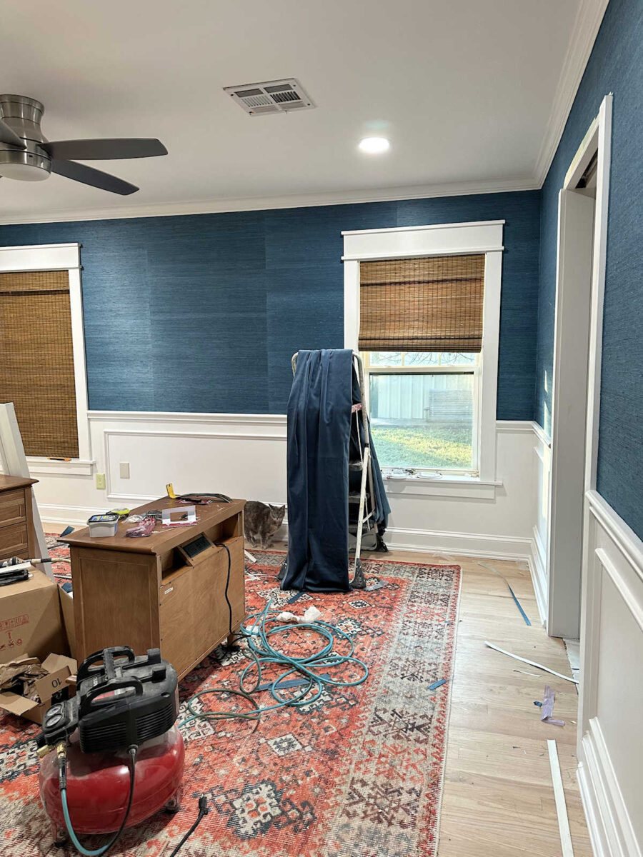
And here’s a look from a distance with the nap going down and the fabric appearing lighter.

And here’s a side-by-side view of the two options from a distance…
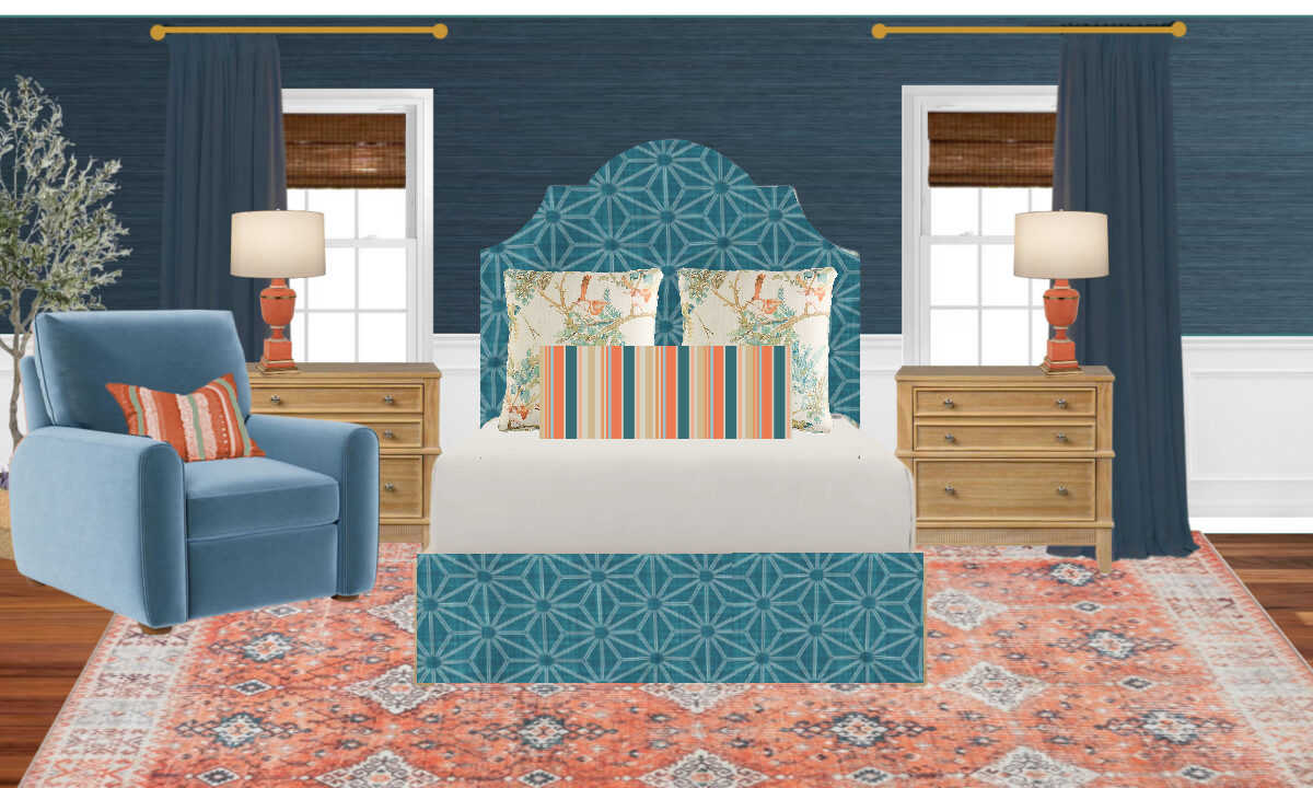
In my mock up of the room, you can see that I went with the darker option…
Just going by the look of the two, I personally prefer the darker option, but the decision isn’t quite so simple as deciding which one looks better. There are other factors that give me pause. The main factor is that hanging velvet with the nap going up will almost certainly lead to them catching dust more easily. I’m trying to decide if that’s really going to be an issue or not. Of course, my vacuum cleaner has an upholstery attachment, and it would take only a few minutes to use that to vacuum the draperies when needed. All of my draperies, even those that aren’t velvet, need to be vacuumed periodically, especially when I’m working on big projects and creating a lot of dust in the house. Hopefully, I’m nearing the end of creating dust on this side of the house, so maybe under normal living circumstances, it won’t even be an issue.
But I really think they will look so much richer and prettier if they’re darker, right? I also have to consider that the recliner is going to be lighter than the walls. So if the draperies are made to look lighter, it might look like I tried to match the draperies to the recliner, and if they’re “off” even slightly, I think the difference will stand out way more than if I make the draperies so that they appear darker and make it look like an intentional decision NOT to make them match the recliner.
Ugh. These decisions would be so much easier if I actually had the recliner. It was supposed to be delivered by November 11, but I’m losing faith that it’ll actually be here on time. According to the tracker on my order, it hasn’t even shipped yet, and I’m pretty sure it ships from somewhere overseas. So I’ll have to move on and make the decisions without the actual recliner in hand. All I have is the website photo, and I just have to hope that it’s accurate.
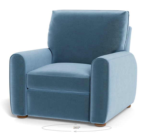
Going by the picture of the recliner alone, which is all I have for now, it seems like the best option for the draperies is the darker color, and I just need to resolve myself to the fact that I’ll need to periodically get out the vacuum with the upholstery attachment and give them a quick vacuum.
More About Our Master Bedroom
see all master
bedroom diy projects
read all master
bedroom blog posts

Addicted 2 Decorating is where I share my DIY and decorating journey as I remodel and decorate the 1948 fixer upper that my husband, Matt, and I bought in 2013. Matt has M.S. and is unable to do physical work, so I do the majority of the work on the house by myself. You can learn more about me here.

Darker, it’s not even close. When it’s hung upside down, it does not even look like velvet!
I love the look of the darker looking for the drapes. The lighter feels washed out.
Agreed. Lighter has a faded look.
Darker for sure! It’s such a rich, luxurious look. It’s going to be stunning!
I instantly liked the darker option best, until you went back towards the door and took the long shot. Weird: then I liked the lighter version better.
One thing I have learned, though, is that your ultimate decision will be beautiful. And if you don’t like it you will change it up! 😆 (dark floors? Nah).
I agree with Mary. I liked the darker at first, closer up, but once you backed up and photographed both again, I prefer the lighter version overall. But I agree that you are the only one who can make that choice. I would just be concerned that the nap running up the drapes could make the drapes appear “messed up” more? But it has been a while since I worked with velvet.
There’s no contest at all. Darker is the only option!
I know you prefer to go to the end of sewing projects, but what if you went ahead and added your trim and side hem, but did not finish either end for now? You know where you’ll install your rods, so you could do those, then pin the panels on each side, but in opposite directions and live with them for awhile. Then, if your chair ever arrives, you will know immediately and can quickly finish your ends. It will also give the panels time to relax.
This is a great idea! A little patience might be called for in this case.
Great idea! This makes a lot of sense to me.
Agree, darker is the way to go.
The darker is much more luxurious looking for sure. Love that one.
Definitely hang with the nap up. The darker will look so much richer!
Go darker. They look so much richer. You can vacuum from time to time. Leave that wide trim off. It just doesn’t go with the look of the room in my opinion. (Everyone has an opinion!)
Yup, Darker for sure. It’s not even a contest to me.
I’m jumping on the darker bandwagon, too—it’s gorgeous!
I agree with you going with the darker look.
I don’t think you can go wrong, but I prefer the lighter–I like how it blends tonally with the wallpaper. Could you show it with the headboard fabric and the trim tape, though? I think that could really help you decide.
Darker – in the photos, it actually reads as velvet with texture. the other reads very flat almost like a denim
The darker drapes give a little more depth to your pallette and does look more lux. I would go darker. the lighter seems to match in value too much and is just slightly different from the teal in the rug and the teal in the fabulous grasscloth. To me, that says you wanted it to match exactly and missed the mark slightly. Its not bad, just not as good as the darker version.
I like the darker look. You could always start the headboard and bed frame next. Maybe the fabric will come right as you finish the wallpaper which is absolutely beautiful.
In my opinion, this is a call only you can make. You are the one who will have to do the work if you hang them upwards. I would not want that extra work myself, but I also would not have Velvet drapes because of this! Too much work at my age! Having said all that , I will vote so that you can have a head count, and I vote nap going downward! I think the lighter shading will look nice with the darker grasscloth, and the recliner will not be right next to the drapery to matter. (I also don’t like the idea of drapes at the door – I would do a roman shade to match the window shades, or one in the Velvet.)
I’ve learned that you always use velvet with the darker effect to show – it is just so much more beautiful! If you want it to be different from the recliner, than that might be the best bet anyway. And you like it better…. win-win-win?!
Darker looks better. Lighter looks like the fabric is faded, imho. What’s a little extra vacuuming in the overall scheme of things, anyway? 😁
I absolutely missed a post somewhere where you decided to change the headboard fabric! I must go find it now.
Darker 100% – the lighter looks faded (not in a good way). Or even like denim – yuck. The rich darker side is so much better.
Totally agree.
Dark. Yes, yes, yes. Not even a close decision. 😁😁 I absolutely LOVE the darker, and I agree the lighter may clash with the chair. It’s gonna be so gorgeous, I can hardly wait. I know you’re the same. 😄
I prefer the darker look. My hesitation is that it’s much more difficult to vaccuum them in an upward direction. Think about it. The instinct is to start at the top and vaccuum downward. Would that work if the nap is going up? Or is that not a problem?
I like that idea of being able to reverse the direction of the drapes if the time arises. So the drapery pins could be used either way. Maybe the drapery tape could be hidden in the hem somehow.
I came here with similar comment as Jackie. My suggestion is to incorporate same length ‘hem’ at both top and bottom of the panels. The panels could then be reversed with nap up or nap down, depending on how they look once the chair and other textiles arrive. Someone else suggested adding the decorative edging now, to at least finish that part of the project while waiting for other items.
I think it’s has too much teal together; I think the bird fabric would be nicer.
I vote for darker and richer. The room is coming along very nicely and I can’t wait to see the finished space.
Team darker!
Perhaps it would be helpful to get a night-time view of the two options (nap up v. nap down), using the lighting you’re planning, just to cover all bases.
My opinion comes from being an avid sewist, but the nap in the wrong direction would drive me insane. I clearly see I’m in the minority in this opinion, lol, and that’s fine, but it would bother me forever to know the nap was in the wrong direction. That may not be an issue for you though, and that’s ok too 🙂
I like darker. Do take a little time to see visualize how you mount the drapery hardware. Like a dk blue painted wood block mounted over the paper. You can swap so it attaches to wood vs drywall under hard to replace paper. That way you can replace the wood on top if there’s an oops mounting or life throws a curveball. You did this for the living room once before because you uses alternate hardware, but not sure if its palatable in here. Overall I think the grasscloth will hide direct holes super-well plus you’ll have enough from cutting where the windows/doors were for a few patches if life throws a curveball.
dark – no doubt
Definitely the dark. It looks so much richer. You did a great job on the grasscloth. It is what it is! I was a professional paperhanger, and it was occasionally difficult to convince a client that grasscloth has a look of its own. Usually not what you expect. I wouldn’t hang it until clients understood it is not like any other.
Did you test dark vs light against your headboard fabric? It seems to me like that adjacency is just as important as comparing the colors to the chair fabric.
I don’t have my headboard fabric yet. It’ll be here tomorrow.
The darker looks richer and more in line with the color of the walls. I’m hoping you get your recliner soon. Blessings to your home.
Definitely the darker option looks the best.
Nap up just seems wrong, but darker looks (marginally) better.
I was taught to work on velvet so that when hung it is darker. Personally, I much prefer the darker option. Like others have said the lighter version looks washed out.