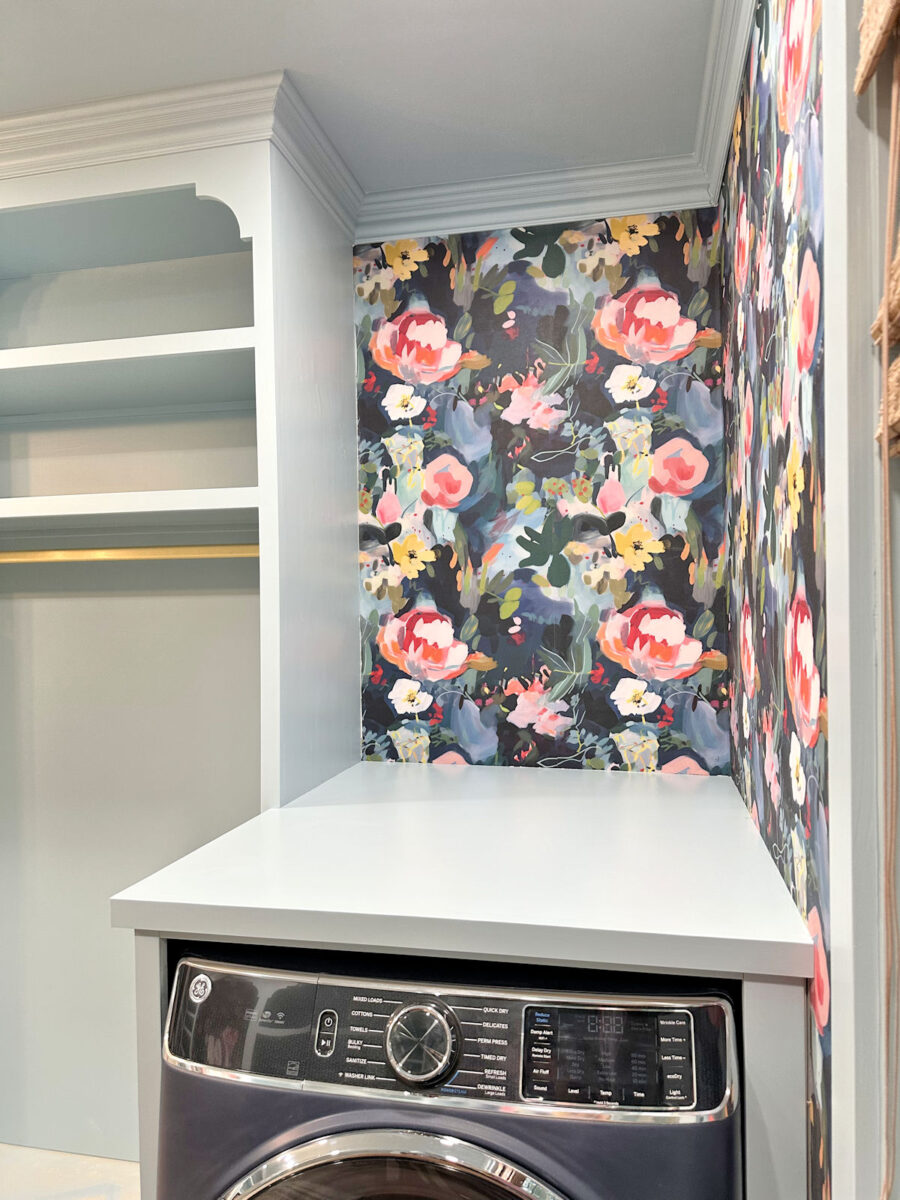
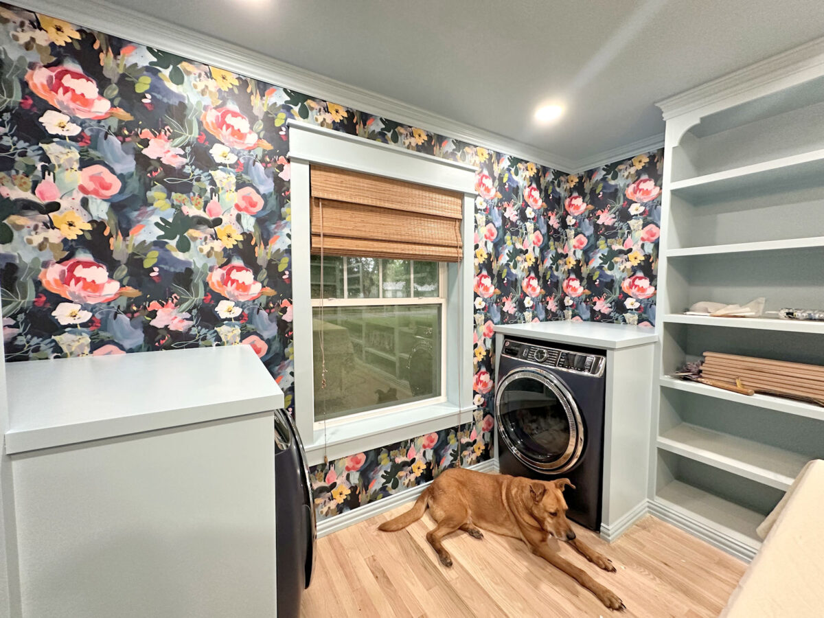
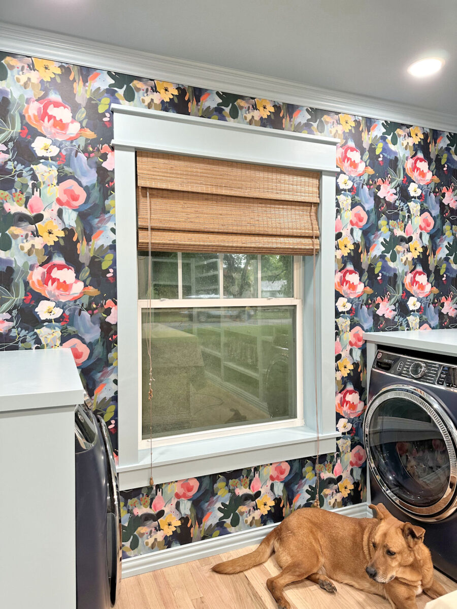
The Finished Washer/Dryer Cabinets And Window Wall
I have to admit that deciding what color to paint the washer and dryer cabinets was one that I really struggled with yesterday. And when I posed that question to all of you, I thought the answer would be clear cut, but it really wasn’t. There was a crowd favorite, but it certainly wasn’t a 90/10, or even 80/20 vote. It was more like 55/45 in favor of the light blue. Here were the two options that I presented.
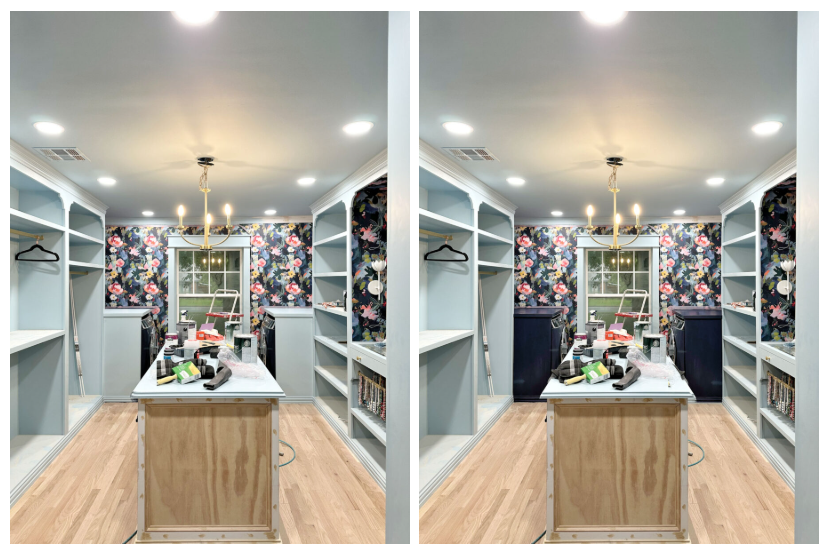
I started off the day pretty squarely on “team dark blue”. My mom was team dark. Other members of my family who weighed in were team dark. So naturally, in the end, I went with…
…the light blue. 😀
The dark blue just seemed to bring in a whole slew of other issues. If I went dark blue, then what color would I paint the baseboards around the washer and dryer cabinets? And if I paint the baseboards around the washer and dryer cabinets dark blue, then many people suggested that I also needed to paint the baseboard under the window the dark blue, which in my mind, would throw off the continuity of the whole look of the room.
And then if that baseboard went dark blue, then others suggested that the crown molding and window trim needed to be dark blue, while others suggested it needed to be white. So in the end, I just decided to stick with my original plan and carry the light blue around the entire room and on all of the trim.
I still need to add the tiny shoe molding where the cabinets meet the wallpapered wall, and also where the washer and dryer cabinets meet the wallpapered wall. I’ll do that at the same time I add the shoe molding around the baseboards on the rest of the cabinets.
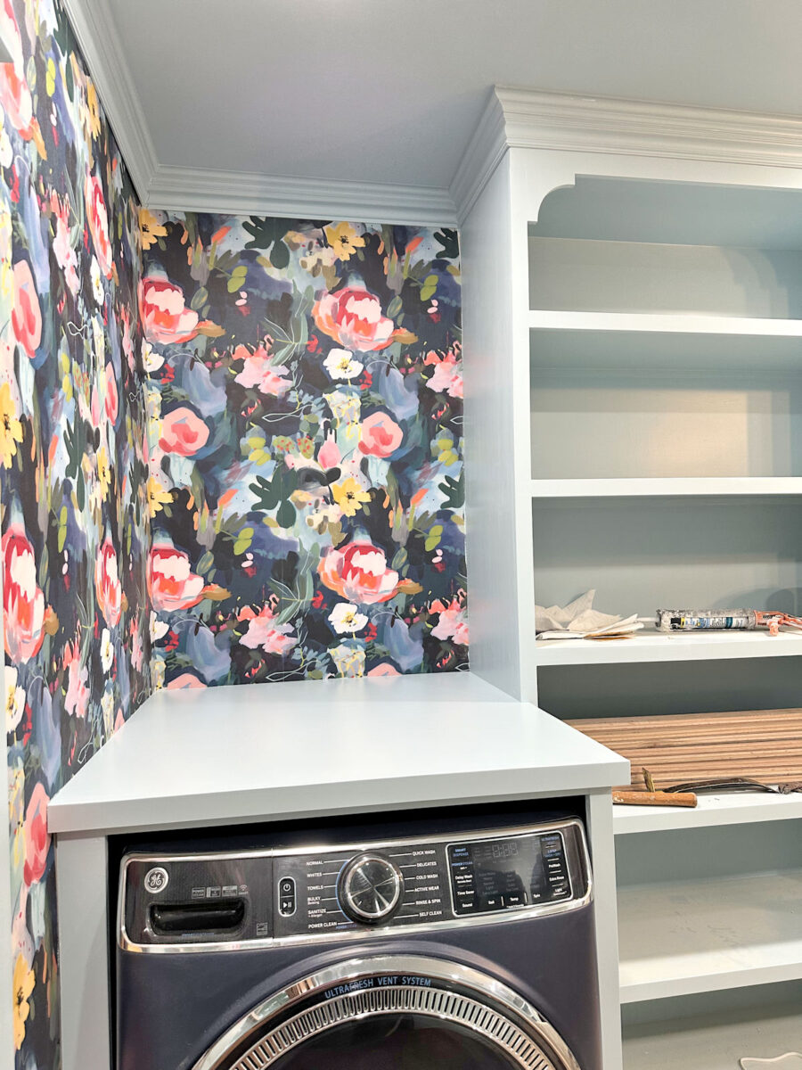
But let me tell you, I struggled with this decision. At one point, I even removed the countertop on the washer cabinet and went back to the idea of making a countertop out of leftover hardwood flooring. I thought I just needed something to break up the sea of light blue. But that didn’t look right to my eye either, so I put the solid countertop back on (which then had to be re-trimmed, wood filled, and sanded again) and stuck with the original plan.
But the main comments that influenced me were from those of you who said that the dark blue cabinets made it look like I had just stuck my dark blue washer and dryer there with no cabinets around them. And if that’s the look I wanted, why did I go to the trouble of building cabinets in the first place?
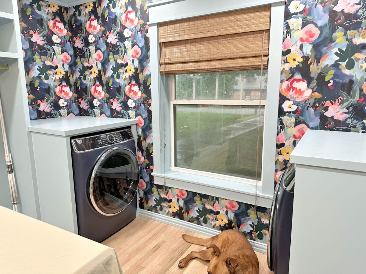
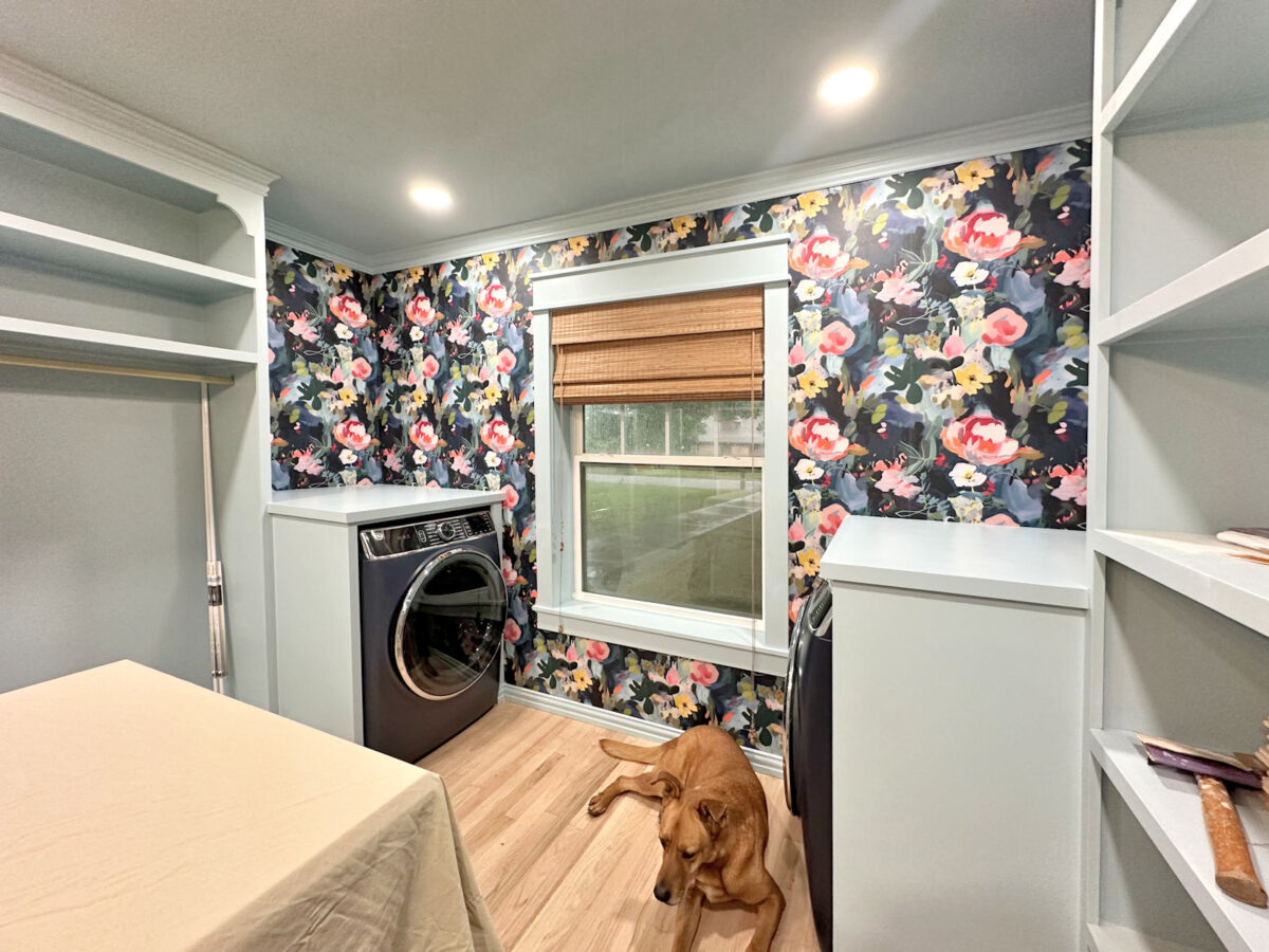
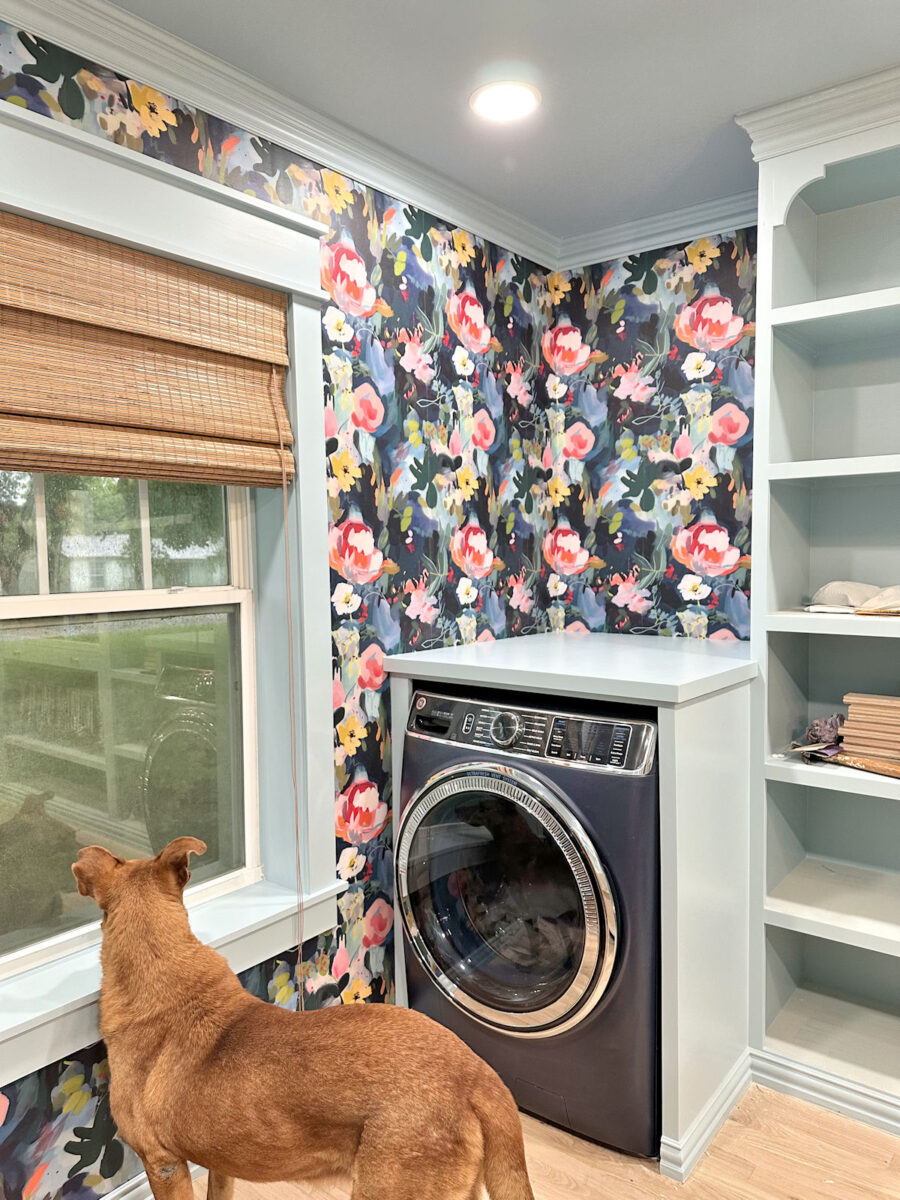
And when I compared the two options side-by-side, that’s exactly what it looked like. And that’s not the look I wanted. I think the light blue makes it obvious that the appliances are sitting inside custom cabinets built for them. That’s the look I wanted. And in the end, I have to say that I really do love the cohesive look of the light blue on all of the cabinets and all of the trim.
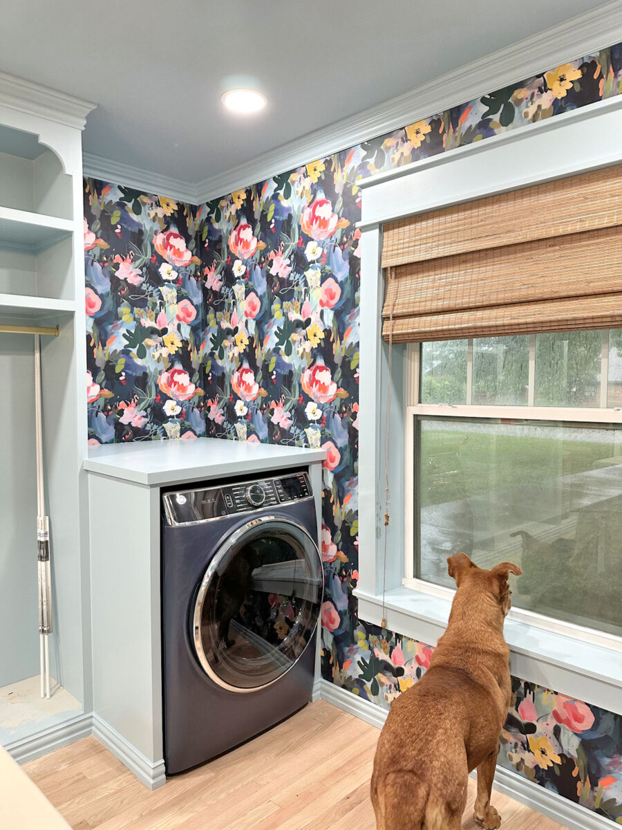
I also decided to bring back the original shade for that I had in here, and I love the look! I love the warmth that the wood tone brings in, and with all of the additional light that I added to the room, it doesn’t look too dark to me. In fact, it’s almost the same color as the woven laundry hampers that I bought, as well as the baskets that I bought to go on the shelves on the opposite wall. (Yes, I bought ten baskets! Someone sent me a link to the perfect baskets, and I snatched them up as quickly as possible. So far, I’ve only received two of the ten.)
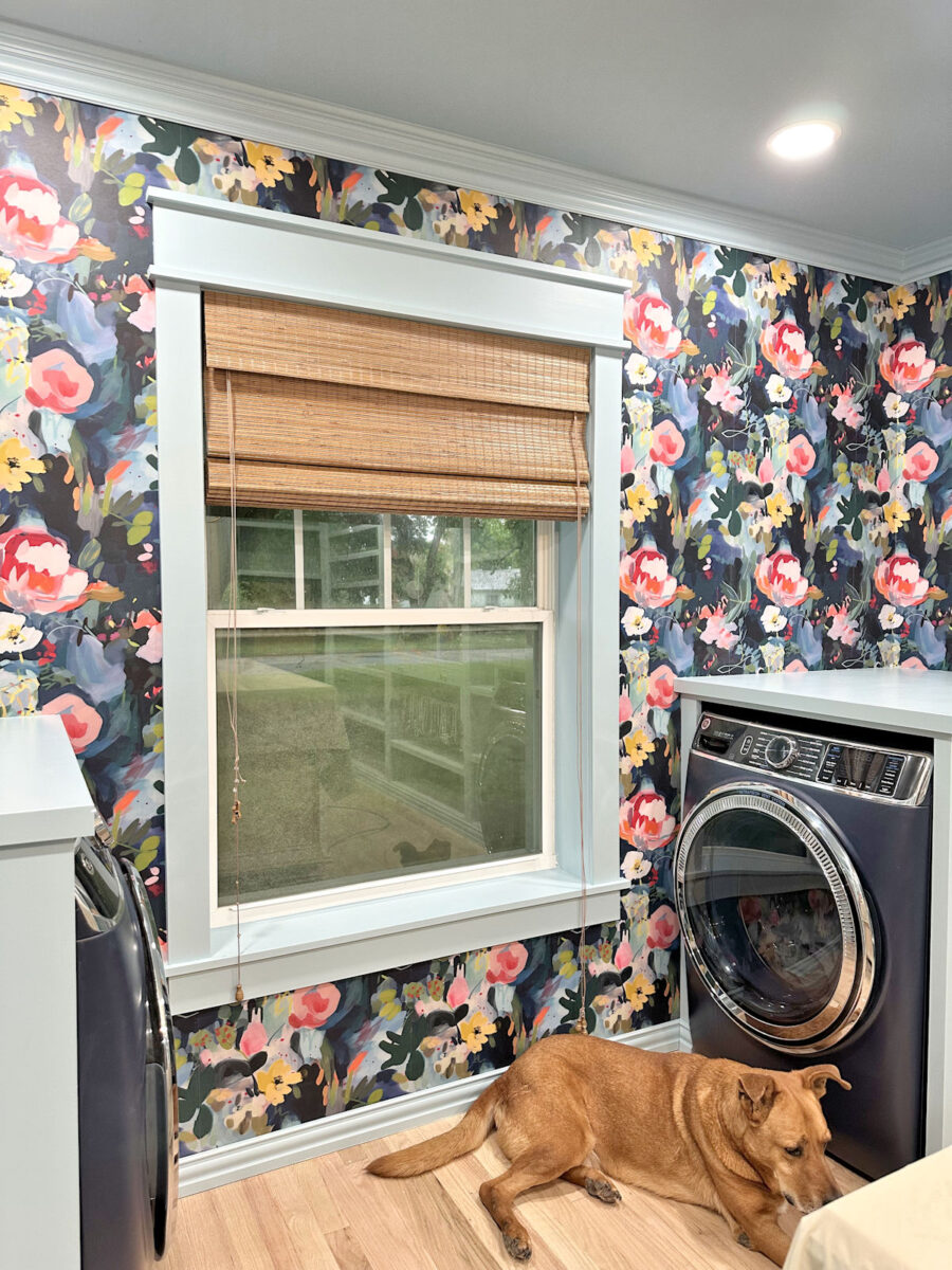
This is a top down/bottom up shade, fully lined shade that can provide complete privacy, but I’m also going to add privacy window film to the window so I can still have some privacy when I want the shade open to provide sunlight to the room.
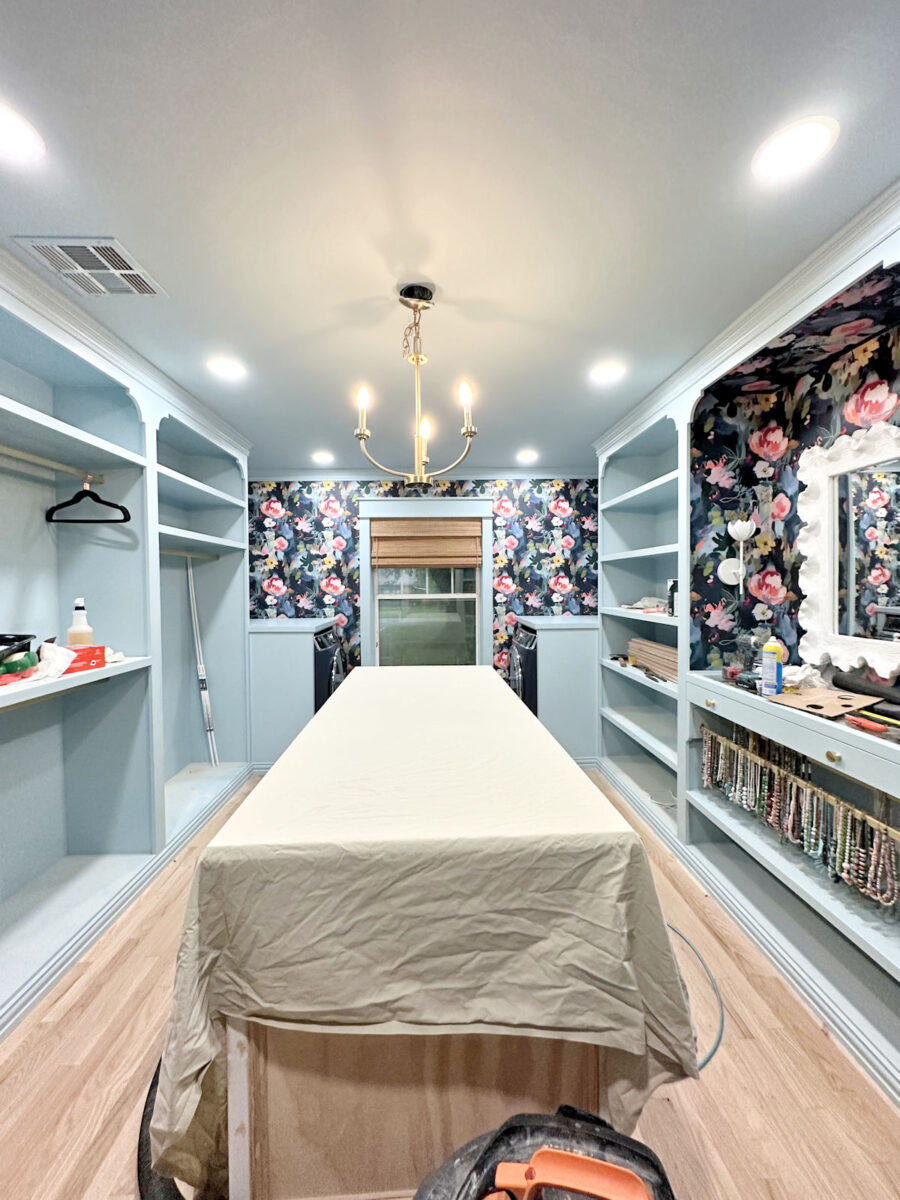
But one more reason I decided to go with the light blue on the cabinets is because I made another big decision yesterday. I won’t be painting the island light blue. In deciding to paint the island the same light blue as the rest of the cabinets, I wasn’t being true to myself. I was trying to please others. But this is my closet. I’m going to be the one using it and seeing it every day. So the only person who needs to smile when they walk in here is me. 🙂
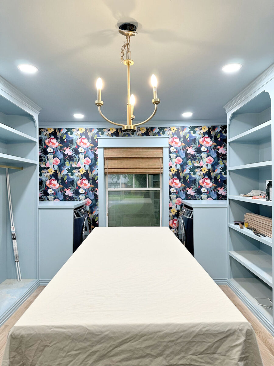
I’m not quite ready to share the color I’ve chosen yet because I’m still not 100% sure about it. I have an idea, and I’ve tested it out on the top of the island, but I’m not ready for input on it at this point. That’s why it’s covered up. 😀 But when I finally decided to be true to me, and to bring in an accent color on the center island, that’s when I made the final decision to stick with the light blue washer/dryer cabinets, countertops, and trim. With that accent color in the middle, I needed everything else on the perimeter of the room (except for the wallpaper and the fronts of the washer and dryer which, to my eye, blend in with the wallpaper) to be the same color.
I have a friend coming into town today, and she’ll be here until Friday, so my work on this room may slow down a bit. Or I may put her to work. 😀 But I’m hoping that by the end of the weekend, I can have the island finished and ready for its big reveal early next week. So stay tuned for that!

Addicted 2 Decorating is where I share my DIY and decorating journey as I remodel and decorate the 1948 fixer upper that my husband, Matt, and I bought in 2013. Matt has M.S. and is unable to do physical work, so I do the majority of the work on the house by myself. You can learn more about me here.

You always make the best decisions!
Definitely the right choice!!! Looks great.
I was back and forth on whether I thought the dark blue or light blue would look better so I didn’t comment on that. I think the light blue looks great! I also think that painting the island a color other than light blue will also look great. I am anxious to see what color you have chosen. I also like the blinds. You’re getting closer to the finish line!
I love your decision Kristi. And I love even more that you are going to change up the color on the island. It should be a statement piece with all of the work you have put into it. I am excited to see the results!!
Ooh,…I love the anticipation you are building up for us. Everything looks very beautiful.
You absolutely made the right choice.
I think when your clothes and shoes and accessories all are in their new home you will be glad you stuck with the light blue. I like it so well that I am entertaining painting my family room which is currently white in the same shade or something very similar.
Sitting here trying to guess what will be revealed under the covered counter.
Great job as always.
I love it! I hope you don’t regret sticking with the light blue, as it really looks more professional and less amateur designer. As for the island, I will not be negative on your choice. As you said, you are the one who will see it every day, so you should be happy with your decisions! Am looking forward to seeing the baskets you got also! Have a good time with your friend, and take the time to enjoy her visit! NO WORKING! She travelled to see you, not to work!
I sit corrected. Right you are, the light blue was the best choice. Beautiful result.
I can’t wait to see what you decided, but on first glance, I’m thinking: bright pink. It would pop in this space AND go with the teal in the adjoining space. (I remember you mentioning you didn’t want to paint the island dark blue because it wouldn’t go well with the teal in the other room).
Wish I’d read the comments first! 😆
So glad you went with the light blue!!!! Looks wonderful!
It is beautiful. I love it!❤️❤️❤️
Keep being true to yourself!
Happy you decided on the light blue. Looking forward to seeing the room completely finished
Enjoy your visit with your friend
PINK♡♡♡
I see your chosen color in the can at the end of your cabinet. If I am right it is a very pretty color. I am so glad you kept the light blue all over the end of the closet. Also the shade does look lighter and looks good. I’m anxious to see the middle piece of furniture finished.
Enjoy your friend’s visit.
Hmmm…the only paint can I see is the light blue. That’s not it. 🙂
I absolutely LOVE it!! Can’t wait to see the island color reveal!!
Ah lak it. Ah lak it uh lot.
It’s gonna be pink! ❤️❤️💯💯💯
I hope you paint the island a pink/coral!!
Have fun with your friend. I love doing projects with mine.
It looks so amazing. Keep on doing your thing. Big cuddles to Cooper.
Cheers to you and Matt!
Love that you went with the closet blue on the W&D cabinet. i am also very happy that Cooper matches so well!
I love seeing Cooper claiming the space, checking for squirrels out the window!
I love that you chose the light blue paint color! I was on the fence about the colors, but I didn’t like the idea of painting the baseboard and trim a different color as well. I think the island should be dark blue. You do you!
I love the light blue! I can’t wait to see the island. I also love the shades you use. I am concerned Cooper will be broken-hearted if you put film on the window. He loves looking out the window.
Can’t wait to see your final vision of your closet island!
I recently viewed the portfolio of Maggie Getz Studio – Rhode Island Beach House
https://www.maggiegetzstudio.com/portfolio/rhode-island-8z7lr-dcnr8-byfjj
There is a striking similarity between your mock-up of your closet island and a dresser in the portfolio. If you need more glamour, maybe gold-leaf bling to your final product?
I was Team Billowy Breeze and so relieved to see the appliance cabinets in that color. It looks really good, and very intentionally built-in. Love it! I can barely wait to see the island revealed!
(You sure know how to create drama on your blog!) 😀
I still think you should wait till you move your clothes, shoes, handbags, etc. in before you paint the island. All that added color might make a difference on what color you choose.
So glad you kept the the same blue! It looks harmonious.
Now, are you going to apply oak veneer to the island? 😂😂😂😂
I’ll take a wild guess and say it is coral!
So glad you went with the light blue…there are still lots of colors coming with garments and accessories. I loved the simple look you did with all the same color…and then a lot of colors with everything else. The dark blue was just too jarring for me. The island color has me excited…now THAT made sense to me…it centered and not a utility like a washer/dryer. Looking forward…
What would it be?? Yellow? Lime green,teal or coral. Im wondering….
Excellent choice on continuing the light blue in the closet.
And I think you chose it for all the right reasons.
My guess is you brought in some pink from the wallpaper for the island!
It’s beautiful! I didn’t vote. But, if I had, I would have been “team light blue.” 🙂 And if we are guessings, I’m gonna guess that your island will be that dark red/burgandy color in your wallpaper. That would be gorgeous!! I’m excited for the reveal!! 🙂
As you said…you’re the only one going to see it all finished when done. I loved the dark blue, but then I dont live there. It has to make only you sing. 😁😁
Please consider painting the window trim white to bring some whiteness over to that side. I’m thinking it may make your mirror and pretty flowered lights stand out more.
I really love the shade in the window, and I agree that it doesn’t look too dark at all! I like the w/d boxes pale blue, and one reason is that the top overlaps the sides of the closet boxes, and the dark blue didn’t make a straight line. It really bothered me 😂. Also it did look like the sides of your appliances. I think all the trims being pale blue works well with the room, but I still think the window trim should be white to provide a stronger contrast to the wallpaper and echo the white mirror and sconces. I’m excited to see your island color!
You made the right choice. Besides the fact that the dark blue would make the appliances look like they weren’t in cabinets, dark blue changes the balance of the entire room. The dark vs light colors balance from this angle would veer too close to 50/50, when you really need a dominant color with closer to a 70/30 or even 80/20 ratio. With the light blue cabinets, your dark wallpaper commands about 25-30% of the visual area by my eye. The wallpaper being in the subordinate/minority cements it as the focal point.
I’m looking forward to the island reveal – hopefully you have chosen a solid pink!! 🙂 Let that wallpaper continue to dominate not only as the focal color but also as the dominant pattern.
My preference would be to wallpaper the sides of washer/dryer cabinets to receded more into the wallpapered wall, but I do love the light blue. The closet is amazing. Great work as usual. I am just in awe!!
Hi! Any chance you could share a link to the window shade?
You can find all those details here: https://www.addicted2decorating.com/beautiful-new-woven-shades-in-my-breakfast-room-living-room.html
If you’re looking for unlined shades, like the ones I have in the studio, bedroom, and master bathroom, this is what I used in the Rustic Walnut color: https://amzn.to/44obGUU (affiliate link)