What Color Should I Paint The Washer And Dryer Cabinets? (Two Options) — Walk-In Closet Progress
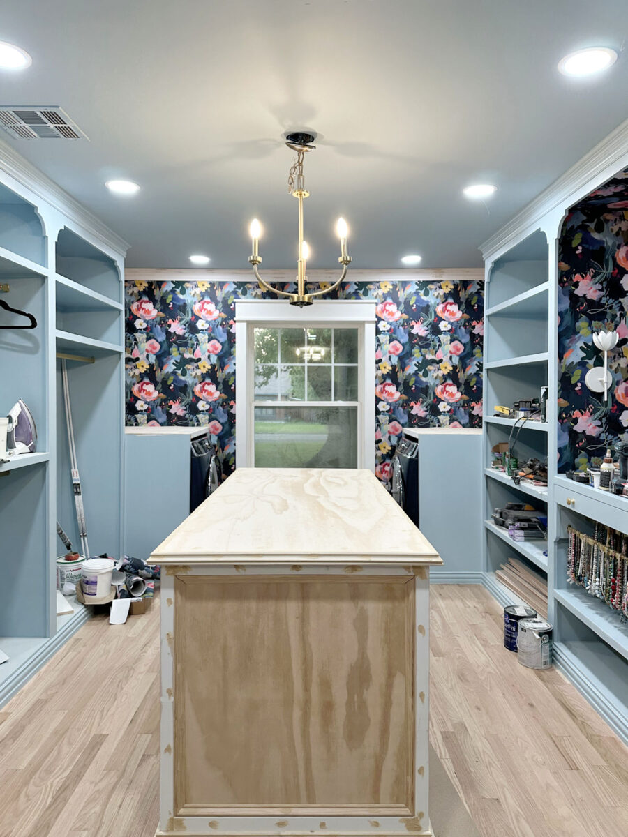
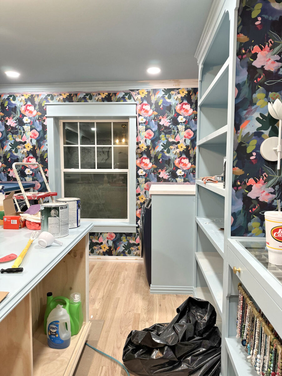
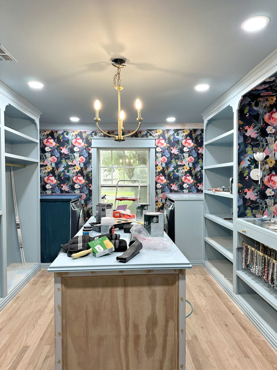
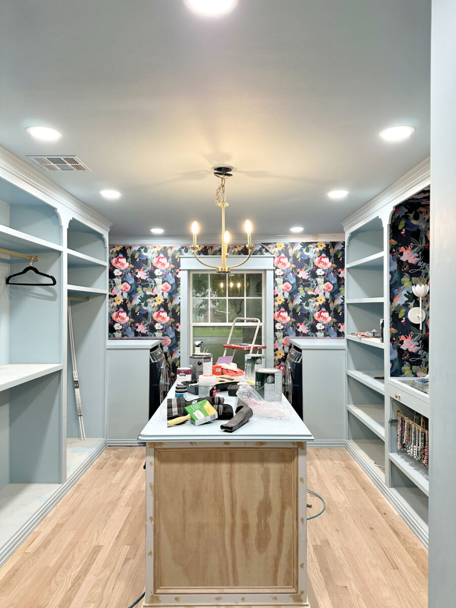
I continue to make progress my walk-in closet/laundry room progress, and over the last couple of day, I’ve made it my main mission to finish up all of the projects that would create dust so that I can get all of my stuff — clothes, handbags and shoes — moved in ASAP. So with that main goal in mind, I got the island top sanded, primed and painted, I installed the countertops on the washer and dryer cabinets and got them trimmed out, wood filled, and sanded, and then I turned my attention to the trim on the back wall and around the washer and dryer cabinets to get all of it sanded, caulked, and painted.
I didn’t quite get it all painted, and even the part I did get painted still needs a second coat. But once I get that trim finished, I’ll just need to do a bit of sanding on the on the base of the island, and then I can get all of the dust cleaned up, and get my stuff moved in! Anything else that needs to be done on the island — finishing the drawer boxes, making the drawer fronts, and making the doors — can be done outside so I won’t create more mess and dust in this room.
I will still need to do some sanding on the drywall once I start framing out the doorway…
But I can very easily drape some plastic, attached to the fronts of those cabinets flanking the doorway and along the ceiling, to keep the dust out of the room.
All that to say that I am SO CLOSE to being able to move my stuff in!! I’m really hoping that by the end of today (Tuesday), I’ll have all of the messy projects done in here, have all of the dust cleaned up, and be able to start moving stuff in. I’ve had my washer and dryer working overtime these last few days since they were moved on last Thursday and hooked up (which makes my closet smell so good, by the way 😀 ), so I’m champing at the bit to get everything in its place.
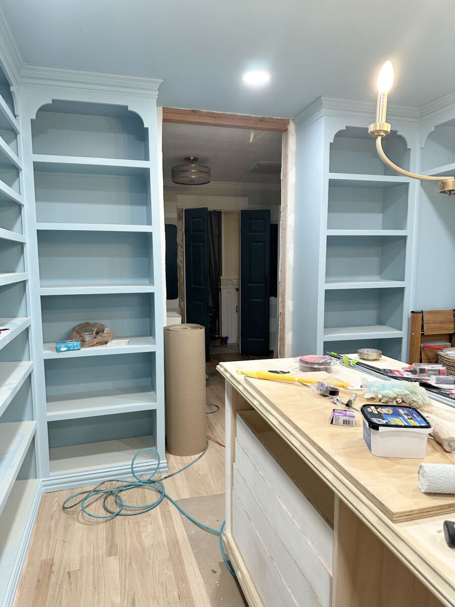
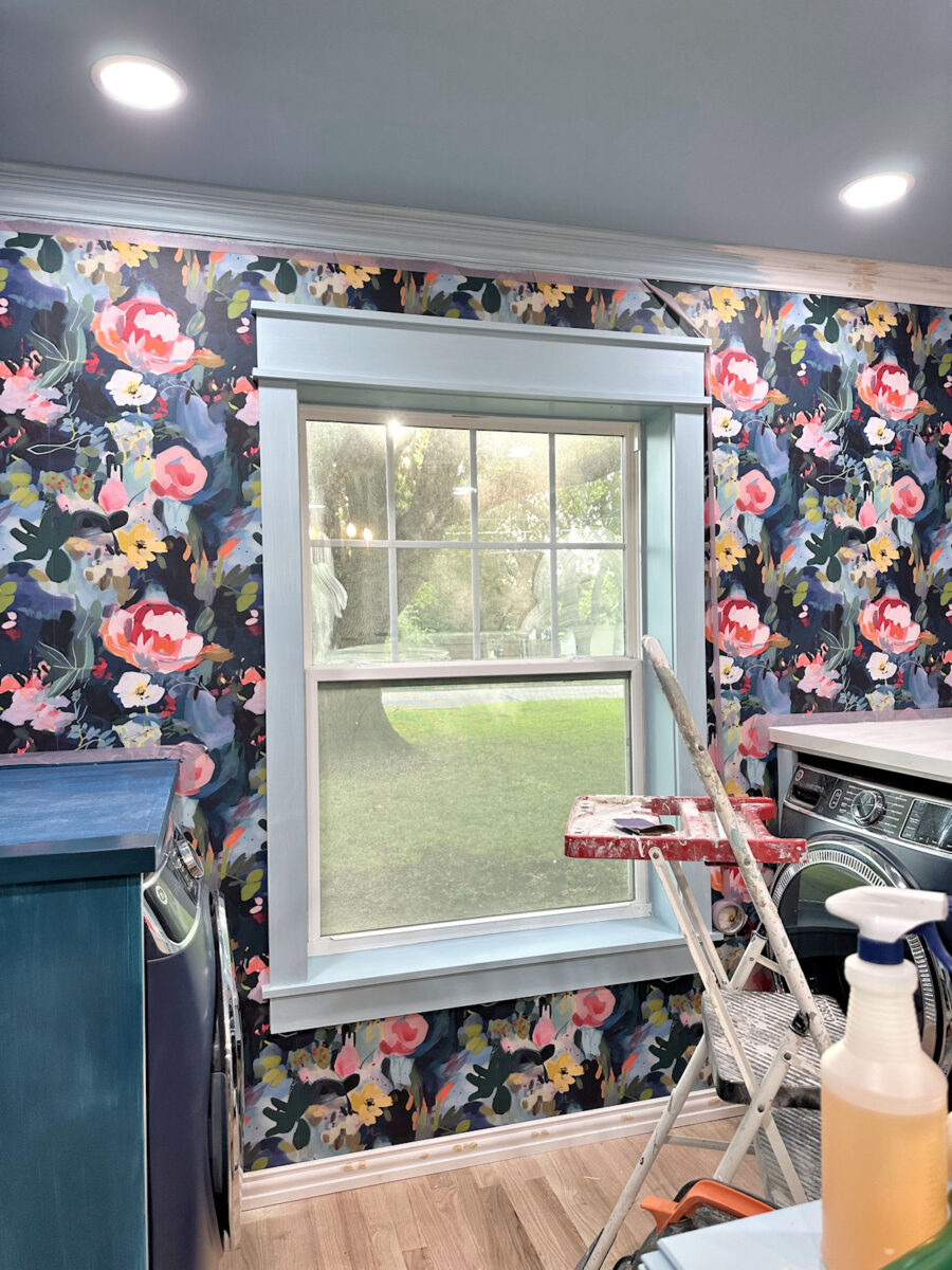
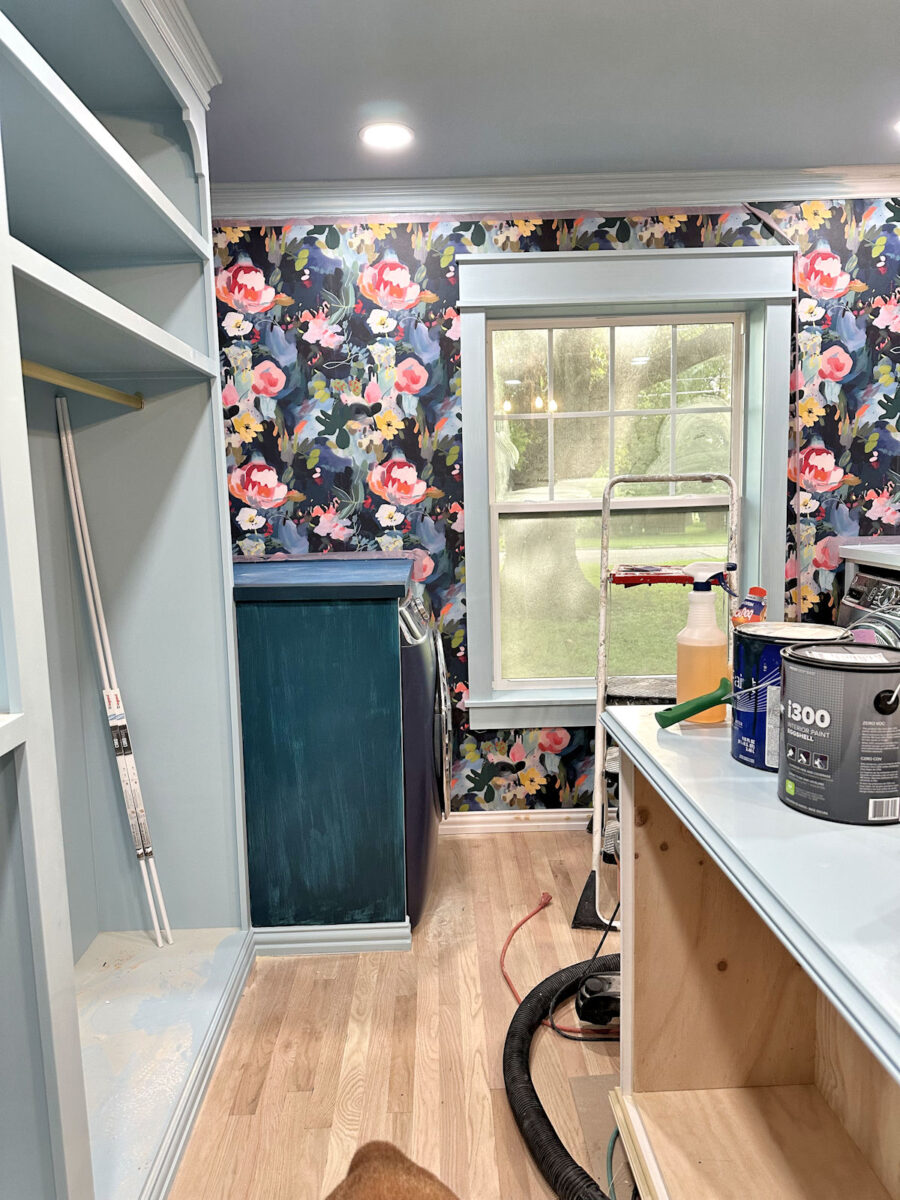
Last Friday when I shared the latest progress, the washer and dryer were in, but the cabinets were still without countertops.
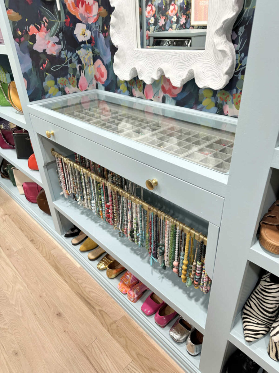
Here’s a closer view of the cabinets without the top front trim and countertops…
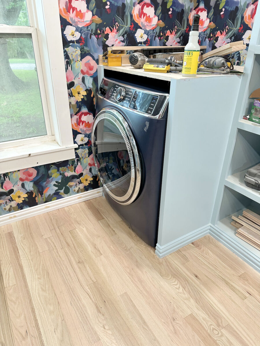
After adding the 1×2 trim along the top front edge of those cabinets, I added the coutnertops, which are just a piece of 3/4″ plywood cut to fit the width of the cabinet and cut to the depth of the cabinet plus about 1/4″. And then I trimmed around that plywood with additional pieces of 1×2 lumber, mitered on the corner. There’s nothing fancy about it.
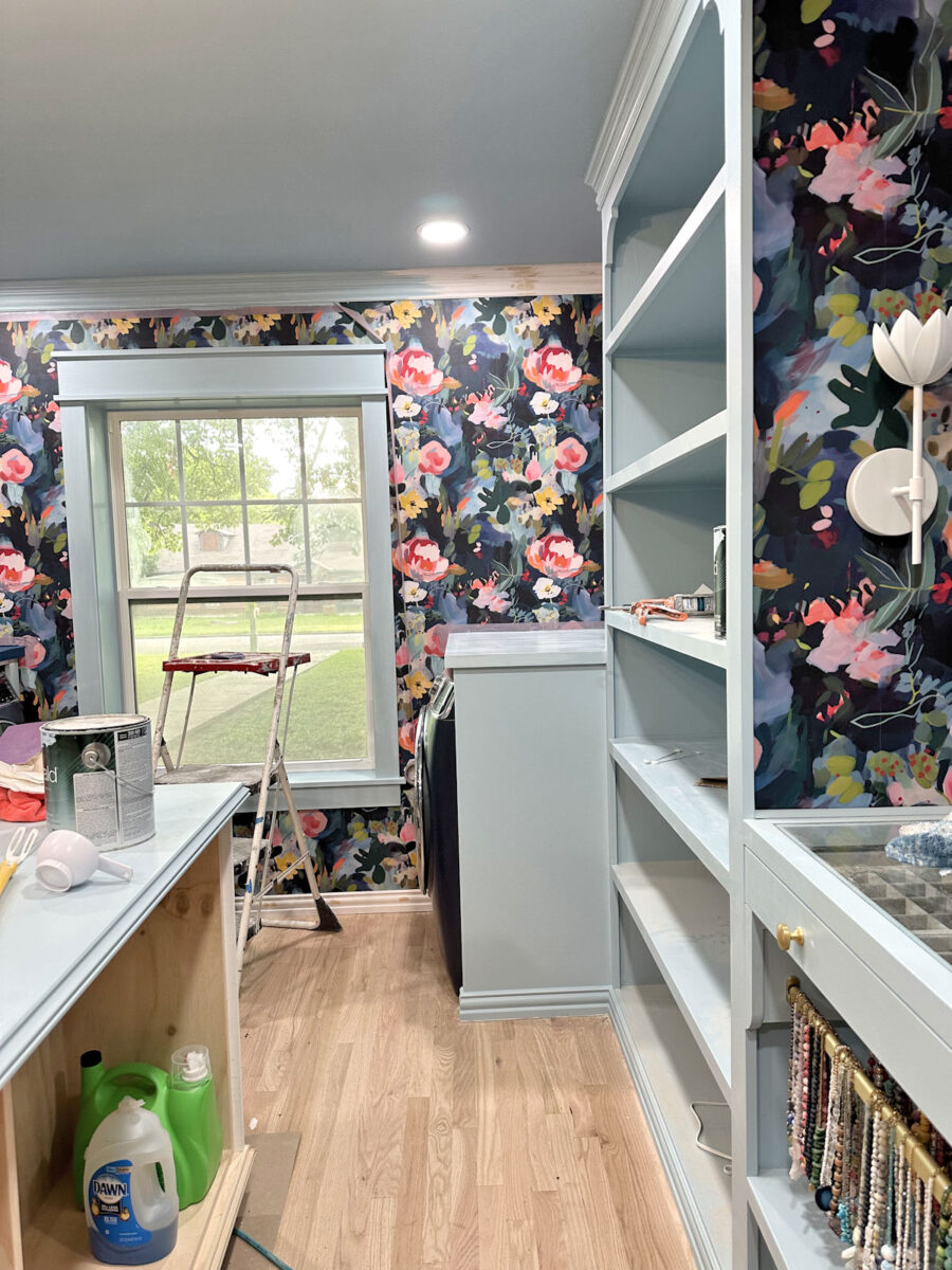
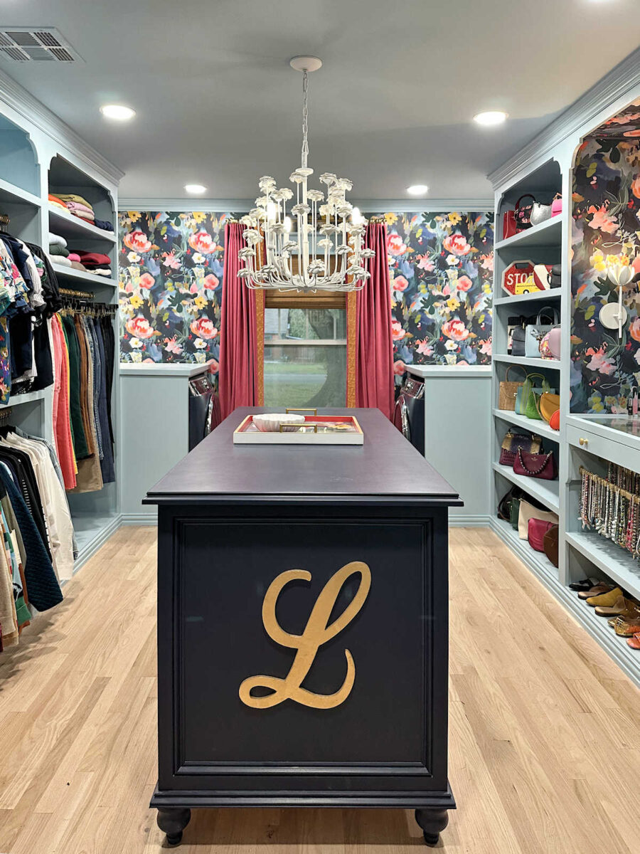
So here’s the progress. The countertops are on. They’ve been wood filled (where the edge trim meets the top plywood), sanded, and primed. The crown molding on the back wall and wrapping around the washer and dryer areas are sanded, caulked, and half painted. The window trim has the first coat of paint on it. I still need to sand, caulk, and paint the baseboard. You can also see that the top of the island is painted, but I didn’t get a good picture of that. You’ll have to wait to see that later. 🙂
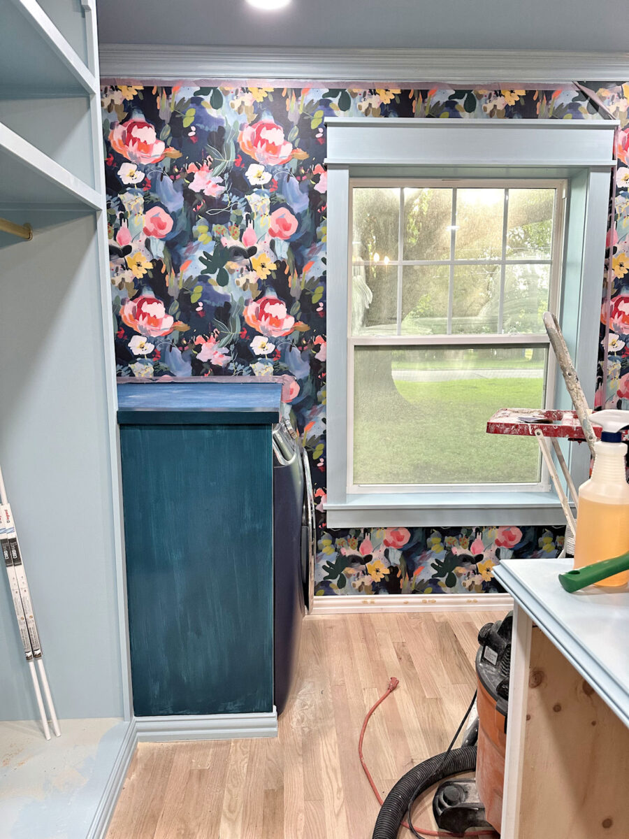
Anyway, as I was working on all of this over the last couple of days, I started wondering if the washer and dryer cabinets would look better painted dark blue to match the washer and dryer and to blend in better with the wallpaper. I decided to try it Sunday evening, and left the house to head to Home Depot at 7:30. They close at 8:00 on Sundays. I should have just waited because that didn’t leave me much time at all to pick out a paint color, and I got it wrong. Very wrong. Plus, for some reason, the paint color I chose couldn’t be mixed in the paint I wanted, and the only paint they could mix it in was some cheap Behr paint that I’ve never even heard of before. It was awful and didn’t cover at all. But at least I could paint the first coat on the countertop with a darker color and get an idea of what it would look like…
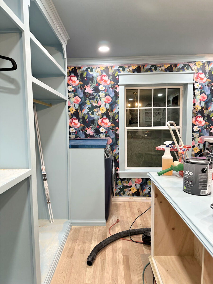
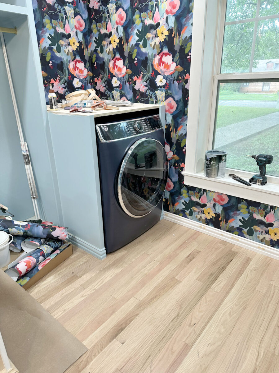
You can see that the color I chose is way too light to match the wallpaper and the appliances.
I didn’t have time to get more paint yesterday, so I decided to paint the cabinet with the dark paint color that I had randomly chosen (without wallpaper in hand) to paint the inside of the cabinets before the washer and dryer were installed. Again, if I go dark on these, this won’t be the final color. I’m just trying to get an idea of what these would look like if they were painted dark.
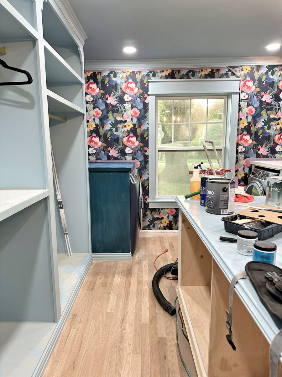
I had to laugh at myself because you can see by that paint color selection, which I chose without the wallpaper in hand, just how much I gravitate towards teals. When I picked out that paint color to paint the inside of the cabinets, I genuinely thought that I was picking a true navy blue. But when compared to the true blue of the dryer, you can see that I, once again, chose a teal. That paint color has so much green in it compared to the dryer. I’m tell you, if you cut me open, I’ll bleed teal! 😀 It’s just in my veins! I can’t choose a true blue to save my life.
So, believe me, I know that this looks awful, and that it’s the wrong color for this area. I’ll need to find a blue that has absolutely no green in it for the final color…if I go with the dark color for these cabinets. But at least this can give us an idea of what a dark color would look like on these cabinets. You kind of have to use your imagination, though. But the question is…
Should these cabinets go dark to match the washer, dryer, and wallpaper?

Or should they stay light to match the rest of the cabinets and all of the trim in the room?
And if I go dark with the color, what about the baseboards on those cabinets? Again, all of the trim in the room is being painted to match the light blue of the cabinets…
And that will include the baseboard on the back wall of the room underneath the window…
I originally thought that if the cabinet and countertop are dark, I would keep the baseboard light to keep that consistent line around the room the same color. (Excuse my dust.)
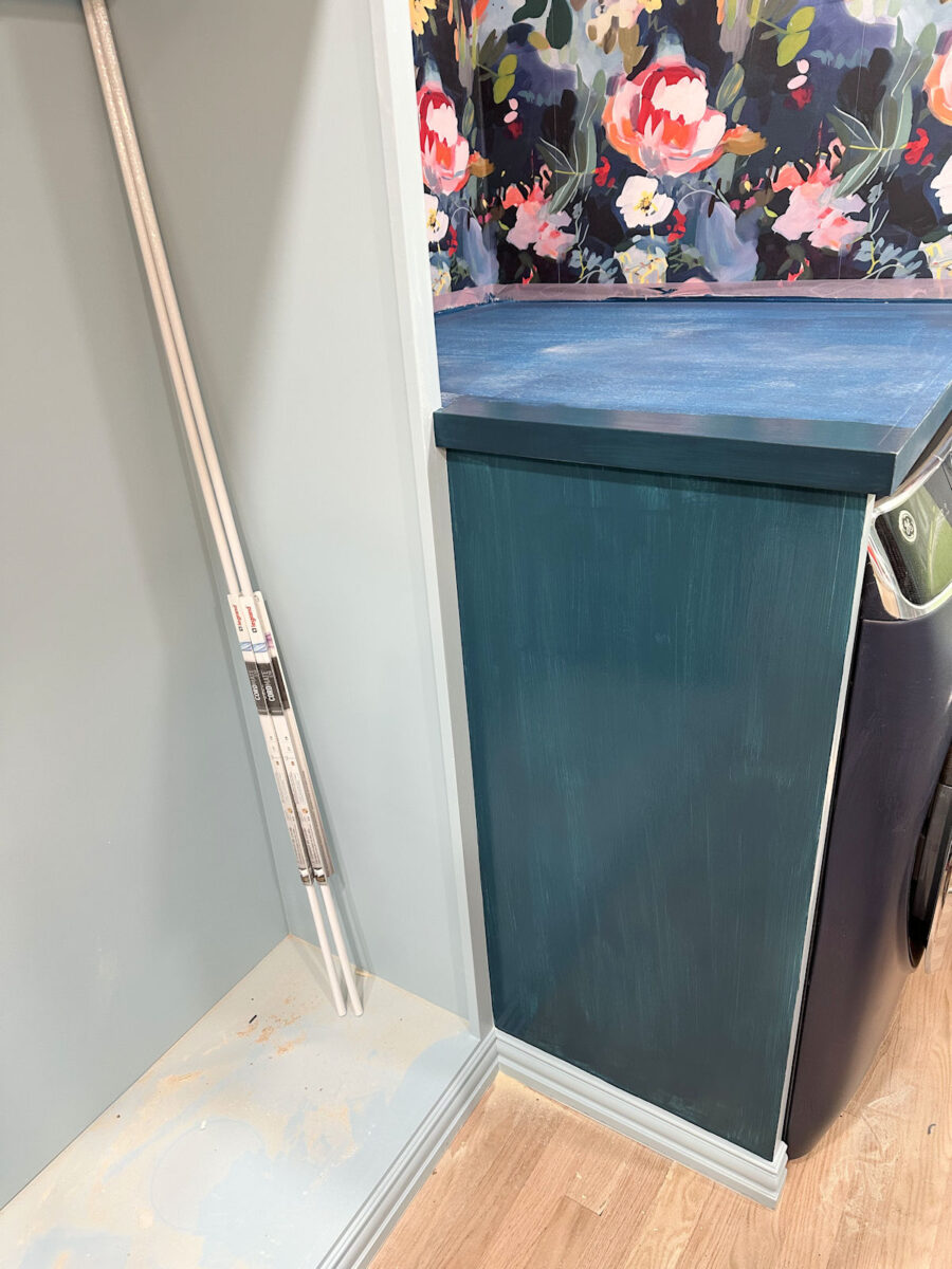
Hopefully, you can envision what that would look like once the baseboard under the window is painted in the light blue.
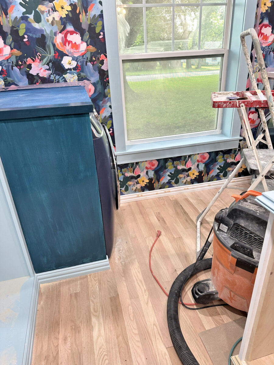
But once I stood back and looked at it, I didn’t like how that looked at all. That baseboard seems to scream for attention. So if I go with the dark blue on the cabinet and countertop, I really think the baseboards just on the washer and dryer cabinets also need to be dark. Don’t you think?
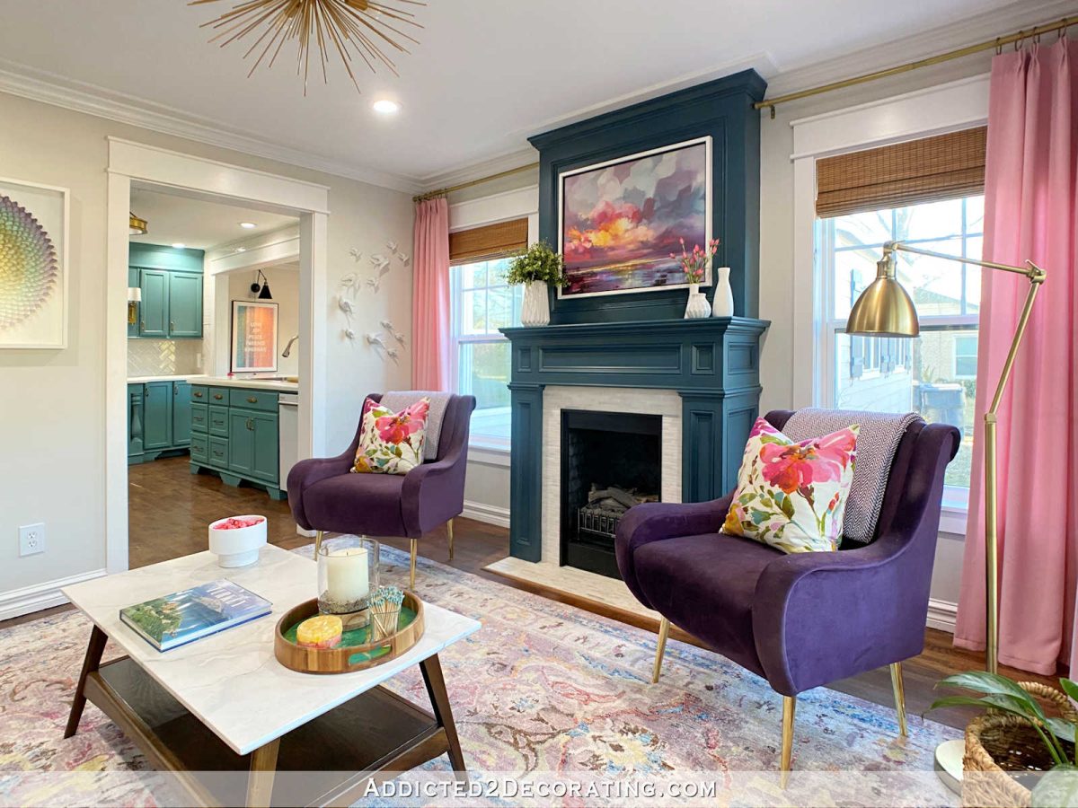
And while I can’t think of any examples of when I’ve done that with baseboards, I’ve certainly done that with crown molding before. The crown molding above the fireplace in our living room continues around the entire room, but while the rest of the crown is painted white, I painted the crown just around the fireplace in the same teal of the fireplace.
So if I go with the dark blue to match the wallpaper and the appliances, I’d basically do that same thing with the baseboards just around those cabinets, and then the baseboard under the window would carry on with the light blue like the rest of the trim.
With all of that said, what do you think? Should I go dark with those two cabinets (with a paint color that actually matches, of course)? Or should I stick with the light blue to match the rest of the cabinets?
UPDATE: I remembered that I had a sample of color-matched dark blue that I used on the trim around the wallpapered mirror closet section, so I used that to paint the left dryer cabinets. Here’s what the proper color looks like…

And then I did a little copy and paste photo editing to compare both colors used on both cabinets. Here’s the light…
And here’s the dark…

Here they are side-by-side…
More About My Walk-In Closet/Laundry Room
see all walk-in closet/laundry
room diy projects
read all walk-in closet/laundry
room blog posts

Addicted 2 Decorating is where I share my DIY and decorating journey as I remodel and decorate the 1948 fixer upper that my husband, Matt, and I bought in 2013. Matt has M.S. and is unable to do physical work, so I do the majority of the work on the house by myself. You can learn more about me here.

Light blue to match the rest of the cabinets. Dark blue just highlights the laundry machines. The dark blue side somehow brings attention to it (might be the wrong color, but I don’t think so) and also makes the room feel smaller. The light blue side just feels a lot better to look at for me.
Also, you have the light blue paint. Paint away and get the clothes and fun stuff in there! 😀
100% agree!
I agree with you, Kate. Painting them dark blue makes them stick out like a sour thumb. The light blue brings continuity to the room.
Totally agree! Keep it light, dark only draws attention.
It’s looking so good though, can’t wait to see it all painted up with clothes loaded in!!
1000% agree. The dark blue just screams…look there are laundry machines right here!
I like the light blue, the navy draws too much attention to them. I know you don’t like white but I think the window trim would be better in white, would give it a fresh pop, like your white mirror on the dark wallpaper.
I agree, I’m not loving the pale blue trim around the window. Because it’s not adjacent to any other painted surface, it doesn’t look color drenched, it just looks off, maybe because the window itself is white, so it’s not whole with the wall or the window, the color is kinda floating there… I agree that white trim would echo the white mirror on that same wallpapered background and provide a nice contrast and look fresh and clean.
This. Although I’d think about painting the trim (crown, base and window) on that back wall dark blue.
Agree with this – the dark color really stands out and draws attention. The light blue does not and allows the wallpaper to shine.
Yup, light blue flows, while dark blue stands out.
Everything she just said!👆🏼👆🏼👆🏼
go dark–cabinets and trim. It makes the washer/dryer much less intrusive in the room and allows the wallpaper to take center stage.
Agree
My thoughts exactly.
I replied to the wrong comment – I meant to agree with Kate. I like the light blue. That’s what I get for trying to comment on a phone …. geez.
I agree also.
I too am on ” Team Light”. Keeps it cohesive & imho blends seamlessly!
I so agree with this. You can’t even see the appliances now. I love the dark. Jmho
Agree with the dark for the washer dryer. I don’t like the light blue crown for the wallpaper.
The fireplace is a feature so I understand painting it differently. The washer and dryer are only blips in the room. The wallpaper is the focal point on that wall. I truly think that keeping the paint color consistent throughout is the choice here. This room is so lovely but again when your clothes and accessories are in this room the washer and dryer will not be noticed. I suggest staying with the light blue with all cabinets and trim. It is going to be beautiful!
Sheila F.
I “see” the machines much more in the dark blue scheme.
LIGHT!! Please, I beg you 🙂
Keep them light and the trim light. You gave a whole lot going on, visually. The consistent color will give your eyes a break and provide continuity.
Kristi,
Have you thought about putting your wall paper on the washer dryer boxes and it would blend perfectly with the wall behind it?
Wow! Cool idea!
This was my thought as well.
I have, but I don’t think it would blend in. It would be impossible to put the wallpaper on the sides and have it match up with the pattern on the walls from all perspectives, and I think the inconsistency would make it stand out rather than blend in.
I think with a laser level and some patientce you could pull off the match well enough. Really the view point of concern would be from the closet door (the pictures above).
This was my thought too – then you don’t have to worry about the trim either, because the light blue trim would match the back wall!
Dark blue certainly changes the look, and I agree the trims in that area would look better dark as well. If you had any of the wallpaper left, you could use it on the sides of the boxes to blend even further. Solid blue tops and trims.
I prefer the dark option—it helps the washer and dryer recede into the background. I think the darker backdrop also allows the surrounding cabinetry to pop more, since it stands out against the consistent deep blue in the back of the closet. With the light blue, their size makes them compete visually with the rest room but especially with the island.
This 👆
Yep!
Yes, the dark blends right in nicely with the wallpaper and feels receded.
I vote for true dark blue completely. (Thanks for the laugh of the day: ‘Cut me open and teal will come out.’)
This is a great space, Kristi. Worth all you are putting into it.
I personally prefer the light blue. I think it looks like the dark blue is trying too hard to steal the show.
Do you want your washer and dryer to stand out or do you want them to disappear? You already decided you wanted something different when you went to buy paint. So it seems you may go darker. I personally would keep them light blue and make a pretty pink or coral tray for your island beneath your flower light fixture and let THAT be what your eye is drawn to 🙂 I’m team color drench!
The light color of the other cabinets looks better to me.
I love the idea of all the trim and the cabinets around the washer and dryer dark. Seems to separate it from the closet and blend it all in together. Whatever you choose will be amazing!
I vote dark. Can you get the blue in the wallpaper color matched? I personally love Behr and have had good luck over the years. I usually get the Premium Plus. I also vote for painting the baseboard the same darker blue in this little area only.
I have had the same Behr Winter Hedge green in my living room/ DR/ kitchen for over ten years, and have no desire to change it. This is unusual for me- LOL
Cant wait to see the finished room!
I took my wallpaper in to have it color matched, but their color match system was down. So I tried to match it, but went too teal. Then he said he couldn’t mix the color I chose in Premium Plus (which is my go-to choice also), and could only mix it in some cheap Behr paint that I’ve literally never seen before. And then it didn’t come on quarts, so I had to buy a gallon. UGH!!! I’ve never had so much trouble just buying paint! I should have just left, but I had rushed there specifically for paint and didn’t want to leave empty handed. 😀
I would definitely leave everything the light blue. It looks chopped up to me if you start painting trim a different color on that side.
Just to add: This closet is beautiful! You are so talented!
I think the dark blue makes the appliances disappear – providing you get the exact same dark blue as the wallpaper background – alternatively if you have leftover wall paper – what about wallpapering the sides and leaving the tops dark blue?
I agree with Benita?
I like the original light blue color, especially if the island is going to be a different color.
I’m the outlier here right now, but I’d opt for dark, as, to my eye, it makes the washer and dryer boxes kind of visually disappear into the wallpaper.
I’m surprised at my choice but my vote is for the dark blue.
Same here—I love the dark blue! But I’m not a pastel person, preferring more saturated colors (like the wallpaper). It’s stunning!
It seems an unnecessary complication to paint those two cabinet sections dark, no need for an accent since the wallpaper provides that. I think you should leave them the pale blue of the balance of the shelving/cabinetry. I think the centre island should be the same.
I love the wallpaper suggestion – 2nd to that would be the light to continue w/the other cabinets
Should I go dark with those two cabinets (with a paint color that actually matches, of coyour!
Nope!
Or should I stick with the light blue to match the rest of the cabinets?
Yes!
The darker color brings my eye straight to the cabinets housing the appliances, making them stand out, like the focal point. The light blue blends so that the whole is harmonious and the chosen focus(es), the wallpaper, the chandelier, take the eye and center stage.
I love it, regardless, knowing that your final choice will rock.
Again: thank you for sharing. Thank you for bravely creating your visions of beauty.
XO
Agree. Team Light.
Definitely the light blue. It ties the entire room together.
I would paint the cabinets, trim, and baseboards around your washer and dryer the dark blue to match the wallpaper. I believe it would help the appliances blend in and allow the wallpaper to become the focal point. This definitely is a feature wall in the closet.
I agree-the dark blue would look better.
I vote light blue. It keeps everything light and airy and consistent and lets the wallpaper shine.
Fan of dark blue and yes, paint the baseboards dark blue in that area!
I prefer dark cabinet with dark trim. I am not sure if I would match the navy appliances or the navy in the wallpaper, but I think appliance so that the appliance/cabinet combo would appear as one.
I personally prefer the light blue. Then all the cabinetry looks cohesive. The appliances aren’t really standing out enough to be concerned with the color of them.
Hi kristi please stay with the light color it blend much better.
If you’re wanting the cabinets to blend in with the wallpaper, maybe consider putting the wallpaper on those areas. I think that the dark blue makes those areas look pieced together and the original blue looks more cohesive.
I think the blue to match the cabinets. It may look too busy adding another color. The wallpaper is beautiful. I would let the focus be on the wallpaper. It may take away from it to add another color. It is beautiful!
Go dark!!!!
I like the way it looks dark, and would do the baseboard around the washer/dryer and back wall under the windows dark as well. To my eye that would provide a cut-off of the washer/dryer area versus the main closet.
Keep the window light-coloured though.
I would stick with the light blue for the cabinets. The top could be light wood color like the floor. Any dark paint just emphasizes those cabinets (and not in a good way) and takes away from the cohesiveness and prettiness of the room. The washer and dryer being dark blue is fine as that is just a peek and coordinates with the wallpaper.
I would go with the light blue on the washer/dryer cabinets for continuity with the rest of the built-ins. The fronts of the appliances already blend in with the wallpaper from the pictures you posted.
Please, Please keep them light blue!!
I like the darker better.
I prefer the light blue. It has a clean, cohesive built-in look. The dark box looks more bulky and rather like an afterthought.
The light blue makes the washer and dryer disappear. The dark blue just looks like the sides of the machine, which if you wanted to see, you wouldn’t have built a surround for them.
This!
Also, this navy is a touch too bright and draws your attention right to it. It doesn’t disappear into the wallpaper.
Agree
Stick with the light blue – otherwise you’re just opening a whole can of worms!
The light blue was sooo much better and cohesive. It makes the wallpaper become the focal point of joy.
Since you asked: Definitely feel that keeping everything the light blue is the way to go. My eye goes immediately to that hulking “box” of dark blue and fixates on it, overshadowing the wall paper, which should be the rightful focus of that end of the room.
Agree
I vote leave them light blue, for continuity, or paper the side of the cabinet that faces the closet, to blend with the back wall. The dark blue adds a new element and that seems to amp up the energy or call attention to them.
100% light blue. I think the W/D peek out just enough and blend nicely with the wallpaper. Stay consistent with the cabinet color.
Light blue to match the cabinets. When I was going to add a different color to my house outside the landscaper said he always goes by the rule of KISS – Keep it simple stupid and you can’t go wrong.
First choice is wallpaper on both the appliance cabinets and also on the blank end of the island that faces the door.
Second choice is definitely dark blue from top to bottom on the appliances to “shrink” the double bulges that jump out into the room.
If you have enough, I would wallpaper the w/d cabinets.
Original blue color!
Go dark!!
Well, my opinion is that the darker color breaks up the caninetry and takes away from the glory of the wallpapered wall. It feels more broken up to my eye.
Enjoy whatever you choose!
I vote for dark w/dark trim.
I like dark blue, including the baseboard.
Light. Don’t make them stick out.
I really like the washer and dryer cabinets, the same color as all of the other cabinets and trim in the room. The navy is too jarring! The wallpaper is beautiful, and will stand on its own once you have the banks of cabinets on both sides all the same color!
But, the ultimate decision is up to you!
Go Dark! Dark blue cabinets and base trim. Cabinets extend out so the light blue doesn’t work as well directly in front of wallpaper while the dark blue would blend in more. Washer and dryer are darker blue as well. Great work!
I vote for light blue.
Since your dark blue washer and dryer are kind of a decor feature by themselves, I’d leave the cabinets light so the fronts of them can be seen. Other reasons for leaving them light blue:
1) Way too many decisions to be made about trimwork if you go dark blue.
2) Color-matching a dark blue to the washer/dryer is going to take a good bit of
work.
3) A dark blue that blends with the cabinets will be slightly off the dark blue of the wall and that’s probably not a problem, but if you go with a dark blue that matches the wall, it may be just enough “off” the color of the washer/dryer that it will bother you.
4) You already have the light blue paint.
I would keep the light blue. It really makes the wallpaper pop! With the dark, it feels like you’re falling into a dark tunnel. It makes that end of the room too heavy. I LOVE this project! So happy for you💕
Definitely go with the darker blue for the washer/dryer cabinets and the trim under those. As is is right now, my eye is drawn down the space directly to the washer and dryer, and that’s not where you want the eye landing – the island, the shelving, even the window… but not the appliances. I think once those are painted the correct shade of navy to match the wallpaper and the appliances, it will be absolutely gorgeous. May I just say how jealous I am of your washer and dryer right in the closet where the clothes will be put away!
Totally agree! 👆🏻
Stick with the light blue. That’s the whole point of color drenching, right?
I was thinking the same – what about this concept that made you even paint the window frame, base boards etc. differently from the other rooms ;)?
I would also stick with the light blue for so many other reasons, but esp this, Kristi: if you really opened this can of worms, I fear that you would at some point also reconsider the window frame colour – it would never end and you’d be stuck with this room for a while longer instead of filling it with all your clothes and finally using it (and loving it!).
I prefer the light blue on all of the wood in the room. Painting the laundry surrounds in another color just adds confusion to the eye. Let the wallpaper shine and the rest take back stage.
I don’t mind the dark color, but definitely paint the baseboard to match, like you said. The dark color kind of gives the look like it’s a separate space/room.
Light blue definitely!
I would stick with the light blue because l wouldn’t. Want the washer and dryer to be a focal point.
I say keep them light. With the dark paint, trim, appliances and wallpaper that end of the room will start feeling heavy and dark. I think it would look off balance to the rest of the room.
I say dark blue. The paint on there in the picture is drawing attention, but I think that if you match the dark background in the wallpaper the cabinet will be hardly noticeable rather than standing out. That would also provide a solid dark background for the light blue dresser/island.
To me the light blue cabinets are a distraction from the wallpaper and kinda give light blue overload when you walk in and see the large island light blue backed up by two fairly large light blue solid cabinet walls.
I could go either way on the baseboards though. If you paint the baseboards around the cabinets dark, you probably should paint the baseboard under the window dark too. And like some people said that just kind of sections off the room.
If I remember correctly, your idea was to paint the whole room the light blue except for the wallpaper. If that was your plan, I think you should stick with it. I personally really like the light blue.
I like the dark better with dark baseboards.
Light blue vote from me. Dark blue makes them very obvious whereas the light blue blends in with the rest of the cabinetry and the appliances are not sticking out like sore thumbs. Blobs of dark blue in the corners really makes them obvious rather than blending in and the darkness also starts to close the room down.
They should be dark to match the wallpaper! Baseboards should be dark, as well.
Light blue to match cabinets. Keep the white top its very elegant looking.
Same color cabinets throughout with maybe dark countertops.
Same color cabinets throughout with maybe dark countertops. The dark blue draws all the attention.
Please stay with light blue. The dark color brings attention to the w/d and distracts from the pretty part of the closet.
Keep them the light blue. These cabinets shouldn’t be a focal point. The dark navy makes them stand out and the light blue allows them to blend in with the others cabinets.?
Keep all trim light blue. Too many colors just confuse things. You already have the bright colors of the wallpaper and a busy pattern. Changing trim/cabinet colors doesn’t give the eye a place to rest. Your closet should contribute to calm and serenity in your day to day life. The light blue is the basis for the calmness and the wallpaper puts a smile on your face since you’re who you are!
I made a mistake of having a dark ceiling in my previous studio. It became depressing and I didn’t want to spend time in there. Be careful how dark you go. By the time you get all your clothes, shoes, purses, etc in the room, you’re going to have a whole lot of color. The light blue keeps it cohesive and becomes a “neutral” background.
I get tired just watching everything you’ve accomplished!
This is like making a quilt and trying to get half a dozen colors to play nice together! I did read one post here about making the far end look too heavy with the dark cabinets. I agree. They also tend to close in on you when you’re in that room.
Do you have any extra wallpaper you could use instead of paint?
I would not create another center of interest. You will have the posters and lights on the window wall. Can you do a mock up with all light blue cabinets and trim, dark blue inside washer/dryer cabinets and your clothes/shoes/handbags in place and see where your eyes go. You are one more Gutsy Woman.
1000% dark. I love it!
It’s interesting to me that so many are saying the dark blue makes the appliances stand out too much. I think it nicely blends them with the wallpaper, yet accentuates the beautiful appliances. To me, the light blue makes them stand out too much!
Keep it simple. Light. The Dark blue looks like a giant hole. I laughed out loud with the first blue. I said “that’s teal”.
Personally, I like the light paint. The dark paint draws attention to them whereas the light paint hides them as part of the cabinets/closet. It’s up to you though… Do you want them to blend in or stand out?
I think the dark blue is a better choice (with painting the trim dark as well). I like the simplified visual of the vertical line of the light blue on the tall cabinets going from floor to ceiling. The bump-out of the washer and dryer in light blue takes my eye away from that continuous line. The more vertical and horizontal surfaces in light blue bounce my eye around like stair steps.
I strongly prefer the dark blue.
I lean towards the light blue. But have you thought about using wallpaper on the side of the washer/dryer enclosure? As you look at the cabinets from the doorway they jut out into the room. Wallpaper might make them less prominent so that end of the room is less heavy looking.
The light blue loks integrated and seamless. The dark sticks out. So much so you could have just left the navy blue appliances out without the enclosure.
Team Light Blue
My thoughts exactly, I vote keep them the light blue.
Team Light Blue. The dark blue disrupts the flow of the room.
It seems like things are 50/50 at this point!
To my eye, the dark paint makes the washer and dryer boxes look
dark and heavy, and makes them stand out more. I would use the
light.
Dark!
Dark
Dark top, light sides
I like the dark blue. It looks better against the wallpaper, and seems to bring
the room together so it looks more finished. Once you have filled the closet it won’t stand out as much. I think it makes it look more elegant with the dark blue. Good luck! 🙂
YES!! Paint them dark!
I am surprised at myself. I prefer the dark, but I first thought light was better, but I like the dark better.
If the bottom trim sticks out to you painted light blue, have you thought of foregoing the base and just do a quarter round to match the flooring in thats space to not have your eye drawn to it? I dont think the base sticks out anymore than the window trim. It compliments the paper. Move your stuff in and live with for a few weeks and i bet you won’t notice it anymore
Definitely stick with the light blue but what about making four more of those bracket trims that you used at the top of your shelving to put on the sides? To my eye the appliance cabinet sides are a little too bare, which may be what is causing you to consider. a different paint color. This would be subtle but tie in a bit better with the rest of the cabinetry. Beautiful work altogether!
Definitely light blue for cohesiveness with the rest of the cabinets.
I like light vs. dark.
My vote is for the light. With the dark it feels like the appliances are just there, sticking out and there’s no cabinetry. This somehow makes the room feel shorter to me too. I like how the light cabinetry leads my eye to your chandelier (that will look amazing once you’ve made it).
What would it look like to wallpaper the sides of the washer/dryer cabinets so that they almost disappear and blend in to the back wall?
Something about the dark appliance cabinets just calms that part of the room. I vote dark.
Hmm, originally I thought going the dark blue from the wallpaper would make the big boxes recede, but it’s not giving the visual I thought it would, sigh. What I do like is the picture where you painted the top dark blue and left the bottom light. On this one I’d definitely get your mom’s artist eye on this also and see what she thinks. Sorry I threw you off suggesting wallpaper on them.
Not one of the options you suggested, but if you have enough wallpaper, I would use that on the side of the cabinet and use the dark blue on top. If you don’t have extra wallpaper, I would do the dark blue.
I vote light to be cohesive. Unless you want the appliances to stand out. My eye is drawn to the appliances with the dark option. Whatever you decide it will be beautiful!
I think the answer will depend on whether you want to highlight the washer/dryer or hide them as much as possible.
To my eyes, the navy seems to make the the washer and dryer MORE obvious, like they are sitting there without any cabinetry around them. If navy was the look you wanted, you could have saved time, lumber and paint matching by not enclosing the washer/dryer in cabinetry, leaving the washer/dryer sides exposed but I thought your initial intent for the cabinets was to conceal them as much as possible. I also feel like 2 big navy boxes at the end of the room actually detracts from the true focal point, the wallpaper.
The light blue is cohesive with the rest of the cabinets and at first glance, it just looks like more cabinetry, not a washer/dryer. For this reason, I vote for the light blue.
I thought the dark would help the dark appliances blend in, but I find it has the opposite effect: the dark cabinets just look like the actual sides and top of the washer/dryer, exposed. I can’t unsee it. And as you pointed out, you’re going to have to do some odd cutting in to blend in the baseboards, which is going to look choppy from certain angles.
Wallpaper to match the walls – they’ll disappear. Both of the paint options draw attention.
Navy blue is my favorite color, but I vote light. From a distance the light looks better to my eye. Whatever you do will look great, it is a closet, not many people other than you will see it. Do what makes you happy:)
I vote Light. The closet is beautiful!
I would go with the dark blue on both the washer/dryer cabinets and all of the trim on that wall. To me, the light color on the cabinets makes them stand out too much and is distracting my eye from the wallpaper. I see the cabinets before I see the beautiful wallpaper. The darker color blends in better and my eye goes to the wall covering first
I prefer the light blue because that keeps the cabinetry color all consistent. Plus it seems silly to build a cabinet around the machine just to paint the cabinet the same color as the machine.
I vote for the dark option, feel it gives the w/d a way of blending in with the back wall. I might even consider the island dark, but that takes the room in a different direction.
I actually think the opposite of some of the light votes. I think the light draws attention to them.
Either option is beautiful but I prefer the dark. It’s looking SO AMAZING!!
After your update, I’m even more in the keep it light group – the dark version looks like you didn’t even built surrounds for the appliances. And it draws my eyes towards the machines instead of making them hover on all the other glorious – light blue – items in the room!
I prefer the continuity of the light blue
I love the dark! My jaw dropped (literally) when I saw it with the correct paint. I think it looks gorgeous!
I vote for all light blue. The navy paint is distracting me from the wallpaper.
I’m also on Team Light Blue!
Light all the way.
I prefer the lighter paint. The darker paint makes the corners look like you have some dangerous ogre hiding in the corners waiting to attack. It seems to overwhelm the room to me. YMMV.
I’m torn. I would love to see a more of a midnight blue color to better match the wallpaper on the washer and dryer cabinet to compare. That way it would look like it was more of a continuation of the wallpaper colors before I decide.
Use the darkest color in the wallpaper.
light blue
Gee, I thought I would like the dark navy a lot. It’s ok, slightly better than the light blue. The boxy washer-dryer cabinets in light blue are overwhelming the interesting wallpaper.
However…IMHO…I would like the window and baseboard trim and crown molding to be white. The white mirror frame looks terrific against the wallpaper. It you paint the window trim white it would pull the eye and coordinate with the mirror frame.
All the cabinets and units are good light blue – it makes them look like furniture.
Good luck
Would I be the absolutely crazy one thinking that you should use the wallpaper on the sides of the washer/dryer cabinets, keeping the tops in the Navy blue color ? Then have the light blue baseboard going all around the room, as it would “look” like the back wallpapered wall if you are looking into the roo….. Just my 2 cents ! I’m loving it all so far ! Can’t wait to see all your clothes back in !
Like a few others have said…I vote for the wallpaper on just that outside of the boxes. I think if you stood back…you could easily get it to all line up. Once you get up closer to the washer and dryer….it won’t matter as much as you won’t be seeing it from a distance. Then keep the baseboard light. The dark color just looks too dark and blah…and the light color tightens up the spaciousness of the room in that area. The wallpaper would be my choice.
Definitely light. Makes the room look bigger, tidier, and just better!
Hi Kristi, with the dark blue color my eyes went immediately to the w/d cabinets. They did NOT look at the wallpaper right away.
In the side by side comparison photo of the 2 colors, I felt like the darker blue color made the room look so much smaller and cramped. It would also compete with all of your other designer choices (jewelry cabinet, necklace hanger, mirror, sconces, etc).
On the other hand, the lighter paint gives an etheral, airy feel to the space. It also allows all the cabinetry to recede so that the eye can travel around the room.
I love both of them, although my eyes are drawn to the dark blue. Paint them your choice – if you decide you don’t like it, it’s just paint (and time)! This project has been so amazing to follow along. You have extraordinary talent, and I’ve learned so much from your blog. I’ve saved several posts specific to our renovation for future instruction.
Team dark here. I would do the cabinets, baseboards, window trim and the crown molding in the laundry area dark. That way both areas have their own look and feel: the closet area all dark and boldly colourful due to the wallpaper, and the closet area all light and colourful due to your clothing and accessory contents.
I like the light blue, matching the rest of the cabinets, best. The dark blue draws the eye and stands out.
So funny, when I was looking at the first dark blue, even though I knew that wouldn’t be the final color, I didn’t think that was the way I’d go…definitely thought light blue all the way. But, once I saw the correct color, I think I’d definitely go with the dark blue. I think it breaks it up a little bit. I don’t think it makes the washer/dryer blend in necessarily, but I think it kind of anchors the room.
The closet is looking gorgeous!! Can’t wait to see it finished 🙂
I commented before on the subject of the washer/dryer cabinets – paint them dark navy though I’m not really happy with that. On second and third thought, paper the sides with your great wallpaper, paint the edges light blue and the counter white or whatever color the island counter will be. The wallpaper will make the hulking cabinets recede and blend with the wall.
There should be a varnish or something like that you could paint the wallpaper so it would hold up.
Oh…go dark and paint the trim to match like you did the crown in your living room.
Keep everything light. You could paint base of washer/dryer cabinets the color of cabinets. Then paint tops of washer and dryer cabinets the island countertop color. You’ll have lots of color in the room when clothes, shoes and purses are in place. Using a lighter color throughout will help make the closet larger, too.
My vote is to keep the cabinet the same throughout the closet. I feel that the navy blue really makes the washer/dryer stand out and takes away from the classy look of the closet. Just my thought. Can’t wait to see what you choose.
Keep it light! Looks great!
I love the dark blue best. To me it makes the wallpaper just pop around it. The light blue looks like you just sat 2 big boxes in front of the tall cabinets (as an afterthought) and left them there. The dark blue to me kinda recedes into the wallpaper and not stand alone boxes. And yes the baseboards in dark too. That way that whole wall looks cohesive to me. I dont think the baseboard will even be noticed, once the island and chandelier are finished. Now go have fun figuring out “your” decision.😁😁
Please go back to the light blue. It looks so beautiful, subtle and refined. The dark is too purple and it just stands out and does the opposite of what you are trying to achieve. I usually love your last minute changes but this one is not for me!
I think the dark blue looks better for cabinets and base boards in laundry area.
Hi, it’s me again – My vote is for the same color as the rest of the cabinets – the W/D cabinets look like they repeat the height of the island, so they’re not alone just sticking out…
But, if you want them to blend in, either paper them like the back wall or have some mirror custom cut
to cover the side…🤔
When those cabinets are in the dark navy, they DON’T blend in…they are rather like the black hole that a TV becomes on a wall…
Why not repeat the wall paper on the side of the W/D cabinets? Then they will actually blend in…
Definitely Light Blue. The dark sticks out too much. Too many different shades going on. The light blue flows nicely! The Wallpaper shows up beautifully with the light blue.
It’s beautiful!💗
Kristi-
Wallpaper the sides of the cabinets and paint the counters the dark blue. This will highlight your beautiful wallpaper and essentially make the cabinets disappear. Would love to see a mock up of this.
I think wallpaper would look great! You can match it if you have enough! Also, I’m so in awe in everything you’ve done in this closet masterpiece.
I kind of like both, but I still like the idea of the whole room being the light blue. I loved that idea, and I still think it looks beautiful and consistent. I think the dark is just a little jarring, but not terrible. Best wishes picking the final color.
Please leave the room color drenched in the lovely light blue!! The wallpaper is a fabulous pop of other colors and faces of the washer and dryer blend into it.
Hi Kristi. I like the dark blue that matches the wallpaper. It makes the box around the washer and the dryer seem to blend into the wallpaper. The entire back wall looks to be the same colour and I find that gorgeous and restful to my eyes.
Say Hi to Matt and the fur babies for me.
God bless. Linda
I strongly agree! The dark recedes into the wallpaper and makes it look natural. Not like 2 big blobs of lite blue sitting in front of the tall cabinets. It even kinda hides the fronts of the w/d.
I’m sure someone has already suggested it in the multitude of responses…but do you have wallpaper left? If so, I would use it on the side of the washer and dryer cabinets and paint the top dark.
Like someone else mentioned, the light blue looks cohesive while the dark blue makes that side of the room heavy. It will also make the room look larger and more airy. I also think you should paint the window trim white so that it matches your beautiful white mirror.
I like the dark blue…but the dark blue looks more like a washer and dryer at the end of your cabinetry. The light blue definitely gives it more of a built in look to me. Which ever way you go, the base molding on the appliance cabinets needs to match the appliance cabinet. The base molding under the window would remain light blue.
Kristi, wow, you are so close to finishing your beautiful. I know it would be expensive but how about wallpapering the w/d cabinets and painting the baseboards the dark blue. I’d love to see an example of this. In my mind wallpapering the cabinets will make them visually disappear.
Kristi — If you use scented laundry products, you are exposing yourself, Matt, and Cooper to chemicals that are damaging your health. Please reconsider using fragrance-free products that do not contain hormone disruptors, allergens, and carcinogens.
https://pmc.ncbi.nlm.nih.gov/articles/PMC10051690/
https://tangieco.com/blog/dangers-of-synthetic-fragrance-and-6-studies-to-back-it-up
I like the light the best.
Haven’t read any other comments, so maybe they disagree, but I feel like the wallpaper catches my eye with the lighter color, and the big blue boxes catch my eye with the darker color. You said you’re going through this process because you want them to fade into the background and the wallpaper be the star. If that is truly the case, stick with the original plan.
I’m torn. I am a dark blue person, so I do love that colour. And I like how the washer and dryer blends in. In the light blue they tend to stick out.
If you like the dark blue, then paint the baseboards, the crown and the window casing the same dark blue. The light blue window trim breaks up the flow of the dark wall. If that wall was all done in the dark colour, it would be dramatic. And yes, it does become a focal point to a degree, but by making the one wall cohesive then everything on that wall is smooth to the eye, not choppy. With the lighting over and around the jewelry area, the eye will then focus on that, the true focal point.
The light blue option is still very nice. But I’ll be honest, it feels a little safe – and you are most definitely not one to choose the safe option.
Ok, I’m not torn anymore. GO DARK!
Oh, and I think wallpapering them would look odd.