The Perfect Green, Round 2 (Including My Final Choice!)
This is the second and final round of the kitchen cabinet paint color options. After taking a good, hard look at my first six choices, I realized that I really did need to step out of my comfort zone (greens that tend to be more olive) and head towards more vibrant greens (kelly and emerald greens).
I should have clarified that I don’t necessarily have to have cabinets that are the exact same color as the cabinets in the Kelly Wearstler kitchen. But I did want to find a color that captures that same brightness/darkness/vividness. I think what I find so interesting about that kitchen is that the cabinet color appears kind of dark, bold, and dramatic, while still being light enough to clearly tell that the cabinets are green. And the green is so vivid, without being so bright that it looks like it belongs in a child’s room.
So that was the challenge for me — not necessarily to find the exact same color, but to find a green that appeals to my own taste, and yet captures that same look and feel.
And yes, I did want to also challenge myself to step away from my comfort zone. 🙂
So once again, here’s the Kelly Wearstler kitchen…
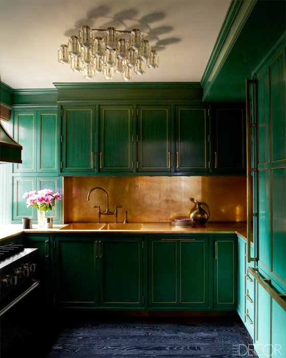 Cameron Diaz’s Manhattan apartment kitchen as featured in Elle Decor
And here are the three new paint colors I sampled yesterday. I took this picture in the early morning light, but the colors look pretty accurate on my computer. I tried to do some glazes over the colors on the top, but I didn’t really have the right supplies, so the pure colors without glazes are on the bottom…
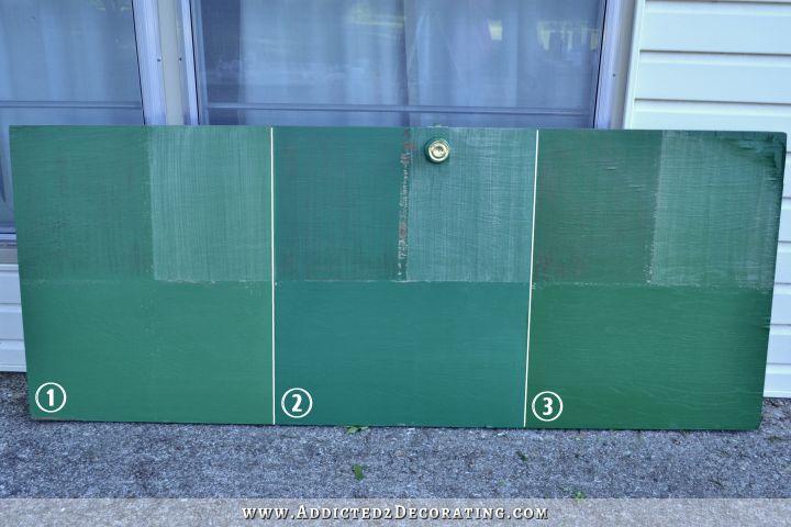
These colors are:
- Cat’s Eye, Benjamin Moore
- Celtic Green, Benjamin Moore
- Derbyshire, Sherwin Williams
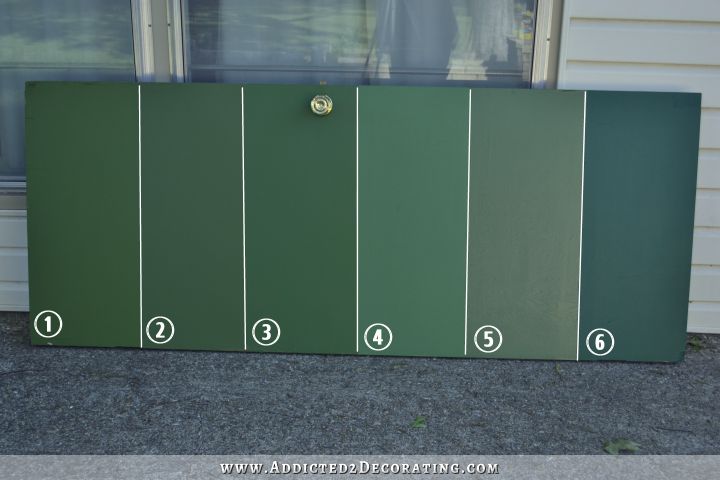
And just to compare with the colors from yesterday, here are those first six colors…
And I can tell you right now that I’m about 90% certain that my final choice will be the new #3, Derbyshire from Sherwin Williams. I’ve dragged that hollow core door around to many different areas in the house, and I love how that color looks everywhere, in all kinds of light. It has all of the qualities I wanted — dark enough to have a rich depth of color, while still being light and vibrant enough to be unmistakeably green. Plus, I think it’s the one that looks the prettiest with gold/brass.
Now I just need to experiment with glazes and get that right, and I can start prepping and painting my cabinet doors while I’m waiting on the floors to be leveled.
I know some of you think I’m crazy to choose a color before seeing it in the actual kitchen with the white walls and lighting. And if I were going for an exact color match, I’d definitely need to wait. But since I’m not necessarily going for an exact color match, and I’ve already viewed these colors in all sorts of lighting and still gravitate towards Derbyshire, I’m quite certain that it’s the perfect color for my cabinets.
Plus, yesterday when I brought the three new samples home and opened up the Derbyshire, Matt’s eyes got so big, and he said, “Ooohhhhh, I love that color!” He almost never has a reaction to color like that, so I’m taking that as a sign that it’s meant to me since it’s my favorite also. 🙂
And as I’ve stated many times before, I’m not exactly known for doing things (in my own house) in an orderly fashion that makes sense to anyone else. And I’m okay with that. It’s just all part of my crazy process. 😀

Addicted 2 Decorating is where I share my DIY and decorating journey as I remodel and decorate the 1948 fixer upper that my husband, Matt, and I bought in 2013. Matt has M.S. and is unable to do physical work, so I do the majority of the work on the house by myself. You can learn more about me here.
From what I can see of the colors on my phone, I like #5 best.
I agree with #3. Nos. 1 and 2 are too blueish. Good choice!
I like 3 best too! Really enjoying following along with your progress!
Yep, Derbyshire is the one I picked before i read any further! That’s the one I’d go with!
Ditto…..just “like” at first sight
Me too. That was my favorite before I read any further. We agreed on the same color yesterday, too, but I like this one better. Can’t wait to see the cabinets!
By the way, I don’t think you’re crazy for picking a color before the lights are in. When you know and love a color, you just know.
I like number 1 it isn’t too dark just right number 2 is too blue looking and number 3 is too dark Just giving you my opinion
YAY! I’m glad you were able to make a choice. So often paint color, while being the easiest to change is the hardest to choose! It is so taste specific and subject to lighting etc. I think its one of the toughest choices…but when you find the right one its awesome and makes such an impact.
So glad Matt loves it too. We that love to decorate our homes so much have a tendency (I think) to do things how we like them the most. So it’s nice when our hubbys do speak up and love something! Have fun painting Kristi!
To keep my opinion from being swayed by yours, I looked at all the pictures and chose a color before reading anything. I actually chose #3 from round 2 as well. I love it! I think that although it is a darker it has a brightness about it (which sounds strange even to me, but there you go) and a lot of depth. It’s going to look beautiful!
I love Derbyshire too! I simply cannot wait to see the finished product! It will look AMAZING!!
I love the Derbyshire color too!! Man I cant wait to see the finished cabinets!! lol!
I agreed with you even before I read your whole post! Derbyshire is the winner!
I think you’ve made the perfect choice. I’m so glad you got some more samples, you are gonna love that. It is almost the exact green of my favorite wall in my living room, which I love. I use cobalt blue and brass as accents and it is gorgeous.
Three looks like a great choice. #1 is kind of fun, too. It will be awesome to see how they come out!
I LOVE the color choice and if you haven’t use SW paint before…It is my favorite brand. It goes on so smooth and dries so well I’ve used others and nothing in my opinion compares to SW. Can’t wait to see progress and see it finished.
Love number 3!
I like #2 because its not so green but does have blueish tones. Which to me have more appeal.
Yes! I took one look without reading the text and said #3. Then I read through your post and found out that Matt liked it too, always a bonus. Can hardly wait to see the finished product.
Yaaaaaayyyyy! A decision has been reached! After seeing Derbyshire, I agree that it is MUCH prettier than #1 from yesterday. Just the right balance of warmth and lightness. And I love Matt’s reaction too! Can’t wait to see the finished kitchen. I think it’s going to be GORGEOUS.
Love the Derbyshire. It was my pick before I knew it was your pick. Here’s to finding your perfect green. And it’s great it was Matts choice also. Super excited for you to get your house levelled tomorrow. You guys must be thrilled. Here’s to an awesome house and beautiful renovations. Cheers.
Derbyshire is a great choice! Try it with a few drops of black and see if it does anything to it. Otherwise have fun with glazes.
Kristi, Are you going to trim the inside tottering of your cabinet doors in gold like the inspiration photo? I love the color #3 as well. I love to read your decision making process!
Diane, I wondered this, too, but didn’t know what to call that part!
Routering not tottering. Sigh.
Ok, am I the only one excited with anticipation to see the final results of this kitchen. I like the color choice. I wish my crazy process would end as well as yours does.
I love both #3’s!! I can’t wait to see this finished!!!!
I too liked the Derbyshire as soon as I saw it. It will look great with the white walls. Great choice.
Green is my favorite color, so I like them all, but I agree that the lady #3 will give you the result you are looking for.
I’m with you, definitely #3, for me, too. Good choice!
as soon as I saw the three new colors, I was HOPING it was the SW green! I love that green color as it speaks rich and vibrant. good choice!
Love both 2 (cause I love blues/teals) and 3 (for an actual green)! Not fond of #1 at all even with glazing! Now…as Diane asked….about where the doors are routered….going to glam them with some gold????
P.S. – Especially loving the color of the top right corner of #3!
I would have said 1 or 3, and it would depend on how it looks in your home for the final decision. I like both of these much more than the colors yesterday (and I have olive greens in my house).
I just recently found your blog and I say go with what you love. I so admire your spirit and your work ethic. I know I will love whatever you do, you have a beautiful heart and I know your kitchen will be the same. Best of luck in all that you do!
The color you picked is the one I LOVED the minute I saw it. I’m so excited to see it done!
Love the color you are leaning towards!
I have a quick favor to ask you…a decorating question (before I go ahead and buy the paint) how do you feel about a bright white baseboard with BM Oxford White on the walls? The Oxford white reads a bit creamier than the baseboards (I sampled it on a wall)…is that okay? I prefer to keep the baseboards a consistent color that is in the rest of the house. Thanks for your help!
I have white doors and baseboards in my home as well, so I chose to do a warm sunlit color in my bedroom instead of white. It’s Behr Orange Glow–we matched colors through Sherwin Williams in the Cashmere Satin finish, and we love it. It’s not bright at all; it just looks like the sun must be shining outside on creamy walls, even when it’s dreary outside. It looks great against the white, as well as everything else in our furnishings because it’s a warm neutral. Hope this helps!
Thank you so much! It definitely helps a lot!!!
Love #3!!!!!
I picked #3 before I read your choice too! Glad Matt’s on board too. That always helps in the decision making! 🙂
That was my favorite also.
#3 is the one. It seems to have everything you want, just beautiful!
I love #3. I think that will be really pretty. Good luck with your painting. Can’t wait to see it finished.
From what I can see, Derbyshire looks most like the Diaz cabinets. I gotta be honest- I think your plans are going to look much better than the Diaz photo which I don’t care for at all. Your back splash will lighten/brighten up your space. Can’t wait to see yours finished!
I also picked Derbyshire before reading your choice. I’m really excited to watch this process and see the end
result.
Yay! I love #3, too. I am a fan of green and can’t wait to see this in your kitchen. It will be beautiful!
Loving another #3! — that’s makes two of them. 😉
I’ve following your blog. It’s so incredible that u are do this practically by yourself from scratch. Everyday I’m excited to see your post. I’m sure whatever color you pick it will look beautiful. I love the kitchen that you are getting your inspiration from. Can you actually tell me, are the counters in the Diaz kitchen brass or are they stone / granite? What about the sinks – are they brass also? Good luck and thanks!
According to the article: The kitchen’s backsplash, counters, and sink fittings are unlacquered brass, the brass-trimmed cabinetry is lacquered in a custom color
Yes! I also chose #3 before I read the rest of your post. Your cabinets are going to be epic!
#3 – SW – Derbyshire definitely – I also selected this one before I saw your choice.
Another vote for #3 too! I liked it with the darker glaze (top left) best. Can’t wait to see where you end up with it. I like that you bring us along on all stages of your home adventures. From the indecision to the fails to the successes. Much more engaging than a simple “ta-daaaa”. 🙂
Yep, #3 has the vibrance and depth that you have described. I thought that even before I scrolled down and learned that it is the one you and Matt are most attracted to. It is good to see that trained decorators like you have to put in the work and time to find the right color. On TV it looks like Candace just finds it automatically.
#3 would be my pick!
I like it – the color you chose. A lot, And I’m not even a “green” type of person (although dh tells me that emerald green looks good on me) Now, youngest dd loves green, especially that hue! The whole idea is starting to grow on me, although I doubt I’d ever go that bold myself, and dh DEFINITELY wouldn’t allow it.
still trying to convince him we need to change the 90’s golden oak cabinets in our kitchen. Sigh.
Derbyshire was the one that immediately caught my eye.
#3 for sure! Can’t wait to see the finished project!
If you and your husband feel the same way then it’s meant to be! I also concur, hehehe!
Great choice and another good choice it to follow your gut and instincts… if it caused a visceral reaction in both you and the Hubs, then it’s right… because in the end, you have to look at it everyday and if you’re initial and immediate reaction was “oooowww” then you’ll enjoy it every day.
Can’t wait to see it all coming together in living color 🙂
#3 definitely has the vintage look over the other colors for sure. And that is also an important factor in your quest to make your home look like its era. (Not that I know that that color was popular then…but it looks ‘old’ and not contemporary.)
Glad you were able to make a quick decision. I think that often when it comes to colors our first reactions are the best. The longer we labor over our choices the less we choose with our hearts.
I think it’s beautiful!
If your trying to match the cabinets that are in the shadowed part #3. But if you were trying to match the cabinets that are in the light then #1.
As soon as I saw the pic #3 was my fave. Love it ! Go with it!
You picked my favorite color too! It will look so good! I am so excited to see your kitchen! Love it and love you!
Ha, I peeked ahead and picked my favorite color of the three before I saw what one you picked and #3 was my favorite, too!
Yes! #3 Derbyshire was the one I was immediately drawn to also. It’s so crisply green!
Hi Christi, I looked at all the colors on the board very carefully to see which color would work best based on requirements you have to achieve your goal. Yep, it’s # 3. I was afraid I had let my own preferences get in way simply because I like it best. It is a clearer, fresher green and is not “grayed down” like the other colors. Plus, I think you have another advantage with Derbyshire. Its ability to work with other colors is infinite. Take some of your stash of paint color chips (you do have a stash, I just KNOW IT!) and look at various colors that can work well with the green. Blues? They are fantastic from sky to navy. Red? Go from pink to burgundy. Yellows? Yep, from pale butter to striking orange. Edgy! Purple? Try this years color, Orchid. It is truly gorgeous though better, I think, for a bedroom or living room.
One of my favorite colors to use (anywhere) is a terracotta. It offers options from the pink range to the shades that lean more toward orange. Most any shade of terracotta has that touch of brown which gives it its mystery. You conjure up an image of desert sands, hot winds, and Bedouin tents. Perhaps the image is that of the stucco wall on an old Italian palazzo sitting in the sun surrounded by vineyards or the old Tuscan tiles you found in a marketplace in Florance when ….Oops! Earth to Connie. Down with the daydreams, okay?
Try it, everyone, its fun but comes with a warning. It’s possible to kill a whole morning in a flash when playing with color.
Oh, I just can’t wait until its completed and I can see all the really clever ideas you use that would never occur to me. Don’t worry, I intend to follow your blog until this house, and whatever other projects you take on as well, are complete and Show House ready.
Oops!
Sorry Kristi. I misspelled your name in my previous comment.
Omg, before I read all the way down, I was like, pick three, pick three,please oh, please pick three, GORGEOUS!!! I agree it is fabulous !
Great! I liked them all. It’s nice to have that decision made.
I too pick Derbyshire before I read any further. How appropriate since this Saturday is The KY Derby. Yes…I am from KY! Love your blog!
Cathy
3 was my choice too. Good one I think.
I kind if yawned and sped right over the first 6 yesterday. Nice greens, and I do use them. Then I saw today’s colors and immediately went for the same green you chose – The Derbyshire. It looks a lot like a particular green one of your favorite designer uses, for the same reasons you are drawn to it. It’s alive and warm and inviting and peaceful, all the same time. I’m so excited to see your final results! Boy, do I wish I lived next door to you! We would get into some big trouble! LOL
Yes, yes and YES! My first choice and was hoping you would pick that one!
Love the site and excited each day after work to touch down and see where your day took you in your world of hard work and fun! So lovely! It’s going to be beautiful! Loved the legs too on prior post or two. That I going to be beautiful. Saw some at HD the other day on displayed cabinetry and it was just regal!
Keep on keeping on, you keep me so inspired!
Mary 🙂
If you and Matt like the color, then its meant for your kitchen! Go for it!
I chose #3 as soon as I saw your new paint samples. I was so glad to see it’s the one you chose, also. I can’t wait to see your kitchen when we get back in August!
I JUST LOVE YOUR CRAZIESS…!!!! I picked the same color as you too.. very pretty color, you made the right choice..glad Matt likes it too..!!
Hot dog! We have a wiener! LOL! Derbyshire was my instant choice as soon as I looked at the picture too! It’s great that Matt likes it as well. SO looking forward to seeing it on the cabinets! Hugs, Leena
I also chose #3 immediately. I am anxious to hear about your glaze choice. I am getting ready to pain my cabinets, I want them washable but not shiny. Can’t wait to hear about your choice. So fun joining you in your projects.
Color 3 was my immediate first choice when I saw it. Love it! We’re talking about freshening up our kitchen (since demo is about 2 years away) and I think I want to experiment with color since I know it’s not a long term issue. Thanks for the inspiration!
I also picked that same color! I can’t wait to see your completed kitchen!
I’m still fond of #3 but not sure with the glaze look that it says “Bold”. It would be interesting to see how it looked with the gold accents. Also, I think going with the copper color vs gold for the accents would be awesome in a kitchen and have a very timeless look.
You are really most inspirational person on the planet. I love reading your blog every day. I picked the same color as you too. Very pretty color, you made the right choice. You keep me so inspired! GORGEOUS! I agree it is fabulous!