Three Options For My Living Room Lampshades
I’ve been working on so many big, tedious projects lately, so I decided that yesterday I would give myself a break. I just had one simple goal – recover the lampshades on my living room floor lamps.
Quick and easy, I thought to myself.
That should have been my first clue that things wouldn’t quite go as planned.
A couple of weeks ago, I showed y’all the striped fabric that I was considering on the lampshades…

There was just something not quite right with that one. The stripes seemed too bold to go next to the floral fabric.
So I ordered more fabric — this Eaton Square Upland Royal fabric from JoAnn Fabrics. I thought it would be perfect to bring the ottoman fabric up onto the lamp shade. But it turns out, I don’t love it.

One of my main issues with this fabric is that the pattern isn’t completely straight on the fabric, so try as I might (and I tried two times), I cannot get the pattern to fall perfectly straight on the lamp shades. I’m a perfectionist when it comes to stuff like that, so seeing that pattern slightly askew on my lamp shades would drive me batty. Plus, I’m just not crazy about the fabric on the lamp shades.
Then I thought maybe all the lamp shades need is a bit of trim. So I added some extra wide bias tape in dark green.
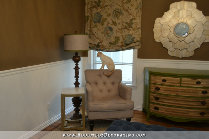
Oh my gosh, can it GET any more boring than that? (Said in my best Chandler Bing voice.) 😀
And I have to consider also that while the plain lampshades contrast nicely with the wall color now, that wall color is temporary. As soon as we get our foundation leveled, I’ll be able to add the wainscoting to this room that I’ve been dreaming of, along with the grasscloth wallpaper on the upper portion of the walls. That grasscloth will be considerably lighter than the current color, so those lamp shades will definitely need some fabric on them that won’t allow them to fade away.
So that brought me back to the stripes. But I had an epiphany. What if, instead of using the front of the fabric with the bold, saturated colors, I turn it to the back of the fabric where the colors aren’t quite so bold and saturated? Here’s what that looks like.
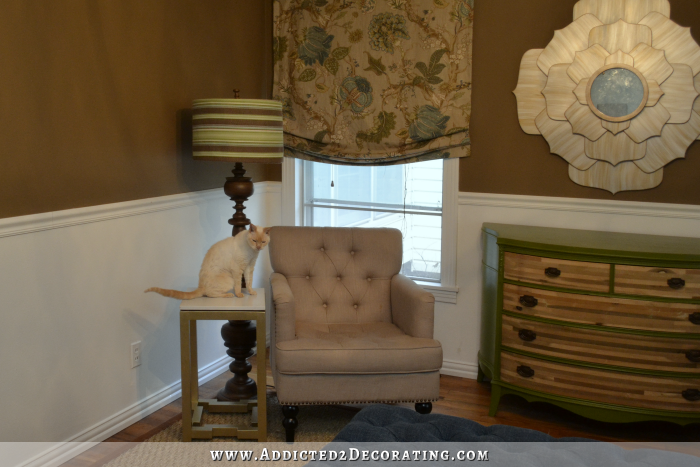
I have to admit, I’m loving this one. But I don’t know if it’s really the right choice, or if it’s just that I’m always drawn to stripes. Always.
So as of now, I’m still at a loss as to what to do with these shades. This very simple project that should have taken me just a couple of hours is now turning into a window treatment indecision type of situation.
So I’m open to your input, as long as you tell me to go with the stripes. 😀 Okay, just kidding. Kind of.

Addicted 2 Decorating is where I share my DIY and decorating journey as I remodel and decorate the 1948 fixer upper that my husband, Matt, and I bought in 2013. Matt has M.S. and is unable to do physical work, so I do the majority of the work on the house by myself. You can learn more about me here.

Kristie: I like the shade that has two bands of green bias tape. They blend well with the overall look of the room.
I agree with you, Lynda. Save the bolder choices for after the grass wallpaper is up. Kristi can put her feet up and take it easy today.
that is so what i had in mind to say what you two just said. i think you need to wait and i know it is hard to wait but i think you need to have the foundation leveled and the sofa. then you can do the lampshades and i think you will know more what will look good then.
I like the stripes too. The blue pattern does nothing for me and the other just fades in to the walls. You need something with some pop.
I agree with the ladies and say just wait until the wall paper goes up. There is no hurry, and I think you’ll find that none of these will work. Just be patiances.
I agree! The others seem a bit busy to me.
I like the third option as well. Once you add the rich texture of the grass cloth and hang up some art, that shade will not be a focal point, you will want it to be part of the layering. You have a lot going on already in that one corner, keep some things simple and let other things pop!
OOOH add your monogram-BIG on #2!
That’s a great idea!
On #3 — the one with the banded edge.
I was going to suggest the same!!!!!
edit-#3
I would bring in your decor first, ie: any mercury glass or wood candle sticks going to be on the end table or other one?? One you have some other things catching the eye, I don’t think your focus will be so much on the shade. I like the plain with trim if that is going to happen. Maybe stripes if no other decor is wanted.
I love the first one green stripes
I totally understand your point, and I think every little detail is important. Even though I think I can’t give you my favorite because I am not sure what color will be the walls. I will recommend you to check this source: house beautiful Fabrics For Your Home by Jennifer Boles. I think it will give you awesome ideas about the best pattern to mix with your window treatment and the stripes in the furniture piece you have there. ( my main language is spanish so, I really wish what I just wrote make sense to you)
I like the blue ‘color’. Would some kind of blue stripe work? or a navy blue solid with stripe trim??
I love your site and am so inspired by your work. And know you will come up with the perfect solution.
blessings
I definitely like the idea of a dark blue solid. I had a scrap from the ottoman that I wrapped around it, and it looked beautiful. I might want it just a touch lighter, but I think that’ll end up being the winner.
I like it as is without anything or with the bias tape. I’m thinking that maybe you should wait on the lampshades until you have the dresser styled and the side tables plus the couch with pillows and the ottoman. That way you’ll be sure that there isn’t too much pattern everywhere. I think stripes may be too much with the striped dresser and the subtle stripes on the mirror, plus whatever you put on the wall to the left (facing the large window). In any case, the room is looking great and I can’t wait to see what you come up with next.
Maybe try fabric #1, inside out, but vertical.
Yes, I was thinking the same thing! Horizontal stripes are lost because of the strong horizontal line of the chest. Try using the stripe vertically!
I agree with DAF.
I agree with DAF also. Texture and pattern are great, but too much can be overwhelming. I would wait until you have the walls just the way you like them and can really tell if your lamp shades will coordinate. Until then, the bias tape looks really clean and fresh.
Totally agree.
I totally agree as well.
I agree with DAF too.
Agree with all above. Looks really nice, so far.
Totally agree here
i love the stripes but they just seem to drown out the beautiful fabric on the roman shades to me. so i have to go with the bias tape. sorry! i really love the striped shades tho…maybe in another room?
I agree with Karen; the striped fabric just overpowers your (pricier! and totally gorgeous!) fabric used for the Roman shades. Similar to Marci’s suggestion, my idea would be to look for a blue and neutral striped fabric for the shades, or maybe a solid blue with neutral bias tape trim. I agree with your assessment that just adding bias tape, while very classy, would blend too closely to the wall, and it’s really too similar to the background color of your Roman shades, too. Another reviewer mentioned a monogram. A large monogram on a blue or green background in a nice khaki shade with blue or green ticking stripe bias trim, I think. 🙂 I don’t know how you get anything done with all of us clamoring to tell you our ideas. I have to just close my eyes sometimes and go for something, lest I overthink it and paralyze myself with indecision instead. Whatever you choose, I know it will work out because your eye for design is unparalleled!
I actually like the stripe, I just think the tone needs to be lighter. The colors look great but not the brightness.
striped crKristi, I LOVE everything you’ve done in this room! You are so talented. I’m always amazed at what you can accomplish, in such a short time. Inspirational! Anyway, back to the lamp shades, since you’re asking our opinion, I prefer the two stripes of green bias tape. I really think the stripes compete with the beautiful lamp base and take the focus off that. I don’t feel it will be a bad thing to have the shades blend with the grass cloth wallpaper. Also, the focus is removed from the beautiful striped credenza. I love stripes too, but I would reign it in a bit and go more simple….just my humble opinion! I’m sure I’ll love anything you decide to do (as I always end up saying “you’re right!”).
I think the Eaton Square one would be perfect……IF it were in the same shade green as your awesome credenza. 🙂 I love stripes as well but this one doesn’t quite hit the mark. The last one is just a little too boring.
So far I like #2 with just the ribbon. What I’m having a hard time wrapping my head around is you changing the wall color….I’m loving the dark brown with all of your DIY pieces. Can’t quite picture grasscloth with those pieces. But as always, I’m sure whatever you decide for the lamps and the walls will be AWESOME.
uh oh, I meant #3….plain with green ribbon
The simplicity of the #3. Compliments the overall look and doesn’t compete.
I love the green stripes too! I think it makes your window treatment “pop” more – as well as the mirror. What about two bands of green (top & bottom)?
LOVE IT ALL – no matter what you do!! 🙂
I would go for the last set of stripes. Not too bold, but also won’t hide amongst the grasscloth. I also want to change my lampshade, but my style is a bit…. different. Lol I have black wainscot, light gray walls, and accents with black/white/gray (depending on the piece) damask, chevron and scroll – type patterns. The lamp is chrome crackle and looks sorta like a sea urchin… it all sounds weird but I swear it all looks really good together…. now I’m rambling, but go with the last one 😀
Vote: #3…. when you change the walls, you can change the lamp shade back to the more vibrant stripes you love. But since you’re asking for input for the current condition: I think the stripes are a little too strong against the window curtain fabric and your strong wall color.
I would do the simple shade but in a blue that coordinates with the blue in the curtains and wall decor.
I think this Idea is one to check out. What in the world is grasscloth?
I like the one with bias tape. Let the focus neon the other patterns in the room.
I’m new to the site and have been looking at all the elements in the room. Love it!
As for the lampshade, I love the suggestion above of a monogram! But I would definitely go with blue trim/monogram. Something a little softer to keep the flow going. I love stripes too, so I see why you love that one! Good luck!
This is exactly what I was thinking… natural with blue monogram and/or trim. The stripes seem too casual for what you’ve done so far. I understand your desire to have the shade pop once you have the grasscloth on the wall but I hate when lamp shades are too dark in color because they block the light. I think a blue trim would at least define the shape of the shade and a monogram would be decorative. Just my $.02! 🙂
I think it depends on what you are wanting to see…if you want the lamp to be a point of interest in the room, the for sure go with the strips. If you want the lamp to be usable but not take up any visual space, go with just the green bands…perhaps add one or two more if it’s still not quite enough color pop for you.
What about chocolate fabric trimmed in the striped fabric? It will contrast beautifully whe you get the walls finished as planned. And it will tie in with the sofa (if I remember correctly you plan on trimming it in the striped fabric).
I love the stripes, but not in that place. They compete with the beauty of the drapes. I like the monogram idea…or one of your cute writings.
I also like the bias tape, but I’m wondering what it would look like if you wrapped the shade vertically with bias tape?…overlapping the tape slightly with either that color or another color?
I love the stripes but the front side was definitely competing with the roman shade fabric and making it more of the accessory than the focal point. With it reversed it makes them more of the same strength and much more a compliment to each other than competing. I love it and love what you are doing there. I am inspired to take on my bedroom now.
I like the stripes, I just think the colors are wrong. Maybe more muted as the curtains are?
The stripe it’s what you are drawn to and adds just the right punch of color . The stripe wins my vote! Also any plans to visit Eastern Washington State? I could use your input on a million things at my house.
Haha! No plans right now, Bobbi Jo. 😀 If my plans change, I’ll let you know. 😉
My fav lampshade…..the blue fabric. Totally understand your feelings about that fabric. My second option would be the bias tape around the shade. K in Minne snow ta
I like the simplicity of the bias tape. When I first looked at all three photos, I did not notice the beautiful base to the lamp, until I saw the third photo. To me the other choices detract from everything else you have going on in your room. However, you always make great choices, so go with your heart.
At least the way the room is now, def the bias tape. You could perhaps go a bit thicker with the bands of color at top and bottom, but every piece can’t be the star of the show. I love the striped fabric too, but its not the best choice in the overall look. With the bias tape option, I actually noticed the pretty shape of the lamp base, it doesn’t fight with the beautiful curtain fabric for attention, and for some reason it seemed to pull together better with the mirror frame you made above the dresser.
Maybe it’s just me but I thought the bold stripes felt too busy looking with the shape of the lamp. I loved the simple shade. A nice balance with your current wall color. You can always change out the shade when you add the grasscloth. If you decide on the stripe I thought the muted stripe looked better with the drapes.
Here’s my 2cents worth… The extra wide bias trim looks great, as the room is now. The other 2 options…… to my eye……… are not appealing. Once you get your room done as you want it, then change the shade to match that. It’s like the stripes in the fabric on the shades, and the fabric of your window coverings are speaking 2 different languages, and they just do not communicate. But then again, what do I know?
I like the third picture but I’d add some trim to the top and bottom of the shade. Maybe some of that beaded trim?
I love your great ideas and decorating style! Not that I’m an expert but im not sure if that light is best for that space. When I see that corner, I love the bold mirror and the statment you have with the beautiful window covering. As a thought maybe a simple black floor pendant lamp might blend in the harware from the cabinet???
I’d wait. If you plan on changing the walls,,,,chances are that you would change them after such a major design change. Lamps are one of the last things to go in a finished room. If the room isn’t finished,,,,leave them for now.
Just my thoughts,,,,
Good luck!
My suggestion would be to take the plain lampshade with green trim and add a smaller blue ribbon band that coordinates with the curtains. Since you love stripes so much, I would add a striped pillow in the chair – then there will be more distance between patterns and they won’t compete against each other so much. Good luck!
I loved the stripes~the last pic that you posted! Very pretty!!!
Did you make your shell-colored mirror? If so, can I get the link to your tutorial? It’s gorgeous!
Yep, I made it! The details are here:
https://www.addicted2decorating.com/diy-40-inch-metallic-lotus-flower-mirror.html
Bias tape. 🙂
Stripes. Definetely 🙂
yes, the stripes is the right color and brings interest to the shades. It is the best choice. Your so right…the Shades need something or they will just fade away. I think the shape of the lamp shade and that it is a wooden base is a perfect addition to the room Can you paint the lampshade? I love the different techniques you’ve used in the condo (the diamond pattern on the wall, etc) and your color combinations are soooo inspiring. I think it’s because I can’t wait to see what else you can do that I’m thinking paint could be an option;-).
I actually tried to paint one of them today. I had the totally wrong color, but I think that’s what I’ll end up doing.
I think that something about the horizontal stripe pattern and possibly the colors conflict with the style of the room. Have you considered vertical stripes? I think you were on track with a more subdued color. Also, I kind of think that a taller shade with bands or vertical stripes would look better. Or! taller with a burnout look pattern that complements the mirror you made?
What about the shades on this page, maybe the Zamira or Casablanca stencil?
http://blog.cuttingedgestencils.com/give-new-light-to-an-old-lamp-shade-using-stencils.html
I like the idea of using a stencil!
I think you should wait until the walls are done and then deal with the lamp shade.
I have to say with your three lampshade options, I like the third shade. I just like that color and kike the solid color. I like the stripes it just doesn’t work for that area……
Well, things are going so well but I think you need to re-think these three options. Personally I think the lighter color surrounding your mirror needs to be repeated. The stripped fabric is really nice but I agree that if you were walking in your house the lampshades would jump out at you instead of cohesively blending and allowing your focal point to talk. (Only because it’s right there shown against those pretty shades. You should definitely use the striped fabric in the room but just a little less prominently.
Try a more solid color but with texture and detail. Like cut paper, bamboo or reeds, or maybe distressed and frayed burlap…. so many ideas. I think a lighter color as well to offset the mirror.
How about cutting a 3 inch width of the striped fabric and place that at the top and bottom as you did with the bias tape? That way, you could have your stripes, yet they wouldn’t be over-powering. The best of both worlds!
Gail, I loved this idea, and tried it today. The problem is that my striped fabric is outdoor canvas, and I can’t get a good crease ironed into it, so it was messy looking. I also couldn’t get the stripes perfectly straight. 🙁 I so wish that would have worked!!! If I had a 100% cotton fabric, I’m sure it would have worked beautifully, but I’m having such a hard time finding striped fabric with the right colors in it. The one I have was the closest I could find.
If you can’t crease the edges, you could cover them with rick rack or some other trim.
I like # three, the stripes are to close to the floral… I do like the stripes on it though if it was placed elsewhere..
Hi…my first time commenting on any blog, but yours is so inspiring I thought I’d like to add my two cents as well. I am partial to the bis tape because it has cleaner lines; however, I’d change it slightly. How would it be if you ran a somewhat thinner tape on the shade in a harlequin/Argyll pattern maybe forgetting about the wide trim on the top and bottom. You could maybe even add a glued on brass nailhead where each point connects or a sophisticated button. Hope this makes sense to you in written form because I see it perfectly in my head! Can’t wait to see what you decide once you’ve stewed over it a while.
Love that idea, Alicia! I’ll give it a try and see how it looks.
Although they are all nice I would pick #2.
The stripes just seem a bit much since the drawer fronts are striped and the other one with the green bands seems a little too tame for you.
I am in the minority here. I still love the stripes! I think that they will blend more as decor and pillows are added. And when the wall cover is changed they will show even better. I also love the kitty! She is the best decor of all!
I love your striped lamp shade but it looks like it’s fighting with your window treatments. I see “clash” all over this duo. Perhaps a light green fabric with the striped material used on the top and bottom edge? If I had to pick one of the ones posted, it would have to be the one with the green bias tape on plain shade.
I’m just glad the cat isn’t all “matchy matchy”… But it definitely “goes”, that Ombre shading on the ears and tail with subtle striping… very elegant and classy. Very nice attention to detail. 😉
Oh the shade? Yeah I can’t make up my mind. What about a blue like ottoman?
I definitely don’t want a matchy matchy cat! 😀 That gave me a chuckle. Ombre ears and tail…LOL. She’s so trendy! 😀
Oh, and blue like the ottoman is definitely my favorite. I wrapped a scrap of the ottoman fabric around it, and it’s the winner.
Kristi,
While you have the walls that nice chocolately brown, I like the ‘dull’ beige shade with the wide bias trim. I’m pretty sure when you put grasscloth and wainscoting on the walls, the first stripe will look great! I’m not crazy about the inside out stripe but I LOVE the original stripe – it brings out all the colors in your window treatment and mirror. Yipes Stripes!
I love the muted stripes, but I also really like the plaid. Looks straight to me!!! Yes, it seems it’s the little details that cause me the greatest angst. Good luck!!!
I like the blue, maybe in another pattern. I like how that looks with the flowers in the shade behind it.
i think a solid blue would look great and bring out the blue in the shades.
My vote would be for the bias tape. I like the idea of the monogram added to it. The other two patterns are just too much pattern and clash with the roman shades. That of course is just my opinion. Your rooms always look great when finished.
Is it possible to do a bit of a whitewash over the stripes to tone them down? Or leave the shade as-is and line the inside with the stripes instead? I like the stripes but they still fight for attention too much. I also thought going vertical would be better because of its proximity to the chest with the horizontal stripes.
Another option would be to ditch these shades altogether and find (or spray) a light metallic shade instead that would compliment but not match the the tables. Even a pearlized shade of mossy green or yellow would be fun.
Ok, first, I’m cracking up at the cat making a cameo appearance in several of the pictures! 🙂 But please tell me I’m not crazy — that first lampshade, with the bold stripes? It’s a different lampshade than in the other pics, right? It looks taller. Also, with the light on in that first pic, I think it makes the fabric look bolder. But, yes, in the end, I do like the toned down stripes best.
MarySue, that cat was making it clear to me who’s boss. 😀 I tried to get her to move, and before I could snap the picture, she was right back up there. She has claimed that table and chair as her own, and she’s quite adamant about it. 😀
The shade in the first picture is actually the same, but I just wrapped the fabric around it and didn’t fold it perfectly to fit the shade, so it appears taller.
I think a solid is needed, as placement near that Roman shade is the key. Have you considered a blue tone to tie in with the print? Or maybe the green of the stand? If any print on the lamp shade is desired, I would use a band ( I would choose a Greek Key sort of band in medium tones – not to dark or light; in brown/gray shades) I would choose main color as the darker shade of blue found on the Roman shade…or a tone thereof…good luck with your choice! 🙂
I like the 3rd options too, but maybe play aroung with it a bit. Like two bands on the bottom and two bands on the top, and make it blue. I like the idea of tying in the color from the ottoman. I do see how you would think that style is a bit drab, but next to the window treatment maybe understated is not a bad way to go. That’s why I think double bands (sorta stripes) in blue would be just the right amount of subtle without blending into the wall.
I prefer the blue color to tie the ottoman into the design. What about a blue solid fabric on the lampshades with something, even stripes, as the trim? Or something along those lines.
Rebecca, I actually had a piece of the ottoman fabric left over, so I wrapped it around the shade to see what that color looked like on there. So far, it’s my favorite by a mile.
The middle one, blue. For pre and post wallpaper.
I personally liked the front side of the stripe fabric, but totally saw what you said about it kind of over powering the drape fabric. But then you went and turned the fabric around!!! PERFECTO!!! =D I say totally go for the subdued stripes!!!
I didn’t read all of the comments, so maybe someone else already suggested that. I would say to decorate for now. You can always change the lampshades again after you get the foundation leveled and the grass cloth up.
What if you were to go the route of the wide bias tape around the edges, but instead of the green fabric use the striped fabric. Then it would sort of tie into the plan for the striped piping on the couch.
Gotta say- I still like the original idea of the stripes. I happen to love them against the floral shades. Why not go bold, right? ! 😀
Another idea- I put a stencil on a drum shade that came out great..A seahorse to go with my new beach theme.
I like #3. The beige with green trim looks elegant and does not compete with the other patterns. I think it ties everything together nicely.
I agree with the stripes overpowering the setting. And I really like the blue but it is also overpowering. My thought is to go with either fabric but cut on the bias in the width you like , fold in the raw edges and use that instead of the green bias tape. A little more interesting pattern. You would get the benefit of the color pop without it overpowering. Love your vision!
#2 !!!! I love that blue. It doesn’t compete, yet ties in your ottoman. I am a neutral girl but #3 is too neutral & the stripes seem too busy w/ the floral.
I love the stripes but I think what I’m missing is more of the blue. I loved how the blue fabric looked so maybe another striped fabric with a little more blue in it. 🙂 Just a thought!
Go blue..it will look really rich..maybe on the simpler side for the shades..it will bring the room together
(btw you have gotten really popular, can’t believe all the posts) 🙂
I like blue too. It made the room pop. Try to find one with a straight pattern?
I like the middle one, the one with the green tape around it. The other two compete too much with the curtains. The green trimmed one really balances well with the curtains and the green chest.
Have you picked out your grass cloth wallpaper yet? Or could you get a piece and hang it next to the lamp to give you a better “view”? I like the stripes, but definitely backwards (inside out, whatever) but it so depends on everything else going on in the room like pillows, candles, tabletop decor etc The white with the green bands would look lovely too. I have what’s probably a stupid idea but…could you try the bands on just the top and bottom but with the striped fabric on the subdued side -in 2 separate pieces that fade into the white? If that makes any sense. So you’d still have just bands on it but it would be the muted striped fabric with the brown striping towards the bottom and light stripe towards the top to fade out and vise versa for the top stripe? So the darker brown stripe would be on the top and bottom and the lighter pale greens in the middle…..Ok now you probably are giving me that Chandler confused look! lol…
I haven’t even looked yet, but I’m thinking I need to pick out the grass cloth ASAP. So much will be determined by the grass cloth.
Go with the green trim for now, because it looks the best (in my opinion) with the walls as they are now. One you have the wall cloth up, your opinion of what looks best with it might totally change.
Also, love that your kitty was helping you model the various options. 🙂
My choice would be to move in the mosaic ones you made. People will just walk by them in the entry. In the living room they would be on display all the time and they are so awesome.
Sometimes less is best, I like the bias. By the time you add a pillow to the chair, you will appreciate the simplicity of it. Stick with the bias version and once the walls are completely finished, revisit the lamp shadesif you want to.
Hey Kristi,
I like the #3 choice. It is a solid color and not boring at all in my humble opinion. The other choices take away from the beautiful pattern in your window shade (which is absolutely beautiful). There is also some “textures/patterns” coming from the dresser to the right. I would stick with #3.
I actually like the stripes …. the original idea! I agree with you on the blue….makes my eye travel all over the shade trying to make the lines straight.
I think once you get all the finishing layers in that room, the brighter stripe would look great. BUT, it’s your room so do what makes you smile!
Kristi,
I say go with the “new” stripes. I like how it ties right in with the wall color, and at the same time pulls in the color of your chest as well as those awesome striped drawers! Go with what YOU love…the stripes! 😉
I like the striped shade with the striped wood of the chest, as they play off each other nicely, but I don’t like the striped shade with the floral window treatment. Even in the muted version of the stripes, the two patterns seem to fight each other despite having the same palette. Although it’s more conservative, I like the plain shade with the green trim with the window treatment, and the trim also echoes the wooden stripes in the chest and its color as well.
The lamps you made were impressive. When I first saw them, I thought they were stained glass with bronze instead of lead holding the glass in place.
I love seeing what you do on your blog, only it makes me feel like a slacker because it takes me so long to get anything done and you’re whipping out projects right and left.
Heck! I have no idea which one I would choose; but I have to say, your little kitty is totally stealing the show–what a cutie!
Wow, lots of opinions on this one. I think the stripes compete too much with the window treatments. I agree with everyone who suggested waiting on this project until the wall color is finalized and the couch is done.
I definitely think you should go with the striped fabric turned inside out on these at least for now. I think it looks great and if you change your mind on them once you get the grass cloth up it will be something that you can change easily.
Hey Kristi. I usually go through the comments and don’t respond if someone else has already posted something similar to my thoughts or ideas. But since I’m at work and couldn’t resist at least reading your post, I’ll bypass the comments and go straight to collaboration. Several ideas: 1. With the bias…What if you made a heavier stripe on the bottom, to weight it a bit, and/or maybe a darker color. 2. What if you combined the bias idea and the stripes to tone it down some, pick a dark color from the fabric and create a thick stripe to soften the boldness. 3. And Something might be happening visually with the bottom of the lamp aligning with the bottom of the shade. Simple adjustment could add up to some comfort to the eye there.
These are just thoughts and ideas. I love your page, your projects and the whole nine, but as a professional graphic designer, I can’t help but see the possibilities and want to chime in.
PS: The last few projects have really got me inspired to get to work on updating my home. The lamps, the console, ottoman and those terrific side tables! Can’t wait to see you in my inbox everyday!
The way I “see” things, I like each piece in a room to be able to stand on its own as a design element (not necessarily as a focal point, however). Each piece then joins with every other piece in the space to form a cohesive whole. I love the heft and style of the wooden floor lamps, and I think that they need a strong shade to balance the substance of the base. I like the idea of using the wrong side of the fabric for the shades. The brown in the stripe echoes the brown finish of the base and makes the lamps complete, imho. I don’t think it competes with the window fabric, but complements it. I’d say go for it; if you don’t like it, you can always change it later!
When you use the striped fabric, all I see is the lamp shade. I like the green bias tape version the best. But, may like the stripe used as trim. If you use a stripe on the shade (all over) it should be a light color. Otherwise, it is too visually heavy. Details, Details Details. Your room is turning out beautiful.
I vote for #2. Something about it just speaks to me. It’s so different and not matchy-matchy.
Hey Kristi,
First if all let me thank you for being such an inspiration! I look forward to see what you do next! I personally loved the blue shade best but I understand the frustration of not having the pattern lay straight. What about a stencil with a similar pattern like the fabric in a beautiful blue to tie in your ottoman? Design is so personal I think whatever sits best with you is the winner! Good luck! P.S. loving the beauty shots with your kitty! 🙂
I love the blue pattern best (just not the crooked part) with the curtains based on my monitor 🙂 It may be time, as many have already stated, to just wait until you have the grass paper up and the room somewhat accessorized and then make the decision. I think the grass paper is going to change the whole vibe!
Sorry but I like the original with the green trim. I think it picks up the color in the curtain. Why don’t you decide after you paint and put everything on the walls.
What about making the lampshades out of a different material? I built one that was making the rounds on Pinterest, out of paint-stirrer sticks. Stained the outside, painted the inside turquoise. It turned out AMAZING. Or maybe paint on your own stripes, then you could choose the vividness (is that even a real word?) of the colors.
But I actually really like the green bias tape. And you can change it once your walls are completed.
I like the softer stripes, but I wonder whether they fight the lovely wood stripes of chest. I love the color of the blue geometric’s softened squares. What does the reverse of that look like. As for the binding, have you considered stacking the colors of the window treatments to make dimensional binding? Whatever you choose, go with your heart.
I am enjoying each post on the amazing progress you are making. When I am re-doing a room in our home, I like to have a place for my eyes to rest. I think the bias tape option would be my choice, but since you really love stripes (who doesn’t), maybe adding another stripe of a thinner width of bias tape in another color above the wide tape could be a solution.
I think you might need to wait until you have the wainscoting and grass cloth up before you can commit to anything. There are already the “stripes” on the dresser drawers and the legs of the table with the lines of the lamp showing through add more lines to this area. Then there is the mirror which has some “stripes” on it in the gold paint. Wait and see what you like in a few months. I think it might come easily when the time is right. Thank you, as always for sharing your thoughts.
One thing that drew me to your blog was your ability to put things together!
I feel that as a designer sometimes “been there done that” is safe, change is sometimes fun. I look forward to seeing what you do and hey if in awhile you want a change- you can always do that!
I love green, my favorite color and I am not a fan of blue BUT I WOULD SELECT THE GEOMETRIC BLUE PRINT. you already have a lot of green going on and stripes are predictable…….just saying……
I have to be totally honest. I love everything you do… but I am not in love with the pattern for the window treatments. I think that is what is throwing the whole thing off. Maybe they can be solid color and then a stripped lamp shade would be great. Trust me I’m not trying to be one of those rude people you spoke of earlier this week but I have been trying for over a month to love those window treatments and I just don’t feel they are you. They don’t have your usual pizazz and spunk. Just seem a bit dated and I really don’t get that from you. I still believe you are better than sliced bread and you rock!
I love the striped fabric on the lamp but I just don’t like it next to the beautiful fabric of the shade. What about covering the shades with a solid color, like blue, and using the green tape or maybe even trimming it with the striped fabric (if that’s even possible lol). I’m certain that no matter what you chose will be beautiful! I love how indecisive you are because I’m the same way! lol Reading your blog is often like listening to my inner dialogue, only with better/more adventurous decorating taste lol
What if you turned the fabric the other way so the stripes went vertical? Or if you used the ottoman fabric?
Just a few more ideas to throw in the mix!
Hold off. You might want to change it after the walls are finished. I sort of would like a pale blue (as in the shades), with maybe a wide band across the bottom. Just can’t get the bold stripes to sit right with the semi-delicate floral. I have to say, as far as I can see, you have always come to the perfect conclusion on all your decisions. I know you will work it out.
I like the one with the bias tape!
I would wait until you do the walls. Really like the stripes but presently I don’t like them next to the roman shades…I know you will figure it out as I love your sense of color and creatively.
Have you considered caning? Or something else with texture but not so much color as to compete with the window treatments?
I love this idea, Stephanie! I just remembered that I have leftover grass cloth from the bedroom at the condo. It’s a light brown with “threads” of blue/green that would match the light blue green color in the window treatment fabric. I think I’m gonna try that! Of course, once I get grasscloth for my walls, it’ll have to be changed. But it might give me just the right amount of texture/color/interest for the room now without being boring like the current shades in their original color.
Thanks for the idea!
I am partial to the stripe but my main concern is that the shade is too small for the lamp. It should cover the knob at the top of the pole.
sell the lamp!
I like the one with the banded green as well. The white goes nice with the walls and it picks up the dresser and there is no competition. Clean, simple and not boring.
I like the muted stripe. Have you thought about turning it vertical instead of horizontal? I think with the stripe on the chest it might be too much horizontal. Or perhaps a chevron pattern instead. Love your ideas!
I agree with the people choosing the second shade. I love the striped fabric also, so maybe sew a accent pillow out of it for the chair.
I think you need some polka dots there…
Stripes, but not that fabric. I would look for a striped fabric without a dominant wider stripe, one with more blue to go with the blue in your roman shade and ottoman. I do like the plain shade with the green trim as the room looks now. Maybe add some pillows with the striped fabric for now and reaccess it when you change the walls.
You know, the lampshade is not a player in the room, just there to add needed light and complement the existing decor. Without the grasscloth in place its hard to see whats best don’t you think? I know you are going to add pillows and probably one right in that chair beside the lamp. Wait until you have everything else done is my vote!
I think you should go with the bias tape, BUT play with the placement and include some blue bias tape as well (maybe have two narrow blue stripes sandwiching a narrow green stripe at the bottom and top of the shade.
I actually liked your first choice. The colors in the striped fabric bring together the colors that were used individually on the other pieces in the room – the blue on the ottoman and the green on the chest. I think the striped fabric complements the fabric used to make the Roman shades (I don’t like the muted side of the fabric because that beautiful strong blue color is lost when you flip the fabric over). However, I agree that the use of both fabrics is rather jarring at first glance. A lot of people voted for the green bias tape, but without the blue color you lose the opportunity to tie all of your colors together.
I can’t decide either. I like the cat.
Each of us has a definite set of ideas and perceptions about color, size and shape. For me, the striped shade looks very much out of place so close to the shades, which are more muted neutrals. That pop of stripes would look better elsewhere, maybe pillows on the couch? My eye tells me that something with less pattern, in the blue color of #2, or #3 with a stripe top/bottom. And as the others have commented, it is hard to tell until we can see the wallpaper up and the couch in. Love your site, and your projects. Thanks for sharing with all of us.
I don’t care for the stripes. I would like to see the same solid color of blue you’ve used with a “texture” of some sort. The stripes just scream a little too loudly for me. It takes away from the window treatment, which is beautiful.
I love what you are doing with this room! All of your fabric choices for the lamp shade are great, but I do think the first stripe over-shadows the fabric window shade. I think I would go with something of a more subtle nature for that reason. Actually, I liked the idea one reader had of putting the striped fabric on the inside of the shade, perhaps with bias trim on the outside? Then when the light is on you would see the stripes but in a much more subtle way. I agree with others that perhaps you should wait on the lampshades until everything else is in place along with your wall treatment. I know it will look fabulous either way you go!
What about some kind of iridescent or metallic-y option to go with the mirror?
The striped fabric, reversed does help it a bit.
You should also look at your options with the lamp turned on too, to see what kind of effect each cause. I know natural sunlight tends make everything look at its best…. wish I had a “natural sunlight” lamp. hehe
The more I look at the reversed stripes, the more I like it 🙂
My eye bounces between the lamp and the beautiful stripes in the wood on the drawers.
I like the stripes!! I think the other suggestions are based on those people’s design choices, which is not bad, just not what your design choices are. With what I’ve seen of all you did in the condo, there is no way you would be happy with the shades any other way. You chose that fabric for a reason, and you keep going back to it, so go with your gut. This with the combination of the stripes on the couch piping will all tie in. I can see where you’re going and I say, Go girl, Go!!!
Go with the stripe (reverse side!) Quite the difference… and perfect for the room!
Well, I’m going against the popular choice here, but I thought the stripes actually emphasize the roman shades instead of conflicting with them. The wrong side of the fabric might be best. But could you please show us a picture with the stripes running vertical instead of horizontal, just to compare. However, actually seeing it might make a difference. I don’t suppose you would want to put the stripes on a bias both on the lamp and on the piping of the sofa? Just wondering.
On the other hand, a teal like the tufted ottoman and the console table would pull that color all the way across the room, as well as draw it out in the roman shades. Maybe I’m indecisive. LOL.
I’ll definitely cut the fabric for the piping on the bias. That just makes more sense than trying to fight the fabric around the curves and ending up with bunched and wrinkled fabric on the curves.
When I mentioned irridescent or metallic, I was thinking something like this lamp:
http://www.dotandbo.com/collections/heavy-metal/pearly-zig-zag-lamp
You might want to check out their entire “heavy-metal” collection for this week. Lots of cool stuff that reminded me of your side tables.
I say go with the stripes but back to front so it is muted. The natural colour with the edging is not strong enough and, although I like the blue, I also think the green in the stripes is helpful to pull it altogether. I agree that stripes right way round is a little too distracting and it fights with the blinds pattern. Love your ideas. I’ve said it before and I;ll say it again because I love it so much – the green cabinet with stripy wood front is highly covetable!!
I like the wrong-side stripe, but wondering how it would look vertical. Also wondering how the shade would look as a solid blue with the green bias trim. Too much?
So far the solid blue is my favorite option. I had some leftover ottoman fabric that I wrapped around the shade, and it looked beautiful next to the Roman shades.
How about adding the bias tape on the top, the bottom AND in the middle? It will still give you stripes, but not be so overwhelming. While I like both of the material choices, I think both are just a little bit bold for the rest of your room. My second choice would be to go with the striped material, but AFTER you have finished the room, ie. after adding the wainscoting and grass paper.
I would wait until the grasscloth is on the walls, or at least lay it out and look at your preferred options against the grasscloth, even the wainscoting. Just because that lampshade will be right against the wallpaper, it will be important that the lampshades show up and do what you want them to (not disappear into the wall or take away from everything else). It all looks beautiful! I’m sure whatever you do will be terrific.
Kristi,
I think the stripes are too much as they take away from/ compete with your green dresser. I am thinking something blue also. plain blue nubby silk or something with texture but solid colored. add some trim.
Love love love… the stripes and how clever to use the back of the fabric. It looks perfect. #4 for sure.
I personally really like just the bias tape or the muted striped one as a second choice.
Hrm. I’m not really loving the pattern of the stripes in that area of the room – it feels like it’s competing with the beautiful roman shades.
I also like the green bias tape, but it feels like a lot of green in that area – because of the painted piece.
What about if you went with a blue, to pick up the lighter blue in the roman shade? What about if you steered away from the green, altogether? Just a thought.
i like the simple look with just the bias tape, what if you found a blue tape aswell to put above it.either way i am sure whatever you choose will look great .i look forward to all your projects.
I like the last one using the back of the fabric. It compliments the floral pattern and the current wall color.
I say get rid of the cat, and go with the stripes!
I like them all EXCEPT for the dark blue one with the graphic design on it.
I like the blue. It ties in the items in the area and looks great with the green of your dresser. The stripes are too much or maybe too green? And the bias tape isn’t fun enough…great work tho! I don’t know how you manage to accomplish so many projects! Great work too!
Well, I personally prefer the simplest version with just bands of tape top and bottom. I think there are too many patterns with stripes added in. The mirror’s striations, then the bands across the furniture piece, then stripes on the lamp, plus the floral shade seems too busy to me.
The lamp base has interest, and the other lamps across the room add yet more pattern and color, so to me, simple on this set of lamps would work well.
BUT it’s your house and your taste, and whatever you pick will suit you best;)
If you go dark on the lampshades, like with the dark blue, I would suggest gold on the inside of the shade to reflect the light. They would glow.
Don’t over look texture….or even a tone on tone fabric which would be a subtle way to get those stripes in. Love how you always share ” how to ” on your projects!
I spray painted two bedside lamp shades with sray paint designed for metal down pipes. I love the result. Is that a consideration. Also love the idea of the ribbon trim. I think bottle green velvet would look fab.
Cheers from an overcast Brissie.
I prefer the one with the green trim as a lot of others before me, I think the blue is too busy & dark and the striped options just have me thinking they don’t do it. However I think you might have missed a trick as your totally genius herringbone lamp would look drop-dead-gorgeous on the table.
I like the boring one with the green trim. In what I feel is a repeat of my argument from the blind/shears/curtains debate…there’s a lot going on on that wall. The pattern from the shades, the subtle linear pattern on the mirror finish, the stripes in the wood of the chest…throwing another pattern in there just seems too much to me. I like the modern pop of the crisp green line against the shade while still leaving some restfulness for the eye.
I love your eye and your energy! Have you considered incorporating the Greek Key pattern from the gorgeous table you made? Maybe a trim with a light blue or green key? Just a thought. Whatever you do it’ll be great.
I really like the Eaton fabric. It is really classy looking and I think it would work well to tie in the ottoman and all the other colors, in the shades/drapes etc, but in a subtle way. It would also make nice throw pillows. (I see a couple/three throw pillows in all the colorful fabrics) I understand not being able to get it on straight. Is there some way you could use some interface or something to stiffen it up before applying it to the shade? I guess my second choice is the green bias tape. I love stripes, but I just don’t love them on those lamp shades. Could you make a bias tape out of the Eaton fabric? or maybe cording? LOL I know you will figure it out and it will look great.
Another thought. Maybe paint/stencil the lamp shades? You could totally control the color pattern that way. I think they would look unique.
I personally liked the blue picking up the blue from the shades. Reintroducing the color, if you will.
Hi kristie. I am in the minority for sure but I love the simple approach to the lamps. I like the option of the simple strip top and bottom of the shade. I don’t think the lamps need to say anything in your room. Let them take a second stage to all the other things you have going on. Sometimes less is more. Cheers
Hi Kristie:
Drapery lady here. Before I comment on your lampshades I just have to say that ever since you’ve bought your house I’m loving your blog. You have some very clever ideas and really do a beautiful job implementing them.
Wrong post to comment on, but I love your new lamps and that mirror!
Anyway onto the lampshade. Instead of looking at the three different fabrics separately look at the pics you posed of the different fabrics. I know you think the green trim is just boring, but if you look at the other two fabrics against the drapes they aren’t complementing instead they are competing with it and that’s where you’re struggling, because they just don’t look right. One other idea would be to pull out the lighter beige in the drapery fabric and cover the shade in a light textured beige to give it some visual interest and then add the bands on the top and bottom. But definitely no to the patterns, it’s just not working right.
Hmmm, I’m not sure if those are your drapes on the windows or if you will be changing them, but if they are the new ones, then I don’t like them AT ALL with stripes – otherwise all of your ideas are neat (and I don’t find the simplest one boring)! Just not in front of a floral pattern…
An alternative sort-of-stripy idea (for general use, not necessarily here, you know what you are doing, I don’t) would be if you could make the lamp into just 3 or 5 stripes (even or uneven) using the same material you’ll put on the wall (if it’s compatible with such a use – and the second colour would be the plain cream the lamp has now).
I hope I’m making sense, I’m too tired right now – but I found your facebook page yesterday and I love it so I’m taking a break looking at your creations! Thanks for sharing! 🙂
Oh, btw I’m not saying I don’t like your drapes, I don’t like the combination of floral with stripes, that’s what I meant. I don’t like florals with stripes in general…
I like the curtains and the stripes. In fact, you have it going on except for the fact that you have everything so pushed back to the wall. I don’t know the size of your room vs furniture but you need to loosen up. Otherwise, wait for the rest of the things to be done before worrying about your lamp shades.
Move the floor lamp to another area, place a table lamp on the chest with an off white shade ( beige, light tan, etc.)
It’s important to me that my lamps are neutral in color, giving me the choice of moving them from to room.