Two Options For Desk Chair Fabric (One Will Lead To Another Change)
The other day, I showed y’all which fabric samples I had ordered for my desk chair in the studio. Most of them arrived yesterday. I think I started with about 10, and narrowed them down to five right away. The others were just too dull, too dark, too bright, etc.
So after that quick elimination round, I was left with these five fabrics…

As you can see, I really had green in mind, so most of them are green. Even the ones I eliminated were green. But there is one oddball there among the greens — that amazing velvet striped fabric that I just had to see in person.

Well, it’s as amazing in person as I had hoped it would be. But that just makes my decision even harder. I was almost certain that the chair would be green, but now there’s this new possibility that takes things in a whole different direction.

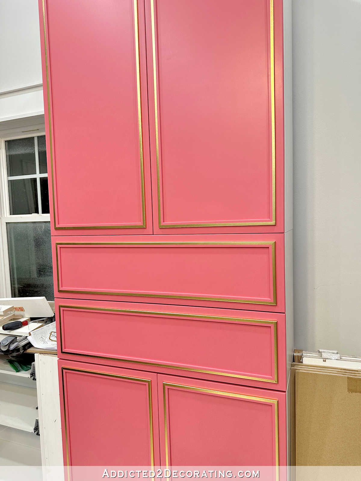
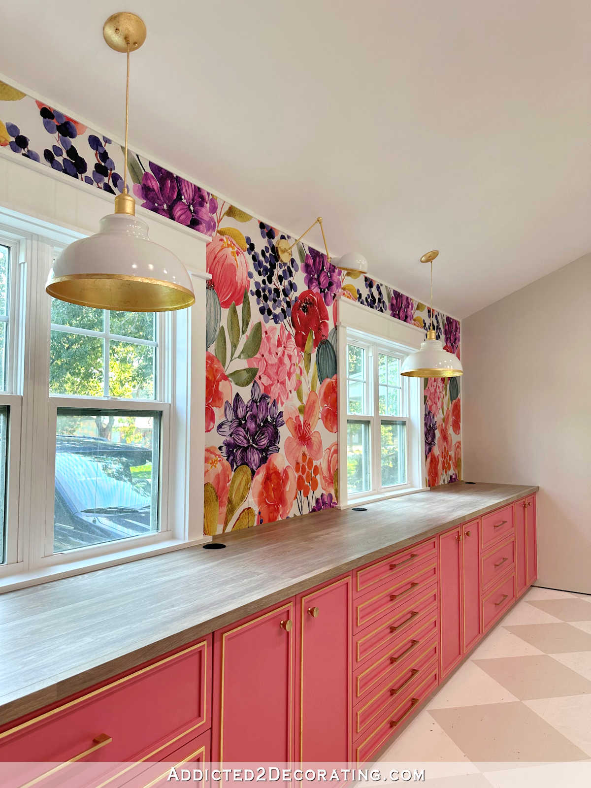
Here’s a really close up view of the fabric. I mean, doesn’t that look like it was custom made to go with my cabinets?! I chose kind of a strange pink for my cabinets, so the fact that this fabric looks so good with that slightly “off” pink cabinet color just seems like the choice has been made for me.

But if I choose that one, my color plan for my pendant light will have to change. There’s no way that the velvet striped chair can sit under a gradient rainbow pendant light made of 1200 spoons painted in this gradient of colors on the bottom row in this photo.

Those two things, that close together, just don’t complement each other at all.
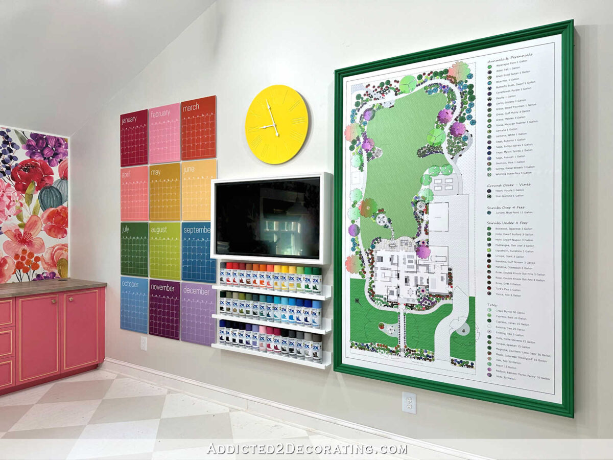
So if I go with that fabric, I’d change my plan for the light and just use one color in an ombre style, starting with dark teal at the top, and gradually getting lighter in color towards the bottom rings. I would probably choose a color like Thai Teal, which is one of the paint color swatches on my paint swatch cabinet.
I think that those would look very nice together next to/above a white desk.
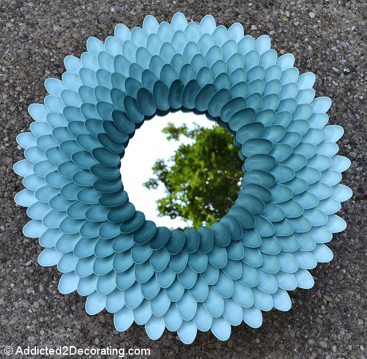
The thought of doing a teal ombre pendant light out of tiny tasting spoon bowls kind of makes me laugh because while the rainbow gradient pendant light was going to be inspired by my favorite piece of art I’ve ever made…

…a teal ombre pendant light would be a throw back to one of my oldest and most popular DIY projects ever. I mean, this goes way back to our condo days, and it’s the viral project that put my blog on the internet map. It’s my original chrysanthemum mirror made out of plastic spoons.
So that’s the direction I’m leaning towards, but I’m not 100% sure as of right now. My mom still prefers the idea of a green chair and the original rainbow gradient pendant light idea. I know that green makes more sense in the room. I really do. After all, look at all this green already in the room…

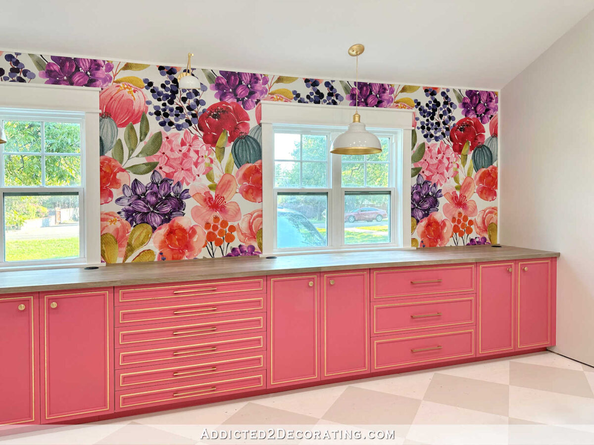
So yes, green completely makes sense. But…BUT…there’s also teal in the wallpaper mural and the floral fabric, and I don’t have any other teal in the room right now. And since teal is my absolute favorite color, doesn’t it make sense that teal needs to have a more prominent appearance in my studio somewhere other than just a random flower in a wall mural and fabric?
Okay, so moving on. If I go with the green, unfortunately, I don’t think that my favorite green fabric will work. It’s a very thin fabric, and it’s not velvet, and I don’t think it will stand a chance against my cat Felicity. So, sadly, I have to rule this one out.

I’m also ruling out this green and white stripe. I love stripes, but this particular one doesn’t do anything for me. I’d love it on a much bigger piece of furniture, like a big upholstered ottoman or even a sofa. But it seems wrong for a desk chair.

So that narrows it down to two green velvets. Do you remember the one green velvet that was that was $159 a yard, and I couldn’t figure out why it was so expensive? Well, now I know. Here it is. I don’t know if you can see how plush this velvet is, but I’ve never seen anything like it. It’s so think and plush that it feels like you could use it to dry off after a shower. 😀 But don’t. That would be an incredibly expensive towel.

And then here is the much more reasonably priced apple green velvet that I thought might be my favorite.

So let me show you a close up view of the difference between these two velvets. Here’s the apple green velvet, which is much closer to what I’m used to, although this one is a bit thinner than what I had hoped.

But it’s still a fairly nice velvet at $25.99 per yard.

Now check out this expensive velvet. You can see how much more plush this fabric is…

And just take a look at this pile. It’s like carpet! 😀 Never in my life have I seen a velvet like this! It’s polyester, which is my second favorite velvet, second only to silk. (I do not like cotton velvet.) I mean, I just can’t stop touching this stuff. I now completely understand why it’s $159 per yard.

So if I go with green, I’m still undecided on which green velvet I’ll choose. Maybe one of these to, or maybe I’ll order more samples. The apple green is a bit thin, and the other one is way more than what I had hoped to spend on fabric.
But what I can’t seem to decide on now is if I should go with the stripe that I love and change up my plan for the pendant light (it’s not to late to do that), or if I should stick with a green chair and the original plan for the pendant light.
Striped velvet fabric with a teal ombre pendant light reminiscent of my original chrysanthemum mirror?
Or a solid green chair with the rainbow gradient pendant light inspired by my rainbow pinwheel art?

Addicted 2 Decorating is where I share my DIY and decorating journey as I remodel and decorate the 1948 fixer upper that my husband, Matt, and I bought in 2013. Matt has M.S. and is unable to do physical work, so I do the majority of the work on the house by myself. You can learn more about me here.

Striped chair! Striped chair! That fabric is gorgeous.
Have you tested the super-plush velvet against your cat’s claws? I’m curious if the higher pile makes it more likely to snag somehow.
Striped chair. Love the fabric.
I agree…striped chair! I loved it the moment I saw it.
Crazy idea before order: put a reasonable size sample strip on a scratching post or onto the chair. Confirm it’s scratched, then note the damage.
I know you are in a hurry but you’d rather destroy a fav sample than 3-4 yards of non returnable favorite fabric.
I agree… I would want to test the scratch potential of both of these options since they are not traditional velvet.
Striped chair fabric. It just goes too well with the cabinets not to use.
why can’t you upholster the back of the chair, and under the outside arms in the stripe and the rest in the green?
or solid green and a few pillows in the stripe
you maybe able to have your rainbow light then
vi
That mirror is what brought me to your blog! Way back in the ancient days! I believe I’ve read every post since. ❤️ So I’m just going to take this moment to thank you for sharing your life with us. Blogging is a lot of work, especially behind the scenes so thank you!!
Either combo looks great! I shy away from the green chair simply because you don’t yet have a fabric that you love and I’d hate to see you settle and then wish you’d used the stripes because you DID love that one.
I agree with the art mirror drawing me to your post and never stopped following you. I too thank you for sharing your DIY life and blog with us. It takes so much to make a blog interesting enough to keep people coming back. Keep being you!
Solid green and rainbow would be perfect, the teal ombre with all the greens and pink in the room would be too much maybe.
I think the colourful strip would be perfect! You have to do it, it’s just perfectly you.😊😊
Good luck with the decision
Why not the stripe and the green on the chair?
Plush green velvet where you touch/sit because you will appreciate it over and over. Striped back (and sides?) of the chair where it will be a special little secret to delight you.
Striped velvet! Striped velvet! That pink stripe matching your cabinets is just perfect. And wouldn’t it be such a great circle-of-life thing to repeat the project that got your blog on the map? Love it.
When this post started, I actually thought hmmmm isn’t velvet the fabric that stands up to the cat? That said I like the strip fabric, or the velvet and I can see either one working well. My one question about the “thick” velvet would be – would the pile show marks or depressions from being used? My recliner ( micro fiber and OLD – shows the outline of my back pockets and seams when I get up.) That’s my only question about the thick pile. Those are just my thoughts – I know what ever you choose you will love or you will redo! 😉
The striped fabric really jumps out as the perfect one for that room!
Isn’t it possible to make a few changes to your paint colors and still do the pendant in colors that go with that fabric? I’m sure you could make it look fabulous!
Stripes!! Hands down.
I vote the teal ombre. As you said, it’s the project that launched the thousand blog posts and to have a daily reminder of where you started would make the studio really come full circle. The stripes look amazing on the chair and still fit the theme.
I like the stripe on just the back. And go with the teal on the rest of the chair. As you said, there is not much teal in the room, but in front of the wallpaper, it would be nice. I find the apple green a bit jarring.
Multi colored stripes for sure!!
At first, before you received the sample swatches, I liked the green swatches best. Now after seeing the beautiful striped velvet fabric displayed on the chair has changed my mind. It is absolute beautiful. And, doing the spoon pendant light in the teal ombre just sounds perfect for your already beautiful studio colors. I can already see your chair done in striped velvet, and the teal hanging pendant light above.
YES!!!
The KOVI fabric is the bomb. Either the stripe or the solid thick green. Spend the money because you deserve it. However, is the green too thick to easily upholster?
You don’t want to send that kind of money and then find out the fabric can’t be managed. Both will be beautiful. I do like the strip, but I prefer the green. You have a lot of business in that room and the strip might just be too much.
What brings that zing to your heart…go with that!
I love the striped velvet for the chair. I’m not convinced it means you have to do a single colour pendant but I get the logic. If you feel you need more green why not do the pendant light in shades of green rather than teal? Or pink?
I think there are enough pops of contrasting coloured elements in the room what with the paint cupboard, the eggplant table bases, and the calendar. I think you should use one of the dominant colours – the pink from the cabinets or the green from the entryway.
I like the colour but don’t care for the texture of the plush velvet – it looks like a terry towel to me and I wonder if it would get crushed when you sit on it. I think you’d be constantly brushing it to raise the nap. It’s also deep enough to catch cat hair.
Concur on green vs. teal pendant if going with the striped option.
Striped velvet fabric with a teal ombre pendant light!!!!!!!
You have a LOT of color & pattern in your room so my vote is the same as your mom.
Same. I love the plush green!
I know this wasn’t one of the options you gave and I’m sorry to throw in a curve ball… I really love the striped fabric and that would be my choice for the chair but to me the solution for the light would be a green ombre gradient. Teal is also MY favorite color and I love how much of it you use, but I think in this particular room a green light fixture would play off the other greens so well!
The less expensive green might be the better choice. It has the knit backing and it would be MUCH easier to sew with. I don’t think you would be unhappy working with the thinner, but thick enough, fabric.
I absolutely love the stripe too. It drew my eye right to it when I first saw the picture. My only concern is that the non-velvet stripes and if they would be temptation enough for your cat to try to scratch. I would hate for you to spend the money on that pricier fabric and have it ruined.
I’d love to see a video of the whole room so we can get a better sense of the color balance. That said, off the top of my head I like the idea of the stripes and the teal shade. I like seeing a couple of touches of teal in the room to complement the wallpaper.
My eyes leaped to the stripes instantly and I was also hoping that the light green stripe was going to make it into the final. I love the teal ombre lampshade and if you finish it with gold inside…well, that would be rather impressive. I am a bold and big splashy pattern kind of girl, and don’t get to exercise it very often, so I am getting to live vicariously through you and your projects.
I think the striped fabric would pay homage to the workout room and feel right anywhere in your home. I know whichever way you go; it will be fabulous and perfect. Good luck, this is a tough choice, but the rewards are endless. The thick green velvet reminded me of my grandfather’s upholstery shop in which he had “mohair” fabric. He would give me small samples for my Barbie clothes. It was very expensive fabric even back then.
Oh, I LOVE that stripe SO much. The colors are so perfect, and looks so eye pleasing with the area behind the desk. Could you focus the lamp with those colors more predominately? The golds, pinks, creams and that beautiful light teal are so nice! Or if you go with your original lamp, then focus on one color there…I think a deeper color green, or any tone in the lamp would still be nice. OH, I adore that fabric. Was that VERY expensive too? I would consider that for my house. Sorry, I’m not much help.
I LOVE the striped fabric but I think it would be overwhelming on the chair and drive you batty trying to match and have the lines going in the right angle. If I know you, you will be trying to get everything perfect and that fabric will drive you insane!
I loooove the striped fabric! And the teal lampshade. My worry would be if it would hold up against your cats claws. But that is my fav.
I really like the striped chair, especially with the pink cabinets being the backdrop, plus like you said, the pink stripe perfectly matches the color of your cabs. I also think the striped fabric will make the chair richer looking due to it’s style and size and fabric, similar to what the gold trim does for your cabinets.
However, I would also be concerned about what Felicity might do to your chair regardless of fabric choice. I say this, because I have first hand knowledge with a cat who only has back claws, but I have replaced chairs in my living room multiple times.
I wonder if the plush velvet would have butt prints every time I got up from the chair. That would bother me, but maybe not you! It is lovely.
I say go green which means you’ll probably go with the stripe.. Anything you pick will look gorgeous but I think the green will just pop and seems more you.. But you know you best..
The colors in the striped fabric look fantastic with the pink cabinets. A stripe with all the colors you need for your rainbow lamp would be incredible. I say “all the colors” but you really don’t need them all, just one or two from each color group. Is there any way you could have something created on Spoonflower? I think I saw that they now have velvet fabric.
I’m with your Mom, except I was wondering if the seat could be in the striped fabric and the rest in green. But i love the original pendant idea.
I love the stripe and ombré light idea. That stripe I think would be more forgiving to cat traffic I think, plus I just like how it sets off your cabinets.
I absolutely love the rainbow gradient artwork and think a light fixture made like that would be a showpiece in your studio! Go for the green fabric.
Heck, no! Absolutely, the striped, colorful, happy one is what you truly want! It makes me happy just looking at it. Anyone can have a solid green chair. But YOU deserve a happy chair! Please!
I love the stripe fabric- I think your chair would look stunning covered in this material.
I know this wasn’t an option, but could you use the striped fabric for your lampshade and the green for your chair?
Ooohh! I L O V E the stripe!
I vote stripe and teal!!
The striped fabric really stands out from the others, plus it looks like it helps the disparate elements together. If the $159 green velvet has a noticeable directional nap that changes every time it is touched, that would drive me crazy over time. Just my 2 cents. Either way would look good.
How are the textures of each of the individual stripe colors in real life? On my screen, the widest stripes look very velvety, while some seem more “flat” and others more “ribbed.” Will each of the textures hold up to sweet Felicity’s nails? Can’t wait to see your final choice!
On your other post, I liked the luxe green velvet. But seeing that stripe ( which I eliminated in my mind) with your cabinets – I love it! I’m not much help, but I think both are gorgeous!
Green chair, original colorful pendant plan. I’m so excited about this room, I can hardly wait!
I say go with the striped fabric and tone down the light fixture! I think a rainbow light fixture would be too busy in your studio and draw your attention away from all of the OTHER colorful items.
I love the stripe and it would make a beautiful chair but it looks like some of the stripes are gros grain rather than velvet. If so, I’m wondering how you’re going to feel about Felicity if she ruins $387 plus worth of fabric not to mention hours of labor.
I like the bright green velvet as well though I think you can find the same color in a less expensive velvet.
A third option would be to do an ivory or teal chair and save the stripe for a pillow on the chair. My cats love to sleep on my throw pillows but they’ve never scratched a them so this is where I’ve used more expensive fabrics.
Yes! Yes! Yes! to the striped fabric and the ombre light, this is such a beautiful fabric and it highlights all the colors in the entire studio. Please choose it. Thanks
I lean solid green chair for reasons others have cited, plus potential for too much pattern at eye level (although I can’t accurately picture a 360 view of the room). Two questions I have about the luxe green fabric are will it imprint and how well does it go with the green in the entryway?
Maybe it’s just my computer, but I think the stripes (that are gorgeous) look great with the rainbow gradient, and don’t match the teal gradient at all. Although I guess it could be too much to have multi-colored stripes and rainbow pretty much right next to each other?
Striped chair, gradient yellow green from the fabric for light, change the clock to one of those yellow green colors…… seems to be a true complement to the eggplant, pink and green, not feel like you’re introducing another color.
I might be the only person that thinks this way but the lamp then feels like an art piece, as does the paint chip and calendar collages, the landscape print. They play with the wallpaper and other elements without overpowering.
For me it’s hard to 100% feel how of all this interacts together in the room without being physically in it. I love the life, joy of the room but for me personally I seem to reach a tipping point when introducing another color in a significant object is too much. Then again Maybe the teal lamp is like your personal “red” object designers always recommend you put in a room.
I’d love to see a photo of the swatches over the chair with the wallpaper/cabinet wall in the background. I think that would give me clarity about introducing more blue. It doesn’t seem to be a strong property of the wall mural.
I agree with your Mom. Green chair and rainbow pendant. I agree the pinks in the stripe match your cabinets but the other colors in the strip are muted and the colors in your room are not muted; the value just feels off. Also I don’t think the teal works with the rest of the room. Yes, there is a little teal in the room but very little and to suddenly introduce a large teal pendant feels wrong. But if I know you, you have already made up your mind and it will be the stripes 🙂 and I am definitely in the minority from what I have been reading…LOL
Same! 100% Green chair. Rainbow pendant light. I think if you use the stripes, you will end up having to repaint the green “entry hall” that goes out to your carport…then you will have to repaint the eggplant doors…etc…which would be pretty. But, the green is just gorgeous!
For me, this is an easy-peasy one.
That luscious multi-stripe used alone on the chair makes my heart sing. More practical also if we are talking ‘function’ and I just love it. The represented colors of the pink (gotta have that) and the lime sold me. The other colors add interest.
The gradient light choice would be beautiful and less complicated. A quiet addition that will not steal the show but be stunning.
None of the green solids talk to me. And I agree with you, never the other stripe.
Okay, I’m talking to myself. This is really a P.S.
I agree with Julie, to my eye, the yellow clock color seems out of sync with the rest of the room. I suggest you consider changing it LATER, once all elements are in place. It seems jarring as it is and is impossible to ignore, making it an unintentional focal point.
I would love to see your original light plan with a solid Thai Teal chair. Solid colour would be much easier to upholster than stripes. And teal is my favourite colour.
Others will say it better I’m sure, but in the past you have made decisions about what you thought you “should” have done and always regretted it.
Your heart is saying the striped fabric, go with the striped fabric, you love it. You will make the pendant light work in another way.
I’m going to caution you against the stripe because it’s not 100% velvet. The stripes with the grosgrain-type weave will attract your cat and tempt her to scratch. It’s just the kind of texture cats like–I’m a long-time multi-cat owner and have seen the things they like to scratch.
I really think you should do a 100% velvet fabric, not the stripe, but I really wish you well with the decision.
I already see a pulled thread in the plush fabric, just in your sample. So, that means cats claws will do the same. IMHO. To me, it looks too much like shag carpet. 💁♀️ But I also really like the stripe. Decisions, decisions. 🤣🤣 No matter what you end up with, I know it’ll be perfect. It always is.
The kitty cat is getting a lot of attention in these comments. Hmmm, rather than decorate around the preferences of the sweet thing, isn’t there some type of pleasant spray that will not be to her liking so that she will be discouraged from feeling like she rules your world?
Surely hundreds of people have had the same dilemma.
Go for the unique pink and multi- color stripe with the ombre teal light shade! It brings rich pattern to that side of the room yet goes with the wallpaper!
I think you could still do a color gradient shade with those hues that are in the striped fabric…
I love the striped velvet, but would really miss the multi-color lampshade. Spoonflower can’t do velvet? Meaning use fabric matching wall paper. Sorry – I need more coffee.
Striped chair! There are many colors in your studio but the only color in the office/desk area is the pink. By having the striped chair it would introduce all/some of the studio colors without having an overdose of color. It would look so classy! I don’t have an idea of what you would do with the planned spoon lamp shade but I wouldn’t do anything crazy with too many colors. I would hate for your studio look as if it is too busy.
Stripe–no contest
Striped fabric with teal ombré light—hands down! Also if kitty does a bit of damage to fabric, multi color stripe will hide it better than solid
OMG !!!! That stripe is gorgeous. When I first read your earlier thoughts about using the stripe, I was “oh no ….. overkill”. But now that I’ve seen it up close and properly against your beautiful pink cabinets … It’s the stripe, the stripe, the stripe. Go for it Kara …. it will look beautiful.
So sorry “Kristi” ….. getting my names mixed up.
As soon as I saw the fabrics the beautiful stripes is absolutely perfect. Also, my favorite colors are teal and pink, so the teal light would be gorgeous.
The striped fabric seems a perfect combination with the cabinet. Could you mix colors to match the fabric so you could still go with your original plan?
Oh my gosh the first thing that hit me, before I read any text, was why did she get a sample of a green towel? That may be a pretty sweet fabric but I wouldn’t be able to get the idea of “my chair is covered in a towel” idea!!
The second thing that hit me visually was that I had a similar stripe fabric in my kitchen and I always loved it! I think it’s my favorite out of all of them with the one to the left of it in second. I just can’t get excited about 159/yd towel fabric. Bear in mind I have only one sense to use here. The big stripe is ugly and the other one is too minty for my taste. Can you put your samples on various pieces of furniture and see which ones the cat favors or hates?
Love the striped fabric and love the pattern it would bring to the office side.
Hi! Such pretty choices. Would it be an option to do the seat & backrest in a solid & the back of the chair in a coordinating stripe? Or even a floral that matches your gorgeous mural wall?
One final thought…since it’s your work shop, would you be likely to stain the chair from doing projects? I would have an absolutely crying meltdown if I got something on really expensive velvet.
IMHO the stripe is fabulous! Seems to me that it would work with the rainbow light if you tweak the spoon colors a bit and maybe leave off the purple row. If you can’t see that ( I know screen colors are not always entirely accurate) I still vote for the stripe. It’s scrumptious! Looks like it was custom made for the room.
Add 1 or 2 side chairs & use the stripe on the seat. For a guest and more interest.
Stripes and ombré light!!!!!
I LOVE that fabric!! And the ombré and subtle but beautiful at the same time
Will you need other chairs for clients? Acrylic chairs with striped velvet cushions would be beautiful. They could be moved out of kitty’s reach if needed. Then you could do the original gradient light and green chair. Maybe even a small lumbar pillow in the striped velvet.
Love the stripes, and since you love them use them in the chair. Having trouble feeling the teal on the pendant light. At first I thought you were going to say you would be using colors of the stripes on the pendant.
But what about a teal chair?
You usually always get it right – but I am not loving the solid green or the striped green with the Pink cabinets – I prefer the striped velvet – Then go for a toned down version of the ombre lamp if you heart is still there –
Cannot wait to see the whole room finished though.
Striped fabric and teal ombre lightshade, hands down. There’s a design theory I’m sure you’re familiar with, promoting the use of a “disruptor color.” The idea is that you need something a little “off” in a room to inject some energy. (Another theory is the 60-30-10 rule.) I love green as much as the next person and have several earthy shades of it in my house (60), along with muted blues (30). But I also use little explosions of mustard yellow (10) here and there to keep it all from looking too sedate and “matchy.” The striped fabric jumped out at me within a nanosecond as being exactly the kind of energy you need for the chair, to offset the florals, and the teal lampshade will be that unexpected color that will elevate the room from “nice” to “awesome.”
I vote for the striped fabic hands down! I loved it the first time you showed it! Green is one of my least favorite colors so l’m a little prejudiced. Aqua is my favorite so l’m all for the light color!
I’d have concerns about the thicker velvet crushing or looking flat if you sit on it for long periods of time. It is undoubtably wonderful, but looks more like an accent fabric or one for a chair you intent to reupholster frequently when it starts to show crush patterns.
Stripes on the front, solid on the back! It makes you happier so it seems like the obvious choice. Also I’ll throw it out there… what about a gold ombre light?
Oh, that is a hard decision to make! The multi-colored stripe fabric is clearly a wonderful complement to the cabinetry and overall color scheme.
Here’s a weird suggestion: what if you had that striped fabric reproduced onto paper or a flat, tight-weave fabric and then used it for drawer liner and/or on the interior back walls of your tall storage cabinets? You would get that pop of joy to see it when you opened the cabinets *and* you could keep your multi-colored pendant light. In the long run, I think the fabulous multi-color pendant would be a more satisfying and spectacular focal point.
Just my two cents and off-the-cuff idea. I’m so enjoying your blog. Thanks for sharing!
I would do the striped chair, but I would also do the light in a non-ombre teal (color of the stripe in the chair). You have a lot going on in the room, with the mural and the swatch cabinet, and the big calendar. If everything is a focal point, nothing is a focal point.
Given that you’ve ruled out the green stripe, I’d go with the green velvet and the multi-colored overhead lamp. But, you certainly could make it work with the striped multi fabric and an ombre pendant lamp.
Both! As others have said, use plush green for the front, and stripe in the back. You wouldn’t need as much expensive fabric that way…. And colorful lamp.
Kristi- I love the stripe one too! However I love the idea of the rainbow light. So maybe switch the velvet to a teal, make a chair pillow with the stripe and do the rainbow. I don’t like the green with the salmon pink, as much as the idea of a teal blue. Just my 2 cents per usual!!! 😄
Send for more samples and see what else is out there, you are limiting yourself to the first few go and order more, samples there are plenty more Fabrics out there for you to look at …