Venetian Plaster Walls & Wainscoting Questions
I started on the Venetian plaster finish on the bathroom walls, and it’s turning out so pretty! I won’t be sharing about the products and process today. That will be in a future post that I’ll share as soon as the walls are finished. But today, I want your input on the color. I’ve also run into a problem with the accent tile I ordered, so that has me rethinking the wainscoting as well. So let me know what you think on both things.
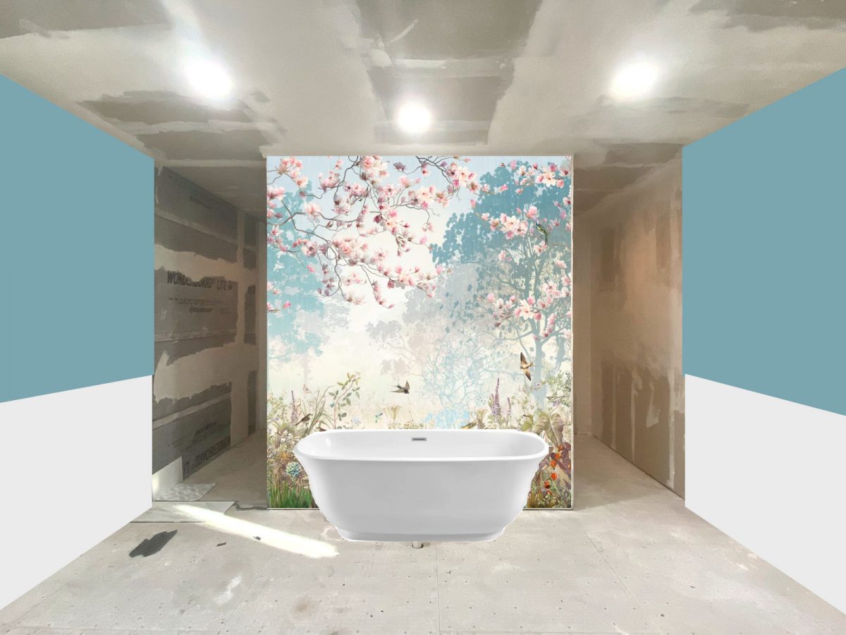
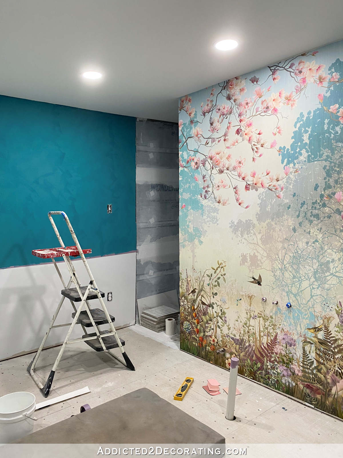
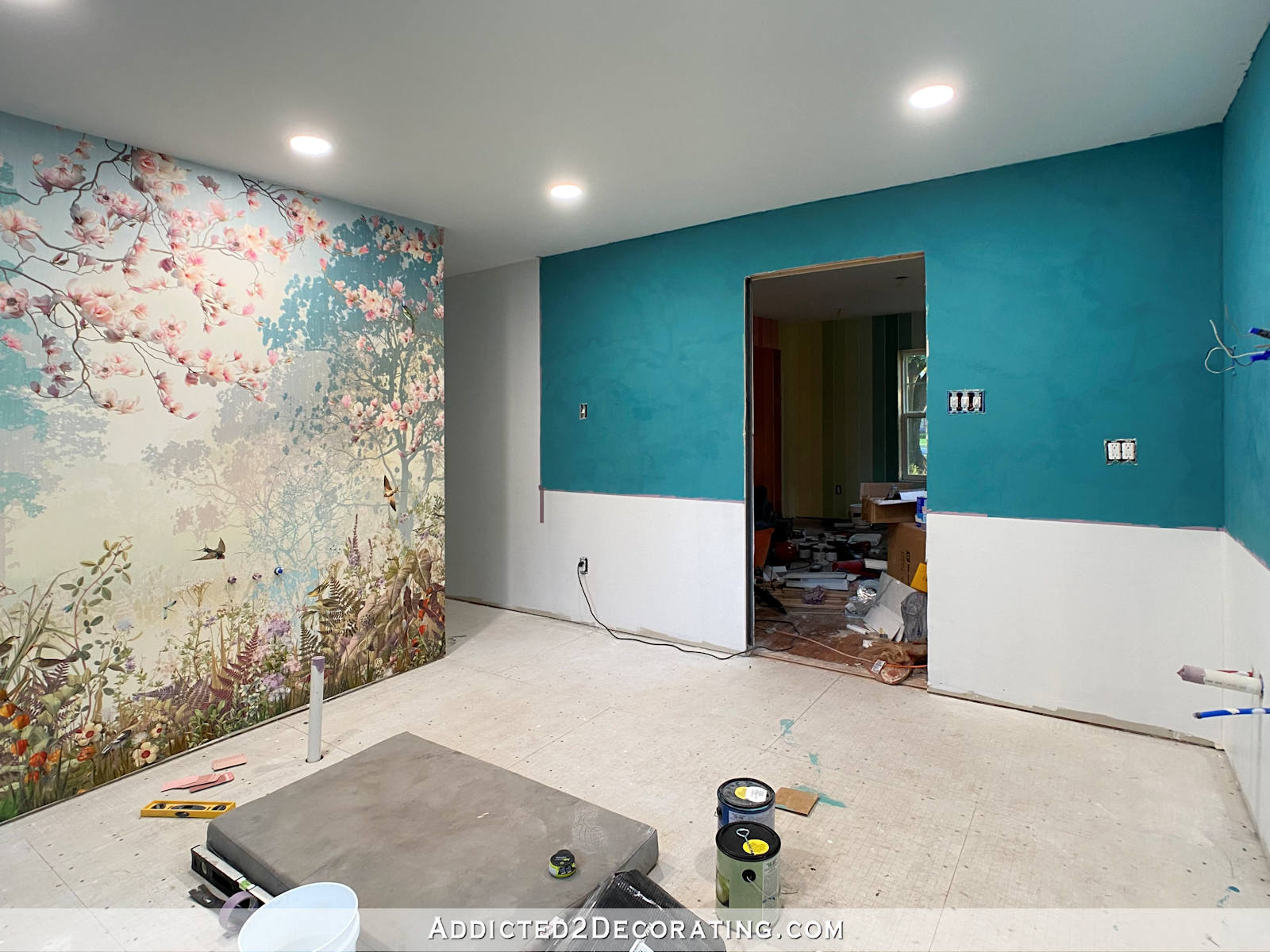
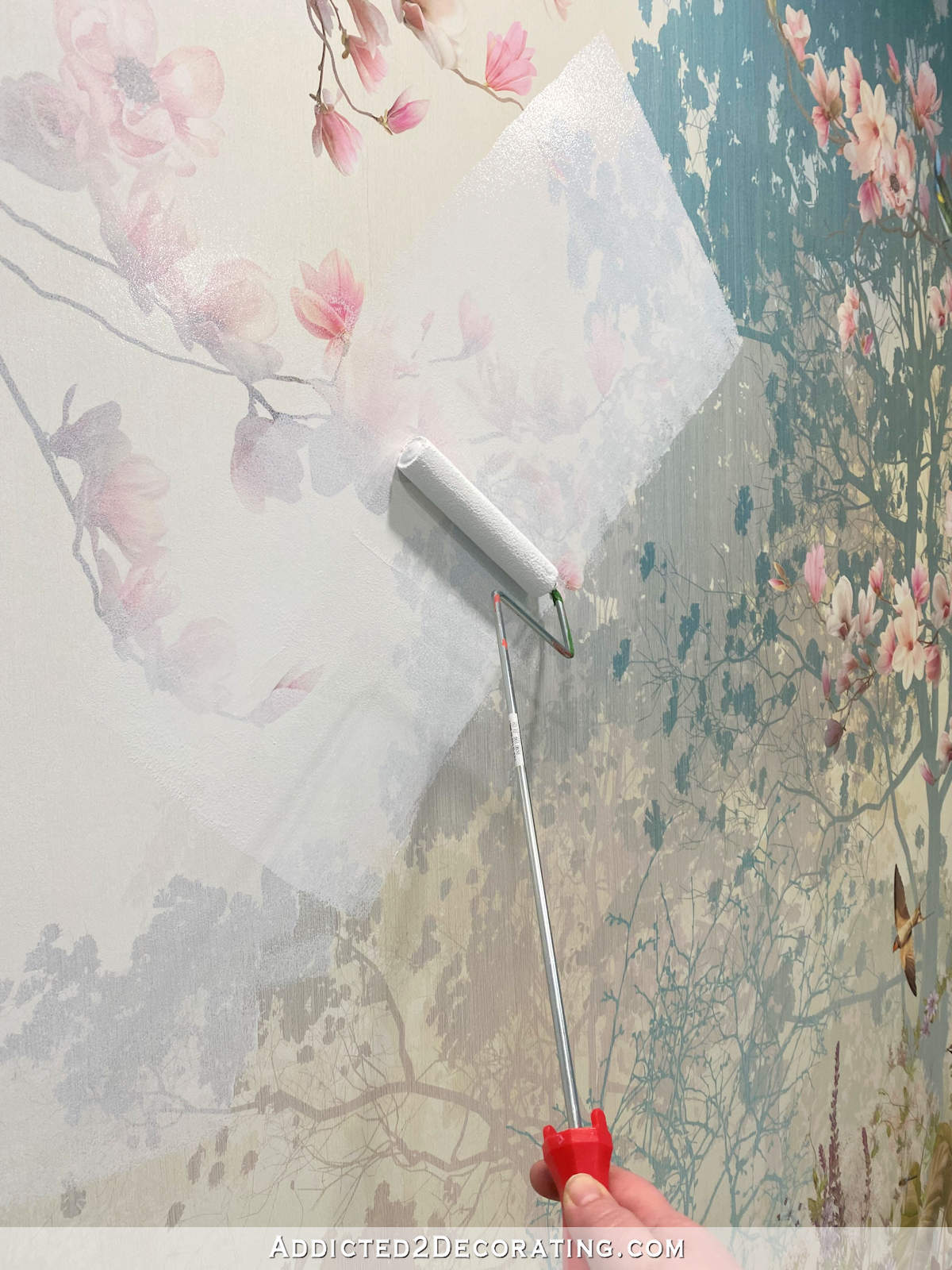
When I originally started thinking through the design of this bathroom, this is the color I had in mind for the Venetian plaster finish on the walls.
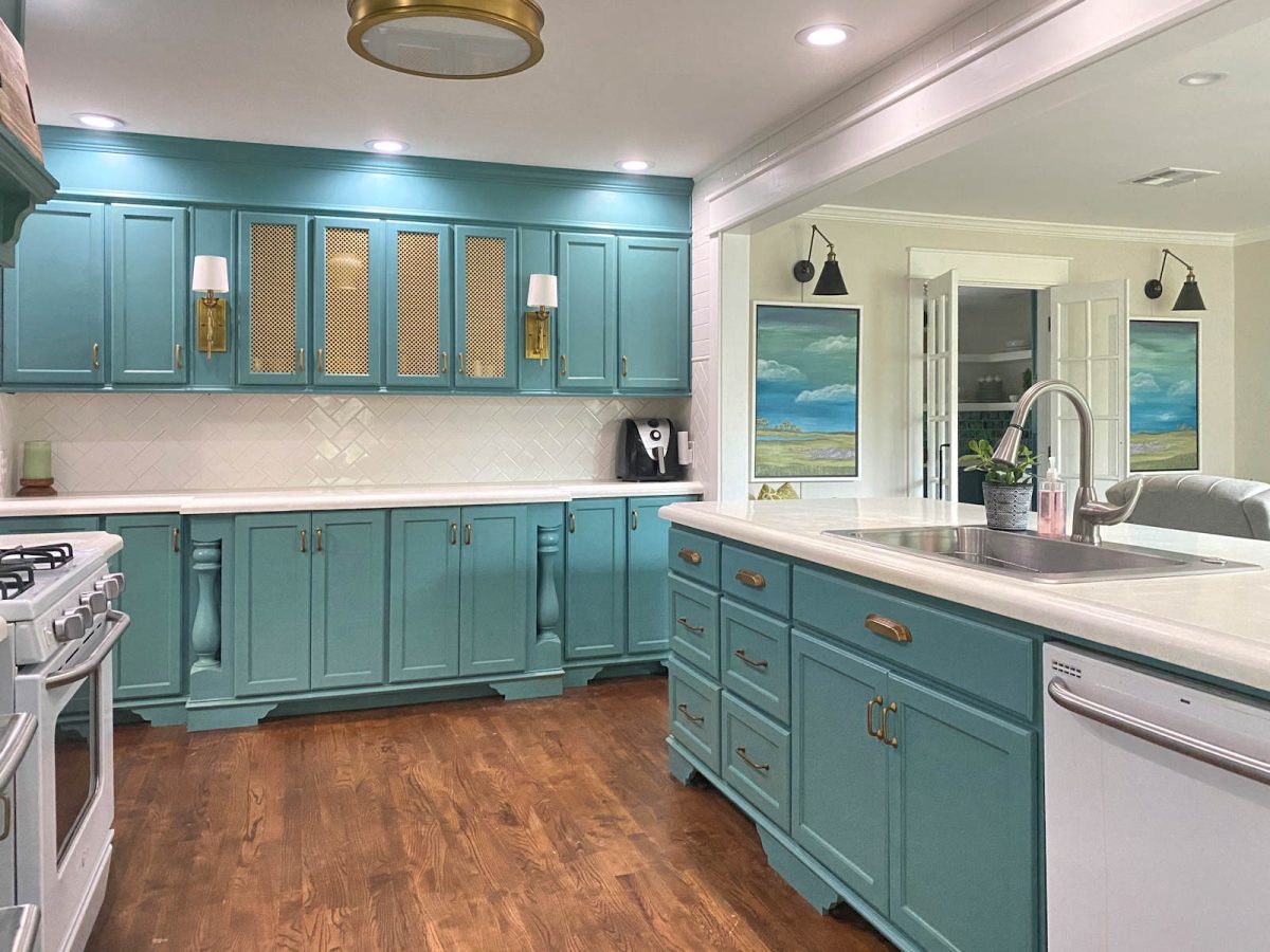
It’s kind of a soft but light teal color. In fact, it’s similar to the paint color I have on my kitchen cabinets.
When I did the mock ups of the walls with the wall mural, I used a similar light color…
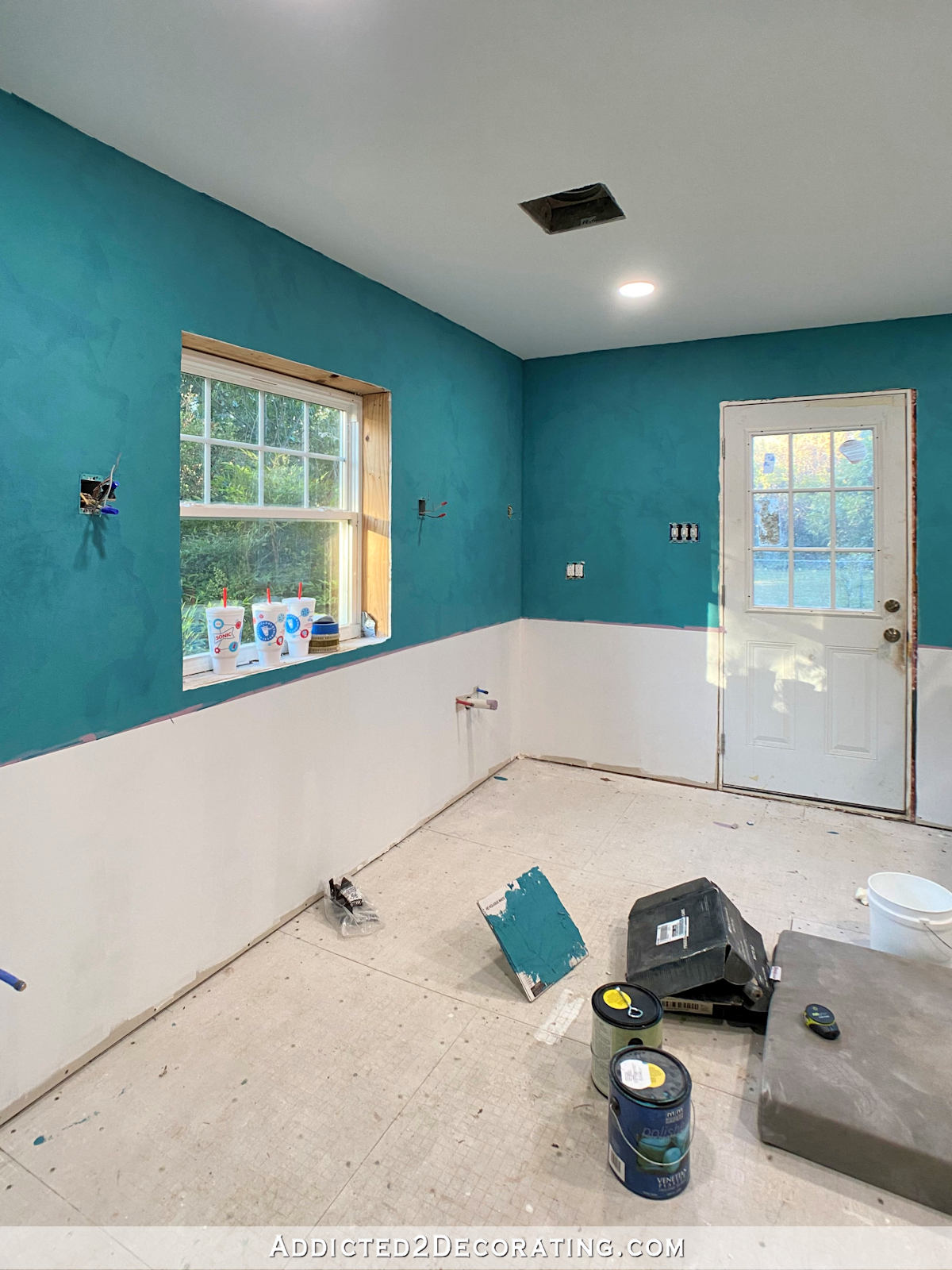
But when I went to the local Benjamin Moore store to get the Modern Masters Venetian plaster finish mixed, the girl mixed it considerably darker. I knew it was darker than what I had been envisioning, but my thought was that I could use the darker color for the first coat, and then take it back and have them lighten it up considerably, and do the second coat with the lighter color.
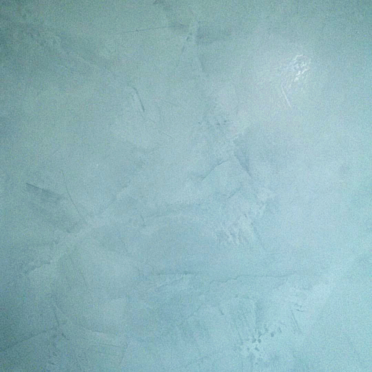
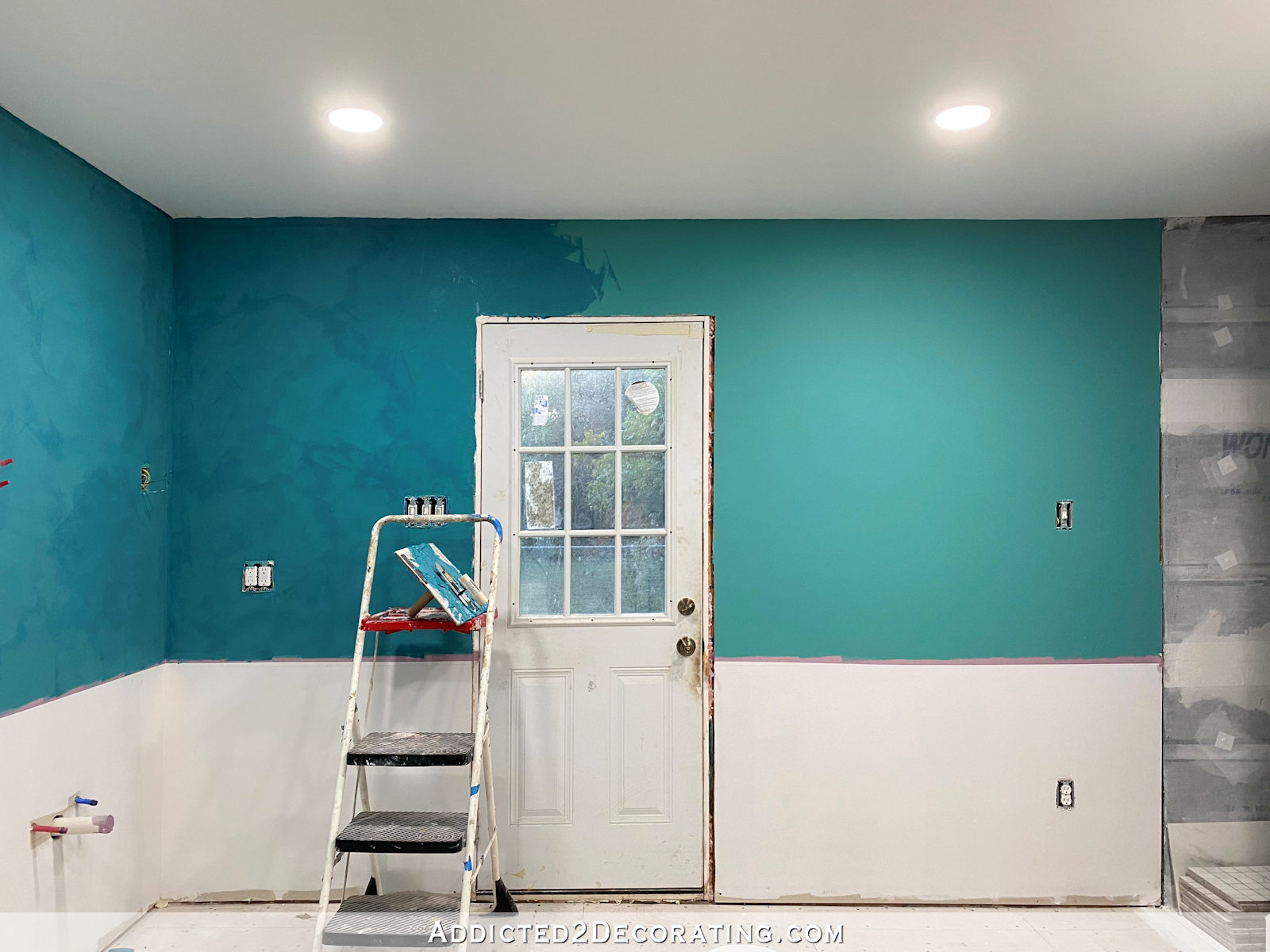
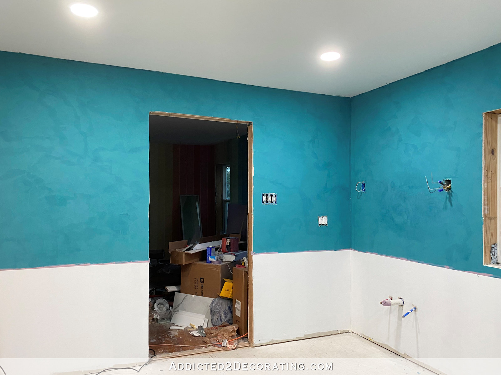
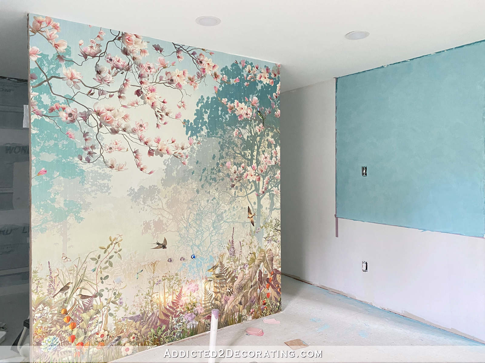
But after doing one coat with the darker color, now I’m unconvinced that it needs to go lighter. This color is gorgeous. It’s so rich, and has such a velvety appearance. This is how it looked last night after it was dry.
Interestingly, this product lightens up a bit after it dries, which is the very opposite of what latex paint does. Right after I did this part of the wall and stood back to look at it, I was fully convinced that it was too dark for the final coat. But it dried just a little bit lighter.
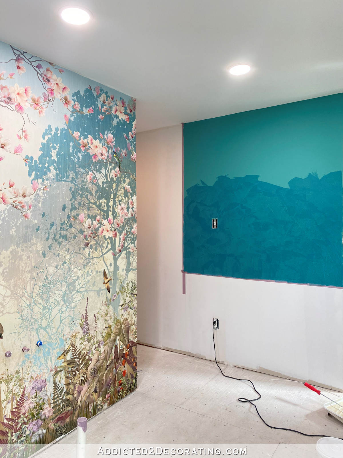
And you can see the difference between the base paint color I used and the Venetian plaster finish. That base coat is Behr Aqua Rapids, and I told y’all that the final color would be deeper, richer, and bluer. I wasn’t wrong.
And here’s how that last area looked immediately after I finished. It was still very wet (and very dark) in this picture.
But as you can see, it all lightened up a bit when it was dry. I just can’t decide if it’s still too dark. Here are a couple of pictures of what the finish looked like last night before I went to bed…

Note: If you’re reading this post on a website other than Addicted 2 Decorating, you’re on a website that steals content from bloggers, and is using my content without my permission. I’d love for you to join me on my actual website! You can click here to find this post on Addicted 2 Decorating.
And then here’s what it looked like early this morning. It was still pretty early, and I took these before the sun had risen above the trees. so it was still pretty dark in the room and I had to turn on the lights. So these aren’t really what I would call daytime pictures, but they’re not nighttime pictures, either. They’re 30-minutes-after-dawn pictures. 😀
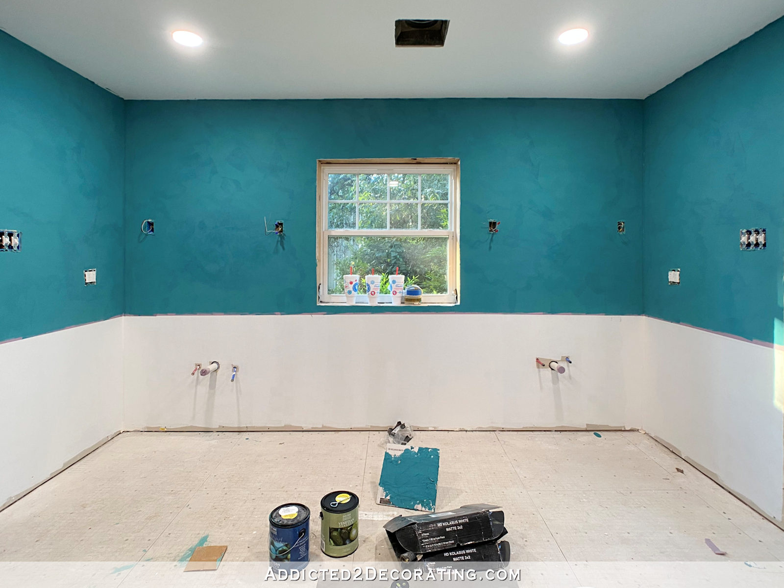
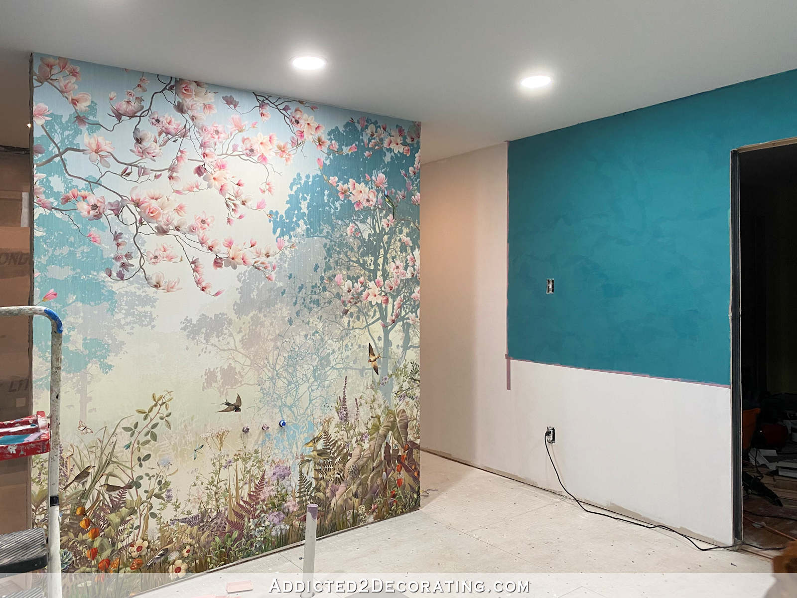
One thing that I had thought is that if I stick with the same color, the walls will get considerably darker after a second coat. So as a test for comparison, I did a second coat on part of this wall. Can you tell where it is?
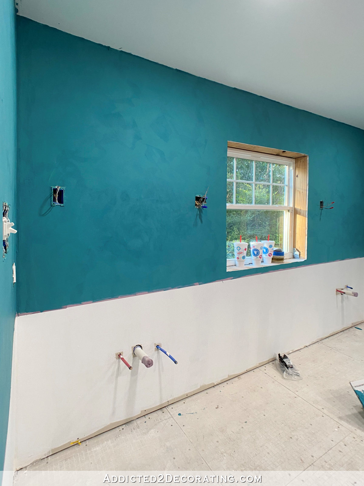
It’s the circled area in the picture below. It has more movement to it, but I don’t really think it appears darker than the rest of the wall. If it is darker, it’s not much darker at all.

So I’m completely torn. Should I stick with this darker, gorgeous, velvety color? Or should I lighten up the second (and possibly third) coat and aim more for the original color I had in mind?
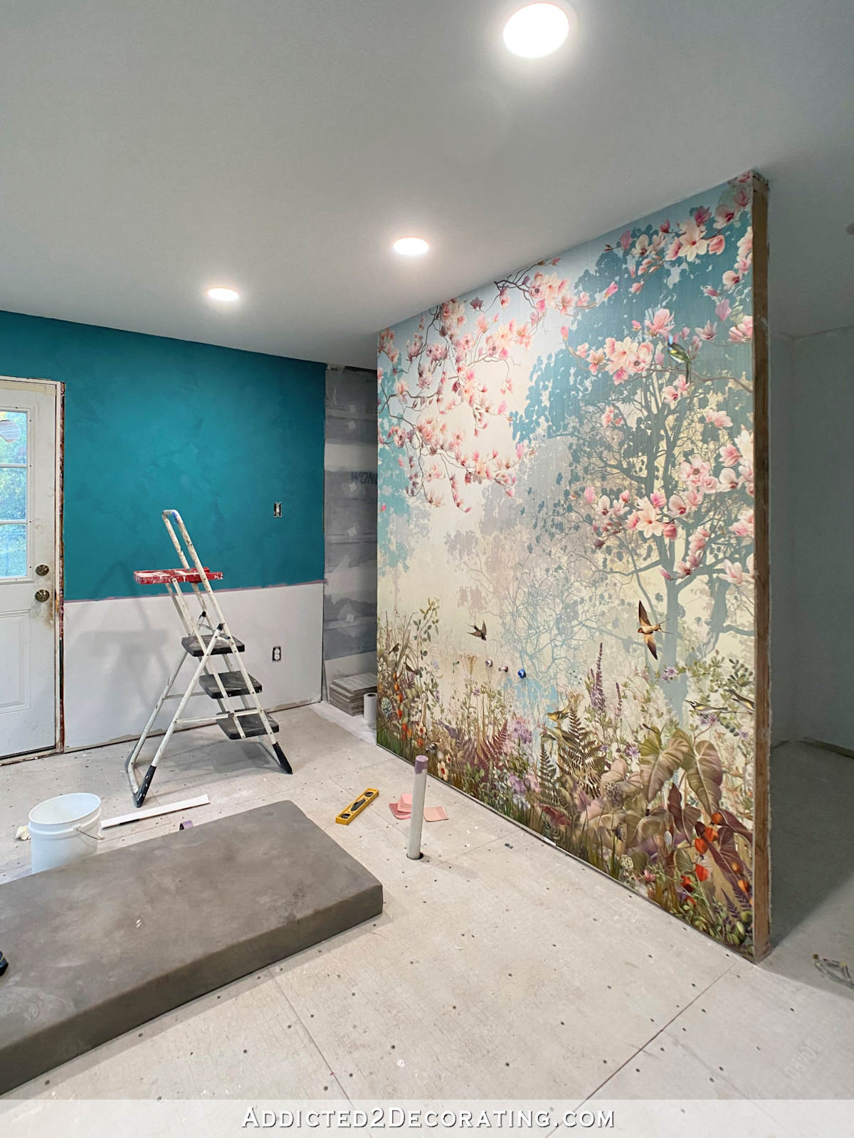
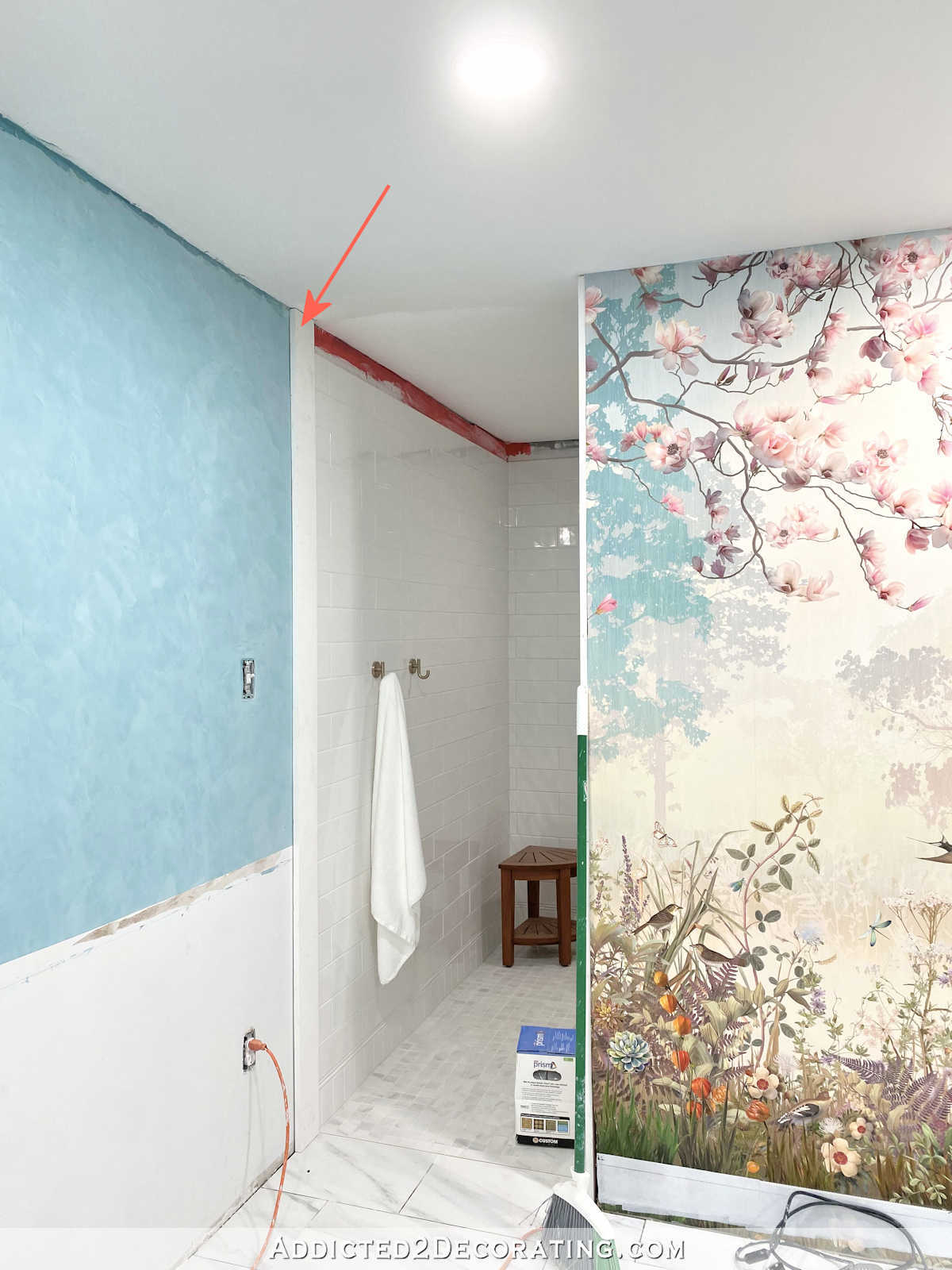
And here’s another problem that may affect that decision. Remember that beautiful shiny glass penny tile I ordered for the accents in the shower and in the wainscoting around the bathroom?
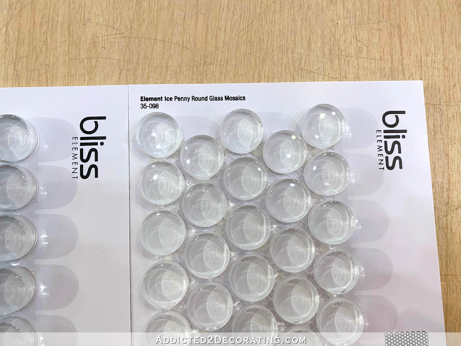
Well, the product page on the website where I ordered it said that it was in stock and ready to ship same day or next business day. I placed my order a week ago. On Monday, it still hadn’t shipped, so I called. There was no answer, so I left a voice mail. I still hadn’t heard back by late Monday afternoon, so I called again, and no answer. So I sent an email.
Then yesterday, I get auto-generated email stating that the status of my order had been changed, and that my money had been refunded. I never got an email from an actual person explaining the situation. No email. No phone call. No nothing from an actual human. Just an auto-generated email about a refund with no further explanation.
So I’m about ready to give up on the accent tile, and with no accent tile, I’m wondering if I should just forgo the whole wainscoting idea altogether.
I love wainscoting. And for some reason, I especially love it in bathrooms. I even love it in tiny bathrooms that don’t have much wall space for wainscoting, like our hallway bathroom.
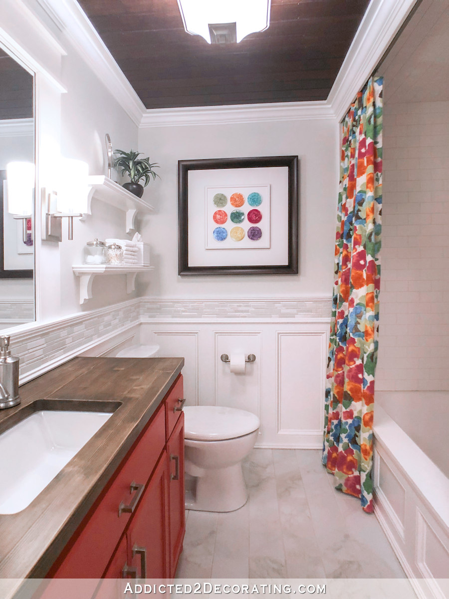
I also love how white wainscoting looks paired with bold colors and/or bold patterns. As much as I love color, I love it even more when it’s contrasted with lots of white. The white makes the colors stand out even more to my eye.
But when using wainscoting in a bathroom, I also love to use an accent tile in the wainscoting that can continue around the vanity as a backsplash. It’s just kind of my M.O. when doing wainscoting in bathrooms. And if I can’t find an accent tile (which has proven to be more difficult than it should be), then I might consider not having any wainscoting at all. But this would drastically change the look of this bathroom that I’ve had in my mind for moths now.
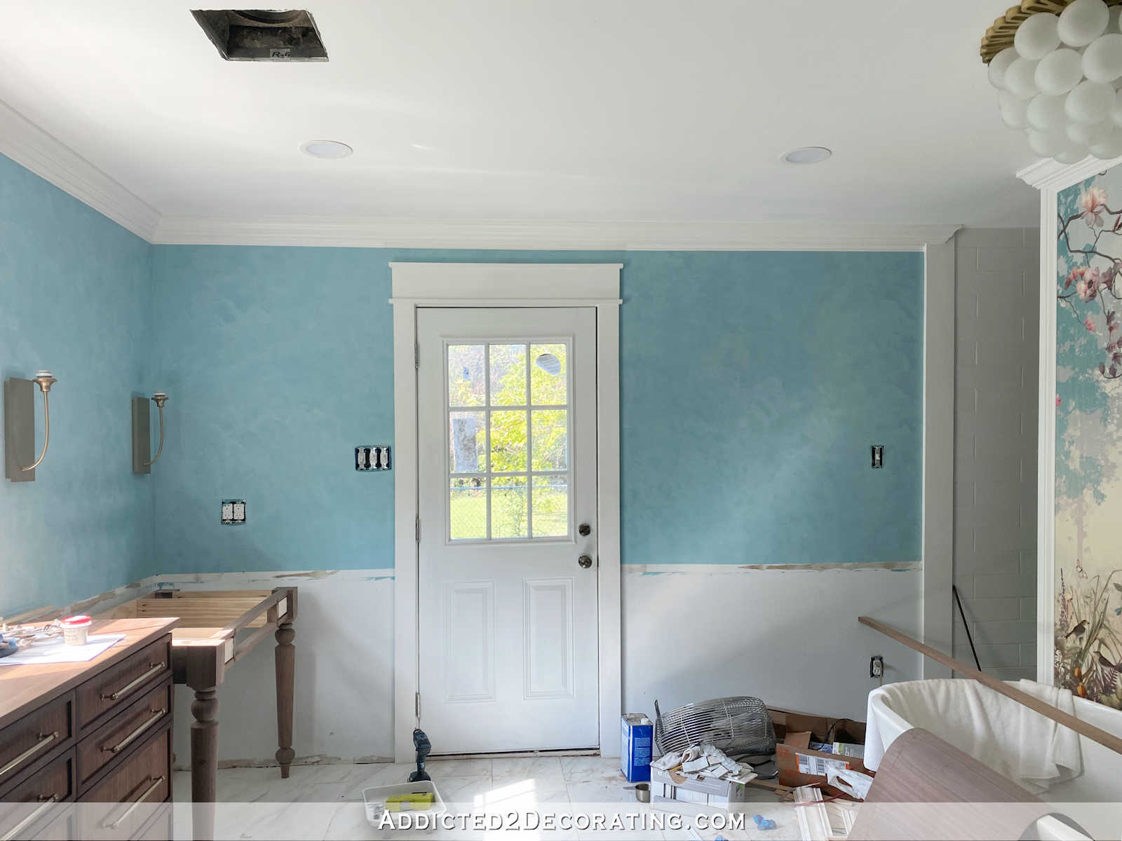
The white wainscoting would provide a beautiful bright contrast to the rich wall color above…
But it would also be really pretty having the Venetian plaster finish on the entire wall from floor to ceiling. And I would still have white trim (crown molding and beefy baseboards) up against the wall color.

So I’m stuck once again. I might take one more trip to the big box stores and the local stores to see if I can find a replacement accent tile that doesn’t break the bank. I just can’t bring myself to pay $37/square foot for a tile. But if I can find something in the $20/square foot or less range, I’d like to stick with my original plan for the walls. But if I can’t find a replacement accent tile, what do you think about the whole wall being the Venetian plaster finish? And in either case, what do you think about this wall color? Perfectly rich and velvety? Too dark? Should I stick with this one, or head back towards the original plan with the subsequent coat(s) of Venetian plaster finish?

Addicted 2 Decorating is where I share my DIY and decorating journey as I remodel and decorate the 1948 fixer upper that my husband, Matt, and I bought in 2013. Matt has M.S. and is unable to do physical work, so I do the majority of the work on the house by myself. You can learn more about me here.
Oh boy, tough one! I love the dark teal, but a bit too dark maybe as it seems to drain the color from the mural. To me, the lighter color seems to complement the mural better and lets that stand out. I love the wainscoting too so vote for keeping that. Here is a link for some penny tile available from our area that might work https://www.susanjablon.com/products/penny-round-clear-iridescent-glass-tile
I agree!
The mural is the star of the show, so go lighter on the walls (especially since there’s only one window for natural light) & forego the tile in the wainscoting. I believe that with the beefy moulding, the wainscoting would be too much distraction from the mural.
Agree 100%!!
Ditto – I agree!!
100% agree also.
Completely agree.
What about doing more above the wainscoting without a tile border (which increases a very horizontal line)? As in the lighter plaster treatment, but with tall, vertical picture frame moldings resembling Georgian period drawing rooms? You get stunning texture, elegant/grand verticality, and interest everywhere without drawing attention away from the main event – the mural…
What about doing more above the wainscoting without a tile border (which increases a very horizontal line)? As in the lighter plaster treatment, but with tall, vertical picture frame moldings resembling Georgian period drawing rooms? You get stunning texture, elegant/grand verticality, and interest everywhere without drawing attention away from the main event – the mural…
Better yet, fill the tall vertical frames with mirror – reflecting more light and views of the mural, chandelier, and window/vanity area!
I agree as well, and really like the penny tile suggested by Judy above.
I think it’s too dark . The mural has a lighter and more airy feel. I think you should lighten it up.
I agree 100%. As much as I love the color, in my opinion the color is just too rich with the mural. And I love wainscoting too — a definite yes vote from me on that!
My thoughts exactly. Your original color plan lets the mural be the star.
I agree
Yes, the lighter color looks better!
It’s too dark. Detracts from the mural.
I agree too. it’s stunning but tends to overpower the blue in the mural.
I agree with both the softer color and keeping the wainscoating.
I think I’m in the opposite camp. The darker color makes the mural stand out more vs. when the color becomes lighter and closer to the mural it will blend more. Personally I don’t like dark colors, but it does look pretty darn nice in there.
Can you try just a small amount of the lighter and see how it looks before deciding?
I agree. Love the darker color and love it with the mural.
Agree!
After studying all of the pictures, to my eye, the darker wall color darkens the mural and the mural loses some of that misty, sunbeam feeling and the dark color brings out the darker tree color. The room loses some of the “spa” feeling with the darker color, my opinion, only.
That’s it! I agree.
That is a BEAUTIFUL tile! You should check it out, Kristi!
Totaly agree …. The darker seems to overwhelm the cheerful delicacy of the free and airy wallpaper…
That color is amazing. The mural is amazing. I want to live in your bathroom.
I love the color. I think beefy trim would provide enough contrast.
Without the mural in the picture I LOVE the paint color. But, my personal opinion is it makes the darker teal color in the mural looks washed out. At least in the photos you attached. Since you asked, I’d lighten it up just a bit. But, here again, you do yo and I’ll love it!
I would lighten it up if it were my bathroom. I would want the mural to be the focus and the walls as plain as possible to not take anything away from it. You make great choices. It will be stunning whatever you choose!
I agree all the way on this AND YOU following your heart and it being BEAUTIFULLY done!
I think you should stick with the light color too.
I love the velvety deep color. So warm and rich. Bathrooms tend to go cold in most people’s homes. I painted my lib ping room a much darker “Capri” blue that literally everyone insisted would be too dark and it is my favorite room in my house. I think you will love the deeper color once you get everything else done. I’d never leave my bathtub if I had that room! 😊
Do you have Sutherland’s stores down there? They carry non-conforming accent tiles…different from all of the big name stores. Not sure if they show them on their website, though. What about doing something fun yourself, like you did in the pantry? Those are still my dream tiles for my kitchen.
I think you need to go with the lighter color
Man, am I in the minority 😀. I like the darker color. It acts as a frame and makes the mural pop. With the lighter color, the mural blends in. You just need to decide which look you prefer for your bathroom. Both are pretty.
I like the wainscoting with or without the tile accent. I think viencian plaster on the whole wall will be too much and you will go back and change it.
Leslie, I absolutely agree with everything you said. I believe the darker color is beautiful, and causes the mural to pop instead of blend. And, I think the white on the bottom makes everything have a statement. It gives a “podium” to the venetian plaster. I think everything looks absolutely incredible and I would give my right arm to have your whole house! And if I hd this bathroom, I would never leave it!! 😁
I like the lighter color plaster. I’d stick with wainscoting and search for a different tile. Your original plan speaks to me.
Agree 100 percent!!!
I also agree with this comment! Lighter plaster color and stick with wainscoting and search for a different tile.
I’m in this camp too!
I think the lighter color complements the mural as the showstopper. Maybe save the darker for the master bedroom.
I painted my kitchen cabinets before I saw yours and had I not just done that I would have painted them the same color as yours. That being said I love the color of your kitchen cabinets and I think you can’t go wrong either way with the bathroom wall color. I think maybe lightening it just a bit may help the mural standout a little more but either way it boils down to what makes you happy. As far as the tile….you could give yourself a deadline on finding that and if you haven’t found the right tile at the right price then go ahead with your other plan. I love what you did in the hall bath so something like that with molding on the bottom part of the Venetian plaster wall would look great.
You said it your self. Perfectly rich and velvety! It is darker than the mural but it’s fine. The room looks plenty bright. Plus you’ve not added mirrors and artwork yet.
I completely agree. I LOVE that dark velvety color, and I don’t think the mural will be lost in it at all.
The dark color competes with the mural. It’s all you see. Go lighter, the texture will continue to make it interesting without competing.
Agree with Deb’s statement. The lighter color will complement the mural instead of compete with it. The mural comes off as more of a soft watercolor, and while the darker walls are pretty, I don’t feel it goes with the mural. Can’t wait to see the finished bathroom!
I love the color but I think it’s too bright with the mural. The color washes out the mural (as someone else stated also). I love the the wainscoting. It will make the room look fresh and clean.
Agree with this and similar comments. Dark color detracts from the mural. If I were doing this I’d stop right where I am and finish the game room while I wait from the tile or make another choice if the penny tile is not available. Do you have a Floor and Decor in Waco?
Tough decision- YOU must make! Trust your gut girl- you always make the right decision when you do!
I feel like the darker color competes with the mural and if you choose to do the walls floor to ceiling with the plaster it will be very dark
Like some of the others mentioned, I think the dark teal washes out the mural. The lighter was better IMHO. And yes to the wainscoting.
I wonder if perhaps the wall colour is too teal compared to the blue of the mural. It may just be the photos giving that perspective. I love the plaster technique !
I like the idea of the tiles in the wainscotting . Would a plain white penny tile offer a nice look.
I agree. I feel the mural has more of a grey undertone. I don’t mind the intensity just tweek the color
Love the color, but not in this room. The mural has a soft look and makes the paint look a little harsh. I’m torn on the wainscoting. I love it and think it adds dimension to the room but there is also something calming about not adding another feature. Perhaps you need to do a mock up with whatever you’re planning to hang on the walls. I know you’ll make it look great in the end.
I totally agree! In addition, in such a wide open bathroom, it would be most elegant to accentuate the verticals as the mural wall itself is vertical and draws the eye in and upward – increase the long vertical, lofty lines of the room…Being such a color gal, I can see the temptation to be all about the color pop as in the stark white wainscoting popping that Venetion plaster color. But when you decided to go with that giggagorgeous mural as your focal point, your direction is no longer about color popping, but about continuing the elegant, lofty, airy look and feel around the room – using texture through your plastered walls, mouldings, vanity style, faucets, mirror frames, art, etageres, plants, upholstery, and lighting – more than going for crisp, color popping which grabs attention away from the grand focal point…the other focal points in the room are, naturally, the windows and vanities with their mirrors (which will reflect the mural BTW) – not the high contrast side walls even if you plan to have art, etageres, etc on them…
Plus the wall color will still pop against white trim and floor. I agree that the color being chopped up by wainscoting on the bottom will mess with the upward flow of the mural.
Keep the color!!! Ditch the wainscoting and use beefy trim 😍😍😍
I love the wall mural/paper.
I love the wall color.
To my eyes they just don’t seem to work together. The mural is light and breezy afternoon. The plaster is dark and moody night.
I would pull one of the very lightest blue colors from the mural and use that. It would not have to be teal; just a pale breath-of-fresh-air blue.
I really like the photo where you use the wall mural on all the upper walls with wainscoting below. That, to my untrained eye, is very elegant.
What do you think of adding an even paler blue to ceiling ?
It will be a beautiful bathroom, no matter what you end up doing!
Agree 100% with this comment.
Love the dark rich color! Don’t lighten it!
I love looking at that mural! It is stunning! The wall paint, however, is too dark in my opinion. It tends to overpower the beautiful mural.
I would lighten the colour and would go ahead with the wainscoting. Even if you don’t find the perfect tile now, do the wainscoting to the bottom rail (the one below the tile), have enough trim for the upper rail, and add the tile and the upper rail later, when you the right tile is available.
The dark teal is gorgeous, but I think it’s too dark for the mural. I would forge ahead with the lighter color you had originally envisioned.
I don’t think it washes out the mural at all. Just the opposite. It’s beautiful.
As per the penny tile, those were not meant to be. Find new ones and stick to the wainscoting. It’ll be beautiful.
I think the dark teal plaster is gorgeous, a real standout, but it’s pretty strong on its own and kind of competes with the wallpaper. Perhaps work in a lighter shade over the top to mute it a little so it plays second fiddle to the wallpaper feature? I think wainscoting in white underneath with a tile border would make it cleaner and brighter. I dunno. Maybe the wainscoting alone with no tile border would simplify. With a wallpaper that bold it isn’t like there’s an absence of important stuff going on.
Lighten the color to your original choice. The mural is misty and the colors subdued. I think the original color choice matches the mural better and you’ll feel “inside” the mural with the lighter color. The rich, velvety teal is nice, but I’m not sure it’s right with the mural.
I like wainscotting, but I liked the cleaner, streamlined look of your mock-up without it. You are already going to have lots of stuff breaking up the walls. The mural, the tiled areas of the shower and toilet spaces, eventually the vanity. I think the eye will be able to rest a bit more and settle on the mural without the wainscotting breaking up the walls.
The color is beautiful but it is too dark and will bring too much attention. Go with the lighter color and your first decision. Let the mural be the star.
You should stop were you are. Get the cabinets and the tub in and then decide. I think you should forget about the accent tile and either do all Venetian plaster or plaster on top and just white wainscoting on the bottom.
That said, if it were my bathroom, I’d keep the color dark, it’s really rich and beautiful, and take the plaster all the way to the floor on the side walls. I think there’s enough competition for attention between the wall mural, the plaster, and all the tile, especially the small tiles in the shower, all of which will be visible from the main part of the bathroom. Sometimes you can do too much and nothing shines.
I agree w the lighter color & going all the way to the floor. With the vanity mirrors, a light hued vanity, white tub & the light floor tile, there is already nice contrast. Plus, you will have towel rods & hanging towels to break up the full venetian plastered walls.
I love the color even if it’s darker because the white lower part will balance it. I wouldn’t do the entire wall. I would look for penny tiles or sometuing similar. Good luck
I think because the bathroom is so large- this darker color adds warmth and doesn’t detract from the mural at all . Looks like it brings the teal out more .
I love following your blog. You have wonderful taste, and I love your color choices. While I really like the deeper color, it just seems a little overpowering for the beautiful mural. I really love your original wall ideas!
1. You should scoop out a 1/2 cup or so of your existing vp and bring it to the paint store. Have them lighten only that a smidge. Better yet, bring along a small container and see if they will give you a small amount of UTC so you can experiment at home with how much you want to lighten it, if at all. You will get an idea of how altering your last 2 coats will look.
2. Do the wainscoting; it’s you! Plus, it will really make the whiter, sunkissed part of the mural sky stand out so nicely!
I’d go to your original lighter color, keep the wainscoting, and lose the tile completely…unless you can find a pretty border tile that picks up a motif in the mural such as an abstract leaf…you could even have random ‘leaves’ on the top edge! More could ‘randomly’ collect and dance up to your vanity mirrors!🤗
I like the original, lighter teal color. It would still have the velvety texture wouldn’t it? I also think traditional wainscoting would be just fine without the accent tile.
Your progress on this master bath is admirable. I vote for wainscoting without an accent tile, unless you find a tile that you love and is affordable. It will provide a contrast with the Venetian plaster and withstand damage better (and be more repairable) from bumps. Further, I am concerned about things getting too busy for the eye with anything but the simplest of accent tile. And I like the idea of going lighter on the second and third Venetian plaster coats to create a swirling mist effect.
I wholeheartedly vote for the darker color, all the way down the wall. The flow of rich, continuous color makes the mural stand out even more, and the white moldings top and bottom will provide plenty of sharp, clean contrast and a gorgeous backdrop for the other things you’ll be adding to the room. Love when glitches take you somewhere beyond what you’d imagined.
Is it too personal to ask how you singlehandedly get so many big projects done in such a short period of time? Do you never grocery shop, cook meals, wash up after, do laundry, walk the dog, cut the grass, rake leaves, sleep — the sorts of things that seem to gobble up so many hours? Your level of productivity is astonishing. Besides keeping well-hydrated (ref. those jumbo cups on the window sill!), what’s your secret to staying on track and getting the most accomplished each day?
Awesome!! Your bathroom is going to be beautiful! Y’all will feel like you are bathing outdoors! So pretty!
I LOVE the deeper color! I like the idea of the wainscoting but I think that deeper color would still be beautiful all the way down to the floor. I definitive prefer the deeper color and it looks so rich in the plaster finish. If anything, I think it make thre mural pop even more. Love it!
I love the darker Teal, But the whole wall I think would be too much. I’d vote for the white wainscoting with what you have. If you can’t find the tile you want now, can you add it later?
My first impression is that the teal wall color fights the eye for attention from the mural. I love the mural. If the wall color is lighter say one of the sky colors in the mural it may work better. Just saying!
Colored small tile on the wainscoting border would look nice. And yes definitely do wainscoting and more trim in the bathroom.
I experienced the same problem ordering bathroom lights. It was frustrating. Changed companies-House of Antique Hardware and they were knowledgeable about what was in stock. No surprises.
I think the lighter color you had originally planned makes the mural stand out more and gives the bathroom a more serene feeling. The dark teal although very pretty is a bit bossy.
I think the dark teal is too much contrast with the white wainscoting. If you go with wainscoting I think you want it to be more restful in a space like a bathroom, so less contrast for sure. The darker is pretty, for sure, but it conveys a more active feeling. If you don’t do wainscoting then I think that the darker would be fine for the whole wall because it won’t be as chopped up and will read more neutral and enveloping across a larger area. In sum, I’d go with your original plan since that is the image you have in your head.
Over the past 30 years, I’ve troweled miles of Venetian Plaster and stucco, so I had to jump into the conversation. May I make a suggestion?
Before you change anything on the wall, make some large samples and compare them to the deep teal and decide which you prefer. This will save a you ton of work later and you’ll work confidently knowing what the end result will be.
You should be able to purchase white VP from your store. First, though, make a sample board of straight teal to play with. Then mix a 50-50 VP of teal and white and apply it to the board. See what you think. Try a 75% white with 25% teal. Compare.
Keep in mind that when you apply the new lighter color, the base color (teal) often will show through, creating more pattern and movement to the wall. This happens due to the variation in thickness of application and how your hand moves across the wall.
My opinion – the deep teal is sublime. It’s rich and velvety, and allows the mural to have center stage. Of course, the decision is ultimately yours. You have an impeccable eye. Whatever you choose to do will be perfect! We’re excited to see what you decide!
It’s a beautiful color but seems a little stark against the mural. Do the wainscoting and add the accent tile later when you find what you really like.
I love the wall color, but I think its depth washes out the mural. That said, I do think the wall color will be less in your face when there is a vanity, mirrors, etc., so I would go with your gut. I have never liked the idea of wainscoting with a Venetian plaster treatment. The two concepts do not “marry” in my mind. And Maria Killam’s website and posts have convinced me that simpler is better when it comes to tile. Otoh, do not design by committee lol!
What a quandary to be in. I actually love the idea of the color on the entire wall. I have always thought that the wainscoting furnished a distraction making the room less dramatic and less romantic than full color walls would be. I would keep the focus on the mural. It’s completely gorgeous with a beautiful ephemeral feeling. That said, as much as I love the dark color of the paint, I believe it kind of diminishes the effect of the mural. A think a color that is somewhat lighter would keep the focus on the mural. That doesn’t mean you have to go with a very light color with no personality or drama of its own.
If you feel the need to have the wainscoting, it could still be added later. You can also try a lighter color on the walls (or wall) then, once you have the color where it exactly what YOU want it, see how you feel about the wainscoting. I don’t feel the decision about the wainscoting (I love it too) has to be made simultaneously with the color choice. Go for your color first.
I do not think it is too dark. I like the richness and velvety feel. Bathrooms have so many slick, shiny surfaces it a beautiful counterpoint. It plays with the wallpaper very well and a lighter color might wash out the paper a bit. I’d probably nix the wainscoting if it were me and let the Venetian plaster be the costar to the wallpaper. Master bathrooms have A LOT OF STUFF so maybe keep it less visually stimulating than a guest bath.
I love wainscoting but for the wallpapered wall specifically I think you should keep it without wainscoting. The mural is the focus, why cut off the bottom? I do think the paint is a bit dark and would look better mixed to match the lighter blues in the mural. A decorative strip of tile above the wainscoting (if you do go with wainscoting) is not necessary and would detract from the design. There’s already enough going on, the plaster wall, the mural the shower tiles…
She is not considering waiscoting over her mural. She asked for feedback about it on the other walls. 😊
I love the color but…… I would agree, it appears too dark for the mural. i would go lighter.
As a lover of color, the mural is just gorgeous and so is the teal! But I think the darker teal, especially without the wainscoting, will overpower the focal point mural wall. I understand your materials dilemma – we’re updating a bath. I think the walls would look beautiful and compliment the mural if painted in the same finish but much lighter as you originally envisioned. Love seeing your acccompliments and admire your talent!
Well I’m no expert but for me the wall color takes away from the mural. It seems too dark and does not seem to match the color of the sky in the mural but I’m not there to see it in person. Also, I vote for keeping the wainscoting.
Oops! Earlier I said I voted for keeping the wainscoting but meant not keeping it at least not on the mural wall.
The color is lovely but I also think lighter would look great too. I would definitely do the wainscoting, it sets off the teal color so nicely. It’s not nearly as pretty when its on the whole wall.
Keep the lovely dark and rich color. I will make you happy, and by the time you add in wainscotting and trim and cabinets and mirrors and art on the walls, there will be less surface area of it to show and more balance. (so, obvs I am a yes to wainscotting too). If you forgo it, I might then want to lighten up the walls.
Can you have them mix a small batch of light so you can do a test batch on a piece of plywood and see how it looks?
I love the color!!! Yes to wainscoting!
I love the dark teal color in general (like I really love it), but I think it is too saturated and competitive with the paper. The paper is the show stopper and in my opinion shouldn’t compete with the paint color. I definitely think the paint needs to go lighter, to allow the paper to be the star. I also think you should do the wainscoting and I think you should find the accent tile you love, ever if it’s a little more than you wanted to spend. This bathroom is worth it, and you’ll regret not doing it.
Lighter.
The darker color overwhelms the gorgeous mural makes it washed out .
If you keep it dark, it seems like it will feel like you are walking in a darker forest with the bathtub mural a sunlit glen at the end of the path. If you go lighter, I think it will feel more like you are standing the sunny glen itself. I think either one sounds lovely, just up to you to decide on the overall feel you’re going for!
Nice color but like many others, think it overwhelms the mural. The mural is the star of the show.
I love it!!! I would hunt for the accent tile you want….. You have beautiful ideas!!
I like the color of the plaster as you have it now. Because you have so much light it won’t look too dark in the room. I also like the bottom half of the wall white. It might be too much to have the entire wall that color. I hope you find a replacement accent, I think it would look so pretty.
My two cents- Keep the main focus on the mural. All the other components need to support the mural, and not try to compete for your eye. I think the walls need to be the softer shade, and a beautiful piece of moulding chair rail height is all that is needed between the upper and lower wall colors. This is where restraint is paramount. Less is more, here. Love that mural!
Kristi, I will be very honest and say my preference is your original color vision for the walls. As beautiful as the richer color is, I feel the mural is downplayed and overshadowed.
Tile – I vote for white wainscoting minus accent tile. Again, no need to busy things up adding accent tile with that gorgeous mural.
You can’t have light without dark. I think the darker color will dramatize all the light elements like the mural and fixtures. It is a backdrop and not the star. The tone of blue is perfect. I like it without wainscoting. There will be plenty of white. I think it will look elegant.
Here are some possible accent tile:
Carrara White Marble 1 inch Penny Round Mosaic Tile Honed
And many others on this site.
Good prices.
I love the dark color on the walls. It enhances the mural and adds a lot of drama to the room. I would like to see you keep the wainscoting, hopefully with an accent tile. This bathroom is going to be so beautiful–like a jewel box!
Let me see if I can explain how the two plaster colors feel to me emotionally. The lighter color has a very calming, soothing feeling. The darker color has a liquid feeling to me, like my feelings are drawn into it.
Please keep the wainscoting if at all possible. It really steps up the richness of the room.
Is there any way you could do something with resin to make the tiles you have in mind? The tiles you made for your pantry are outstanding…..just wonder if you could create what you need here.
Ooooooooo! 🥰 That idea is marvelous!
Like the bold color you have. I too like wainscoting. It adds richness. Keep your existing bold velvet color and go with what your heart wants.
Do the wainscoting with a plain white tile with a little sparkle (but subtle) in it?
That is a gorgeous color, but I do love the original best. Even lighter would be awesome too. You want to be soft and dreamy like the mural. I still like the original concept for the walls.
Surely there is a accent tile that would make the project perfect. The plaster looks awesome, just too dark.
That’s not really venetian plaster. If you want real venetian plaster, buy the real marble power and mix it and tint it to the true color you want. It’s much harder to work with, but in the end you’ll be much happier. I’ve used both and am in the process of doing my entire house in the real venetian plaster. The walls will never have to be touched again.
I am happy that you made the point that this is not real Venetian Plaster. Real Venetian plaster has an alabaster like effervescence that looks like a soft rag rolling with high and low finishes. It contains real marble pigments. I lived in Morocco for several years and their lime infused plaster (Tadelakt) has some of the same efference. I think your plaster wall would serve your ambience better were it lighter. Tadelakt is often put on with a flat stone in Morocco and has layers. The artisans that I worked with often put Tadelakt on bowls and other eating or decorating items for sale to the tourist trade. It was often used for sinks in bathhouses (Hammans). It has lasted for centuries in well maintained homes. It almost feels like brushing up against a hard velvet. Much Tadelakt in the the Kings’ palaces.
While the dark teal is beautiful it seems too dominate for this space. Personally not a big fan of wainscoting but your version is pretty, so I hope it works out for you 🙂
LOVE that dark rich color, I hope you keep it!
I love that color, but it sort of seems to make the mural fade, rather than being the spotlight, so I think I’d try to go lighter. As to the wainscot, I like the original idea, and think you should keep looking for a tile you love. Would it be too terrible/difficult to add the wainscot and tile accent at a later date? Like, you could do the full wall now, and if in a year or two you find a tile you love, add the wainscot and tile accent then? Just curious. 🙂
The mural is the star. The mood it casts is soft. The lighter plaster complements it without dominating the room.
As for selecting wainscoting: I can see it with or without. Consider that you will be adding so many more elements to the room. It seems to me it would be good to factor in all of that before you make a final decision. Everything counts in the design equation. Fixtures, hardware, mirrors, all of it.
Patrice (posted at 11:27 a.m.) presented a balanced view of what else to consider. Simple is more elegant and restful. That is the vibe of the mural to me.
Looking forward to seeing what you decide.
I love that you let us walk through this process with you! In my opinion I think if you are going to do wainscoting then leave the darker richer color, if you are going to forgo the wainscoting then I’d use a lighter shade. I like the richer darker color but feel like it needs the white to balance it out. Good luck! I can’t wait to see what you decide! 🙂
And P.S. ~ keep the white wainscoting!
As in most things, I’m in the minority here loving the deeper shade. (My tiny diningroom is that color) I feel it makes a more dramatic base and makes the mural pop. What will go on those walls? That could make a big difference in which way to go.
Another thing to consider is the flow from the colors in the gym.
I LOVE the color. I think it lets the mural shine, while still linking to that same color in the mural. I also LOVE the full wall of color (no wainscoting). It’s a big room and I don’t think that color will overwhelm it–exactly the opposite: the color helps the big space look cozy and warm. I think with the trim, it’s going to be incredible. (And of course, you can always add the wainscoting later.) Can’t wait for the venetian plaster tutorial.
I personally love the velvety, darker color! In my opinion, it doesn’t wash out the mural at all because the mural is light enough to contrast and enhance it. Also with all the white trim, white bathtub, etc it will not look washed out. Love everything about this!!
If you can’t find the penny tile, I would go without…equally beautiful in my opinion.
You can’t go wrong, everything you do turns out beautifully. I can’t wait to see what you decide to do.
I love the color and don’t think it’s too dark at all. It’s beautiful. I prefer the look without the wainscoting, it looks very classy.
I also like that this bathroom would be different from your other bathrooms rather than all the same style. Whatever you decide, I’m sure it will be beautiful.
I absolutely love this darker color! Leave it! You can’t go wrong with either option of the full wall of color or half wall of wainscoting.
The color brings out the dark teal tree on the right side.
For me, the present colour is much too dark – I feel it mutes that fabulous mural and takes away its focus.
I too, love the wainscotting of your original plan – it gives so much character and luxurious finish to a room. So hopefully you’ll find a new accent tile to use to stay with your original and beautiful design.
The color is fabulous, and it’s clear you love it. The mural is beautiful an a soft way. Lightening the walls will take the Kristi out of it. You are a saturated color person. Think of the purple buffet and the depth of the new color. Keep the wainscot and look for a different tile. You still have lots of time.
Agree with the comments that the darker color washes the mural out…my eye goes to the dark wall instead of the gorgeous mural. Go softer in a bathroom for a calm tranquil space…..that mural screams tranquility to me😍
I must admit, I love the original soft teal you chose. But I know how you love rich saturated color so if that’s your jam, go for it. I am sad about the wainscoting because like you, I love the contrast and I’m so in love with your other bathroom. Happy hunting!
Can you share the venetian plaster product
How about using the darker teal paint in the eventual master bedroom. That way you don’t have to give it up and it will compliment the bathroom, but a lighter color will let the mural shine in the bathroom.
I think you’re overthinking the paint. It’s gorgeous. Leave it. You seem to love it.
As for the tiles, give a day or two more and sleep on it. You’ve already “lost” a week waiting. Relax.
Do you have any tiles left over from the pantry that were maybe too light for that room? Something almost pearlesent. Just a thought.
Love the dark velvety walls. They need to stand up to the mural, the tile, the wainscoting, and any shelves or pictures you have in there.
I think it’s too dark. It is pulling my eye away from the mural, and it (to me) is darkening the room too much. As for the accent tile, I hate to see you not find something you love. There had to be something you have overlooked! If nothing else, can you create a tile as you did with the pantry, just not as bold?
Adding to my comment above, what about doing your own as mosaic tiles?
I love it dark and dreamy. With all the white contrast I don’t think it will be too dark at all. Perhaps do dark now, and then once everything else is finished you can go back and put a lighter layer on if you feel it’s not right?
Go bold or go home!
Darker on the entire wall, floor to ceiling.
Looks ravishing and opulent.
The floor and the ceiling are light, the lovely mural is light, the bath is white, so that with the added skirting and coving in white, that should be contrast enough.
(and of course, you can always change your mind later……….😁..).
I think you answered your own question regarding the wall color – it’s beautiful. Easy to let the audience convince you otherwise but you obviously love it. So stick with it. And as far as wainscoting, again you answered your own question. You love the look, it’s your thing, it’s what you envisioned. Go for what you know!
Go lighter, forget the wainscoting.
I LOVE the texture of the Venetian plaster! It may just be because you’ve charged us with looking at the walls, but I feel as though my eyes are drawn to the darker color teal first before looking over at the mural. For me personally, I feel as though the mural stands out as the star of the show more when the teal is lighter and closer to your original mock up.
I am 100% team wainscotting! Have you considered any of the other mosaic tile shapes in the same Ice color from Tesoro’s Element collection? http://www.internationalwholesaletile.com/element.html
Just my opinion but I think it’s too dark. Very pretty but needs to be much lighter.
I love this Venetian plaster finish and color! It’s very rich. And it compliments the mural beautifully.
As for the wainscoting, if you can’t find a tile you like in your budget, you could use some chunky wood or MDF trim in white.
just a suggestion…you could use those clear flat craft marbles from dollar tree as your backsplash and just create your own to look the same as the order that was cancelled (sorry about that btw!) You seem to be super crafty and talented….make what you want! They sell those bags of them it looks like 15 or 20 pcs for a buck! soooo….worth a look see??? Grout them on the wall ?
Yes! Thats what it kinda looks like anyhow!
as usual it is beautiful…..keep going! You are so inspiring.
Current paint: too dark. 😞
Wainscoting: 👍🏻
I like the darker paint better. I think the darker teal makes the colors in the mural pop more.
Kristi, I can tell by the way you describe the color like deep velvety that you are loving this color . I absolutely love it with the wainscoting. When you get the trim all up it will lighten it tremendously. Ive just finished my bathroom and used the small mother of pearl tiles from overstock. They are thin but oh,when the light catches them its simply gorgeous! Why dont you do the dark and wainscoting. Theres always a giant eraser if you dont love it .( paint roller)
Hi, Kristi..
Wondering are there any Restore or salvage building supply warehouses in your area? Over the years, I’ve had success finding items, such as the tile, especially when you need a sorta small amount.
Hey I love the wall color -on its own. – maybe its just the pictures but it looks like it isnt quite meshing with the blies in the mural. Like its a bit too green of a teal. IF it matches nicely with the mural in real life then id stick with it, otherwise it needs to be adjusted so the undertones are closer. Good luck!
…lighter walls
…wainscoting
…accent tile
Just my opinion and they way I think you would be happy with.
The darker color is beautiful, but I think it makes the mural wall look washed out….so I would vote for the original color you picked.
When we remodeled our master bathroom a few years ago, we did a wainscot that is not wood and turned out beautifully. It is made of the same 12″ x 24″ marble that our floors are, and it is topped by marble chair moulding pieces. We are thrilled with how it came out and would do it again, if we ever built another house.
Have you considered running your floor tiles up the wall as a wainscot and putting a porcelain moulding piece along the top?
The dark velvety colour is stunning and very much in keeping with YOU! love it.
don’t forget by the time you add all the accessories – i will be perfectly broken up with mirrors, towels, lighting, skirting, caninetry etc.
whatever you decide – i for one – will LOVE IT!
GO WITH YOUR GUT.
I think do the wainscoating regardless of the accent tile. you could always add the tile later when you find the perfect one… or the penny turns up. 😉
The dark teal just has me thinking 80’s home decor with seashell sinks and peach hand towels. There is something about it that seems like old 80’s rather then the reimagined 80’s colours that are trending right now. I really love the lighter colour as it sits so beautifully with the mural and let’s it be the star of the room.
I’d leave the color as it is now. Once you add the white wainscoting, the white tiles, white tub, etc. etc. all in cold bright white – this dark will get muted.
Maybe leave it now, see what you think once all the components are in place then paint it light if needed later.
Once again I seem to be the minority opinion; but I like the darker color. The richness is lush and dramatic. I think either way, with or without wainscoting and tile will be beautiful.
I love that color! When I first saw the picture I thought I wish you would just do the whole wall without the white. I think that would be gorgeous.
It is pretty, but I vote to go lighter.
I know I’m late to this discussion… I agree with those who say to go lighter with the Venetian plaster. Have you looked at any Mother of Pearl accent tiles? I think it would look gorgeous with the mural and Venetian plaster colors. Since you’re not covering a huge area it should be doable price-wise. This bathroom is going to be stunning!
Stick with the white wainscoting as the plaster color is too much color and shrinks your room. The color on the top of the walls is fine; not too dark, just leave it alone. Did you have a piece of wallpaper blown up to cover the one bathtub wall?