DIY Teal Venetian Plaster Wall Finish Using Modern Masters
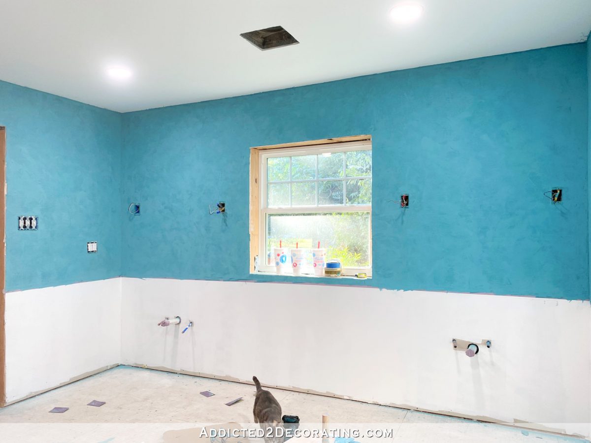
I might have my Venetian plaster walls in the bathroom finished, but I’m going to live with them as they are for a day, and look at them throughout the day, and decide if I might want to do one more lighter coat. When I showed you pictures of the walls after I had done the first coat, I was second-guessing the color. I had planned on the walls in the bathroom being a lighter teal, similar to what I have on my kitchen cabinets. But once I got the first coat of the darker teal on the walls, it was so gorgeous that I wondered if I might want to keep the walls dark. Here’s how it looked…
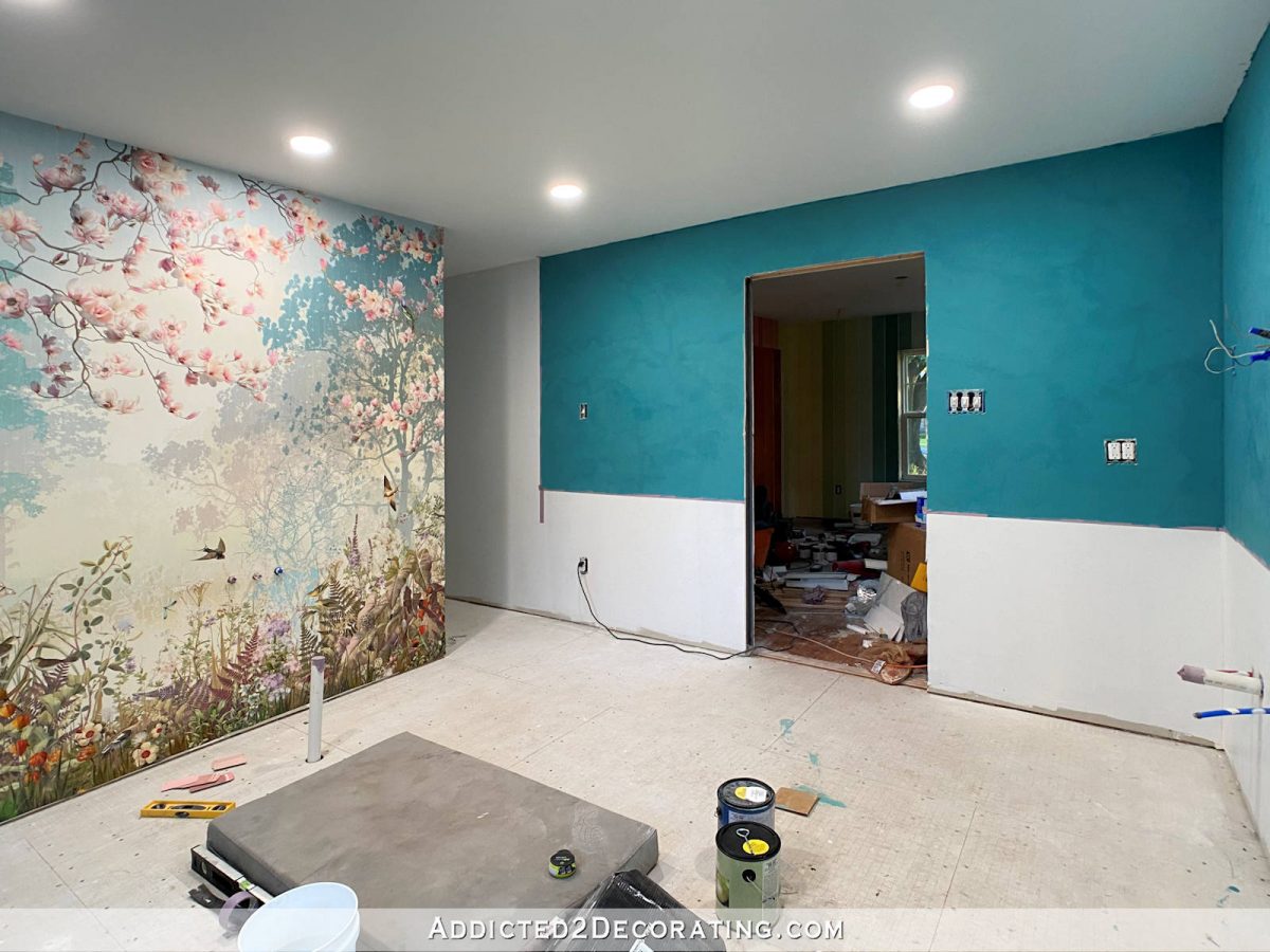
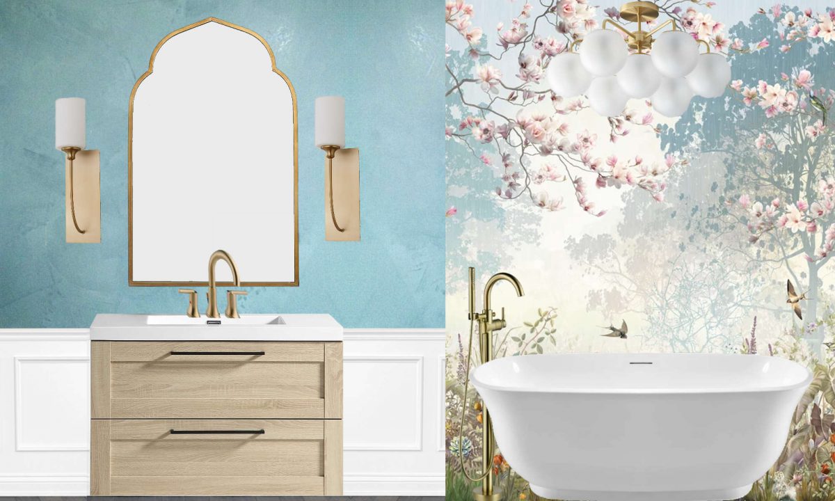
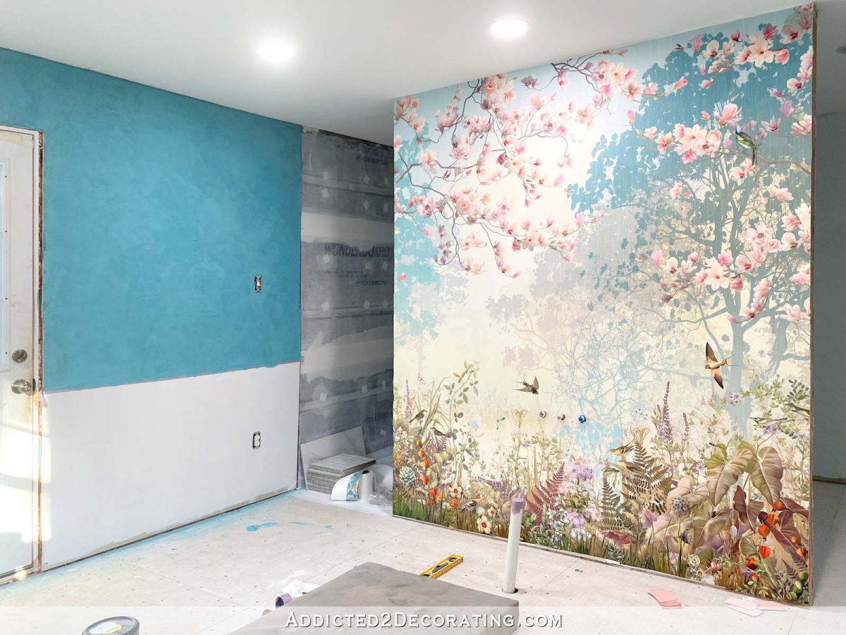
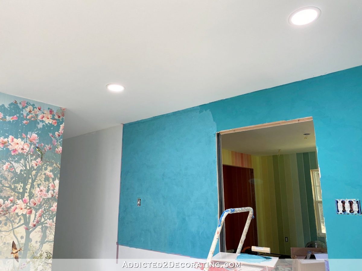
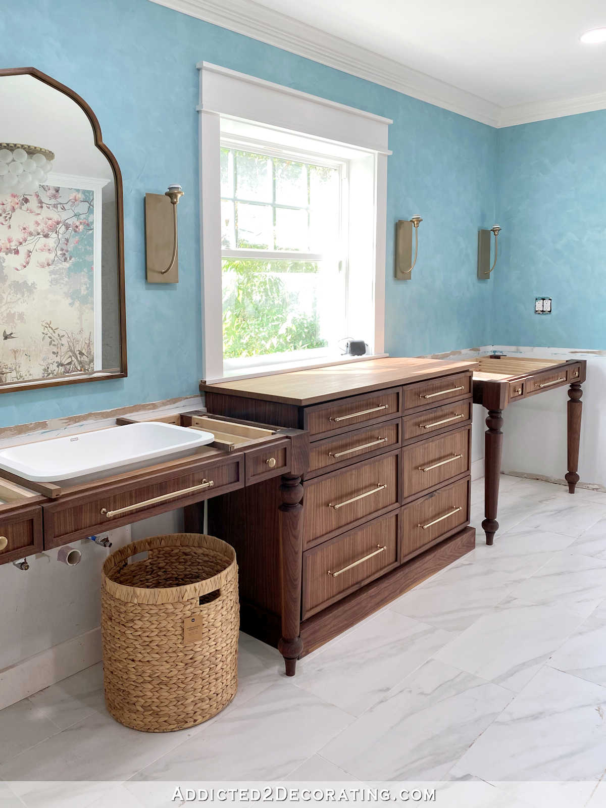
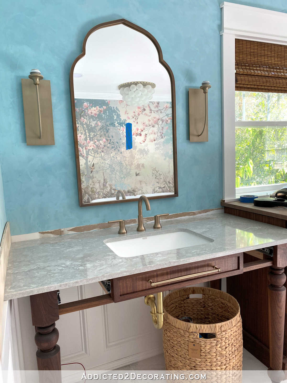
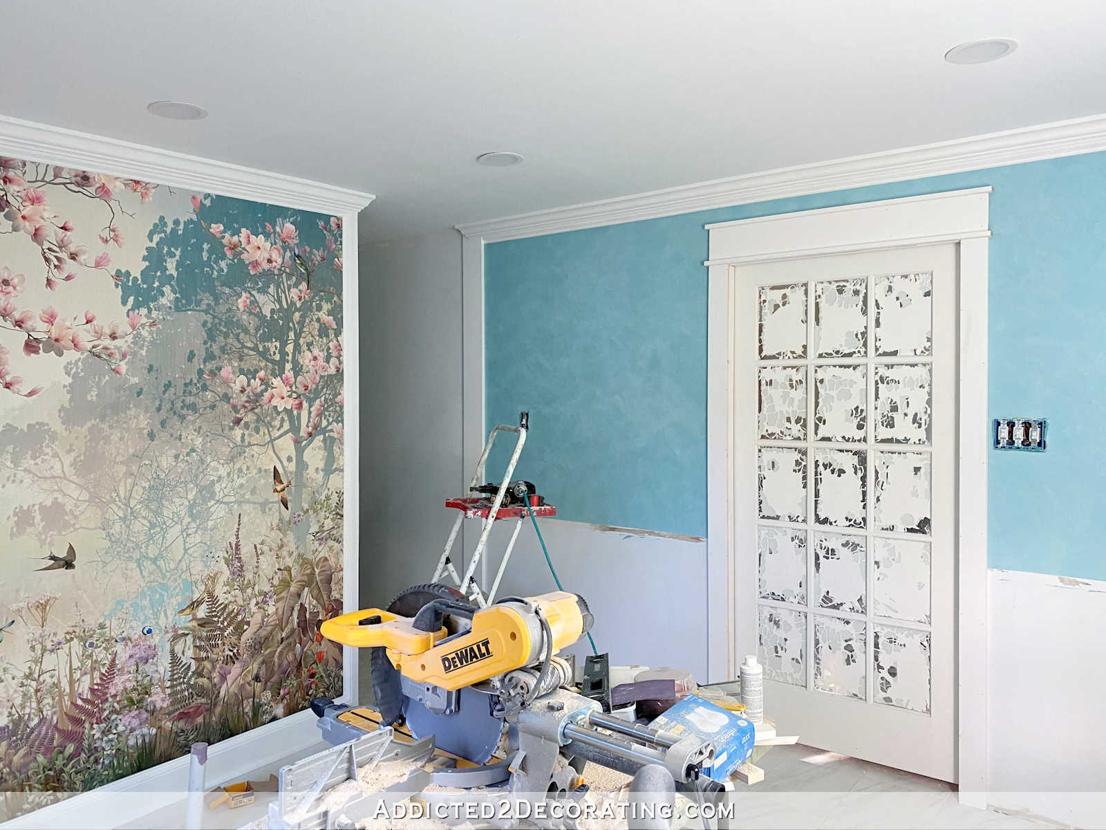
But after going back and looking at posts where I had shared my original plan for the bathroom, I decided to stick with lighter walls. I love that spa look that I created with the original mock ups of the bathroom, and I can’t get that look with the darker walls. So after two more coats, gradually getting lighter and lighter with each coat of the Venetian plaster finish, this is what my walls look like now…
It still has that velvety look, because that’s the nature of the Venetian plaster finish. But it’s considerably lighter now.
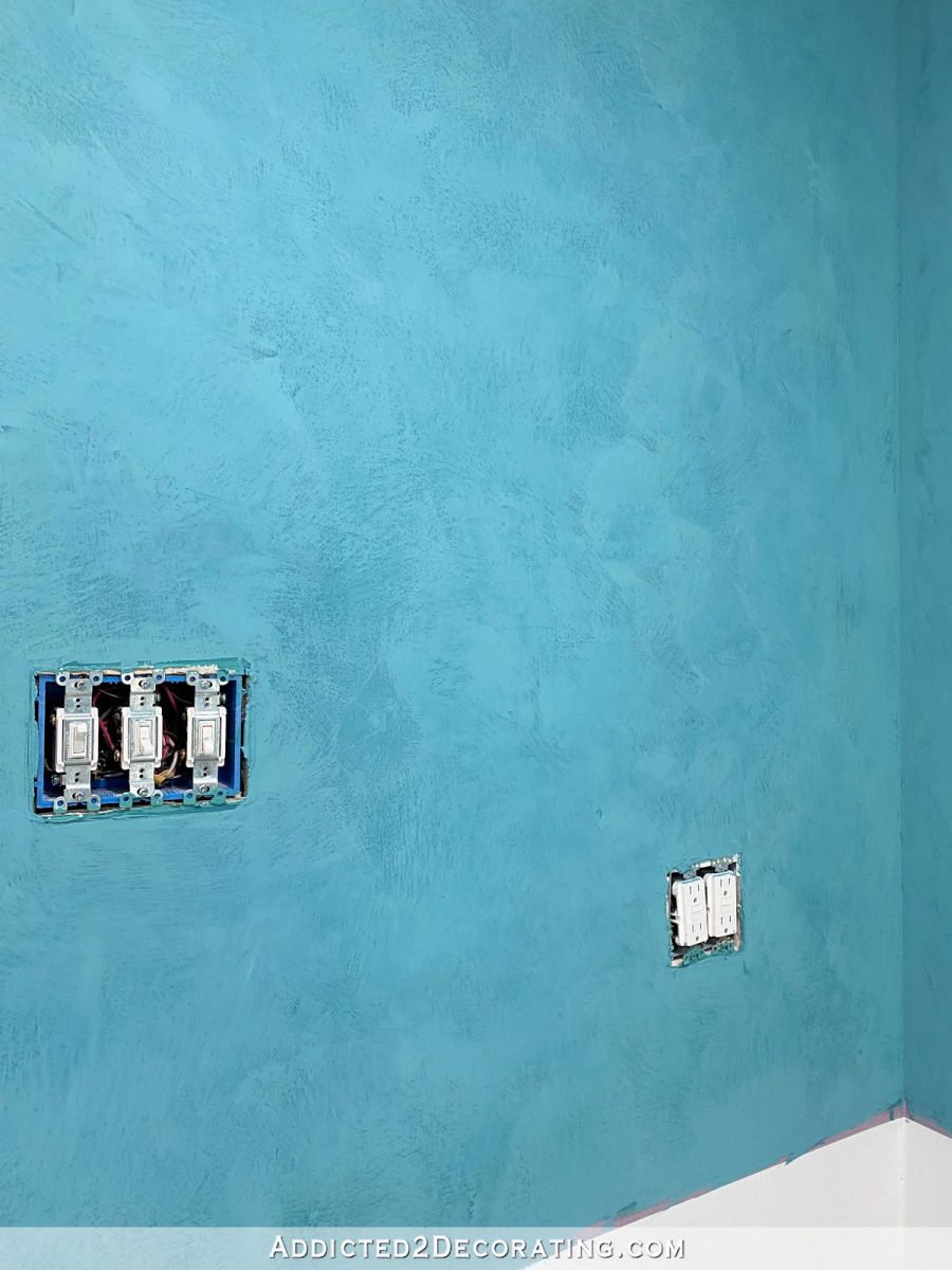
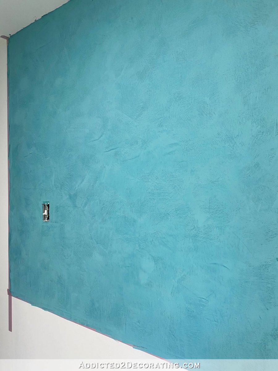
It’s still not quite as light and soft as I had originally planned, though. So that’s why I’m thinking I might do one more coat this weekend just to lighten it up one more time.
And each new layer adds such a beautiful depth to the finish. Even though it’s lighter, it looks much more velvety now than it did with just the first coat on it.
Note: If you’re reading this post on a website other than Addicted 2 Decorating, you’re on a website that steals content from bloggers, and is using my content without my permission. I’d love for you to join me on my actual website! You can click here to find this post on Addicted 2 Decorating.

So here’s the progression. I started with a coat of Behr Aqua Rapids, and then troweled on the Modern Masters Venetian plaster finish on top of that.

This is the product I used — Modern Masters Venetian Plaster in an ultra-deep tint base.
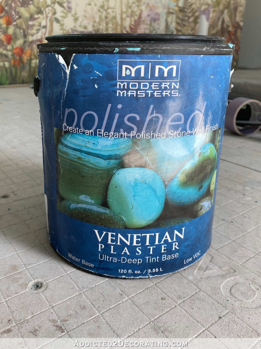
And this is the formula for the original dark teal…
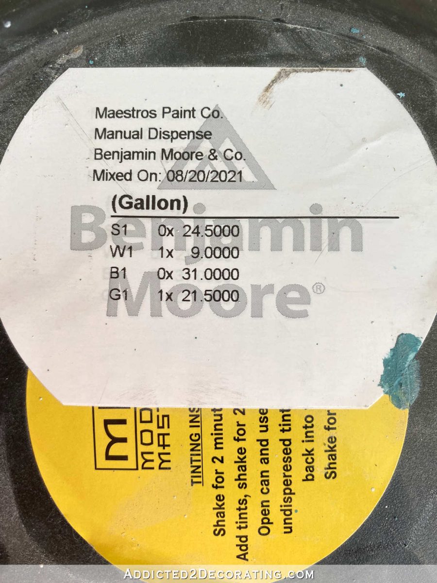
That first coat was pretty dark, and also had a lot of green in it.
That was much darker than I had intended it to be, but I seemed to have trouble communicating what I wanted with the girl working at Benjamin Moore that day. She kept telling me that they generally don’t tint this product because it’s used as a texture, and then you’re supposed to paint over the top with latex paint. That’s not at all what this product is, but I think she was thinking she was tinting it more like a tinted textured primer that doesn’t really need to be a precise color. When tinting primer, close enough is good enough. So that’s how I ended up with such a dark color to begin with.
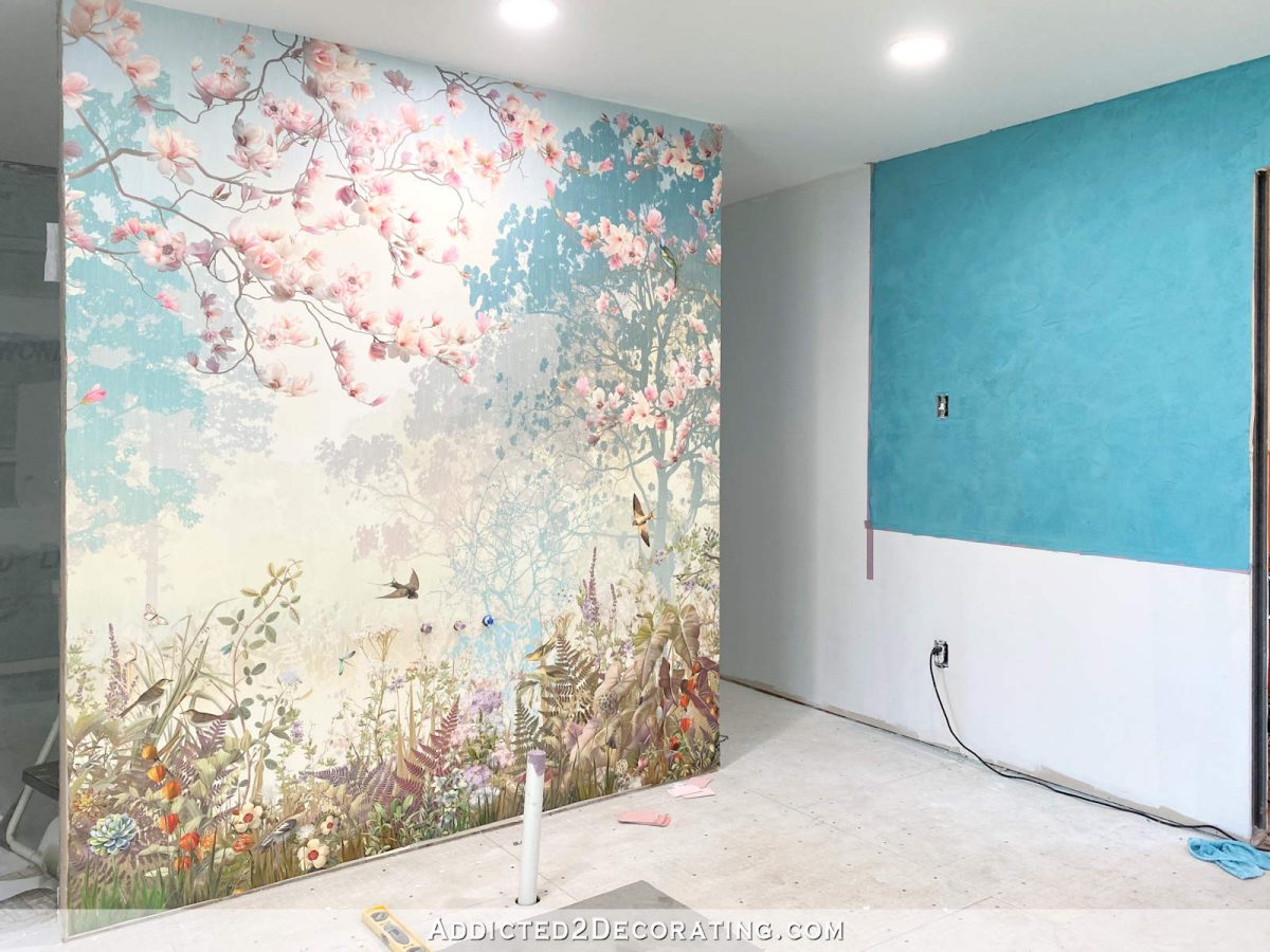
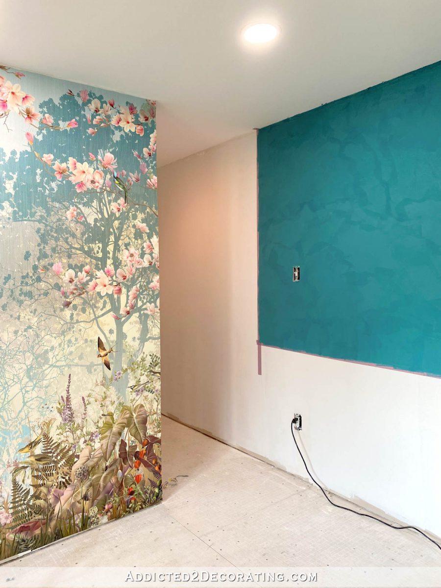
I wasn’t really concerned about it, because I knew I could build up layers and lighten any subsequent coats, and that a darker layer or two would add depth to the finished wall. She told me I could bring it in and she’d lighten it up for me if the color wasn’t right. But rather than doing that, I just bought another gallon of the Venetian plaster in a light base, had her add just a touch of gray to it (so that it looked like a dirty white rather than a stark white), and then did a second coat with that new mixture. You can see the difference between the wall to the left of the doorway, and the area above the doorway.
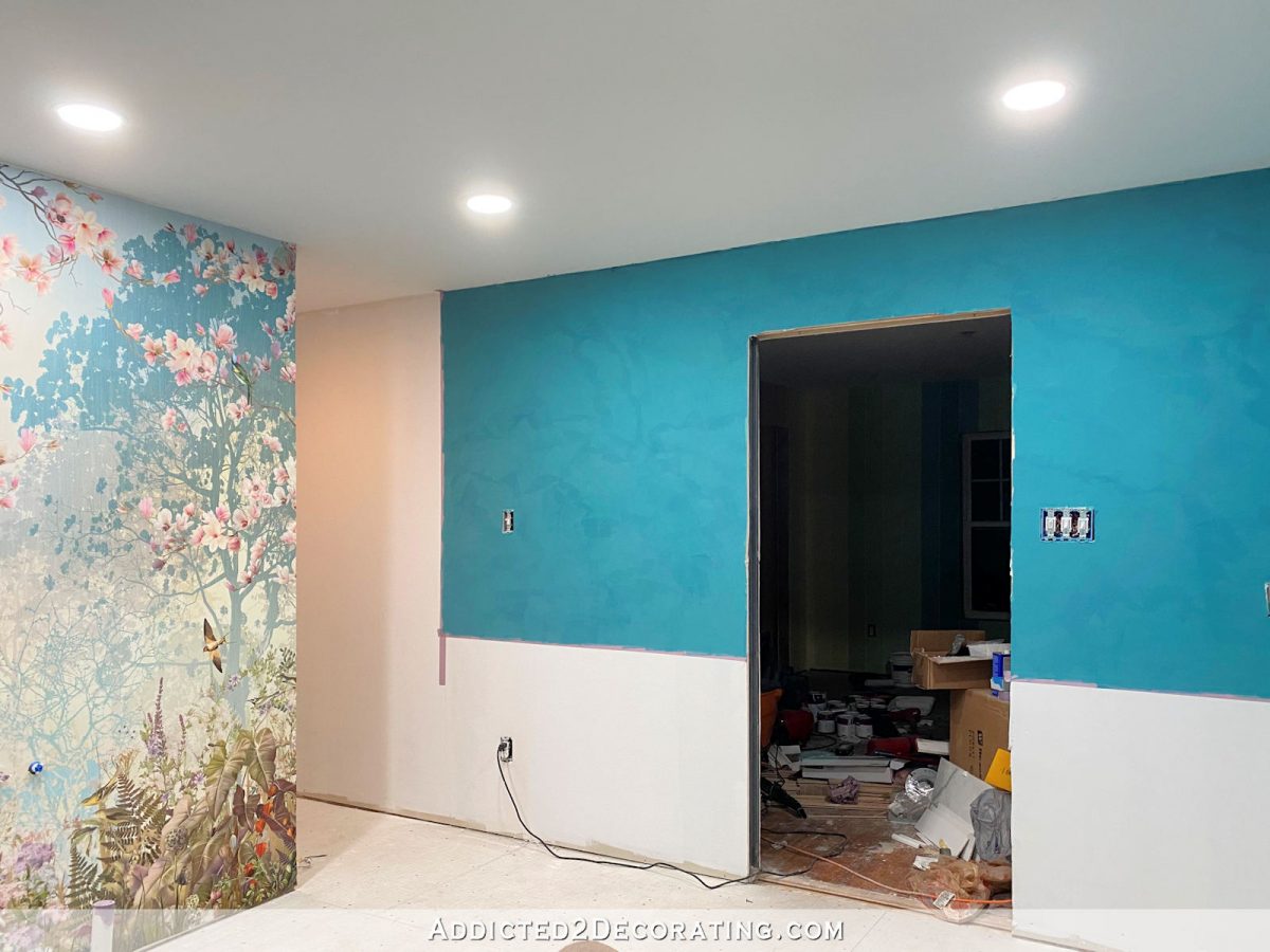
That was still not the right color, so I spent about 45 minutes sanding the wall by hand with 220-grit sandpaper just to remove any imperfections (the wall is supposed to have a smooth finish, not a textured finish). Sanding also brings out the “movement” in the finish. And then I lightened some of the plaster in the same way, and did a third coat. You can see the difference in the third coat (to the left of the door) and the second coat) to the right of the door) in the picture below…

And here’s what that third coat looked like when it dried…
DIY Venetian Plaster — The tools and the process
The process using Modern Masters Venetian Plaster (or any other similar finish like LusterStone) is time-consuming, and you’ll definitely get a good arm workout, but it’s really pretty simple.
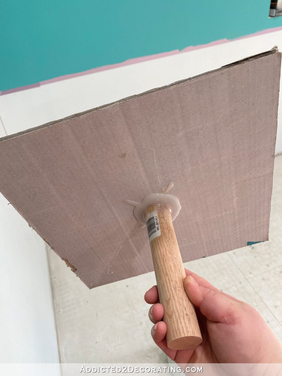
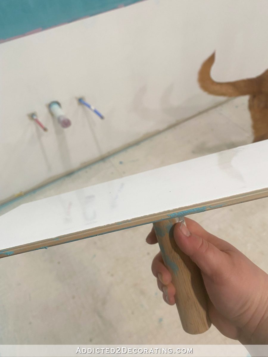
First, you’ll need a drywall hawk to scoop the plaster onto. You can purchase one from Home Depot, Lowes, or Amazon, and they look like this. But I didn’t want to make yet another trip to the store, so I made my own out of several layers of cardboard (the pieces that came out of the mosaic tile packages for the shower) hot glued together with a piece of dowel rod hot glued to the bottom. It worked just fine.
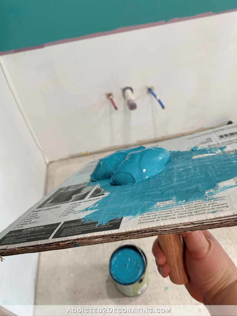
But that one only lasted for a day, and there was no way to wash off the dried plaster, so the next day I replaced the cardboard with an extra ceramic tile. This was heavier, but worked better because it was washable.
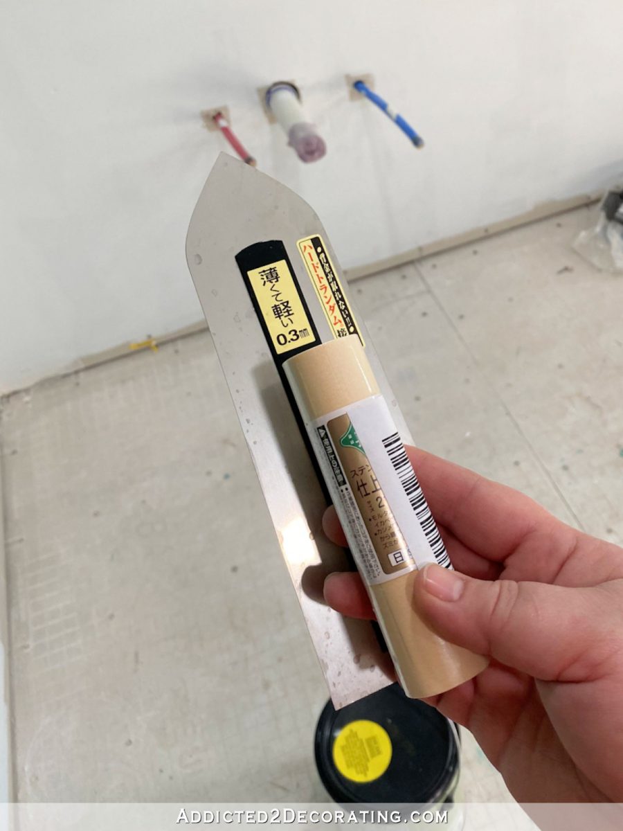
And then, of course, you need a trowel. I used this Japanese finishing trowel that I purchased on Amazon.
To apply the finish, I simply scooped some of the Venetian plaster finish off of the hawk onto the trowel…
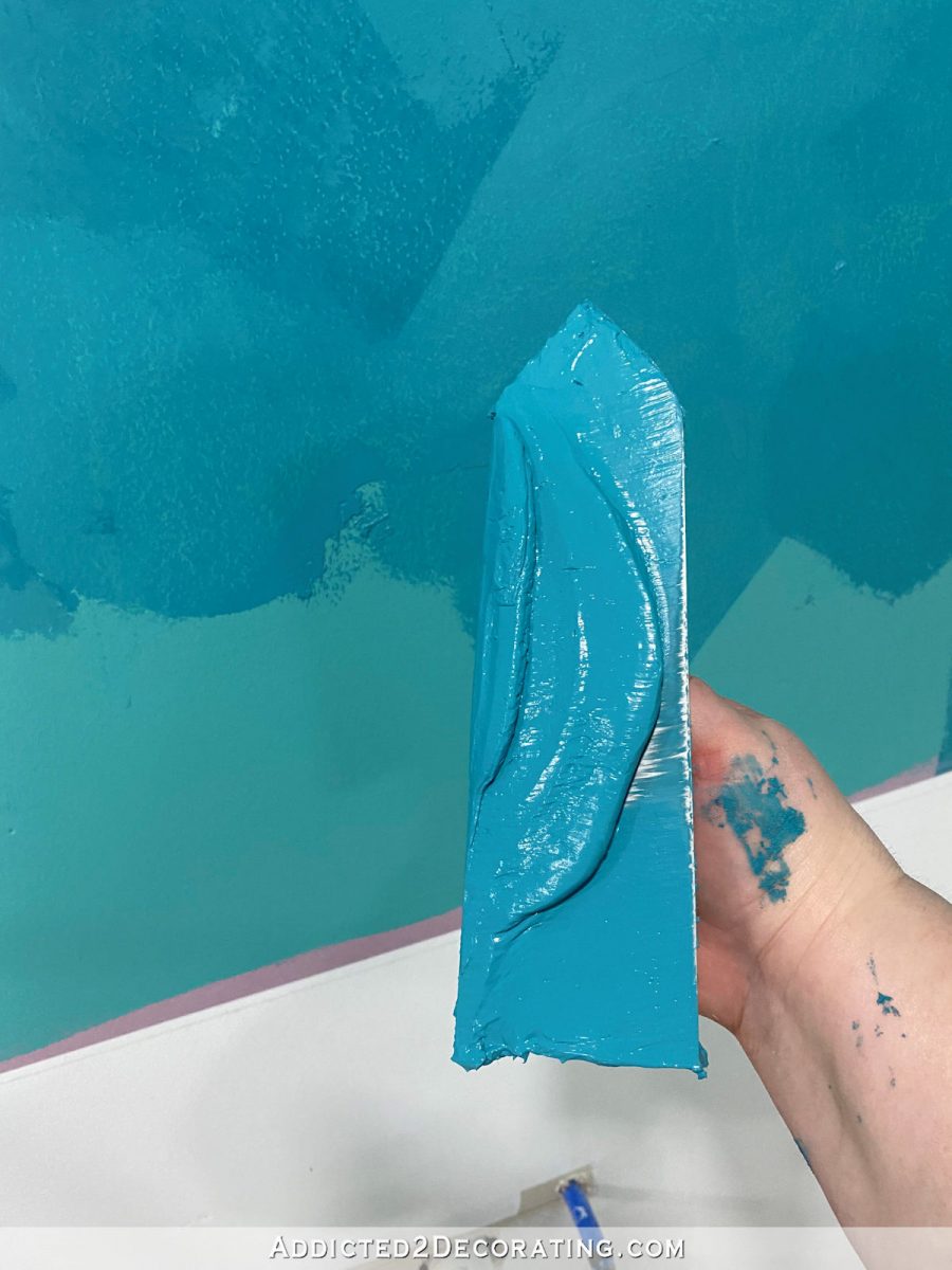
And then while holding the trowel at about a 15-degree angle to the wall…
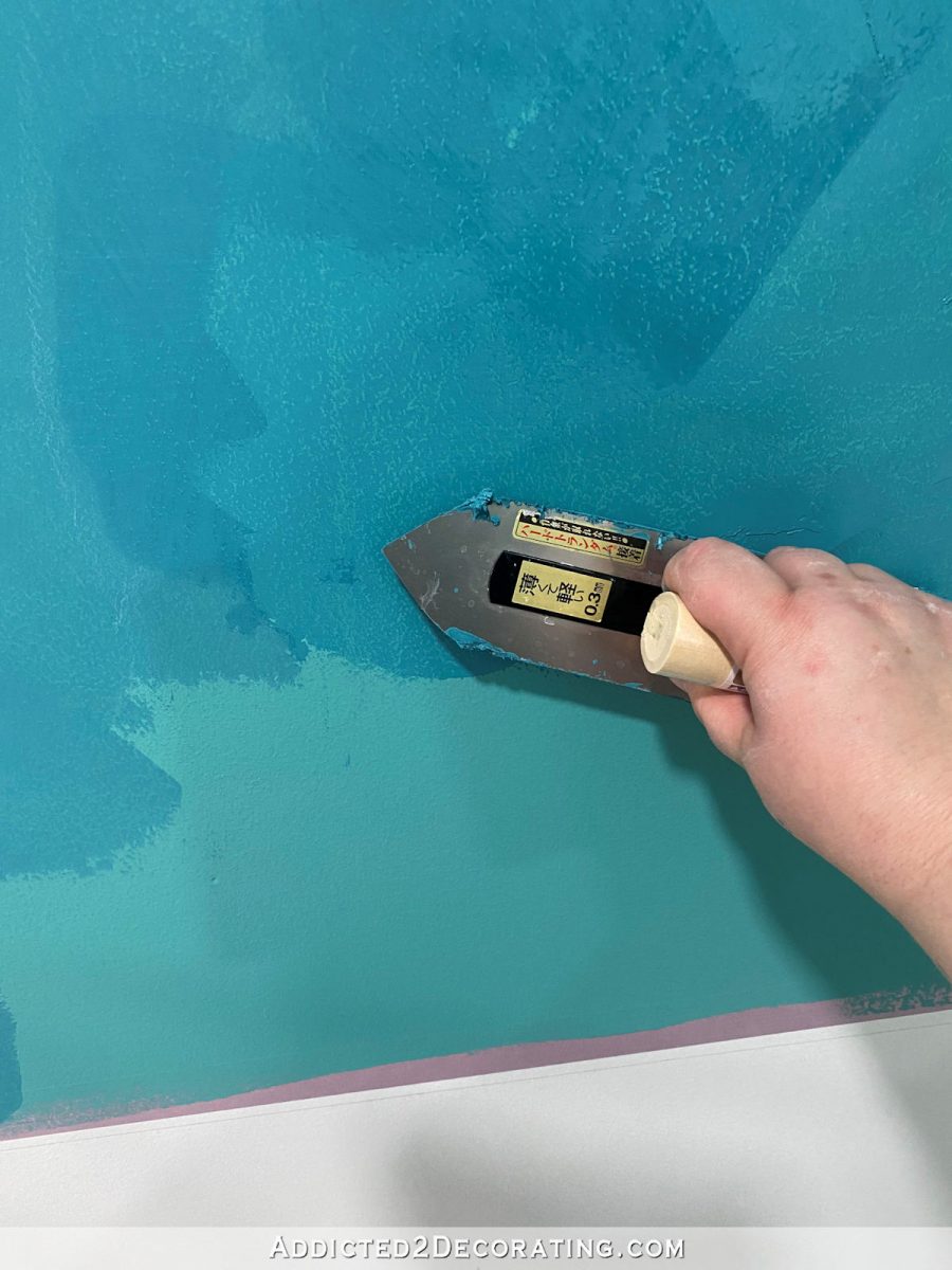
…, I smeared the finish onto the wall. Nothing about this needs to be neat or clean. In fact, the more random, the better.
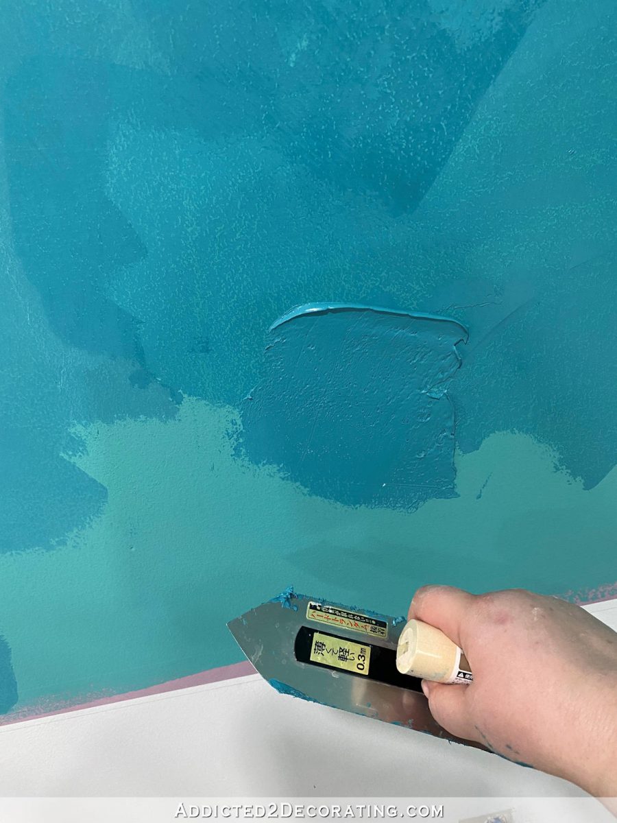
And then while holding the trowel at about a 45-degree angle to the wall so that the edge of the trowel is against the wall, I scraped off the excess.
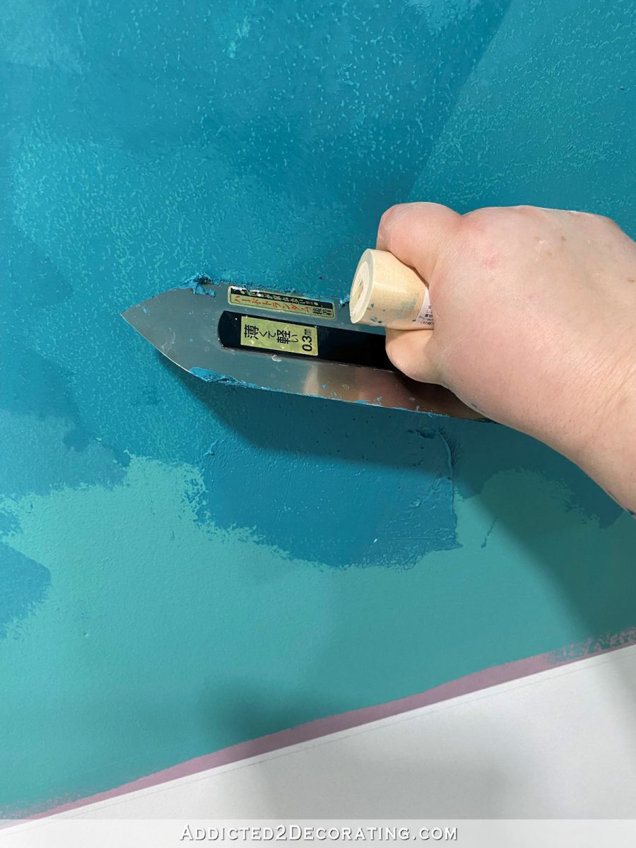
Again, the key here is randomness. Make sure you’re not smearing and scraping in the exact same direction or pattern over and over and over again. Make sure that you’re varying the application and your motions so that the finished wall has a more random pattern rather than a noticeably consistent pattern.
Also keep in mind that the finished wall is supposed to be smooth. The textured look comes from the layers, not from actual texture that you can feel on the walls. So you do actually want to scrape off the excess rather than intentionally leaving behind any build-up of the product on the walls. This isn’t like those highly textured drywall mud “plaster” walls that people used to do in the 90s that would snag your sweater if you brushed up against it. 😀
So once you repeat that process about 1000 times, you have the first coat done. And then you’ll want to repeat that process at least once more time. Even if you don’t plan to change colors between coat, it’s that second, and perhaps third, layer that creates all of that beautiful movement in the finished wall. You can’t get that with just one coat. If you have imperfections or build-up anywhere on the first coat, you’ll want to sand those by hand (NOT with an electric sander) with 220-grit sandpaper before doing the second coat.
But as for these walls, I think I might do one more coat to make them just a little lighter and softer. I think it’s a safer bet to stick with my original plan that I’ve been dreaming about for months now rather than changing things up on the fly.

Addicted 2 Decorating is where I share my DIY and decorating journey as I remodel and decorate the 1948 fixer upper that my husband, Matt, and I bought in 2013. Matt has M.S. and is unable to do physical work, so I do the majority of the work on the house by myself. You can learn more about me here.

Oh my goodness!!! That is soooo gorgeous!!! The movement showing up with the lighter layers is exceptional, and it really showcases that beautiful mural! I agree, another lightening layer will really add the final touch! Be careful of your neck with all that work.
I agree with every word Judy shared above! Hate that another coat is showing need, but knowing your wonderful perfectionistic nature and ability to persist until things are just right, it feels that the long term reward of colors in the hues you want will be the key that makes this room absolutely cohesive with not a speck of disharmony or boredom – ALL BEAUTIFUL!!
Just gorgeous!!
Lighter is a much better match to mural and just as stunning as the darker that you liked! Love it!
It is best to stick with the well thought out plan. It is lovely. Have you posted a link anywhere to the mural, it is so full of color yet isn’t “in your face”
The plastered walls are lovely, but the color still looks “off” on my screen.
The mock-up color is almost spot on. The actual plaster color seems to lean to “teal” where the mock up color is a different blue.
I’m certain standing there and seeing it in person the colors are not so different.
I would do the walls in the same colors as the mock-up, but make them even lighter. It will make the mural sing!
I too agree the lighter is so much better. Love it.
So to be sure I really understand you. You lightened the original mixture with the light gray? Then you lightened it a 2nd time with the light gray?
She didn’t really add enough color to the gallon of Venetian plaster to make it an actual gray. She added just enough to make the color go from a bright white to what I would call a dirty white. But it was still very much in the white category, and didn’t appear gray. But yes, I used that dirty white to lighten the original color. I actually ended up doing that three times.
I do indeed love the lighter color. It is getting closer to your mock up which I LOVE, LOVE, LOVE! It almost seems as if the mock up has a silverness to it that is missing in your wall color. Maybe instead of going lighter add a silver wash ? Either why I am enjoying watching you work your magic and inspiring me. Thank you.
This is perfectly beautiful! Thanks for sharing all your information.
This sounds really interesting. Do you have a video to show the process?
Not yet, but I hope to have a short video to post on Instagram soon.
Just plain “drop dead gorgeous.” Breathtaking. 🥰🥰🥰
I think the lighter look is much better. Love it!!
Needs more gray in the color. At least on my computer screen (they are all different, I know).
I fell in love with the original much lighter sample…. These darker colors make the walls look too “heavy” for that amazing wall paper….
I just love it!! ***MIC DROP***
I think that’s stunning. In my opinion, if you lighten it up much more, it’s gonna look washed out. JMHO
It is beautiful.
I’ve plastered my entire house 3 times. You need at least 2 more coats of the plaster to get the best finish, maybe more depending on how thick your first 2 coats were and how textured your walls were. Those spots coming through are texture from your wall or texture from your trowel. When you burnish the wall they will show through, making lots of dotting and skipping, less waves and more blotchy. The thicker your first 2 coats were and the more skim coats you do, the better the wall will look after it’s burnished. Modern has a nice top coat if you want to forgo the top coat burnishing but it will have much less movement. The more skim coats, the more movement your walls will have, the better the finish. My best walls have 2 thick coats (I had texture to cover) and about 4 skim coats. I would also take your trowel and do a minor burnishing between your skim coats to make sure you knock down any high spots or lines because they will show through the final coat like polka dots and skips and they are hard to sand at the end. It’s much easier to see them between coats so you can recoat and compensate for the higher spots, if that makes sense.
Plaster is deceiving, it looks all nice and smooth until you burnish and then you see all the marks clearly. And if you have to recoat because of a sand through or a line you don’t like, you have to do the entire wall because you will see the lines of patched areas. Depending on how it was mixed in the can, each coat can be a different color, lighter as you get to the bottom of a can. If you need to open another can that will be darker than the bottom of your last can. You can feather repairs in but it’s tricky since you cant see the real finish until you sand, then burnish and top coat.
I would have loved to have seen the walls “continue” the mural with “sky” blue. That being said, I’ve never seen any of your completed work that I didn’t love.
OMG I love the lighter color. Blend so well with the mural now.
I loved the dark first coat but agree that the lighter one now compliments the (fantastic) mural much better – and still is very very beautiful! Thanks for explaining the process. I did this twice in bathrooms in my student days (weird that it is often a choice for bathrooms) but didn’t know about creating depth by layers. Thanks for that info! My SO just walked past my screen and was interested in the look – his comment: that would be nice for our bathroom 😉
to explain: he didn’t know then that this is IN your bathroom, I only explained it to him after his comment….
I love the lighter color, and I thinks it looks wonderful with the mural. Even lighter might be even better! I also love the look, but I always thought that would had a roughness to the finish. How can it be smooth with just highlights? I think we all need a tutorial! This room is going to be spectacular!
It’s totally smooth. It almost has a slick feel to it.
YES!!! SPA is the keyword!!! The mural
is the key jumping off point of peace and tranquility! The lighter walls will continue that purpose! You go, Girl! So strong and full of determination!!! You get things DONE! 🤗
Love it just the way it is. I don’t think you need to lighten it up too much more, if any. My opinion, of course.
Ahhhh…..much better!
Beautiful! But I totally agree, go with your original vision!
Oh yes, do whatever it takes to bring it up to your original vision. It’s going to be spectacular!
It’s beautiful, Kristi! I agree that the lighter color looks better. So fun to see it all coming together!
The lighter color is So Much Better with the Gorgeous mural, IMHO. A final layer to soften and lighten will be Perfect. Love This! As usual. =D
Soooo beautiful! This is going to be such a dreamy bathroom!
We’ve bought a house but can’t move in until the current tenant’s lease is up, so I’m doing a lot of thinking about what I want to do. Going to have to try this look in a room! The smallest bedroom is going to be my “woman cave” (for lack of a better phrase) and I am going to go full on girly girl in there. Floral curtains, maybe a mural (so, so, so love yours!), and possibly this Venetial plaster treatment in a soft color on the others walls. Swoon!
as much as Kristi loves pink, I almost expected her use that color in the plaster. if you get the same mural, maybe you should go pink. I would love to see that too.
Looks wonderful, but it looks like a lot of work! I see that Felicity and Doggie are keeping you company.
It’s looking beautiful, and I think lighter is the way to go!
Do you think this is possible to apply to a ceiling (without being a nightmare mess?!)?
I’m sure it’s possible, but there’s no way I’d ever take on that project, and I’m pretty adventurous when it comes to what I’m willing to take on. I just can’t imagine all of that work with a trowel over my head for hours and hours.