What I’ve Learned From My Viral Facebook Post
I had an unexpected thing happen on Facebook a few days ago. Some of you may not know that I have an Addicted 2 Decorating Facebook page where I mostly just share my latest blog posts, but I also try to add a few additional posts throughout the week. It may be a throwback to an old project, a random picture of a room in our home, or something else. (You can find me here if you want to follow along.)
In the past few years, I haven’t spent a whole lot of time on Facebook, mostly because I just don’t have the time, and the payoff for spending time on that Facebook page hasn’t been very high. I do read all of the comments and make it a point to interact with regular readers, especially if they ask questions. I do my best to answer all questions that people have, whether it’s here on the blog, on Facebook, or on Instagram. I probably don’t catch 100% of them, but I do try my best.
So about two weeks ago, I posted this picture, and asked, “Who did it better, me or ChatGPT?😀” with an explanation that the top is how I actually decorated our living room, and the bottom is how ChatGPT “decorated” my living room.
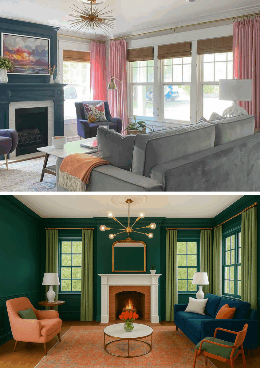
Most people preferred mine. A few preferred the ChatGPT version. A couple of people didn’t like either one. No big deal. It was just a fun, meaningless post.
But one comment caught my attention because the woman said she didn’t like my version of the living room because it wasn’t “cohesive”. I thought, wait. You can say a lot of things about my house. I get that my colors aren’t for everyone. I tend towards colors that most people would be afraid of in their homes (or so I thought), and I get that. But, not cohesive? I definitely think the colors in our house are cohesive. I’ve worked really hard to make them cohesive.
And then I realized that she was seeing (for the first time) one picture of one room from one angle, and that’s it. She probably just randomly happened upon that post in her Facebook feed and has never seen any other part of our house. That one photo is all she’s ever seen. And from that angle, you can’t really see the details of that room that I think make it cohesive.
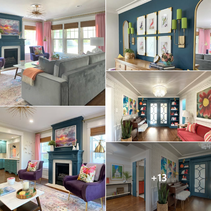
So I put together another post, and this time I included 17 pictures of various rooms in our home. The post looks like this on a Facebook feed, and of course on Facebook, you can click on a picture and then click through all 17 pictures to see them much larger.
The point of the post wasn’t that everyone MUST love my hous😂 I really do understand that many people wouldn’t want these colors in their home. People aren’t required to like my house.
The whole point of the post was that sometimes you have to see a room from various angles, and in the larger context of the rest of the house, to see that it is cohesive. That’s it. That was my only point. And when seen from various angles, and in the larger context, I still contend that our house is very cohesive, even if I’ve decorated our home in colors that you abhor.
Well, my goodness, I had no idea that that post would take on a life of its own. It has been YEARS since I’ve had anything go close to “viral” on Facebook (and really, things don’t go “viral” today like they did a decade ago, so that’s probably not even a good word to use), but this post grew legs and ran. As of this morning, it had been viewed 1,457,545 times. It had received 13,698 reactions, comments, and shares. And it had gotten 249,619 clicks. Keeping up with all of the comments (again, because I like to at least try to answer as many questions as possible, which requires me to read through the comments) has felt like a full-time job in itself.
Here are the 17 photos that I shared in that post. If you’re a regular reader, you’ll see that I included photos from before I started our master bedroom suite remodel. You can see the actual post on Facebook here.


The main thing that shocked me about the response to that post was that the comments are overwhelmingly positive. I’d say about 99.9% of the comments were people expressing their love of what I had done in our home. That genuinely shocked me. I mean, we have lived through a decade of neutral farmhouse style dominating every medium imaginable, from TV to Instagram to magazines and more. I expected the response to our house to be at least 50/50 likes and dislikes. But that was not the case at all.
I was also very shocked that the overwhelming majority of comments were from people who liked my specific color palette that I used in our house. I mean, it’s one thing to like color in general, but it’s something altogether different to like the very specific color palette that I’ve used in our house. Again, I genuinely never would have expected it to appeal to such a large swath of people.
But do you know what that tells me? I think that people are color starved. And it’s obvious from reading through all of those comments. People are literally color starved. We’ve had all of these neutral interiors shoved at us for so long now, combined with the fact that so many people are simply afraid of adding color to their homes in fear of messing up, or ending up with a clown house, or fearing what a future buying might think, or dreading a day long in the future when they might have to actually repaint something, that they’ve just surrounded themselves with neutrals.
Some people genuinely love a neutral surrounding, and I totally get that. I do not doubt for one second that there are actually people who need completely neutral surroundings in their home. And I definitely understand that there are people who can appreciate photos of a home from a color lover like me, but who would feel nothing but anxiety all day every day if they actually had to live in my home. We’re all different. We’re all wired differently. Those different personalities and different temperaments require different surroundings to make us feel calm, peaceful, safe, and relaxed.
But I am 100% convinced that there are way too many people out there who have convinced themselves that they are “neutral” people when they’re not. For those people, that decision to surround themselves with nothing but neutral colors isn’t driven by a genuine internal need for calmness. It’s driven by fear. And that makes me sad.
Color is life, y’all! That’s why nature is FILLED with it! And when you bring color into your home, you breathe life into it. It doesn’t have to be flooded with color like my home is. And you certainly don’t have to decorate with the colors I’ve chosen. The colors I’ve used speak to me. Those colors that speak to me may be repellant to you. But I remain convinced that, with very few exceptions (and I do realize there are exceptions), most people have actual non-neutral colors that speak to them. Colors that they see, and that make them feel like they just want to drink it in. Those colors that make you feel that way should fill your home. Those are the colors you should be surrounding yourself with. Those are the colors that you should come home to at the end of a long day at work. Those are the colors that should fill that sanctuary called “home” — that respite that we all need from a crazy and chaotic world outside of those protective walls.
Decorating your home is about so much more than just filling it with the latest trends and the latest “color of the year.” That’s no way to decorate a home. While the whole neutral farmhouse trend was raging on for the last decade, I’ve been over here in my own home doing my own thing. And regardless of trends, regardless of what colors are deemed “popular” from one year to the next, I’ve ignored all of that, and I’ve created a home that makes me want to breathe it in every time I walk through the door.
I wish everyone had that. I want that for everyone. But that takes courage, and it requires putting away that fear. Find those colors that do that for you and fill your home with those. I promise you, it’s more than just decorating. It’s more than just making things pretty. It goes far beyond that in ways that probably even the most brilliant scientists, brain specialists, or psychologists can’t even fully explain. But just trust me on this. Do it, and you’ll see for yourself just how quality-of-life-changing it can be.
It starts with finding your colors. Not my colors. Not the “color of the year” from Benjamin Moore or Sherwin Williams. Not the colors that Southern Living or Architectural Digest tell you are the “it” colors for the year. But your colors. That color you’ve been drawn to all of your life. That color that you see, and you just want more of it. That color that makes you want to drink it in. That’s your color. Find it, go with it, and fill your home with it. Don’t worry about what others think about it. They don’t live there. Your home is for you.

Addicted 2 Decorating is where I share my DIY and decorating journey as I remodel and decorate the 1948 fixer upper that my husband, Matt, and I bought in 2013. Matt has M.S. and is unable to do physical work, so I do the majority of the work on the house by myself. You can learn more about me here.

This is the most amazing home decorating advice I’ve ever seen. It should be obvious, but it isn’t, because everyone is telling us what we should want all the time. “That color you’ve been drawn to all of your life. That color that you see, and you just want more of. That color that makes you want to drink it in. That’s your color. Find it, go with it, and fill your home with it. Don’t worry about what others think about it.” ❤️
YES! I SO agree with this! My walls are all drenched in creamy white, but I’m busy furnishing the rooms with bright, exciting colors. Your blog provides amazing inspiration. Thank you!
You’ll notice that most of my walls are neutral as well. I think that allows all of the colors to SHINE. People seem to look past the neutral walls and just see the colors, which is just what I had hoped.
Hi Kristi: GREAT ADVICE!!! My family has a long-term family friend who is an interior decorator that have been featured in numerous national publications, multiple times. She also used to teach Interior Decorating and I have attended one of her full courses and been to a few of the multi-million dollar homes, she has decorated. She has always said, your walls should predominantly be a back-drop, with your window treatments, art, rugs and accessories being the (color) stars. She loves color and says the walls don’t have to be neutral colored, they just don’t need to be the standout in all of the rooms in your home so she uses complimentary colors like the Billowy Breeze you used. With that said, one of the homes she decorated was a new home and it was done with VERY bright colors. Instead of the builder colored walls, it was painted these bright colors as the initial colors and she said when the paint was delivered, the painters thought that it was going to look like a circus. But after they saw the final product, they loved it. It was one of the most beautifully decorated homes, I have ever seen! Traditional Southern decor but with A LOT of color and pattern. Your closet has a similar flair. Thank you sharing your colorful and creative journey and teaching so many of us DIY skills and color possibilities!! P.S. To me your home definitely looks cohesive without looking like the same/very similar rendition in every room.
Very well said! I’ve done a variety of design work and often got comments from people that they loved it, but never felt they could “pull it off” and it is sad. Any fear that keeps anyone from truely expressing themselves is really frustating to watch, lol.
Amen!
Our house is peridot chartreuse, fuchsia, navy, russian blue, reds, ,black, and neutrals. Unique is the word I hear most. Never thought I would have fuchsia in my house until my hubby pointed at an eggplant colored print he liked and it snowballed from there. I love the elegant look of the neutral palette in magazines, but when we walk into our home we smile and are happy to be back.
I’d love to see your house! The colors sound wonderful together!
I’d love to see it too…they are some favorite colors for me as well…have very few right now. I sometimes pick a picture/artwork I LOVE, and decorate around it…hence my Chartreuse powder room with lots of other colors that was in the water/tropical fish print I liked…I’m in Florida. 😂 I made it work from towels to accessories, and only now I have to make it beige as we are selling this house. Watch out world…Kristi is influencing all of us!, and giving us the courage to enjoy the colors that we love. Eggplant! A Favorite color!
I think your post generated so many “ clicks” because it is a reflection of real-life people, loving their home. The common sense advice you gave is what folks are dying to hear! Thank you… ( from a long-time follower) 💕
My mother-in-law would always say she’s using Earth tones. It drove me nuts! I wanted to say dirt tones, but the Earth is so colorful, nature puts purple, blue,orange and green all together! I love the way mono tines looks in other houses but I am learning ,alot from you, color makes me happy.. and I don’t care if it makes anyone else happy because I live here! So thank you and your amazingly colorful house!
I totally agree! We went sofa shopping a couple of weeks ago. We want either a red or bright green sofa. We would have been in luck if we had wanted a gray/beige/camel/tan/off white sofa or black. While we came across a couple that were okay, we are still searching for “the one”. I think we’ll have to order it. I hope furniture companies start to see this change.
We need color.
Preach on Sister. I love your colors and I’d love to brighten up my house with color and wallpaper. But I can only do that in my mind now. We are pretty brown and neutral. Fear is a good emotion that holds me back. Fear my husband would walk out the door or have me committed! No really, but fear all the same. I even have a white car and he has a grey truck………..neutral.
I’ve tried to think which of your rooms is just to much color, but I love them all. I certainly could easily live in your house. We peopl who feel like we know you, love you. Your blog brightens our day. Have a good one.
I love color but am married to a neutral lover. We have worked to find a happy medium in most of our rooms. Our rooms are mostly neutral walls but color splashes from furniture, art and plants. If it’s your home and you like it, go for it! ❤️
I am soooo sick of gray and white in an entire house. We are considering downsizing and I intend to tell the realtor not to even think of showing me any house that’s all gray!! It’s dreary, boring and depressing to me. I blame a certain decorator on a certain tv show for the gray/white/farmhouse decorating trend. NO THANKS, I’ll always choose beautiful colors!
A good word of encouragement. Gives me things to think about. Thanks Kristi.
I stumbled across your blog from a post you shared about your chandelier made from wooden tasting spoons (which I adore, by the way), and I think what you said about people being color-starved is so spot-on. We’ve been greiged and neutraled to death – not just in our homes, but in our business, yards, and even our cars. Give me a riot of colorful chaos in an overrun garden instead of a manicured lawn, or the fun pastel car colors and appliances of the ’50s and ’60s, any day.
Looking forward to checking out more of your content—thanks for the inspiration!
Can you believe the car makers hardly make more than 5 colors anymore. I bought a ew car two years ago…silver was all I could get…😒 I love some of the Toyota Prius colors but they don’t make them in the bigger cars…We need to let them all know…color matters to us!
Exactly! My car is red — and I can ALWAYS find it in a huge parking lot!
AMEN! And again, I say, AMEN!!!
I really like this, and in theory I do agree. However, I have to say that I think many people (myself definitely included) lack the innate talent to intuitively put together color and pattern to achieve a look that they love and that reflects their taste and style. I truly think it is something you either have a knack for or you don’t – like math, or music – you can improve your proficiency through practice but for the most part you’ve either got it or you don’t.
I enjoy color and beautiful surroundings but I struggle to create that in my home. I go with safer, neutral choices because over the years I’ve realized that I’m not that good at choosing something that will ultimately look like I want, and I don’t really have the time, budget, and patience to redo things until I get it right But this does give me a bit to think about and maybe its time to try choosing more of what I love (blue! always blue!) and less of what feels safe. Thanks for the food for thought!
I LOVE decorating with color. I love color in every room. And I love adding in new colors whenever it is time to redecorate a room (which is approx every seven years for me).
Your color palette is fabulous. You keep doing what you love!!
Big color lover here – that’s why I follow you!
For those looking how to incorporate more color into their homes, take a look at your clothing, shoes and bags — that will likely give you a jumping off point!
Unless you’re a nurse and wore white for most of your working life! Blue or green scrubs are just as bad! LOL
But scrubs are the perfect lounge wear so I head to online uniform shops and get crazy when tops go on sale! I do solid color knit capris and skorts. ALL my tops are very wild, multicolor prints. 1. Can wear different bottoms and 2. Hides all food choices from my tremors!
I make a habit of reading your Facebook page and I really liked the post you’re referring to. All your photos showed very well and cohesive to me. I don’t care for your particular color pallet but I enjoy watching your designs so much. I don’t choose Teal or blues or pink, but gold, yellows, orange, fall colors are my jam. No neutrals for me. That is what I like most about you, your use of COLOR!
Pinks, purples, and turquoise. And a little bit of orange/coral. Those are my colors. I’m in my “last house” and I feel a little sorry for my niece when the time comes to sell it to settle my estate, but not sorry enough to live in a beige or grey house. I’m especially thrilled with my pink kitchen cabinet project, currently being done, and my REALLY pink dressing room/closet. I’ve used a deep Capri blue (rich turquoise, the color of the water in the Blue Grotto) in several areas and I smile every time I glimpse it. My bedroom and bathroom haven’t told me their colors yet, but I can guarantee, there will be COLORS.
I follow your Facebook page as well as a maximalist group, just for the color inspirations. Some are so crazy and joyful to see.
Kristi, one thing I have discovered in myself, regarding the psychology of color, is that a well-done cohesive colorful room is both calming AND energizing. Whereas a well-done neutral scheme is just “calm.” I have a high stress job, and I come home so wound up. My body is begging for relaxation. I want some calming music, a clean house, and a decorating scheme that calms me down. At first glance, a neutral room will accomplish that.
But I have been in some fabulous hotel rooms that are immersed with color that have the same effect. I was recently in Auburn University’s “The Graduate” hotel (a Hilton chain), which was heavily decorated in a complimentary scheme of blues and oranges. I wish I could share pictures, because it was done so, so well. That room, with all its color, evoked “HAPPY” in such a classy way. But it was also incredibly calming because of the color harmony. Obviously the designer is very skilled and every element of the room was very intentional to pull this effect off with such bold colors.
We love your home because you have that same skill – to evoke happiness, energy, but also calm (opposite of chaos) with your color and furniture choices. I wish you could describe that skill, which I presume you possess intuitively, into an instructional series, which I would gladly pay for. It is so so hard to nail all the tenants of interior design – contrast, texture, color harmony (which requires its own dedicated expertise), dominant/subordinant elements, etc. You seem to do it so effortlessly!
So many of us enjoy your work because of your incredible skill. It feels easier/safer to decorate in neutrals, but I think we all want more color – if only it weren’t so hard to pull off!
Life is short, color on. Scientists tell us that there are 10 million colors in the world today, and I say bring it on. How boring it must be to live in a conference room of dullness. Many have to work in places like that for half their days, why bring that home with you. My formal dining room is a very rich red, and I have my collections of Imari and Chinese blue & white porcelain in there with very good artwork. That room truly expresses the oriental feel that is carried through the house. We were military and traveled the world for 27 years and 16 moves. Every room in our home shows you something of our travels. Our 2-story foyer is painted in “Melted Butter”…it’s always about food with me. The list goes on and on, I have not left color out of any room. Perhaps because for 16 houses, I had to live with boring off-white walls, and all I had to do to add color was the furnishings and artwork. Never be afraid of color, there is no right or wrong, just what you love. So, open up that box of crayons and get on with it. Thanks for being our color inspiration Kristi, keep on doing that very colorful you.
Cheers to you and Matt!
Well said!
Sheila F.
Amen, sister!! Thanks for the recap of your rooms and congratulations on the viral Facebook post. I hope it will bring you more blog readers. I’ve followed you for years so I know what your home looks like and that it’s cohesive but I don’t think I’ve really thought about it since your first home tour video years back.
I love pretty much the same colors as you and my sister’s favorite color is probably the equivalent of Benjamin Moore Chantilly Lace. It took me a few years to convince her to add some color for interest. When friends ask about color, I say, “What colors do you gravitate to in your clothes or garden? Bring those into your home and you can’t go wrong.”
This was my favorite post of yours EVER. My walls are not white in any room but they are various neutrals including blue. But then in them I add color with the decor. I love my home. I walk in and love it. Others come in and say how beautiful it is. That’s great. But I love it, and that’s what I really care about. Great post!
Thank you – great post, so true. I also love color and believe your house should be an expression of who you are, too many beautifully bland homes out there.
What an inspiring message Kristi! God bless you for your encouragement, your talent and your down-to-earth realness. 😊 So refreshing!
Doesn’t surprise me at all! My house is filled with pale pink and aqua, and I love to heavily accent with other colors, like hot pink, orange, navy, green, yellow, gold, lavender, etc, with neutral wood and white throughout as well… but my house looks downright neutral compared to the people on Instagram that I follow and LOVE! 🙂 It seems like the decorating world has gotten bolder with color lately and I love it. \
Some of the instagram homes I like: homewithhelenandco, kate_rose_morgan, the_shoestring_home, chicsleekus
50 years ago when I was a sweet young thing, I didn’t have a clue about decorating and cohesive anything. Well, I did try to make sure my clothes colors played nicely together and I had matching shoes. Being raised in poverty doesn’t help. A lady I became friends with had a beautiful home. I asked what her secret was because she wasn’t wealthy either. She told me that she loved color and decided that if she couldn’t replace something at KMart or, later, WalMart, she tried to keep it closer to the neutral tones with softer colors. If she could replace pieces of her decor at cheaper prices, that’s where she splurged on colors. Thrift stores and yard sales contributed greatly to her theme which contained lots of things that are now antiques but were present in her daily life growing up in Tennessee.
I still think you’re my sister from a different mister! When I got a 2400 sq ft studio, I used royal purple, aqua, blk/white and some related colors that were darker/lighter.
Never a better time to strike a publishing deal! Your style is so colorful & unique AND you do it yourself, on a budget! I’d buy that book in a heartbeat!😍
Oh YESSSss!! Me too!
Kristi …. you have inspired me to be bolder and to give DIY a go. To my surprise, at 76 I’m learning new skills that I never would have contemplated if not for you.
My daughter who is building her first brand new home with her partner is doing colour and lots of it, going for those in nature, deep green kitchen cabinets with terra-cotta, wood and bronzes in her bathrooms. Navy and white in the laundry room and mint / sagey greens the living spaces. She wants wallpaper in her bedroom; but has yet to convince her significant other.
I’ve been a lifelong lover of interior decor – any style and I’m so proud of my girl for daring to do “her”.
Thankyou Kristi – from Australia.
Congratulations girl! Enjoy the accolades! I’m gonna kinda enjoy them myself as a 13-year follower and lover of your colorful homes! I always knew it was good! Lol ❤️
Yay happy color! There are a handful of you who’ve been making pretty, color-filled spaces through the black/white/wood phase we’re finally starting to leave behind. UK accounts are much better at this than US instagrammers. I’m a moderate when it comes to color but never, never tried to have a neutral home. I don’t own any black or khaki pants, either.
Well, we are building a down-size house next door. Lot’s of white/gray/black. (New for me as I’ve been stuck in earth browns, beiges, and creams forever!) But, now I am thinking I have lots of room for colors on everything else. It’s probably best to be neutral on things for us…this is our last home, and for sure I can decorate the changeable stuff with colors…thanks to you today. You are so correct…I have always loved color…very few that I do NOT like…but my favorites have been lost for so long…I figure I have a full pallet now for my furniture, artwork, and accessories. Thank you as always!
BRAVO…..!!👏🏻
I had a dear friend (since passed away) who would always ask my advice on decorating her home. I was happy to help her because she was always receptive to what I said. One time I finally told her to think of the colors she loves most, make a list, and use that list to choose her wall color, furnishings and accents. She was a great gardener and loved plants, so she sat in her garden making her list. Then she used it to decorate her new house, and it was wonderful, and very much HER! She was so proud, and got compliments from anyone who came in her home. I was proud too, as she told everyone the advice I’d given her! I miss he so much; she was taken too soon!
I couldn’t agree more! I’ve been saying for years – I don’t live in a white or beige world – why would I decorate in my home that way? I love colour as well….and your use of colours and textures…is absolutely gorgeous! I’m no where near as talented as you…(or close to age…lol).
I get the “heebie-jeebies” when I’m in a boring coloured space. My SIL (bless her heart)…..has beige everything….walls, flooring, I mean everything!! And she is perfectly fine with it….but I can’t live in a home void of colour!!
Preach it! Color is a nutrient!
I love how you’ve decorated your house. It isn’t quite my style and yet I still receive *lots* of inspiration from your photos–and joy from just taking in the palette you use. Keep the colors coming!
You’re brilliant Kristi! Thank you and keep doing you!!
This is your manifesto, and I could not agree more. One of the joys of aging is getting to a place where you don’t give a hoot what other people think about your choices. You do you!
I agree about people being color-starved. I decorate with bright colors also and I can see how happy people feel in my home. Would they try it themselves? That’s a hard no. But they are appreciative. But even if that weren’t, it makes me sooo happy!
Color is so important! If someone is confused as to which color talks to them, I highly recommend getting your season color palette done. It’s so insightful and unique for each person.
YES. Your hoe is GORGEOUS. I love my color filled home. Neutral walls, so it’s not a madhouse, but colors I love all over the place! It’s very happy! (And other people like it too.) 😁